

You've just hung your new artwork with excitement, but something feels off. It seems disconnected from the rest of your decor, like a guest arriving in a suit to a casual party.
The colors don’t harmonize with your curtains, it clashes with your sofa, and even your plants seem to be shunning it. That artwork you loved so much in the store now appears lonely on your wall, creating more confusion than harmony.
You've tried rearranging your furniture, changing the lighting, even moving your plants. But nothing works: your decor lacks coherence and you don’t know how to create that harmony everyone talks about in decor magazines.
It's normal, and it's not your fault! The problem is that you’ve been taught to choose each element separately, without understanding the secret language that unites paintings, textiles, and furniture into a harmonious ensemble.
By the end of this article, you’ll master the art of making your artworks converse with the entire interior, creating that refined atmosphere where each element responds and mutually enhances each other.
Why does your artwork seem foreign in your own living room?
Most people think that having beautiful objects is enough to create a beautiful interior. It’s like believing that assembling quality instruments is enough to form an orchestra: without a conductor, even the best musicians produce a cacophony.
Your artwork isn't the problem. The problem is that it hasn't yet found its place in the visual conversation your curtains, furniture, and accessories are having with each other.
💡 Revelation from a decorator: Marie, an interior architect, says: "I've seen clients spend fortunes on magnificent artworks that ended up tarnishing the atmosphere of their living room. The problem? They were buying with their eyes, not with their interior.”
💬 Conversation with a decor expert
The golden rule of decorative harmony: It's not similarity that creates harmony, but the emotional resonance between elements. Like in a melody, it’s the echoes and responses that create beauty, not unison.
The 3 mistakes sabotaging your decor (and you don't even know it)
You feel this frustration: your interior lacks personality, your guests never rave, and you yourself don't feel that secret pride when you come home. You may even avoid having people over because your living room doesn’t reflect who you are.
What’s really happening is that your decor suffers from three deep misunderstandings that no one has ever explained to you. These invisible mistakes create this feeling of "something being off" without you being able to put your finger on it.
It's like trying to cook a refined dish without knowing the order of the ingredients: even with the best products, the result is disappointing.
🚫 Mistake #1: You decorate by zones instead of creating a visual flow
Contrary to what 90% of people believe, a harmonious interior is not built wall by wall, but by visual circulation. Your eye should be able to travel naturally from one element to another, guided by invisible correspondences.
It's like a river: water always finds its way following natural slopes. Likewise, your gaze follows "visual slopes" created by the colors, shapes and textures that respond to each other in space.
Result? Your living room seems compartmentalized, each corner lives its own life, and this overall cohesion that makes the difference between an amateur interior and a characterful interior eludes you.
🔍 Quick test: Stand in the center of your room, close your eyes for 5 seconds, then open them. Where does your gaze settle first? If it hesitates or jumps from one element to another without logic, your visual flow is broken.
🎨 Mistake #2: You seek harmony through color instead of emotion
Most people think that matching colors is enough to create a beautiful decor. It's like believing that wearing blue from head to toe is enough to be elegant: true harmony comes from balance, not uniformity.
In reality, what unites a painting with its environment is the emotional atmosphere they create together. A romantic painting will dialogue better with flowing curtains than with curtains of the same color but rigid.
Consequence: you spend hours searching for the exact cushion that "matches" your artwork, when you should be looking for one that extends its emotion. And this exhausting quest makes you lose the pleasure of decorating.
🪴 Mistake #3: You neglect the living elements that give soul to the whole
Here's what no one notices: in interiors that truly touch us, there are always living elements that create this feeling of warmth and authenticity. Plants, natural textures, materials that evolve over time.
You can check this at home: look at the decor magazines you admire most. Count the natural elements present in each photo. You will discover that they are never there by chance.
Impact? Your decor can be technically perfect but lack soul. It's this inexplicable coldness that makes you never feel completely at home.
🎯 The 3 signals that betray these mistakes:
- Your gaze doesn't know where to settle: Sign of a broken visual flow - like a conversation where everyone talks at once
- You often change your accessories without being satisfied: Proof that you are looking for harmony at the wrong level - in form rather than emotion
- Your guests say "it's pretty" but don't linger: Revealing an interior that pleases the eye but doesn't touch the heart
✨ The trigger factor that changes everything
What really makes the difference is understanding that your painting is not a decorative object but a visual conductor. Once you consider it as the starting point of a conversation between all your elements, everything becomes clear. It's the domino effect: one well-chosen and well-placed element positively influences everything else.
Universal rule of decorative harmony: Don't ask "Does it go together?" but rather "Does it tell the same story?". Harmony is born from narrative coherence, not visual resemblance.
| ❌ Amateur vision | ✅ Expert vision | 💡 Explanation | 🎯 Concrete benefit |
|---|---|---|---|
| Everything must match | Contrasts create dynamism | Harmony is born from balance, not uniformity | A living and personal interior |
| The painting decorates the wall | The painting inspires the whole room | A strong element can unify the whole | Natural and effortless coherence |
| Plants are decorative | Plants give soul | Living things create emotion and warmth | A welcoming atmosphere |
| Each corner has its function | All the space dialogues | The eye needs visual paths | Feeling of a unified space |
The 3-step method to create harmonious dialogue
Rest assured: creating the harmony you dream of is simpler than you imagine. It's about building a visual conversation step by step, like learning a language. First the words, then the sentences, finally the nuances. In three weeks, you will look at your living room with the secret pride of someone who masters their art.
🎼 Overview of the transformation: We will first identify your "dominant note" (your painting), then create the "harmonies" (textiles and furniture), and finally add the "nuances" (living elements and details). Each step will give you immediate and visible satisfaction.
🎯 Step 1: Identify and reveal your painting's personality
It all starts by listening to what your artwork has to say. Just as a good architect studies the terrain before building, you must understand the emotion and energy of your work so that everything else follows naturally. This step will give you that liberating feeling of "now I know where to start".
🔍 What you need for this analysis
- Optimal natural lighting: Observe your artwork at different times of the day to understand how colors evolve. Artificial lighting can be misleading, unlike daylight which reveals the true nuances. Avoid cold neon lights that distort colors. A photo of your current room: Take a step back and photograph the whole thing objectively. The eye gets used to what it sees daily, but the lens reveals imbalances. This will give you a neutral starting point. A notebook: Documenting your observations helps you see beyond your spontaneous impressions. Words clarify thought and reveal connections that intuition alone might miss.
🎨 How to decipher the language of your work
Analyze the dominant emotion: Sit comfortably in front of your artwork and ask yourself what emotion it inspires you first. Is it serenity, energy, nostalgia, sophistication? This emotion will be the guiding thread of all your decoration, as it will determine the overall atmosphere of the room.
⏱️ Time: 10 minutes | ✅ Success when: You can describe the ambiance in 2-3 precise words | ⚠️ Attention: Do not confuse the emotion of the artwork with the one you would like to feel - listen to what it is really saying
Identify the hidden color palette: Look beyond the obvious colors. What nuances appear in the shadows, reflections, transitions? These subtle colors are your secret allies to create links with the rest of the decoration without falling into the obvious.
⏱️ Time: 15 minutes | ✅ Success when: You have noted 5-7 different nuances | ⚠️ Attention: Beginners only see 2-3 main colors and miss the nuances that make it rich
Determine the visual rhythm: Is your artwork dynamic with moving shapes, or soothing with flowing lines? Contemplated or energetic? This rhythm must be reflected in your choices of textiles and shapes to create emotional coherence.
⏱️ Time: 5 minutes | ✅ Success when: You know if your decor should be zen or dynamic | ⚠️ Attention: Do not project your personality onto the work - respect its own character
✨ Validation of this first step: You should be able to explain in one sentence the atmosphere and color personality of your artwork. If it's unclear, revisit the observation at a different time of day. Bravo, you have just discovered the secret key that will play throughout your decor!
OUR RECOMMENDED PRODUCTS
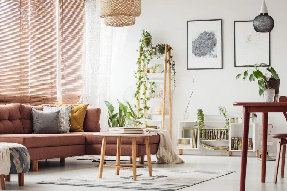
🪟 Step 2: Create echoes with textiles and furniture
Now that you know your artwork's personality, it’s time to give it conversation partners. This step is particularly rewarding because you will immediately see your room take on a new dimension, as if all the elements finally started speaking the same language.
🎯 The textile elements that create the connection
- Curtains or sheers: They frame your artwork and can either amplify it or subtly support it. Choose the texture according to the work's energy: fluid for a romantic painting, structured for a geometric piece. Avoid overly busy curtains that compete with the art.
- Cushions and accent textiles: These little ambassadors carry the subtle nuances of your palette throughout the room. They create visual reminders that unify the space. Prioritize 2-3 different textiles rather than one to create richness.
- Rugs or flooring: The floor anchors the whole ensemble and can either echo the colors of the artwork or create a sophisticated contrast that highlights it. A good rug dialogues with the work without ever imitating it.
🎼 How to orchestrate these elements
Create subtle chromatic reminders: Use the secondary shades of your artwork (not the main colors) in your textiles. A discreet blue-gray from the painting can inspire a cushion, creating an invisible but powerful connection. The idea is to suggest, never imitate.
⏱️ Time: 30 minutes of reflection | ✅ Success when: The links are obvious once pointed out | ⚠️ Attention: Resist the temptation of a "total look" - harmony is born from subtlety
Harmonize textures according to emotion: If your artwork exudes softness, prioritize soft and flowing textiles. If it's energetic, dare to use more structured materials. This tactile coherence reinforces the emotional impression without your guests being able to explain why.
⏱️ Time: 20 minutes | ✅ Success when: Touching your textiles evokes the same sensation as looking at the artwork | ⚠️ Attention: A poorly chosen texture can break all the harmony built
🌿 Step 3: Bring life with natural elements
This final step transforms your technical decoration into a true art of living. Living and natural elements give this emotional depth that makes you feel good at home without knowing why. It's the secret of interiors that are never forgotten.
🪴 How to choose and place your living elements
Select plants that dialogue: Choose plants whose shapes and colors complement your artwork without competing with it. Rounded leaves to soften a geometric painting, or architectural forms to structure a blurry work. Nature becomes your decorative ally.
⏱️ Time: 1 hour of research | ✅ Success when: Plants and artwork seem made for each other | ⚠️ Attention: Avoid plants that are too spectacular, which divert attention from the art
Create visual triangles: Place your natural elements so that the eye naturally circulates between artwork, plants and decorative elements. This triangular circulation is the secret of compositions that retain the gaze and create an impression of perfect balance.
⏱️ Time: 45 minutes of adjustment | ✅ Success when: The eye naturally travels around the room | ⚠️ Attention: Too many elements break the circulation - less is often more
Rule of natural progression: A week between each step allows your eye to get used to it and validate your choices. Don't rush anything - harmony is built over time and reflection.
You have just discovered the fundamentals of decorative harmony. Now, a few professional tips will give you that little touch of sophistication that makes all the difference and subtly impresses your guests.
💫 Decorator's secret: Lighting changes everything! A spotlight directed at your artwork at 30° will create reflections in your shiny elements (vase, mirror) and visually unify the whole. It’s the trick that transforms a beautiful decoration into a true staging.
🤔 "What if I'm wrong and it doesn't go together?"
"I'm afraid of making a bad choice and missing the harmony that I am looking for..."
This concern is normal and even healthy! It shows that you understand the importance of consistency. Here’s the good news: there are no “bad” choices, only unresolved choices. Even professional decorators constantly adjust. Harmony is built in touches, not by revelation.
🎯 Reassuring action: Start with a single textile element - a cushion for example. Live with it for a week. If you still like it after 7 days, it’s the right choice. Otherwise, try something else. This gradual method avoids costly mistakes.
⚠️ The 5 pitfalls that sabotage your decorative harmony
Warning: these common mistakes can undo all your efforts in seconds. I'm revealing them to you to spare you the disappointments experienced by 80% of decorating enthusiasts. Recognizing these pitfalls will save you months of trial and error.
- 🚫 Trying to match everything perfectly: It's tempting to look for a cushion in the exact same color as the painting, but that's a beginner's mistake. The result: a flat and lifeless interior. Instead, look for close shades that create subtle echoes. Harmony is born from conversation, not unison.
- 🚫 Neglecting lighting when making choices: Choosing your textiles in a store under neon lights and then discovering they are different at home is a classic. Light changes everything! Always test your samples at home, at different times of the day, before buying.
- 🚫 Overloading the space with decorative elements: When you discover harmony, you want to do too much. But an overloaded room loses its impact. Golden rule: if you hesitate to add something, that means you already have enough. Elegance is knowing when to stop.
- 🚫 Exactly copying a magazine inspiration: Decor photos are meant to sell, not to live with. Get inspired by the overall atmosphere, but adapt it to your space and lifestyle. Your interior should look like you, not like a catalog.
- 🚫 Changing direction too often: Harmony requires consistency. If you change your mind every week, you will never achieve that coherence you are looking for. Give yourself time to get used to it before judging.
🛡️ Quick verification system: Before each purchase, ask yourself: "Does this element tell the same story as my painting?" If you hesitate for more than 3 seconds, it's no. Your instinct knows when something is wrong - trust it.
🎁 Special readers offer
Because you took the time to inform yourself, enjoy 10% discount on your first order:
⏰ Valid 72h after reading • Applicable to all our products
❓ Frequently asked questions about decorative harmonization
Allow 3-4 weeks for a complete transformation, taking one step per week. This gradual approach allows your eye to get used to it and validates your choices. Rushing the process often leads to costly regrets. A good layout improves with time.
With €200-500, you can completely transform the atmosphere of a room with textiles and accessories. The trick: start with the most visible elements (curtains, cushions) that have the greatest impact. Plants are inexpensive but bring a lot.
This is often a sign that you are looking for harmony at the wrong level. Stop trying to match colors and focus on emotion. A "difficult" painting often has a strong personality that requires more subtlety in associations. Sometimes, changing the lighting is enough to reveal everything.
Absolutely! In a small space, harmony is even more important because every element counts double. Use the same principles in a concentrated version: fewer elements, but more care in their selection. A well-harmonized small space always looks bigger.


