I spent seven years designing modular cultural spaces – municipal libraries, community centers, coworking spaces – where the same walls host business meetings, creative workshops and public conferences in turn. One question always comes back: how to dress these chameleon spaces without freezing their identity?
Here's what a painting suited to a multipurpose room brings: a visual presence that structures the space without locking it into a single function, an aesthetic consistency that enhances each use, and a flexibility that naturally accompanies daily transformations.
The trap? Choosing a work that is too narrative, too emotionally charged, which conflicts with the diversity of activities. I have seen magnificent municipal halls made cold by abstractions that are too intellectual, and associative spaces energized by a simple triptych in neutral tones.
Rest assured: dressing a multipurpose room does not mean giving up personality. On the contrary, it is an opportunity to create a visual signature open enough to become the common denominator of all your activities. I will show you how.
Geometric abstraction: the ally of multi-purpose spaces
In my first layout project for a Lille neighborhood house, I installed an abstract composition with clean lines in the main room. The result? Users didn't even notice the painting – in a good way. It visually structured the space without ever capturing attention intrusively.
Geometric abstract paintings work remarkably well in multipurpose rooms because they offer a presence without imposing a reading. Unlike figurative works that tell a specific story, abstraction remains open to interpretation. A yoga workshop will see one thing and a condominium meeting another, and that is precisely their strength.
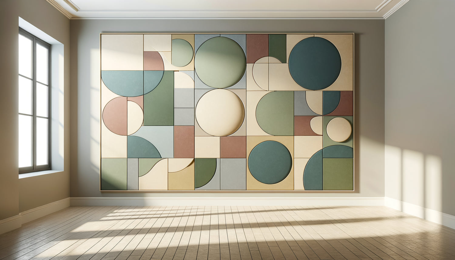
Favor compositions with simple shapes and balanced colors. Circles, rectangles and horizontal lines create a visual harmony that soothes without putting to sleep. For a room hosting various activities, I systematically recommend a palette of three to four shades maximum, with a neutral dominant (beige, pearl gray, off-white) and one or two more sustained accents.
Formats that structure without segmenting
In a multipurpose room, the format of the painting directly influences the perception of space. A large horizontal format (minimum 120x80 cm) creates a visual continuity that unifies the place, particularly effective on the main walls facing the entrance. I experimented with this approach in a Brussels coworking space: the panoramic painting gave an unexpected depth to a rectangular and functional room.
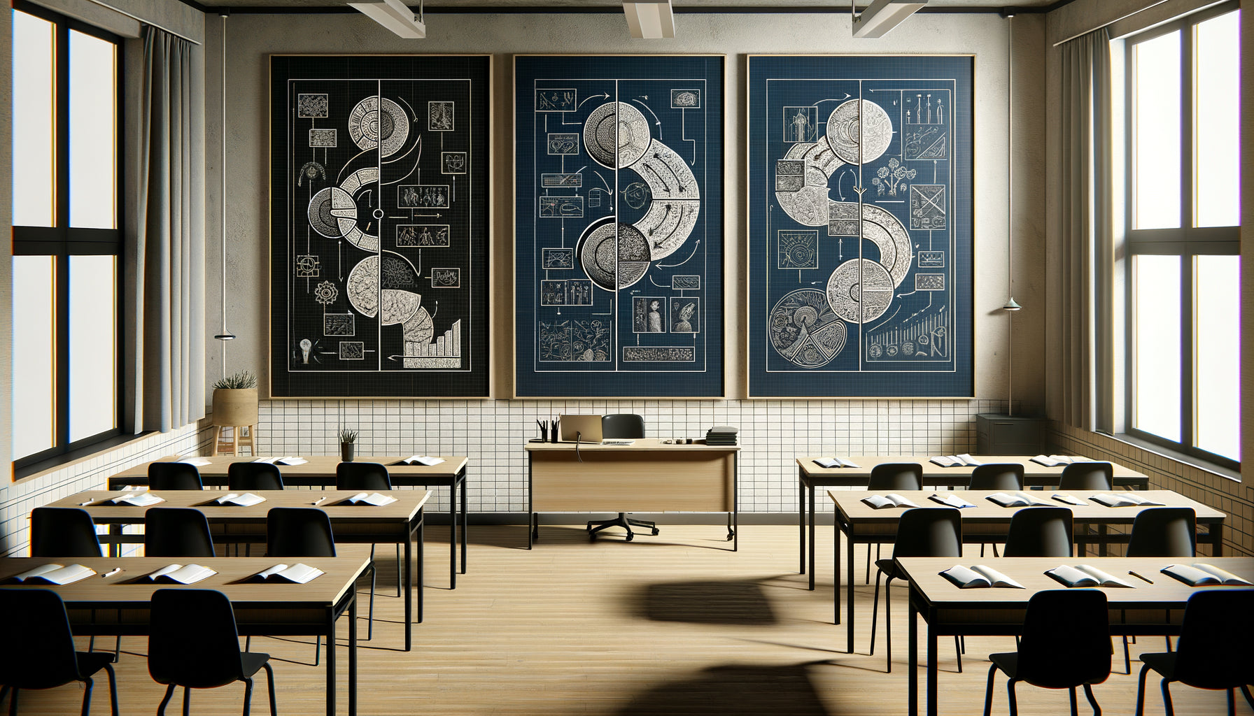
Triptychs and diptychs offer a fascinating alternative. Their modular structure echoes the versatility of the room itself. For a community that regularly reconfigures its space, this solution provides visual flexibility: the panels can be repositioned according to the layout, while maintaining their aesthetic coherence.
Color palettes that unite all uses
Color is your best ally – or your worst enemy – in a multipurpose room. I learned this lesson during a project for a cultural association: the bright red painting chosen by the committee was magnificent in itself, but created a palpable tension during meditation sessions, while being perfect for debate evenings.
For a space hosting different activities, tertiary color palettes work remarkably well: soft terracotta, sage green, slate blue, pale ochre. These shades have enough character to create an atmosphere, without ever imposing too much energy. They accompany both professional training and creative workshops for children.
Tone-on-tone combinations offer a discreet sophistication particularly suitable. A painting declining several nuances of grey-blue, for example, brings depth without creating a focal point that is too dominant. In a municipal hall I furnished in Nantes, this monochrome approach transformed an impersonal space into a welcoming place, while remaining neutral for formal assemblies.
Avoid the pitfalls of overly marked colors
Saturated hues – bright red, lemon yellow, intense violet – create a specific energy difficult to reconcile with the diversity of activities. If you absolutely want a vibrant touch, integrate it as a minimalist accent in a predominantly neutral composition: an orange line on a beige background, a few touches of turquoise in a grey scale.

When landscape becomes a unifying element
Contrary to popular belief, some figurative paintings work perfectly in multipurpose rooms. My experience with a vocational training center opened my eyes: a minimalist landscape – stylized forest, purified marine horizon, silhouette mountain – creates a welcome visual breathing space in spaces often dense with activity.
The key lies in the treatment. A hyperrealistic photographic landscape risks creating a distraction. On the other hand, a graphic interpretation, almost schematic, of the same subject offers a soothing presence without intrusive narration. These works function as symbolic windows, particularly valuable in rooms with no natural light.
For an associative library, I selected a painting representing a stylized black and white birch forest. The result: readers found it to be an invitation to calm, workshop facilitators a neutral backdrop, and event organizers an elegant setting that enhanced their photographs.
The materials and textures that enrich without weighing down
Beyond the subject matter and colors, the texture of the painting considerably influences the atmosphere of a multipurpose room. Works with subtle reliefs – light impasto, layering of materials – add a tactile dimension that humanizes multifunctional spaces, often designed primarily for their practicality.
I experimented with this approach in a community space with a textured painting in tones of linen and stone. The slightly structured surface captured the light differently depending on the time of day and lighting used, creating a discreet variability that subtly renewed the perception of the space. A morning workshop would not perceive exactly the same work as an evening conference.
The supports themselves deserve attention. For rooms with heavy traffic, prioritize canvas prints mounted on frames or protected rigid supports: they are more resistant to handling during frequent rearrangements. Glass, although beautiful, creates problematic reflections when presenting with a projector.
The question of framing in adaptable spaces
In a multipurpose room, I systematically recommend minimalist frames or paintings without visible frames (print on edge). Elaborate frames, gilt and ornate moldings create a formality unsuitable for the flexibility of the space. A simple brushed aluminum or light natural wood frame provides the necessary finish without imposing a particular style.

Scale and strategic placement
The most common mistake? Undersizing the artwork for fear that it will dominate the space. In a room of 40m² or more, an artwork less than 80 cm wide is literally lost, especially if chairs and tables are regularly rearranged. The rule of thumb I apply: the artwork should occupy at least one-third of the width of the wall on which it is hung.
Positioning directly influences the use of the room. On the wall facing the entrance, the artwork creates a welcoming focal point that structures the space as soon as you enter. On a side wall, it becomes an accompanying element, less prominent but still structuring. I systematically avoid the wall behind the presentation area: the artwork then competes visually with speakers or projected content.
Hanging height also deserves consideration. In a room where people are sometimes seated and sometimes standing, position the center of the artwork 160 cm from the floor: a compromise that works in most configurations. This height allows the artwork to be visible without dominating, present without imposing itself.
Your multipurpose room deserves a visual identity worthy of it
Discover our exclusive collection of artwork for School that naturally adapts to multifunctional spaces and enhances every activity.
Dealing with specific technical constraints
Multipurpose rooms impose practical constraints that are often overlooked. Acoustics, for example: in a space where amplified voices, musical instruments, and group conversations resonate in turn, a stretched canvas artwork contributes modestly but truly to sound absorption. It's not an acoustic panel, but every element counts in these often reverberant volumes.
Variable lighting is another challenge. A room equipped with projectors, adjustable spotlights, and natural light requires an artwork whose colors remain stable under different light temperatures. Neutral tones and limited palettes avoid unpleasant surprises: this perfect beige under LED becomes greenish in tungsten light.
Finally, ease of maintenance is not negligible in a heavily used space. A smooth artwork, without excessive relief, will be easy to dust. If your room hosts activities with children or material handling, plan for a slightly elevated positioning (center at 170 cm) to avoid accidental contact.
Creating an evolving visual signature
The true intelligence in choosing a painting for a multipurpose room lies in its ability to become the visual DNA of the place while receding into the background to benefit activities. Some spaces I have decorated have seen their painting become so integrated into the identity of the place that it appears naturally on communication supports, event photos, as a discreet but constant signature.
This visual continuity creates a valuable psychological effect: despite the variety of activities, users perceive an overall coherence which transforms a simple multipurpose room into a true space. The painting is no longer an added decorative element, but an identity component of the space.
To achieve this goal, think of your choice as a long-term investment. Avoid trends that are too marked – Pantone's color of the year, very dated patterns – in favor of timeless compositions that you will not tire of. A good painting for a multipurpose room should remain relevant for at least ten years, accompanying the evolution of uses without ever seeming obsolete.
Imagine your room in six months, transformed by this perfectly chosen painting. Users enter and immediately feel that this place has been designed for them, whatever their needs at the moment. The space breathes, adapts, welcomes. Your next appointment: measure precisely your main wall and define the color palette that already echoes your existing furniture. This is the first step towards a truly coherent multipurpose room.
Frequently Asked Questions
What size painting should I choose for a 50m² multipurpose room?
For a 50m² room, aim for a painting of at least 100 to 120 cm wide on the main wall. This dimension creates a sufficiently asserted presence without overwhelming the space. If your room has high ceilings (more than 3 meters), you can even opt for a vertical format of 120x150 cm which will enhance the ceiling height. The frequent mistake is to choose a too timid format that gets lost in the volume. A large painting visually unifies the space and structures the different activity zones. If you are hesitating between two sizes, always choose the largest: in a multipurpose space where furniture moves regularly, the painting must remain the constant visual reference point, and for this, its presence must be significant without being overwhelming.
Can I install multiple paintings in a multipurpose room?
Yes, but with great caution. Multiplying artworks only works if you create a true coherent series rather than an accumulation. I equipped an association room with three paintings of the same size (60x60 cm) in a range of blues, spaced regularly on a longitudinal wall. The result created an elegant visual rhythm that accompanied movement in the space. On the other hand, mixing different styles, formats and palettes quickly turns the room into a chaotic exhibition. If you opt for multiple paintings, make sure they share at least two common elements: either the color palette, or the graphic style, or the format. And limit yourself to a maximum of three works in a room of less than 70m², otherwise you risk creating visual overstimulation incompatible with certain activities such as concentration meetings or meditative practices.
Do paintings with quotes or typography suit multipurpose rooms?
Generally, I do not recommend them for truly versatile spaces. Paintings with text or quotes impose a reading and interpretation that can conflict with certain activities. A motivational quote may seem out of place during a serious board meeting, while a poetic message may appear irrelevant during technical training. Moreover, the text inevitably captures attention and creates a distraction during presentations or interventions. Notable exception: rooms mainly dedicated to educational or creative activities, where an inspiring message effectively reinforces the purpose of the place. In this case, prioritize minimalist typography and a very short message (a maximum of three to five words), graphically integrated into a larger visual composition. The text then becomes a graphic element rather than content to be read, which completely changes its impact on the space.