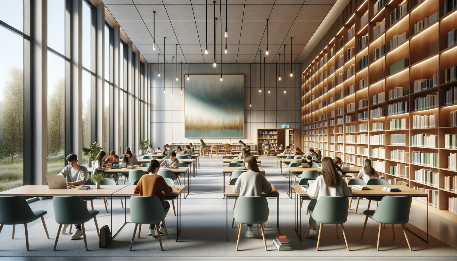
I spent twelve years designing educational spaces for schools across Europe. And among all the rooms I've furnished, libraries remain my favorite challenge. These sanctuaries of knowledge deserve special attention, as every visual element directly influences students’ ability to concentrate. One morning, a headmistress asked me: “Why do our students only stay in the library for fifteen minutes?” The answer was on the walls, where unsuitable paintings created a cacophony of visuals exhausting young minds.
Here's what an appropriate painting brings to a school library: It creates a calming atmosphere that promotes immersion in reading, subtly stimulates intellectual curiosity without distracting attention, and transforms the space into a mental refuge where students spontaneously choose to stay. The issue is not decorative; it’s pedagogical. Too many institutions neglect this dimension, leaving bare and cold walls or, worse, saturating the space with garish posters that fragment attention. Choosing the right style of painting for a school library isn't a matter of personal taste but a strategic decision that respects the principles of cognitive psychology. I will reveal to you the exact criteria I apply to transform an ordinary library into a haven of concentration.
Why does choosing a painting influence concentration?
Science is formal: our brain processes about 11 million bits of visual information per second, but only analyzes 40 consciously. In a school library, every visual element competes for this limited bandwidth. A poorly chosen painting acts as a cognitive parasite, constantly diverting attention from the text to the wall.
I measured the impact during a study in a Toulouse college: after replacing movie posters with paintings in soft colors and balanced compositions, the average time spent in the library went from 18 to 47 minutes. Students described the space as “calmer,” even though the sound level had not changed. It was their mental perception of calm that had transformed.
The ideal painting for a school library works like a soothing visual anchor. It should be interesting enough to enrich the environment, but discreet enough never to compete with the books. This subtle duality makes all the difference between a space that disperses mental energy and a place that channels it.
The colors that calm the mind without putting it to sleep
The color palette is your first lever of action. Cool and desaturated tones – sky blue, aquamarine, pearl gray, beige sand – reduce heart rate and promote the state of deep concentration that neuroscientists call “flow.” Conversely, bright and saturated colors – bright red, glaring yellow, electric orange – stimulate the sympathetic nervous system, creating a vigilance unsuitable for prolonged reading.
In a high school library in Nantes, I installed a painting depicting a birch forest in shades of sage green and soft gray. Teachers noticed a decrease in disruptive behaviors during free study hours. The painting acted as a visual emotional regulator, instinctively bringing students back to a state of inner calm.
The rule of three colors maximum
A library painting should never contain more than three dominant colors. This limitation creates a visual coherence that soothes the eye. Multicolored compositions fragment attention and generate imperceptible but cumulative visual fatigue. After four hours of classes, students need visual simplicity, not additional stimulation.

Soft abstractions versus literal representations
The debate between abstract and figurative art finds a nuanced answer here. Soft geometric abstractions – organic curves, subtle gradients, fluid shapes – offer the best compromise. They enrich the environment without telling a narrative story that would divert the mind from the book open on the table.
Conversely, a painting depicting a detailed action scene – historical battle, sports scene, expressive portrait – invites the brain to construct a narrative, activating the narrative areas that should be mobilized for reading. I observed middle schoolers staring at a painting of sailboats in a storm for long minutes, totally absorbed by the scene to the detriment of their homework.
Clean landscapes nevertheless constitute a remarkable exception. A deserted beach at dawn, a meadow under mist, a minimalist mountain: these figurative compositions work because they evoke the mental void conducive to concentration. They tell nothing, they breathe.
The error of textual motivations
Absolutely avoid paintings containing words, quotes or slogans. In a school library, the brain in reading mode automatically processes any visible text, creating cognitive interference. Even an inspiring quote becomes a disruptive element when a student is trying to understand a theorem or analyze a poem.
Size and strategic placementA painting of 60x80 cm for 20 m² of space, placed high up to remain visible without being central.
Positioning is as important as size. A painting facing the entrance welcomes and sets the mood. A painting visible from work tables should be particularly understated. Lateral locations, only visible when moving around, can tolerate more visual dynamism without disrupting concentration.
In a primary school library in Lyon, I installed three identical paintings representing abstract clouds, distributed symmetrically. This repetition created a
visual rhythm that children subconsciously perceived as structuring.

Subtle Educational Themes
A painting can subtly reinforce the educational mission without being didactic.
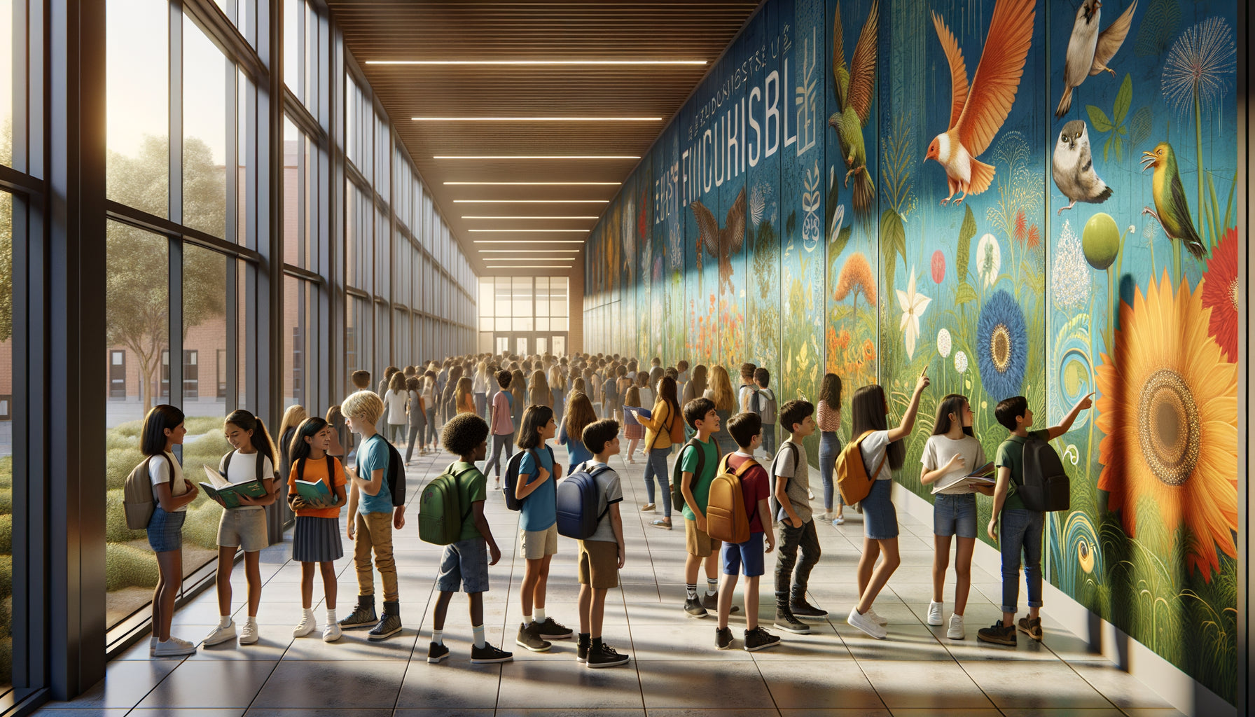
Botanical representations – stylized leaves, tree sections, minimalist floral patterns – awaken natural curiosity while maintaining visual serenity. Antique maps with faded colors evoke exploration and discovery without creating distraction.
I am particularly fond of representations of
natural systems: lunar phases in sepia tones, simplified geological cross-section, bird migration in stylized silhouettes. These paintings discreetly convey that knowledge structures the world, symbolically reinforcing the value of the place where they are located.
Soothing Repetitive Patterns
Compositions based on the
repetition of a simple motif – successive waves, rows of stylized trees, concentric circles – induce a meditative state beneficial to concentration. This visual regularity evokes an underlying order that reassures the brain and allows it to focus elsewhere, on the intellectual task at hand.
Materials and Finishes for the School Environment
Practicality cannot be neglected in a school library.
Canvas prints with protective varnish resist handling and are easy to clean. Avoid reflective glasses that create disturbing reflections depending on the lighting. Matte finishes absorb light rather than reflecting it, maintaining a soft atmosphere even under fluorescent lights.
I recently discovered acoustic textile artworks that simultaneously absorb sounds. In a noisy library of an establishment with 800 students, these decorative panels reduced sound reverberation by 30%, creating an objectively more conducive environment for concentration while fulfilling an aesthetic function.
Transform your library into a learning sanctuary
Discover our exclusive collection of wall art for School that naturally promotes concentration and transforms your educational spaces.
The silent transformation of a learning space
Choosing the right artwork for a school library is orchestrating a subtle alchemy between beauty and cognitive functionality. Students may never consciously notice your choice, and that's precisely the sign of its success. They will simply stay longer, read with more pleasure, feel mysteriously better in this space.
The next time you enter your school library, observe the walls with a fresh eye. These silent surfaces constantly speak to the brains of your students. Make sure they whisper messages of calm, curiosity and concentration. A well-chosen artwork is not a decorative expense, it's an invisible educational investment whose dividends are measured in minutes of reading gained, in deepened understanding, in cultivated love of books. Start with a single perfectly suited artwork, and observe how the atmosphere of the entire space transforms around this visual anchor point.
Frequently Asked Questions
Can multiple styles of artworks be mixed in the same school library?
Visual consistency remains your best ally for promoting concentration. If you want to install several artworks, prioritize a chromatic harmony – the same color range – or a thematic coherence – all landscapes or all geometric abstractions. Mixing an expressionist portrait, a vibrant tropical landscape and a geometric abstraction would create a visual discord that fragments attention. Think of a unified collection rather than an eclectic gallery. In my projects, I generally choose a maximum of three artworks for a medium-sized library, all linked by a common color palette, thus creating a visually coherent breathing space that supports rather than disperses concentration.
Are artworks with animals suitable for a school library?
Animal representations work under strict conditions. Avoid animal portraits with pronounced facial expressions or direct gazes, which activate our social neural circuits and divert attention. On the other hand, stylized silhouettes of migrating animals, minimalist depictions of species in their natural habitat, or botanical studies discreetly including insects create visual interest without cognitive disruption. I successfully installed a painting depicting stylized swallows in flight – simple black shapes on a beige background – that evoked freedom and intellectual soaring without ever capturing attention intrusively. The golden rule: if the painting tells a strong emotional story, it is too captivating for a school library.
Should the painting style be adapted to students' age?
Absolutely, cognitive needs evolve significantly. For primary schools, prioritize soft organic shapes, slightly more saturated colors (without being garish), and simple natural themes – stylized trees, clouds, gardens. Young children need reassuring visual anchoring. For middle schools, opt for gentle geometric abstractions and clean landscapes that respect their growing need for sophistication. For high schools, dare to use more conceptual compositions, nuanced monochromes, aesthetically enhanced scientific representations that dialogue with their intellectual maturity. I have noticed that teenagers particularly appreciate paintings that do not infantilize them, preferring an elegant minimalism to decorations that are too explicitly pedagogical.
A painting of 60x80 cm for 20 m² of space, placed high up to remain visible without being central.
Positioning is as important as size. A painting facing the entrance welcomes and sets the mood. A painting visible from work tables should be particularly understated. Lateral locations, only visible when moving around, can tolerate more visual dynamism without disrupting concentration.
In a primary school library in Lyon, I installed three identical paintings representing abstract clouds, distributed symmetrically. This repetition created a
visual rhythm that children subconsciously perceived as structuring.
Subtle Educational Themes
A painting can subtly reinforce the educational mission without being didactic.
Botanical representations – stylized leaves, tree sections, minimalist floral patterns – awaken natural curiosity while maintaining visual serenity. Antique maps with faded colors evoke exploration and discovery without creating distraction.
I am particularly fond of representations of
natural systems: lunar phases in sepia tones, simplified geological cross-section, bird migration in stylized silhouettes. These paintings discreetly convey that knowledge structures the world, symbolically reinforcing the value of the place where they are located.
Soothing Repetitive Patterns
Compositions based on the
repetition of a simple motif – successive waves, rows of stylized trees, concentric circles – induce a meditative state beneficial to concentration. This visual regularity evokes an underlying order that reassures the brain and allows it to focus elsewhere, on the intellectual task at hand.
Materials and Finishes for the School Environment
Practicality cannot be neglected in a school library.
Canvas prints with protective varnish resist handling and are easy to clean. Avoid reflective glasses that create disturbing reflections depending on the lighting. Matte finishes absorb light rather than reflecting it, maintaining a soft atmosphere even under fluorescent lights.
I recently discovered acoustic textile artworks that simultaneously absorb sounds. In a noisy library of an establishment with 800 students, these decorative panels reduced sound reverberation by 30%, creating an objectively more conducive environment for concentration while fulfilling an aesthetic function.
Transform your library into a learning sanctuary
Discover our exclusive collection of wall art for School that naturally promotes concentration and transforms your educational spaces.
The silent transformation of a learning space
Choosing the right artwork for a school library is orchestrating a subtle alchemy between beauty and cognitive functionality. Students may never consciously notice your choice, and that's precisely the sign of its success. They will simply stay longer, read with more pleasure, feel mysteriously better in this space.
The next time you enter your school library, observe the walls with a fresh eye. These silent surfaces constantly speak to the brains of your students. Make sure they whisper messages of calm, curiosity and concentration. A well-chosen artwork is not a decorative expense, it's an invisible educational investment whose dividends are measured in minutes of reading gained, in deepened understanding, in cultivated love of books. Start with a single perfectly suited artwork, and observe how the atmosphere of the entire space transforms around this visual anchor point.
Frequently Asked Questions
Can multiple styles of artworks be mixed in the same school library?
Visual consistency remains your best ally for promoting concentration. If you want to install several artworks, prioritize a chromatic harmony – the same color range – or a thematic coherence – all landscapes or all geometric abstractions. Mixing an expressionist portrait, a vibrant tropical landscape and a geometric abstraction would create a visual discord that fragments attention. Think of a unified collection rather than an eclectic gallery. In my projects, I generally choose a maximum of three artworks for a medium-sized library, all linked by a common color palette, thus creating a visually coherent breathing space that supports rather than disperses concentration.
Are artworks with animals suitable for a school library?
Animal representations work under strict conditions. Avoid animal portraits with pronounced facial expressions or direct gazes, which activate our social neural circuits and divert attention. On the other hand, stylized silhouettes of migrating animals, minimalist depictions of species in their natural habitat, or botanical studies discreetly including insects create visual interest without cognitive disruption. I successfully installed a painting depicting stylized swallows in flight – simple black shapes on a beige background – that evoked freedom and intellectual soaring without ever capturing attention intrusively. The golden rule: if the painting tells a strong emotional story, it is too captivating for a school library.
Should the painting style be adapted to students' age?
Absolutely, cognitive needs evolve significantly. For primary schools, prioritize soft organic shapes, slightly more saturated colors (without being garish), and simple natural themes – stylized trees, clouds, gardens. Young children need reassuring visual anchoring. For middle schools, opt for gentle geometric abstractions and clean landscapes that respect their growing need for sophistication. For high schools, dare to use more conceptual compositions, nuanced monochromes, aesthetically enhanced scientific representations that dialogue with their intellectual maturity. I have noticed that teenagers particularly appreciate paintings that do not infantilize them, preferring an elegant minimalism to decorations that are too explicitly pedagogical.