

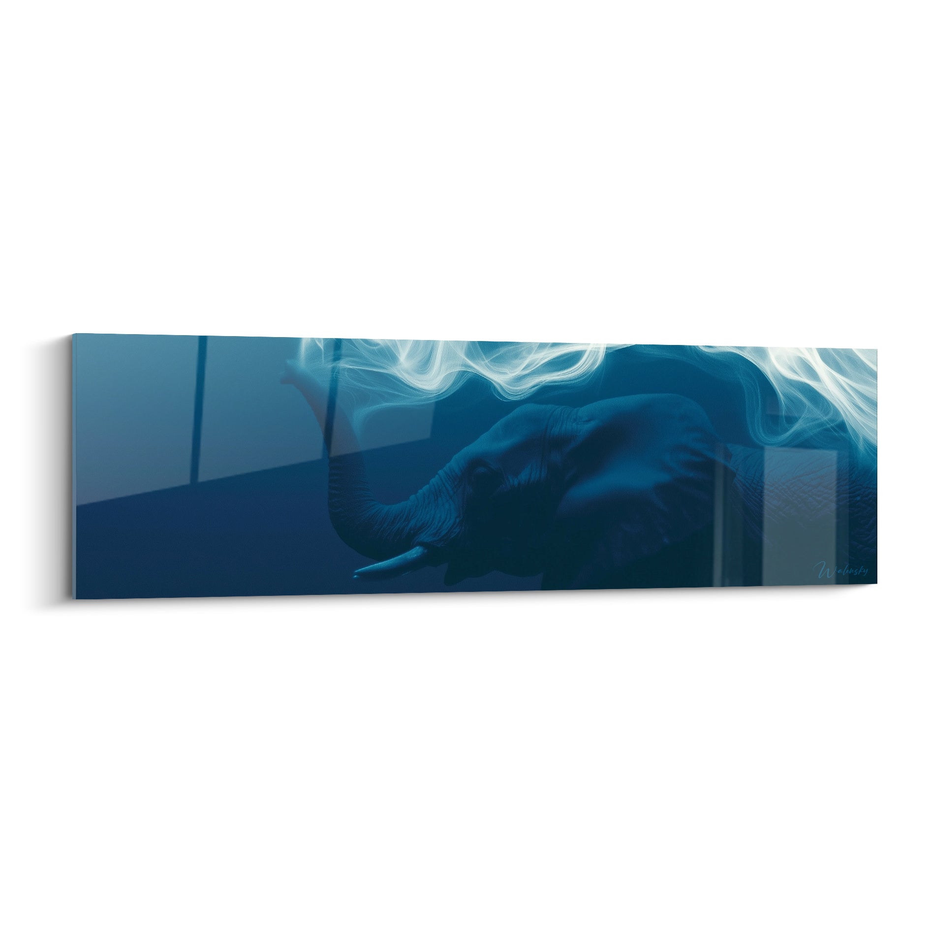






Do paintings lighten or weigh down a room?
October 11, 2025 · 16 min read · by Walensky
You've just hung this beautiful artwork on the wall of your living room, but instead of the hoped-for "decor magazine" effect, you feel like the room now looks smaller and more cluttered. You step back, observe, adjust... but something feels off.
This unpleasant feeling that the space has shrunk, that the walls are closing in, that your room has lost brightness. You question your choice: did you make a mistake putting this piece here?
Perhaps you've already tried moving it, trying another wall, or even temporarily removing the artwork. But the doubt lingers: do artworks really weigh down space or is it just an impression?
This uncertainty is perfectly normal and does not reflect your decorating abilities. The real reason for this confusion lies in a lack of understanding of the visual rules of spatial perception that govern our brains.
By the end of this article, you will know exactly how to choose and position your artworks to create an impression of space and lightness, transforming each wall into a decorative asset that enhances your interior.
Why does this question obsess so many decor enthusiasts?
This questioning about the visual impact of artworks arises at the crucial moment when you want to personalize your space without distorting it. It's like choosing the right spices in cooking: poorly dosed, they can spoil the entire dish. Wait too long, and you risk getting used to bare walls that desperately lack character.
🏠 Customer testimonial: "I lived with white walls for two years out of fear of making a mistake. When I finally dared to hang my first artworks, I realized that I had deprived my apartment of its soul all that time. The transformation was striking!"
Conversation with a decor expert
The golden rule of visual lightening: An artwork only weighs visually if it is disproportionate or poorly positioned. Well chosen, it becomes a space amplifier that guides the eye and creates the illusion of a larger room in just a few days.

Decoding: what's really happening in your perception?
You may be feeling this frustration: your walls seem "heavy" despite your efforts, your decor lacks harmony, or your guests don't notice your beautiful artistic acquisitions.
This is actually a conflict between your eye and your brain. Your brain processes visual information according to automatic patterns, and when a decorative element disrupts these patterns, it creates a feeling of discomfort.
It's like trying to read a book upside down: technically possible, but exhausting for your visual system.
The trap of poorly calibrated proportions
Contrary to popular belief that a large painting "fills" the space, it is often the accumulation of small elements poorly distributed that creates the effect of overcrowding.
Imagine your wall as a musical score: a few deep and well-placed notes create more harmony than a multitude of high-pitched notes scattered around.
This understanding will transform your approach to wall decor: instead of fearing large pieces, you will seek them out for their structuring power.
🔍 Quick test: Observe your room and count the visual elements on a single wall. More than 5 elements? Your eye doesn't know where to rest and creates this feeling of "too much".
The illusion of colors that "bring" walls closer
Popular belief has it that dark colors bring surfaces closer. In reality, it is the lack of contrast that creates the effect of visual crushing.
It's like looking into a poorly lit tunnel: without landmarks, your brain loses its sense of distance and space.
Once this nuance is understood, you will discover how to use contrasts to create depth even in the most restricted spaces.
The unknown factor of hanging height
Few people realize that hanging height directly influences the perception of volume. A painting hung too high "pulls" the ceiling down.
You can spot this phenomenon in your space: if you have to look up to admire your work, it unconsciously creates a feeling of vertical compression.
This discovery immediately changes your relationship with space: every centimeter counts in creating an airy and balanced atmosphere.
The 3 signals of a layout that weighs down:
- You instinctively avoid looking at certain walls: sign that the visual balance is broken, like a dish too salty that you don't finish
- Your guests remain standing in certain areas: indication that the space does not "breathe", creating an unconscious discomfort
- You systematically turn on the lights during the day: proof that natural light is "absorbed" instead of being reflected by your decorative elements
The secret trigger: the balance of full and empty spaces
The real factor that determines whether a painting lightens or weighs down lies in the management of negative space around it. It's like in photography: the subject only exists in relation to its background. Your painting becomes a visual anchor that organizes all the surrounding space. Too tight, it suffocates; too isolated, it floats without coherence.
The breathable rule of thirds: The free space around your painting should represent at least one third of its total surface area. Check immediately: mentally trace a rectangle around your work and observe whether the empty areas balance it.
| ❌ Common belief | ✅ Decor reality | 💡 Explanation | 🎯 Practical benefit |
|---|---|---|---|
| Large paintings overwhelm small rooms | They create an effect of grandeur through optical illusion | The eye follows the contours and mentally extends the space | Feeling of a larger room without work |
| Multiplying small works enlivens the wall | Too many elements create visual chaos | The brain cannot process more than 7 elements simultaneously | More restful and sophisticated decoration |
| Bright colors liven up the space | Color harmony determines the impact | A poorly integrated tone creates a break in the visual flow | Coherent and soothing atmosphere |
| You should avoid black in small spaces | Black/white contrast maximizes depth | Opposition = dynamism = feeling of space | Assertive character without clutter |

The progressive method to master the art of visual lightening
Rest assured: transforming your walls into decorative assets that enlarge your space requires no particular talent. It's like learning to drive: intimidating at first, then natural with the right progression. In 3 logical steps, you will go from hesitation to mastery, and each wall will become a visual expansion opportunity.
🎯 Overview of your transformation: Step 1 - Diagnosis of your current space, Step 2 - Strategic selection and positioning, Step 3 - Harmonization and expert finishing. Each phase will give you visible immediate results and prepare the next for a spectacular cumulative effect.
Step 1: Decoding your space (the foundations of success)
Starting with this analysis is crucial because it reveals the hidden strengths and weaknesses of your room. It's like diagnosing before treating: you can’t improve what you don’t understand. This step will give you immediate satisfaction as you will finally see your space with an expert eye.
What you need for this analysis phase
- Measuring tape (minimum 3 meters) : Unlike approximate smartphone apps, a real measuring tape gives you the precision needed to respect the golden ratio. Choose a rigid one to measure heights without assistance. This accuracy will determine the final visual impact./
- A spirit level or reliable leveling app : The human eye instinctively detects imbalances, even slight ones. A crooked picture subconsciously creates tension that weighs down on the perception of space. Invest in a good level for professional results./
- Paper and pencil (or phone notes) : Noting your observations avoids memory errors and allows you to objectively compare different configurations. This traceability significantly accelerates your progress./
Now let's move on to concrete practice:
Detailed actions for a successful diagnosis
Map your main walls : Measure and note the dimensions of each wall intended to receive art. Include the position of sockets, switches and openings. This mapping reveals maximum impact zones where your gaze naturally rests.
⏱️ Time: 15 minutes | ✅ Successful when: You have a simple sketch with all measurements | ⚠️ Attention: Do not neglect obstacles (radiators, sockets) - they drastically influence the final rendering
Identify your natural focal points : Stand at the entrance of the room and note where your eye is drawn spontaneously. These zones possess a natural visual attraction power that must be exploited intelligently.
⏱️ Time: 5 minutes | ✅ Successful when: You have identified 2-3 magnetic zones | ⚠️ Attention: Avoid confusing "focal point" and "available wall" - not all walls are equal
Analyze the flow of light : Observe how natural light evolves in your room at different times. Lighted areas amplify the effect of colors while darker areas absorb them.
⏱️ Time: 10 minutes at 3 different times | ✅ Successful when: You can distinguish between lighted/shadowed zones | ⚠️ Attention: Artificial lighting completely changes the situation - test in the evening too
✅ Step 1 validation: Your space now seems "readable" and you clearly distinguish its strengths and constraints. If you are still unsure about certain areas, take a photo from the entrance - it will reveal what your brain automatically "corrects". Congratulations, you now have an expert vision of your space!
— Our selection


OUR RECOMMENDED PRODUCTS
Step 2: Strategic Selection and Placement (The Art of Perfect Positioning)
You are now moving from diagnosis to concrete action. This step is particularly rewarding as you immediately see the impact of each adjustment. The snowball effect begins: each well-placed element facilitates the positioning of the next.
Tools for Millimeter Positioning
- Kraft paper or newspapers: Create templates with the exact dimensions of your artworks to test positions without making holes. This pro technique avoids regrets and walls riddled with mistakes. Much cheaper than definitive placement errors. Repositionable adhesive putty: Temporarily fixes your templates without damaging the paint. Unlike classic tape, which can tear off the paint, this putty removes cleanly. Essential for experimentation. 2H pencil (hard lead): Discreetly marks your reference points without leaving visible traces under the artwork. A lead that is too soft would create difficult-to-erase marks. This detail makes the difference between an amateur and a professional.
Professional Positioning Protocol
Create and test your templates: Cut out exact shapes of your artworks from kraft paper. Temporarily attach them to visualize the impact without commitment. This simulation reveals flaws invisible to the imagination.
⏱️ Time: 20 minutes | ✅ Successful when: The proportions seem natural to you | ⚠️ Attention: Templates always appear smaller than real artworks - this is normal
Respect the 145-150 cm rule: The center of your artwork should be at this height (eye level of an average-height person). This universal rule creates optimal visual harmony in 90% of cases.
⏱️ Time: 5 minutes per artwork | ✅ Successful when: You naturally look at the center without raising or lowering your eyes | ⚠️ Attention: Above a sofa, descend to 130-135 cm to compensate for the seated perspective
Balance visual masses: Distribute your artworks according to their "visual weight" (size + color intensity). A large, dark artwork balances several small, light works. Think balance rather than symmetry.
⏱️ Time: 15 minutes of tests | ✅ Successful when: No area seems to pull more than the other | ⚠️ Attention: Balance is felt more than it is calculated - trust your instinct
🎨 Validation of Step 2: Your room has gained character without losing lightness. The space seems more "lived in" and sophisticated. If some areas still seem empty, that's normal - it's better to under-decorate than overload. You now master the basics of strategic placement!
Step 3: Harmonization and Expert Finishing (the final touch that changes everything)You've reached the level where every detail counts. This step transforms a "correct" decoration into a designer-level arrangement. Your guests will notice this sophistication without being able to explain it - it’s the signature of expert craftsmanship.
Professional-Grade Finishes
- Accent Lighting (adjustable spotlights or LED strips): Reveals colors and creates depth even in the evening. An unlit artwork loses 60% of its visual impact after sunset. The investment is immediately noticeable.
- Uniform Quality Frames: Even if your artworks are different, consistent frames create a sophisticated cohesion. Choose a reduced color palette (2 tones maximum). This consistency unifies the whole.
- Strategic Mirrors: Placed opposite your artwork, they double the visual impact and create dynamic reflections. A well-placed mirror can double the feeling of space.
Advanced Harmonization Techniques
Create Chromatic Correspondences: Identify 2-3 dominant colors in your artworks and subtly repeat them in your textiles (cushions, curtains). This pro technique creates a soothing visual coherence.
⏱️ Time: 30 minutes of reflection + targeted shopping | ✅ Success when: The eye naturally moves from one element to another | ⚠️ Attention: Too much color echo creates a dated "matching" effect - dose subtly
Optimize Artistic Lighting: Install dedicated lighting that reveals your artworks without creating reflections. A 30° angle from the top avoids shadows. This light transforms your artwork into true windows of light.
⏱️ Time: 45 minutes of installation | ✅ Success when: Colors appear more vibrant than under general lighting | ⚠️ Attention: Avoid LED lights that are too white (>4000K) which distort warm colors
Fine-Tune Negative Space: Adjust the space between your elements millimeter by millimeter. 3-5 cm can transform a disparate ensemble into a harmonious composition. This precision reveals your expert mastery of space.
⏱️ Time: 20 minutes of micro-adjustments | ✅ Success when: Everything seems to "fall into place" naturally | ⚠️ Attention: Don't seek mathematical perfection - the eye prefers slightly asymmetrical balances
🏆 Step 3 Validation: Your space now has a distinctive visual signature. The transformation exceeds your initial expectations and each visitor immediately notices the sophisticated atmosphere. You now know how to tell the difference between amateur decoration and expert arrangement!
Expertise progression rule: Move to the next step when you no longer see obvious improvements in the current step. Your eye becomes more refined - what seemed perfect to you last week may seem improvable today. This is a sign of your growing expertise!
You now master the solid basics of visual arrangement. It's time to discover the subtleties that only professionals know and which make the difference between a beautiful decoration and a true aesthetic crush.
🎨 Designer’s secret: The "wall breathing" effect consists of intentionally leaving a main wall with little visual clutter so that the eye can "rest" between visually rich areas. This counterintuitive technique amplifies the impact of other walls by contrast and avoids visual saturation.
Reader's question
"I'm afraid a large painting will dominate my small dining room too much..."
This concern is very understandable and reveals your sensitivity to decorative balances. In reality, it’s often the opposite that happens: in a small space, several small elements create more "visual noise" than a single strong piece. Imagine a small room as a delicate jewel: it's better to have a beautiful central diamond than multiple small stones scattered around. To reassure yourself, start by testing with a paper template - you will be surprised how much the space gains character without losing amplitude.
💡 Immediate test: Create an 80x60 cm template and position it 145 cm from the floor on your main wall. Observe for 48 hours - your eye gets used to it and you will see the real effect without a definitive commitment.
— You may also like


Common pitfalls that turn your artworks into visual obstacles
After supporting hundreds of decor projects, I know the recurring mistakes that can spoil your efforts. These pitfalls are predictable and perfectly avoidable when you know them.
- 🎯 Aiming for perfect symmetry: The desire to center and mathematically balance everything is natural, but paradoxically creates a cold and frozen "museum" effect. Your brain prefers dynamic balances that bring life to the space. Dare to slightly offset your compositions. 📏 Neglecting the scale of surrounding furniture: A painting must dialogue with its nearby furnishings. Above a large sofa, an artwork that is too small seems lost and visually diminishes the furniture. The rule: minimum 2/3 of the width of the furniture below. 🌈 Multiplying styles without a common thread: Mixing abstract art, landscapes and portraits can work, but requires a unifying element (dominant color, type of frame, artistic period). Without consistency, the effect becomes cacophonous. 💡 Underestimating the impact of lighting: A beautiful painting becomes dull under poor lighting. The common mistake: relying only on general lighting that creates shadows and distorts colors. Each important work deserves its dedicated lighting.
- 📐 Hanging too high "to protect": The fear of bumps leads to hanging high, but a painting that you have to look up at creates unconscious visual fatigue. Your decor should be naturally contemplable, not like a museum exhibition.
🛡️ Verification checklist before final installation: The whole thing pleases after 3 days of templates - Lighting reveals colors well in the evening - You naturally look at the works without effort - The space seems larger, not more cluttered - Alarm signal: if you still hesitate after a week of testing, it means something is wrong with the proportions or location.
— In the same vein


Answers to frequently asked questions
The visual impact is immediate, but your eye takes 3 to 7 days to get used completely to the new configuration. That's why I recommend living with the templates for a minimum of 48h before permanent installation. Optimize this time by taking photos at different times: they reveal what your brain automatically "corrects".
Allow between €300 and €800 for a professional result: 1-2 master pieces (150-400€), dedicated lighting (80-150€), quality frames (50-200€), and harmonization accessories (20-50€). Start with a strong room - the effect will be spectacular even with a reduced budget. The expensive mistake: multiplying small purchases instead of investing in a striking work.
Absolutely! 80% of success lies in the choice and positioning, not in the technical installation. A good templating avoids 90% of errors. For installation, modern systems (rails, self-drilling hooks) greatly simplify the operation. If you know how to hammer a nail straight, you know how to hang a painting correctly.
The secret lies in the unifying element: a consistent color palette, coordinated frames, or a common theme (nature, geometric abstraction...). A handy rule of thumb: no more than 3 different styles per room, with a dominant style at 60%. A successful example: black and white photo + geometric abstract + line drawing, all framed in thin black frames.
Your decorative transformation begins now
In a few weeks, you will enter your living room with a feeling of pride and accomplishment. Your walls, once neutral or hesitant, are now telling your story with elegance and sophistication. Your guests will immediately notice this warm and refined atmosphere, without being able to precisely explain what has changed. This is the signature of a successful arrangement: the effect is felt more than it is analyzed.
This mastery of wall art will give you confidence for all your other decor decisions. You will develop this "expert eye" that instinctively distinguishes good proportions, successful balances, and harmonious colors. This skill naturally transfers to overall arrangement, textile choices, and space organization. Your aesthetic sensitivity is refined permanently.
Remember: you now have all the keys to transform any wall into a decorative asset. The theoretical part was the most difficult. Start today by measuring your main wall and creating your first template. In 48 hours, you will have a clear vision of your future arrangement. Action always dispels doubts - and your space is waiting for your first courageous decision!
🚀 Your first action today: Choose your main wall and take its measurements. This simple action transforms your project from a "vague dream" into a "concrete plan". Your future awaits you at the end of this measuring tape!

Explore our collections


