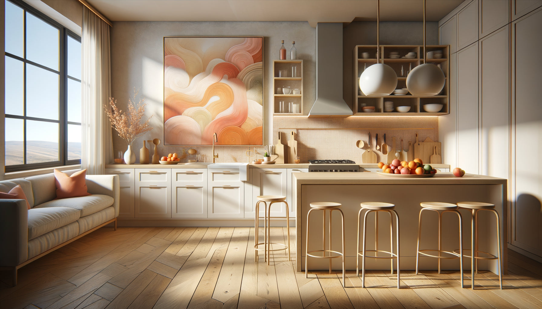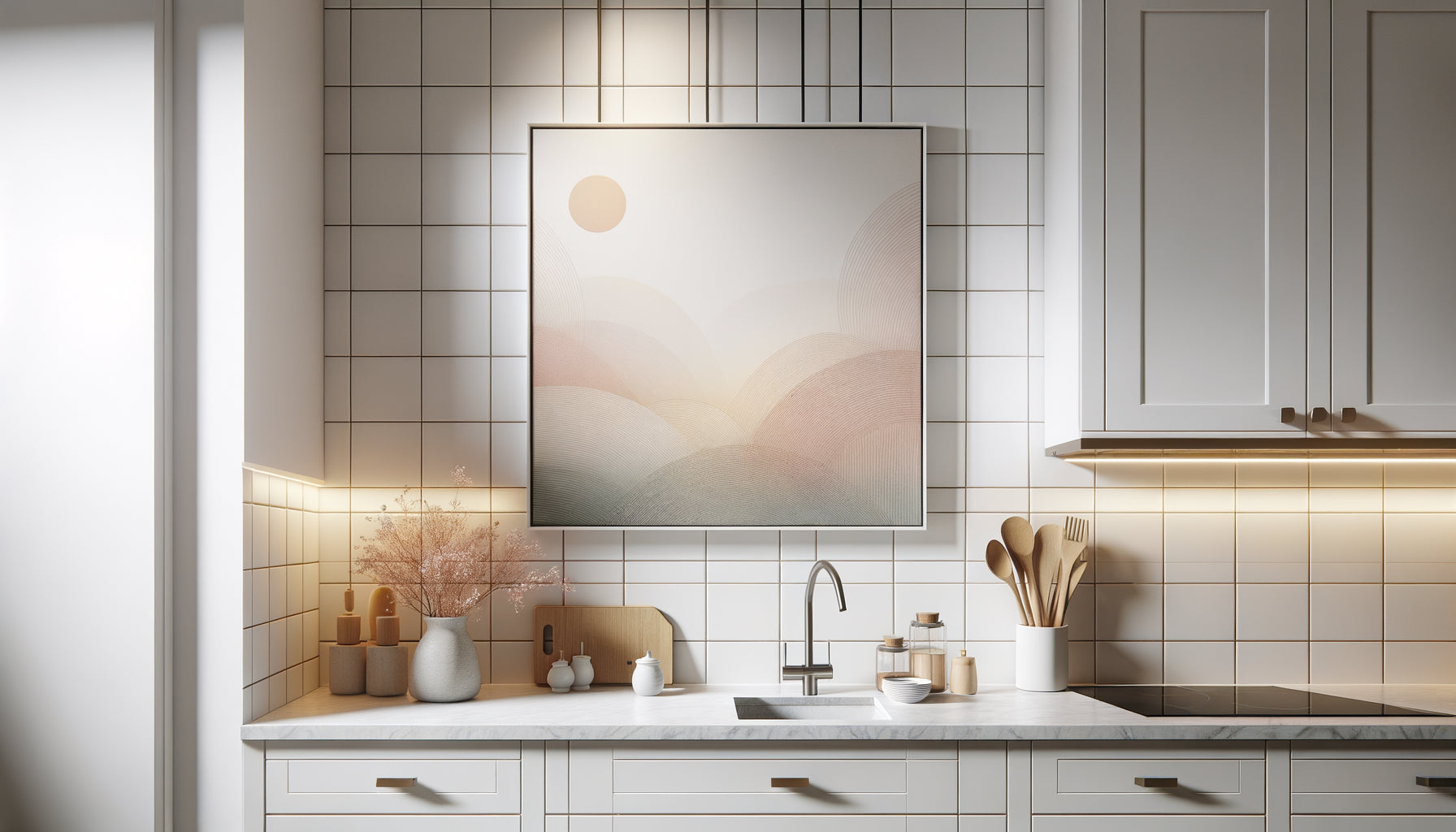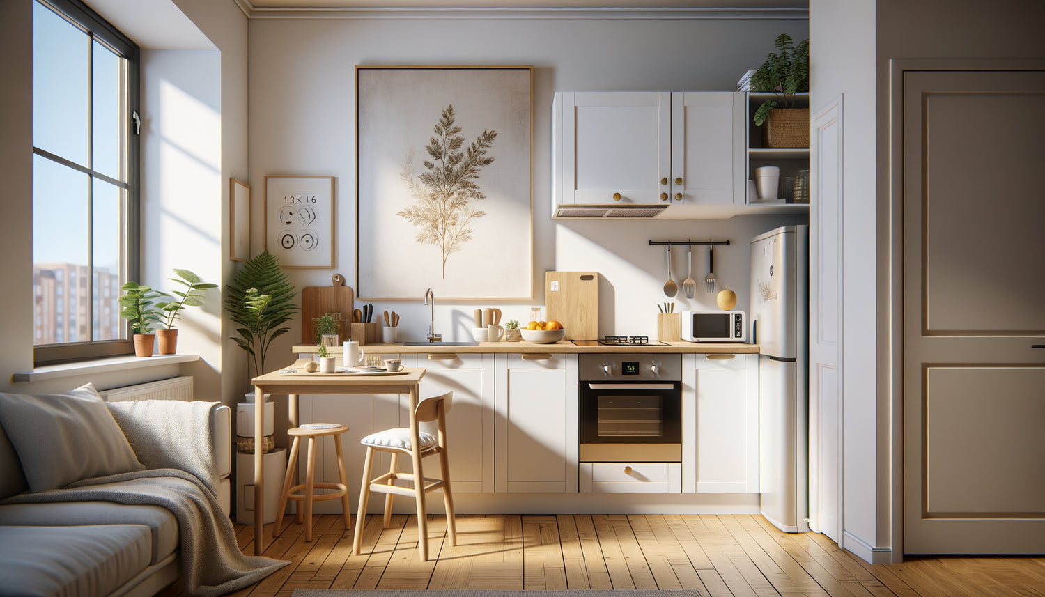
When you step into your first student studio apartment, the kitchenette often resembles a narrow corridor wedged between a mini-fridge and two electric burners. Yet, this year, I saw a design student transform this 3m² kitchen corner into a veritable personal gallery with just one 30x40cm artwork. This simple frame above her kettle metamorphosed the space: suddenly, preparing dinner was no longer a chore, but a moment in a home that resembled her.
Here's what the right dimensions of an artwork bring to a student apartment kitchenette: they create a focal point that visually structures the space, they add personality without cluttering, and they transform a functional corner into a pleasant living space. In a reduced space where every centimeter counts, choosing the right size makes all the difference between a decor that suffocates and an arrangement that breathes.
The problem? Faced with the constraints of a student studio - walls often white and impersonal, wall surfaces limited by cabinets and extractor hood, tight budget - one hesitates. Too large, the artwork will overwhelm the kitchenette. Too small, it will disappear into the decor. And then, there's this fear of drilling holes in a room you’ll leave in a few months.
Rest assured: sizing an artwork for a student kitchenette follows simple and universal rules. Whether your kitchen corner is 2m² or 5m², whether it is open to the studio or closed by a door, the same principles apply. And no, you don't need a laser measure or a degree in interior design.
I will show you how to choose the perfect dimensions for your kitchenette, based on available space, furniture layout and desired effect. You will know exactly which size to prioritize, where to hang your artwork, and how to create maximum visual impact with a minimal budget.
The rule of proportions: understanding the scale of your kitchenette
In a student apartment kitchenette, the first mistake is to underestimate the importance of proportions. I have accompanied dozens of students in furnishing their first accommodation, and the scene repeats itself: they arrive with a 70x100cm poster bought online, hang it above the worktop, and realize that the space suddenly seems even smaller.
The fundamental rule: an artwork should never occupy more than 60-70% of the width of the available wall. In a standard student apartment kitchenette, you generally have a free wall surface of 60 to 100cm wide between the cabinets. On this space, aim for an artwork of 40 to 70cm maximum.
Take your smartphone and photograph your kitchenette. Look at the image: it reveals the real proportions that your eye, accustomed, no longer sees. Breathing zones - these empty spaces around the artwork - are as important as the artwork itself. In a small space, they create the illusion of amplitude.
For classic linear kitchenettes (cabinets aligned along a single wall), horizontal rectangular formats of 40x30cm or 50x40cm blend in naturally. They follow the horizontal line of countertops and shelves, creating visual harmony. For L-shaped kitchenettes, you can dare to use a slightly vertical format (30x40cm) on the perpendicular wall, which draws the eye and creates depth.
The three strategic locations and their ideal dimensions
Every student apartment kitchenette has three potential hanging zones, each with its own specific dimensional constraints.
Above the countertop
This is the classic location, the one everyone envisions first. The available height between the countertop and the ceiling (or upper cabinets) dictates your choices. In most student studios, this space measures between 40 and 60cm.
Recommended dimensions: 30x20cm to 50x40cm. Leave at least 15cm of free space above the countertop - an essential safety zone to avoid water or oil splashes. A picture too close to the cooking area will quickly accumulate grease and steam.
I saw a literature student hang three small 20x20cm formats in a horizontal triptych rather than one large artwork. The result: the impression of a personal collection rather than standard decoration, while respecting the constraints of her cramped kitchenette.
On the opposite wall (closed kitchenette)
If your kitchenette is separated from the studio by a door or partition, the wall opposite the cabinets becomes a perfect gallery. Here, you gain freedom: no constraints of steam, heat or splashes.
Recommended dimensions: 40x60cm to 60x80cm. You can dare to use slightly larger formats that create a real focal point when entering the space. Position the center of the artwork at eye level (about 150-160cm from the floor) for maximum impact.
A trick I love: create a mini vertical gallery with two overlapping artworks (a 40x30cm above a 30x20cm). This draws the eye upwards and gives an impression of high ceilings, precious in studios often with low ceilings.
On the corner or partition return
In L-shaped or U-shaped kitchenettes, these small return walls (often 30-40cm wide) are neglected treasures. They offer lateral visibility from the rest of the studio.
Recommended dimensions: 20x30cm to 30x40cm. Vertical formats that follow the narrow shape of these spaces. Favor thin frames (1-2cm maximum) so as not to visually overload these already compact areas.

Adapt dimensions to match the artwork's style
The size of a painting in a student apartment kitchenette depends not only on available space, but also on the work's visual language. A detailed photographic landscape has different needs than a minimalist typographic poster.
Minimalist compositions - a lemon on a white background, a quote in clean typography, a line drawing - brilliantly support small formats. A 20x30cm is more than enough to get the message across. Their simplicity creates an impact even at a distance. In a kitchenette, these paintings bring lightness and do not visually saturate the space.
Conversely, complex artworks - detailed still lifes, bustling urban scenes, reproductions of masters - require a more generous format to reveal their subtleties. A 40x50cm or 50x60cm allows you to appreciate the details without having to stand close to the wall. I advised an art history student to choose a 50x40cm format for his reproduction of a Flemish still life: the fruits, reflections on glass, textures become readable even while making coffee.
Textual paintings - vintage recipes, retro posters, quotes - follow a logic of readability. If the text becomes unreadable from 1.50m (the average distance in a kitchenette), the format is too small. Test before you buy: photograph the painting on your computer screen, step back into your studio, check the readability. Generally, an A3 format (30x40cm) constitutes the minimum for comfortable readability.
When constraint becomes creativity: alternative solutions to standard dimensions
Sometimes, the configuration of your student apartment kitchenette defies classic dimensions. Too narrow a wall, an intrusive hood, a poorly placed window... That's where unconventional solutions shine.
Modular composition: instead of one painting, consider two or three small formats (15x20cm or 20x20cm) arranged in a cluster. You create a personalized installation that adapts exactly to your available space. A communication student I accompanied used five framed postcards (10x15cm each) arranged in an asymmetrical constellation: the effect is dynamic, modern, and she can reorganize the whole thing at will.
The panoramic format: in very narrow kitchenettes (less than 80cm wide), a horizontal panoramic painting (40x15cm or 50x20cm) follows the geometry of the space. These elongated formats create a horizontal line that visually widens the room. Favor landscapes, urban skylines, or abstract compositions that take advantage of this particular ratio.
The table placed: who said you had to drill holes in the walls? In a student apartment where you are renting, placing a small painting (maximum 20x30cm) on a shelf or the edge of a micro-worktop avoids holes. Change it as your mood dictates without any constraints. This solution works particularly well with an integrated easel frame.

The fatal error: when dimensions sabotage harmony
After accompanying hundreds of kitchenette layouts in student apartments, I can instantly identify the three dimensional errors that ruin all the decorative potential.
The giant poster syndrome: this magnificent 70x100cm poster bought in a store without measuring beforehand. Result: it covers 90% of the wall, almost touches the side cabinets, and turns your kitchenette into an advertising poster. The space appears compressed, claustrophobic. In a student studio, the golden rule remains: less is more. A well-proportioned 40x50cm painting will create a greater visual impact than a poorly sized giant.
The anarchic multiplication: the desire to personalize leads some students to accumulate small paintings without dimensional coherence. Three different formats (15x20cm, 25x35cm, 30x40cm) mixed on the same wall create visual chaos rather than harmony. If you are composing a gallery, maintain logic: either identical formats in series, or a coherent progression (small-medium-large), or a large central painting surrounded by equidistant small satellites.
The too small painting for the ambition: on the contrary, a timid format (10x15cm) lost in the middle of a large white wall panel gives the impression of an unfinished, hesitant decoration. In a standard kitchenette, the minimum viable format to create a visual impact remains 20x30cm. Below that, the painting becomes anecdotal.
Transform your kitchenette into an inspiring space
Discover our exclusive collection of Kitchen Wall Art that perfectly adapts to small spaces and creates the atmosphere you deserve.
Visualize before investing: the paper mockup method
Before buying your wall art for your student apartment's kitchenette, invest 20 minutes in a simple technique that will save you regrets and unnecessary expenses: a full-size paper mockup.
Cut out the exact dimensions you are considering from newspaper or cardboard. A 40x30cm? Cut a 40x30cm rectangle. Temporarily stick it to the wall of your kitchenette. Step back. Make yourself a coffee. Observe the rendering while you go about your normal activities.
This test instantly reveals whether the proportions work. Does the paper rectangle seem too imposing? Cut out a smaller one. Too timid? Enlarge it. Test several positions: centered, offset to the right, higher, lower. Photograph each configuration with your smartphone.
An extra tip: print a miniature version of the artwork you are considering and glue it in the center of the paper rectangle. This gives you an ultra-realistic preview of the final rendering. This method helped me help a student realize that she was imagining a 50x70cm when a 40x50cm created the perfect balance in her 3m² kitchenette.
The bonus of this technique? It also works for composing multiple arrangements. Cut out three 20x30cm rectangles, play with the spacing, find the composition that speaks to you before any purchase.
Beyond dimensions: creating the illusion of space
The dimensions of the artwork in your student apartment's kitchenette are not limited to the physical centimeters of the frame. The visual content plays an equally crucial role in the perception of space.
Artwork with perspective and depth - a street that recedes into the horizon, a misty forest, a window open onto a landscape - creates a virtual window that visually pushes back the walls. In a kitchenette without an exterior window (frequent in student studios), a 40x50cm painting depicting a bright landscape compensates psychologically for the lack of opening.
Light and bright colors amplify the space. A painting with pastel tones or dominated by white reflects light and visually enlarges the kitchenette. Conversely, concentrated dark tones create depth but can weigh down an already compact space. In a student studio with limited natural light, prioritize luminous works in medium format (30x40cm to 40x50cm) rather than darker works even smaller.
Vertical compositions draw the eye upwards and create a sense of height. If your kitchenette suffers from low ceilings (under 2.40m), a vertical format of 30x40cm or 40x60cm visually counteracts this compression. Conversely, in a narrow, high kitchenette, a horizontal format stabilizes proportions.
Evolution and flexibility: thinking about your decoration over time
A student apartment is by nature a transient habitat. Between moves, roommate changes, and personal evolutions, your kitchenette today may not be the same in six months.
This reality argues for versatile dimensions that will adapt to your future configurations. The 30x40cm format constitutes the sweet spot: substantial enough to create an impact in a small student kitchenette, compact enough to integrate into varied spaces if you move. I have followed students over several years of different accommodations: those who had chosen 30x40cm or 40x50cm formats were able to reuse their artworks in each new kitchenette, while extreme formats (too large or too small) ended up stored under the bed.
Also prioritize flexible hanging systems. Repositionable adhesives, magnetic rods, or rail systems allow you to change the location or orientation of your artwork without multiplying holes in the walls. In a rental apartment, this is a major advantage.
Think evolutionary collection rather than unique purchase. Start with a medium-sized artwork (40x30cm) this year. Add a second complementary format (30x20cm) the following year if your budget allows. This progressive approach lets you refine your decorative style without an initial massive investment, while creating a thoughtful dimensional consistency.
The psychological impact of good proportions
Beyond pure aesthetics, the dimensions of the artwork in your student apartment kitchenette deeply influence your daily feeling in this space.
A correctly sized artwork creates what designers call a visual anchor point. Your gaze has a place to naturally rest when you enter the kitchenette. This anchoring generates a sense of structure and order, even in a reduced functional space. Psychologically, you perceive your kitchenette as a thought-out, inhabited, personal place rather than a simple inherited utility area.
Harmonious proportions also produce a soothing effect. Studies in neuroaesthetics show that our brain reacts positively to balanced ratios. In the stressful context of student life, transforming your kitchenette into a visual micro-refuge by choosing an artwork with adapted dimensions is not superfluous luxury, it's an investment in your daily well-being.
I’ve heard students confide that their kitchenette, decorated with a carefully chosen 40x30cm artwork, had become their favorite place to unwind between study sessions. Not because the space fundamentally changed, but because the right proportions created harmony that invited relaxation.
Conclusion: sizing is personalizing
Choosing the dimensions of an artwork for your student apartment’s kitchenette is more than just a matter of centimeters. It's asserting that even in a constrained, temporary, functional space, you deserve an environment that reflects you and inspires you.
Keep the fundamentals in mind: 30x40cm to 50x40cm for placements above the countertop, vertical formats to create height, horizontal compositions to visually widen, and always this rule of maximum 60-70% of the available wall width. Test before buying with your paper mockup. Prioritize the quality of a well-sized artwork over multiplying random sizes.
Your student apartment kitchenette is just waiting for that little creative gesture to become a space where preparing your morning coffee becomes an enjoyable moment. The right artwork dimensions will transform this kitchen corner into a place that tells your story, even in 3m². So measure, imagine, and treat yourself to this first step towards a home that truly resembles you.
FAQ: Your questions about artwork dimensions in a student kitchenette
What is the minimum size for an artwork to be visible in a student kitchenette?
The minimum size to create a real visual impact in a kitchenette is 20x30cm. Below that, the artwork risks getting lost in the decor and appearing anecdotal, especially in a space where attention is naturally drawn to functional elements (hobs, sink, cupboards). For an optimal effect with a single artwork, I recommend a 30x40cm format which remains compact while asserting a clear decorative presence. If your budget or space is really limited, prefer an excellent small 20x30cm artwork rather than a larger, lower-quality format: in a reduced space, visual quality always takes precedence over the amount of surface covered.
Can you put multiple artworks in a small kitchenette or does it overload the space?
Yes, you can absolutely install multiple artworks in a small student apartment kitchenette, provided you respect a composition logic. The key is dimensional consistency and regular spacing. Three options work particularly well: a triptych of three identical formats 20x20cm or 20x30cm aligned horizontally with 5-10cm spacing; a vertical composition of two superimposed artworks (for example 30x40cm above a 20x30cm) that draws the eye upwards; or an asymmetrical constellation of 3 to 5 very small formats (15x20cm) arranged according to a clear visual logic. The mistake to avoid: mixing disparate sizes without apparent structure, which creates visual chaos. When in doubt, prioritize a single medium-sized artwork (40x30cm) well placed rather than a haphazard accumulation.
What dimensions should I prioritize if my kitchenette doesn't have a free wall above the countertop?
If your student apartment kitchenette is equipped with tall cabinets that occupy all the space above the countertop, exploit alternative locations. The opposite wall (if your kitchenette is closed off) accepts more generous formats: 40x60cm to 50x70cm positioned at eye level create a magnificent focal point visible upon entering. The side partition returns (these small walls of 30-40cm between the kitchenette and the rest of the studio) are perfect for vertical formats 20x30cm or 30x40cm. Finally, consider an artwork placed on a shelf or top of the refrigerator (maximum format 20x30cm for stability). One last creative option: small magnetic artworks 10x15cm to 15x20cm directly on the fridge door, transforming this functional element into an evolving personal gallery.