

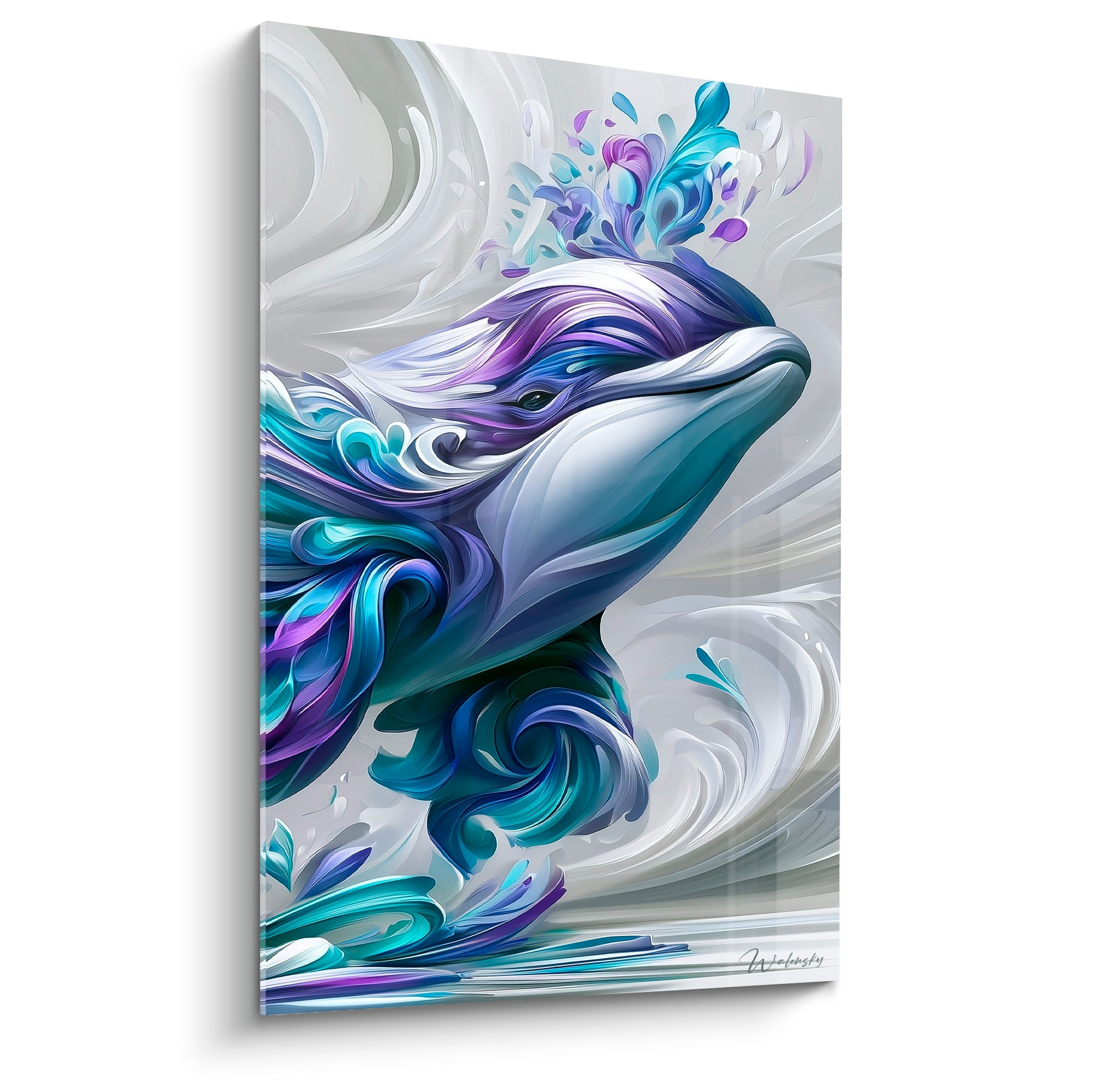






Frameless Tempered Glass Artwork: What a Clean Style for a Design Kitchen?
December 1, 2025 · 11 min read · by Walensky
In the morning, when grazing light streams through your kitchen, it comes to die on this white wall that has never really found its soul. You've invested in designer appliances, impeccable chrome fixtures, a quartz countertop – but something is missing. That certain something that transforms a functional kitchen into an inspiring living space.
Here's what a frameless tempered glass artwork brings to your design kitchen: optimal protection against humidity and splashes, tenfold increased brightness thanks to the reflections of the glass, and that airy feeling that only a borderless work can create. Three assets that precisely meet the technical and aesthetic requirements of a contemporary kitchen.
Many hesitate to hang an artwork in their kitchen, convinced that steam, heat, and splatters condemn any wall decor. Others fear that adding a traditional frame will visually weigh down a space where every detail counts. This double constraint has long relegated kitchens to the status of purely utilitarian rooms.
Yet, the frameless tempered glass artwork finally reconciles decoration and practicality. I'll show you how to choose the clean style that will sublimate your design kitchen, creating that visual continuity sought by all lovers of harmonious spaces.
The technical elegance of tempered glass: when protection becomes invisible
Tempered glass has this rare quality: it protects without imposing itself. Unlike a frame which defines, isolates and segments the space, the frameless artwork in tempered glass blends into the architecture of your kitchen. Its smooth, continuous surface subtly reflects natural or artificial light, creating unexpected depth effects.
Thermal tempering multiplies the strength of the glass by five. Faced with temperature variations – from the oven heating to the windows open in winter – your work remains stable, impassive. Oil splashes, cooking fumes, even tomato sauce splatters: a simple pass of microfiber sponge restores the original shine. This resilience transforms the constraint of the kitchen into a decorative opportunity.
But the major asset of tempered glass lies in its optical transparency. No yellowing over time, no visual distortion. The colors of your artwork retain their initial vibrancy, as if the work floated directly on the wall. This visual purity naturally blends with the codes of contemporary design: clarity, honesty of materials, search for the essential.
Graphic minimalism: when less becomes masterful
In a design kitchen, every element must justify its presence. Graphic minimalism meets this requirement with an economy of means that fascinates. A black line on a white background. An organic curve. Three circles that dialogue. These refined compositions do not clutter the gaze – they guide it, create visual breaths between functional areas.
I notice that frameless paintings with simple geometric patterns amplify the sense of depth. A diagonal line seems to extend the countertop. Overlapping rectangles echo the facades of furniture. This subtle resonance between the artwork and architecture generates an impression of a controlled space, where nothing is left to chance.
Black and white naturally asserts itself in this register. Its chromatic neutrality allows it to coexist with any kitchen palette – from Scandinavian blond wood to anthracite lacquered facades. But be careful: neutrality does not mean blandness. A well-chosen minimalist painting concentrates attention, creates a focal point that reveals the sophistication of the whole.
Forms that structure space
Vertical lines visually elongate a narrow wall between two pieces of furniture. Horizontal compositions widen a backsplash. Circular shapes soften the rigidity of right angles omnipresent in a kitchen. Each geometry dialogues differently with your existing architecture.

Our favourite
Pearl Universe Painting - Abstract Contemporary Painting Edition
233,90€
Discover this artworkColorful monochrome: mastered boldness
While black and white minimalism is reassuring, colorful monochrome is daring. A painting with tempered glass entirely in shades of cobalt blue, terracotta or sage green brings this chromatic vibration that some kitchens too wise demand. The absence of a frame makes this audacity acceptable: without a border to contain the color, it seems to escape naturally from the support, like a breath rather than an affirmation.
Monochrome works particularly well in design kitchens with neutral materials – gray concrete, brushed stainless steel, white laminate. It injects personality without creating a stylistic break. A range of beiges and ochres warms up a kitchen with cool tones. Shades of bluish gray sophisticate an already contemporary space.
The trick is to choose a shade that picks up on an existing element, even a discreet one: the color of the chairs, the undertone of the countertop, the accent of a pendant lamp. This subtle correspondence creates a coherence that seems to have always been there, as if the frameless painting had been thought out from the conception of the kitchen.
Organic abstraction: when nature is refined
Organic abstraction offers a fascinating territory for design kitchens: forms inspired by plants or minerals, but stylized to the essence. No realistic bouquet or detailed landscape – rather an evocation of a leaf, the suggestion of a wave, the shadow of a branch.
These compositions create a subtle connection with the nourishing function of the kitchen. They recall that behind induction cooktops and connected refrigerators lie raw materials, seasons, natural textures. A tempered glass painting showing flowing curves in terracotta evokes artisanal ceramics. Stylized plant motifs in olive green dialogue with the herbs on the windowsill.
Abstraction also allows for movement without agitation. Wavy lines bring softness to an environment dominated by flat surfaces and right angles. This subtle contrast enriches the sensory experience of the space without overwhelming it.
Texture becomes graphic design
Some frameless paintings play on the texture of the photographed material in very close-up: bark, polished stone, rippling water. Tempered glass amplifies these textures, giving them an almost tactile presence. A particularly striking effect in a kitchen where noble materials – marble, solid wood, leather – are already valued.

— Our selection


Typography art : words as architectural decor
Typography art transforms letters into visual architecture. A word, a short quote, a number enlarged to become pure form. In a design kitchen, this approach works remarkably well: it adds personality without imposing figurative imagery.
“Gather”, “Savor”, “Home” – these simple words in refined typography create an instant atmosphere. The painting with tempered glass gives them a strong, almost sculptural graphic presence. The absence of a frame reinforces the impression that the word is directly integrated into the wall, like a contemporary engraving.
Numbers also work wonderfully: a significant date, geographical coordinates, a lucky number. Their apparent neutrality hides an emotional charge known only to the inhabitants. This discreet intimacy is perfectly suited to the refined spirit of a contemporary kitchen.
Font choice matters immensely. Sans-serif characters reinforce modernity. Geometric typefaces dialogue with the room's architecture. Condensed letters elongate the space, while wider versions stabilize it. Every typographical detail influences the overall perception.
— You may also like


The art of placement: where and how to hang your frameless artwork
A frameless tempered glass artwork requires thoughtful positioning. Its formal discretion allows it to colonize spaces where a traditional frame would seem too massive: the narrow space between two tall pieces of furniture, the area above the sink, the often-neglected return corner.
The rule of thirds works admirably in kitchens: place the center of your work at two-thirds of the wall's height. This position creates a natural balance that guides the eye without forcing attention. For a backsplash, consider the frameless artwork as a visual window that aerates the workspace.
Beware of direct heat sources. Although tempered tempered glass resists admirably, placing it within 30 centimeters (12 inches) of a cooktop or oven is not ideal. Favor walls perpendicular to cooking areas, or integrated dining spaces in the kitchen.
Lighting radically transforms the perception of an artwork on glass. An adjustable spotlight creates dynamic reflections that evolve with the time of day. The natural light from a side window makes colors vibrate. Even indirect lighting from LED strips under tall cabinets can sublimate your work through luminous reflections.
Your kitchen deserves more than a blank wall
Discover our exclusive collection of Kitchen artworks that will transform your culinary space into a true contemporary gallery.

Formats and proportions: harmony through dimensions
The panoramic format (70x30 cm or 100x40 cm) naturally follows the horizontality of a backsplash or wall above a low buffet. Its discretion in height compensates for its width – perfect for design kitchens with standard ceilings where every vertical centimeter counts.
The square format (50x50 cm or 60x60 cm) brings stability and balance. It visually anchors a space, creating a geometric reference point that structures perception. In a kitchen with multiple rectangles (furniture, appliances, windows), this perfect shape offers a soothing counterpoint.
The vertical format (40x80 cm) stands out between two columns of furniture or in a narrow corner. It elongates the space, draws the eye upwards, gives the illusion of generous ceiling height. A frameless artwork in this format transforms an architectural constraint into a decorative opportunity.
The golden rule: your artwork should occupy about two-thirds of the width of the furniture or area it overlooks. Too small, and the painting seems lost. Too large, and it overwhelms the space. This proportion creates a natural visual breathing room.
Maintenance and durability: lasting beauty
Tempered glass requires minimalist maintenance – exactly what a designer kitchen owner demands. A slightly damp microfiber cloth is sufficient for daily cleaning. For stubborn grease marks or splashes, a little diluted dish soap works wonders.
Avoid abrasive products that could micro-scratch the surface. Window cleaners are perfect, provided you spray them onto the cloth rather than directly onto the frameless painting – excessive moisture could seep in through the edges and alter the image beneath the glass.
The durability of tempered glass far exceeds that of a framed print under classic glass. No UV fading, no paper yellowing, no deformation due to humidity. Your decorative investment retains its original brilliance for decades.
This longevity is perfectly in line with the philosophy of contemporary design: buy less but better, prioritize lasting quality over fleeting trends. A painting with tempered glass is not a seasonal decoration – it's an architectural element that lasts through the years.

Composing with existing elements: the art of consistency
Your frameless painting does not live in isolation – it dialogues with your choices of faucets, furniture handles, and pendant lighting. This silent conversation between the elements creates harmony or chaos.
If your kitchen features ultra-contemporary lines and high-tech materials (lacquered glass, integrated LEDs, invisible appliances), opt for a sleek painting with radical geometric compositions. Stylistic consistency amplifies the strength of each element.
For a kitchen with softened design – light wood, discreet handles, muted colors – prioritize organic abstraction or monochrome in natural tones. These works create a bridge between functional rigor and domestic softness.
The rule of three: your painting should echo at least three other elements in the room, whether through color, shape, or style. This subtle repetition weaves a network of correspondences that unifies the space without uniformizing it.
Imagine yourself tomorrow morning, coffee in hand, your gaze naturally drawn to this wall once anonymous. The frameless tempered glass painting captures the light of the rising sun, its clean lines silently dialogue with the architecture of your kitchen. It's no longer simply a preparation area – it has become a place where functionality meets contemplation, where the everyday subtly rises to the art of living.
Start by observing your kitchen at different times of the day. Identify the wall that catches the eye, determine the dominant color palette, and measure the available space. Then choose your style épuré based on what you have discovered. Harmony is not decreed – it is built, element by element, in respect of what already exists.
Frequently Asked Questions
Does tempered glass really resist splashes and humidity in a kitchen?
Absolutely, and that is precisely why verre trempé is favored in contemporary kitchens. Its perfectly smooth and non-porous surface prevents any moisture or grease infiltration. Unlike a canvas stretched on frame which can warp with hygrometric variations, or framed paper which can buckle, tempered glass remains dimensionally stable. The thermal tempering process makes it four to five times more resistant than ordinary glass, capable of withstanding significant thermal shocks. You can therefore install it near a cooking area without fear of it cracking at the first temperature contrast. For daily maintenance, a simple wipe with a damp microfiber cloth removes splashes. The tableau sans cadre in tempered glass is not a fragile decoration that requires special precautions – it is a robust element designed for the demands of an active kitchen.
What type of painting is best suited to a white minimalist kitchen?
A completely white cuisine design constitutes a blank canvas that allows for several approaches. Graphic black and white minimalism naturally extends your existing simplicity – think of simple geometric compositions that create rhythm without breaking the color harmony. But you can also dare colored monochrome: a tableau sans cadre in terracotta, cobalt blue or sage green tones will bring that touch of personality that transforms an immaculate kitchen into a warm space. The absence of frame is crucial here: it allows the color to dialogue with the white without creating a brutal visual boundary. Organic abstraction also works remarkably well, especially in shades of beige, gray or earth – it injects texture and depth while preserving minimalist softness. Simply avoid compositions that are too loaded or multicolored which would create a dissonance with your existing sobriety. If in doubt, the rule is simple: choose a work whose essence you could describe in three words maximum.
How to securely fix a tempered glass painting without damaging the tile or painted wall?
Fixing a tableaux with tempered glass requires an adapted technique but remains accessible. Most of these works are equipped with an invisible suspension system on the back – either integrated metal brackets or high-strength adhesive supports. For a painted wall in good condition, double-sided adhesive fixings for heavy loads are generally sufficient for formats up to 60x60 cm. Simply ensure that the surface is perfectly clean, degreased and dry before application. For larger formats or on tile, use appropriate anchors for your support: Molly anchors for plasterboard, impact anchors for concrete or brick, vacuum cups for tiles if you want to avoid drilling. The key is weight distribution: a frameless table of medium size generally weighs between 2 and 5 kg – much less than a bathroom mirror. If in doubt, consult a professional for the first installation; you will understand the logic and be able to repeat the operation alone later. Investing in a solid fixing protects both your wall and your artwork.
Explore our collections


