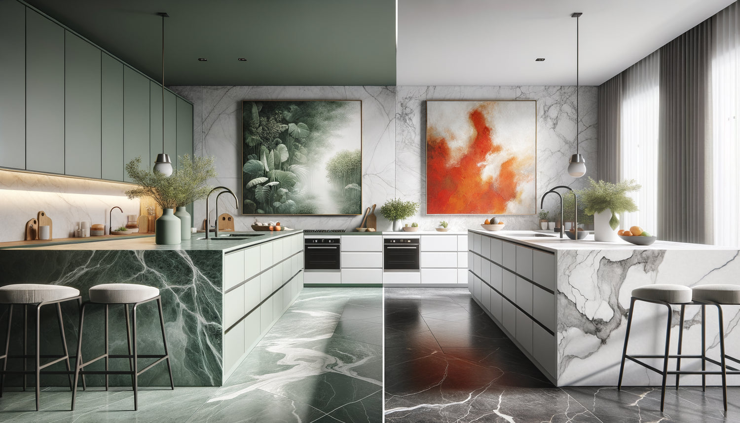
I have visited more than two hundred high-end kitchens in my career as an interior designer, and one question invariably arises during the final stage of design: should this contemporary masterpiece harmonize seamlessly with the Calacatta marble countertop, or create a bold visual contrast? Last week, a Parisian client was still hesitating between an abstract painting in shades of gray that elegantly extended her anthracite granite, and an explosion of yellows that transformed her kitchen into a living art gallery.
Here's what an informed decision between matching and contrast brings: a kitchen that reflects your authentic personality, a space where art dialogues with matter, and an atmosphere that transforms every culinary moment into an aesthetic experience.
The dilemma is real: too much harmony and your kitchen risks sinking into chromatic monotony, too much contrast and the whole thing may appear chaotic. You have probably spent hours selecting this quartz, marble or precious wood countertop, and now this painting you love seems to either disappear into the decor, or scream its presence.
Rest assured, there is no universal rule carved in stone. Each kitchen has its own personality, its own visual language. The key lies in understanding the principles that govern the balance between coherence and boldness, between dialogue and surprise.
I will reveal to you how to orchestrate this encounter between your painting and your countertop, so that your kitchen becomes that unique place where functionality and art naturally merge.
Chromatic harmony: when the painting extends the material
The matching approach is based on an ancestral principle of interior design: to create a visual continuity that soothes the eye. When you choose a painting whose tones echo those of your countertop, you establish an immediate spatial coherence.
In a contemporary kitchen with a white marble countertop veined with gray, an abstract canvas playing on shades of pearl, taupe and off-white establishes a refined dialogue. The eye naturally glides from one surface to the other, creating a chromatic fluidity that visually enlarges the space. This approach works particularly well in small kitchens where visual unity becomes a valuable asset.
I recently orchestrated a scene for a Scandinavian kitchen with a light oak countertop. The painting chosen represented a Nordic forest in honey and beige tones, creating an exceptional organic continuity. The wood grain seemed to extend into the artist's brushstrokes, as if the living material of the countertop found its poetic echo in the artwork.
A subtle assortment doesn’t mean monotonous duplication. It's about creating chromatic echoes, discreet resonances. If your countertop features notes of rust in a brown granite, a painting with terracotta and caramel touches will enrich this palette without servilely copying it.
The bold contrast: art as a focal point
Conversely, a bold contrast transforms your painting into a true protagonist of the culinary space. This approach fully assumes the role of visual hook for the artwork, creating a magnetic focal point that immediately captures attention.
A polished concrete countertop in dark gray becomes the perfect stage for a vibrant canvas with carmine reds and oranges. This chromatic opposition generates a dynamic visual tension that electrifies the atmosphere of the kitchen. The space ceases to be simply functional and becomes a true artistic scene.
Contrast works on several levels. A temperature contrast opposes warm tones to cool tones: imagine a Carrara marble countertop, immaculate and almost glacial, facing an abstract painting with sunny yellows and warm ochres. This encounter creates an energetic vibration that warms the space without compromising its sophistication.
A saturation contrast also plays a fascinating role. A deep black granite countertop, sober and mineral, can accommodate an explosion of pastel colors – powdered pinks, sky blues, mint greens – creating an unexpected balance between gravity and lightness. This surprising juxtaposition infuses your kitchen with a unique personality.
However, be careful: bold contrast requires a certain decorative confidence. It requires that the rest of the space is relatively neutral to avoid visual cacophony. Peripheral elements – backsplash, furniture, appliances – must serve as a soothing frame for this contrasted dialogue.

Materials speak: understanding the language of your countertop
Before choosing between assortment and contrast, listen to what your countertop has to say. Each material possesses an intrinsic personality that naturally guides your artistic choices.
The marble, with its aristocratic veining and cold luminosity, generally calls for paintings with streamlined compositions. Its natural elegance is just as well suited to a sophisticated monochrome assortment as it is to contrasts with colorful works with clean lines. Marble does not tolerate confusion: it requires the painting to affirm a clear intention, whether harmonious or oppositional.
Solid wood, warm and organic, naturally dialogues with works evoking nature, landscapes, plant materials. A walnut countertop can wonderfully complement a forest painting in similar tones, but also supports contrast with a geometric work in primary colors that emphasizes its natural texture.
Granite and quartz, with their contemporary and uniform appearance, offer an ideal backdrop for artistic boldness. Their visual solidity can absorb powerful contrasts without being destabilized. An immaculate white quartz becomes the perfect setting for an abstract painting with frank contrasts and expressive textures.
Polished concrete, industrial and raw, has this rare ability to welcome both assortment in sophisticated gray tones and the most radical contrast with pop art or street art works in saturated colors.
The 60-30-10 rule applied to the artistic kitchen
To orchestrate harmoniously the relationship between your painting and your countertop, I rely on a proven rule: the 60-30-10 rule. This classic color formula adapts perfectly to the kitchen.
60% of your visual palette comes from the dominant color – usually kitchen cabinets and walls. 30% corresponds to the secondary color – often the countertop and backsplash. The remaining 10% represents the accent touch – your painting is its ideal expression.
If you opt for assortment, your painting fits into the continuity of these 30% that the countertop represents, visually reinforcing this middle zone of the composition. Tones respond to each other, creating a coherent and soothing color envelope.
If you choose contrast, your painting becomes that precious 10% which energizes the whole. It introduces a color absent from the remaining 90%, creating that magnetic point of interest that the eye naturally seeks in any well-composed space.
I applied this principle in a kitchen where the Guatemala green marble countertop was already a strong presence. Rather than contrasting directly with the painting, I chose a work that took up green as a secondary note, while introducing golds and coppers that created a measured contrast. The result: a balance between coherence and surprise, between assortment and contrast.

Scale and proportion: the dialogue of dimensions
Beyond color, the relationship between artwork and countertop is determined by a crucial dimensional register. A large artwork above a narrow countertop can visually overwhelm the space, while a small canvas on a vast central island may appear insignificant.
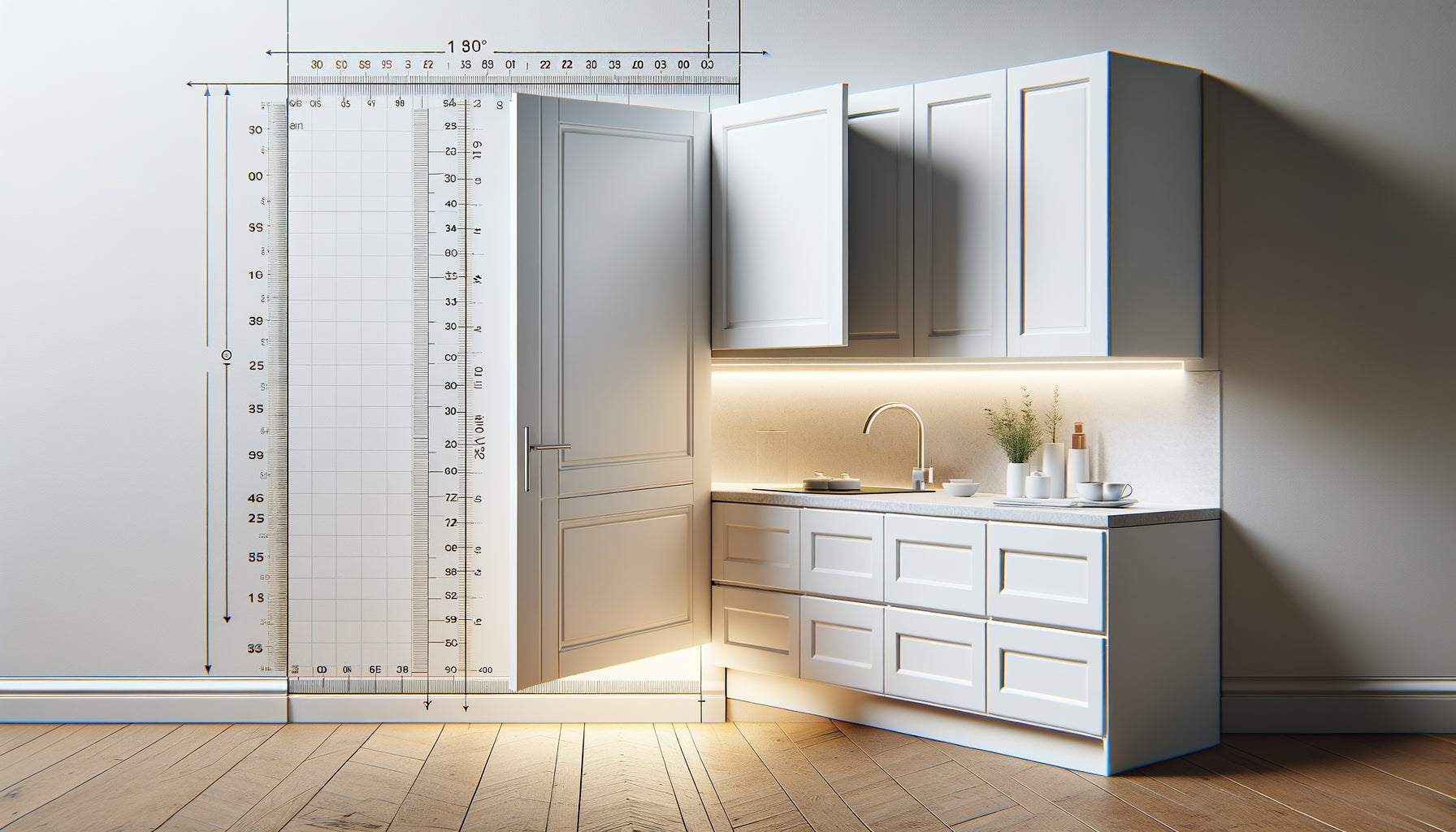
The ideal proportion? Your artwork should cover approximately 60 to 75% of the width of the countertop it overlooks. This proportion creates a satisfying visual anchor without dominating the space. If your countertop is 180 cm wide, aim for an artwork measuring 110 to 135 cm.
This proportional rule also influences your choice between harmony and contrast. A large artwork can afford a bold contrast because its size naturally asserts its presence. A modestly sized work will often benefit from a harmonious blend that integrates it rather than making it appear as a timid attempt at contrast.
Also consider the placement height. The center of the artwork should be approximately 145-150 cm from the floor, the standard human eye level. This position allows the artwork to converse with the countertop located about 90 cm lower, creating a natural visual connection between the two elements.
Creating Visual Bridges: The Hybrid Strategy
Between pure harmony and radical contrast lies a third path, subtle and sophisticated: the hybrid strategy. This approach involves creating chromatic bridges between the artwork and countertop while introducing calculated contrasting elements.
Specifically, you choose an artwork whose dominant color contrasts with your countertop but contains touches that echo its tones. Imagine a pearl gray quartz countertop facing a predominantly cobalt blue artwork, dotted with silver and gray accents. The main contrast creates the visual impact, while the color echoes ensure cohesion.
This technique allows you to get the best of both worlds: the energy of contrast and the safety of harmony. It works particularly well in open-plan kitchens that flow into living rooms, where the artwork must assert itself without creating too abrupt a break with the adjacent living space.
Accessories play a crucial role in this strategy. Kitchen utensils, potted plants, or visible tableware can pick up on the colors of the artwork, creating visual echoes that harmoniously distribute tones throughout the space. An artwork with notes of terracotta can thus converse with a white countertop via strategically placed terracotta pots.
Your kitchen deserves a work of art that reflects it
Discover our exclusive collection of Kitchen Wall Art that transforms your culinary space into a personal art gallery, whether they blend harmoniously or contrast boldly with your countertop.
Your kitchen, your artistic signature
Match or contrast? This question goes far beyond simple decoration to touch on the very essence of your relationship with domestic space. Matching creates an enveloping, soothing atmosphere where each element gently converses with others. Contrasting affirms a strong personality, transforms the kitchen into an aesthetic manifesto, a statement of intent.
Listen to your intuition, but arm it with the principles we have explored. Observe the natural light in your kitchen at different times of the day: how does it transform the colors of your countertop? This observation will guide you towards matching if the variations are subtle, towards contrasting if the light already creates dynamic games.
Tomorrow morning, as you prepare your coffee, imagine yourself facing that canvas you hesitate to choose. What feeling predominates? The peaceful harmony or the stimulating energy? Your kitchen is already whispering the answer to you. All that remains is to listen to it and dare the transformation that will make this everyday space a place where art and life naturally merge.
Frequently Asked Questions
Do I absolutely have to reproduce the exact colors of my countertop in my painting?
Absolutely not! Matching never means an exact duplication of shades. It is rather about creating subtle chromatic echoes, tonal resonances. If your countertop is gray-blue granite, a painting containing touches of slate, smoky blue or pearl gray will create this sought-after harmony without appearing repetitive. Think of the color family rather than the exact match. The human eye perceives harmony in chromatic relationships, not in mechanical reproduction. Allow yourself a margin of creative freedom: it is precisely this breathing between shades that makes matching elegant rather than predictable.
I'm afraid that too strong a contrast will become tiring in the long term, is this justified?
Your concern is legitimate and shows a mature reflection on your space. Indeed, some highly saturated contrasts can become visually demanding on a daily basis. The solution? Opt for a value contrast rather than saturation contrast. For example, a dark countertop facing a painting with light tones creates an elegant and timeless contrast, less aggressive than an opposition of saturated primary colors. Another trick: choose a work whose composition contains areas of visual rest – neutral or white spaces that give the whole thing some breathing room. Finally, remember that contrast becomes familiar over time: what seems bold the first week becomes your new aesthetic normality after a few months. Trust your ability to visually adapt, while favoring sophisticated contrasts over brutal chromatic shocks.
Can I change the painting according to the seasons while keeping the same countertop?
What a wonderful idea! It is precisely one of the great advantages of wall art: its flexibility. Your countertop remains fixed, but your painting can evolve, transforming the atmosphere of your kitchen with the rhythm of the seasons. Consider a strategic rotation: a painting with warm and contrasting tones to energize winter days, a work that matches soft and fresh tones to soothe summer heat. This approach has a double advantage: it regularly renews your visual pleasure and allows you to experiment with different relationships between painting and countertop without permanent commitment. Favor discreet and easy-to-handle hanging systems. Gradually build up a small collection of two to four paintings that you will alternate according to your mood and seasonal light. Your kitchen will then become a living space, in perpetual aesthetic evolution.