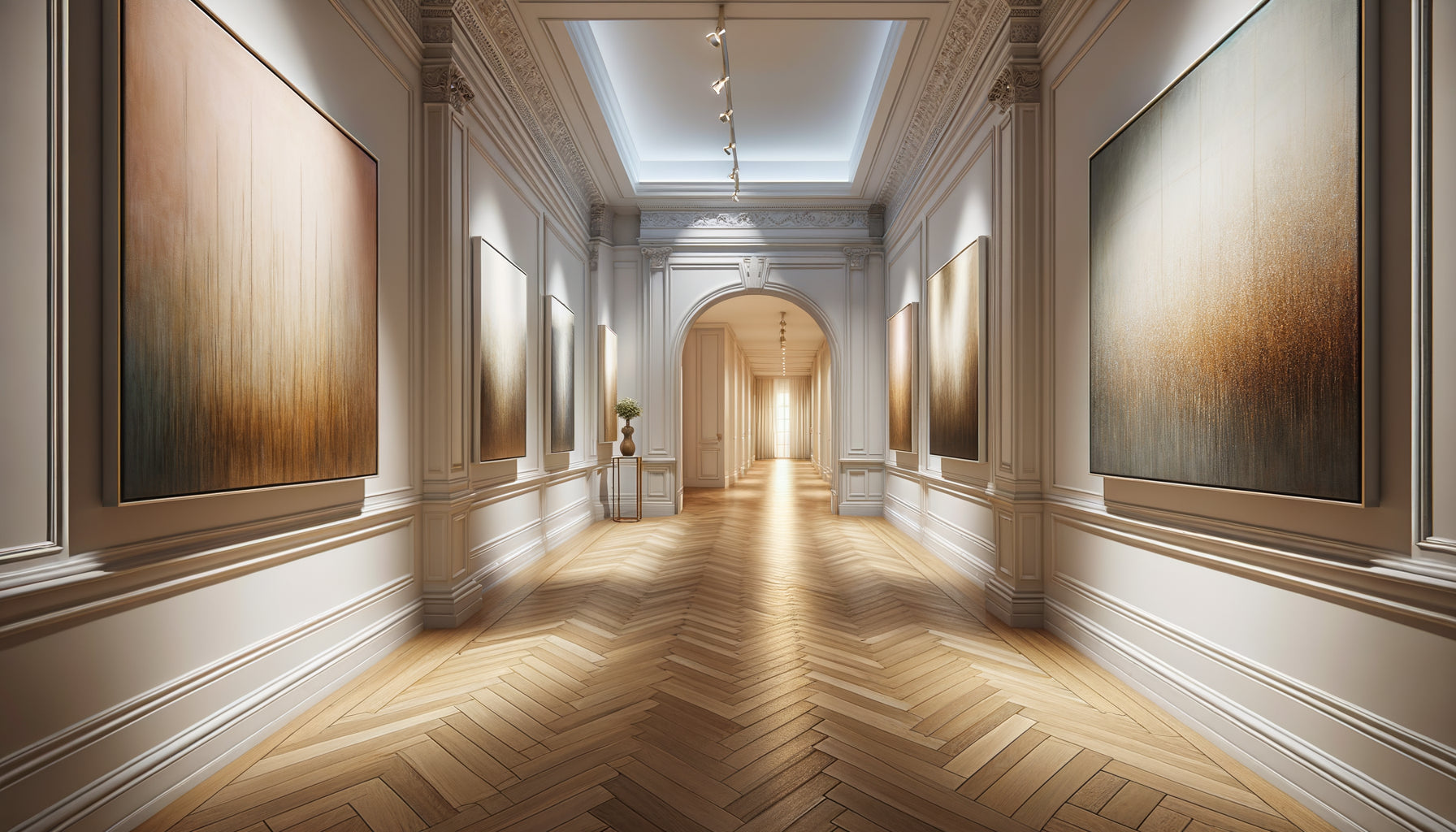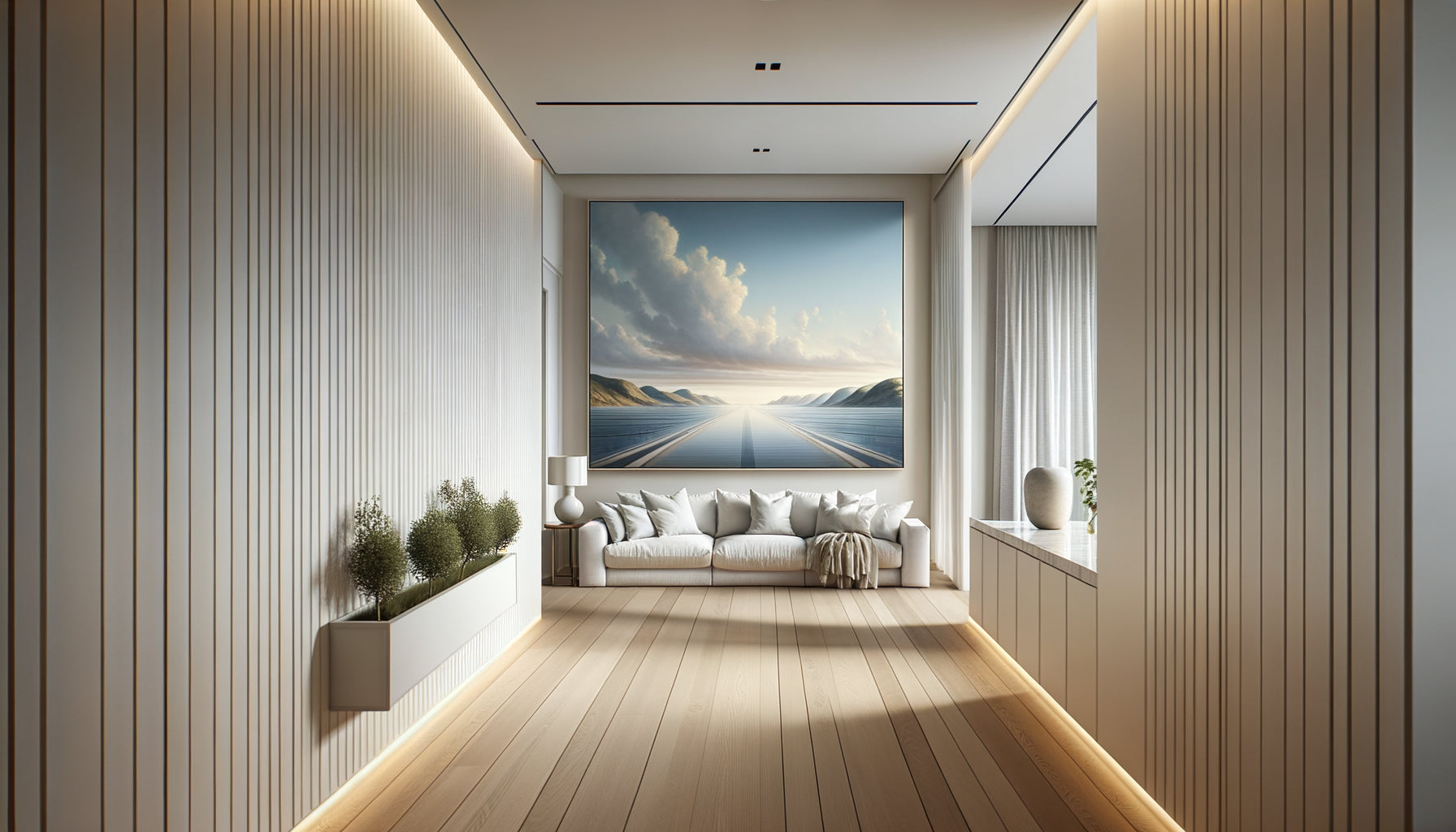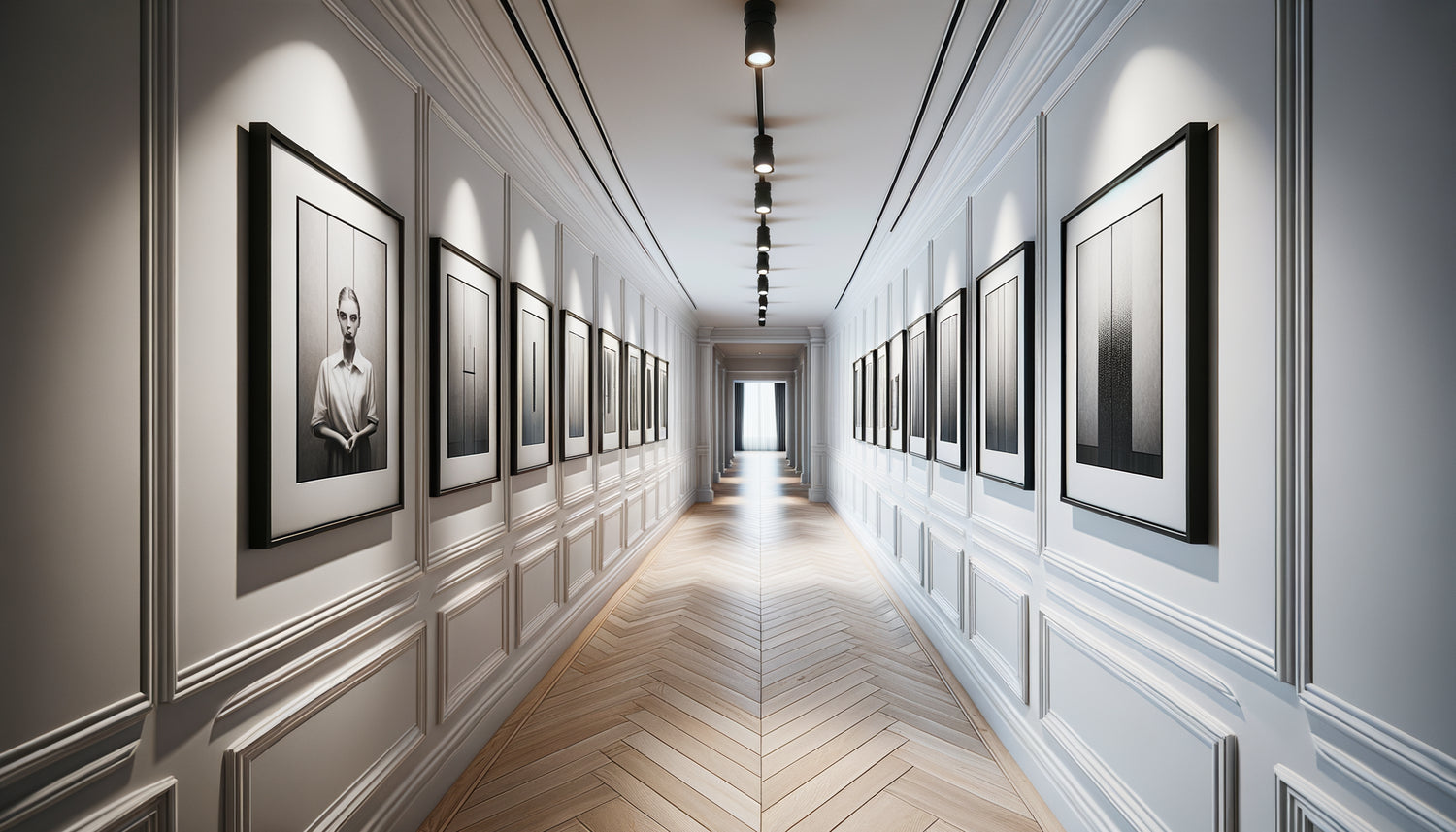
I will never forget that Parisian apartment hallway of 12 meters: off-white, narrow, soulless. The owner possessed five magnificent 20x30cm photographs from his travels in Iceland, all framed identically. "I don't know how to arrange them without creating a monotonous effect," he confided in me. Three hours later, this forgotten passage had become the centerpiece of his apartment.
Here's what a series of 5 identical artworks brings to your gallery hallway: a captivating visual rhythm, an unsuspected architectural depth, and that consistent elegance which transforms a simple passage into a true artistic experience.
The problem with hallways? No one really knows what to do with them. Too narrow for a large painting, too long for a single work, too neglected in decorating projects. You may have enthusiastically purchased these five artworks, but now they are languishing against a wall, waiting for a layout that never comes. This indecision paralyzes: strict alignment or creative offset? Regular spacing or free composition?
The good news? The 20x30cm dimensions are perfect for creating a dynamic gallery in a hallway. Their vertical format naturally follows the height of the walls, while their multiplication creates that visual rhythm which guides the eye and the step. You don't need to drill fifty holes or hire a decorator. Just understand a few hanging principles that transform five identical frames into an installation worthy of an art gallery.
I am going to reveal the configurations that really work, those that I have tested in dozens of hallways of varying dimensions. You will know exactly where to place each artwork to create the desired effect: modern and graphic, organic and natural, or rhythmic and architectural.
The perfect horizontal alignment: the power of the continuous line
The horizontal line arrangement remains the classic configuration for a simple reason: it works every time. Your five 20x30cm artworks align at the same height, creating a visual frieze approximately 170cm wide (allowing for 10-12cm spacing between each frame). This total length is perfect for hallways from 2 to 4 meters.
The crucial trick? The hanging height. Forget the "1m60 from the floor" rule that works in spacious living rooms. In a hallway, position the center of your artworks at 145-150cm from the floor. Why this difference? Because we walk through a hallway, we don't settle in it. The eye naturally scans lower, and this slightly lowered height creates perfect visual intimacy.
I discovered a fascinating variation with a collector in Brussels: she offset each artwork 2cm downwards compared to the previous one, creating a subtle diagonal of 8cm overall. Almost imperceptible, but this slight descent naturally accompanied the progression through the hallway. A detail that changed everything.
Spacing: your best rhythmic ally
The classic mistake? Placing prints too close together (5-6cm) out of fear of empty space. The result: a compact block that stifles each image. Or the opposite: spacing them excessively (20cm+) to the point of losing all cohesion. The ideal zone for 20x30cm formats is between 10 and 15cm.
Test this technique: use a reference object (a book, a pouch) to visualize the spacing before drilling. At 10cm, your prints dialogue intensely. At 15cm, they breathe more freely. Choose according to the desired atmosphere: a dense and immersive gallery, or an airy and contemporary exhibition.
Vertical column arrangement: when the hallway rises
A less obvious but spectacularly effective configuration in narrow hallways (less than 90cm wide): vertical hanging. Your five 20x30cm prints overlap on a single wall, creating an artistic column nearly 2 meters high.
This arrangement radically transforms the perception of space. Where horizontal alignment accentuates the length of the hallway, the vertical column draws the eye upwards, giving an impression of amplified ceiling height. I used this technique in an attic hallway where the height gradually decreased: the vertical effect visually compensated for this architectural constraint.
Position the bottom print at approximately 80cm from the floor (to avoid impacts with strollers, bags or animals), then space each work by 8 to 12cm. The last print will culminate around 2m20, creating this elegant verticality that structures the passage. Attention: this configuration requires a sufficiently high wall (minimum 2m80 under ceiling) to avoid the “cluttered” effect.

The staggered grid pattern: mastered asymmetry
Here's my favorite arrangement for lovers of contemporary elegance: the offset quinconce. Imagine a horizontal imaginary line 150cm from the floor. You place three prints aligned on this line (positions 1, 3 and 5), then the remaining two slightly above (positions 2 and 4), creating a wavy movement.
This shift can be subtle (5-8cm) for a gentle wave, or more pronounced (15-20cm) for an affirmed graphic effect. This arrangement breaks the monotony of strict alignment while maintaining reassuring visual coherence. It is particularly suitable for high-end hallways, where this sophisticated architectural detail adds a touch of refinement without ostentation.
The key to success? The regularity of the shift. If you raise the second print by 10cm, the fourth must follow exactly the same rule. Asymmetry only works when it obeys a clear geometric principle. Otherwise, it looks like a measurement error.
Variant for very long hallways
In passages longer than 5 meters, space your paintings further apart (20-25cm between each) and accentuate the quincunx movement. You create visual “stations” that mark the progression, each painting becoming a point of attention that rhythmizes the walk. One architect client called this arrangement “the breathing of the hallway”: a perfect metaphor.
The cross composition: bold geometry
For hallways of comfortable width (minimum 110cm), try this daring configuration: a central painting at standard height (145cm from the floor to the center), two paintings on either side on the same line, then two paintings above and below the central painting. You obtain a perfect cross, a strong geometric composition that anchors the gaze.
This arrangement works wonderfully when your five identical paintings present a strong thematic coherence: photographic series, chromatic variations, or repetitive motifs. The cross format then becomes a visual manifesto, an assumed decorative statement of intent.
Technically, space the horizontal arms 12-15cm apart, and the vertical elements 10-12cm. The cross measures approximately 65cm wide by 60cm high: compact but impactful. Ideal for marking a focal point (facing the entrance of the hallway or at the level of an important door).

The ascending staircase: accompany the movement
Par excellence narrative arrangement, the diagonal staircase follows the natural logic of progression in a hallway. Your first painting is positioned low (100cm from the floor to the center), then each following painting gradually rises by 12-15cm. The fifth painting culminates at approximately 160cm, creating an upward diagonal movement.
This configuration generates a powerful visual movement that accompanies the walk. In a hallway leading to children's rooms, I even reversed the slope according to the direction of circulation: rising when going towards the bedrooms (energy, awakening), descending on return (calm, return to calm). The parents loved this psychological subtlety.
The staircase works particularly well with sequential photographic content: chronological series, narrative progression, or evolution of a landscape. The format then follows the story, each physical step corresponding to a visual step.
Ready to transform your hallway into a personal art gallery?
Discover our exclusive collection of hallway art that will transform this neglected space into a true daily visual experience.
The fatal mistakes to absolutely avoid
After fifteen years of designing wall arrangements, I instantly spot recurring errors. The most common? Ignoring the lighting. Your five 20x30cm artworks beautifully arranged lose 80% of their impact in a dark hallway. Install adjustable spotlights, an LED strip or wall sconces before even thinking about the arrangement.
Second trap: neglecting circulation. In a 90cm wide hallway, avoid frames that protrude too much (more than 3cm deep) which create threatening angles for hips and shoulders. Opt for thin, flat frames mounted flush to the wall.
Third mistake: paralyzing perfectionism. You measure, re-measure, calculate for weeks without ever making the first hole. My set designer's advice? Use painter's tape to temporarily position your artworks. Live with this test configuration for 48 hours. Adjust. Then drill. You will avoid 90% of post-installation regrets.
Close your eyes. Imagine yourself returning home tomorrow evening, opening the door, and discovering this transformed hallway. These five 20x30cm artworks that you already own, perfectly arranged, creating that visual rhythm that makes you smile every time you pass by. This is not an inaccessible magazine decor fantasy. It's an afternoon of work, a few wall plugs, a spirit level, and the courage to turn intention into action.
Choose your preferred configuration. Mark the locations this weekend. And Monday morning, you will no longer be walking through a hallway, but your personal gallery. The formats are already perfect. All that's missing is your decision.
Frequently asked questions about hanging artworks in series
Can I mix portrait and landscape orientation in my series of 5 artworks?
For a series of identical artworks in a 20x30cm format, I strongly recommend keeping the same orientation for all. Visual harmony relies on this consistent geometric repetition: five vertical portraits or five horizontal landscapes. Mixing orientations only works with very eclectic compositions featuring varied formats, which is not your case here. The strength of an identical series lies precisely in this formal discipline: same size, same orientation, same framing. It is this constraint that paradoxically liberates creativity in the spatial arrangement. If your five 20x30cm artworks are in portrait orientation, exploit the vertical, horizontal or staggered configurations I have described. Consistent orientation will amplify the visual impact of your gallery hallway, creating the hypnotic rhythm that characterizes professional installations.
What wall color works best with a series of 5 identical artworks?
The ideal wall color depends on the content of your artworks, but here's my tried-and-true rule from dozens of hallways: if your five 20x30cm artworks feature colorful or rich photographic visuals, opt for a neutral wall (off-white, pearl gray, linen beige) that allows the works to fully express themselves. Conversely, if your artworks are minimalist, graphic or monochrome, dare to use a colored wall (midnight blue, sage green, terracotta) which will create a dramatic contrast and highlight the series. In a dark hallway with no natural light, always choose light tones that reflect artificial light. A set designer's tip: test paint samples (30x30cm) behind an artwork for a week, at different times of the day. You will immediately see which shade enhances your series. The wall is not a detail: it represents 95% of the visible surface area of your gallery hallway.
How much time should you allow to properly hang 5 artworks in a series?
For a careful installation of five 20x30cm artworks in a hallway, allow between 90 minutes and 2 hours if working alone, or 60 to 90 minutes with two people. This duration breaks down as follows: 20 minutes for measurements and preparatory markings (this is the crucial step that is too often rushed), 40 minutes for drilling and installing fixings (wall plugs, hooks), 20 minutes for hanging and fine adjustments, then 10 minutes for cleaning and final checks. Never try to do everything in 30 minutes flat: you will get artworks crooked, uneven heights, and that persistent frustration which spoils the pleasure of the result. My professional advice? Divide the project into two sessions. Session 1 (Sunday afternoon): measurements, markings, testing with adhesive tape, visual validation. Session 2 (Saturday following): drilling and final installation with the assurance of having made the right choices. This method avoids 99% of errors and transforms a stressful chore into a mastered creative project. The perfect gallery hallway deserves this patience.