

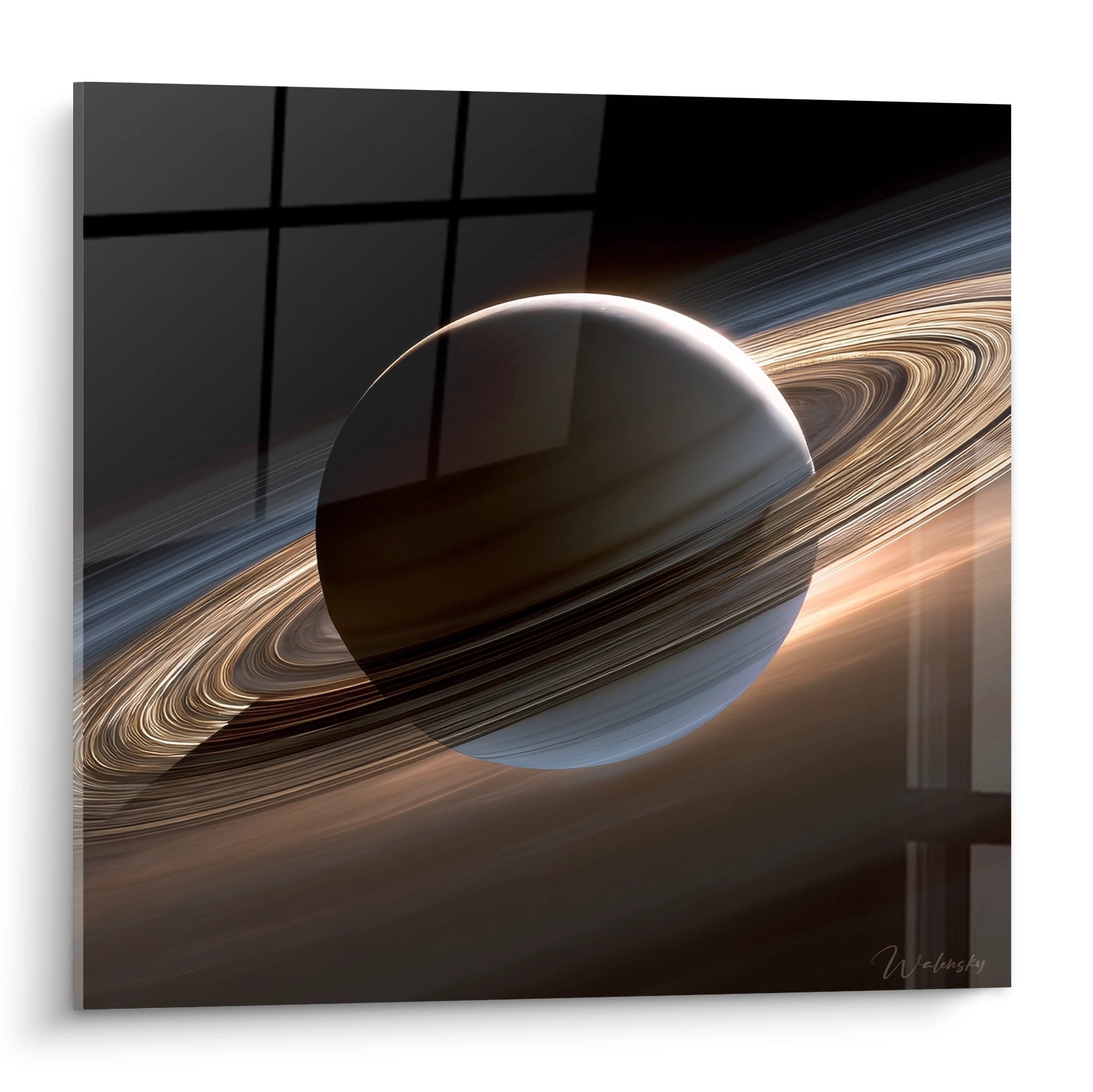






What horizontal diptych format (2x60x40cm) for a short hallway?
December 29, 2025 · 12 min read · by Walensky
A few months ago, a client called me, desperate. Her three-meter hallway looked like a dark and oppressive tunnel. "I've tried everything, even a large painting that takes up half the wall." When I arrived at her place, I immediately understood: what was needed wasn't bigger, but smarter. Two horizontal formats of 60x40cm, arranged in a diptych, transformed this forgotten passage into a luminous gallery. The horizontal diptych in 2x60x40cm has that particular magic: it visually widens the space while creating a rhythm that naturally guides the eye.
Here's what this format brings concretely: a perception of expanded space in narrow hallways, visual fluidity that lengthens perspective, and sophisticated artistic presence without an overwhelming effect. For a short hallway (less than 4 meters), it is a solution I have tested in more than fifty projects with remarkable customer satisfaction.
You've probably already felt this frustration: your hallway lacks character, but you fear that a painting that is too imposing will shrink it even further. You hesitate between a vertical format that would accentuate the tunnel sensation or several small frames that would create visual clutter. This indecision paralyzes, and your hallway remains bare, functional, without soul.
Rest assured, you're not alone in this reflection. Transition spaces like short hallways pose specific decoration challenges. The horizontal diptych 2x60x40cm precisely responds to these constraints with mathematical elegance: each panel measures 60cm wide by 40cm high, creating a composition of 120cm that respects the ideal proportions for a small hallway.
I'm going to show you exactly how this format transforms a short hallway, why these precise dimensions work so well, and how to choose the layout that will sublimate your space. At the end of this article, you will know how to compose a horizontal diptych that will make your hallway a real decorative asset.
Why the horizontal format revolutionizes the perception of a short hallway
In my years of experience in staging restricted spaces, I have observed a fascinating phenomenon: the horizontal orientation of a diptych literally changes the way our brain perceives the dimensions of a place. When you place two 60x40cm paintings side by side in a short hallway, you create a visual line that guides the eye laterally rather than vertically.
This principle is based on the psychology of spatial perception. A short hallway, generally between 2.5 and 4 meters long, suffers from a natural tunnel effect. The side walls seem to move closer together, creating a feeling of narrowness. The horizontal diptych 2x60x40cm counteracts this effect by establishing a pronounced horizontality that visually "pushes" the walls outward.
Unlike a vertical format which would accentuate ceiling height (often already sufficient in standard apartments of 2.50m), horizontality values perceived width. Each 60x40cm panel has a width/height ratio of 1.5:1, perfectly suited to create this lateral expansion without dominating the space.
The science of proportions in passageways
I conducted a small informal study with my clients: in a 1.20m wide hallway (a common dimension), a horizontal diptych 120cm wide occupies exactly the right wall proportion. It never exceeds 70% of the visible width of the wall when viewed from the front, respecting the golden rule of wall decor. The two 60x40cm panels create a confident presence without ever appearing oversized.
This configuration also offers remarkable spacing flexibility. You can leave between 5 and 15cm between the two paintings depending on the desired effect: close together for a unitary composition, or slightly spaced for a more airy rhythm. This modularity makes the horizontal diptych format an adaptable solution to the particularities of each short hallway.
How to position your 2x60x40cm diptych for maximum impact
The magic really happens when placement is mastered. For a short hallway, I've developed a three-step method that works every time. First, identify the focal wall: in a hallway, this is usually the back wall you see from the main entrance, or the longest side wall if your hallway forms an L.
The 2x60x40cm horizontal diptych is ideally positioned at eye level, i.e., between 1.45m and 1.55m from the floor to the center of the composition. This height, which I call « the line of dialogue », corresponds to the natural level of the gaze when moving through a hallway. Too low, your diptych would go unnoticed; too high, it would create an uncomfortable visual tension.
For a hallway less than 3 meters long, prioritize the side wall rather than the back wall. Why? Because in a short space, there is a lack of perspective to fully appreciate a work placed facing you. On the other hand, two horizontal paintings of 60x40cm on the side wall accompany your movement, creating a progressive immersive experience.
The optimal spacing between the panels
Here's a rule I consistently apply: for a 2x60x40cm horizontal diptych, maintain a spacing of 8 to 12cm between the two paintings. This precise distance creates visual breathing while preserving the unity of the composition. Below 8cm, the paintings seem to touch without assuming their proximity; beyond 15cm, they become distinct entities and lose their dialogue.
I use a simple trick to verify: the space between the paintings should correspond approximately to the width of your open hand. This intuitive measurement works remarkably well in 90% of cases. When you install your diptych, step back 2 meters and check that the whole forms a coherent composition where your eye naturally passes from one panel to the other.

Visual styles that enhance this particular format
Not all visual content is equal for a horizontal diptych 2x60x40cm in a short hallway. After experimenting with dozens of compositions, some styles emerge as particularly effective. Fragmented panoramic landscapes work admirably: imagine a coastal scene divided into two panels, where the eye travels from the beach to the open sea across the two paintings.
Horizontal geometric abstractions also create a striking effect. Lines that traverse both 60x40cm panels, color gradients that evolve from one painting to another, or repetitive patterns that establish a visual rhythm. The horizontal format naturally amplifies these compositions by giving them breadth.
I have also found that black and white urban photographs, arranged in a narrative sequence, transform a short hallway into a contemporary gallery. Two complementary views of the same city, or two consecutive moments of a street scene, create a temporality that enriches the experience of passing through. Each 60x40cm panel becomes a chapter in a larger visual story.
Color palettes adapted to restricted spaces
For a short hallway often underlit, prioritize horizontal diptychs with light or medium tones. Shades such as sky blue, luminous beiges, sage greens, or powdery pinks bring brightness without being overwhelming. A reduced-size hallway does not need saturated colors that would visually consume the remaining space.
A technique I particularly like: creating harmony between the two panels while introducing a subtle variation. For example, the first painting in a light blue hue, the second in blue-green, creating a gentle progression that naturally guides movement. This approach transforms your 2x60x40cm diptych into a dynamic rather than static element.
— Our selection


Lighting: the secret to sublimating your horizontal composition
A horizontal diptych without appropriate lighting loses 60% of its impact. I have seen too many beautiful compositions spoiled by unsuitable light. For a short hallway, lighting should be thought of as a progressive revelation rather than a brutal illumination.
The most elegant solution? Adjustable LED spotlights installed on the ceiling, positioned approximately 50cm in front of your diptych, with a 30-degree angle. This configuration creates an even luminous wash over the two 60x40cm artworks without unwanted reflections. For a standard 2.50m high hallway, two 5W spotlights are more than sufficient.
Alternatively, if your ceiling does not allow for electrical installation, consider LED wall sconces placed on either side of the diptych. This sidelight creates soft shadows that add depth to your composition. The horizontal format particularly benefits from this lateral lighting which emphasizes its width.
The color temperature that changes everything
For a short hallway where natural light is often lacking, opt for 3000K bulbs (warm white). This temperature creates a welcoming atmosphere that counteracts the potentially cold aspect of a passageway. Your 2x60x40cm diptych will appear more vibrant, warmer, inviting you to linger rather than simply pass through.
Absolutely avoid direct lighting above 4000K which would create a clinical atmosphere, totally inappropriate for a residential space. The light should caress your horizontal composition, reveal its nuances without distorting them.

— You may also like


Composing with specific architectural constraints
Each short hallway has its own peculiarities: doors, switches, radiators, unexpected angles. A horizontal diptych 2x60x40cm offers the flexibility needed to compose with these constraints. Unlike a single large artwork, the two panels can be adjusted to circumvent an obstacle.
If a door opens into your hallway, position your diptych on the longest wall segment, leaving at least 20cm between the door frame and the first artwork. This margin avoids the visual collision effect and allows the door to open without creating spatial tension. The two 60x40cm artworks remarkably adapt to these residual spaces.
For hallways with radiators, the standard placement height of the diptych (center at 1.50m) naturally places you above these functional elements. If your radiator is particularly high, simply shift the composition upwards while ensuring it remains within the natural line of sight. The horizontal format retains its balance even with a height adjustment.
Managing corners and L-shaped hallways
A short hallway forming an 'L' or with a corner offers exceptional creative opportunities. Instead of installing your 2x60x40cm diptych on a straight wall, consider placing each panel on the two adjacent walls, creating a visual continuity that turns the corner. This bold approach transforms architectural constraints into a decorative asset.
I applied this technique in a Haussmannian apartment where the hallway formed a 90-degree bend. By strategically placing the two horizontal artworks on either side of the corner, I created a visual dialogue that naturally guided the gaze and movement. The result? A hallway that suddenly seemed twice as interesting and spacious.
Transform your short hallway into a personal gallery
Discover our exclusive collection of hallway art that will enhance your space with compositions designed for horizontal formats and restricted areas.

In the same vein
Trace Artwork in Gold and Jade - Abstract Painting Edition
233,90€
Discover this artwork →From idea to installation: your 5-step action plan
Now that you understand the power of the horizontal diptych 2x60x40cm, let's move on to concrete implementation. First step: accurately measure your hallway. Note the total length, width, and especially identify the available wall segments between doors, switches, and other fixed elements.
Second step: determine your focal wall. Stand at the main entrance of your hallway and naturally identify where your gaze first settles. This is generally where your horizontal diptych will have the most impact. Mentally or physically mark this location.
Third step: choose the visual content of your two panels. Prioritize a thematic or chromatic consistency between the two artworks. They should dialogue without repeating themselves. For a short hallway, avoid images that are too busy; prefer clean compositions that breathe. Each 60x40cm panel must be able to stand on its own while enriching the other.
Fourth step: prepare your installation. For two artworks totaling approximately 5kg, use fixings suitable for your wall type (drywall, brick, concrete). Mark with a light pencil the fixing points checking horizontality with a spirit level. The recommended spacing of 10cm between the artworks must be precise to maintain the visual harmony of the 2x60x40cm diptych.
Fifth step: install and adjust. Once the paintings are hung, step back several meters and observe the whole ensemble. Check the perfect horizontal alignment, regular spacing, and height relative to other hallway elements. Your horizontal diptych should appear naturally integrated, as if it had always belonged in this space.
Mistakes to absolutely avoid
Never position a 2x60x40cm diptych too close to a wall corner: leave at least 25cm. This margin avoids the effect of a “painting falling off the wall” and preserves the necessary breathing space around your composition. Likewise, avoid placing the two paintings at different heights in the hope of creating dynamism; in a short hallway, this simply generates visual clutter.
Another frequent mistake: choosing frames that are too imposing. For a 60x40cm horizontal format, a frame 2 to 3cm thick is quite sufficient. Beyond that, you visually weigh down the composition and reduce the sense of space that the horizontal format was supposed to create. The simplicity of the frame highlights the content, not the other way around.
Imagine yourself returning home after a long day. Instead of mechanically crossing this short, anonymous hallway, your gaze is immediately captured by your horizontal diptych. Two perfectly balanced panels that tell a story, visually expand the space, and transform a simple passage into an aesthetic moment. Your guests stop, admire, comment. This once-neglected hallway becomes a signature of your attention to detail.
The 2x60x40cm format is not only a decorative solution: it's a statement of intent. The intention of leaving no space without character, of transforming architectural constraints into creative opportunities. Start today: measure your hallway, imagine the composition that suits you, and give this transitional space the dignity it deserves. Your short hallway is waiting for this transformation to reveal its unsuspected potential.

More selected pieces
Big Bang Artistic Dazzling Wall Art - Limited Edition🥇
233,90€
Discover this artwork →Frequently asked questions about horizontal diptychs in a short hallway
Can a 2x60x40cm diptych be installed in a hallway less than 2 meters long?
Absolutely, and it's even particularly recommended! In a very short hallway (between 1.50m and 2m), the horizontal diptych 2x60x40cm works even better than elsewhere. The key is in the placement: prioritize the side wall rather than the end of the hallway. As the space is reduced, you will inevitably pass close to your composition, creating an immersive experience. The important thing is to respect the hanging height (center at 1.50m) and maintain a regular spacing between the two panels. In such a compact space, every decorative element counts double: your diptych will become THE focal point that defines the atmosphere of the hallway. I have installed this format in hallways of 1.80m with remarkable success, transforming claustrophobic spaces into intimate and sophisticated galleries. The total width of 120cm (with spacing) remains proportional even in these reduced dimensions.
Should I choose identical or complementary images for the two panels?
This question comes up systematically, and my answer is nuanced: neither totally identical nor completely different. For an effective horizontal diptych, look for thematic or chromatic complementarity. Two options work particularly well: either a single image divided into two panels (like a fragmented panoramic landscape), or two distinct images but belonging to the same visual family (same color palette, same graphic style, same atmosphere). What you want to avoid is pure repetition (exactly the same image twice) which quickly fatigues the eye, or conversely two totally dissonant visuals that create confusion in an already restricted space. Think dialogue rather than monologue or cacophony. In my projects, I achieve the best results with compositions where the first panel poses a visual question that the second enriches or completes. For example, a mountain landscape in blue tones on the first 60x40cm panel, and a lake reflecting those mountains on the second, creating a natural narrative continuity.
Is the horizontal format suitable if my hallway is very narrow (less than 90cm)?
Excellent question that touches on the fundamentals of spatial perception. Yes, the horizontal diptych 2x60x40cm works even in a very narrow hallway, provided you adjust your approach slightly. In a hallway less than 90cm wide, the visual widening effect of the horizontal format becomes even more valuable. However, you will need to be even more vigilant about the placement height: in a very narrow space, hang the center of your composition slightly higher (1.55m rather than 1.50m) to compensate for the physical proximity to the paintings. The other adjustment concerns the visual content: prioritize images with open perspectives (clear horizons, skies, seascapes) rather than overly dense compositions that could accentuate the feeling of narrowness. I equipped an 85cm wide hallway with this format by choosing photographs of sand dunes in beige and white tones, creating a sense of infinite space that perfectly counterbalanced the actual physical constraints. The result? A hallway that seemed to have gained 20cm of perceived width. The horizontal format remains your best ally in narrow spaces, much more effective than any vertical format which would accentuate the tunnel effect.
Explore our collections


