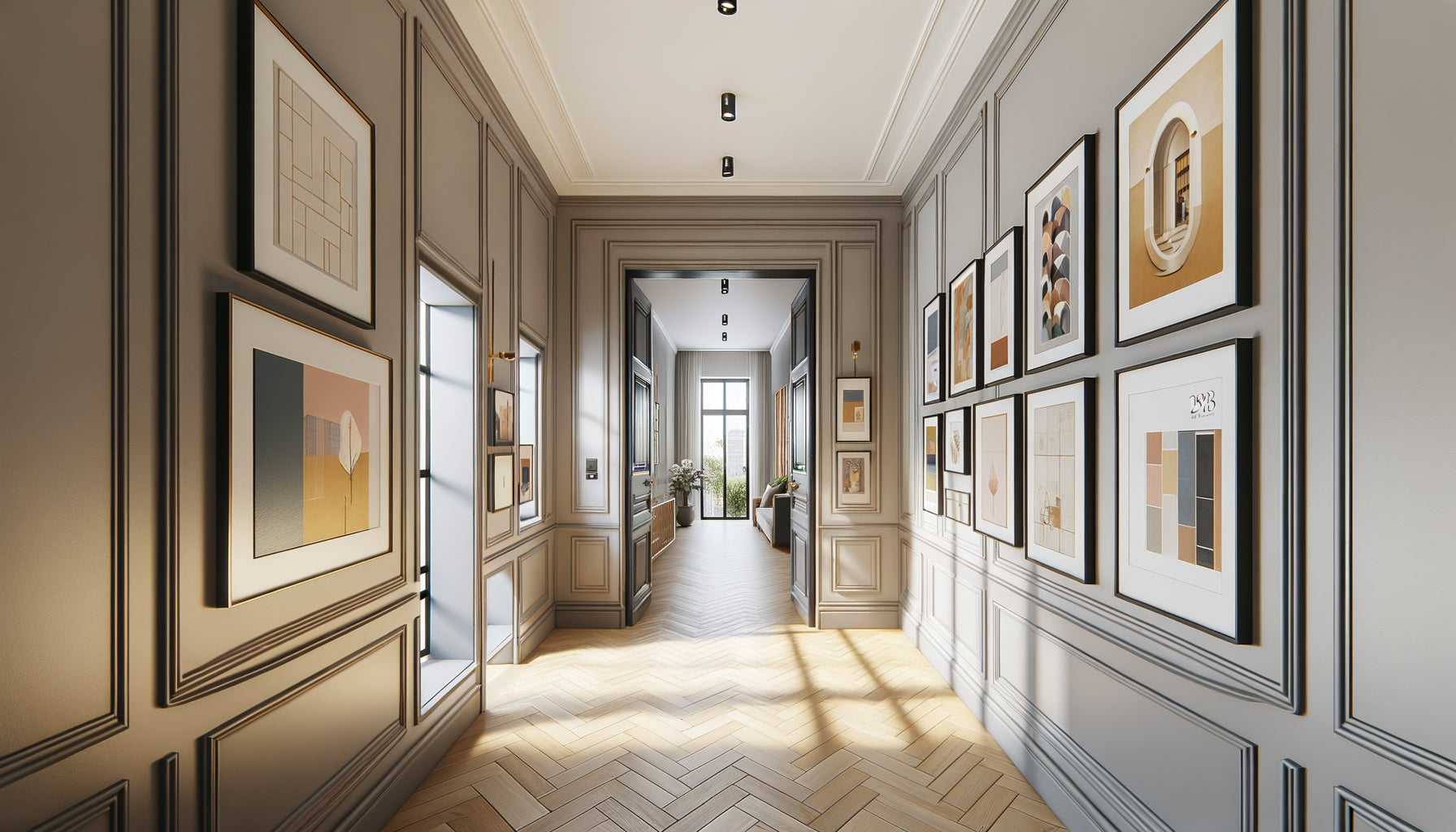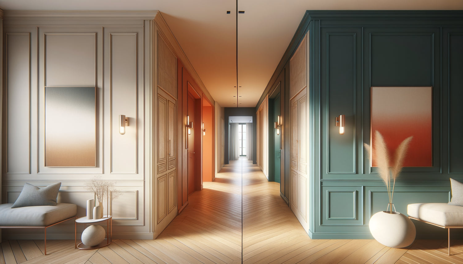
The entrance to a home tells a story in seconds. The hallway you walk through every day, the staircase connecting the floors, the entryway welcoming your guests: do these transitional spaces deserve the discretion of neutral tones or the boldness of color? After fifteen years designing interiors where every square meter counts, I've observed a disturbing truth: these passageways hold considerable emotional power, yet are neglected by 80% of homeowners who treat them as mere functional corridors.
Here’s what a well-thought-out transitional space brings: visual fluidity that expands the entire interior, an aesthetic signature that enhances each adjacent room, and a daily experience that transforms the mundane into the memorable. You're probably hesitating between the reassuring safety of a timeless beige and the secret desire for a deep blue that would make your heart beat. This tension between caution and boldness paralyzes so many promising projects. Rest assured: the choice between neutrality and color is not binary, and I’m going to show you how to make this decision based on your architecture, natural light, and personality. In the following lines, you will discover the objective criteria that will transform this hesitation into creative certainty.
Neutrality is never neutral in a transitional space
Neutral tones are a misnomer. In a hallway or entryway, an off-white, pearl gray, or sand beige are never simply passive backdrops. They create a visual breathing room that allows the eye to circulate without fatigue between the different living spaces. I measured this effect in a Parisian apartment where replacing a pine green with a bright greige literally expanded the perceived space by 30%.
The strength of neutral tones in transitional spaces lies in their ability to highlight architectural elements. A dove-gray staircase reveals the beauty of wrought iron railings. An ivory hallway enhances an antique parquet floor. These subtle shades act as settings that magnify what deserves attention: a vintage console, a designer pendant light, or simply the quality of light streaming through a window.
When neutrality becomes strategy
In narrow or poorly lit transitional spaces, neutral tones are as much a technical solution as an aesthetic one. A hallway less than a meter wide gains in perceived width with a warm white reflecting light. A staircase without a window breathes more easily in pale linen than in terracotta. This approach works particularly well in contemporary architectures where fluidity takes precedence over surprise.
But be warned: choosing neutrality requires increased vigilance regarding materials and shades. A beige can turn yellowish under poorly chosen LED lighting. A gray can seem cold in a space without natural light. Successful neutrality requires testing several samples at different times of the day, observing how natural light transforms the hue from morning to evening.
Daring with color: when passage becomes destination
Color in a transitional space radically changes the game. It transforms the passageway into a memorable experience. I have seen guests stop, surprised and delighted, before a hallway of vibrant Klein blue that contrasted with the pristine white of the adjacent living room. This boldness creates visual punctuation, an unexpected breath in the domestic journey.
A colorful transitional space has a unique narrative power. It announces, prepares, creates an emotional anticipation before entering the next room. An entrance hall in warm terracotta welcomes generously. A sage green staircase establishes a progressive serenity between floors. It's no longer just a functional route, but an intentional architectural sequence.
Colors that succeed in passageways
Not all shades are suitable for transitional areas. The colors that work best have depth without aggression: navy blues bring enveloping elegance, forest greens create a soothing connection, ochres warm without stifling. Conversely, bright reds or lemon yellows risk tiring the eye in a space traversed several times a day.
Saturation counts as much as the hue itself. In a three-meter long hallway, 70% saturation creates a visual impact without oppression. In a multi-level staircase, you can play with a chromatic gradient that accompanies the ascent or descent. I recently designed a project where blue gradually transitioned from denim to sky between the ground floor and the first floor, creating a remarkable sensation of elevation.

Objective criteria for making a decision
Beyond aesthetic preferences, several objective factors guide the choice between neutrality and color in a transitional space. Natural light comes first: a hallway bathed in light tolerates and magnifies bold colors, while a dark space requires light tones to avoid becoming oppressive.
The length and width of the space also play a decisive role. A long, narrow hallway gains depth with a colored background and neutral side walls. A generous entrance can accommodate color on all four walls without risk of suffocation. Ceiling height also offers opportunities: a colored ceiling in a transitional space creates a spectacular effect without reducing the sense of space.
Harmony with adjacent rooms
A transitional space never lives alone. It must dialogue with the rooms it connects. If your living room adopts sophisticated neutral tones, a colored hallway creates a dynamic contrast. If your living spaces already display an affirmed color palette, a neutral transitional space offers a welcome visual break.
This logic of visual flow applies particularly to open doorways. When you stand in the living room, what do you see of the hallway? This view should be intentional. A door frame can become a living picture: the colored hallway appears as an artistic touch from the adjacent room, adding depth to the whole.
The hybrid solution: the best of both worlds
The most sophisticated approach often combines neutrality and color in a mixed strategy. A colored base with high neutral walls creates personality without reducing space. A single accent wall of color in a neutral hallway transforms perspective. The ceiling can receive a bold hue while the walls remain discreet.
This technique of color zoning works particularly well in large transitional spaces. An entrance with a vestibule can adopt a warm color in the welcome area, then gradually lighten towards the living areas. This gradation naturally accompanies the movement of the body in space.
Color accents as an elegant compromise
If total commitment to color intimidates you, colored touches on a neutral background offer a safe experimentation ground. A door frame painted in a bold hue, contrasting baseboards, a panel of wall behind a piece of furniture: these punctual interventions bring character without radically transforming the space.
Decorative elements also play this role as a bridge between neutrality and color. In a hallway with white walls, a series of colored frames or a vibrant suspension injects adjustable personality. This approach allows you to test your appetite for color before a more radical commitment on the walls themselves.
Your transition space deserves a visual signature that reflects you
Discover our exclusive collection of wall art for Hallway that transforms a simple passage into a personal gallery, whatever your color palette.

Your decision begins with careful observation
The choice between neutral tones and color in a transition space is never simply a matter of personal taste. It's part of a spatial and lighting ecosystem that must first be understood. Spend a day observing your hallway or entrance: how does the light evolve from morning to evening? What emotions do you feel when passing through it currently? What atmosphere do you want to create?
Take photos at different times of day, test paint samples on at least one square meter, live with those tests for a week. The color that seduces you in store can disappoint in your specific lighting context. The neutral shade that seems pale on a color chart can reveal a remarkable subtlety in your particular architecture.
Your transition space reflects your relationship to home: functional passage or architectural sequence in its own right? Neutral tones offer security, fluidity and timelessness. Color offers expression, surprise and memorability. Neither choice is inherently superior: only the one that resonates with your vision of domestic comfort counts. Start by identifying what you currently lack in this space. This absence will guide you to the palette that transforms your daily life, one passage at a time.
Frequently asked questions about color choices for transition spaces
Can a dark hallway support a dark color?
Contrary to popular belief, a poorly lit hallway can beautifully accommodate a deep color if you agree to turn the flaw into an asset. A midnight blue or forest green in a dark space creates a enveloping atmosphere, almost theatrical, particularly effective with well-thought-out artificial lighting. The mistake would be to choose a mid-tone that appears dull: in a dark space, it is better to embrace either maximum brightness with a light white or depth with a saturated hue. Add multiple light sources (wall lights, spotlights, accent lamps) to reveal the richness of the chosen color. This bold approach works particularly well in old architecture where the transition space becomes an intimate setting rather than just a passage.
How to coordinate the color of a transition space with multiple rooms in different styles?
The transition space serving several rooms with distinct universes benefits from a federating rather than coordinating approach. Identify a hue present as an accent in each of the adjacent rooms and amplify it in the passage: if your living room contains blue in a cushion and your bedroom in bedding, a blue hallway creates the connecting thread. Alternatively, neutrality becomes your ally by serving as a common palette that enhances each universe without favoring any. A third strategy is to treat the transition space as an intentionally distinct buffer zone, with its own identity that marks the separation between atmospheres. This latter approach works brilliantly in large apartments or houses where each space can assert its singularity without compromising overall coherence.
Do neutral tones risk appearing cold and impersonal?
The coolness of a neutral tone rarely comes from the hue itself but from the absence of texture and variation. A gray can seem glacial on smooth walls under LED lighting, but become warm and welcoming with a velvety matte paint, natural wood elements, and warm-temperature lighting. The personality of a neutral transition space is built through materials (rattan, brass, ceramics), the works hung, the furniture chosen. An immaculate white hallway with a vintage console, a Berber rug, and an artisanal suspension has infinitely more character than a colorful but empty hallway. Neutral tones offer this freedom to evolve the decor without chromatic constraints: you can change your decorative elements over the seasons or as desired without creating dissonance. Consider neutrality as a canvas that you enrich progressively, rather than as an absence of choice.