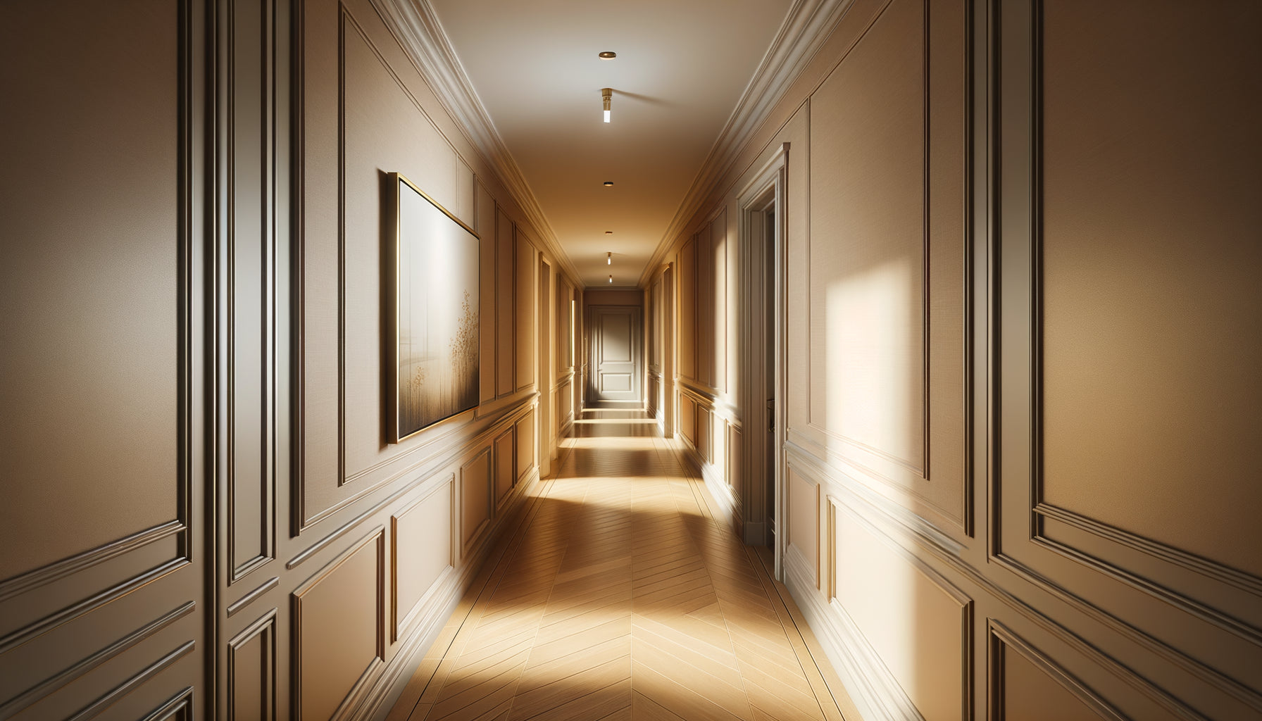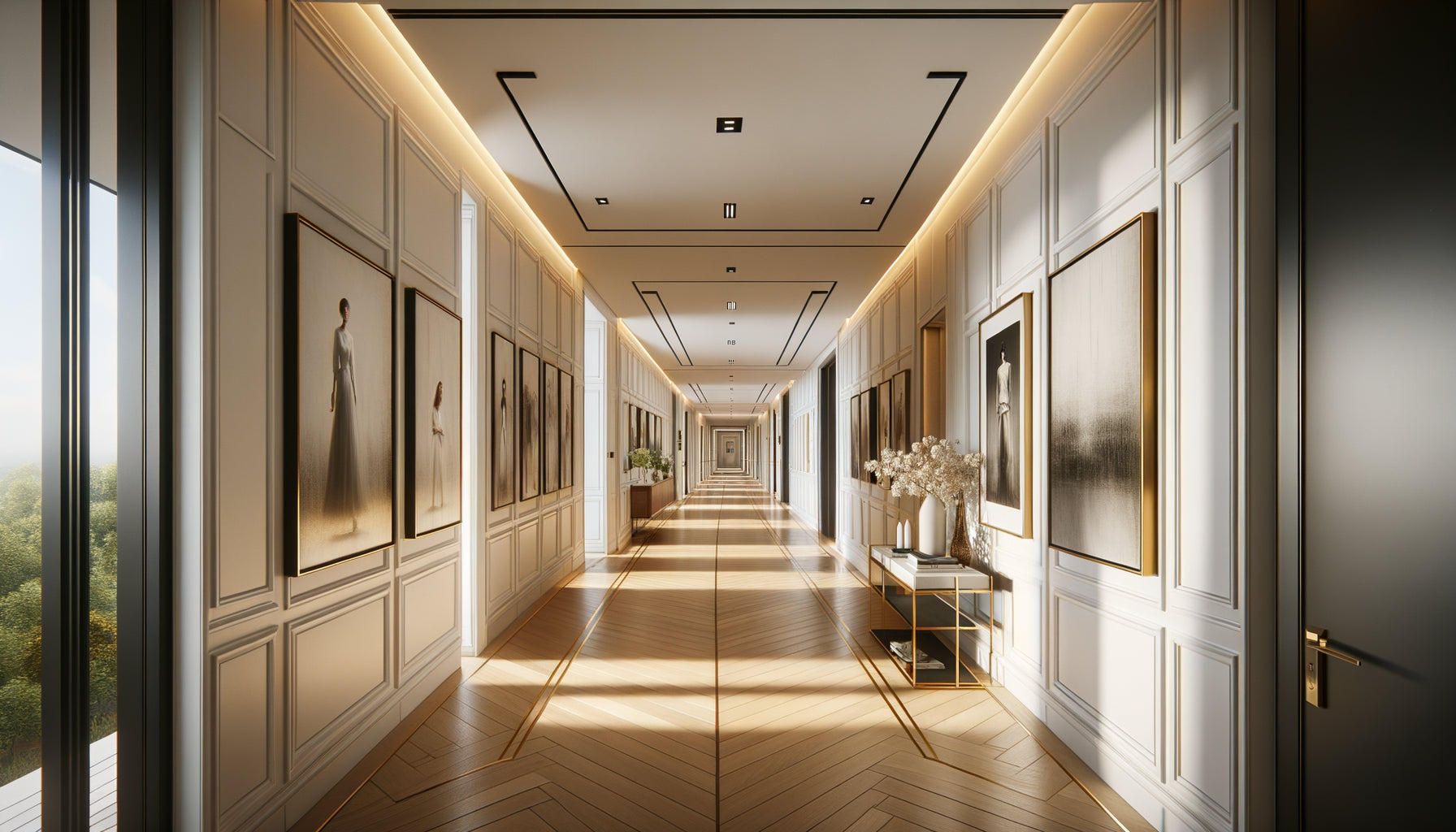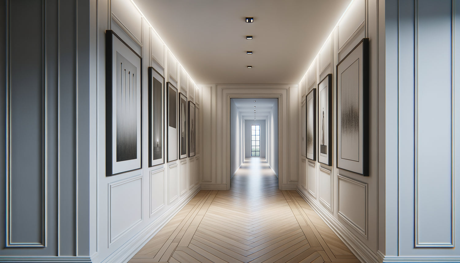
This morning again, crossing this narrow hallway that separates my workshop from the storage room, I observed how grazing light transformed the works hanging. After twenty-three years of designing exhibition spaces for galleries and private residences, this question keeps coming back: what orientation to prioritize in these often neglected passages? The answer is never binary, but it reveals fascinating secrets about spatial perception.
Here's what the right choice of orientation brings: a sense of height that enhances volumes, a visual rhythm that transforms the passage into a true personal gallery, and an architectural coherence that values every square meter of your interior.
You have probably already experienced this frustration: hanging a painting in a hallway and realizing that it visually crushes the space, or conversely, that it seems lost, floating without apparent logic. These errors of scale and proportion create a dissonance that our eye immediately perceives, even without understanding why.
Rest assured: understanding the fundamental principles of wall composition in circulation spaces completely changes the game. It's not about rigid rules, but about understanding how our gaze interacts with these particular volumes.
I will reveal to you how to choose the ideal orientation according to your architectural constraints, and above all, how to transform a simple hallway into a memorable visual experience.
The vertical paradox: why our eye seeks height
In a hallway, our gaze works differently than in a living room. The width constraint naturally creates an upward movement of the gaze. I have observed this phenomenon hundreds of times during installations: visitors instinctively raise their eyes in narrow spaces, unconsciously seeking to escape the sensation of lateral compression.
vertical paintings brilliantly exploit this perceptual dynamic. Their elongation creates a line of force that guides the gaze upwards, immediately giving an impression of additional height. In a standard hallway with 2.50 meters under ceiling, a vertical format can visually add 20 to 30 centimeters of spatial perception.
This verticality resonates particularly well with the architectural proportions of a hallway. Imagine a 60 x 90 cm canvas in portrait orientation: it naturally fits into the stretched geometry of the passage, creating a proportional harmony that our brain identifies as balanced and soothing.
But beyond simple perception, vertical paintings in a hallway offer a considerable practical advantage: they free up visual space on each side, allowing the gaze to breathe despite the narrowness of the place. This lateral breathing is essential to avoid the oppressive tunnel effect.
When horizontality becomes a narrative force
However, consistently rejecting horizontal formats would be a strategic mistake. I have created some of my most successful compositions by deliberately playing against the vertical intuition, and the results can be spectacular.
Horizontal tableaux excel in hallways when they create a deliberate counterpoint with the architecture. In a sufficiently wide hallway (over 1.20 meters), a landscape format can slow down perception, inviting contemplation rather than simple passage. This visual friction transforms the hallway into a destination rather than a simple transition.
A horizontal format works particularly well for panoramic or narrative artworks: landscapes, cityscapes, abstract compositions with lateral movement. I recently installed a series of three 80 x 40 cm horizontal paintings in an 8-meter hallway: the rhythm created by this horizontal repetition transformed the passage into a captivating cinematic sequence.
The trick lies in strategic positioning. A horizontal painting placed at the end of a hallway, visible from the entrance, creates a powerful focal point that attracts the eye and gives dramatic depth. This technique, borrowed from classic art galleries, transforms linear perspective into an immersive experience.
The Rule of Golden Proportions
For standard hallways (80 cm to 1.20 m wide), I apply a simple formula: the width of the painting should never exceed 60% of the visible wall width. A 90 cm horizontal painting in a 1-meter hallway will create a pleasant visual tension. Beyond that, the effect becomes overwhelming, stifling the space rather than sublimating it.

The Art of Mixed Composition: Breaking Conventions
After two decades of experimentation, my conviction has solidified: the most memorable installations intelligently combine vertical and horizontal orientations. This mixed approach creates a visual symphony that transcends simple decoration.
Imagine this composition: three vertically sized paintings (40x60, 50x70, 40x60) creating an ascending rhythm, followed by a 70x50 horizontal painting as a visual breath. This alternation generates a dynamic movement that naturally guides progression through the hallway while maintaining visual interest.
The key lies in thematic coherence despite formal variation. The artworks must engage with each other through their colors, style, or subject, creating a narrative continuity even with different formats. I recently orchestrated a series combining vertical portraits and horizontal urban landscapes: the unifying thread of sepia tones bringing the whole together.
This mixed approach also offers valuable flexibility in the face of real architectural constraints: switches, doors, radiators. Rather than forcing an artificial symmetry with only vertical or horizontal formats, the combination allows for intelligently adapting the composition to existing obstacles.
The decisive criteria for your choice
Faced with a new hallway, I systematically evaluate five criteria before recommending an orientation. These parameters determine whether vertical artworks are better suited than horizontal in your specific configuration.
Available width remains the primary factor. Below 1 meter, verticality naturally prevails to avoid visual clutter. Between 1 and 1.50 meters, all formats become possible with a still marked advantage for verticals. Beyond 1.50 meters, the hallway behaves more like a narrow room, and horizontal formats regain their relevance.
Ceiling height drastically influences perception. With standard ceilings (2.40-2.50 m), vertical artworks visually elongate the space. But with high ceilings (3 meters or more), characteristic of old buildings, horizontal formats can create a welcome visual anchor, avoiding a vertical « well » effect.
The length of the hallway determines the possible rhythm. A short hallway (less than 3 meters) will ideally accommodate one or two impactful vertical artworks. A long hallway (6 meters or more) allows for complex compositions alternating orientations and creating a true progressive gallery.
Natural lighting subtly changes the situation. A hallway bathed in lateral light enhances vertical formats whose surfaces better capture variations in luminosity. A dark hallway sometimes benefits from larger horizontal formats, maximizing the reflective surface of artworks framed under glass.
Architectural style finally suggests natural harmonies. Haussmannian apartments with their vertical moldings call for vertical artworks that extend these lines. Contemporary interiors with clean lines can play with horizontals to create an assumed modernist contrast.
The exception that proves the rule
I worked on a hallway of only 75 cm wide in an industrial loft: we installed a series of seven small horizontal artworks (30x20 cm) creating a sequential film over 5 meters. The effect was striking, proving that no rule is absolute when creativity and coherence combine.

Hanging techniques to maximize impact
The chosen orientation only reveals its full potential with a mastered hanging. The standard museum hanging height (center of the work at 5'3" from the floor) works remarkably well for vertical paintings in a hallway, naturally aligning the gaze with the heart of the composition as you pass.
For horizontal paintings, I often adjust slightly upwards (center at 5'5"-5'7") to compensate for the perception of movement. In a hallway, we do not contemplate statically like in a living room: we walk, creating a dynamic viewing angle that requires this subtle correction.
The spacing between artworks varies depending on orientation. Between vertical paintings, I recommend 5.9" to 9.8" of wall space, creating sufficient breathing without diluting the impact. Between horizontal paintings, this spacing can extend up to 15.7"-19.7", exploiting the available width and creating a more airy rhythm.
The hanging rail technique revolutionizes flexibility in hallways. This system allows you to easily change the orientation and position of your paintings without multiplying holes in the wall. I equipped my own hallway with this system: I can switch from a vertical composition in winter to a horizontal series in spring, completely renewing the atmosphere.
Your hallway deserves more than just a neglected passageway
Discover our exclusive collection of hallway paintings that transform every square foot into a personal art gallery, with carefully selected vertical and horizontal formats.
Transformation begins now
Imagine walking through your door tomorrow morning and discovering your hallway transformed. Vertical paintings elongate the space, creating an airy perspective where narrowness once reigned. Or perhaps you have chosen a bold horizontal format that slows down the passage, transforming daily routine into a contemplative moment.
This decision between vertical and horizontal orientation is ultimately just a pretext to completely reinvent your relationship with these transitional spaces. Each hallway tells a different story, calls for a unique solution. Listen to your space, observe how light travels through it, feel its natural rhythm.
Start simply: a single artwork, well chosen, perfectly positioned. Live with it for a few weeks, observe how it changes your daily perception. Then adjust, complete, refine until you create that composition which will make your hallway more than just a passage – a true spatial signature.
The perfect orientation exists, it is simply waiting for you to discover it.
FAQ: Your questions about artworks in hallways
Can you mix vertical and horizontal artworks in the same hallway?
Absolutely, and it is often the most dynamic solution! The key lies in stylistic consistency: unify your works with a common color palette, a similar artistic style or a narrative theme. Alternate orientations rhythmically rather than randomly: for example, two verticals followed by a horizontal, creating a natural visual breathing space. I have found that this mixed approach also allows you to better adapt to architectural constraints (doors, switches) while maintaining a strong visual impact. Start by positioning your master vertical pieces at strategic points (beginning and end of hallway), then complete with horizontals in the intermediate spaces.
What is the maximum size for a vertical artwork in a narrow hallway?
For a standard 80 cm to 1 meter wide hallway, I recommend vertical artworks not exceeding 50-60 cm in width and 90-120 cm in height. This proportion avoids a feeling of clutter while maintaining a significant visual presence. In a really narrow hallway (less than 80 cm), prefer more modest formats such as 40x60 cm or 30x80 cm which create the desired vertical elongation without compromising circulation. The frequent mistake is to choose artworks that are too wide and visually overflow into the passage space. Always measure the available width between the baseboards and apply the 60% rule: your artwork should never occupy more than 60% of this width to allow lateral breathing room.
Can horizontal artworks work in a very long hallway?
Excellent intuition! Long hallways (6 meters and more) are perfect for compositions with horizontal paintings, provided you create an intelligent visual rhythm. A series of three to five identical or coordinated horizontal paintings, spaced regularly, transforms the hallway into a cinematic gallery that naturally guides progression. This horizontal repetition visually slows down the space, compensating for the effect of excessive length. Alternatively, place a large horizontal painting at the focal point (usually the end of the hallway) to create a powerful visual appeal upon entry. This technique works particularly well with panoramic landscapes or abstract works with lateral movement. The spacing between horizontal artworks can be more generous (40-60 cm) than for vertical ones, exploiting the available length without visually saturating the space.