Understand why your neutral interior leaves you wanting more
Do you recognize these situations? You regularly change the arrangement of your decorative objects without ever being satisfied with the result. Your interior photos on social networks receive little interaction compared to other similar spaces. You feel a constant need to buy "something extra" without knowing exactly what.
What you are experiencing is not a lack of taste, but a visual reading imbalance. Your eye instinctively seeks anchor points, contrasts that allow it to "breathe" and fully appreciate the harmony you have created. Without contrast, even the most beautiful harmony becomes monotonous.
Imagine your interior as a melody : without variation in rhythm or tone, even the most beautiful note becomes tiresome. Contrast is that subtle variation that transforms a note into music.
The first hidden cause: the illusion of perfect uniformity
Contrary to what magazines suggest, a "perfectly harmonious" interior generates no emotion. Our brain needs variation to stay engaged and create that feeling of "home" you are looking for. The reality? The most beautiful interiors subtly play with oppositions.
It's like watching a landscape of pristine snow : magnificent for the first few seconds, but the eye quickly looks for a tree, a stone, an element that breaks this uniformity to rest and appreciate the whole.
This revelation will transform your decorative approach: you are no longer looking to create perfect uniformity, but dynamic balance. Your gaze will naturally identify areas where you can introduce this necessary "visual breathing space".
🔍 Immediate test: Take a photo of your main room, then look at it for 30 seconds. If your eye has no point on which to "settle" naturally, that's exactly the symptom we are talking about. Your space needs anchor contrasts.
The second cause: confusion between contrast and bright color
Many think that adding contrast means introducing flashy colors or loud patterns. In reality, the most sophisticated contrast often plays on textures, materials and tonal values rather than pure colors.
Think of a classic tuxedo: black and white, no bright colors, yet an incomparable visual impact and elegance. The secret? A perfectly mastered contrast of values.
This misunderstanding explains why your previous attempts failed: you were adding color where depth needed to be created. The result goes beyond your expectations, with a natural sophistication that impresses effortlessly.
The third cause: the oversight of visual hierarchy
In an interior without contrast, all elements have the same "visual importance". Result: nothing stands out, nothing guides the eye, nothing tells a story. Your beautiful linen sofa blends into the beige wall, your designer coffee table disappears into the whole.
Observe your current space: can you instantly identify the main element of each area? If the answer is no, then the visual hierarchy does not exist. Your best decor investments lose all their impact.
This missing hierarchy affects your daily life more than you imagine: you never really feel "settled" in your space, as if something indefinable is constantly lacking.
🎯 3 signs that your interior lacks hierarchy:
- The gaze floats without settling: When you enter the room, your eye seeks a privileged point of attention but finds only uniformity
- Photos make the space look bland: In photos, your interior seems to lack personality despite beautiful individual elements
- Permanent feeling of incompleteness: You constantly feel the need to add "something" without knowing exactly what
The trigger element: the magic of contrasted focal point
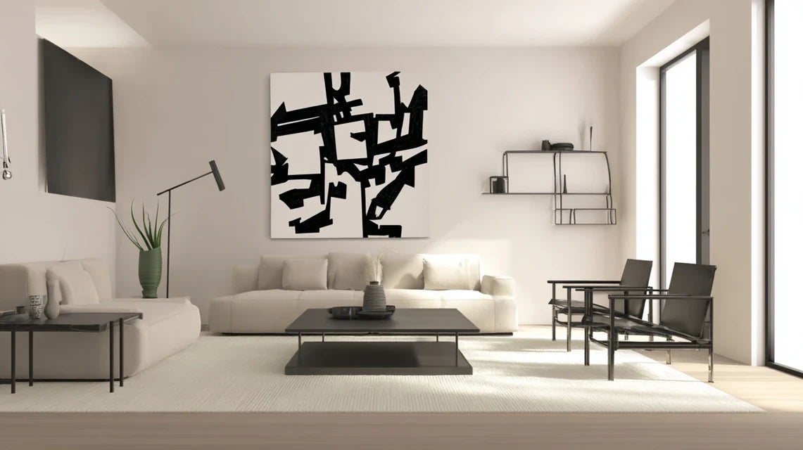
The secret of interiors that mark? A strong focal point that dialogues with the surrounding neutrality. This contrast acts as a visual magnet that reveals and enhances everything else. Guaranteed domino effect: once this anchor point is created, you immediately see which other elements can be subtly contrasted to amplify the impact.
Identify your future focal point: the most visible element from the entrance of the room, the one your gaze naturally encounters first.
Universal rule of successful contrast: A single strongly contrasted element is better than several slightly differentiated elements. Test immediately: choose the most neutral decorative object in your room and imagine it in a contrasting version (darker, more textured, more matte...).
| ❌ Traditional approach |
✅ Contrast strategy |
💡 Why this changes everything |
🎯 Immediate benefit |
| Add color everywhere |
Create a strong focal point |
The eye finally has a visual anchor |
Instant and mastered decor impact |
| Seek perfect harmony |
Create subtle visual tensions |
The brain remains stimulated and engaged |
Living and personalized interior |
| Multiply small details |
Concentrate the impact on the essential |
Every chosen element makes sense |
Natural sophisticated elegance |
| Follow color trends |
Play with textures and materials |
Timeless and personal style |
Decoration that doesn't go out of fashion |
The progressive method to master the art of decorative contrast
Rest assured: introducing contrast into a neutral interior doesn't require any revolution. We will proceed step by step, like a chef gradually balancing the flavors of a dish. Each level brings you immediate satisfaction and naturally prepares you for the next. In 3 weeks, your decor eye will be completely transformed.
🗺️ Your transformation journey: Foundation Level (visual anchoring), Sophistication Level (dialogue of materials), Mastery Level (personal signature). Each step reveals new possibilities and gives you confidence to explore the next. Guaranteed result from the first step: your space immediately gains character.
🎯 Step 1: Create your first contrasted anchor
Starting with anchoring is essential because it reveals the hidden potential of your existing neutrality. Like the foundations of a house, this first intervention structures everything else. The satisfaction is immediate: from the very first day, you feel this subtle but decisive difference that transforms your relationship to space.
🛠️ Your preferred anchoring elements
-
The large format painting: Wall art of minimum 80x60cm, in black and white or deep tones (navy, charcoal, dark chocolate). Choose with a subject that really speaks to you, as it will become your visual signature. Avoid standard prints: favor photographic art or original creations that tell a personal story. The impact on the overall atmosphere is immediate and structuring.
-
The character cushion: Fabric with strong personality (ribbed velvet, thick linen, bouclé wool) in a shade that "pinches" pleasantly with your neutral base. Texture takes precedence over color: a charcoal velvet cushion on a cream linen sofa creates more impact than a colored cotton cushion. Make sure the tactile quality is remarkable: elegance is felt as much as it is seen.
-
The sculptural object: Unique decorative piece (handmade ceramic vase, raw wood sculpture, design lamp) that dialogues with the surrounding sobriety through its shape or material. The principle: one remarkable object is better than three pretty objects. Choose it for its ability to attract attention effortlessly and spark conversation.
Now, time for concrete action:
🎨 Setting up your anchor
Identify your maximum impact zone: Position yourself at the entrance of your main room and identify the element that your eye naturally encounters first. That's where your contrast will have the most effect. This strategic area maximizes visual impact as it benefits from the "first look," the most decisive in terms of overall impression.
⏱️ Time: 5 minutes | ✅ Successful when: You clearly identify THE zone that naturally attracts attention | ⚠️ Attention: Do not confuse "central area" and "impact zone" - sometimes the preferred viewing angle reveals a lateral wall more strategically than the wall facing the entrance.
Test the contrast effect: Before making any purchase, simulate the effect with a temporary dark object (book, throw blanket, even a black cardboard box). Position it in your identified zone and observe how your perception of space transforms. This preview avoids costly mistakes and gives you confidence in your final choices.
⏱️ Time: 15 minutes | ✅ Successful when: You physically feel that "something has changed" in the atmosphere | ⚠️ Attention: If the effect seems too strong, it's normal at first - your eye gets used to it within 48 hours and will then appreciate this new dynamism.
Adjust contrast intensity: Modulate the "strength" of your contrast according to your comfort level. Start with a moderate contrast (charcoal gray vs beige) before daring bold contrasts (black vs white). The principle: your level of confidence dictates the intensity, not theoretical rules.
⏱️ Time: 1 week of observation | ✅ Successful when: The contrasted element makes you smile every time you see it | ⚠️ Attention: Resist the temptation to immediately add other contrasts - let this first element "do its effect" and reveal the following possibilities.
✅ Validation of your first success: Your anchor is perfectly integrated when it seems "to have always been there" while bringing that new energy you feel. Check that you spontaneously photograph this space more often and that your loved ones comment positively on "something different". If you are still hesitating, that's perfect: doubt is part of the evolution of taste !
🎨 Step 2: Orchestrate the dialogue of materials
Now that your first anchor structures the space, you can refine your signature by playing with textures and finishes. This step is more subtle but infinitely rewarding: you move from obvious contrast to sophisticated refinement. The snowball effect begins: each new element reveals possibilities that you had not seen before.
🧶 Contrasting Texture Palette
-
Matte vs. Glossy Materials: Combine a deep matte element (raw ceramic, charred wood) with a subtle glossy touch (brushed metal, smoked glass). The goal is not frontal opposition but refined complementarity. Where to source: local artisans for authenticity, design stores for modernity. Essential quality: the material must be noble to the touch - avoid plastic imitations that betray the sophisticated intention.
-
Structured Textiles: Crinkled linen, looped wool, embossed cotton, ribbed velvet - each texture tells a different story and dialogues with your base neutral. The principle of operation: light catches differently depending on the texture, creating visual richness without adding color. Quality indicator: the texture should remain beautiful even when crumpled or slightly worn.
-
Raw vs. Refined Elements: Rough wood against polished metal, natural stone against precious fabric. This duality creates a modern sophistication that avoids the pitfall of "too perfect". The visible benefit: your interior gains authenticity and personal character.
🎼 Composing Your Textured Symphony
Map Your Existing Textures: Inventory all the materials present in your room and identify their "families" (all soft, all smooth, all hard, etc.). This analysis reveals shortcomings and imbalances. A balanced room presents at least 3 distinct textural families that respond harmoniously.
⏱️ Time: 20 minutes | ✅ Success when: You clearly identify your "textural monotony zones" | ⚠️ Attention: Do not count micro-textures (fine weave, light grain) - focus on textures immediately perceptible from 2 meters away.
Introduce Signature Texture: Choose ONE remarkable texture that will become your guiding thread (example: matte black metal for all your accents). This textural consistency creates a subtle but recognizable decorative signature. Deploy this texture on a maximum of 3 elements: enough to create an echo, not enough to tire.
⏱️ Time: 3 weeks of progressive integration | ✅ Success when: The texture becomes "obvious" in your space without being overwhelming | ⚠️ Attention: Resist the temptation to over-texture - elegance is born of restraint and precision.
🌟 Step 3: Affirm Your Personal Decorative Signature
You now master the codes of sophisticated contrast. This final step allows you to transcend the rules to create your unique decorative language. You no longer follow trends, you anticipate them. The final result? An interior that is like nothing else, where each visitor immediately feels your personality and affirmed taste.
🎭 Advanced Customization Elements
-
The conversation piece: A one-of-a-kind piece that tells YOUR story (art purchased on a trip, revisited family heritage, commissioned artisanal creation). This piece should be intriguing enough to spark questions, personal enough to reveal your world. Desired quality: emotional authenticity more than market value. Strategic placement: visible but not intrusive, it punctuates your signature without shouting it.
-
The personal color code: A accent color that becomes YOUR signature (not necessarily your favorite color, but the one that enhances your neutrality). Deployed sparingly on a maximum of 2-3 elements, it creates that visual recognition that makes you say "that's so you." Test first on removable items before permanently integrating it.
-
The lighting staging: Ambient lighting that reveals your contrasts depending on the moment. Dimmable accent lamps, quality candles, discreet LED string lights. The goal: to subtly transform your interior from day to night, revealing different facets of your decorative personality.
🎨 Finalizing Your Decorative Signature
Define your "decor keyword": In one word, how do you want your interior to be perceived? (sophisticated, warm, bold, zen, eclectic...). This guiding word orients all your future choices and ensures the consistency of your signature. Each new element must serve this keyword or be discarded, even if it is beautiful individually.
⏱️ Time: 3 days of reflection + application test | ✅ Success when: Your keyword naturally guides your decor choices | ⚠️ Attention: Avoid vague keywords ("beautiful", "harmonious") - favor terms that evoke an emotion or a specific sensation.
Rule of mastered contrast progression: You are ready for the next step when the current step seems "natural" to you and you spontaneously begin to see possible improvements. Objective criteria: successful photos from the first try, specific compliments from your guests, desire to share your space. Patience and ambition balance each other: move at your own pace, but move.
Congratulations, you now master the subtleties that distinguish an amateur from a connoisseur. These final refinements give you that decorative confidence that interior design professionals instinctively possess.
🔥 Pro tip - Expert level: The "invisible contrast" rule: the most beautiful interiors hide their boldest contrasts in details that only the trained eye notices (colored cushion reverse, painted library interior, textured vase bottom). This discreet sophistication creates a sense of permanent discovery and avoids an overly styled effect.
💭 Reader question
"Won't I get tired of these strong contrasts? I tend to change my mind often when decorating..."
This is an excellent question that shows you are responsibly considering your decor investments. The beauty of a well-thought-out contrast is its ability to evolve. Unlike trendy colors that go out of style, value and texture contrasts stand the test of time. Your anthracite velvet cushion will be just as modern in 10 years, only the decor around it will evolve. Start with easily changeable elements (textiles, decorative objects) before investing in contrasting furniture. Your confidence will grow with experience.
💡 Reassuring action: Test your contrast tolerance with a temporary rental (artwork via Artsper, furniture via Made.com). After 3 months, you'll know precisely what intensity of contrast corresponds to your personal temperament.
⚠️ Pitfalls to absolutely avoid to preserve the elegance of your contrasts
Attention, your newly acquired enthusiasm can play tricks on you. These errors are so common that they deserve to be anticipated in order to preserve the sophistication of your decorative approach.
-
🚫 The overdone contrast: Wanting to create contrast everywhere simultaneously is the first temptation after discovering this approach. Consequence: your interior becomes visually exhausting and loses its original serenity. Solution: the "one validated contrast = possibility of exploring a second" rule. Let each intervention “breathe” before adding the next. This error affects 80% of enthusiastic beginners.
🚫 Confusing contrast and brutal opposition: Associating pure black and pure white without an intermediate shade creates a tiring "checkerboard" effect. True sophistication is born from nuanced contrasts. Alternative: always introduce a "linking grey" (warm beige, natural linen, brushed metal) that softens the transition. Successful example: charcoal black + ecru linen + bronze metal.
🚫 Neglecting lighting in the equation: A perfect contrast in natural light can become glaring or dull under artificial light. Always test your contrasting combinations at different times of the day and under your usual lighting. Adjust if necessary: a contrast that is too strong in the evening may be perfect during the day. It's a detail that even professionals sometimes forget.
🚫 Copying without adapting to your space: Reproducing exactly a contrast seen on Pinterest without taking into account your proportions, exposure, existing style. Every space has its specificities. Adapt the idea rather than copying the execution: same color but different texture, same principle but adapted scale. Your interior will thank you for preserving its authenticity.
-
🚫 Underestimating visual adaptation time: Judging a contrast "failed" within the first 48 hours when your eye needs 7 to 10 days to get used to a significant decorative novelty. Give yourself this adaptation period before modifying or abandoning. Exception: if the contrast really bothers you in the morning, it is probably too intense for your temperament.
🛡️ Anti-error verification system: Photograph your space before/after each contrasted intervention. If the "after" photo makes you smile spontaneously, it's validated. If you feel a diffuse malaise, analyze: too strong? poorly placed? or simply need for adaptation? Warning signs: visual fatigue after 1 hour in the room, desire to look away, feeling of agitation rather than positive stimulation.
❓ Your specific questions about decorative contrast
💰 What budget should I allocate to transform my neutral living room with effective contrasts?
Allow 150-400€ for a significant impact: one large format artwork (80-200€), 2-3 quality cushions (40-80€), a sculptural object (30-120€). Optimize by starting with the most visible element (often the wall facing the entrance) then gradually add more. Concrete example: Caroline transformed her beige living room with a black and white artwork at 120€ + 2 velvet cushions at 35€ each = spectacular result for 190€.
⏰ How long before I really see the difference and feel comfortable with these changes?
Immediate visual impact, psychological comfort in 7-14 days. Your eye quickly adapts to significant novelties, but your brain needs 1-2 weeks to integrate the change as "normal". Patience is essential: never judge definitively before 10 days. If after this period you smile when entering the room, it's perfectly successful.
🏠 Do these principles work in a studio or do I need a large room?
Excellent news: contrasts are even more effective in small spaces! In a studio, a single well-chosen contrasting element visually structures the entire space. Prioritize verticality (tall artwork, contrasted shelving) to visually enlarge the space. Studio tip: contrast behind the bed or on the kitchen wall instantly creates distinct "zones" without partitions.
🔧 I'm not a handyman, can I create these effects without work or complicated hanging?
Absolutely! 90% of effective contrasts require no DIY. Zero-work solutions: cushions, throws, objects placed, mirrors to lean against, self-adhesive LED garlands, high-end wall stickers. For artworks: use drilling-free hanging systems (Command Strips for lightweight works, tension rails for walls). Your landlord and your back will thank you.
🎨 How do I know if I dare enough or if I'm overdoing it with my contrasts?
Golden rule: if you hesitate, you are probably in the right dosage. Too little = no doubt but no impact. Too much = immediate certainty that "it won't work". The right contrast generates positive excitement mixed with a slight apprehension which disappears in a few days. Infallible test: if your loved ones positively notice without being able to say exactly what, it's perfect.
🌟 Your decorative transformation is underway
In 3 weeks, you will enter your home with a different smile. Your living room will no longer be that beautiful impersonal space that left you wanting, but YOUR space, one that tells your story and reveals your refined personality. Your guests will immediately feel this authenticity which distinguishes inhabited interiors from simply decorated ones.
This mastery of contrast goes far beyond decoration: you develop an aesthetic eye that will serve you in all your future choices, from choosing a restaurant to the harmony of your outfits. Your confidence in your personal taste is strengthened durably, freeing you from dependence on trends and external opinions.
The most difficult thing was to understand these visual mechanisms that we have just dissected together. Now that you master them, your first concrete step: choose TODAY your impact zone and visualize your first contrast. Your dream interior is waiting for your first bold step.
🚀 Your 7-day challenge: Dare your first contrast before Sunday and observe the magic happen. You now have all the keys in hand to reveal the hidden potential of your neutral interior. Your unique decorative signature awaits you!
📚 To go further in your decor expertise
Deepen your knowledge of the art of contrast with our specialized guides on combining materials, choosing noble textures, and the secrets of interior design professionals.