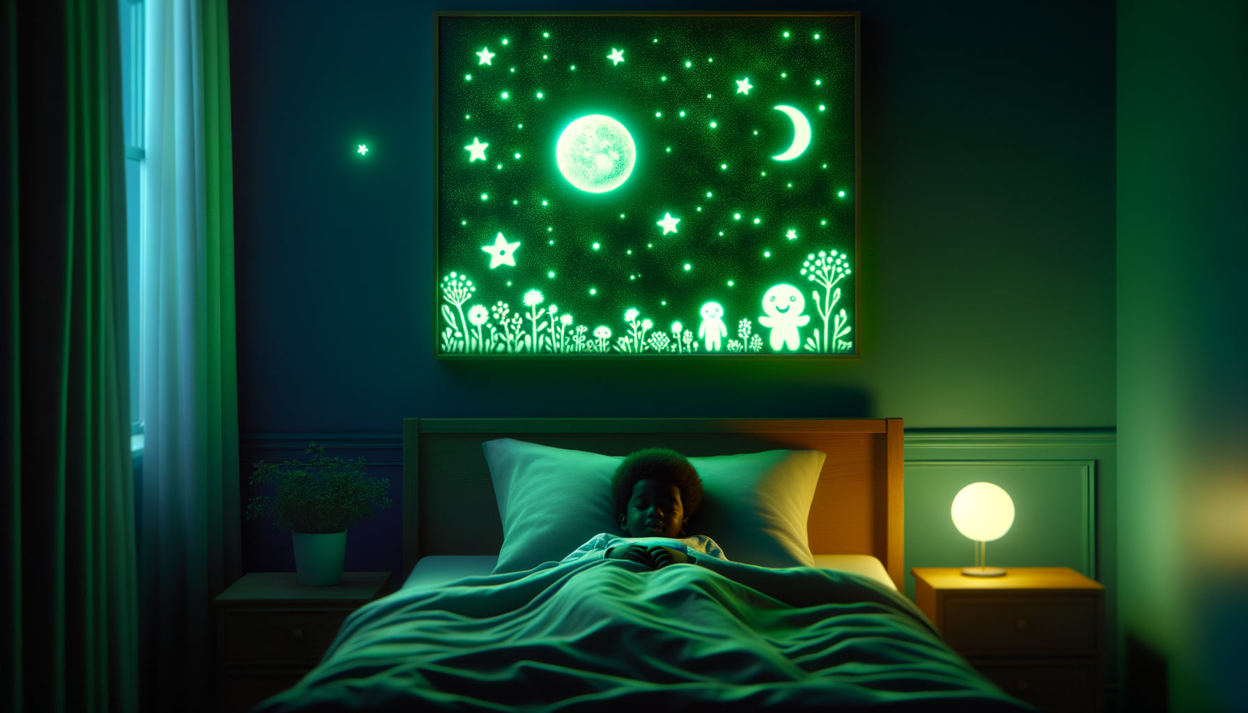
The first time I accompanied a young mother in creating her newborn’s room, she confided something unsettling to me: “I want my baby to feel enveloped in softness as soon as he opens his eyes.” This sentence still resonates with me after twelve years spent designing spaces for early childhood. Because that is precisely what guides parents towards pastel-toned artworks: this instinctive quest for a soothing visual cocoon for their child.
Here’s what pastel-toned artworks bring to a baby's room: a visually calming environment that promotes sleep, gentle stimulation adapted to the fragile sensory development of newborns, and a harmonious atmosphere that reassures both the child and his parents. Faced with the natural anxiety of creating their baby’s first living space, many parents feel lost between contradictory advice and fleeting trends. Rest assured: choosing pastel tones for wall decor is not a trend, it's a sensitive response to the real needs of a toddler. I will reveal to you why these soft hues naturally find their place in nurseries, and how they create much more than just decoration.
The science of soft colors: why pastel tones really soothe babies
During a consultation with a pediatrician specializing in sensory development, I discovered a fascinating fact: a newborn’s visual system perceives only 5% of what an adult sees. During the first months, babies mainly distinguish strong contrasts and simple shapes. Pastel colors – these softened shades of white that seem almost transparent – offer an ideal transition to the colorful world.
A pastel-toned artwork in a baby's room does not overwhelm the fragile gaze of the child. Powder pink, sky blue, mint green or butter yellow create a visual presence without aggression. In my projects, I have observed that babies exposed to these soft hues exhibit fewer signs of overstimulation: reduced crying, easier falling asleep, prolonged periods of calm alertness.
Parents instinctively prefer these pastel artworks because they feel, sometimes without articulating it, their regulating effect. These colors naturally lower the level of cortisol – the stress hormone – in both children and adults. In the confined space of a room where parent and baby spend nocturnal hours, this calming atmosphere becomes a valuable ally against exhaustion.
The visual embrace: creating a protective cocoon through color
Marie, a young mother I accompanied, told me how anxious she felt each time she put her son in his crib. Together, we decorated the walls with pastel-toned artworks depicting vaporous clouds and delicate animals. A few weeks later, she wrote to me: “Now, when I lay him down, I feel like I’m putting him in a cloud.”
This notion of 'visual embrace' largely explains why parents choose pastel shades for a baby’s room. Unlike saturated colors that create visual tension points, pastels diffuse a soft light that seems to emanate from the walls themselves. A pastel artwork doesn’t ‘shout’, it whispers. It doesn't capture attention, it accompanies it.
I’ve noticed that parents often describe these artworks with tactile vocabulary: 'soft', 'velvety', 'caressing'. As if color could be touched. This synesthesia is not insignificant: it reveals that pastel tones activate our sensory memory of comfort – that of soft blankets, plush toys, maternal cuddles. By choosing these shades, parents create an environment that visually says ‘here, you are safe’.

Artworks that grow with the child
A less obvious but equally decisive argument: the aesthetic longevity of pastel artworks. Unlike overly childish decorations that will need to be removed as soon as the child is three years old, pastel colors age gracefully.
I have designed rooms where the same pastel artworks chosen for a newborn still accompanied the child at the age of eight. The key? Compositions subtle enough not to ‘look babyish’, but gentle enough to suit the early years. A artwork representing geometric shapes in blush pink and pearl grey, for example, appeals as much to a seven-year-old girl as it delights the parents of a newborn.
This durability also represents an ecological and economic choice that parents appreciate. In a society increasingly aware of waste, investing in timeless pastel artworks becomes a responsible gesture. You are creating not a decoration for the occasion, but a visual heritage that will accompany the decisive first years of your child.
Family harmony: when parents feel good too
Here’s a truth few dare to say: a baby’s room is not only the space of the child. It's also the place where parents spend countless hours of nocturnal breastfeeding, endless rocking, moments of wonder and exhaustion mixed. Pastel tones create an environment that emotionally supports the whole family.
Paul, a young father, told me: "I never thought a simple artwork could change my mood. But when I'm standing at 3 am with my daughter crying, this lavender blue painting above the dresser calms me down as much as she does." Pastel colors are not frivolous – they are therapeutic.
These soft hues reduce eye fatigue in spaces where we spend a lot of time. They promote the production of serotonin, a neurotransmitter of well-being. A artwork with pastel tones thus becomes a silent accomplice to difficult nights, a reassuring visual anchor when everything seems chaotic. Parents favor these works because they take care of them as much as their baby.

The psychology of softness: breaking gender stereotypes
For a long time, pink was for girls, blue for boys. Today, pastel tones offer a palette freed from these constraints: sage green, pale yellow, delicate mauve, rose beige, pearl gray... These nuances make it possible to create a nursery that does not confine the child to gendered expectations.
I have accompanied many parents who specifically wanted this benevolent neutrality. A artwork with pastel tones in multiple colors – blending touches of several soft hues – creates an inclusive environment where the child can freely develop their personality. This approach reflects a profound societal evolution that contemporary parents embody through their decorative choices.
These pastel artworks thus become silent messengers of values: softness without weakness, delicacy without frivolity, aesthetics without rigidity. They tell a story of parenthood that seeks balance between protection and freedom, tradition and modernity.
The cocooning effect enhanced by natural light
A technical aspect often overlooked: pastel tones interact beautifully with natural light. A sky blue artwork seems to illuminate from within under the morning light. A powder pink warms deliciously at sunset. These subtle variations create a dynamic environment without being stimulating.
Unlike saturated colors that can become aggressive depending on the lighting, pastel colors remain soft in all circumstances. This visual stability explains why so many parents favor them: a artwork with pastel tones will never transform the room into a garish space, whatever time of day it is.
I've noticed that in south-facing bedrooms, where the light can be intense, pastel artworks absorb excess brightness while diffusing it gently. In darker rooms, on the contrary, they capture every ray and reflect it subtly. This adaptability makes them particularly intelligent decorative allies.
Give your baby a cocoon of gentle visual comfort
Discover our exclusive collection of art for children's rooms that will accompany your little one’s first dreams with soothing tones and timeless compositions.
Creating the space of first memories
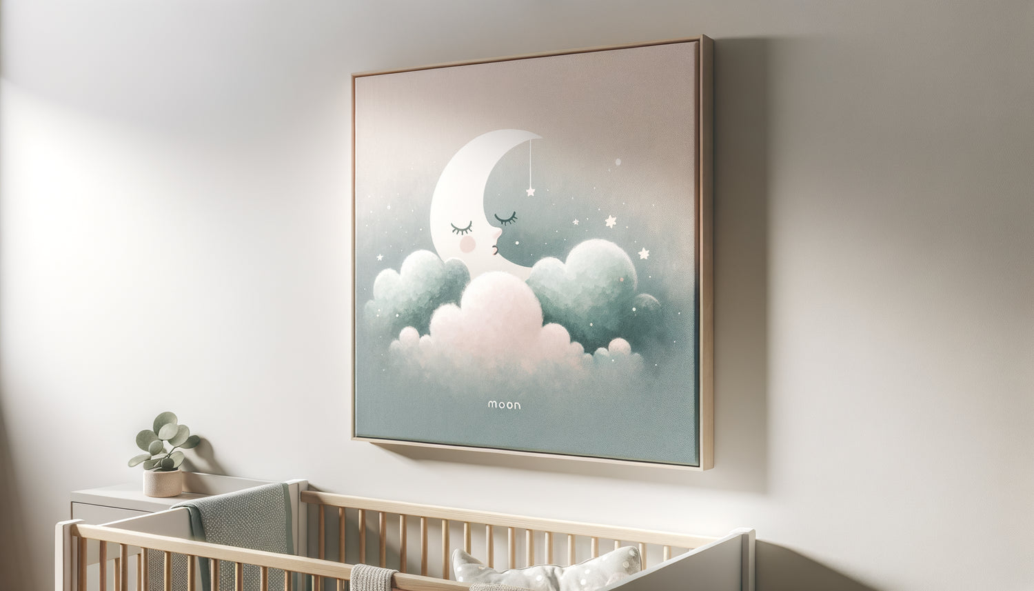
Close your eyes for a moment. Imagine yourself entering your baby’s bedroom in the early morning. The light filters gently through the curtains. On the wall, a pastel artwork depicting a benevolent moon and delicate stars seems to watch over the cradle. Your child sleeps peacefully, their relaxed face reflecting the serenity of the space you have created for them.
You're not choosing just decoration when you opt for pastel artworks – it’s the backdrop for first smiles, first “daddy” and “mommy,” first hesitant steps. These soft colors will imprint your child’s sensory memories, forming the emotional substrate of their future security.
Parents favor artworks in pastel tones because beyond all scientific, aesthetic or practical reasons, they intuitively know one thing: gentleness is never a superfluous luxury. It is the universal language of parental love, translated into colors on a wall. And in this first living space, every detail counts to tell this little being: “Welcome to a world that will take care of you.”
Frequently asked questions about pastel artworks for baby’s room
Don't pastel tones risk making the room too bland?
It’s a legitimate concern, but unfounded when you understand the richness of pastel tones. The key lies in layering different shades and choosing artwork with interesting compositions. A pastel artwork with subtle graphic details – textures, soft geometric patterns, or delicate illustrations – creates sophisticated visual depth. I have designed entire rooms in pastel tones that overflowed with character thanks to the variation of hues (powdered pink, pale peach, delicate mauve) and the play of materials. The trick is to choose pastel artwork with a subtle focal point – a stylized animal, an organic shape – that attracts the eye without overwhelming it. Think “soft” but not “empty.” You create a soothing space that remains visually stimulating for baby’s development.
From what age can I introduce pastel artwork into the nursery?
From birth, and even before! Contrary to popular belief, newborns immediately benefit from the presence of pastel artwork. During the first weeks, their blurry vision mainly perceives shapes and soft contrasts. A pastel artwork placed about 25-30 cm from the baby's field of vision (for example above the changing table) quickly becomes a reassuring visual landmark. Around two months, when color vision begins to develop, pastel tones offer ideal stimulation – present enough to spark interest, soft enough not to fatigue. I encourage parents to install these artwork even before the baby arrives: it contributes to the emotional construction of the nest, and you will yourself benefit from their soothing effect during the last weeks of pregnancy. The visual environment counts from day one.
How to combine several pastel artworks without overwhelming the space?
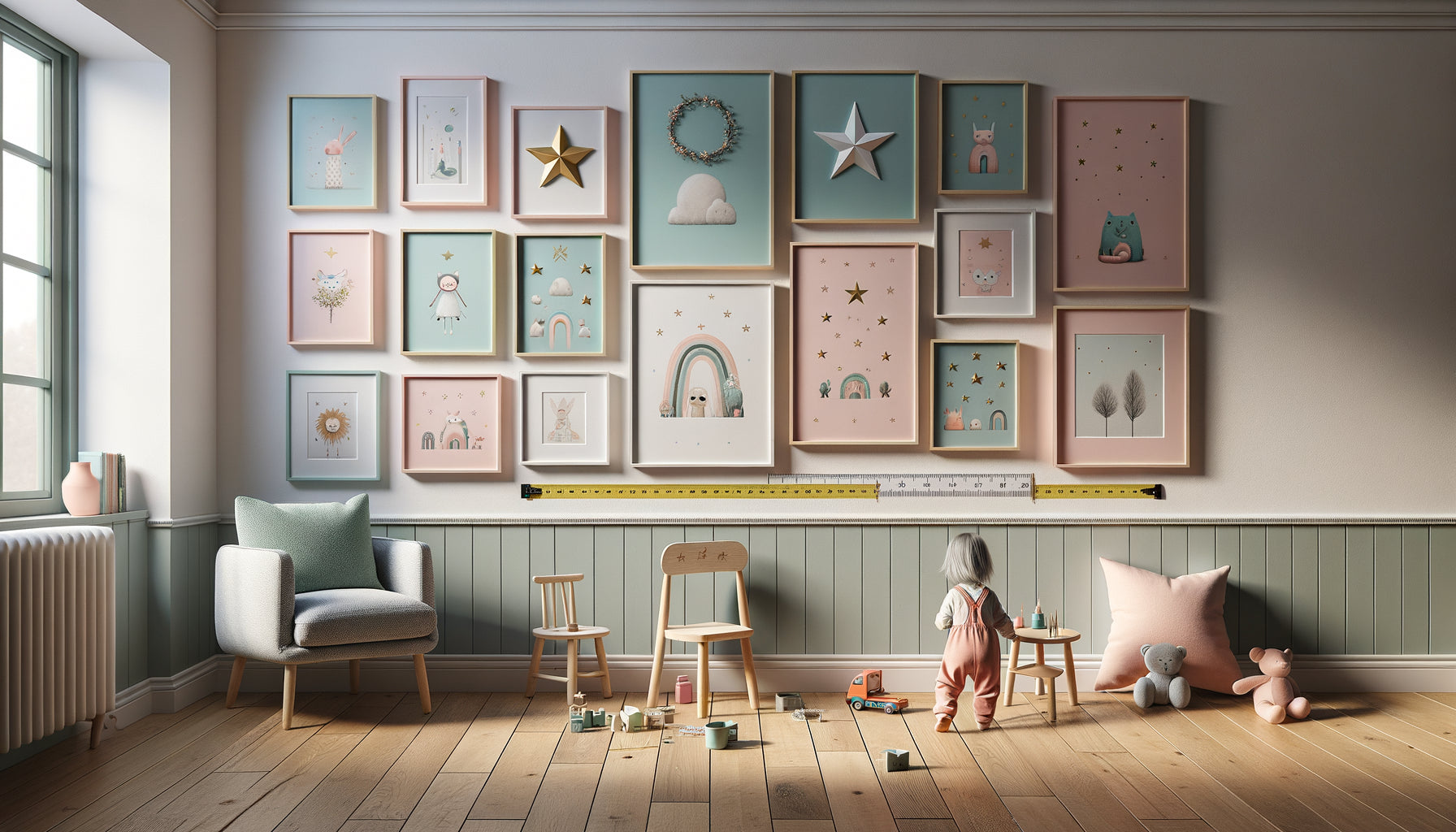
The golden rule I apply: unity in diversity. Choose tableaux with pastel tones that share either a common color palette (for example, different shades of blue and green), or a similar graphic style (minimalist illustrations, soft watercolors, geometric shapes). For a bedroom of 10-12 m², I recommend a maximum of three tableaux of varying sizes: a large format (50x70 cm) as a centerpiece, accompanied by two smaller formats (30x40 cm) that create a visual dialogue. Favor an asymmetrical but balanced arrangement – avoid perfectly symmetrical alignment which can appear rigid. Spacing also counts: let each tableau breathe with at least 10-15 cm between them. Pastel tones have this remarkable quality of being able to coexist without competing with each other – a powder pink harmoniously dialogues with a mint green or a butter yellow. Trust your intuition: if the whole ensemble soothes you at first glance, then it will be perfectly suited to your baby.