I remember this young mother, standing in the middle of her baby’s future room, with shining and slightly lost eyes. "I want this space to grow with him," she confided to me. This sentence sums up all the magic and challenge of decorating a child's room: creating a cocoon that accompanies their transformations, from their first smiles to their teenage dreams.
Adapting artwork choices to the child’s age is offering much more than just decoration: it stimulates cognitive development, nourishes imagination, and creates a reassuring refuge that evolves with their personality. A well-chosen picture becomes a silent companion of growth, a visual landmark that structures their world.
Many parents feel paralyzed by this choice. Should they opt for timelessness at the risk of boring an 8-year-old? Choose cartoon characters who will lose their appeal in a few months? How to create a visual harmony without infantilizing the space? These legitimate questions deserve concrete answers.
The good news? There are simple strategies to choose artwork that accompanies each stage of childhood, from birth to adolescence, without requiring complete redecoration every two years. Let me guide you through these different phases, with adaptation keys that will transform the room into a true evolving sanctuary.
The first months: a universe of softness and contrasts
For a baby from 0 to 6 months, vision remains blurred and limited. Their world is built progressively, where black and white contrasts play a fascinating role. I have seen newborns intensely fixate on simple geometric patterns, as if hypnotized by these clean shapes.
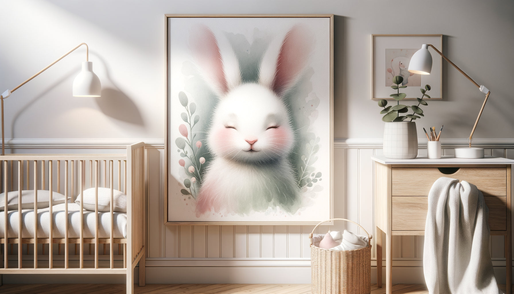
Artwork suitable for babies favors simple shapes: concentric circles, soft stripes, stylized animal silhouettes. Pastel colors soothe – powder blue, tender pink, warm beige – creating an enveloping atmosphere that promotes sleep. A triptych representing moon, stars and clouds in soft tones becomes a soothing visual ritual before bedtime.
Also consider the hanging height: place artwork at changing table or bed level, where baby can observe it during changes or quiet awakening moments. Artwork positioned too high simply won't exist within their field of vision.
The visual textures that stimulate without overstimulating
Avoid compositions that are too busy and generate excessive stimulation. A baby needs visual calm to build their landmarks. Favor minimalist illustrations: a single animal per picture, soothing repetitive patterns, stylized nature representations. This visual simplicity accompanies the progressive maturation of their nervous system.
From 6 months to 3 years: awakening through colors and discoveries
Around 6 months, everything accelerates. The child begins to distinguish bright colors, recognize familiar shapes, and point at what intrigues them. This is the time to introduce more colorful and narrative artworks that stimulate their boundless curiosity.
Animals become privileged visual companions. A smiling elephant, a benevolent lion, a family of foxes: these gentle representations of animals create emotional connections. I've noticed that toddlers often develop 'favorites' among the artworks, which they greet every morning with joyful babbling.
Educational artworks make their appearance: illustrated alphabet, colorful numbers, geometric shapes associated with everyday objects. Without forcing learning, these visuals naturally familiarize the child with concepts they will find later. A picture of a tree with its fruits becomes an excuse for conversations and sensory discoveries.
Now prioritize a lower hanging height, at eye level when they play on the floor or crawl. The wall becomes an accessible visual exploration ground, a personal gallery that dialogues with them.

The preschool years (3-6 years): when imagination takes over
Between 3 and 6 years old, the child becomes a storyteller. Each image triggers narratives, imaginary games, parallel worlds. Artworks become portals to fantastic universes: enchanted forests, stylized treasure map, astronaut explorer, princess's castle revisited with modernity.
This is the ideal age to integrate elements that reflect their emerging passions. A child fascinated by dinosaurs will thrive in front of a triptych representing different species in gentle prehistoric landscapes. A little girl passionate about dance will find inspiration in an aquarelle ballerina with bright colors.
Interactive artworks become more relevant: world map where you can stick stickers of visited countries, visual schedule with magnetic illustrations, framed chalkboard to draw. These hybrid supports between decoration and activity accompany their growing need for autonomy and personal expression.
Involve the child in the choice
From around 4 to 5 years old, suggest they choose a picture from a pre-selected selection. This participation strengthens their attachment to their space and develops their aesthetic sense. I have seen bedrooms transform when the child becomes a co-creator of their visual environment.
School age (6-10 years): affirmation and personality
Starting primary school marks a turning point. The child develops affirmed tastes, sometimes rejects what they consider 'for babies'. Pictures should evolve towards more sophistication while maintaining a playful and inspiring dimension.
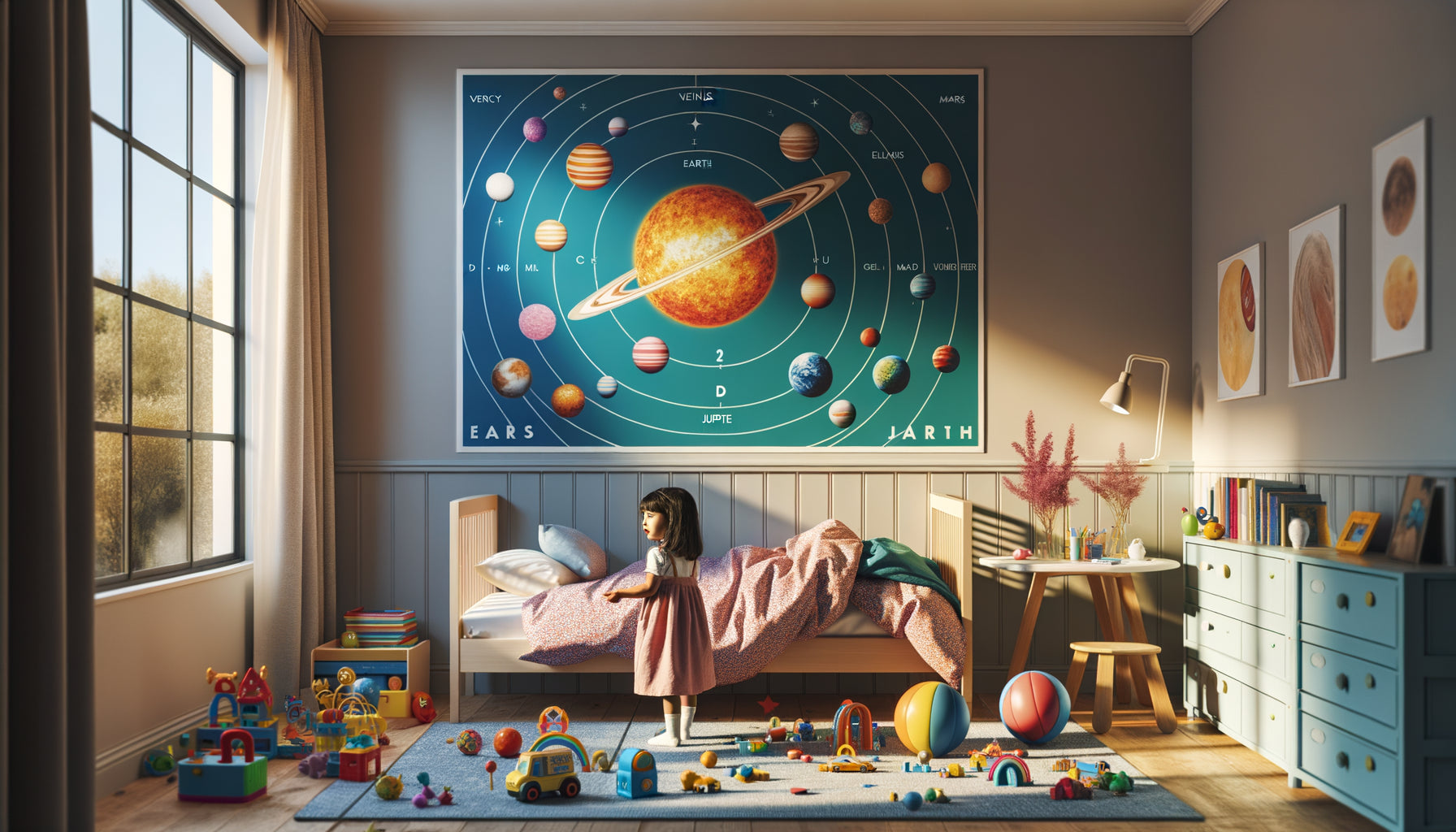
Themes expand considerably: space explorations, mysterious seabeds, monuments of the world, calligraphed motivational quotes, reproductions of adapted artworks. A picture representing the solar system with planets to scale nourishes their thirst for knowledge while decorating elegantly.
This is also the age when mixing decorative pictures and personal productions works wonderfully. Frame their most accomplished drawings alongside chosen artworks: this values their creativity and creates a unique evolving gallery. Use consistent frames to visually unify the whole.
Colors can become more complex: gradual abandonment of pastels in favor of more assertive shades – duck blue, terracotta, sage green, mustard yellow. These more mature palettes accompany their transition towards pre-adolescence without abruptly meeting their need for softness.

Pre-adolescence (10-13 years): the challenge of transition
Pre-adolescence represents the ultimate decorative challenge. The child is no longer really a child, but not yet an adolescent. Pictures must negotiate this delicate transition between childhood universes they reject and the adult world they do not yet fully inhabit.
Favor modern abstraction, inspiring messages, stylized urban representations, black and white photographs of landscapes or architectures. A minimalist triptych representing ocean waves is just as suitable for an 11-year-old as it is for a student. This timelessness becomes valuable.
Modular and customizable pictures excel during this period: framed cork panels to pin photos and memories, rail systems allowing easy changing of visuals, evolving wall compositions with empty frames to fill according to mood. This flexibility respects their identity fluctuations.
Give them more control over aesthetic choices. Your role becomes that of a guide who offers quality options, while respecting their need to personally appropriate their space. A pre-teen who chooses their own prints develops autonomy and confidence in their aesthetic judgment.
Create a timeless foundation from the start
A smart strategy is to install a few timeless pieces from the beginning : a beautiful vintage world map, a large abstract work in soft colors, a black and white nature photograph. These visual anchors remain relevant from 0 to 18 years old, while you adjust the other elements according to developmental phases.
Ready to create a space that grows with your child?
Discover our exclusive collection of wall art for kids' rooms that accompanies each stage of their development with style and softness.
Cross-cutting principles for all ages
Beyond the specifics of each age group, certain universal principles guide the choice of prints for children. Quality always trumps quantity : it's better to have three carefully chosen prints than a cluttered wall generating visual confusion.
Think overall composition. Prints dialogue with each other and with the furniture. A chromatic harmony connects everything: repeat a color from the print in a cushion, a rug, an accessory. This visual consistency soothes and structures the space.
Safety remains non-negotiable : solid mounting systems, frames without sharp corners, shatterproof glass for the youngest. A falling print can cause injury and create lasting anxiety. Favor canvas prints or lightweight frames for play areas.
Finally, consider lighting. A beautiful print poorly lit loses 80% of its impact. A small directional sconce or soft ambient lighting highlights the works while creating a warm atmosphere for evening rituals.
Visualize the transformation
Imagine : you enter the room that you have composed with care. Your baby, now a toddler, joyfully points to his elephant on the wall. A few years later, this same child, now a schoolchild, tells you an invented story inspired by the magical forest print. At 12 years old, he proudly chooses his first teen's print, affirming his emerging identity.
Paintings become silent witnesses to their growth, visual milestones that punctuate childhood memories. By adapting these choices to each age, you create more than just decoration: you compose the setting for their most beautiful dreams, the frame for their first discoveries, the showcase of their development.
Start today. Observe your child, their reactions to colors, their current fascinations. Let these clues guide your first selection. And remember: a painting can change, but the emotion it has evoked will remain etched in their emotional memory forever.
Frequently asked questions about choosing paintings according to age
Is it really necessary to change paintings at each stage of growth?
No, not necessarily all the paintings. The most judicious approach is to create a timeless base with 40-50% of paintings that will last through the years – soft abstract works, nature photographs, stylized maps. Then complete with 50-60% of visuals adapted to the current age, which you will adjust every 3-4 years approximately. This strategy offers reassuring continuity and stimulating renewal, without requiring a complete overhaul at each birthday. Some paintings will even become 'visual comfort objects' that your child will want to keep until adolescence. Respect these attachments: they are part of their identity construction and emotional landmarks.
How many paintings to put in a child's room?
The golden rule: less is more, especially for young children whose nervous system can be easily overstimulated. For a baby, 2-3 paintings are quite sufficient. Between 3 and 6 years old, you can increase to a maximum of 4-5 pieces. For older ones, a wall composition of 5-7 elements works well, provided that visual consistency is maintained. Also think about white walls: they are not enemies but necessary visual breaths. A completely covered wall creates a visual saturation that harms rest. Favor an accent wall with your main paintings, and leave other spaces more uncluttered. This visual breathing promotes concentration and relaxation, particularly important for sleep quality.
Can you mix different styles of paintings in a child's room?
Absolutely, provided you maintain a harmonious thread. The mix works wonderfully when you keep either a consistent color palette, a unified frame style, or a common theme. For example, you can combine nature photography, animal illustration and floral abstraction if they share similar tones – blue, green and beige for instance. Or mix watercolor, line drawing and typography if all the frames are in natural wood. This mixity creates visual richness and personality, while avoiding the cluttered effect. For bedrooms shared between siblings of different ages, it is even the ideal solution: each child can have 'his' paintings while maintaining overall harmony. Test virtually by photographing the wall and superimposing your choices before permanently hanging.