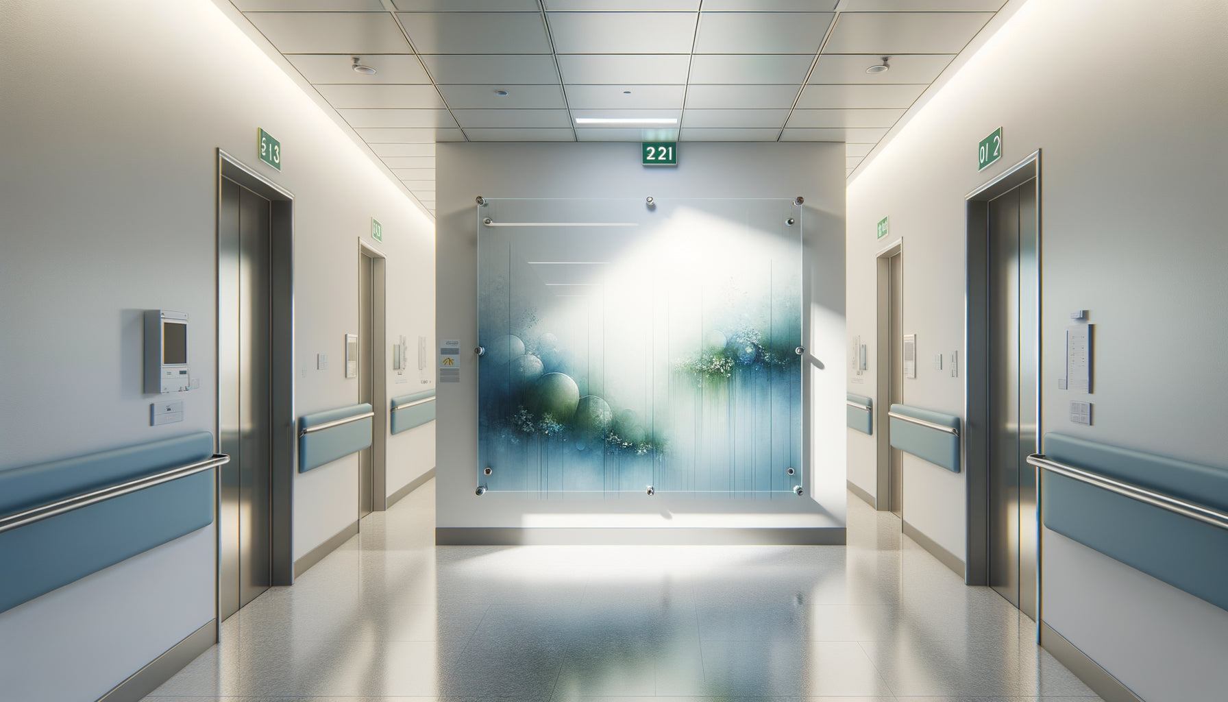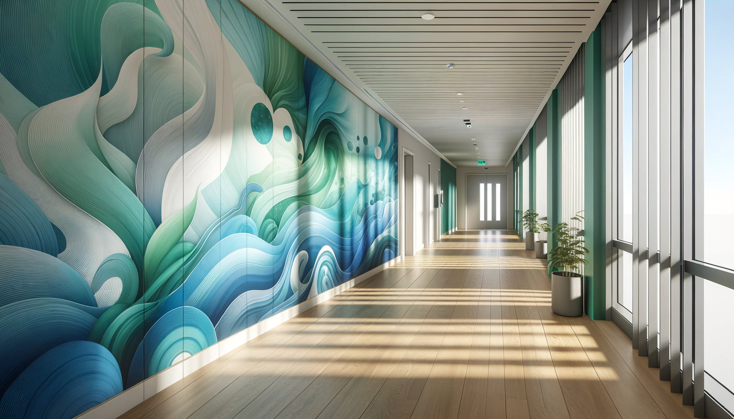
I spent fifteen years designing care environments for private hospitals and clinics before understanding a fascinating truth: &strong;color doesn't decorate, it heals. During a consultation for the renovation of an oncology department, a nurse confided in me that some patients refused to enter rooms with immaculate white walls. Too sterile. Too anxiety-inducing. This observation transformed my professional practice.
&strong;Here’s what blue and green tones bring to wall art in medical settings: they physiologically reduce patient anxiety, decrease the perception of pain, and create an environment conducive to healing. These shades are not simply an aesthetic choice, but a visual prescription validated by decades of research in environmental psychology.
Too often, medical spaces prioritize neutrality out of fear of bad taste or lack of knowledge. Bright white dominates, paradoxically creating more stress than it soothes. Yet, every day, thousands of patients wait in rooms that amplify their anxiety rather than calm it.
The good news? Integrating wall art in these tones requires neither major renovations nor a colossal budget. &strong;A thoughtful selection of paintings with blue and green hues radically transforms the patient experience, while respecting the health and budgetary constraints of establishments.
This article reveals why these specific colors work so effectively, how they affect our physiology, and what strategies to adopt to create truly soothing medical spaces.
The science behind calming shades
When our gaze rests on a &strong;cerulean blue or an &strong;emerald green, our autonomic nervous system reacts instantly. These cool tones trigger a cascade of measurable physiological responses: slowing of heart rate, decrease in blood pressure, reduction in salivary cortisol levels.
A study conducted by the University of Sussex showed that patients exposed to environments with blue and green hues required &strong;up to 20% less analgesics than those placed in neutral rooms. It's not decorative folklore, it’s applied neurobiology.
Blue, in particular, stimulates melatonin production and slows our metabolism. In a medical setting, this shade subconsciously evokes the sky and the horizon, creating a sense of space even in small rooms. &strong;Green, on the other hand, recalls nature and activates brain areas associated with safety. Our brains, inherited from millions of years of evolution, recognize these colors as synonymous with vital resources: water and vegetation.
The impact on time perception
A fascinating phenomenon I've observed in my projects: blue and green tones alter our perception of time. Patients report that waiting rooms decorated with wall art in these shades feel shorter. An examination room with walls adorned with seascapes or forest scenes transforms the anxiety of anticipation into almost meditative contemplation.
Why these colors outperform warm tones in care environments
You might legitimately wonder why not opt for energizing yellows or warm oranges. The answer lies in the specific emotional state of people in medical settings.
Warm tones stimulate: they increase heart rate, awaken attention, create a sense of urgency. Exactly the opposite of what an anxious patient needs. I've seen pediatric emergency rooms attempting to be playful with bright reds and oranges, inadvertently creating overstimulation in children already distressed.
Blue and green tones, on the other hand, calm without anesthetizing. They maintain alertness while reducing hyperactivity of the sympathetic nervous system. This subtle difference makes all the difference in a therapeutic environment.
A dental clinic I collaborated with replaced its abstract wall art with vibrant colors with a collection of underwater photographs in shades of blue. The appointment cancellation rate dropped by 15% in six months. Patients reported feeling less anxious from the waiting room.

Which shades to prioritize according to medical spaces
Not all blues and greens are equal. The selection of precise nuances determines the therapeutic effectiveness of your wall art.
For waiting rooms
Prioritize light to medium blues – think horizon blue, glacier blue, aquamarine. These shades create a serene atmosphere without falling into clinical coldness. Greens tending towards turquoise work particularly well, evoking tropical waters and creating a welcome mental escape.
I installed in a radiology waiting room a series of paintings depicting coastal landscapes in pastel blue-green tones. Patients spontaneously mentioned feeling transported elsewhere, momentarily forgetting the anxiety-inducing medical context.
For patient rooms
In recovery areas, sage greens and celadon greens excel. Softer than emerald green, they evoke springtime nature and promote rest. These shades have demonstrated their ability to improve sleep quality, crucial for healing.
Lavender blues or gray-blues are also suitable, particularly for maternity services where they soothe without darkening the atmosphere.
For consultation rooms
Opt for tempered deep blues or softened forest greens. These tones inspire confidence and professionalism while maintaining a soothing effect. A delicate balance between medical credibility and emotional comfort.
Common mistakes to absolutely avoid
After auditing dozens of medical facilities, I notice three recurring errors that sabotage the therapeutic effect of wall art, even with the right colors.
First mistake: overly saturated blues and greens. An electric blue or neon green, even technically within the correct color family, creates a visual aggression. In a medical setting, subtlety is key. Shades should be slightly desaturated, as if washed by natural light.
Second mistake: ignoring lighting. A blue-toned painting under cold fluorescent lighting becomes glacial and inhospitable. The color temperature of light sources must complement, not fight, your wall art. Favor warm white LEDs (2700-3000K) that enrich blues and greens without distorting them.
Third mistake: overabundance. A wall entirely covered in blue-green paintings creates a visual saturation. Negative space – areas of visual rest – remains essential. One or two strategically placed paintings surpass ten crammed works.
I visited a medical practice where every square centimeter featured turquoise nautical motifs. The paradoxical effect? Patients felt overwhelmed, literally. The sought-after soothing turned into chromatic claustrophobia.

How to harmoniously integrate these tones into your medical space
The theory is fascinating, but practice requires method. Here's my proven approach for effectively deploying wall art in blue and green tones.
Start by identifying the anxiety points in your space. Where do patients wait the longest? Which areas generate the most apprehension? These priority locations deserve your maximum visual attention.
Next, choose a consistent theme rather than a disparate collection. Marine landscapes, forest scenes, aquatic abstractions – thematic continuity reinforces the immersive effect. A patient moving from reception to examination room should experience a smooth chromatic journey, not a succession of contradictory styles.
Prioritize generous formats. An 80x120 cm painting creates a soothing focal point. Scattered small works fragment attention and dilute the desired psychological impact.
The rule of thirds
A professional tip: place your paintings so that their center is at eye level for a seated person. In medical settings, patients spend more time sitting than standing. This height of 120-130 cm from the floor maximizes visual exposure and therefore the therapeutic effect.
Transform your care environment into a haven of peace
Discover our exclusive collection of wall art for medical offices that combines refined aesthetics and proven therapeutic benefits.
The future of color therapy in medical settings
Current research reveals fascinating perspectives. Scandinavian hospitals are experimenting with dynamic wall art systems where blue and green hues adapt to the time of day, optimizing patients' circadian rhythms.
Augmented reality now allows patients to temporarily personalize their visual environment, choosing their preferred blue-green landscape on a discreet screen. These technological innovations do not replace traditional wall art, but complement it intelligently.
What remains constant? The timeless power of blue and green to soothe the human mind in medical contexts. No innovation changes our millennia-old neurological wiring that associates these colors with safety and life.
Imagine your next patient walking through the door. Their shoulders immediately relax. Their gaze finds refuge in a soothing marine landscape. Their breathing slows naturally. Your medical space no longer just treats – it welcomes, reassures, heals at first glance.
Start modestly: a painting strategically placed in your main waiting room. Observe the reactions. Listen to spontaneous comments. You will quickly see that blues and greens do not simply decorate your walls – they actively participate in the care protocol, silently but powerfully.
Frequently Asked Questions about Calming Wall Art in Medical Settings
Do blues risk creating a too cold or depressing atmosphere?
This legitimate concern stems from confusion between poorly calibrated blues and therapeutic blues. Very dark or heavily desaturated blues can indeed darken the atmosphere. On the other hand, medium to light blues, slightly warmed – think sky blue, glacier blue, aquamarine – create serenity without coldness. The trick is to select shades containing a subtle touch of green or gray, avoiding pure primary blue. Combined with warm lighting and a few natural elements like light wood, these blues become enveloping rather than austere. I have equipped dozens of medical spaces with these tones, and never has a patient mentioned a feeling of cold – on the contrary, they consistently describe an impression of calm and space. The key lies in the overall chromatic balance, not just the isolated color.
Can blues and greens be mixed in the same medical space?
Absolutely, and it is even recommended to create a rich and natural palette. Blue and green are neighbors on the color wheel, which guarantees spontaneous visual harmony. In nature, these colors coexist constantly – ocean meeting coastal vegetation, aquatic reflections in forests. Your eye and your brain instinctively recognize this association as balanced. The optimal strategy is to choose a dominant tone (for example, 60% blues) and a complementary tone (40% greens), creating a subtle variation that maintains visual interest without causing confusion. Turquoise shades, located precisely between blue and green, work wonderfully as a chromatic bridge. I designed a clinic where the waiting room favors navy blues while consultation rooms adopt sage greens, with turquoise artworks in the corridors ensuring the transition. Patients and staff appreciate this soothing diversity.
Are these colors suitable for all types of medical practices?
The blue and green tones demonstrate a remarkable versatility across almost all medical specialties. They excel particularly in dentistry, cardiology, oncology, pediatrics and general medicine – all areas where patient anxiety is a significant factor. However, some nuances deserve consideration: in ophthalmology, avoid excessive contrasts that could fatigue freshly examined eyes. In dermatology, prioritize faithfully rendered tones under your specific lighting to avoid misrepresenting skin tones. In psychiatry or psychology, these soothing colors are an obvious choice. Even in surgery, pre- and post-operative spaces greatly benefit from these reassuring tones. The only possible exception concerns certain emergency services where controlled overstimulation may be sought, but even there, family waiting areas gain from adopting these calming shades. In fifteen years of practice, I have encountered no medical specialty where judiciously selected blues and greens did not contribute positively to the patient experience.