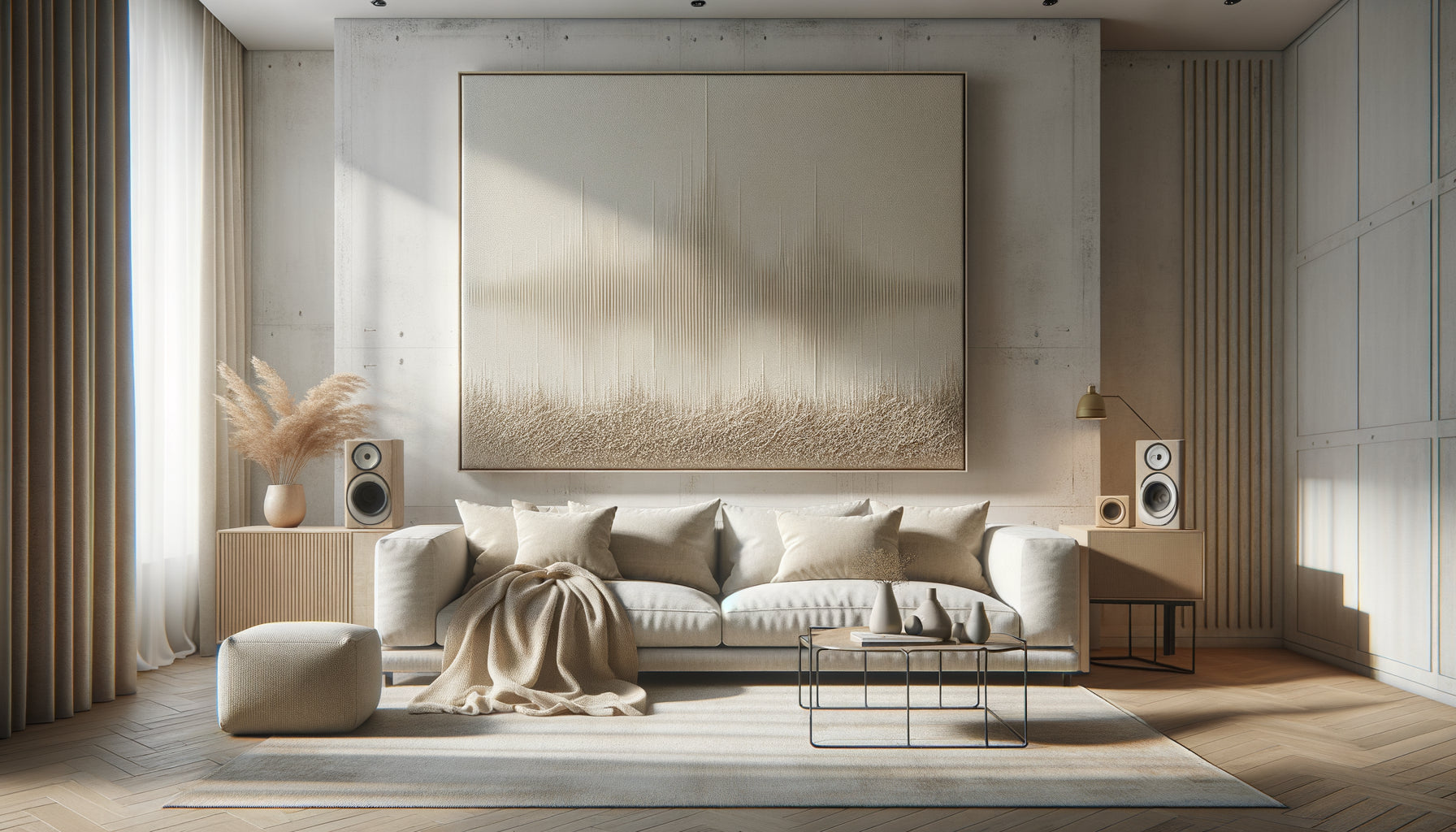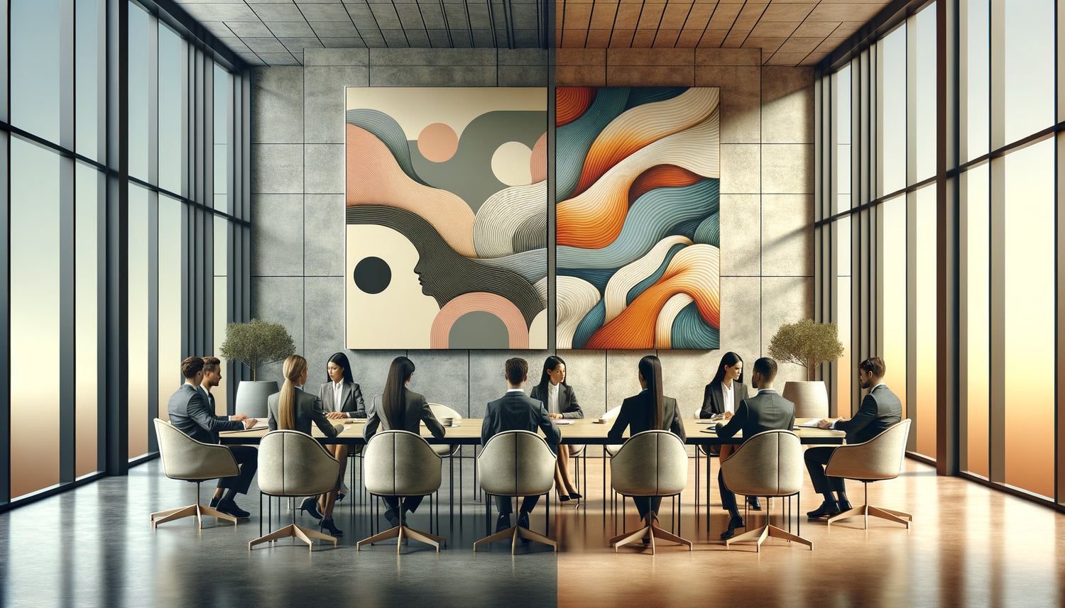
One day, while entering a meeting room in a Parisian law firm, I was struck by a paradox. The waiting hallway overflowed with life: an explosion of vibrant colors, expressive portraits, bold compositions that immediately captivated the eye. But once the door was crossed, the atmosphere changed radically. On the walls of the meeting room stood three minimalist photographs of misty landscapes, almost abstract in their sobriety.
Here's what this strategic distinction brings: maximum concentration during important decisions, a visual hierarchy that supports the objectives of each space, and a user experience perfectly calibrated to the psychological needs of each moment.
How many meetings have you experienced where participants seemed elsewhere? Where the thread of discussion got lost in endless digressions? Where glances wandered away from the agenda? This mental dispersion is costly: in time, efficiency, and poor decisions. What if the visual environment played a more crucial role than we imagine in this equation?
Rest assured: creating workspaces that truly work isn't magic, but an understanding of cognitive psychology and the impact of artwork on our attentional abilities. By adapting your artistic choices to the specific function of each space, you transform your walls into allies of collective performance.
After twelve years spent designing workplaces for consulting firms, notarial offices, and general management teams, I can tell you one thing: choosing a painting is never neutral. It shapes behaviors, influences emotional states, and determines the quality of human interactions that take place in the space.
The science of attention: why your brain can't handle everything
Our attentional system works like a spotlight with limited battery power. Each visual stimulus consumes a portion of this precious resource. In a meeting room, the goal is clear: focus 100% of this cognitive energy on exchanges, documents, and decisions to be made. Any visual element that captures attention becomes a direct competitor of this objective.
Neuroscience teaches us that our brain processes visual information in two distinct modes. The bottom-up mode is automatic and involuntary: strong contrast, bright color, complex pattern capture our gaze without us consciously deciding it. The top-down mode, on the other hand, requires a voluntary effort to maintain attention on a specific task. In a meeting room, every overly stimulating painting forces the brain to spend energy resisting distraction.
I measured this effect during a project for a law firm specializing in business law. After replacing a series of brightly colored abstract paintings with black and white architectural photographs, the managing partner told me that meetings ended an average of 15 minutes earlier, with more accurate records. The change seemed minimal, but its impact was measurable.
Waiting areas: orchestrating calm and positive distraction
Conversely, a waiting area responds to radically different psychological needs. Here, distraction is not the enemy: it's a therapeutic ally that transforms anxiety into curiosity, impatience into contemplation. People who are waiting do not have a cognitively demanding task to perform. Their minds wander naturally, and without visual anchors, they tend to ruminate or amplify stress.
Paintings in a waiting area play the role of passive emotional regulators. A narrative scene invites you to imagine a story. A colorful landscape evokes memories of travel. A dynamic abstract composition stimulates aesthetic reflection. All these mental processes divert attention from the clock and the wait itself.
In a medical office I decorated in Lyon, we installed a series of paintings depicting Japanese gardens, Provençal markets, and Mediterranean alleyways. Patients spontaneously reported that the wait seemed shorter. Administrative staff noted less tension and impatience. The artworks created a time bubble where subjective time pleasantly dilated.
The paradox of controlled stimulation
There is a subtle balance to be found. A waiting area should not become an overloaded art gallery that generates visual fatigue. Paintings should be interesting enough to capture attention, but not to the point of creating excessive stimulation. The goal is active calm, not overstimulation.
I generally recommend works that combine recognizable figurative elements with a harmonious palette. Natural landscapes work remarkably well: they activate what environmental psychologists call attention restoration, a process where contemplation of natural scenes regenerates our tired cognitive abilities.

The visual criteria that make all the difference
Specifically, how do you distinguish a painting suitable for a meeting room from a work intended for a waiting area? Several visual parameters come into play, and understanding them radically transforms your design choices.
The complexity of the composition is the first criterion. A meeting room calls for streamlined compositions: simple lines, generous negative spaces, clear visual hierarchy. A waiting area tolerates and even benefits from richer compositions: details to discover, superposition of elements, narrative depth. The eye can wander through it without quickly exhausting the subject.
Chromatic saturation plays a fundamental role. Bright and saturated colors stimulate the sympathetic nervous system: they activate, energize, but also distract. In a meeting room, prioritize desaturated palettes, neutral tones, monochromatic harmonies. In a waiting area, dare to use more present colors, provided they remain harmonious and do not create an aggressive contrast.
The narrative content deserves particular attention. A painting that tells a story, shows characters in action or evokes a recognizable scene naturally captures our attention. Our brains are wired to detect faces, interpret emotions, anticipate actions. These works are perfect for a waiting area where this attentional capture is desirable. Conversely, a meeting room benefits from welcoming non-narrative works: abstract geometry, minimal landscapes, monochrome textures.
Scale and strategic positioning
The size and placement of paintings amplify or attenuate their distracting impact. In a meeting room, position the works out of the direct line of sight of seated participants. A painting facing the table becomes a permanent competitor for attention. Prefer side walls or the wall behind the main position, where the eye only rests during natural pauses.
In a waiting area, on the contrary, paintings should be immediately visible and accessible to the gaze. Place them at eye level of a seated person, in the natural line of sight. Vary the formats to create a visual rhythm that maintains interest without tiring.
When mistakes are costly: cases I have observed
I was urgently called to an accounting firm where partners complained about endless and unproductive meetings. Analyzing their main meeting room, I immediately identified the problem: a huge contemporary painting depicting a colorful crowd in motion, placed directly opposite the table. Each participant had this human kaleidoscope in their direct field of vision. It was impossible not to look at it during moments of reflection.
We replaced this artwork with a series of three photographs of mineral deserts, in shades of beige and gray. The effect was immediate. Participants reported an increased ability to focus. Debates remained more structured. Decisions were made faster. The original painting found a second life in the reception area, where it perfectly fulfills its new function: to captivate and positively distract.
Conversely, I visited a dental clinic where the waiting room displayed monochrome reproductions of Gothic cathedrals. Technically flawless, aesthetically interesting, but emotionally unsuitable. These dark and austere images amplified patients' pre-existing anxiety. We replaced them with watercolors of Mediterranean gardens in soft colors. Patient feedback changed radically: the space was perceived as more welcoming, more soothing.

Compose your artistic strategy by space
The key to a successful layout lies in a differentiated and intentional approach. Each space in your professional environment deserves specific consideration of the role art will play there.
For your meeting rooms, establish a strict visual charter: prioritize monochromes, abstract landscapes, minimal geometric compositions, and clean architectural photographs. Limit the number of artworks: one to three maximum per space. Opt for medium formats rather than overwhelming large formats. Choose simple frames that do not create additional visual competition.
For your waiting areas, allow yourself more creative freedom: figurative works with characters or scenes from life, harmonious color palettes, compositions richer in detail, thematic series that create a narrative from wall to wall. Vary the formats to energize the space. Don't hesitate to create small galleries that invite progressive discovery.
Between these two poles, your hallways, circulation areas and break rooms occupy an intermediate territory. They tolerate more dynamic works than meeting rooms, but must avoid overstimulation. Think transition rather than destination: artworks that accompany movement without freezing it.
Brand identity as a guiding thread
This functional differentiation does not mean aesthetic inconsistency. Your selection of artworks should reflect a unified visual identity while adapting to the specific needs of each space. Define a general color palette that dialogues with your graphic chart. Choose a dominant artistic style that expresses your professional values. Then modulate intensity, complexity and narrative content according to the function of the space.
A corporate law firm might opt for a minimalist contemporary line, ultra-pure for meeting rooms and more colorful for waiting areas. A medical practice could choose a nature and well-being theme, expressed in zen compositions for consultation rooms and more vibrant landscapes for public areas.
Transform your professional spaces into true performance tools
Discover our exclusive collection of wall art for law firms that combines aesthetic excellence and cognitive functionality, designed to support concentration and serenity according to your spaces.
Visualize the transformation
Imagine your next strategic meeting. You enter a clean space where nothing distracts from the clarity of your thoughts. The walls welcome works that soothe without captivating, that exist without imposing. Your attention remains exactly where it should be: on the issues, the figures, the decisions, the faces of your colleagues. Time no longer disperses in visual digressions. Conclusions emerge more naturally.
Now imagine your clients in your waiting area. Their gaze rests on a painting depicting a sunny garden. For a few moments, they are no longer in this firm that may intimidate them, but in this landscape that soothes them. Anxiety decreases, subjective time stretches pleasantly. When you receive them, their emotional state is more receptive, more relaxed.
This transformation does not require an architectural revolution. It simply requires a refined understanding of the psychology of spaces and intentional artistic choices. Start by auditing your current paintings: are they in the right place? Do they serve the right function? Then, space by space, realign your works of art with the cognitive and emotional goals of each location.
The power of paintings on our behaviors is immense and underestimated. By mastering it consciously, you transform your walls into silent allies of your professional excellence.
Frequently Asked Questions
Can I use the same paintings everywhere to create a visual consistency?
Aesthetic consistency is important, but it doesn't mean absolute uniformity. Think of a stylistic family declined in different intensities. You can perfectly choose works by the same artist or from the same artistic movement, but selecting streamlined compositions for meeting rooms and richer versions for waiting areas. For example, if you like seascapes, opt for minimalist horizon-ocean views in meeting rooms, and more animated port scenes in waiting areas. Consistency comes from style and palette, functionality comes from compositional complexity.
How to tell if a painting is too distracting for a meeting room?
Do this simple test: sit in the place of a participant and look at the painting for 30 seconds. If your gaze continues to explore the work, discovering new details, following dynamic lines or interpreting narrative elements, this painting is too captivating for this space. A painting suitable for a meeting room is read in a few seconds: you appreciate it, then your attention is naturally freed. Another indicator: if you can easily describe a story or identify characters in the work, it probably contains too many narrative elements for a concentration area. Prioritize compositions where your gaze quickly finds visual rest.
Are abstract paintings always preferable to figurative works in meeting rooms?
Not necessarily, but with an important nuance. The determining criterion is not abstract versus figurative, but simple versus complex. A figurative photograph of minimalist architecture or a desert can be perfectly suited for a meeting room, as it presents few elements to process cognitively. Conversely, some very dynamic abstract works with multiple bright colors and conflicting shapes create intense visual stimulation that distracts just as much as a complex figurative scene. Look for compositional and chromatic simplicity above all. A streamlined figurative landscape in neutral tones will always surpass a lush and multicolored abstraction for a meeting room. The eye must be able to quickly find visual stability.