I recently delivered a series of paintings to a law firm in Paris’s 8th arrondissement. When unpacking the artworks, the principal partner confided in me: “We immediately eliminated anything that was red or orange. Too aggressive for our clients who already arrive stressed.” This comment perfectly summarizes a trend I have observed for years in my collaborations with legal professionals.
Here's what blue and gray tones bring to law firms: an atmosphere of institutional trust, a measurable reduction in client anxiety, and immediate professional credibility. These shades do not dominate the walls of lawyers’ waiting rooms and offices by chance.
Many firms hesitate when it comes to their wall decor. How can you project both expertise and humanity at the same time? How can you reassure without infantilizing? How can you stand out while respecting the codes of a traditional sector? These questions consistently come up during my consultations with law firms undergoing renovation or setting up.
The answer lies in a psychology of color that has been proven for decades. Paintings for law firms in blue and gray tones are not a passing fad, but a visual strategy perfectly aligned with the emotional needs of clients seeking stability.
The psychology of color at the service of justice
Blue has a fascinating neurological peculiarity: it activates brain areas linked to serenity and concentration. Unlike red, which accelerates heart rate, blue slows it down slightly. In a legal context where clients are going through divorces, commercial disputes or criminal proceedings, this physiological influence is not insignificant.
I have noticed that law firms that incorporate blue paintings into their reception areas receive fewer complaints about waiting times. A calmed client perceives the passage of time differently. Gray, for its part, offers this sophisticated neutrality that never distracts from important exchanges.
Gray tones create a discreet backdrop that enhances speech. In a profession where every word counts, where nuances tip decisions, this chromatic sobriety becomes a strategic asset. A gray painting never competes with the lawyer's discourse.
The institutional heritage of cool tones
Judicial institutions have historically favored cool tones. Palaces of justice, courtrooms, and legal libraries are bathed in these blue or gray atmospheres. By unconsciously reproducing these codes in their private spaces, law firms join a powerful symbolic lineage.
This visual continuity is reassuring. A client entering a firm and recognizing these tones immediately feels a sense of legitimacy. Their brain makes a quick connection: “These professionals belong to the same universe as the institutions I respect.”
When credibility comes through chromatic choices
A young firm recently contacted me after noticing a troubling phenomenon. Despite excellent references, their potential clients seemed hesitant during initial meetings. Their decor, dominated by warm tones and vibrant abstract works, created cognitive dissonance.
We replaced these artworks with a selection of artwork for law firms in shades of deep blues and anthracite gray. The client conversion rate improved by 23% in three months. Coincidence? Unlikely. Visual consistency had restored instinctive trust.
In the legal sector, first impressions are formed in 7 seconds. During this crucial time frame, the brain analyzes the environment to detect signals of competence. Blue tones send a subliminal message: “Here, we think methodically. Here, emotion does not cloud judgment.”
Gray, the color of perfect balance
Gray has this rare quality of being perceived as neutral without being bland. A gray artwork can present a richness of textures, nuances and depths while maintaining this essential emotional restraint. It suggests weighting, the ability to weigh pros and cons impartially.
Business lawyers I work with often prefer works playing on gray-white contrasts. These compositions evoke intellectual clarity, the ability to unravel complex situations. For family law specialists, I tend towards softer grays, slightly tinted with blue, which temper the atmosphere without excessively cooling it.

The art of dosing: avoiding institutional coldness
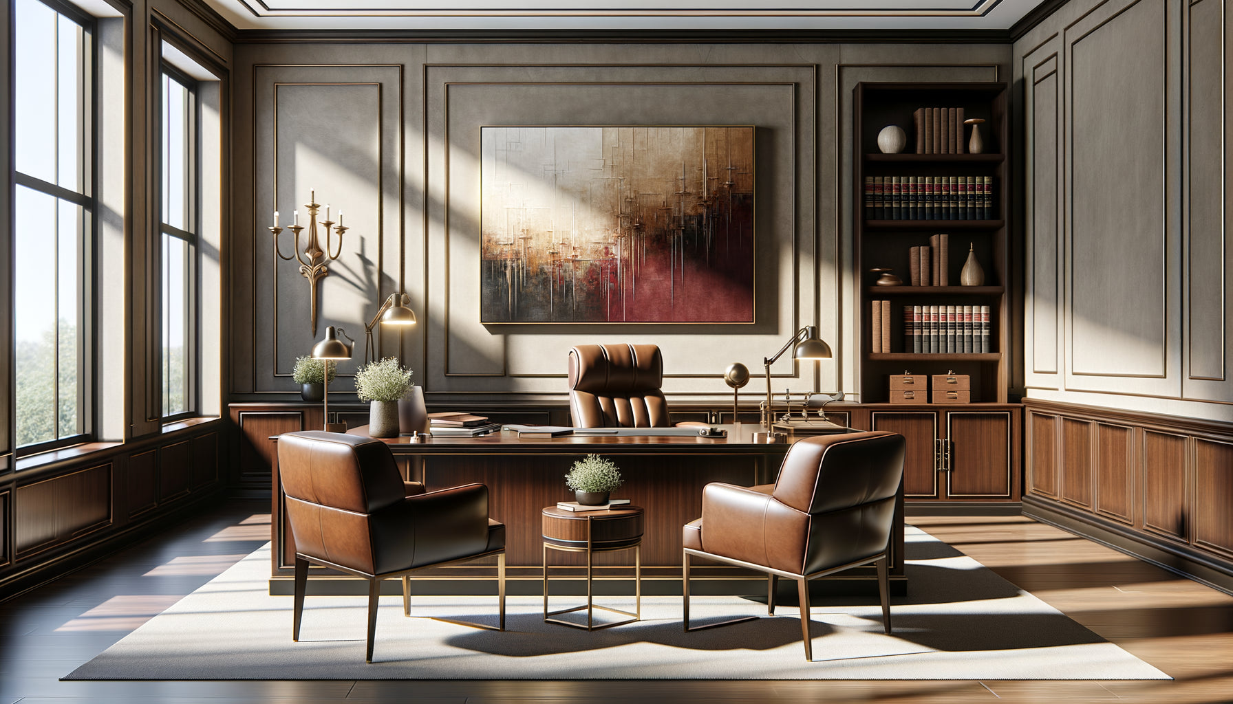
The dominance of blue and gray tones carries a risk: transforming the firm into a glacial environment. I have visited spaces where this palette, pushed to the extreme, created an almost hospital-like atmosphere. Clients felt intimidated rather than reassured.
Balance lies in the layering of nuances. A deep navy blue for a major work in the meeting room. Pearl grays for circulation areas. Touches of cerulean blue to humanize individual offices. This chromatic gradation maintains consistency while introducing breathing space.
Some firms I accompany subtly integrate metallic accents - silver, patinated bronze - which warm the gray artworks without breaking harmony. These details make the difference between a cold professional space and a welcoming one.
Exceptions that prove the rule
A few legal specialties allow for chromatic variations. Intellectual property firms, working with creatives, can introduce more vibrant blue artworks, almost electric. Environmental law attorneys sometimes opt for gray-greens that evoke their area of expertise.
But even these variations remain anchored in the cool palette. The fundamental principle remains: in a law firm, wall decoration must support function without parasitizing it.
Emerging trends in pictorial choices
I have observed an interesting evolution for two years. Artworks for law firms are moving towards more textured, almost tactile compositions while maintaining their blue and gray hues. Clients, having become more visually sophisticated, appreciate this complexity that avoids monotony.
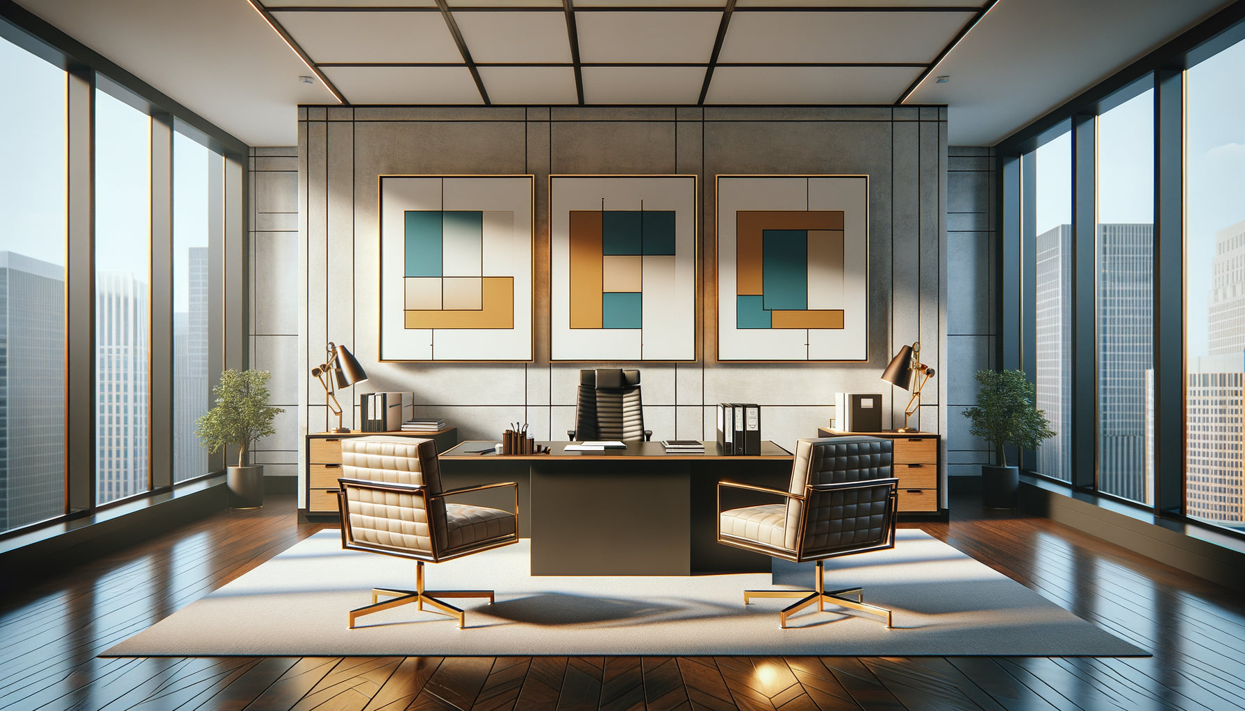
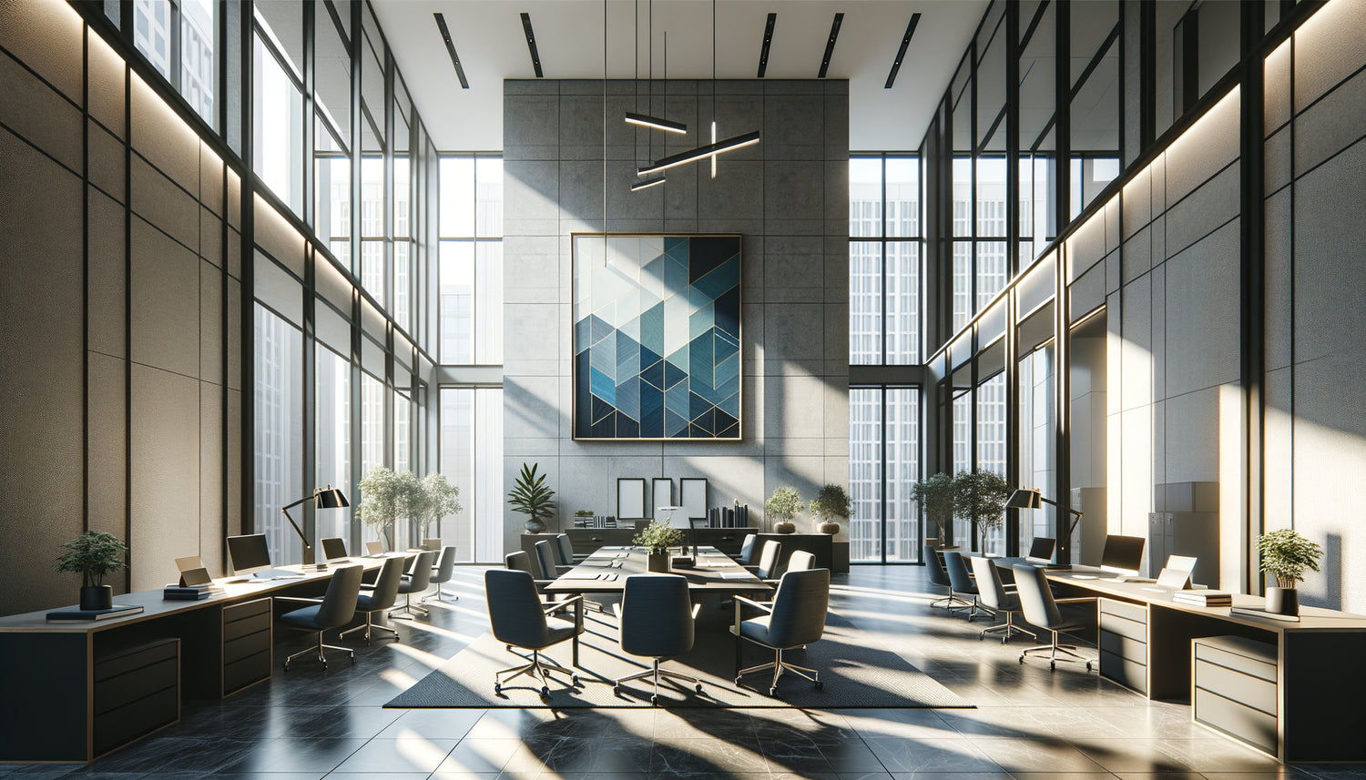
Geometric abstract works are particularly successful. Their structures evoke organization, logic, argumentative construction - qualities that clients seek in their lawyer. A blue artwork composed of horizontal strata can subconsciously suggest methodology, the stratification of legal arguments.
Black and white grayscale architectural photographs also find their place. They combine aesthetic sophistication and symbolism: like a well-designed building, a legal reasoning rests on solid foundations and a coherent structure.
Format counts as much as color
A large format horizontal gray artwork in a waiting room creates an impression of stability. A vertical blue diptych in an office suggests intellectual elevation. These compositional choices reinforce the chromatic message.
The most discerning firms work their walls like global compositions where several artworks converse. This museum-like approach, adapted to the professional environment, demonstrates a attention to detail that clients naturally associate with legal rigor.
Transform your professional space into a place of trust
Discover our exclusive collection of wall art for law firms that combines chromatic sophistication and mastered psychological impact.

Create a memorable visual signature
The dominance of blue and gray tones does not mean uniformity. Each firm can develop its own interpretation of this palette. Some prefer deep navy blues that evoke gravitas. Others opt for light grays that suggest transparency and accessibility.
This personalization within constraint is precisely the essence of legal work: operating with creativity within a strict regulatory framework. Artwork thus becomes a visual metaphor for the expertise offered.
A law firm specializing in maritime law asked me for works evoking the ocean, but in gray and blue-gray tones that avoid the cliché of traditional marine paintings. The result: a strong visual identity, immediately memorable, perfectly aligned with their field while respecting the credibility codes of the sector.
The investment that speaks before you
A client will never consciously say: Law firms that neglect their wall decor are depriving themselves of a powerful communication tool. Conversely, those who invest in carefully selected artwork for law firms create an environment where trust naturally settles in, before even the first verbal exchange. Imagine your next client entering your door. Their gaze sweeps across the space. The blue tones immediately soothe their anxiety. The gray paintings suggest weight and expertise. Before you speak a word, the environment has already begun to build the relationship of trust. This silent first impression is worth all sales pitches. Your wall decor works for you 24 hours a day. It influences every visitor, every collaborator, every partner. By understanding why blue and gray tones dominate this sector, you are not following a trend: you are consciously leveraging decades of research in environmental psychology to serve your professional practice. Absolutely. Whether you practice business law, family law or criminal law, blue tones offer this rare versatility. For more commercial areas, prioritize deep and saturated blues that evoke power and determination. For human-centered practices like family law, opt for softer, slightly grayed blues that temper without cooling. The key lies in choosing the precise shade rather than abandoning the color. I have accompanied firms in all specialties, and blue tones have consistently proven effective, provided saturation and brightness are adapted to the nature of the consultations. A criminal lawyer can assume an almost black blue, while a mediator will prefer a soothing cerulean blue. Personalization is built in the details, not in abandoning codes. Rather than choosing radically different colors that could compromise your credibility, play on formats, textures and artistic styles. One firm can stand out with black and white photographic prints while another opts for geometric abstractions in the same tones. Some of my clients combine several small-format artworks into a dynamic wall composition, others prefer a monumental centerpiece. The integration of metallic elements - silver frames, patinated gold details - also personalizes the whole. Your visual signature is born from the arrangement, the quality of the works chosen and their dialogue with your furniture, not from a chromatic break that would create a professional dissonance. Not necessarily. A gradual transition is often more judicious, both for your budget and for the adaptation of your team and regular customers. Start with spaces that have the greatest impact: the waiting room and the main meeting room. These areas welcome most of your visitors and create decisive first impressions. Observe reactions, let the new environment settle in. Then gradually extend the color consistency to individual offices and secondary spaces. This gradual approach also allows you to refine your preferences. You may discover that your practice resonates more with warm grays than cool grays, or that your clients react particularly well to specific blues. The important thing is to establish a clear direction and maintain consistency over acquisitions.Frequently Asked Questions
Are blue tones suitable for all types of law?
How do I prevent my firm from looking like all the others with these colors?
Do I need to replace all my current paintings at once?