I spent twelve years creating visual identities for law firms in London, Paris and Geneva. In each project, the same tension: how to project authority and modernity without falling into institutional coldness? The answer is rarely found in corporate decoration catalogs. It emerges when you understand that art is not an accessory, but a strategic language that speaks before you even open your mouth.
Here's what a mastered artistic style brings to an international business law firm: immediate credibility with wealthy clients, subtle differentiation from competitors, and an environment that stimulates complex negotiations. You don't need to transform your offices into a contemporary art gallery. Three consistent aesthetic choices are enough to create a lasting impression.
The problem? Most firms opt for generic reproductions of « safe » abstract art or dusty legal engravings. The result: spaces that look like all the others, where neither partners nor clients feel truly inspired. Your walls become invisible, when they could tell a story of vision and excellence.
The good news: you don't need to be an experienced collector. You just need to understand which artistic movements resonate with the values of international business law. I will show you the styles that really work in these demanding environments, those I have seen transform impersonal waiting rooms into memorable spaces.
Geometric minimalism: the visual grammar of precision
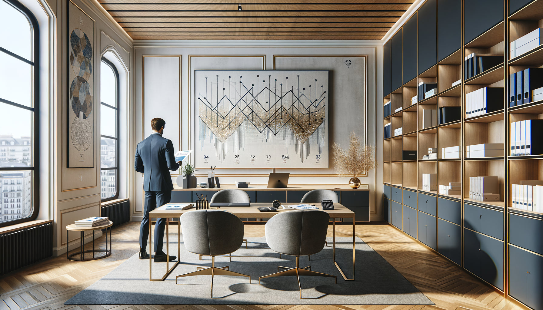
When a partner asked me to rethink his firm near the London Stock Exchange, he wanted « something that breathes rigor without being austere ». I immediately thought of the masters of geometric minimalism. This artistic style, born in the 1960s, is based on clean shapes, sharp lines and a limited palette. It visually translates what a business lawyer does: structure the complex, clarify the ambiguous.
Geometric minimalism works because it communicates order without rigidity. A composition of colored rectangles by Josef Albers or Mondrian-inspired orthogonal grids create a soothing mathematical harmony. In a meeting room where multi-million dollar acquisitions are negotiated, this aesthetic subconsciously reinforces the idea that everything is under control.
Minimalist works offer another strategic advantage: they never distract. Unlike figurative landscapes or portraits, they offer intelligent visual rest. Your international clients, whether they come from Tokyo or São Paulo, intuitively understand them. No cultural reference to decode, just a feeling of universal clarity.
How to integrate it without a false note
Choose a maximum of three artworks per space, in generous formats. A geometric triptych behind the reception creates more impact than six small scattered prints. Prioritize shades that dialogue with your graphic charter: if your logo plays on navy blue and silver, opt for compositions using these tones. Art then becomes a coherent extension of your identity.
Lyrical abstraction: when emotion serves strategy
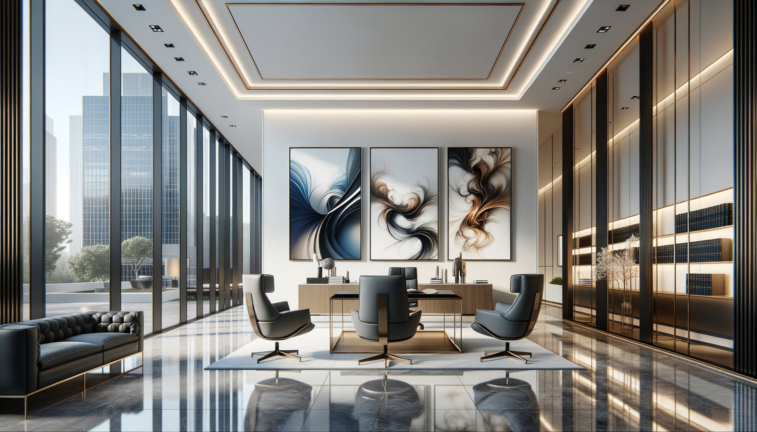
You might think that emotion has no place in a law firm. Wrong. I have found that clients seek technical excellence AND relational intelligence. Lyrical abstraction – those canvases where colors and gestures are released without representing reality – humanizes your spaces without weakening them.
This artistic style, embodied by masters like Rothko or de Kooning, works differently from minimalism. Where geometry structures, lyrical abstraction inspires deep reflection. A large canvas with shades of superimposed blues in your main office becomes a meditative focal point. It suggests that behind legal technique, there is a nuanced understanding of human issues.
I installed a lyrical abstract work in the waiting room of a Parisian law firm specializing in mergers and acquisitions. The partners reported that several clients had spontaneously mentioned the “different atmosphere” of the place. Abstract art had created a psychological transition space: visitors arrived tense, left with the feeling of having been understood beyond the contract.
Avoid the pitfalls of abstraction
Beware of works that are too gestural or aggressive. The chaotic splashes of some expressionist abstract artists can generate unconscious anxiety. Prioritize contemplative abstractions: harmonious color fields, translucent superimpositions, compositions that invite calm rather than agitation. In an international law firm, abstract art should suggest mastery, not disorder.

Architectural photography: a mirror of ambition
An artistic style often overlooked, yet remarkably effective: contemporary architectural photography. Not tourist postcards, but graphic compositions of skyscrapers, bridges, urban structures captured with precision. This choice makes sense for an international law firm that supports developers, investors and multinationals.
These photographs function as visual metaphors for your business. A black and white image of a glass and steel facade in Manhattan evokes construction, solidity, long-term vision. It resonates with clients who are building commercial empires. I have seen partners choose photographs of suspension bridges for their negotiation rooms: the perfect symbol of the ability to connect two shores, to create passages where there was only emptiness.
Architectural photography also has a practical advantage: it grounds your firm in contemporary reality. Unlike historical styles, it affirms that you are looking towards the future. A coherent portfolio of six to eight large-format photographs, arranged in the main hallway, creates a visual journey that tells the story of global urban and economic transformation.
Why avoid certain prestigious styles
Let's be frank about artistic styles that seem obvious but create dissonances. Academic classicism – those portraits of aristocrats or historical scenes – dates your spaces. It suggests that you are looking back rather than anticipating international legal changes. Exception: if your firm has existed for 150 years and deliberately cultivates this historical continuity.
Narrative figurative art poses another problem. A lively street scene or an expressive portrait captures attention, but diverts it from strategic discussions. In a meeting room where a cross-border operation worth eight figures is being decided, you want your clients to focus on your arguments, not the meaning of the canvas behind you.
Even provocative contemporary art – conceptual installations, politically engaged works – risks alienating some clients. An international business law firm welcomes leaders with diverse cultural sensitivities. The chosen artistic style must unify without ever dividing. Sophisticated neutrality always beats divisive originality.

Creating consistency: art as a narrative system
True sophistication does not come from accumulating expensive works, but from building a coherent aesthetic system. I always encourage firms to define a guiding principle: either pure geometry, contemplative abstraction, or architectural photography. Mixing the three dilutes the message.
Imagine choosing geometric minimalism as your primary artistic style. Your public spaces – reception, waiting rooms, hallways – then feature variations on this theme: Carl Andre compositions in the entrance, Sol LeWitt's colorful grids in the corridors, François Morellet’s relief structures in the main conference room. This repetition creates a memorable visual signature.
Individual offices can allow for more personalization, but still within the defined palette. A partner may prefer a warmer lyrical abstraction, as long as it respects the overall tones and spirit. This approach transforms your firm into a thoughtful spatial experience, where every detail reinforces your positioning.
The mistake of eclectic collections
I have audited firms where each partner had chosen “their” work, creating a visually incoherent patchwork. An impressionistic landscape sits alongside a medieval engraving and a pop art photograph. Result: no artistic style prevails, no identity emerges. Your visitors remember nothing. Worse, this dispersion suggests a lack of unified strategic vision – exactly what you do not want to communicate.
Transform your professional spaces into true ambassadors of your excellence
Discover our exclusive collection of wall art for law firms that combines aesthetic rigor and international sophistication.
Format and scale: decisions as strategic as style
A technical detail that few firms master: the dimension of artworks counts as much as their artistic style. A small watercolor, however beautiful it may be, disappears in a meeting room with ceilings three meters high. It betrays hesitation, a shyness incompatible with your international stature.
For reception areas and main rooms, aim for imposing formats: minimum 120 x 150 cm for a centerpiece, ideally diptychs or triptychs reaching 2 to 3 meters in total width. These dimensions assert confidence and ambition. They also create architectural focal points that structure the space without requiring heavy renovation.
In individual offices, adapt the scale: 80 x 100 cm is sufficient to create presence without overwhelming. Corridors accept vertical formats (60 x 120 cm) that accompany movement. Always think proportion: the artwork should occupy about two-thirds of the width of the wall it adorns, never less than half.
Investing intelligently: limited editions and emerging artists
The question of budget always arises. Good news: a consistent artistic style doesn't require original Rothkos. Limited edition, signed and numbered prints by recognized contemporary artists offer authenticity and quality at controlled prices. A Ellsworth Kelly screenprint or a Frank Stella lithograph costs fifteen times less than an original, while retaining true artistic value.
I also encourage firms to support emerging international caliber artists. The Beaux-Arts schools of Paris, London or Berlin train exceptional talents whose current works are accessible. In five years, when these artists are exhibited in major galleries, you will own pieces that have gained in value. And you will have demonstrated a form of vision and boldness that your clients appreciate.
The decisive criterion? The quality of execution and consistency with your guiding line, never the celebrity of the name. An impeccable geometric composition by an unknown artist is better than a mediocre lithograph by a famous master. Your clients do not check signatures; they feel the overall quality of the environment.
Art as a strategic conversation tool
One last aspect I have observed in the most sophisticated firms: they use their artistic style as an intelligent icebreaker. A large geometric abstraction in the meeting room naturally becomes a topic of conversation while coffee is served. These thirty seconds of informal exchange about art relax the atmosphere before addressing complex contractual clauses.
Some partners even prepare a brief anecdote about the main work in their office: why this particular artistic style, what the artist was trying to express. Not a lecture, just two sentences that humanize the environment. “This Vasarely composition explores the perception of movement in stability – much like our approach to international business law: creating structures that allow agility.” Simple, memorable, strategic.
Art then becomes an extension of your expertise: you not only understand the law, but you master the cultural codes that facilitate international business relationships. It is this global sophistication that your most demanding clients seek.
Imagine your next client stepping through the door of your firm. Before you even exchange a word, the walls have already communicated rigor, vision and excellence. This first impression will never fade, even after hours of technical negotiation. The artistic style you choose today shapes the reputation you build for tomorrow. Start by defining your guiding line: geometric, abstract or architectural. Then select three consistent works for your public spaces. This decision will take you a day, but it will positively influence every professional interaction over the next ten years.
Frequently asked questions about artistic styles in business law firms
Should you prioritize French artists for a Parisian office or adopt a more international approach?
Excellent question that touches on your positioning. For an international business law firm, I recommend a deliberately cosmopolitan approach to artist selection. Mix creators from the Americas, Europe and Asia working in the same artistic style – for example, three geometric abstractions by an American, a Japanese and a German. This geographic diversity reflects your international practice and avoids the pitfall of cultural nationalism. Your clients from Singapore or New York will appreciate this openness. That said, a few French touches remain relevant in secondary spaces to anchor your local presence. The ideal balance: 70% international artists in public areas, 30% local talent in private zones. This distribution affirms your dual legitimacy.
How to choose between several artistic styles when the firm's partners have different tastes?
This is the classic challenge of collective decisions. My proven method: organize a session where you present not individual works, but three complete scenarios – one for each major artistic style (geometric minimalism, lyrical abstraction, architectural photography). Show how each option would unfold throughout the firm with concrete visuals. This approach transforms the sterile discussion “I like it / I don’t like it” into strategic reflection: which style best suits our target clients, our positioning, our internal culture? Generally, a consensus emerges around the style that resonates with the firm's professional identity. If no agreement appears, opt for geometric minimalism: it is the most unifying artistic style, one that rarely displeases even if it does not excite all partners. Better a sober consistency than an eclecticism that superficially satisfies everyone.
Should we change the artworks regularly or build a permanent collection?
This question reveals two opposing philosophies, both legitimate. Firms that build a permanent collection create a strong and lasting visual signature. Their regular clients find familiar landmarks, and art becomes an integral part of the place's identity. This is the approach I prefer: invest in quality pieces that you will keep for at least ten to fifteen years. The artistic style chosen should therefore be timeless – another reason to favor geometric minimalism or contemplative abstraction over fleeting trends. An interesting alternative: keep your major works in strategic spaces (reception, large meeting room) but provide a rotation system for secondary hallways and offices. This allows you to refresh the environment every eighteen months without diluting your main visual identity. Absolutely avoid too frequent rotations which create instability and suggest a lack of conviction – quite the opposite of what an international business law firm should embody.