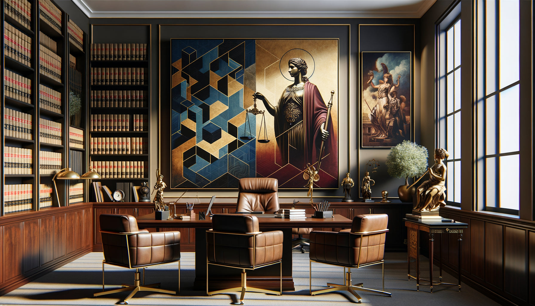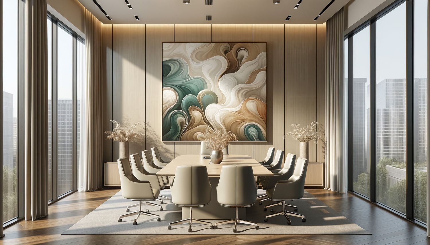
I learned this lesson seven years ago, during a consultation that almost went disastrously wrong. A merger and acquisition consulting firm had just moved into brand new offices on Avenue Montaigne. Everything was perfect: designer furniture, carefully considered lighting, an unobstructed view. Except that during the first negotiation with an Asian client, he froze in front of the immense blood-red abstract canvas that dominated the meeting room. The contract was signed elsewhere. Since then, I have been assisting executives, lawyers and consultants in choosing their professional artworks, and I can tell you that a well-chosen artwork is never insignificant.
Here's what a well-chosen artwork brings to your meeting room: it instantly positions your level of professional requirements, it creates a neutral ground that soothes the natural tensions of negotiations, and it becomes that visual anchor that transforms a cold space into an authentic place of dialogue.
You know that uncomfortable moment when your clients enter your meeting room and scan the space with their eyes? Those first three seconds are decisive. An unsuitable artwork – too personal, too provocative, too childish – creates a subliminal discomfort that contaminates the entire commercial relationship. Conversely, an appropriate canvas immediately establishes a framework of trust.
The good news? Recognizing an appropriate artwork does not require a doctorate in art history. It just takes understanding a few principles that I have refined over hundreds of installations. You will discover how to evaluate a work from the perspective of spatial psychology, non-verbal communication and controlled emotional impact.
The three looks test: your first selection filter
Even before talking about style or color, I submit each potential artwork to the three looks test. First impression: what do you feel in the first five seconds? A suitable artwork for a meeting room with clients should arouse interest without provoking a visceral negative reaction. If you or a colleague frown, move on.
Second look, after thirty seconds: does the artwork reveal enough depth to sustain attention without becoming obsessive? The best pieces for professional spaces possess this paradoxical quality: they are gradually discovered while remaining in the background. An abstract landscape with subtle nuances, a balanced geometric composition, a refined architectural photograph.
Third look, imagined after the tenth meeting: does the artwork retain its power without tiring? An appropriate canvas ages well. It doesn't follow a trend too strongly, it doesn’t impose a single message. It functions as a discreet companion to your professional exchanges.
The rule of cultural consensus
A work of art intended for a meeting room transcends cultures. I have learned to avoid overly marked symbols: obvious religious references, flags, controversial historical figures. A nature scene, a geometric abstraction, a study of materials or lights speak a universal language. Recently, I installed a series of three canvases representing mineral textures for an international law firm. Result: each client, whether from Tokyo, Dubai or New York, finds in these compositions an accessible serenity.
The psychology of colors in a professional context
The colors of a work of art are never neutral in a meeting room. They act on the emotional state of your interlocutors unconsciously but measurably. Deep blues and anthracite grays instill calm and concentration – perfect for contractual negotiations or audits. Nuanced greens, from sage to forest, create a balance between vitality and stability, ideal for creative or strategic meetings.
Beware of bright reds and oranges in a work intended for this use: these shades increase blood pressure and can unconsciously put your clients on the defensive. I do not systematically rule them out, but I recommend them only as minor accents in a composition dominated by more soothing tones.
Beiges, creams and off-whites work remarkably well in appropriate works. They bring brightness and breath without imposing a particular emotion. An abstract canvas playing on variations of whites and textures becomes an amplifier of natural light, particularly valuable in windowless meeting rooms.
Chromatic balance with your visual identity
A common mistake: choosing a work of art that conflicts with your graphic chart. If your logo and communication supports use specific colors, the artwork must dialogue harmoniously with this universe without duplicating it. For a firm whose identity is based on royal blue, I selected an abstract composition mixing grays, whites and touches of copper – an elegant complementarity that reinforces coherence without saturating the space.

Format and proportion: the art of visual anchoring
The format of a suitable artwork is never random. In a standard meeting room (15 to 25 m²), I prefer artworks between 80 and 120 cm wide. Smaller, the impact is diluted. Larger, the work dominates and distracts from the subject of the meeting. The goal? To create a secondary focal point that structures the space without stealing attention.
Horizontal formats work better than vertical ones in most configurations. They naturally accompany the movement of the gaze during exchanges around a table. A panoramic composition (2:1 or 3:1 ratio) creates a feeling of openness particularly appreciated in confined spaces.
For large boardrooms (over 40 m²), diptychs or triptychs offer an elegant solution. They provide the necessary presence while maintaining visual modularity. I recently installed a triptych depicting abstract marine landscapes in a 50 m² room: the artwork structures the main wall without overwhelming it.
When the subject of the artwork becomes strategic
The narrative content of an artwork deserves particular attention. Suitable subjects for a meeting room share one characteristic: they suggest without imposing. Abstract landscapes, architectural studies, geometric compositions, photographs of natural materials (wood, stone, water) work universally well.
I systematically avoid portraits (too personal, creating a feeling of observation), figurative scenes that are too narrative (which trigger divergent interpretations), and textual works with slogans (too prescriptive). One exception: minimalist typography quotes can work if they are short, consensual, and graphically integrated into a clean composition.
Works depicting paths, horizons, bridges or doors have a subtle metaphorical dimension that resonates positively in a professional context. They evoke movement, progress, openness – values you want to associate with your client relationships. Without being literal, this discreet symbolism works deeply.
The question of the artist and signature
Should you favor works by recognized artists? My experience says no, not necessarily. What matters is the quality of execution and appropriation to the context. A high-quality digital reproduction, perfectly framed, of an architectural photograph can be infinitely more appropriate than a poorly chosen original painting. Authenticity counts less than coherence.
That said, investing in an original artwork or limited edition sends a signal of value and singularity. It is a strategic choice for high-end firms who want to differentiate themselves. In this case, prioritize emerging contemporary artists whose style matches your criteria: their rating is accessible and their creative freshness brings a distinctive touch.

Framing: The Detail That Changes Everything
An appropriate work of art can be ruined by an unsuitable frame. For a professional context, I systematically recommend subtle and contemporary frames: brushed aluminum, lacquered black or white wood, minimalist floating frames. Gildings, baroque moldings, rustic frames send overly marked stylistic signals.
Anti-reflective glass is a non-negotiable investment for a meeting room. There's nothing more annoying than a work transformed into a mirror by artificial or natural light. This technical finish allows the artwork to remain legible in all conditions, an essential criterion for a functional space.
The frame thickness should be proportional to the format of the work: between 2 and 4 cm for medium formats, up to 6 cm for large compositions. A frame that is too thin looks cheap, a frame that is too thick makes it look heavy. Visual balance is paramount.
Transform your meeting room into a space of trust and inspiration
Discover our exclusive collection of wall art for law firms that combines professional sophistication and mastered visual impact.
Visualize the transformation of your professional interactions
Imagine your next strategic meeting. Your clients walk through the door and discover an abstract composition with soothing tones, perfectly proportioned, which structures the space without cluttering it. Their shoulders relax imperceptibly. The ambient stress level decreases by a few notches. Exchanges flow more easily.
This is not magic, but the result of a thoughtful selection. An appropriate work of art works for you, silently, meeting after meeting. It becomes an integral part of your professional image, just like the quality of your welcome or the relevance of your analyses.
Start by evaluating your current space. Measure your main wall. Observe the light at different times. Identify the dominant colors of your furniture. Then apply the filters we have explored: test of three looks, psychology of color, adapted format, universal subject. You will see that an appropriate work reveals itself, as a matter of course.
Frequently Asked Questions about Choosing Artwork for Meeting Rooms
Should artwork in a meeting room be changed regularly?
No, and that's precisely one of the criteria for an appropriate work of art: its ability to endure without becoming tiresome. Unlike a reception area where rotation can create dynamism, a meeting room benefits from visual stability. Your regular clients subconsciously appreciate this consistency, which contributes to a sense of reliability. I recommend keeping a well-chosen artwork for at least five to seven years, unless there is a radical change in the company's identity or complete redesign. This permanence also allows the work to fully integrate into the collective memory of your team and partners. If you feel the need for change, it’s often a sign that the initial artwork was not appropriate enough – too trendy, too personal, or poorly sized.
What budget should be allocated for artwork suitable for a professional meeting room?
The budget varies considerably depending on your strategic choices, but the good news is that there’s no direct correlation between price and relevance. For a museum-quality reproduction with professional framing, expect to spend between 300 and 800 euros for a standard format (80-120 cm). If you opt for a limited edition signed by a photographer or contemporary artist, the budget ranges from 800 to 2500 euros. Original works by emerging artists start around 1500 euros and can reach 5000 to 8000 euros for large formats. My advice: consider this investment as an element of your visual communication, just like your website or brochures. A budget of 1000 to 1500 euros allows you to acquire a quality piece that will truly transform the atmosphere of your meeting room. Spread this investment over several months if necessary, but never sacrifice framing quality to save 200 euros.
How do you know if a work of art is too personal for a meeting room?
Apply the emotional consensus test: show a reproduction of the artwork to five people with different profiles (varying ages, cultures, sensitivities) without any particular context. If more than one person expresses a marked negative reaction or if interpretations diverge radically, the work is probably too personal. A work suitable for a meeting room should elicit reactions ranging from positive neutrality to moderate appreciation, never total indifference or excessive passion. Warning signs of a work that is too personal include: a very distinctive artistic style (raw hyperrealism, violent expressionism, disturbing surrealism), intimate or controversial themes (nude bodies, political scenes, explicit religious references), aggressive colors or compositions that monopolize attention. On the other hand, a work that moderately pleases almost everyone is exactly what you are looking for: it creates common ground without imposing a point of view, it soothes without putting to sleep, it enhances your space without diverting attention from the essential – your professional exchanges.