I've spent twenty years composing walls for discerning collectors. And I can tell you that one question comes up more often than any other in my workshop: how to hang a work of art above a bookcase without turning the whole thing into a visual chaos? This week alone, a client confessed to giving up on three beautiful paintings out of fear of overwhelming her wall of books. What a waste.
Here's what a well-chosen painting brings to your bookcase: it structures the whole by creating a soothing focal point, it dialogues with your books rather than competing with them, and it reveals your personality with an elegance that bindings alone cannot offer. The question isn't whether to add art, but which to choose.
The frustration is legitimate. You love your books, you love art, but when the two meet, your eye doesn’t know where to settle. The multicolored spines, the gilded titles, the varied formats already create an intense graphic symphony. How to add a work without provoking a visual cacophony?
Rest assured: there are simple, almost counterintuitive rules that I consistently apply. And contrary to popular belief, the choice between figurative and abstract doesn't depend on your personal taste, but on the visual density of your bookcase and the effect you want to create.
In this article, I reveal the method I use for my clients for two decades. You will know exactly what type of art to choose according to your configuration, and why some works transform a loaded bookcase into a harmonious composition when others create noise.
The paradox of the saturated library: why less detail creates more impact
Let's start with a fundamental principle that my clients always discover with astonishment: faced with a very loaded bookcase, abstract art becomes your best ally. It seems counterintuitive, doesn’t it? One would imagine that a beautiful landscape or portrait would bring life.
But here's what actually happens. Your books already tell a thousand stories. Each spine is an invitation to narrative. The titles, the authors, the covers create a rich visual story. When you add a figurative work above – a detailed landscape, a genre scene, an expressive portrait – you superimpose a sixth story on a wall that already contains five hundred.
The human eye naturally seeks to identify, name, tell. Faced with a bookcase topped with a figurative painting, your brain enters cognitive overload: it wants to read the titles, understand the organization, identify the subject of the painting, establish connections. It's exhausting.
Abstract art works differently. It doesn’t tell stories, it breathes. An abstract composition with clean shapes and harmonious colors creates what I call a visual rest area. Your gaze can finally stop, settle, without having to decipher or analyze. The painting becomes a space of silence in the chatter of books.
The 70/30 rule that I consistently apply
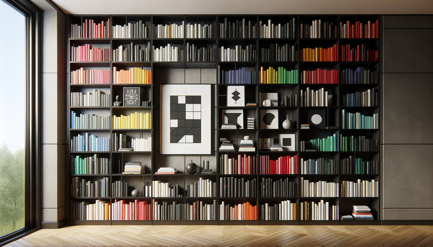
In my studio, I use a simple rule to evaluate the visual load of a wall: if your library occupies more than 70% of the visible surface and presents a wide variety of colors and formats, systematically prioritize minimalist abstract art. Not gestural and explosive abstract – that would add chaos – but rather compositions with blocks of color, soft geometric shapes, controlled contrasts.
I recently worked with a collector whose library contained more than 2000 volumes. A magnificent wall of knowledge, but visually saturated. We hung a large abstract canvas in earth tones and off-white, with only three organic forms. The result? The library immediately became more readable, more elegant. The painting did not add information; it created structure.
When figurative art becomes your best asset
Now, let's reverse the perspective. Because figurative art absolutely has its place near a library – provided you understand exactly when and how to use it.
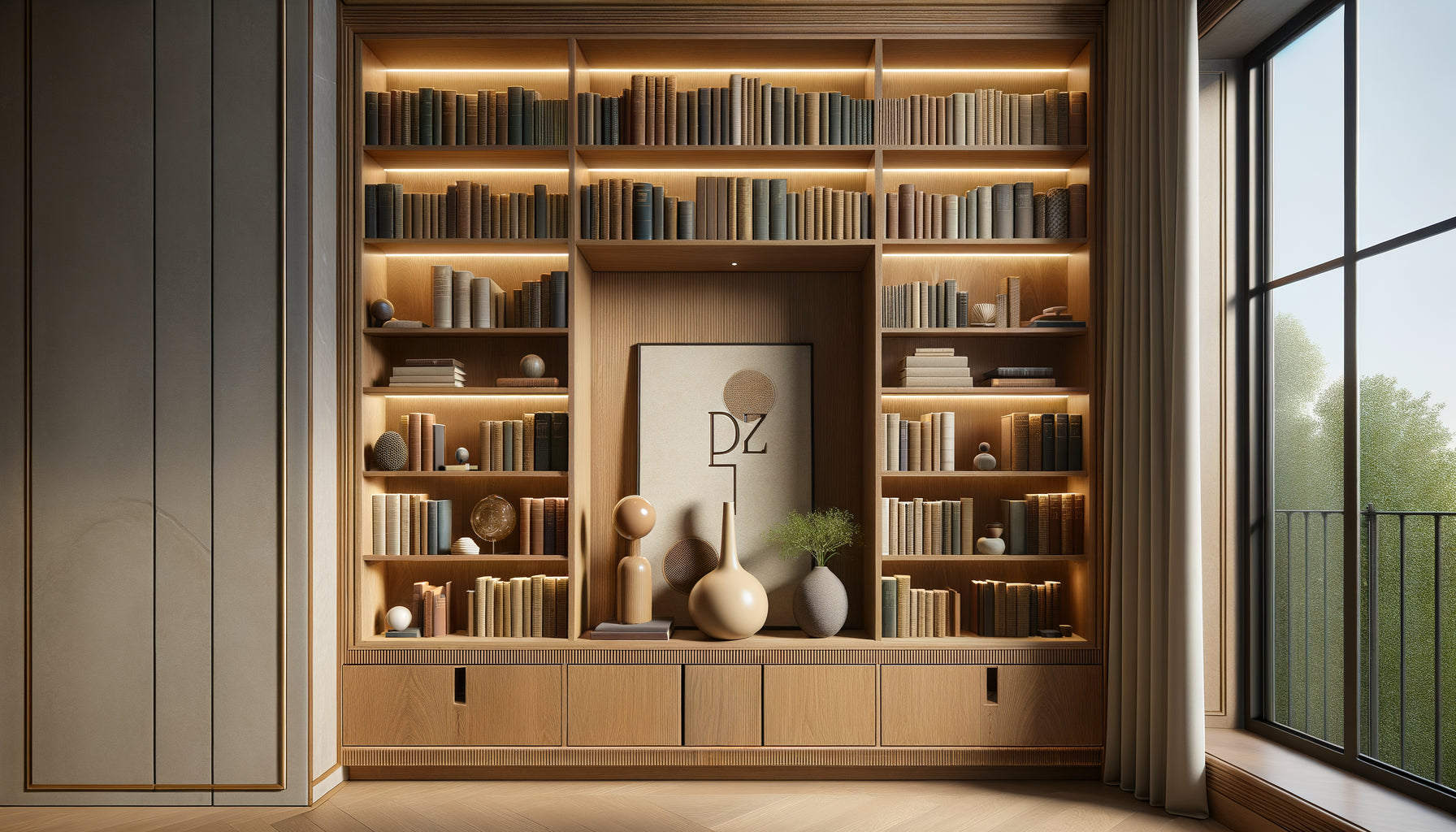
Figurative works triumph in two specific configurations. Firstly, when your library is relatively organized and homogeneous: books classified by color, uniform bindings, clean organization. In this case, the visual load is already controlled. A figurative painting then brings that touch of life, singularity, warmth that humanizes the whole.
Secondly, and it's more subtle, when you are looking to create a thematic conversation. If your library is specialized – travel, botany, art history – a figurative work in resonance beautifully reinforces this identity. I composed a wall for a gardening book library topped with a botanical watercolor. The effect was striking: the painting did not compete with the books; it extended them, creating an obvious narrative continuity.
The secret of soothing figurative art
But be careful: not all figurative art is equal when facing a loaded library. You must prioritize what I call contemplative figurative. Forget complex narrative scenes, baroque compositions, portraits with intense expressions. Favor simple and soothing subjects: a clean landscape with wide horizons, a minimalist still life, an elegant and restrained nude.
The key lies in the simplicity of reading. The eye must identify the subject in one second, without effort. No details that catch the attention, no second degree that requires analysis. Just a gentle presence that anchors the space without competing with the density of the books.

Color: The Often Overlooked Criterion That Changes Everything
Figurative or abstract, this debate often hides the truly decisive element: the chromatic palette of your painting. I have seen excellent stylistic choices fail miserably due to poor color management.
Faced with a multicolored library, you have two possible strategies. The first: choose a painting in neutral tones (beiges, grays, off-whites, deep blacks). This approach works wonderfully because it creates a contrast of sobriety. Your colorful library retains all its vibrancy, and the painting acts as a visual stabilizing element.
The second strategy, more daring: opt for a monochromatic work in a shade present but minor in your library. If you have a few touches of deep blue among your bindings, a large entirely blue painting creates an elegant resonance. This technique, which I call chromatic amplification, extracts a color from the mass and magnifies it.
What to absolutely avoid? Multicolored paintings with a scattered palette. With a library already rich in colors, adding a rainbow work creates an exhausting chromatic competition. Your eye finds no rest, no hierarchy. It's the most common mistake I correct.
Size and Frame: Two Variables That Disrupt the Equation
Let's now talk about what no one tells you: the size of your painting radically influences the choice between figurative and abstract.
For a large format (over 100 cm), abstract art almost naturally imposes itself above a loaded library. A large detailed figurative painting would create an overly dominant presence, visually overwhelming your books. On the other hand, a wide composition with simple shapes beautifully structures the space, creating a soothing frame that encompasses and enhances the entire library.
For a medium format (50-80 cm), you have more freedom. This is where contemplative figurative art finds its ideal place. A subdued landscape, an elegant silhouette, a refined floral composition bring that touch of life without saturating the space.
The Element Everyone Forgets: The Frame
The frame deserves particular attention. Faced with a visually dense bookcase, a thin and discreet frame is almost always preferable to an ornamental one. Why? Because the books already create a complex geometry of vertical and horizontal lines. A baroque or overloaded frame adds yet another layer of visual complexity.
I consistently recommend simple frames – fine natural wood, matte black metal, or even the complete absence of a frame for contemporary canvases. This sobriety allows the painting to dialogue directly with the books, without decorative intermediaries that would come to parasitize the exchange.

Composing with the existing: the three-step analysis method
You are probably wondering how to apply all of this concretely to your own bookcase. Here is the method I consistently use to evaluate each situation.
Step 1: Assess visual density. Step back three meters. Slightly squint your eyes. Does your bookcase form a relatively homogeneous mass, or can you clearly distinguish each book, each color variation? The more details you distinguish at a distance, the more visually loaded your bookcase is.
Step 2: Identify the dominant color. What hue predominates? Do you mainly have warm tones (browns, reds, oranges) or cool tones (blues, greens, grays)? This dominant will guide you in choosing the chromaticity of your painting.
Step 3: Define your intention. Are you looking to soothe the whole thing (favor abstract minimalism), create a coherent narrative (opt for figurative thematic), or assert a strong contrast (dare to use powerful monochrome)?
These three steps give you a clear mapping of your situation. The decision between figurative and abstract naturally follows from this analysis, rather than resting on an abstract aesthetic preference.
Transform your bookcase into a harmonious composition
Discover our exclusive collection of Bookcase paintings that dialogue perfectly with your books, whether they are soothing abstract or contemplative figurative.
The fatal error committed by 80% of my clients
Before concluding, I must warn you about the most common and damaging mistake I observe. It concerns both figurative and abstract choices: trying to fill all available space.
Facing an imposing bookcase, many feel the need to hang a painting that occupies the entire width of the furniture. This is a fundamental error. With a bookcase already very visually loaded, you need breathing room, emptiness, negative space. A painting that occupies 60 to 70% of the bookcase's width creates a much more elegant balance than a wall-to-wall format.
This principle applies to both styles. A large abstract piece that allows for breathing structures the space with authority. A medium-sized figurative piece centered creates a precise focal point that organizes the gaze. In both cases, breathing is as important as presence.
I recently convinced a client to reduce the size of the painting she was considering by 40%. She was skeptical. When we hung the smaller artwork, her relief was immediate: "Finally, I can look at my books AND my painting. They are no longer competing."
Your bookcase is already speaking to you: learn to listen
After twenty years of composing walls, I have realized that each bookcase already has a personality, a rhythm, a breath. Your role is not to impose a painting, but to reveal the latent harmony that already exists between your books and the space they occupy.
The choice between figurative and abstract art is not a matter of personal taste or decorative trend. It's a strategic decision that depends on the visual density of your bookcase, its color palette, your expressive intention. A very loaded bookcase naturally calls for minimalist abstraction to create rest. An organized and sober bookcase can accommodate contemplative figurative work that brings life and narrative.
Imagine yourself in six months. You enter your room. Your gaze naturally settles on the bookcase-painting ensemble. No tension, no competition. Just an elegant visual conversation between your books and the artwork you have chosen. Your guests stop, admire, immediately understand who you are. That is exactly the balance you deserve.
The next time you stand in front of your bookcase, don't ask yourself what style you prefer. Ask yourself which work will allow your books to breathe, to shine, to reveal all their beauty. The answer is already there, in the space that awaits.
Frequently Asked Questions
Can we mix abstract and figurative art on the same bookcase wall?
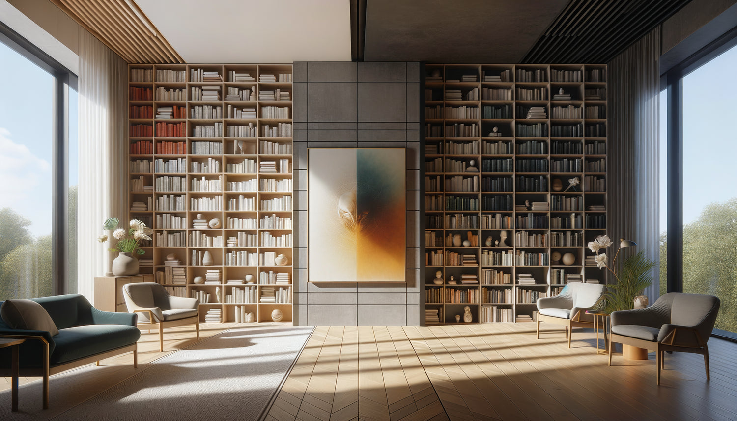
Technically yes, but it's a risky exercise I would not recommend to beginners. If your library is already very visually cluttered, adding two different art styles generally creates confusion rather than richness. The exception: if you have a very large library segmented into distinct sections (for example, two separate libraries on either side of a window), you may consider a different style for each section. But in this case, make sure both artworks share at least one common characteristic – similar color palette, comparable size, or identical frames. For most configurations, prioritize stylistic consistency. Your space will gain clarity and elegance.
My library contains books of all colors. Should I choose a black and white painting?
Black and white is indeed a safe option, but not the only one. Faced with a multicolored library, you have three effective color strategies. Firstly, black and white or neutral tones (beiges, grays) create a soothing contrast of sobriety. Secondly, you can choose a monochromatic work in a color present but minor in your books – this creates an elegant resonance without competition. Thirdly, opt for natural tones (burnt sienna, ochre, sage green) which harmonize with almost any book palette. What you should absolutely avoid is a multicolored painting with a scattered palette that would compete with your books. The golden rule: the fewer colors your painting contains, the more harmoniously it will integrate into a colorful library.
I'm afraid abstract art will be too modern compared to my old books. What should I do?
This is a legitimate but often unfounded concern. Abstract art is not synonymous with aggressive modernity. There are many abstract works with classic tones, noble textures, which dialogue beautifully with old books. Look for abstractions in warm and deep tones (browns, burgundy, aged gold), with textures reminiscent of old paper or patinated leather. Organic and gentle abstract compositions harmonize particularly well with libraries of old books. Paradoxically, I have often found that a sober and elegant abstract piece highlights antique books better than a classic figurative painting, which can create stylistic redundancy. Abstract art creates a contemporary breath that brings out the precious and timeless character of your old books. Test by printing some abstract works and holding them in front of your library – you will be surprised by the result.