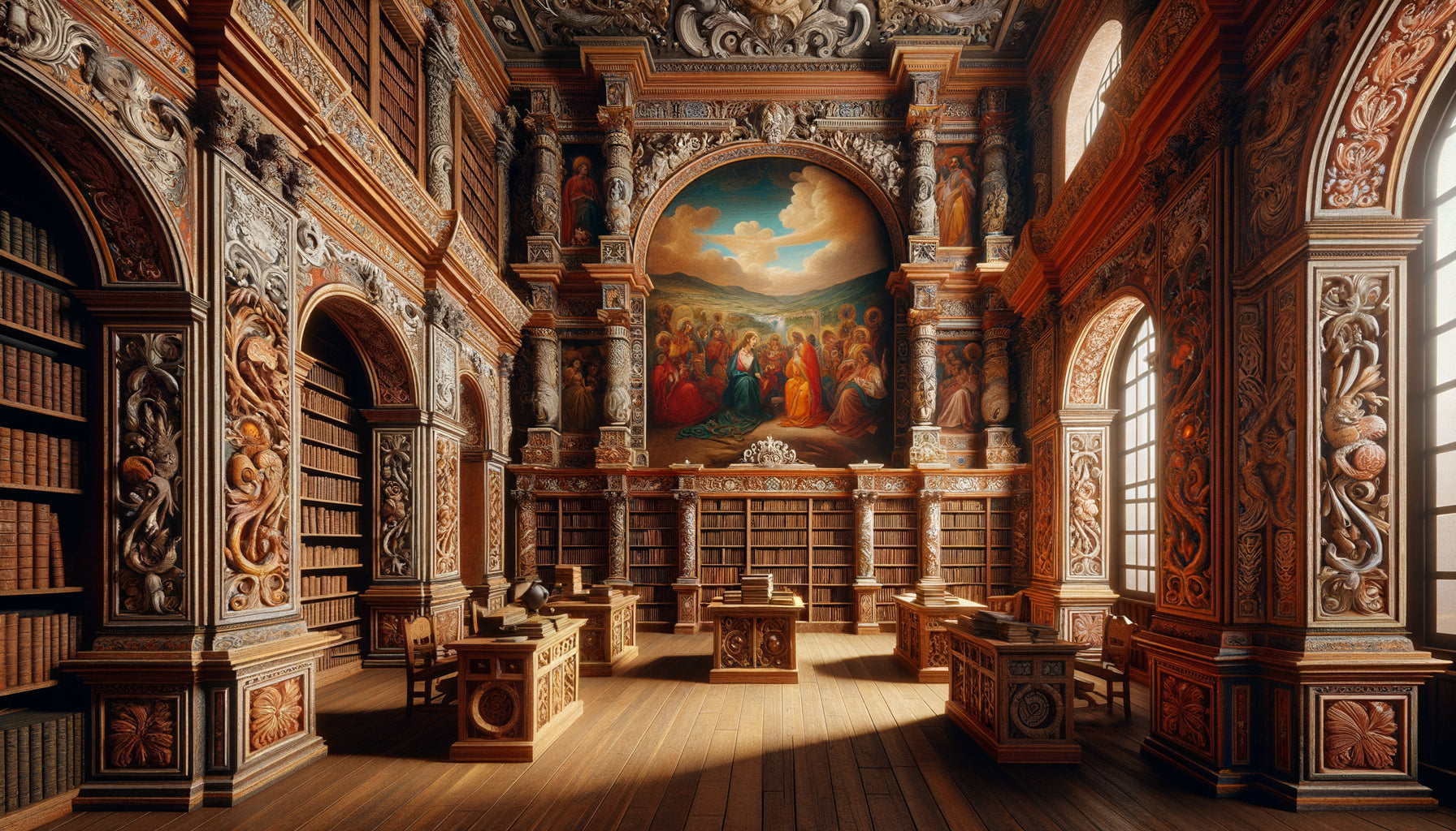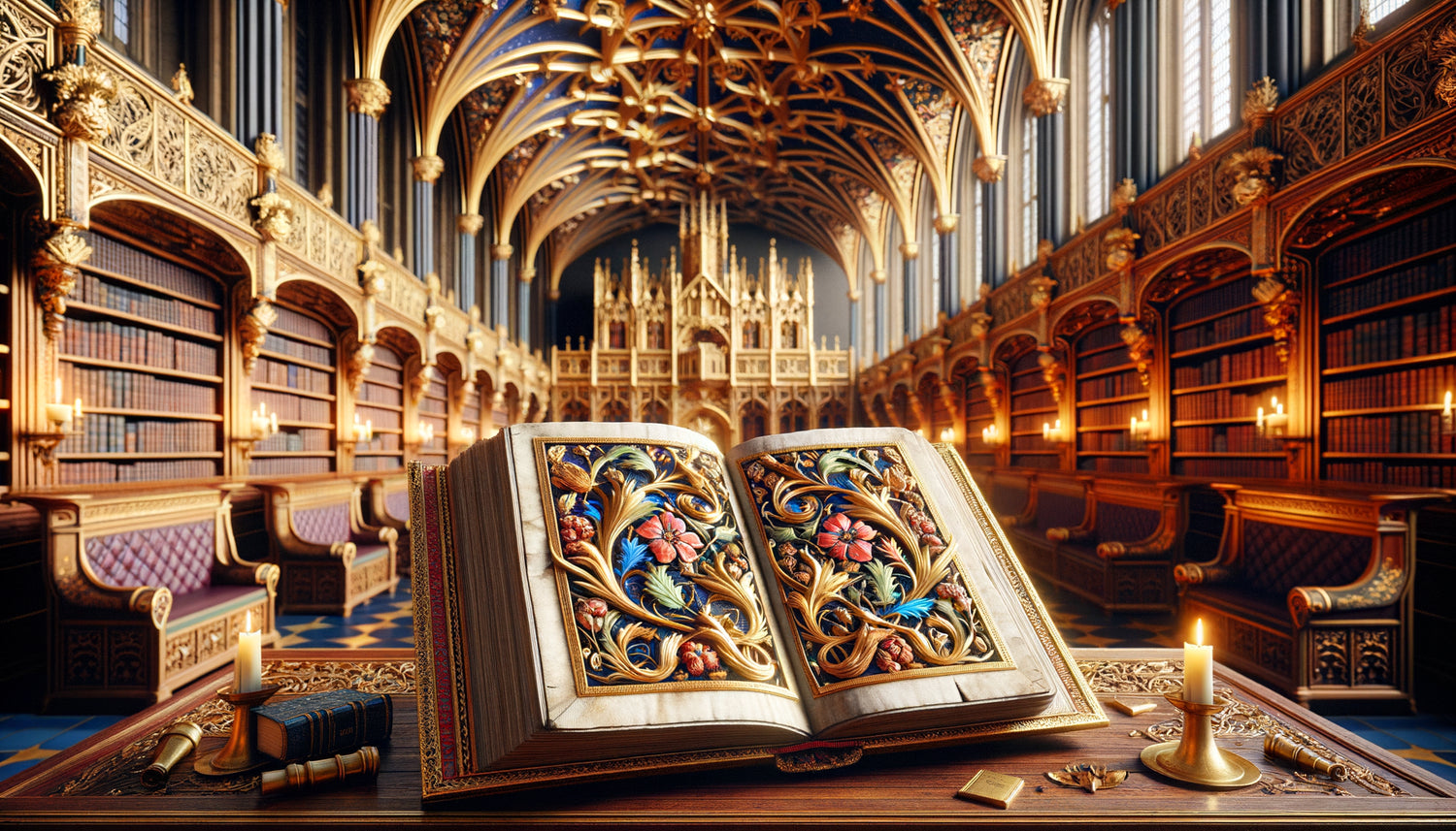
Imagine stepping through the doors of a royal library from the 15th century. The air is fragrant with leather and ink. On the desks, manuscripts reveal pages where gold captures the light of candles. These illuminations are not mere decorations: they shaped the very soul of these sacred places of knowledge. Every scroll, every precious pigment applied by the monastic copyists inspired the architecture, furniture, and atmosphere of these temples of books.
Here's what illuminations brought to royal libraries: an aesthetic of luxury where gold and rare pigments define refinement, a visual organization that structures space and guides the eye, and a symbolism of power that transforms knowledge into a monarchical treasure.
Today, we contemplate our modern shelves without understanding where this idea comes from that libraries should be sanctuaries of aesthetics. Why this obsession with precious woodwork, ornate ceilings, display cases showcasing treasures? Frustration arises when trying to recreate this timeless magic without grasping its medieval roots.
Rest assured: by understanding how illuminations dictated the visual codes of the first royal libraries, you will discover the eternal principles that make a reading space truly inspiring. These lessons cross centuries and can transform your own interior.
I invite you on this journey where the art of manuscript has sculpted the architecture of knowledge.
The gold of illuminations: birth of an aesthetic of luxury
In medieval scriptoriums, illuminators applied gold leaf to the initials and margins of manuscripts. This costly practice reserved gold for the most powerful patrons: kings, dukes, cardinals. When these illuminated manuscripts joined royal libraries, they naturally imposed an aesthetic standard.
The architects and decorators of these spaces understood a fundamental truth: the environment must be worthy of the treasures it housed. The coffered gilded ceilings of Charles V's library at the Louvre, for example, directly responded to the brilliance of the hours books preserved below. This visual coherence was not accidental.
Illuminations thus dictated a color palette dominant: gold of course, but also ultramarine blue from lapis lazuli, vermilion red, malachite green. These colors were found in the wall hangings, Oriental rugs laid on reading tables, and enamels of boxes containing the most precious volumes.
A lesson for today
This chromatic harmony between container and content remains a powerful principle. Your most beautiful books deserve a setting that dialogues with them, not competes with them.
When illumination structures architectural space
Medieval illuminations followed rigorous principles of composition: monumental initial letter at the beginning of the text, borders framing the page, miniatures inserted into medallions. This visual organization directly inspired the arrangement of royal libraries.
Observe the library of Charles V's Library: illuminated manuscripts were arranged on inclined lecterns, open to the most spectacular pages. These books became works on display, like paintings on a wall. The architecture had to create "frames" for these treasures: vaulted alcoves, decorated niches, precious showcases.
The painted vaults often reproduced the motifs of the illuminated margins: plant tendrils, fantastic creatures, heraldic coats of arms. The library of King Matthias Corvinus in Buda pushed this logic to the extreme, with murals that seemed to extend the illuminations of the Corvina codices preserved in the room.
This approach transformed the royal library into a giant manuscript whose pages the visitor turned as they moved. Each bay, each thematic section constituted a "chapter" of this architectural work.

The furniture: when illumination becomes three-dimensional
Illuminations did not only inspire the general architecture: they shaped the specific furniture of royal libraries. The sculpted chests that protected the manuscripts reproduced the motifs of the illuminated frames, with their twisted columns and Gothic arcades.
The bookstands developed in the 15th century to present illuminated manuscripts are remarkable creations. Their feet carved in the shape of dragons, lions or eagles echoed the creatures of the margins. Some bookstands even incorporated ivory and precious stone inlays that echoed the pigments of the manuscripts.
The curule chairs reserved for high-ranking readers were upholstered with gold brocade velvet imitating the damask backgrounds of Flemish illuminations. This visual continuity between the book and its environment created a total immersive experience.
The importance of scale
A fascinating detail: illuminators constantly played with scales of representation, placing miniature scenes in monumental initials. Royal libraries adopted this principle with cathedral-like proportions rooms housing intimate reading spaces, almost secret niches.
Sacred Light: Transposing the Radiance of Pigments
Illuminations were designed to capture and reflect light. Burnished gold, lead whites, translucent glazes created shimmering effects that copyists meticulously calculated. Architects of royal libraries transposed this science of light into space.
The stained glass windows of medieval libraries filtered the light like the colored glazes of illuminations. At Sainte-Chapelle, where part of the French royal library was housed, the light streaming through the stained glass bathed the manuscripts in a glow comparable to that emanating from their illuminated pages.
Bronze candelabras and chandeliers multiplied the light of candles, creating moving reflections on the gilded bindings and open illuminations. This dancing light recalled the technique of gold leafing which brought miniatures to life.
Some royal libraries, such as Urbino's, incorporated mirrors strategically placed to amplify natural light and create depth effects, just as illuminators used reverse perspective to give depth to their compositions.

Symbolism of Power: From Manuscript to Political Decor
The illuminations in royal manuscripts were never innocent. They asserted dynastic legitimacy, representing the commissioner in majesty, surrounded by the symbols of his authority. Royal libraries amplified this political function.
The royal portraits in pied adorning the libraries echoed the iconographic conventions of presentation illuminations: the monarch holding a book, surrounded by his advisors, receiving divine wisdom. The library of El Escorial multiplies these visual references which transform the space into a political manifesto.
The coats of arms and mottos sculpted, painted, woven throughout the royal library reproduced those that adorned the illuminated frontispieces. François I's salamander, Claude de France's ermine: these emblems passed from parchment to stone in perfect symbolic continuity.
This political dimension explains why royal libraries placed so much importance on staging. Like manuscripts illuminated during presentation ceremonies, the library had to impress foreign ambassadors and affirm the cultural power of the kingdom.
The Invisible Legacy in Our Contemporary Interiors
We have inherited these first royal libraries from the principles we unconsciously apply. The idea that a home library should be a separate space apart, differentiated from the rest of the house, comes directly from this medieval tradition where illuminated manuscripts imposed their own aesthetic logic.
The wall lights that we place above our shelves resume the function of candelabras that lit up the illuminated manuscripts. Our taste for libraries with warm tones – mahogany, fawn leather, bottle green – perpetuates the palette of medieval pigments.
Even our habit of arranging objects between books – statuettes, precious boxes, frames – comes from these royal libraries where illuminated manuscripts mingled with reliquaries and works of art, creating cabinets of curiosities before their time.
Give your library the soul of royal collections
Discover our exclusive collection of Library wall art that captures the spirit of medieval illuminations and transforms your reading space into a sanctuary of knowledge.
Create your own dialogue between book and decor
You don't need illuminated manuscripts to apply these principles. Start by identifying your most beautiful books : illustrated editions, carefully bound volumes, art books. Observe their dominant colors, materials, style.
Then choose an accent element that dialogues with them: a gilded frame reminiscent of the gold in illuminations, a textile with rich tones, a brass object that catches the light. Like royal architects, create visual echoes rather than literal repetitions.
Think light : a library without adequate lighting is like an illumination in the dark. Multiply light sources at different heights to create this warm atmosphere of historic libraries.
Finally, don't forget the personal dimension: illuminations told the story of their commissioner. Your library should tell yours, with your own symbols, your favorite colors, your own treasures.
Illuminations transformed the first royal libraries into spaces where every detail celebrated the book as an absolute treasure. Five centuries later, this reverence for the book-object and its environment remains the secret of libraries that truly transport us. By understanding this ancestral dialogue between manuscript and setting, you can compose a reading space that honors your books while reflecting your own story.
Frequently Asked Questions
What colors should I choose for a library inspired by illuminations?
Medieval illuminations favored a palette that was both rich and consistent: gold and honey tones (reminiscent of the gold in miniatures), deep blue (inspired by lapis lazuli), burgundy red (evoking vermilion), and hunter green (referencing malachite). For a contemporary interpretation, use these shades in touches rather than blocks: a midnight blue reading chair, highlighted red bindings, brass accessories. Warm neutral tones – beige linen, taupe gray, off-white – serve as a “parchment” on which your colored accents will stand out. The key is to create a color harmony where each color dialogues with the others, like in an illuminated page where each pigment finds its place in the overall composition. Avoid garish or neon colors that would break this timeless atmosphere.
How to light my library to recreate the atmosphere of royal libraries?
The lighting in royal libraries was based on a fundamental principle: multiply light sources rather than relying on a single central suspension. Install adjustable wall lights above your main shelf sections, choosing warm-toned bulbs (2700-3000K) that recall the glow of candles. Add a desk lamp with a brass or opal glass lampshade for your reading area. If possible, integrate indirect lighting behind cornices or under shelves to create a soft atmosphere. Historic libraries also played with natural light: if your room has windows, use linen or velvet curtains that filter without obscuring, creating this golden light that bathed the manuscripts. In the evening, don't hesitate to use candles (real or LED) for contemplative reading moments. The goal is layered lighting that avoids shadows while creating an intimate atmosphere.
Can this style be adapted to a modern and minimalist library?
Absolutely! The influence of illuminations on royal libraries is not limited to literal medieval style. You can capture the spirit rather than the letter. In a contemporary interior, retain three key principles: firstly, the visual coherence between your books and their environment – if your volumes have covers with modern graphic designs, choose minimalist shelves that showcase them rather than compete with them. Secondly, the importance of noble materials – even in a streamlined version, prioritize solid wood over melamine, brushed metal over plastic, glass over PVC. Thirdly, precious accent touches: a fine gilded frame rather than baroque, a bronze contemporary sculpture, a rug with muted but deep tones. The spirit of royal libraries lies in the idea that books deserve a setting worthy of them. In a modern version, this translates to quality design furniture, clean lines but authentic materials, and a few carefully chosen objects that personalize the space without cluttering it.