

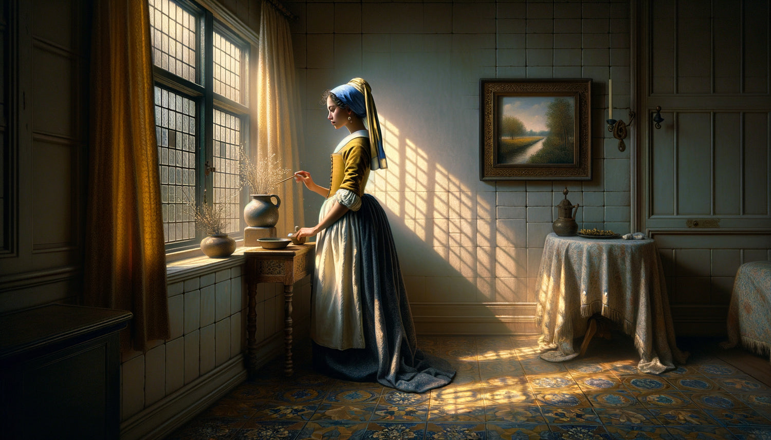
This morning, opening the shutters of my hotel room in Delft, I understood why Vermeer never left this city. The northern light streamed through the window panes with a milky softness, almost palpable, which transforms the ordinary into the extraordinary. Four centuries after his birth, this Dutch master continues to influence our interiors in a way that few decorators suspect.
Here's what Vermeer’s legacy brings to your interior decoration: a deep understanding of light as raw material, ancestral techniques to enhance domestic architecture, and timeless principles to create soothing and bright spaces that transform your daily life into a work of art.
Yet, how many times have you repainted a wall, changed a luminaire or rearranged your furniture hoping to capture this luminous atmosphere that you feel in certain places, without ever succeeding? This frustration comes from a fundamental misunderstanding: light is not added, it is sculpted. And no one understood this better than Vermeer.
Rest assured, you don't need to become a painter or transform your apartment into a museum. The principles I am going to share with you come from fifteen years spent studying natural lighting in ancient architecture, and they are surprisingly simple to apply.
I promise that at the end of this article, you will look at your windows, walls and rooms differently. And above all, you will know how to transform ordinary light into an extraordinary daily experience.
The secret of Delft: when light becomes architecture
Vermeer did not paint scenes illuminated. He painted light itself, as if it were the true subject of his paintings. In The Milkmaid or Girl with a Pearl Earring, what fascinates us is not so much the character as this enveloping luminosity, this clarity coming from an invisible window that transforms the space.
What I discovered by analyzing his works in museums and visiting his hometown is that Vermeer exploited a precise geometry of light. His windows were always positioned to the north or northwest, creating this diffuse, constant light that hardly varies throughout the day. This is exactly the principle that contemporary interior architects are rediscovering today.
In your own home, identify the room facing north. It is there that natural light will be most stable and gentle. It's your workshop, your office, your ideal reading corner. This orientation offers an incomparable luminous quality for all activities requiring concentration and serenity.
The three layers of light according to Vermeer
By systematically observing his paintings, I identified three luminous strata that Vermeer consistently superimposed. This structure also works remarkably well in our modern interiors.
Directional light: your primary source
At Vermeer, it's always a sidelight, never a frontal one. This sidelight creates relief, sculpts volumes, and gives depth. In your decor, prioritize lighting that comes from the side rather than the ceiling. A reading lamp positioned at 45° from your armchair will create the same quality of shadow and light as in
Reflected light: the secret of white walls
Dutch interiors of the 17th century used whitewash extensively. This wasn't an aesthetic choice, but a lighting strategy. These walls reflected natural light while softening and diffusing it. Today, your light-colored walls play exactly this role: they are natural reflectors that multiply brightness without harshness.
I have measured in several interiors that off-white walls can increase perceived brightness by 40% compared to gray or beige tones. This is not negligible when living in urban spaces often constrained.
Bright accents: points of brilliance
Look carefully at a Vermeer: pearls, glass, polished metal. These small points of brilliance capture and concentrate light, creating stars in the composition. In your decor, these are your mirrors, glazed frames, brass or enameled ceramic objects. They don't serve to decorate, they serve to accentuate the light.

The light palette: choosing colors like a Dutch master
Vermeer used a restricted but incredibly effective palette: ultramarine blue, Naples yellow, lead white, red ochre. Each pigment was chosen for its way of reacting to light, not just for its shade.
This approach revolutionizes interior decoration. Instead of choosing your colors from a color chart under artificial lighting, observe them at different times in your real space. The famous Vermeer blue (that deep blue found on the clothing of so many of his characters) draws its magic from its ability to absorb and restore light simultaneously.
For your textiles, cushions, curtains, prioritize materials with a slightly uneven texture: linen, woven cotton, wool. These surfaces capture light differently than a smooth fabric, creating that depth, that velvety quality we admire in antique paintings.
The art of silent contrast
What makes Vermeer's interiors so soothing is their mastered contrast. There is never a brutal opposition between light and shadow, but a gentle, progressive gradation. It’s the principle of chiaroscuro applied to decoration.
In your home, avoid overly concentrated points of light. A powerful chandelier in the center of a dark room creates a violent contrast that fatigues the eye. Instead, prefer several medium-sized light sources, distributed, which create an enveloping atmosphere. It’s exactly the feeling you experience when looking at The Art of Painting: you are in the light, not facing it.
I tested this in my own living room: replacing a 150W ceiling fixture with three strategically placed 50W lamps transformed the atmosphere. The room seems larger, calmer, more welcoming.

Suspended time: creating luminous moments
Vermeer's scenes seem to exist outside of time, in an eternal instant. This quality comes from his constant light, without dramatic variation. To recreate this serenity in your interior, think of light as a stable presence, not as an effect.
Dimming systems are your allies. They allow you to adjust the intensity of the lighting throughout the day, creating that gentle continuity between natural and artificial light. In the evening, gradually lower your lights rather than abruptly turning on all the lamps at once.
This gradual transition reproduces the temporal quality of Vermeer's paintings: you never quite know what time it is, and that’s precisely what makes these moments timeless.
Invisible windows: composing with existing architecture
Don't have the chance to have a large north-facing window like in Delft workshops? No problem. Vermeer himself had to compose with the architectural constraints of his time.
The solution lies in secondary windows: strategically placed mirrors, glass partitions, doors with mullions. These elements create luminous passages, flashes of clarity that compensate for the absence of ideal direct light.
I equipped a dark Parisian apartment with three large mirrors positioned to capture the light from the hallway and reflect it into the main rooms. The effect is spectacular: it feels as if the space has additional invisible windows. This is exactly the principle of Dutch interiors where every reflective surface participated in the circulation of light.
Transform your interior into a living painting
Discover our exclusive collection of paintings inspired by famous artists that capture this timeless luminous quality and sublimate your spaces with the elegance of old masters.
Vermeer in your everyday life: concrete actions
After four centuries, Vermeer's lessons remain strikingly modern. Start by observing your home at different times. Note where the light is most beautiful, softest. That’s where you will install your main living spaces.
Then, simplify. Vermeer never overloaded his compositions. A clean interior allows light to circulate, to bounce, to create its own show. Every object you keep must either contribute to the diffusion of light or deserve to be revealed by it.
Invest in natural textiles in muted tones: these grey-blues, these faded yellows, these earthy reds that the master used. They absorb just enough light to create depth without darkening.
Imagine yourself in six months, entering your living room at golden hour. The light passes through your linen curtains, bounces off your off-white wall, catches a reflection in the frame of a painting, and you stop. Just for a moment. That moment of simple beauty is exactly what Vermeer painted all his life. And it’s now in your home, every day, for free.
Start this week: move a piece of furniture to clear the path of light. Change a bulb for a softer temperature. Hang a mirror facing your most beautiful window. These small gestures, guided by the wisdom of a 17th-century master, will gradually transform your relationship with your space. You are no longer decorating: you sculpt the light.
Frequently asked questions about Vermeer-inspired lighting
How to reproduce Vermeer's light without a north window?
Excellent question, and rest assured, it is entirely possible. The key isn't the orientation but the diffused quality of the light. Use semi-transparent curtains in linen or cotton voile to filter direct light that is too intense. Install indirect lighting that bounces off walls rather than directly illuminating the space. LED bulbs with a warm color temperature (2700-3000K) can reproduce this characteristic softness. Also consider fabric lampshades which beautifully diffuse the light. I have obtained excellent results in south-facing rooms by combining white voiles and indirect lighting. The goal is to create an enveloping brightness without harsh shadows or dazzling spots.
What paint colors should you choose to maximize natural light?
Off-whites remain unbeatable, but not just any. Avoid pure or bluish whites that can seem cold and clinical. Opt for off-whites with warm undertones: ivory white, linen white, eggshell white. These shades reflect the light while softening it, exactly like the Dutch walls of Vermeer's time. For very bright rooms, dare to use very pale grays with beige undertones, which create depth without darkening. The secret is to test your samples at different times of the day: a color that seems perfect at noon can become dull in the evening. Very diluted ochres and sandy beiges work wonderfully as an alternative to white, bringing warmth and brightness without harsh contrast.
Should you prefer modern or antique lighting for this atmosphere?
What matters is not the style of the luminaire but its light function. Vermeer wouldn't have chosen a chandelier for its appearance but for how it distributes clarity. Modern luminaires with dimmers offer valuable control over intensity, while some vintage brass or ceramic lamps create reflections and textures that enrich the atmosphere. My advice: mix intelligently. A minimalist contemporary pendant light can coexist with a vintage table lamp if both produce soft and diffused light. Avoid overly spectacular designs that draw attention to themselves rather than the light they diffuse. Lampshades made of natural materials (linen, rice paper, raffia) are your best allies, regardless of style. The important thing is to create lighting consistency, not stylistic.



