I remember this client, Sophie, staring at her white wall for three months. She had everything: the perfect sofa, matching cushions, a vintage coffee table. But that empty wall screamed her discomfort. "I want something, but I'm afraid of making a mistake," she confided in me. Like her, you may be hesitating to take the plunge. A diptych is precisely the ideal solution for starting without risk.
Here's what a well-chosen diptych brings to your apartment: an instant visual depth without overwhelming the space, an aesthetic consistency easier to master than a complex composition, and that touch of sophistication that immediately transforms an anonymous room into a personal living space.
The dilemma is always the same: too small, and your artwork disappears into the decor. Too large, and you create an oppressive imbalance. Between conflicting advice on the internet and the abundant offer, choosing the right diptych format becomes a puzzle when it should be a pleasure.
Rest assured, there are proven diptych formats that work in 90% of apartments. You don't need to be a decorator to succeed with your first wall composition. In this article, I will reveal the formats that have proven their worth with my clients, those that instantly create harmony without a false note.
The 50x70 cm format: the safe bet for your first diptych
After accompanying dozens of people in their first wall decoration, I can affirm it: the 50x70 cm format per artwork is the undisputed champion for starting with a diptych in an apartment. This dimension is not random; it's the result of a mathematical balance between visual presence and elegant discretion.
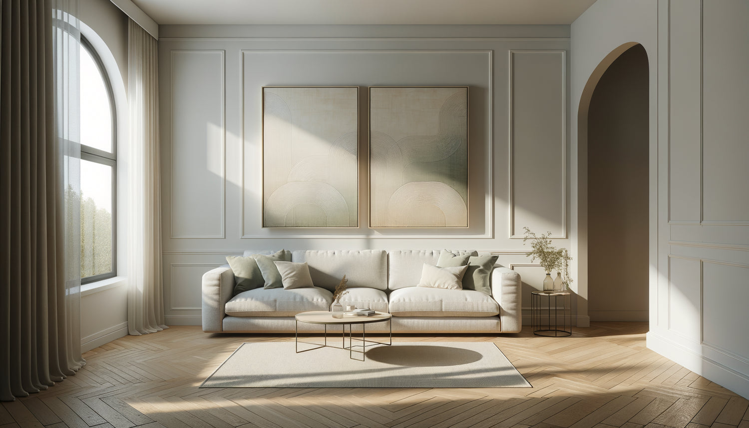
Specifically, a 50x70 cm diptych offers you a total width of approximately 110 to 120 cm once the two artworks are installed with their spacing (count 10 to 20 cm between the two panels). This is precisely the ideal width to dress up a two-seater sofa, frame an entrance console, or energize a hallway without stifling it.
This format has a decisive advantage for beginners: it forgives mistakes. Unlike large formats that require high ceilings and significant distances, the 50x70 cm adapts to standard apartments with ceiling heights of 2.40 m to 2.70 m. You can install it in a 15 m² living room as well as in a 12 m² bedroom without creating a disproportion.
Why this format works in almost all spaces
The beauty of the 50x70 cm diptych lies in its versatility. In portrait (vertical) orientation, it creates a visual elevation that draws the eye upwards, giving the room a sense of height. This is perfect for apartments where every centimeter counts. In landscape (horizontal) orientation, this same format visually widens the space, ideal for narrow walls or hallways.
I installed this size at Martin's, in a 25 m² studio apartment in Lyon. His abstract diptych in 50x70 cm above the sofa bed instantly structured his living space. The room, which seemed cluttered, found its visual anchor. The format didn't overwhelm the small living room, but asserted its presence enough to create a focal point.
The 40x60 cm diptych: the ally of small urban spaces
If your apartment is on the compact side (less than 30 m²), or if you are decorating a bedroom, an office, or a kitchenette, the 40x60 cm format deserves your full attention. It's the elegant little brother of the 50x70, the one that slips into constrained spaces without ever seeming cramped.
This diptych format offers a total wall footprint of approximately 90 cm wide, which perfectly corresponds to the human scale of small spaces. Above a desk, it creates an inspiring atmosphere without overshadowing your computer screen. In a bedroom, it asserts itself above the bedside table with just the right amount of character.
The mistake I often see: wanting to absolutely have a large format in a small space for fear that « it won't be seen enough ». The result? An overwhelming effect, like wearing a coat three sizes too big. The 40x60 cm diptych avoids this pitfall by respecting the proportions of your space while asserting a true decorative personality.
The art of creating an evolving gallery
An unexpected advantage of the 40x60 cm format: it easily integrates into an evolving composition. You start with your diptych, and over time, you can add other formats around without creating a visual cacophony. This is the « progressive gallery » approach that I implemented for Léa, who was afraid of committing to a large wall decoration all at once.
She started with a 40x60 cm nature diptych in her living room. Six months later, she added a triptych in the same color range on the adjacent wall. Her apartment now tells a coherent story, built step by step, without an initial massive investment.

When to dare the 60x80 cm format for a statement of intent
Do you have an apartment with beautiful volumes? Ceilings of 3 meters, a living room of 25 m² or more, and above all, the desire to assert a strong decorative choice? The diptych in 60x80 cm format is your best ally to create an immediate visual impact.
This generous format develops a total width of approximately 130 to 145 cm once the two panels are installed. This is the format that suits dressing a large corner sofa, structuring a 4-meter wall, or creating a focal point in an open dining room. It asserts its presence without asking permission.
However, be aware: this format requires respecting certain proportions. It needs a minimum distance of 2.50 meters to be fully appreciated. Beyond that, your gaze cannot embrace the entire composition, and the desired effect fades away. That is why I systematically advise against it in bedrooms or narrow hallways.
The format that structures large rooms
In renovated Haussmann apartments or lofts, the challenge is reversed: avoiding walls appearing desperately empty. A 60x80 cm diptych visually anchors the space and creates functional zones. I used this format for Julien, who had just moved into an 85 m² apartment with a huge living room-dining room in a row.
His black and gold graphic diptych above the sofa instantly defined the living area, creating a visual break with the dining space. Without this strong composition, the room lacked structure, like a sentence without punctuation.
Panoramic formats: a modern alternative for complex walls
And if your wall has architectural constraints? An off-center window, a radiator, a door that « eats » the space? Panoramic diptych formats (such as 30x90 cm or 40x120 cm) offer an elegant solution to these decorative puzzles.
These elongated formats allow you to exploit restricted horizontal spaces: above a sofa wedged between two windows, in a narrow hallway, or to visually connect two areas of the same room. The panoramic diptych guides the gaze horizontally, creating a reading dynamic that visually expands the space.
At Claire's, a 1.20 m wide hallway seemed oppressive despite its natural light. A 30x90 cm diptych installed in landscape orientation transformed this compulsory passage into a mini art gallery. The eye glides along the panels instead of butting against the close walls.

How to choose the orientation of your diptych according to your wall
The format is not everything: the orientation of your diptych (portrait or landscape) radically changes the visual impact. It's a dimension often neglected by beginners, and yet crucial for successfully composing.
Portrait (vertical) orientation creates an elevation, a sense of grandeur. It is perfect for spaces with standard or low ceilings that you want to visually enhance. Place your vertical diptych above a low piece of furniture, a console, or a headboard to maximize this stretching effect.
Conversely, landscape (horizontal) orientation widens the space. It soothes, creates stability, and is suitable for wide but limited height walls. A horizontal diptych above a sofa creates a natural harmony by following the lines of the furniture.
The golden rule I apply: observe your bare wall and identify its main constraint. Too narrow? Choose a horizontal format to widen it. Low ceiling? Opt for a vertical orientation that draws the eye upwards. Your diptych should compensate for architectural flaws, not highlight them.
The spacing between the two panels: the detail that changes everything
A technical detail often underestimated: the distance between your two paintings. Too close together (less than 5 cm), they lose their identity as a diptych and look like a poorly cut painting. Too far apart (more than 25 cm), visual coherence is broken.
My starting advice: space your panels by 10 to 15 cm for 40x60 and 50x70 cm formats. For larger 60x80 cm formats, you can go up to 20 cm without breaking the visual dialogue between the two works. This breathing space between the panels allows each part of the diptych to exist while maintaining the unity of the composition.
Ready to transform your blank wall into a true art gallery?
Discover our exclusive collection of wall art for Apartment that perfectly adapts to the diptych formats recommended in this article.
Visualize your success and take action
Imagine yourself in three weeks. You come home after a long day. Your gaze immediately catches on your diptych, installed exactly in the right place, in the right format. It wasn't so complicated after all: you chose the 50x70 cm format for your living room, respected the 15 cm spacing between the panels, and positioned the whole thing 145 cm from the floor.
Your guests notice it instantly. “It’s beautiful, where did you find that?” Your apartment is no longer an anonymous space, it has become your space, one that reflects you. And it all started with this first diptych, the one you didn't dare to choose just a few minutes ago.
Start simply: measure your wall, identify the furniture it overlooks, and choose the appropriate size from those we have explored. The 50x70 cm format remains your best starting point if you are still hesitating. The important thing is not perfection, but action. Your first wall art awaits you.
Frequently Asked Questions about Diptych Formats
Can I mix different formats in my diptych?
No, and that's precisely what defines an authentic diptych: the two panels must be of the same size to create this characteristic visual harmony. If you use two different sizes, you create an asymmetrical composition that can work aesthetically, but it is technically no longer a diptych. To start, I strongly advise you to respect this rule of format uniformity. It greatly simplifies your choice and guarantees a balanced result. Once you master the basics of wall composition, you can explore bolder arrangements with varied formats, but start with this solid foundation.
At what height should I install my diptych on the wall?
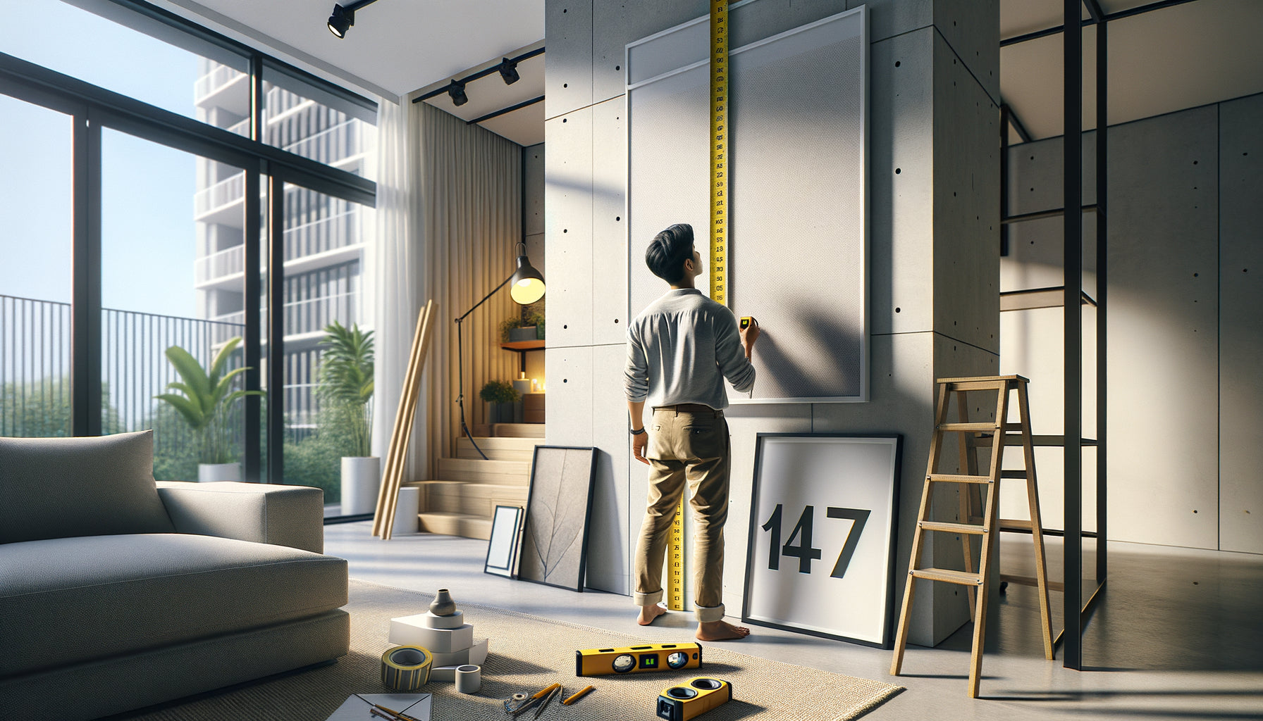
The professional rule that I consistently apply: position the center of your diptych between 145 and 155 cm from the floor. This height corresponds to the eye level of an average-height person and guarantees optimal visual comfort. Specifically, if your diptych is 70 cm high, the bottom of the paintings will be approximately 110-115 cm from the floor. Above a sofa or piece of furniture, leave 15 to 20 cm of space between the top of the furniture and the bottom of your composition. This visual breathing room avoids the “stuck” effect that clutters the whole thing. Use a spirit level or smartphone app to ensure perfect alignment: there's nothing more distracting than a slightly tilted diptych that constantly draws the eye.
Should the format of the diptych correspond to the size of my sofa?
Excellent question that touches on an essential rule of proportion in decoration. Your diptych should occupy approximately 60 to 75% of the width of your sofa to create a visually harmonious balance. For example, if your sofa is 180 cm wide, aim for a diptych with a total width (panels + spacing) between 110 and 135 cm. A 50x70 cm diptych (approximately 110-120 cm in total) would be perfect. Too small, it will float in the space and appear disconnected from the furniture. Too wide, it will visually overflow and create an imbalance. This rule of thirds is not absolute, but it offers an excellent starting point for beginners. Over time, you will develop your eye and can adjust according to your personal sensitivity.