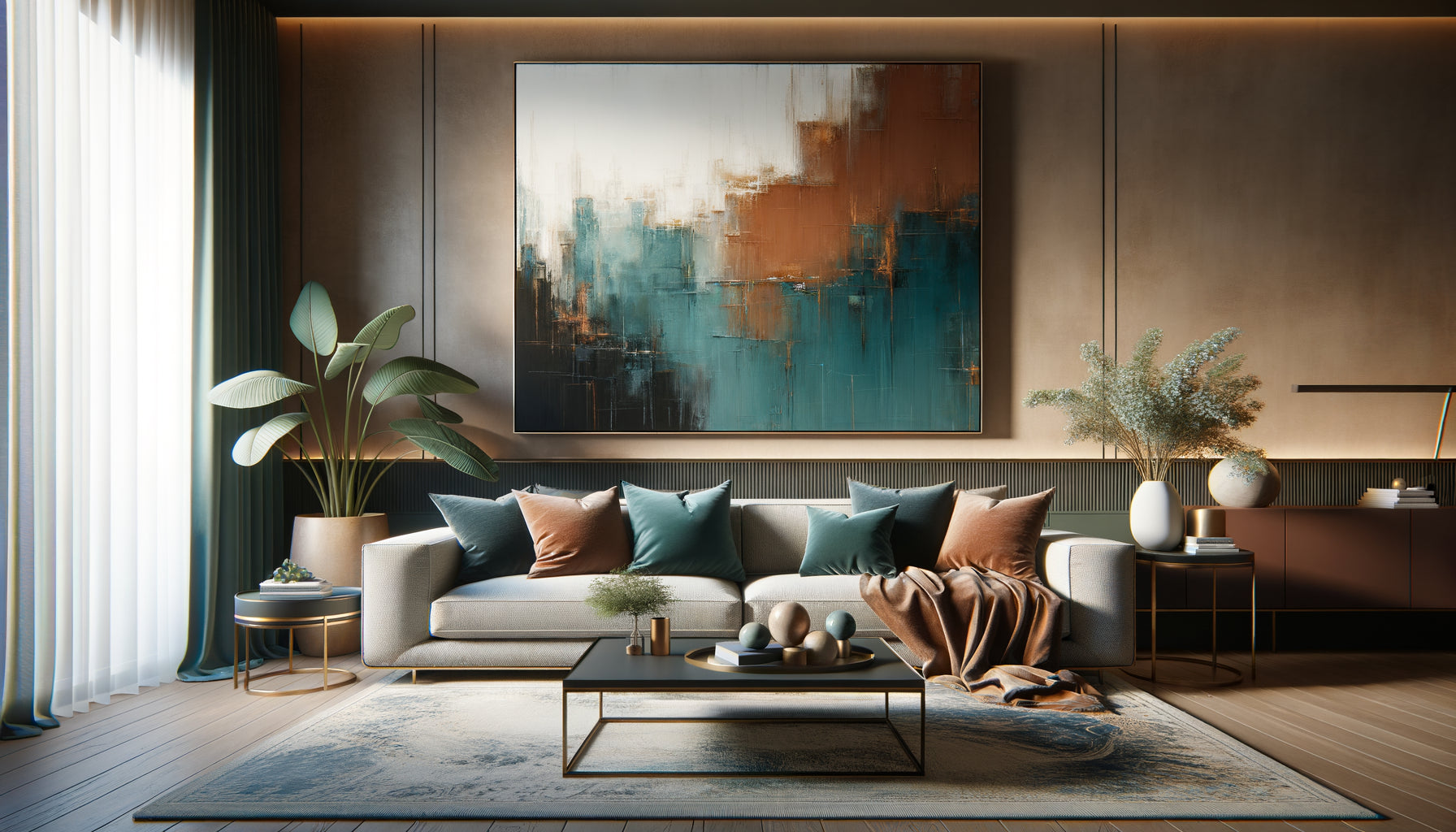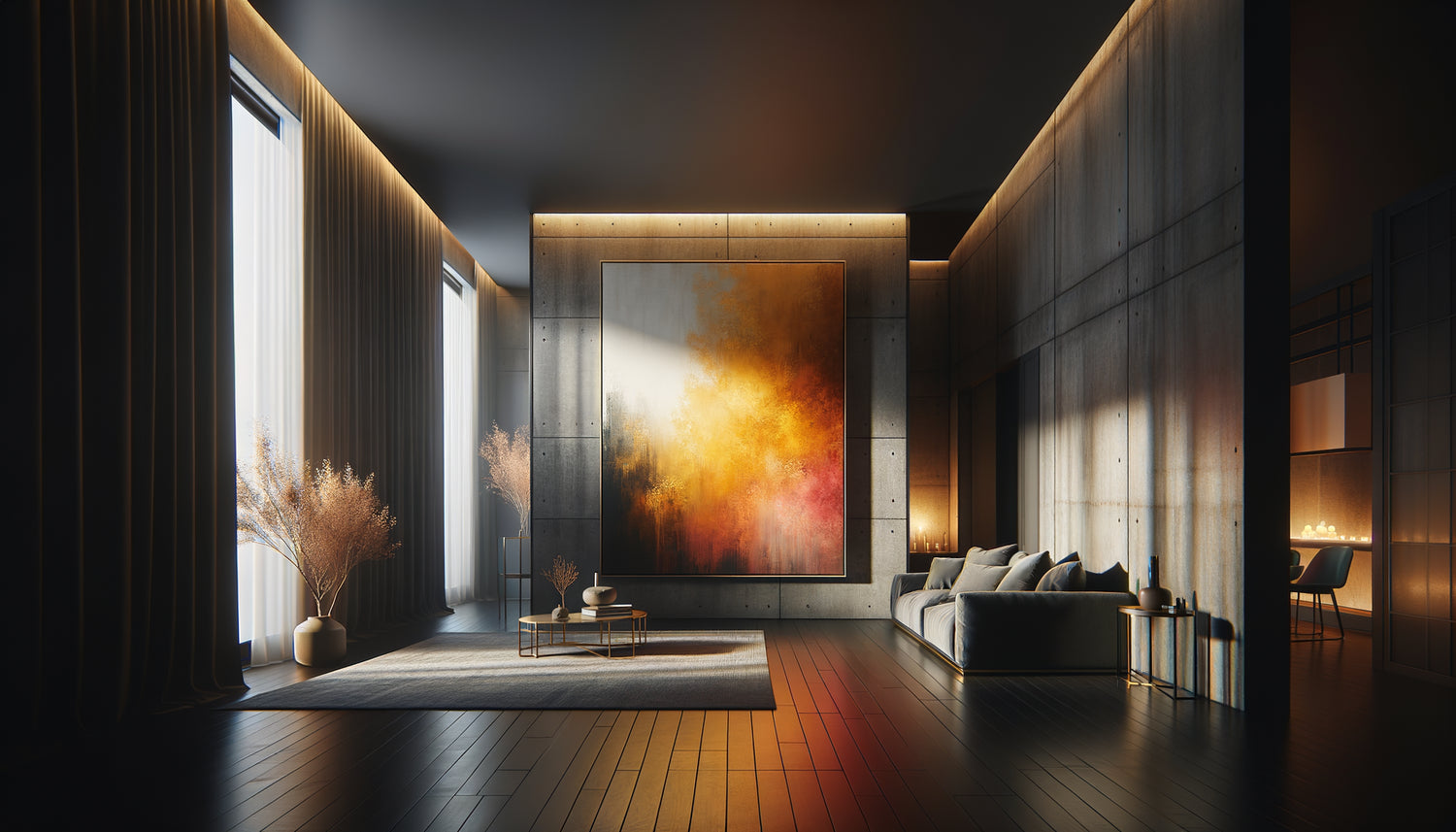
I have spent twenty years advising collectors on their art acquisitions, and the question that comes up most often in my office is not "Which artist to buy?" but "How to bring my interior to life?”. Particularly when it comes to a north-facing apartment, where natural light plays hide-and-seek all day long. This apparent challenge actually hides an extraordinary opportunity: transforming a cold space into a warm sanctuary through the judicious choice of painting colors.
Here's what good painting colors bring to a dark apartment: they create an artificial source of light that compensates for the absence of direct sunlight, they warm up the atmosphere by breaking the bluish hue of Nordic light, and they give the illusion of enlarging the space by playing on contrasts and depth.
You have probably already felt this frustration: coming home in the late afternoon and feeling like you are entering a cave. Your white walls meant to “reflect light” remain dull. Generic decorating advice never seems to apply to your particular situation. Yet, the solution exists. It requires neither expensive work nor complete rearrangement. It lies in the thoughtful choice of a few strategically placed and colored paintings. Let me show you how some colors literally have the power to illuminate a dark apartment.
Golden yellow: your permanent indoor sun
In north-facing apartments that I had the opportunity to study, paintings with golden yellow tones produce the most spectacular effect. It's no coincidence: yellow has the wavelength closest to natural sunlight. When you hang a painting dominated by warm yellows – ochre, honey, saffron – you literally install a virtual window facing south.
I saw one collector transform her dark living room with an abstract canvas where touches of Naples yellow and pale gold danced. The effect was striking: even on gray days, the room seemed bathed in a morning glow. The secret lies in the warm nuances of yellow, not acidic or lemon yellows that can appear aggressive in Nordic light.
To maximize this effect, prioritize paintings where golden yellow is combined with touches of cream white or beige. This combination creates a soft luminosity that does not tire the eye. Avoid pure or fluorescent yellows, however, which, under cold northern lighting, lose their luster and turn greenish.
Copper orange: simultaneous warmth and depth
If yellow brings light, copper orange brings warmth. This is the color I systematically recommend for living spaces – living rooms, dining rooms – in dark apartments. A painting with orange tones creates a fireplace atmosphere, that feeling of immediate comfort you are looking for when you come home.
Orange artwork works particularly well in semi-abstract compositions or autumnal landscapes. Think of terracotta, amber, and patinated copper tones. These shades have a density that absorbs the cold light from the north to return it as a warm radiance.
How to strategically place your orange artworks
Location makes all the difference. In a north-facing apartment, hang your warm-colored artwork on the wall opposite the windows. Natural light, even limited, will illuminate them and amplify their warming effect. A large orange artwork placed facing you as you enter a room immediately transforms the perception of space: it becomes more welcoming, more intimate.

Vermilion red: the energy that awakens dormant spaces
Many hesitate to use red in a dark apartment, fearing it will weigh down the atmosphere. This is a mistake I myself made for a long time. In reality, artwork with touches of vermilion red act as visual exclamation points that energize a dull interior.
The key lies in dosage. You are not looking for an artwork entirely red, but a work where the red appears in strategic accents – poppies in a landscape, abstract touches on a neutral background, architectural details. These splashes of red illuminate a dark apartment by creating focal points that attract and retain light.
I advised a couple living on the ground floor of a Parisian building facing a north courtyard to install a triptych with notes of cadmium red in their hallway. This previously gloomy passage has become a vibrant gallery that sets the tone for the entire apartment. Red has this unique ability to psychologically activate our perception of light and warmth.
Colors to absolutely avoid in your Nordic apartment
Just as some colors illuminate, others can transform your dark apartment into a cave. Cold blues, steel grays, and deep purples amplify the inherent coldness of a north-facing exposure. I have seen too many art lovers make the mistake of hanging a beautiful marine with blue-gray tones, only to discover that their living room became glacial.
Similarly, be wary of artworks dominated by black or overly dark browns. In a space already lacking direct light, these colors absorb the little available brightness without giving anything back. If you really like these shades, make sure they are balanced with bright touches – an orange sunrise over a dark sea, golden reflections in a black abstract composition.

The strategy of bright contrasts: off-white and vibrant touches
A technique that I particularly like for north-facing apartments is to select light-colored artworks with touches of warm colors. Imagine a canvas mostly composed of off-white, cream or pale beige, crossed by splashes of mustard yellow, burnt orange or coral.
This approach works on two levels. First, the light background acts as a reflector, capturing and diffusing the available light in the room. Second, vibrant color touches create bright spots that guide the eye and give an impression of airy space. This is particularly effective in small, dark apartments where every centimeter counts.
The art of layering colors
For more adventurous collectors, I recommend the technique of "layering": visually overlapping several artworks with complementary colors. A large canvas in pale yellow tones as a base, complemented by a smaller work with orange accents, all balanced by a third element with touches of red. This composition creates a symphony of colors that progressively illuminates the space, as if you were turning on multiple light sources at different intensities.
The shades of blush pink and coral: unexpected bright softness
Here's a revelation that few decorators know: artworks in shades of blush pink and coral have an exceptional illuminating power in dark apartments. These colors combine the warmth of red with the softness of white, creating an enveloping brightness particularly suitable for bedrooms and relaxation areas.
A painting dominated by antique roses, faded corals or peach pastels reflects light while warming the atmosphere. It is a subtle alternative for those who find yellow or orange too present. I helped an architect select a series of watercolors in pink-orange tones for her north-facing office: the effect was both professional and remarkably bright.
Transform your dark apartment into a haven of light
Discover our exclusive collection of apartment wall art that captures and diffuses the warmth your interior needs.
Compose your personal palette of light
Each north-facing apartment has its own luminous personality. Some receive soft, diffused light all day long, while others are plunged into near-permanent twilight. The selection of wall art colors to illuminate your space must take these nuances into account.
Start by observing your apartment at different times of the day. Note the darkest areas and those that receive a minimum of indirect light. The former deserve your brightest paintings – golden yellows, copper oranges. The latter can accommodate works with more nuanced colors – dusty roses, pale yellows, light ochres.
Don't be afraid to mix several chromatic approaches. A large yellow painting in the living room, a series of small orange canvases in the hallway, a work with coral accents in the bedroom: this diversity creates a luminous path that naturally guides through the apartment. The important thing is to maintain consistency in color temperature – always warm, never cold.
Transforming a dark north-facing apartment is not magic, but an intuitive understanding of how colors interact with limited natural light. Paintings then become much more than simple decorative elements: they are your daily allies in creating a space where it’s good to live, regardless of the orientation of your windows.
Imagine yourself returning home on a winter evening, turning on the lights, and discovering those touches of golden yellow, copper orange, and warm coral that instantly transform your apartment into a luminous refuge. That's exactly what the right wall art colors can achieve. Start by identifying your darkest room and give it a first work in warm tones. You will see: light will come naturally.