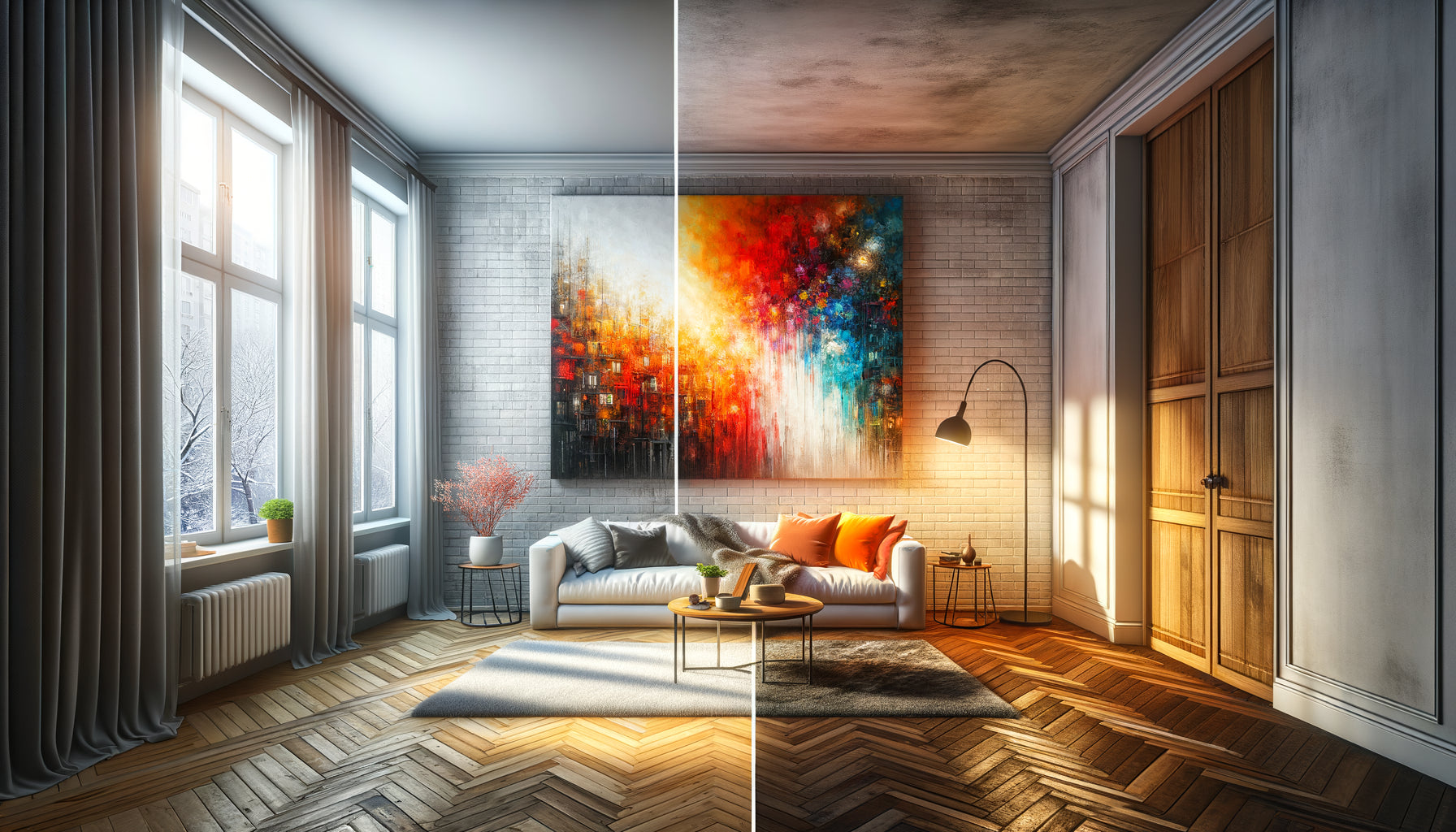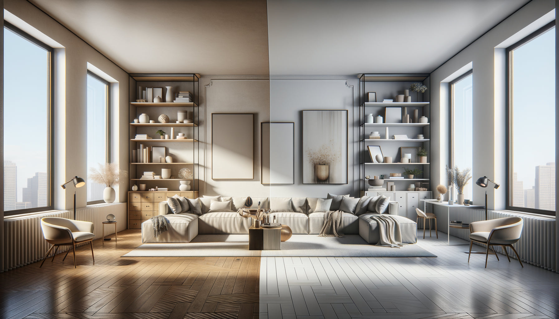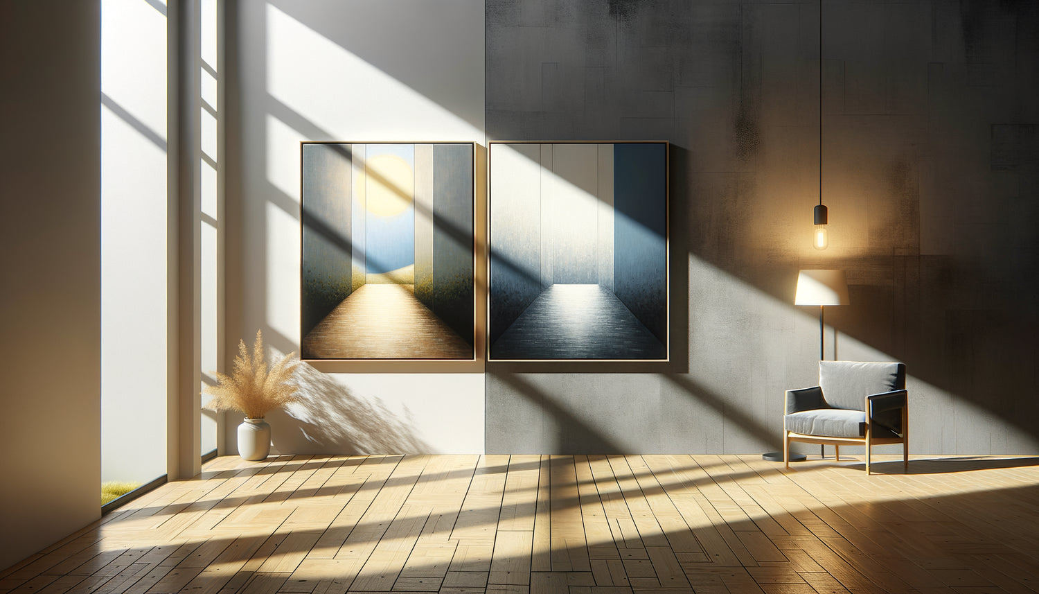
The apartment is signed, the boxes are ready, but a question haunts you: how to choose your paintings without having yet lived in this space? This light coming through these unknown windows will transform your favorite works into a decorative disaster?
Here's what pre-selection of paintings adapted to an unknown natural brightness brings you: the freedom to compose your collection now, the assurance that your artworks will resist variations in light, and the certainty of avoiding costly mistakes related to reflections, discoloration or visual disappearances.
You feel this frustration: it is impossible to test your favorites in your future living room. Salespeople are pressuring you, delivery times are lengthening, and you fear that a magnificent artwork in a gallery will become invisible under the harsh light of a south-facing exposure.
Rest assured: for twelve years of supporting collectors in real estate transitions, I have developed an infallible method to select paintings resistant to all lighting conditions. These technical criteria, often ignored even by experienced decorators, transform uncertainty into strategy.
I will reveal the six essential parameters that guarantee a painting will flourish whatever the natural brightness of your future interior.
The reflectance coefficient: your first shield against the unpredictable
Before even falling in love with a composition, examine the surface finish of the painting. This technical detail determines whether your artwork will capture light harmoniously or create dazzling areas.
Paintings with a matte or satin finish have a reflectance coefficient of less than 20%. Specifically, they absorb most of the light rays instead of reflecting them towards your eyes. This property makes them extraordinarily versatile: as readable in front of a bay window facing full south as in a poorly lit north hallway.
Conversely, varnished glossy works create point mirrors that reveal every light source. Beautiful in controlled lighting, they become unreadable under direct natural light. I have seen collectors spend thousands of euros on pieces that they had to relegate to secondary spaces after moving in.
Test in gallery: photograph the artwork from different angles with flash enabled. If saturated white areas appear, this excessive reflectance will be a problem in an environment with variable natural brightness.
The tilt test technique
Tilt your head slightly in front of the painting. If the image partially disappears or radically changes appearance depending on your position, this artwork will require millimeter placement that you cannot guarantee without knowing your future brightness. Favor pieces whose reading remains stable regardless of your viewing angle.
The contrast depth: when light reveals or erases
Natural light possesses this fascinating and cruel power to amplify or cancel out the contrasts of a painting. A work with subtle nuances, superb under the subdued lighting of a gallery, can literally evaporate under abundant natural light.
For paintings adapted to an unknown natural brightness, look for a high contrast index. Technically, the difference between the darkest and lightest values should be perceptible even when squinting. This reserve of differentiation ensures that the work will retain its narrative structure regardless of light intensity.
Monochrome pieces or those with subtle gradients represent the greatest risk. They require precise control of ambient light to reveal their nuances. Without knowing the orientation of your windows, the presence of filtering trees or reflective vis-à-vis, you are betting on the unknown.
My verification tip: take a black and white photo of the painting with your phone. If the resulting image retains its depth and readability, the work has enough structural contrast to withstand variations in light. If it becomes flat or confused, move on.

These pigments that defy time and light
Natural brightness is loaded with destructive ultraviolet rays. A work exposed near a window receives the equivalent of several years of artificial lighting in a few months. Without knowing future sun exposure, your best ally becomes the intrinsic resistance of the pigments.
Request information on the color permanence index used. Professional pigments are rated for their UV resistance: look for the 'Lightfastness I' or 'Excellent Permanence' designation. These formulations retain their brilliance for decades even under direct exposure.
Artist-quality acrylics and oils formulated with mineral pigments generally offer excellent stability. Be wary of works with particularly vibrant shades in reds, pinks and purples: these color ranges often require more fragile organic pigments that quickly fade under intense natural light.
The trap of prints and reproductions
Printed artworks, even of high quality, use pigment inks whose longevity varies considerably. Without explicit UV resistance certification (look for 'Giclée on archival paper' or '100+ year certified print'), these pieces may lose 30% of their color intensity in two years near a window.
The tonal composition: your all-risk light insurance
Some color palettes successfully navigate all lighting environments. This compositional resilience is based on millennia-old artistic principles that masters intuitively exploited.
Tableaux built on a dominant of mid-tones (neither very light nor very dark) with contrasting accents have remarkable adaptability. Under low natural light, mid-tones capture enough light to remain visible. Under strong light, they do not saturate and retain their depth.
Conversely, extreme compositions pose problems: very dark paintings disappear in poorly lit interiors, while works that are very light become dazzling under direct light, losing all definition.
Analyze the tonal distribution: ideally, 60% of the work should be in mid-values, with 20% dark areas and 20% light areas. This proportion guarantees a balanced reading regardless of natural lighting conditions.

The format and visual density facing changing light
The size of a painting radically changes its perception under different lighting conditions. This parameter, often neglected, becomes crucial when you cannot anticipate the exact lighting ambiance.
Large formats (over 100 cm) with an airy composition better tolerate extreme variations in light. Their scale creates a presence that persists even under low lighting, while their visual breathing avoids saturation under intense light.
Small formats require more precise control of the light. Under low natural light, they lose impact; under strong light, their details can be crushed by ambient glare. If you opt for pieces less than 50 cm, absolutely prioritize compositions with high contrast and matte finish.
Also observe the density of visual information. Very detailed works require precise lighting to reveal their richness. Stripped-down compositions, with clear shapes and generous blocks of color, maintain their readability regardless of the quality of natural light.
The protective framing: your last line of defense
The frame is not just a decorative element: it's a protection system against light aggression. For artworks intended for an unknown natural brightness, the framing becomes a selection criterion in its own right.
If the artwork allows, require UV-resistant glass or museum glass filtering up to 99% of ultraviolet rays. This 30 to 50% extra cost is life insurance for your artistic investment. Even under direct daily sunlight exposure, your colors will remain intact.
For canvases without glazing, check for the presence of a UV protective varnish. Professional artists systematically apply this final transparent layer which filters harmful rays while unifying the surface. Its absence condemns the artwork to accelerated degradation in any uncontrolled lighting environment.
Also consider the frame depth: a box of at least 3 cm creates a peripheral shadow zone that attenuates the impact of grazing light, particularly aggressive in the morning or late afternoon depending on window orientation.
Ready to compose your collection without waiting to discover your new light?
Discover our exclusive collection of wall art for Apartment which have been selected according to these light resilience criteria to thrive in all environments.
Your new life begins now, your walls too
Imagine that moment: you cross the threshold of your new apartment, the boxes are stacked, and your paintings are waiting to be hung. Natural light floods the space, different from what you imagined, yet... each artwork reveals exactly the presence you were hoping for.
No unpleasant surprises, no blinding reflections, no dull or faded colors. Simply the satisfaction of having anticipated the unpredictable thanks to solid technical criteria rather than a haphazard intuition.
These six verification parameters transform the purchase of paintings for an unknown natural brightness into a methodical approach. Matte finish, high contrast, permanent pigments, dominant mid-tones, adapted format and UV protection: your checklist for walls that tell your story whatever light bathes them.
Start today: revisit your favorites list with this new technical perspective. You will naturally eliminate at-risk pieces and strengthen your confidence in those that will brilliantly cross all lighting environments.