That blank wall above your sofa has been taunting you for months. You've already imagined a hundred times the perfect artwork for that spot: the one that would transform your living room into a magazine-worthy space, the one that would make your guests say "Wow, that's exactly what it needed." But between questions about dimensions, hanging height, and style, you still haven't done anything. And that void persists.
Here's what a well-chosen artwork above your sofa brings: a focal point that visually structures your living room, an affirmed personality that tells who you are, and that harmonious balance that makes all the difference between a mediocre space and an interior that truly resembles you.
Frustration, I know it well. After fifteen years of composing spaces for demanding individuals, I've seen too many beautiful artworks completely lost because they were too small, too high, or simply unsuitable for the sofa they were supposed to enhance. The classic mistake? Choosing based on a whim without considering proportions, ideal height, or stylistic consistency. Result: a work that floats in the void or overwhelms the space.
This guide gives you the concrete keys so that your artwork above the sofa becomes that masterpiece you imagine. From precise dimensions to placement tips, you will know exactly how to create that "it was obvious" effect that characterizes the most beautiful interiors.
The rule of thirds: your best ally for choosing size
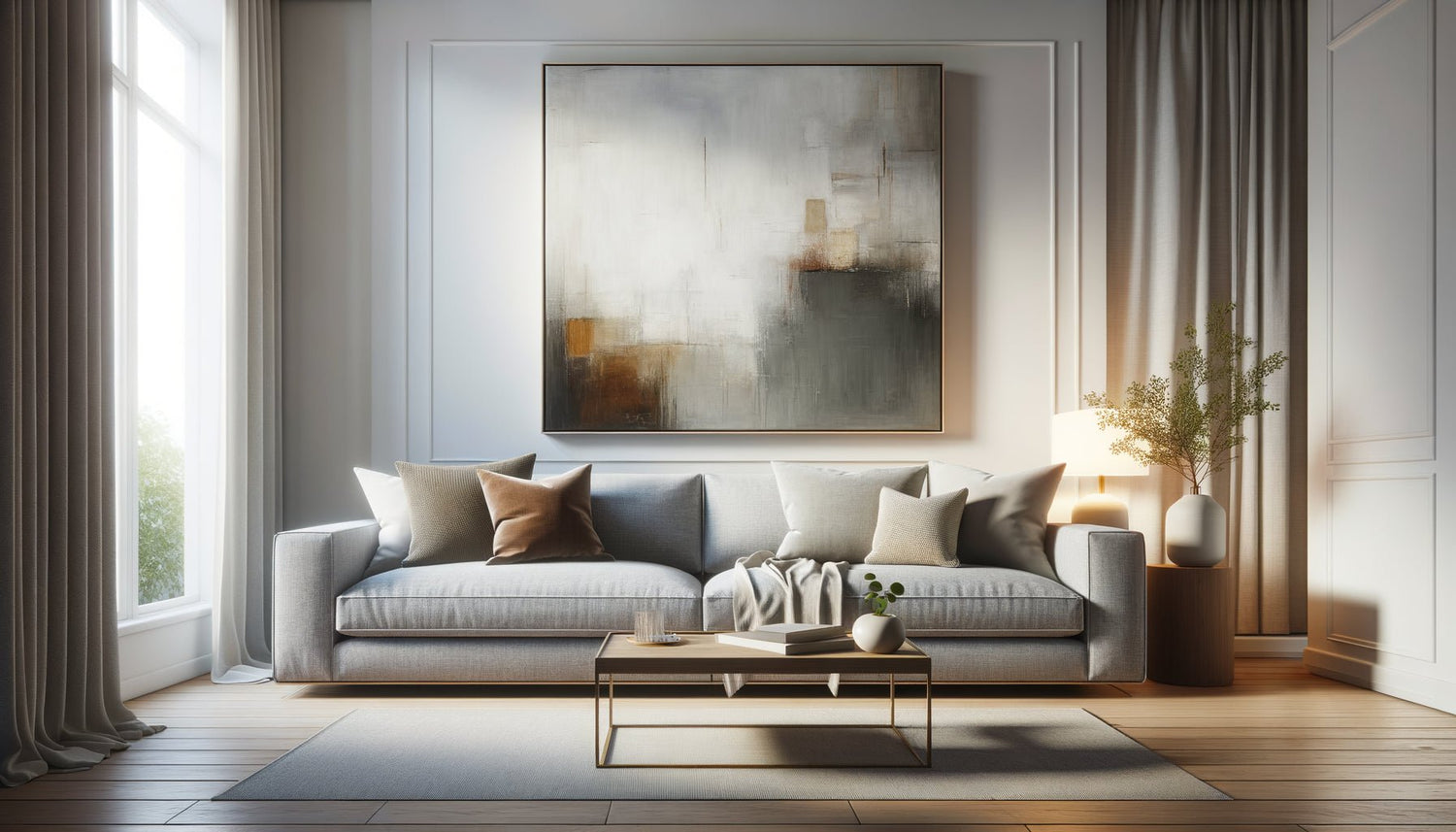
Forget approximations. For a painting above a sofa to create the desired visual harmony, there is a golden rule tested on hundreds of projects: the width of your artwork should represent between 50% and 75% of the total width of your sofa. Ideally, aim for two-thirds.
Specifically, if your sofa measures 200 cm wide, look for an artwork between 100 cm and 150 cm. This proportion creates a natural visual dialogue between the furniture and the work, without one overwhelming the other. A painting that is too small will give the impression of floating in the void, creating an uncomfortable imbalance. Conversely, a work that is too imposing will visually stifle your sofa.
I recently worked on a living room where a 220 cm sofa was topped with a 60 cm artwork. The effect was catastrophic: the wall seemed empty despite the presence of the work. By replacing it with a composition of 140 cm, the space instantly found its balance. The sofa and the painting were finally talking to each other instead of ignoring each other.
The multiple composition alternative
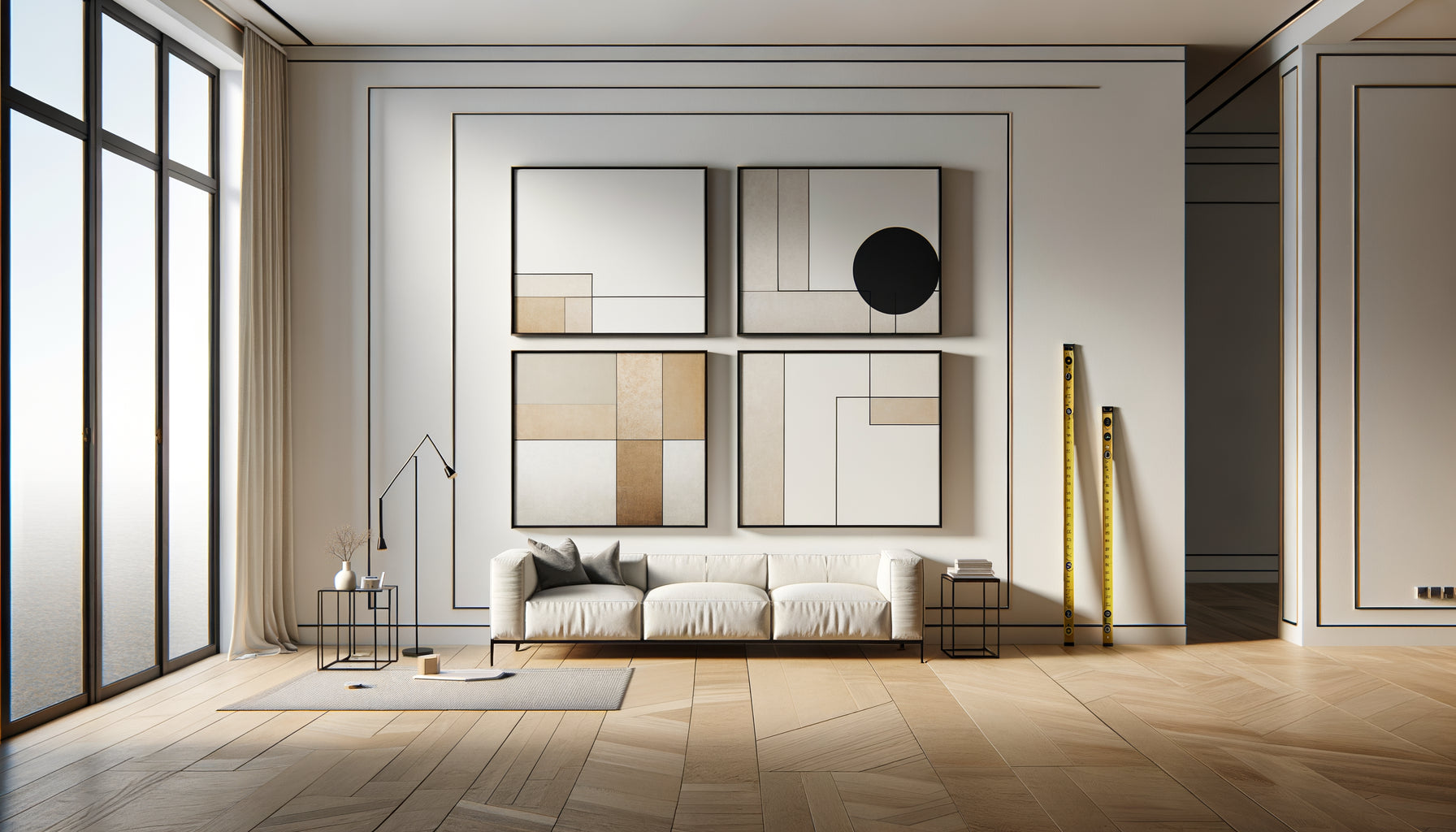
If you don't have a large artwork on hand, create a wall composition with several artworks of varying sizes. The whole must respect the same rule of thirds. Mentally trace an imaginary rectangle encompassing all your pieces: this overall area should measure between 50% and 75% of the width of the sofa. This technique offers creative flexibility while maintaining the essential proportional balance.
At what height to hang your artwork? The science of the perfect gaze
The hanging height determines whether your artwork will be comfortable to view or seem misplaced. The universal rule in museums and galleries? The center of the artwork should be at eye level, approximately 145-150 cm from the floor. But above a sofa, this rule requires a crucial adjustment.
When you are seated, your natural line of sight changes completely. For an artwork above a sofa, the trick is to leave between 15 and 25 cm of space between the top of the backrest and the bottom of the frame. This interval creates visual breathing room while keeping the artwork within your comfortable field of vision, whether you are sitting or standing.
Too much space? Your artwork will seem disconnected from the sofa, as if it belongs to the ceiling rather than your living room composition. Not enough? The whole thing will appear compressed and stifling. These 15-25 cm represent the ideal balance point tested on countless configurations.
The mistake everyone makes
Never measure from the floor assuming a standard height. Each sofa has a different backrest height. Always measure from the top of your specific backrest, then add your 15-25 cm. This method guarantees a harmonious result, regardless of your furniture.

Discover this inspiring artwork
Adapting your artwork's style to the atmosphere of the living room
An artwork above a sofa is not just about dimensions. It’s the first element your guests will notice when entering, the one that defines the ambiance of the entire space. The style of your artwork should therefore dialogue with your furniture and color palette.
For a contemporary sofa with clean lines, prioritize abstract art, geometric compositions or artistic photography. These styles amplify modernity without creating a stylistic rupture. Colors can be bold or minimalist depending on whether you are looking for a dynamic focal point or understated elegance.
With a classic or velvet sofa, dare to use romantic landscapes, sophisticated still lifes or even a vintage portrait. These works create a historical continuity that enriches the decorative depth of the space. However, be careful not to fall into pastiche: even in a classic universe, a touch of surprise is always welcome.
Scandinavian or mid-century sofas pair beautifully with botanical illustrations, vintage prints by artists from the 50s-60s, or organic abstractions in soft colors. These styles share a common search for balance between functionality and aesthetics.
Color harmony, the key to a successful ensemble
Your artwork can either reprise the dominant colors of your living room to create a soothing harmony, or introduce a contrasting accent color to energize the space. Both approaches work, but rarely simultaneously. A living room in neutral beige and gray tones can receive a splash of teal or terracotta via the artwork. Conversely, a space that is already colorful will benefit from a piece that unifies existing shades rather than adding new ones.
Vertical, horizontal, and square formats: which one to choose?
The format of your artwork radically influences the perception of space. A horizontal (landscape) format is the natural choice for a painting above a sofa: it follows the width of the furniture and visually expands the room by accentuating horizontal lines. It's the safest and most harmonious option for 80% of configurations.
A vertical (portrait) format works beautifully above a compact sofa or in a space with beautiful ceiling height that you want to enhance. It draws the eye upwards and brings a sculptural elegance to the whole. However, be careful: it requires a sufficiently proportioned sofa to avoid creating imbalance.
The square format offers architectural modernity particularly suited to contemporary interiors. Its symmetry creates a reassuring visual stability, ideal for minimalist spaces or sofas with very geometric lines.
In my practice, I observe that the horizontal format remains the most versatile and easiest to succeed with, but vertical and square formats offer fascinating creative opportunities when the proportions of the space allow it.

Discover this inspiring artwork
Corner sofa: composing with complexity
A corner sofa presents a specific challenge: which part of the furniture should you consider when choosing your artwork? The answer depends on your layout. If your corner sofa forms an L in a room's corner, focus on the longest section and treat it like a classic sofa to apply the rule of thirds.
A common mistake is wanting to cover the entire length of the L with a gigantic artwork. The result: a disproportionate piece that overwhelms the space. It's better to create a focal point above the main section, then potentially compose a second point of interest on the perpendicular wall with smaller artworks or complementary decorative elements.
For a corner sofa placed in the center of the room (a less common configuration), the artwork naturally positions itself behind the most visible section from the main entrance to your living room.
Your living room deserves a work of art that truly resembles it
Discover our exclusive collection of landscape paintings that will transform the space above your sofa into a true focal point.
Finishes and framing: the detail that changes everything
The impact of the frame on overall harmony is too often neglected. A painting above a dark leather sofa will beautifully complement a matte black or dark wood frame, creating consistent sophistication. Conversely, a light-toned sofa with natural hues calls for light wood, white, or even frameless frames for a modern canvas.
Gold or brass frames bring a touch of luxury particularly suited to chic classic interiors or art deco universes. They instantly warm up the atmosphere and create a captivating point of light.
For lovers of radical modernity, the frameless canvas offers a contemporary fluidity where the artwork seems to float on the wall. This option works wonderfully with large formats and graphic abstractions, but requires impeccable mounting execution to avoid any messy effect.
The mat (this margin between the artwork and the frame) remains an elegant technique for highlighting illustrations, watercolors or photographs. It creates a visual breathing space that focuses the gaze on the artwork itself, particularly effective for delicate compositions.
Visualize before hanging: the kraft paper technique
Before drilling your wall, use this professional trick that avoids 90% of placement errors: cut a piece of kraft paper or cardboard to the exact dimensions of your future artwork. Temporarily fix it to the wall with repositionable adhesive tape, then step back.
Live with this simulation for 24 to 48 hours. Observe it at different times of the day, under different lighting conditions. Sit on your sofa and check the visual comfort. Step back from the entrance of the room. This ghost artwork will immediately reveal to you whether the proportions work, whether the height is comfortable, whether the location creates the desired effect.
This simple technique has saved me countless holes in walls and costly adjustments. It allows you to experiment without risk and validate your choices before final installation. You can even test several wall composition configurations to identify the one that speaks to you most.
Create Your Personal Balance
Imagine yourself in three months, comfortably settled on your sofa, a book in hand. Your gaze naturally rises and meets this painting that makes you smile every time. This perfect balance between just proportions, ideal height, and consistent style transforms your living room into a personal refuge where every element finds its place.
This guide has given you the essential rules: two-thirds of width, 15-25 cm spacing, stylistic harmony. But the magic happens when you adapt them to your unique sensitivity. Start by accurately measuring your sofa, test with kraft paper, then choose the artwork that resonates with your universe. Your painting above the sofa is waiting for you to reveal the full potential of your living room.
Frequently Asked Questions About Paintings Above the Sofa
Can I put several small paintings instead of one large one above the sofa?
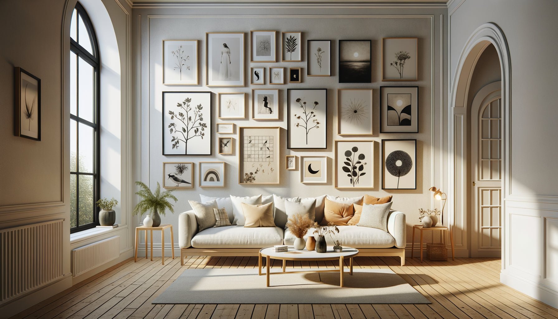
Absolutely, and it's even an excellent creative alternative! A wall composition with multiple paintings offers a unique personality to your living room. The key is consistency: respect the two-thirds rule considering your entire composition as a single visual block. First arrange your layout on the floor to test the harmony of sizes, colors, and spacing (keep 5-10 cm between each frame). Gallery wall compositions work beautifully with matching frames for unity, or deliberately varied frames for an assumed eclectic effect. Always start by hanging the centerpiece, then develop around it. This approach allows you to evolve your decoration gradually and tell a richer visual story than a single painting.
What should I do if my ceiling is very high and the painting seems lost?
A high ceiling is a valuable architectural asset that simply requires an adapted hanging strategy. First solution: increase the size of your artwork to occupy more vertical space without violating the two-thirds rule in width. Second approach: create a vertical composition with several stacked artworks that guide the eye upwards. Third option, my favorite for large volumes: add complementary decorative elements (floating shelves, wall sconces, hanging plants) that create visual tiers between the sofa and the ceiling. The goal is not to fill all the vertical space, but to create visual connections that harmoniously structure the height. Always keep your 15-25 cm between the back of the sofa and the artwork: this base remains unchanged even with cathedral ceilings.
Should the artwork's colors match those of the sofa cushions?
This question reveals a legitimate concern for harmony, but be careful not to fall into excessive coordination that would make the whole too predictable. The most successful approach is to create subtle chromatic echoes rather than a perfect assortment. If your cushions have petrol blue, your artwork can indeed contain this shade without it being dominant. The reverse works beautifully: first choose your favorite artwork, then select a few cushions that discreetly pick up a secondary color of the work. This method creates a sophisticated coherence without a catalog effect. The most successful interiors mix harmonies and surprises: 70% chromatic consistency for unity, 30% contrast for character. Your artwork can also play the role of contrasting accent that energizes a monochrome sofa, provided this boldness is assumed throughout the room.