In the hushed workshops where grand murals were born, an invisible presence silently altered the vision of artists. The fumes of turpentine, a solvent indispensable to painters, floated in the confined air of the scaffolding and imperceptibly transformed their perception of colors. This toxic reality shaped the works in ways that muralists themselves did not always suspect.
Here's what exposure to turpentine fumes caused in muralists: a progressive distortion of chromatic perception that pushed them to overcompensate for their color choices, eye fatigue that altered their judgment of nuances, and neurological modification that transformed their very relationship to the visible spectrum. These invisible effects explain some of the bold colors we admire in historical frescoes today.
You contemplate these monumental frescoes in churches, palaces, public buildings, and you wonder how these artists dared such audacious color combinations, so vibrant, sometimes so out of step with the conventions of their time. This question has haunted art historians for decades. But the answer may lie in the material working conditions, in this atmosphere saturated with solvents that these creators breathed daily, suspended between earth and sky.
Rest assured: understanding these mechanisms does not diminish the grandeur of these works. On the contrary, it reveals the complexity of the creative process, this alchemy between artistic intention and physiological constraints. Today, this knowledge allows us to appreciate these masterpieces differently and to question our own relationship with colors in our contemporary interiors.
I invite you to dive into this fascinating universe where chemistry and perception meet, where turpentine fumes became unwitting collaborators of the greatest muralists in history.
The toxic atmosphere of fresco workshops
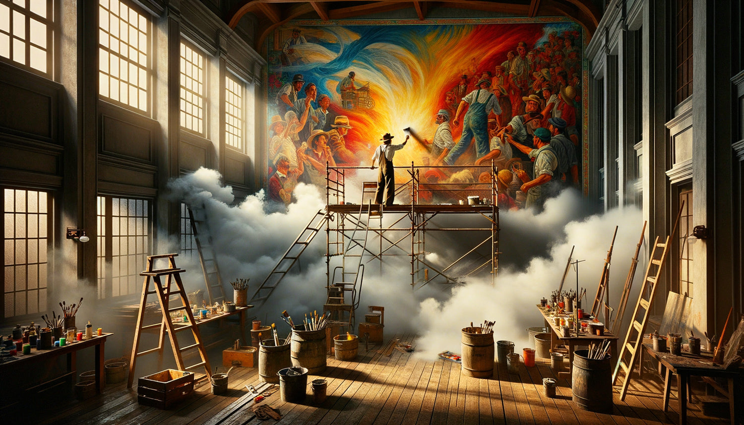
Large mural painting projects created closed environments where turpentine fumes accumulated with no effective way to escape. On the scaffolding erected against the walls, sometimes several meters high, muralists worked in confined spaces surrounded by protective tarpaulins that prevented air circulation. Each brushstroke, each tool cleaning, each pigment dilution released volatile molecules that gradually saturated the atmosphere.
Turpentine, extracted from pine resin, has been the universal solvent for oil paint since the Renaissance. Its exceptional diluting power made it an indispensable tool, but its volatility transformed every workshop into an involuntary inhalation chamber. Muralists spent eight, ten, sometimes twelve hours straight there, breathing these concentrated emissions without any real respiratory protection.
This chronic exhibition created a particular physiological state. Turpentine fumes penetrated the airways, passed into the bloodstream and reached the brain in minutes. The central nervous system, particularly sensitive to organic solvents, then began to function differently. Muralists often described a feeling of lightness, sometimes euphoria, which they attributed to creative inspiration when it was actually progressive intoxication.
How solvents modified chromatic perception
The effect of turpentine fumes on color vision followed a multi-step process. First, eye irritation: the eyes reddened, tearing and blinking increased, creating a liquid veil that altered light refraction. This initial physical alteration already changed the perception of delicate nuances.
Then came the neurological effect. Solvents act on neurotransmitters responsible for processing visual information. Dopamine and serotonin, involved in color perception, see their metabolism disrupted by exposure to organic fumes. The brain then begins to interpret signals sent by the retina differently.
Muralists exposed to turpentine fumes developed increased sensitivity to certain wavelengths, particularly in the blue-violet spectrum, while their perception of reds and yellows diminished. This phenomenon unconsciously pushed them to overload their compositions with warm pigments to compensate for what they perceived as a fading. The result? Frescoes where ochres, vermilions, Naples yellows burst with an intensity that the artist himself did not fully perceive in his vapor-saturated environment.
Unconscious chromatic compensation
Great muralists developed intuitive strategies to counter the effects of turpentine fumes on their perception. Diego Rivera, for example, used to descend from his scaffolding every two hours to observe his frescoes from the ground, in less saturated air. This practice allowed him to readjust his chromatic choices with a temporarily « detoxified » eye.
Other artists used color charts prepared in advance, in clean air conditions, as absolute references. They regularly compared their current mixes to reference samples, thus trying to compensate for the perceptual drift caused by exposure to fumes. This method reveals an acute awareness, among some masters, of the sensory alterations provoked by their tools.

Historical Testimonials from Muralists on Their Perception
Archives reveal unsettling confessions. Michelangelo, in his letters from the Sistine Chapel, mentions "mists in vision" and "colors that change between morning and evening." These descriptions precisely correspond to the known effects of turpentine fumes on the visual system. The Florentine master worked in a particularly confined space, lying on his scaffolding, his face just centimeters from the painted surface saturated with solvents.
In the 19th century, Puvis de Chavannes noted in his journal: "My blues always seem too pale on the wall, I must strengthen them considerably, then I discover the next day that they dominate the entire composition." This observation reveals the typical perceptual distortion caused by chronic solvent inhalation: weakening of sensitivity to cool tones during exposure, followed by a return to normal after a night's rest.
Mexican muralists of the 20th century, particularly prolific in their writings, described altered states of consciousness that they attributed to creative intensity. José Clemente Orozco spoke of "seeing colors vibrate and sing" after several hours of work. David Alfaro Siqueiros, more aware of chemical realities, frankly evoked the "intoxicating effects of turpentine and essences" which he considered an integral part of the mural creation experience.
The Colorful Legacy of This Chemical Constraint
Paradoxically, turpentine fumes and their effect on the perception of muralists have contributed to creating some stylistic signatures that we admire today. The excessive chromatic intensity of many Baroque frescoes, long attributed to a taste for exuberance of the time, may partly result from this involuntary perceptual compensation.
Renaissance Italian frescoes often present more marked chromatic temperature contrasts than what color theory of the time recommended. Reds blaze against deep blues, yellows burst next to saturated violets. This boldness, which we interpret as a visionary mastery of color, may partly be the result of an altered vision seeking to perceive contrasts that the intoxicated brain no longer clearly distinguished.
In our contemporary interiors, this historical lesson takes on a new meaning. When we choose wall art or vibrant-colored abstract compositions, we may be unconsciously responding to this legacy of muralists: the need for intensified colors, affirmed contrasts, chromatic presences that assert their existence despite perception conditions.
Modern restoration methods shed light on the past
Contemporary restorers, equipped with spectrographic analyses, regularly discover that the pigments used in ancient frescoes are much more concentrated than necessary to achieve the desired visual effect. This "over-pigmentation" is perfectly explained by the altered perception of muralists working in solvent fumes.
Some restorations even reveal layers of pentimenti where the artist, returning to their work after ventilation, attempted to soften colors that they suddenly judged too intense. These corrections bear witness to a progressive awareness of the effects of turpentine vapors on chromatic judgment.

Recreating intensity without risks in our contemporary spaces
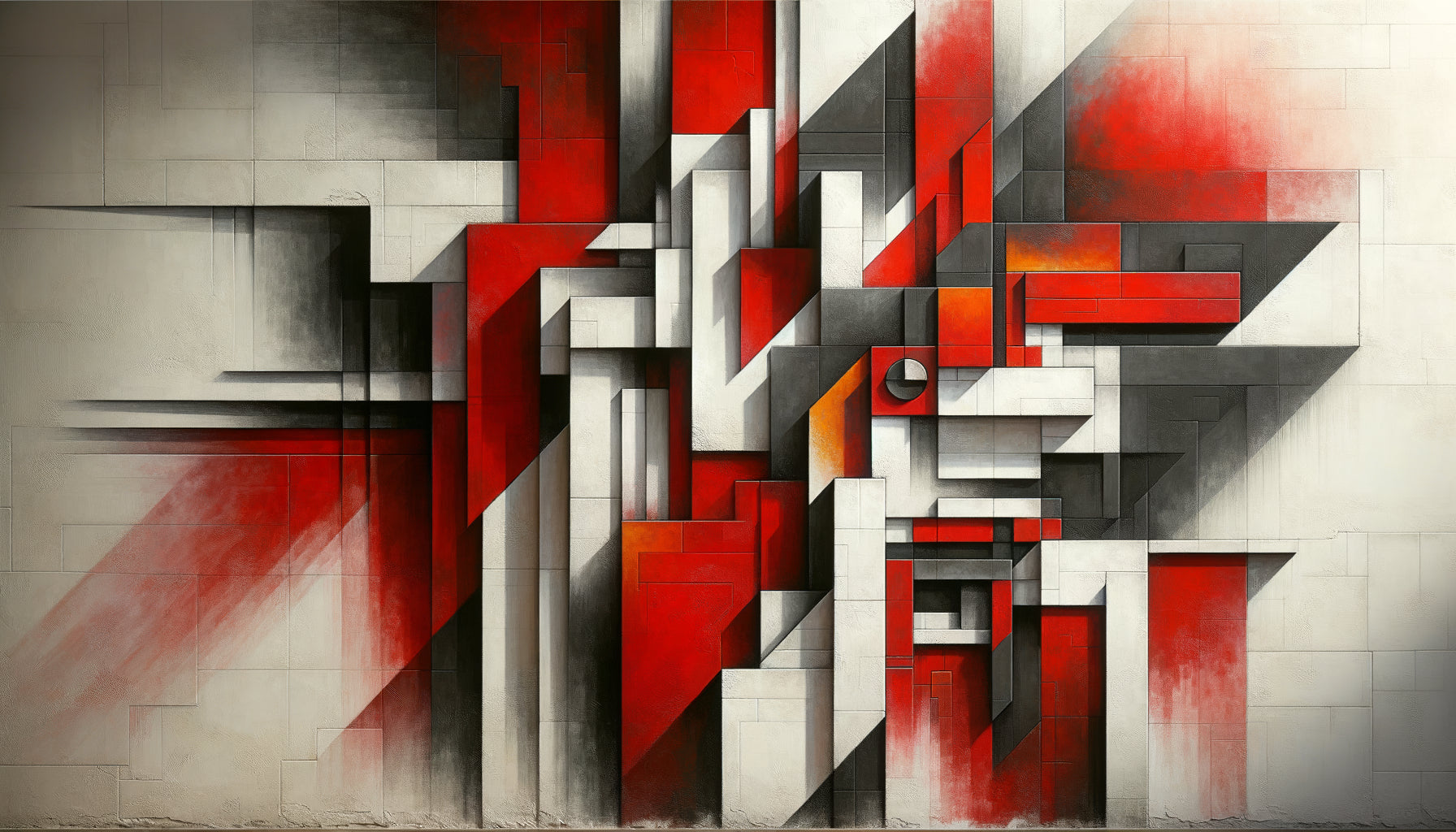
Today, we can capture this chromatic intensity characteristic of large mural frescoes without exposure to toxic fumes. Contemporary wall compositions are directly inspired by this visual legacy: saturated colors, affirmed contrasts, a presence that transforms the space.
In a living room or dining room, a vibrant-colored artwork creates this sense of monumentality that muralists sought in their frescoes. Deep blues converse with warm ochres, vermilion reds respond to emerald greens, recreating these bold chromatic harmonies born in workshops saturated with fumes.
Lighting plays a crucial role in this contemporary transposition. Where muralists struggled against perception altered by solvents, we can use LED lighting with variable color temperature to reveal all the nuances of a composition. In the morning, cooler light highlights blues and purples; in the evening, a warm tone exalts reds and yellows, creating an evolving chromatic experience.
Capture the chromatic intensity of the great masters in your interior
Discover our exclusive collection of abstract paintings that recreate these powerful colored vibrations, inherited from historical wall art, without compromising the health of your environment.
The lesson of vapors for our contemporary relationship with color
This history of turpentine fumes and their influence on the perception of muralists teaches us a profound truth: our experience of color is never purely objective. It depends on our physiology, our environment, our internal states. The great masters created in conditions that modified their vision, yet they produced works that continue to move us.
This understanding frees us in our own decorative choices. There is no « good » perception of color, only different chromatic experiences. What matters is the emotion provoked, the transformation of space, the personal resonance with a palette.
When you install a colorful composition in your interior, you perpetuate this millennial tradition of dialogue with pigments. Your perception, unique and subjective, determines your emotional response. Muralists knew this intuitively, even if they attributed their intensified visions to divine inspiration rather than neurological effects of solvents.
Imagine your main wall transformed by a vibrant color composition, a direct heir to this mural tradition. Every morning, the light reveals new nuances. Every evening, the tones warm and dialogue with the ambient lighting. You have created your own contemporary fresco, with the chromatic intensity of the masters but in a healthy environment. You have become, on your scale, a curator of color, perpetuating this fascinating heritage where perception and pigment dance together to create visual emotion.
Frequently asked questions about the influence of fumes on artistic perception
Are contemporary artists still affected by solvent fumes?
Modern artists using acrylic paints or digital techniques are no longer exposed to turpentine fumes like their predecessors. However, those who still work with oils and traditional solvents may experience similar effects if they do not ventilate their studio properly. Current safety standards recommend mechanical ventilation systems and wearing respirators when using organic solvents for extended periods. Awareness of risks has evolved considerably, and most art schools now teach chemical safety practices. Alternatives such as citrus-based solvents or odorless mediums allow health to be preserved while maintaining traditional techniques. This evolution reminds us that the material conditions of creation always influence the final work, even if this influence has become more controllable.
How to tell if a historical mural was painted under the influence of fumes?
Several clues allow art historians to detect the probable influence of turpentine fumes on a wall painting. The excessive concentration of pigments, revealed by spectrographic analysis, suggests that the artist was compensating for impaired perception. Unusually marked chromatic temperature contrasts, with very saturated reds and yellows adjacent to deep blues, may also indicate perceptual alteration. Restorers also examine layers of pentimenti: corrections made after drying, where the artist attempted to soften colors that had become too vivid, revealing a post-exposure awareness. Written testimonies from artists mentioning visual difficulties, “fogs” or changes in perception between work sessions constitute valuable documentary evidence. Finally, comparison with preparatory sketches made in a ventilated studio sometimes shows significant chromatic discrepancies with the final artwork.
Can I recreate the intensity of historical murals in my modern interior?
Absolutely, and without any of the toxic risks that muralists faced! The characteristic chromatic intensity of large frescoes can be perfectly transposed into a contemporary interior thanks to modern wall compositions. Choose works with marked temperature contrasts: deep blues against warm ochres, saturated purples near bright yellows. Lighting plays a crucial role: install adjustable spotlights or variable-temperature LEDs to make the colors vibrate according to the time of day. Size also counts; a generously sized room, even in an accessible format, creates that monumental effect sought by muralists. Position the artwork on a clear wall, like a fresco in its original architecture, to give it all its presence. Modern printing techniques on canvas faithfully reproduce the textures and depth of historical pigments, offering you the visual heritage of masters with the durability and safety of contemporary technologies.