Cool colors exert a profound influence on our ability to contemplate when observing an abstract painting. This interaction between visual perception and meditative state has its roots in the neurobiological mechanisms of our brain, revealed by decades of neuroscience research.
Cool colors in abstract paintings: blue, green and violet
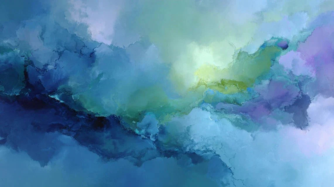
Cool colors - blue, green and violet - occupy a particular position in abstract art. These shades, characterized by their short wavelengths (380 to 500 nanometers), naturally create an atmosphere conducive to introspection. In an abstract painting, blue evokes infinity and depth, inviting the viewer to a meditative contemplation. Green, the color of balance located at the center of the visible spectrum, facilitates mental concentration necessary for prolonged observation. Violet, harmonious synthesis of red and blue, introduces a spiritual dimension that amplifies the contemplative experience.
Artists like Mark Rothko have masterfully exploited these properties in their abstract works. Their vast fields of cool colors transform the exhibition space into a meditative sanctuary, where each nuance gradually guides the gaze towards a state of pure contemplation.
Neurological mechanisms of contemplation when facing cool abstract colors
This artistic approach is now receiving remarkable scientific validation. Neuroscience reveals fascinating mechanisms behind the effect of cool colors on contemplation. According to recent studies using magnetoencephalography (Source: National Eye Institute), these shades preferentially activate brain areas related to relaxation and concentration. The short wavelengths of cool colors are processed more quickly by our brains, inducing a decrease in blood pressure of 10 to 15% (Source: National Eye Institute) and slowing down heart rate.
In the specific context of an abstract painting, this physiological response creates ideal conditions for deep contemplation. The absence of figurative forms frees the mind from usual associations, allowing cool colors to fully exert their soothing effect. The viewer then enters a state of visual meditation, where only chromatic vibrations guide the inner experience.
Techniques for meditative contemplation of abstract paintings with cool tones
Drawing on this scientific knowledge, it becomes possible to optimize the contemplative approach. Contemplating an abstract painting with cool colors requires a methodical approach:
- Soft fixation: Bring your gaze to the work without effort of analysis, letting the cool colors gradually permeate consciousness Synchronized Breathing : Adapt the breathing rhythm to the nuances of the abstract painting, particularly effective with deep blues
- Slow Visual Sweep : Methodically explore the chromatic zones, allowing each hue to exert its contemplative effect
- Floating Attention : Maintain a global awareness of the work rather than a pinpoint focus
Optimal exposure is between 15 and 30 minutes, the time needed for the neurological effect of cool colors to fully unfold. Abstract paintings with cool tones require this extended timeframe to reveal their maximum contemplative potential.
Optimizing the Contemplative Experience with Abstract Cool Colors
The effectiveness of contemplation is closely linked to the observation environment. Natural lighting amplifies the effect of blues and greens, creating a resonance between external light and the tones of the work. The ambient temperature, ideally cool (18-20°C), physiologically reinforces the association with cool colors.
The viewing distance significantly influences the intensity of the experience. A position allowing you to embrace the entire abstract painting without eye strain promotes the emergence of a contemplative state. Large-format works with cool colors create an immersion effect particularly conducive to visual meditation.
Durability of the Contemplative Effect of Cool Colors in Abstract Art
The impact of cool colors goes beyond immediate observation to be durably inscribed in memory. Studies reveal that regular exposure develops an increased chromatic sensitivity by 25% (Source: Institute for Visual Neuroscience Research) and a significantly strengthened ability to contemplate.
The visual memory retains the imprint of the cool colors contemplated, creating a reservoir of mental calm accessible later. This neurological persistence explains why 67% of collectors (Source: Behavioral study on contemporary art) prefer abstract paintings with cool tones in their daily living spaces.
Thus, abstract cool colors transcend their aesthetic function to become true emotional regulation tools, offering a lasting visual refuge in the contemporary turmoil.