- Presentation Real estate agency art
- Wall art for real estate agency: Professional impact
- Wall art for real estate agency: Space design
- Wall art for real estate agency: Visual strategy
Discover our exclusive selection of wall art for real estate agencies, designed specifically to enhance your professional spaces and strengthen your brand image. Our large-format creations transform your offices into welcoming environments where every client feels confident completing their real estate projects. Explore our three comprehensive guides to make the optimal choice that will set your establishment apart.
The decisive influence of wall art on your real estate agency's credibility
In the real estate sector, first impression often determines the course of the business relationship. A strategically chosen real estate agency wall art acts as a silent certificate of professionalism the moment your clients cross your office threshold. Property owners entrusting the sale of their asset and buyers investing their savings unconsciously seek signs of reliability in your environment.
How does your wall decoration influence real estate purchase decisions?
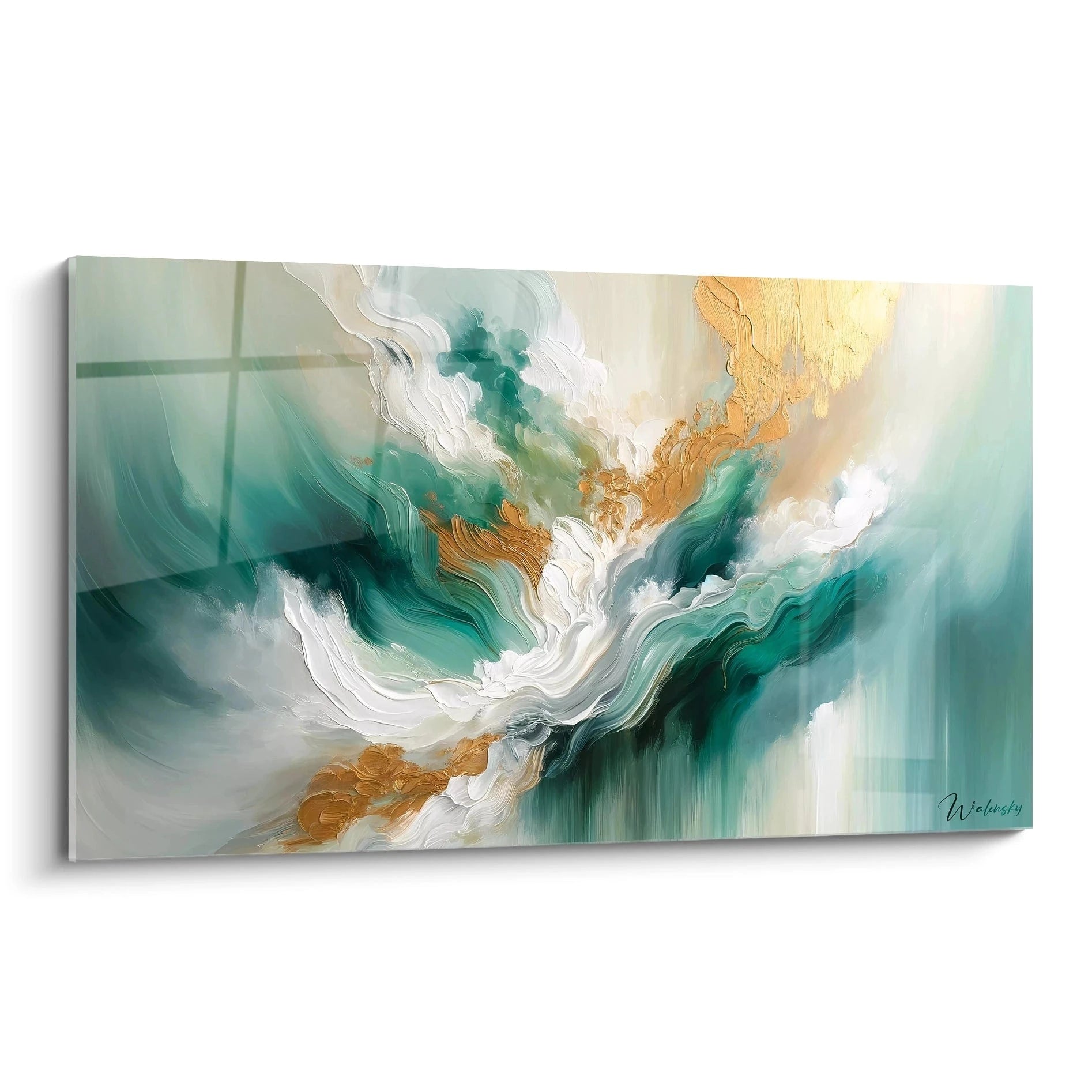
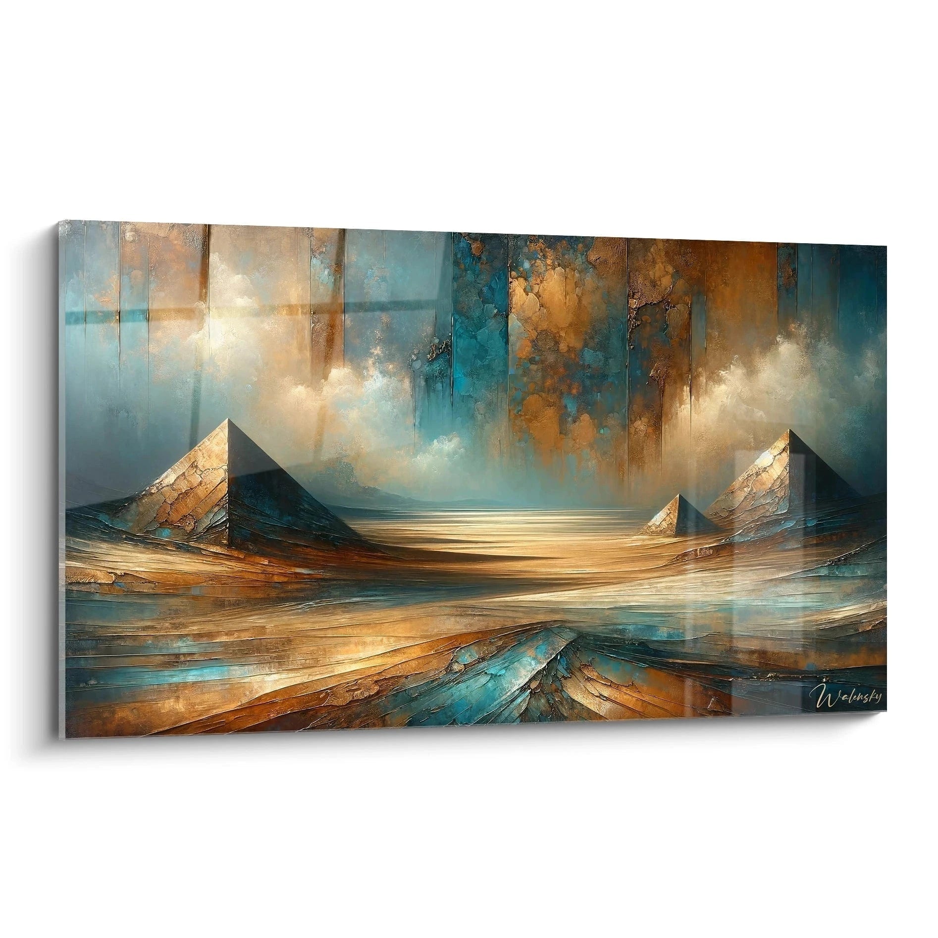
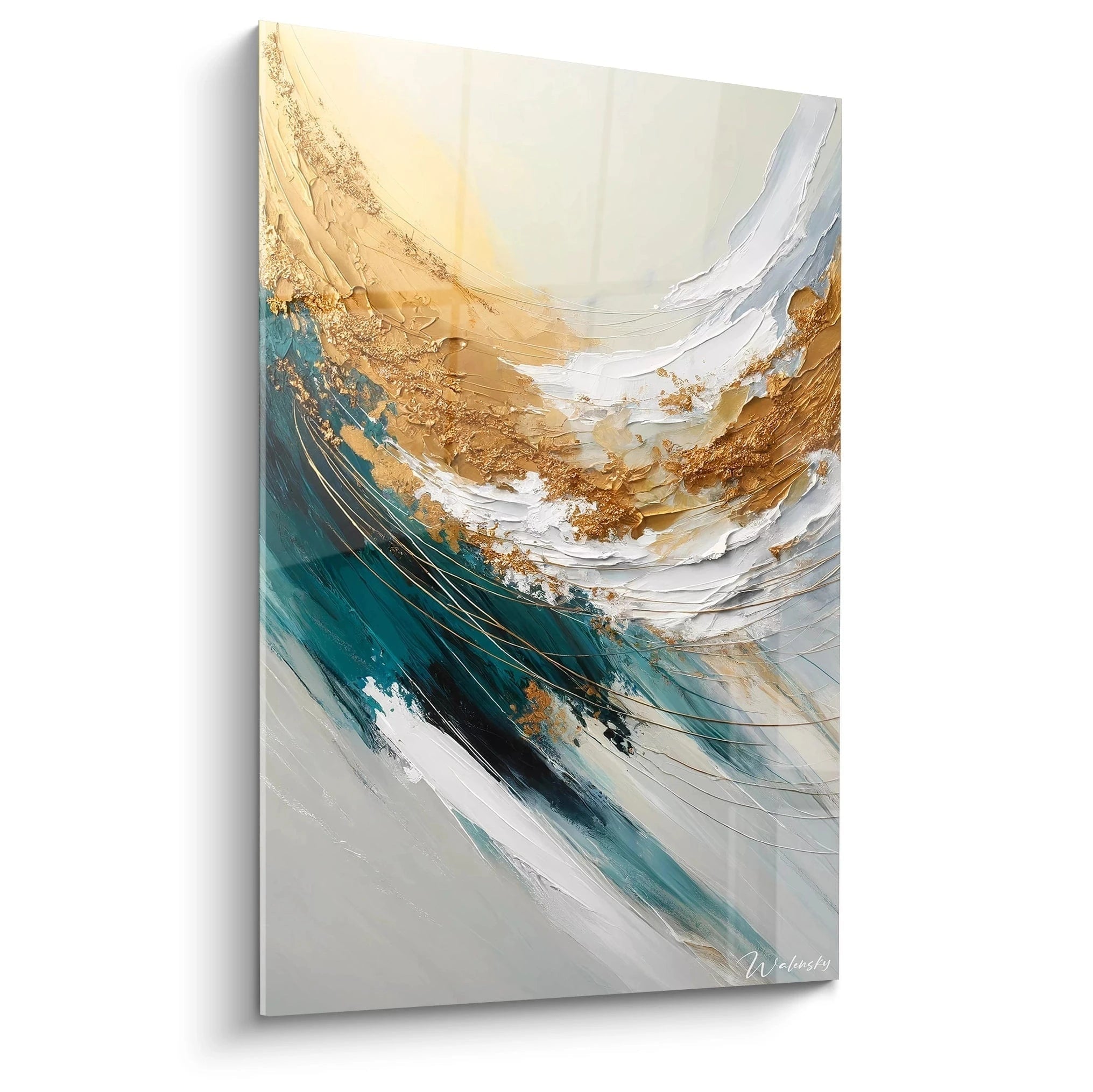
Neuroscience applied to commerce reveals that the visual environment of a transaction venue directly impacts the level of trust granted by the client. Wall art for a real estate agency depicting emblematic architectures or sophisticated urban panoramas creates a mental association between your establishment and the quality of service offered. This psychological correlation works particularly well with representations of sought-after neighborhoods, recognizable skylines, or exceptional properties that evoke expertise and professional networks.
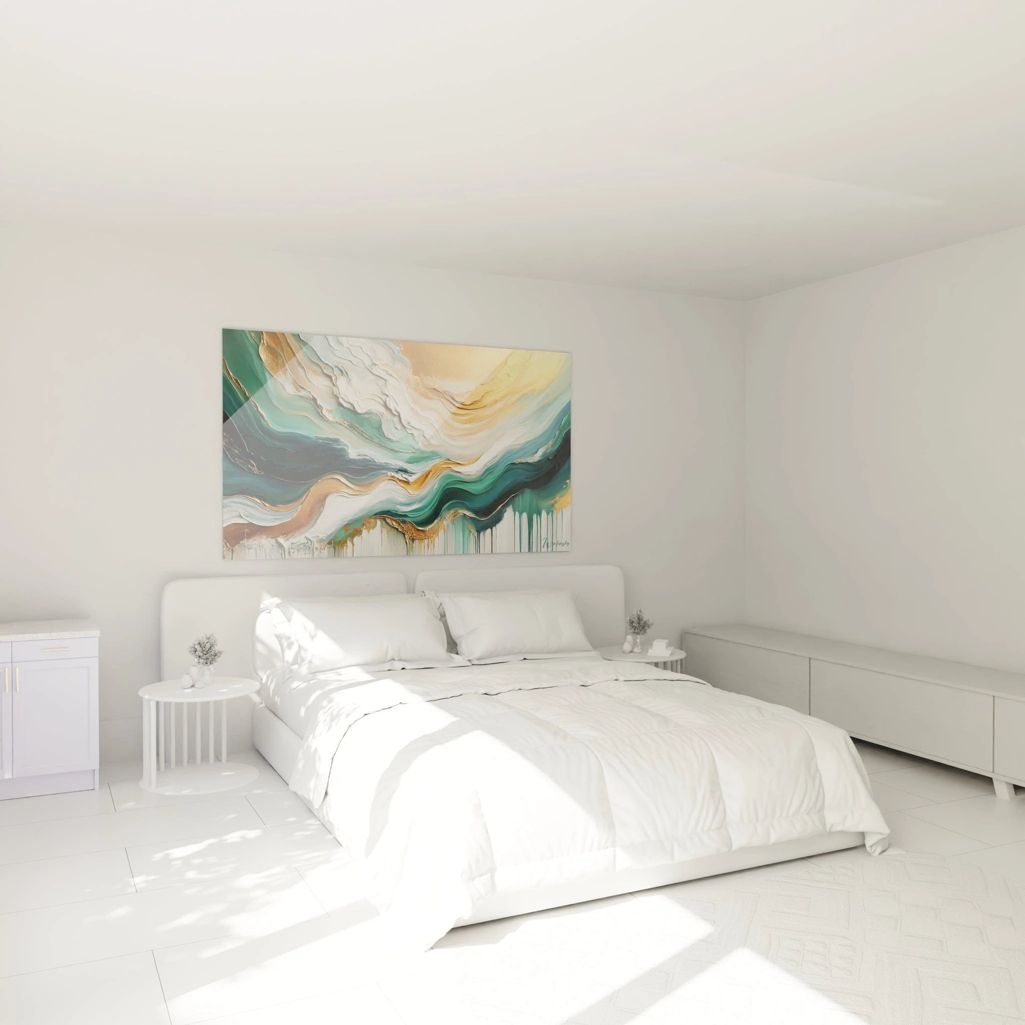
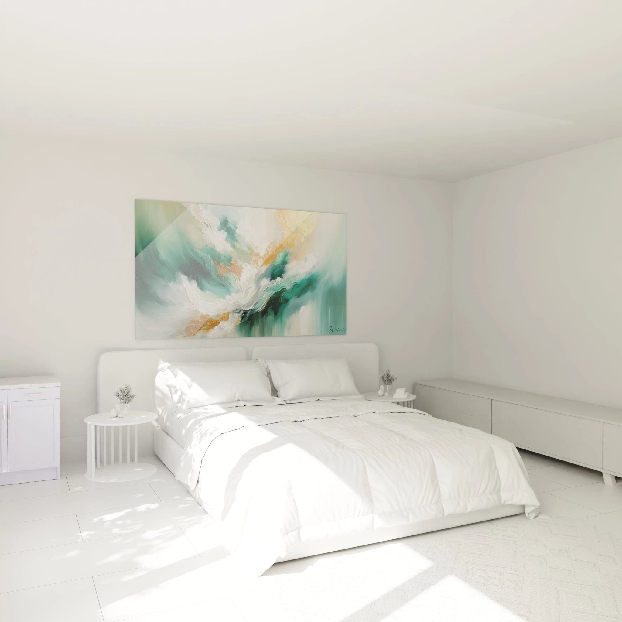
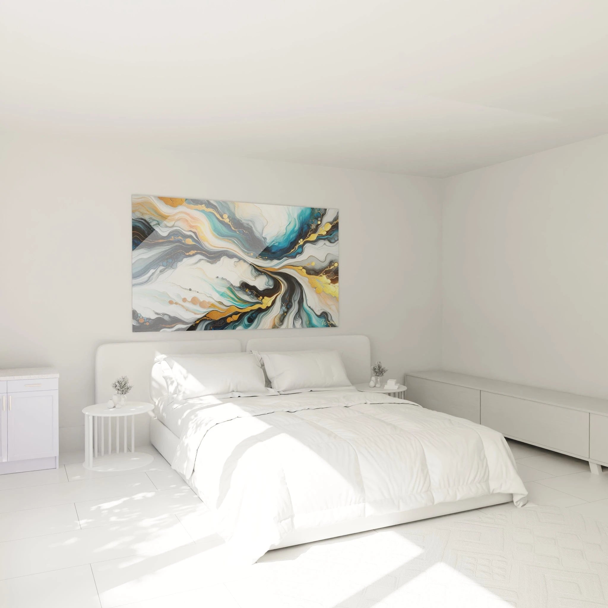
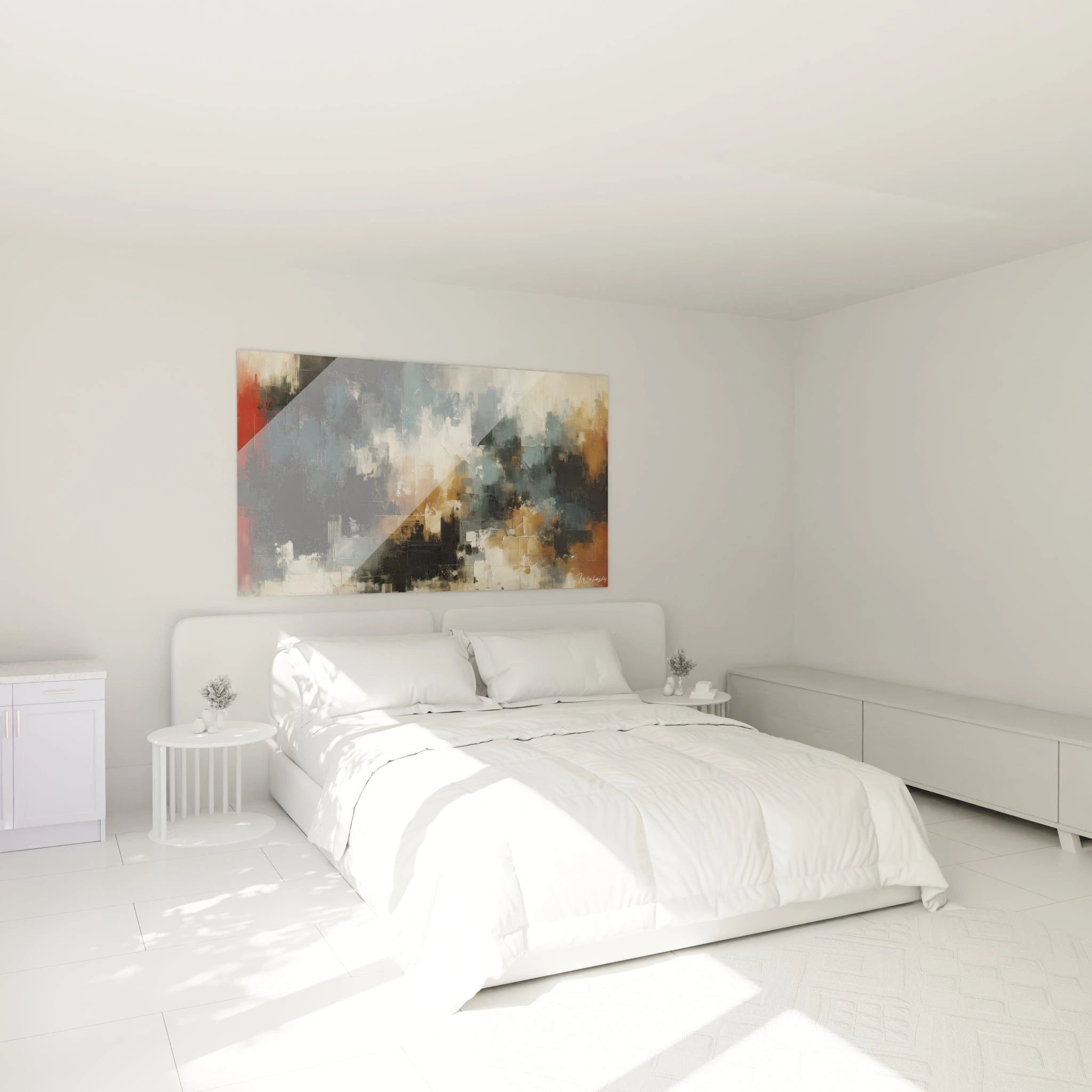
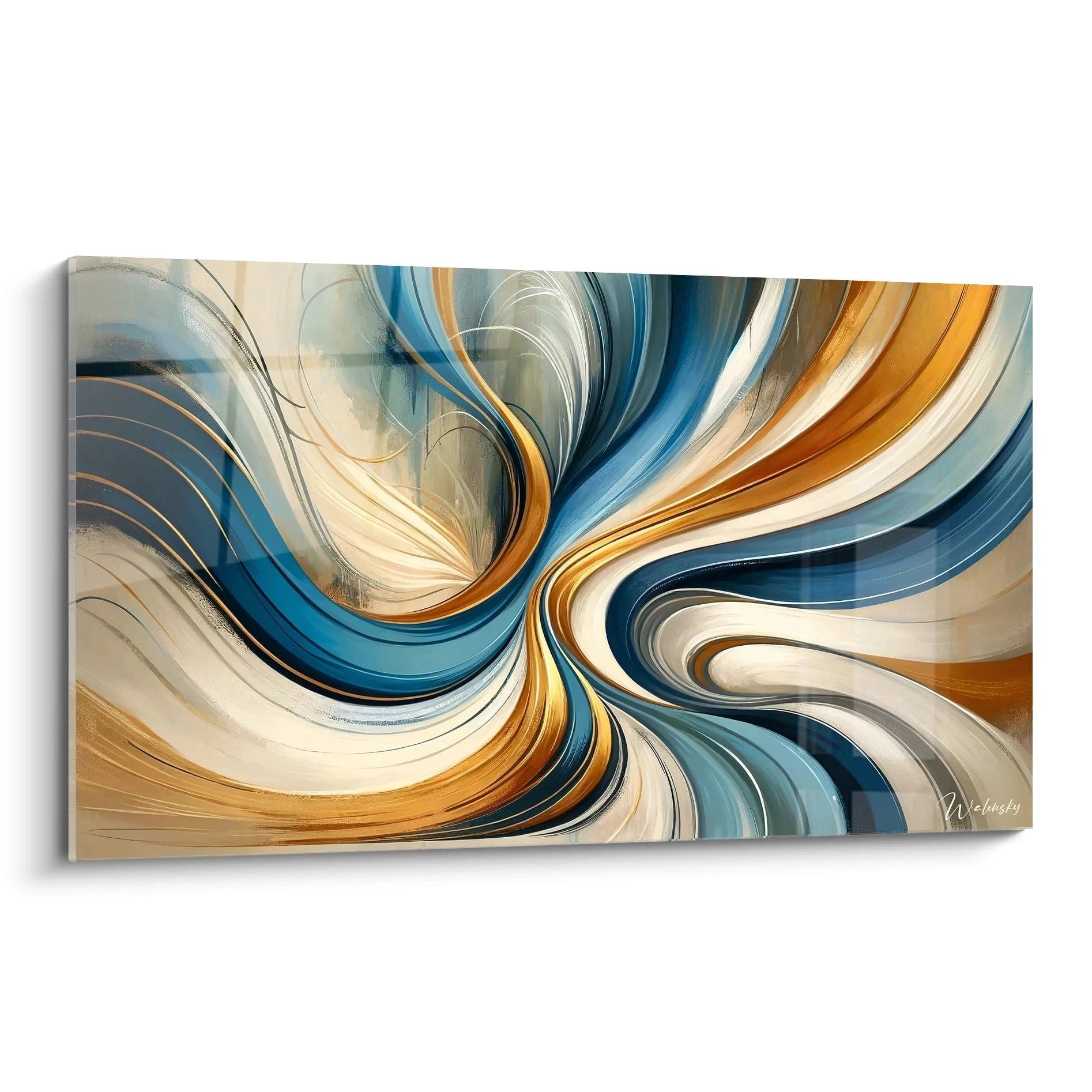
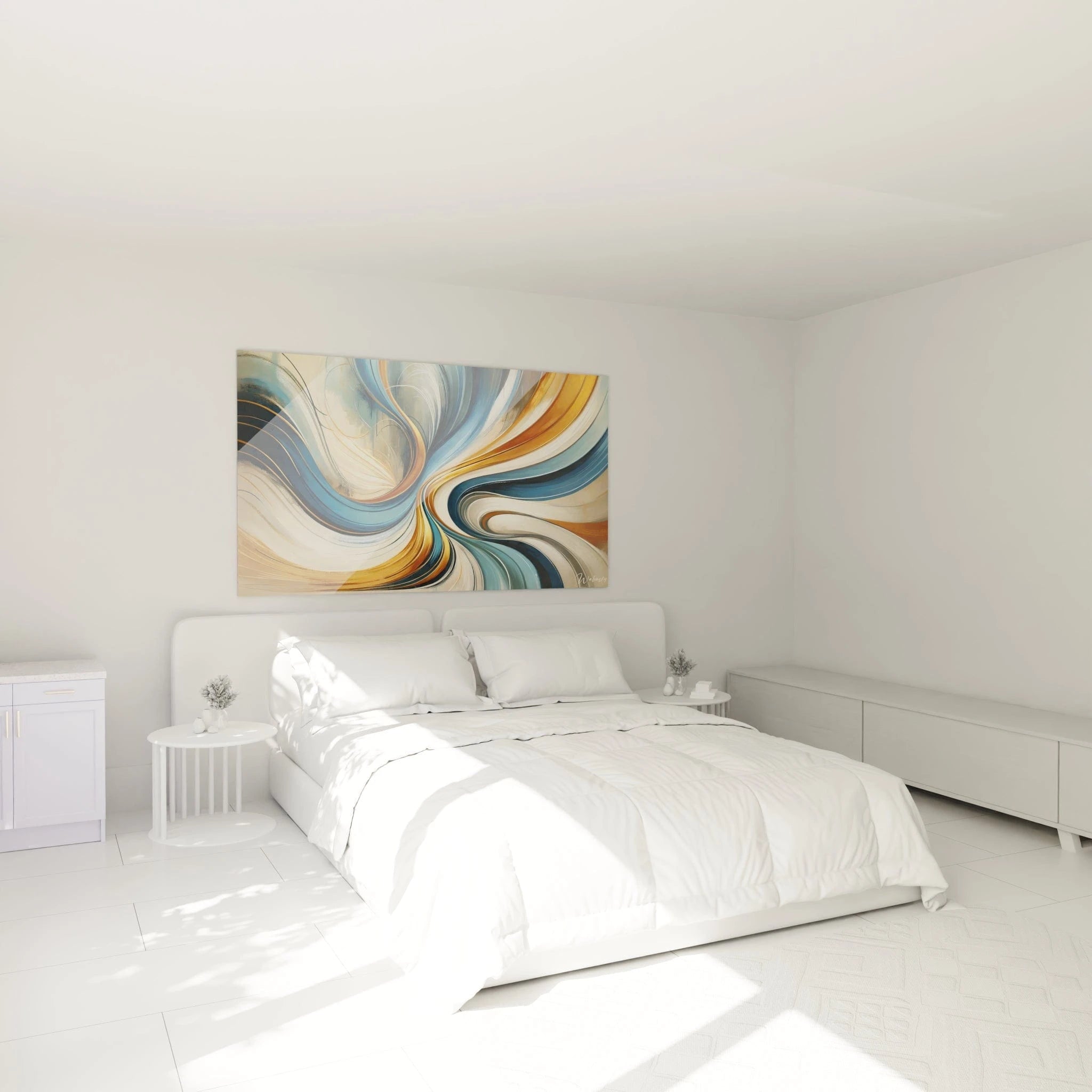
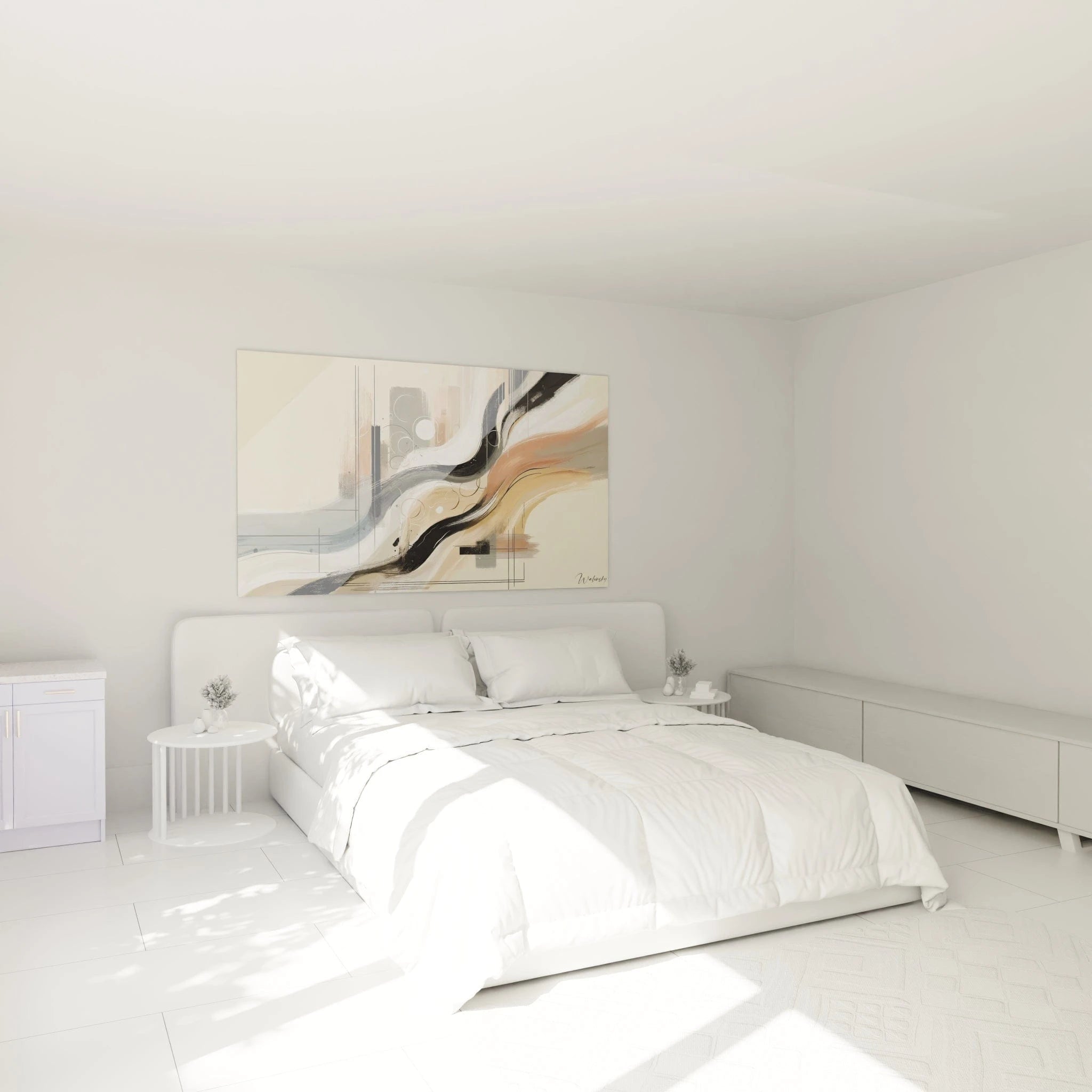
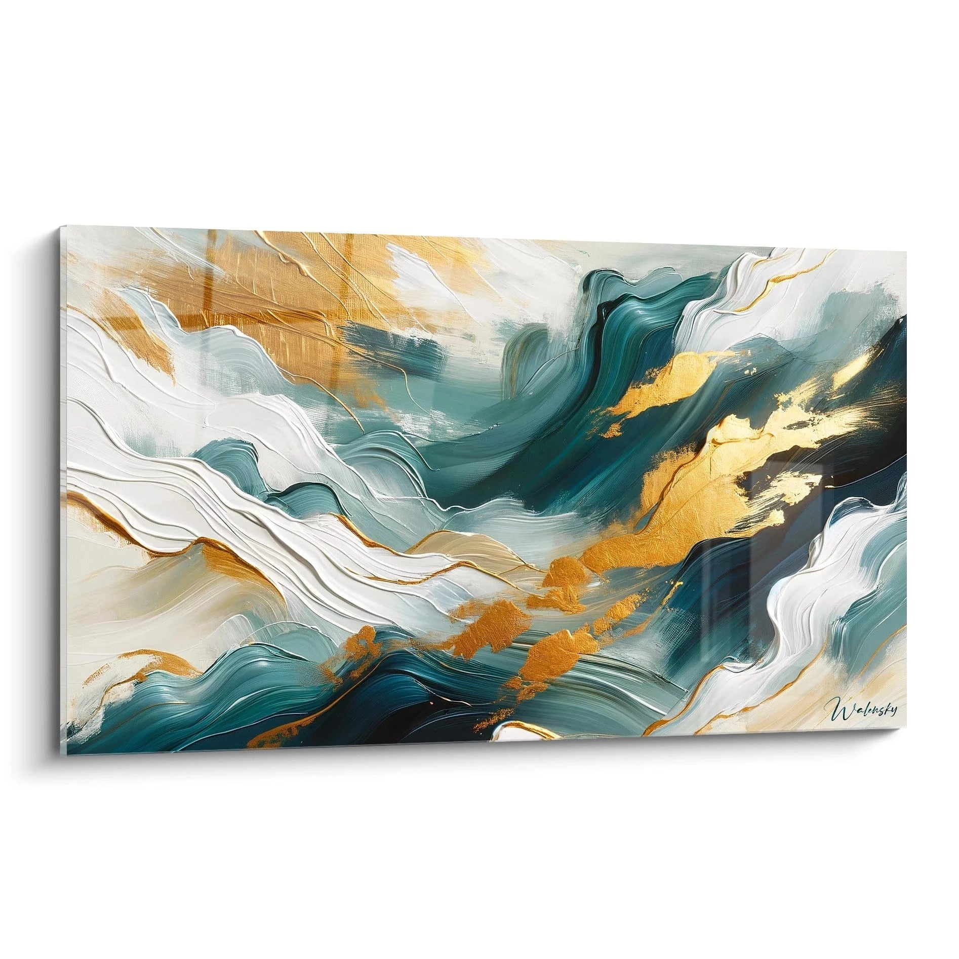
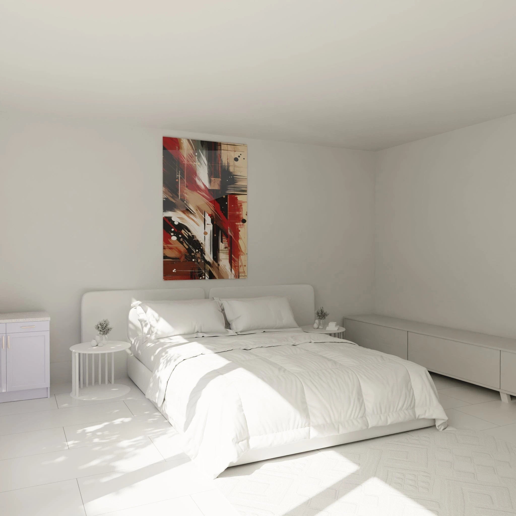
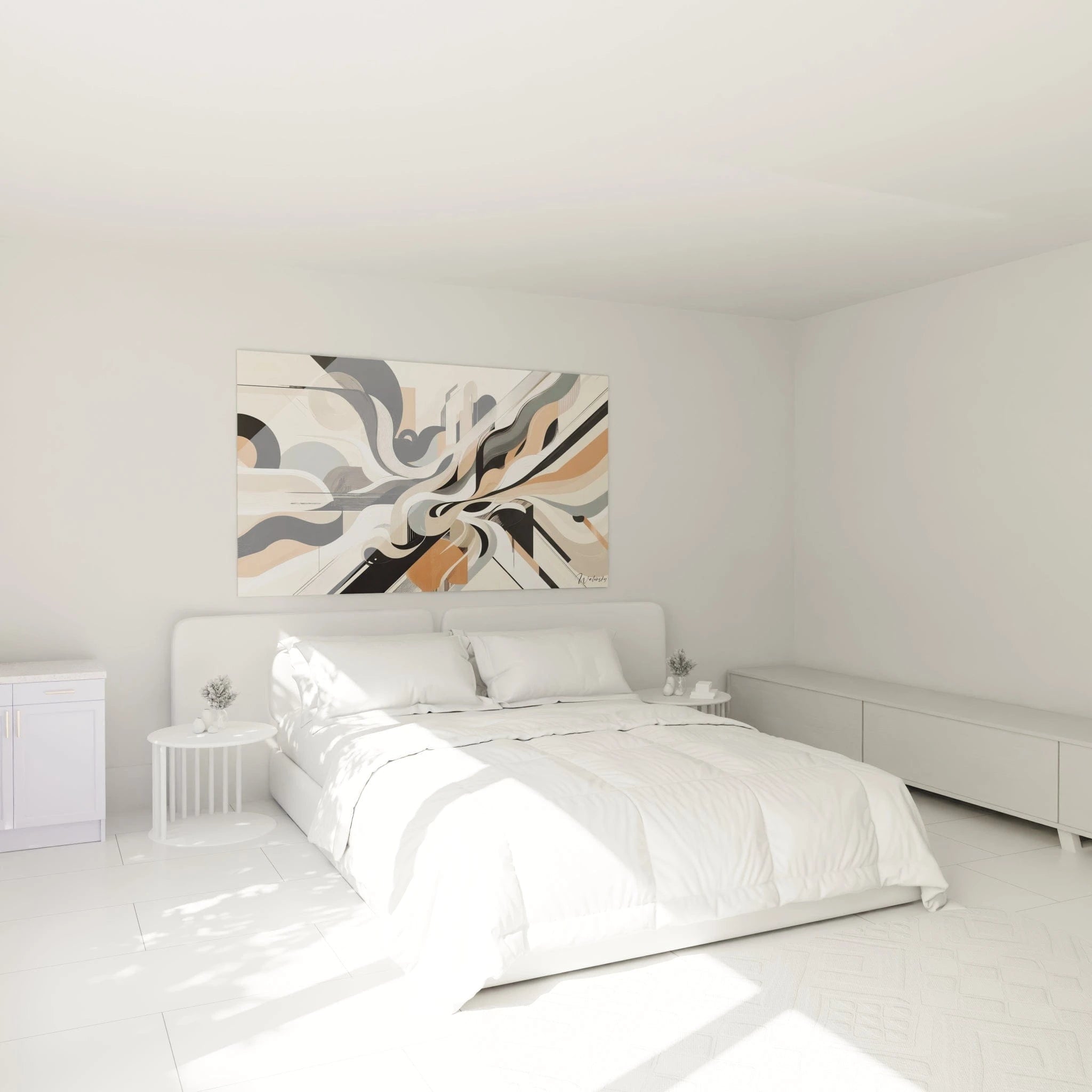
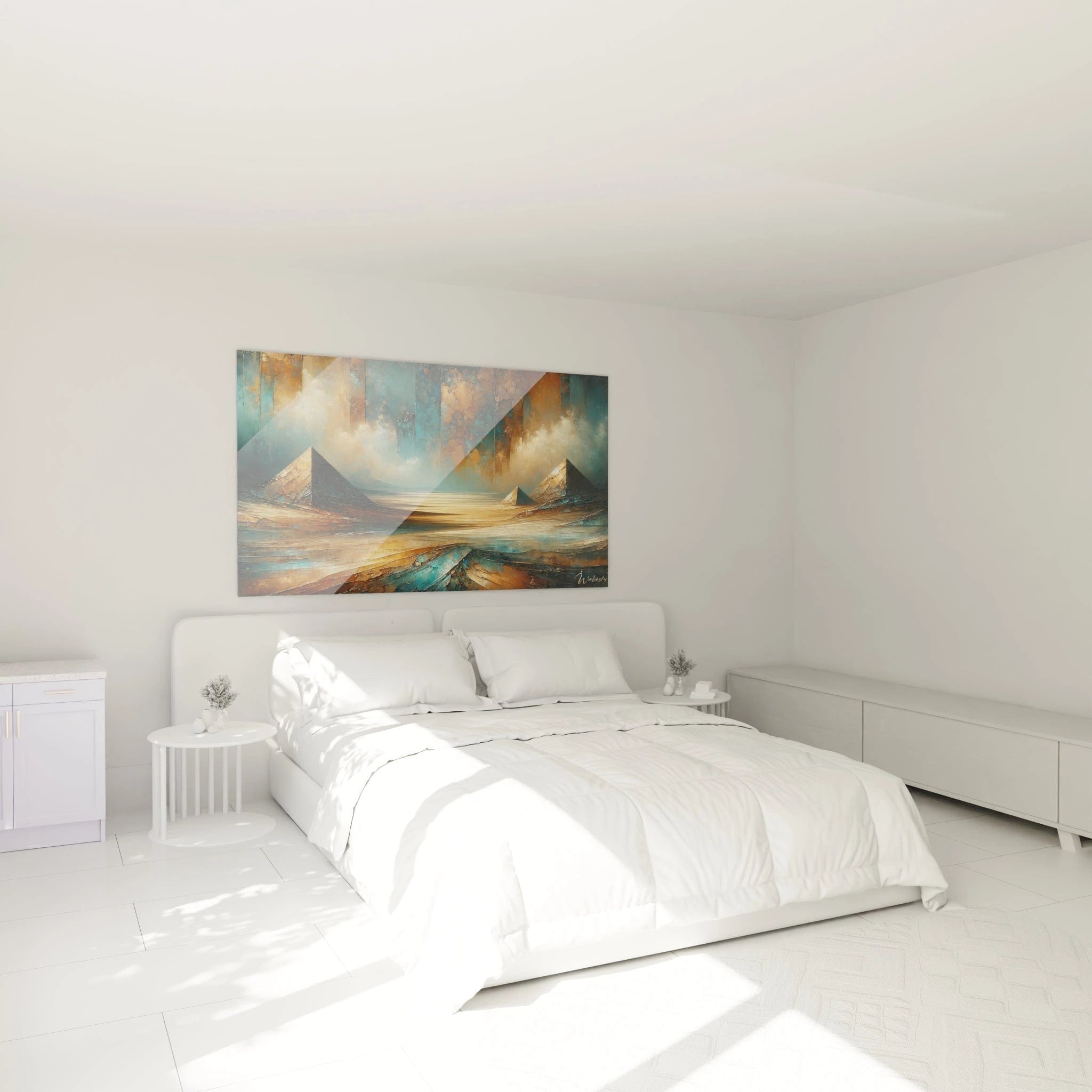
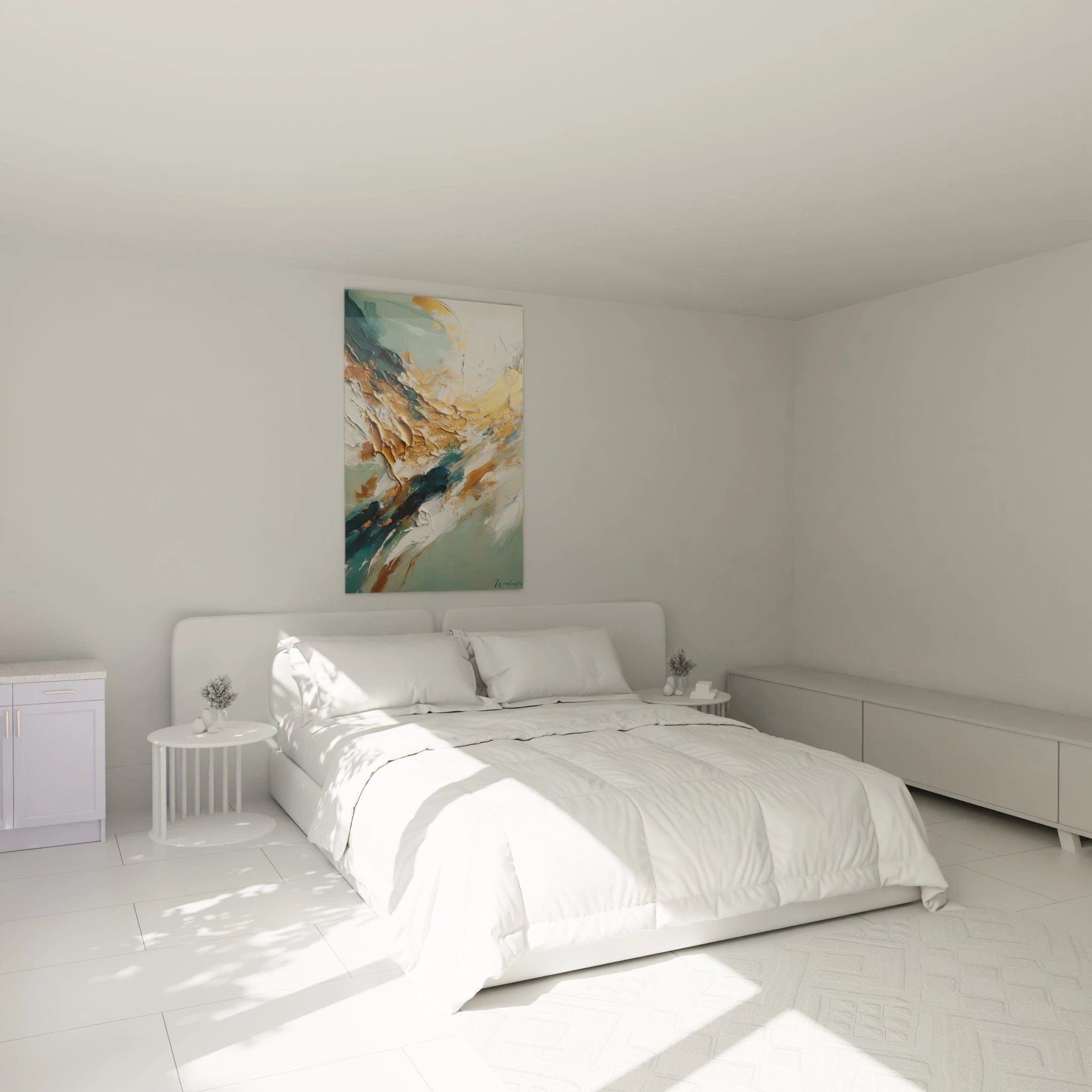
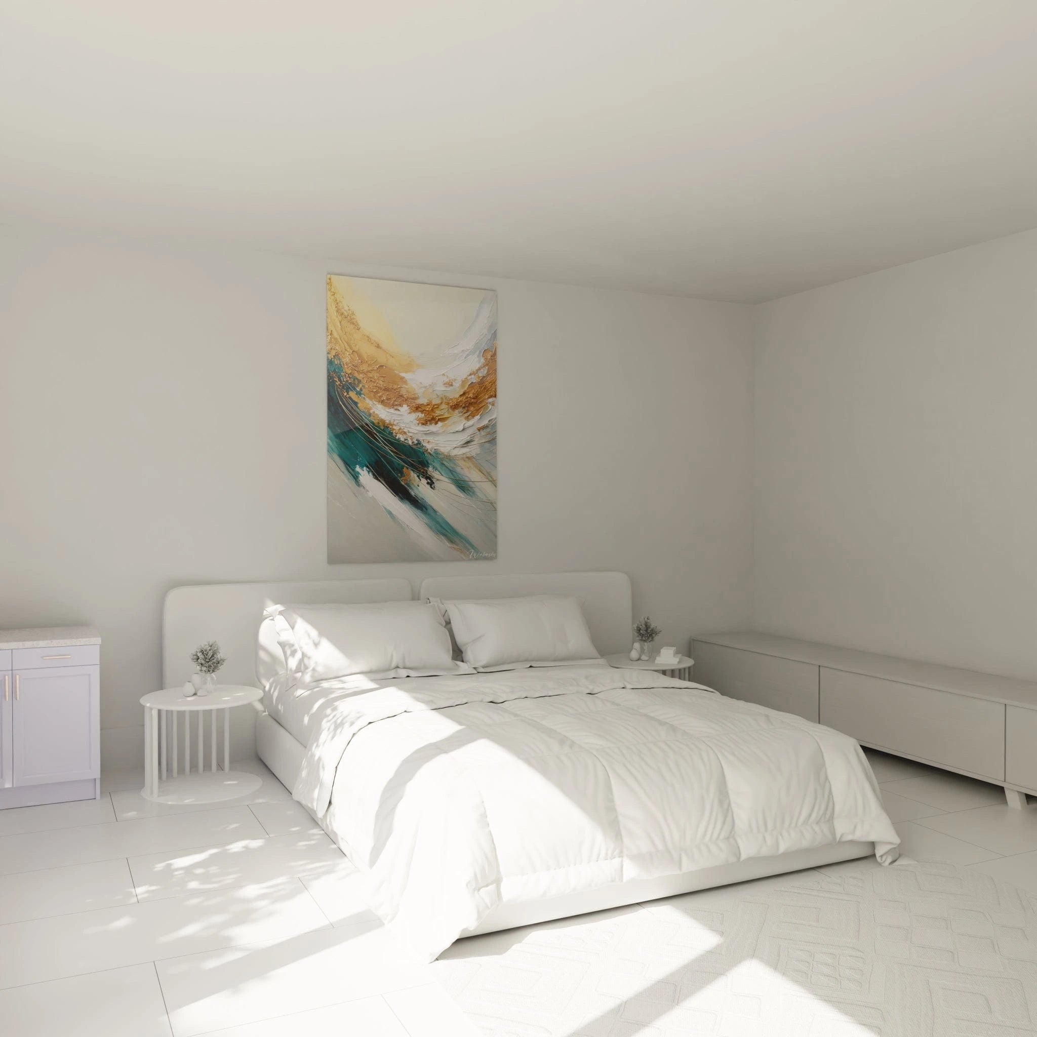
Imposing formats, suited to the often vast reception walls of agencies, reinforce this perception of professional scope. A visual of 120x80 cm or larger immediately communicates the investment made to provide an appropriate setting—a detail your clients interpret as reflecting your overall commitment.
Color psychology applied to real estate transactions
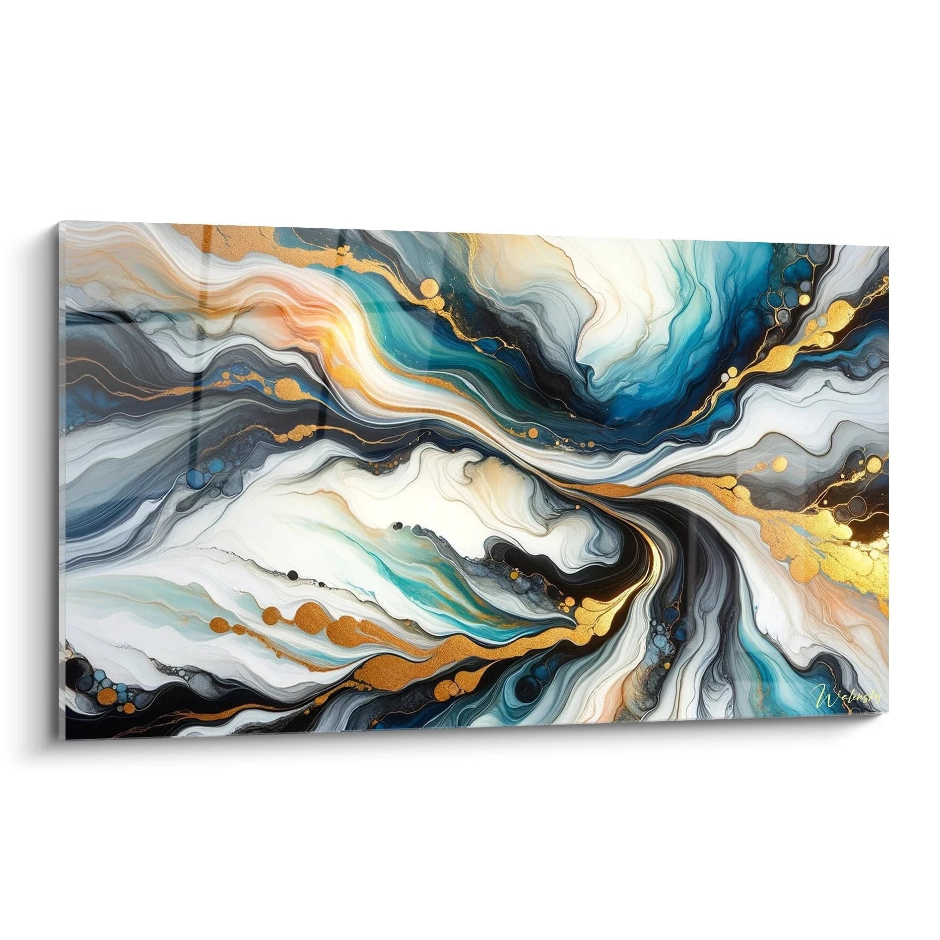
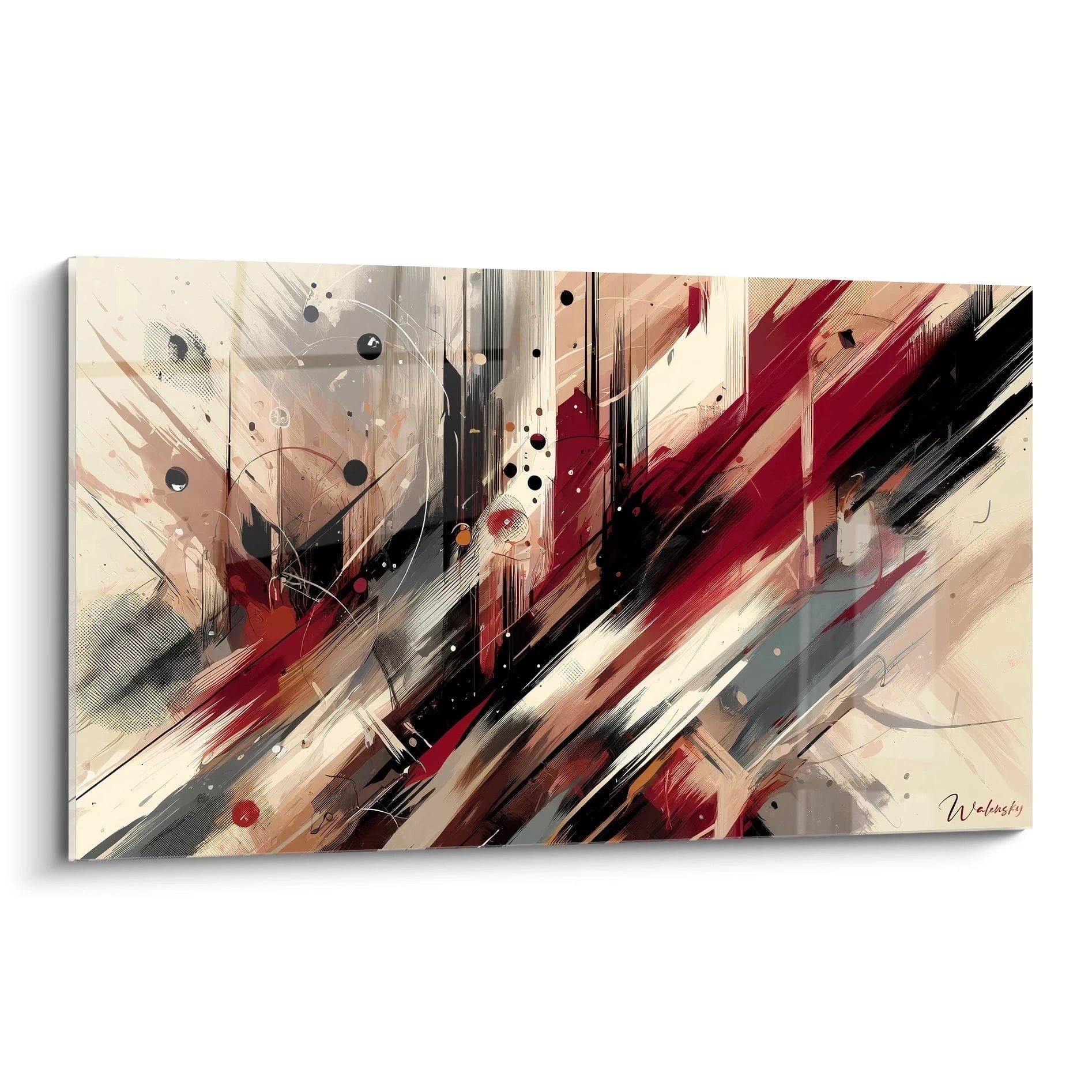
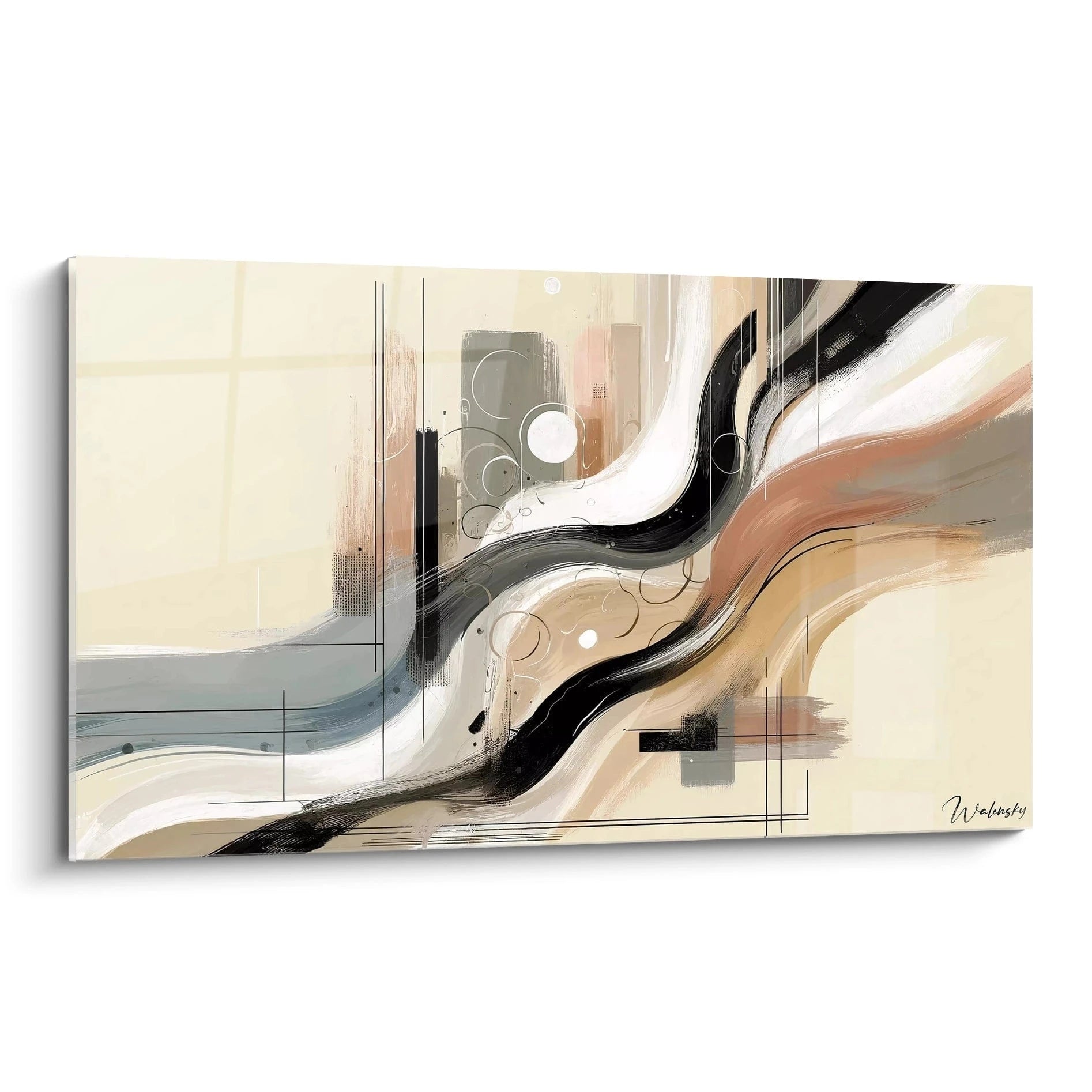
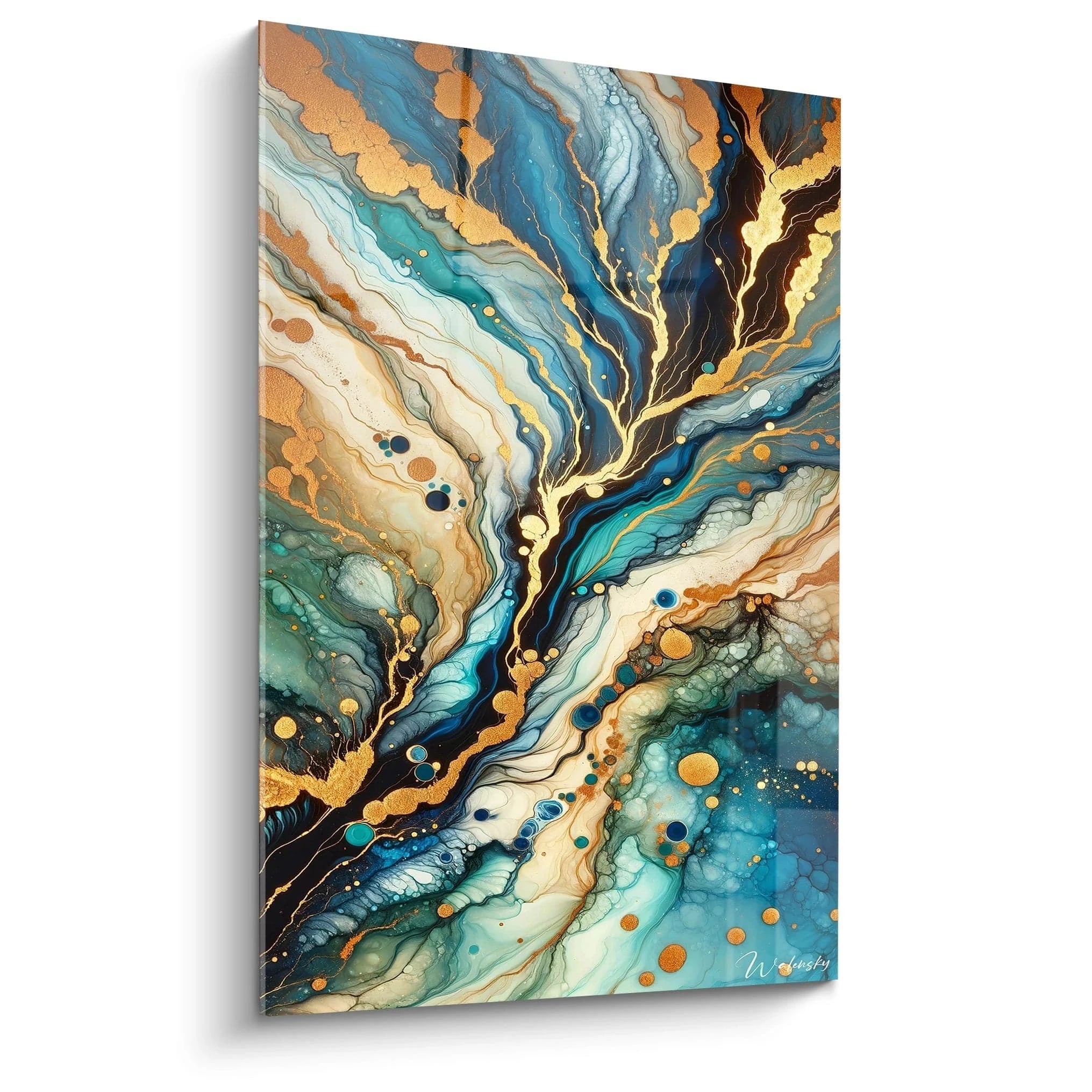
Contrary to common assumptions about generic commercial decoration, the color choice of wall art for a real estate agency must meet specific imperatives. Sophisticated neutral tones—anthracite gray, elegant beiges, off-whites—intentionally dominate quality professional spaces because they don't interfere with the complex emotions tied to buying or selling property.
This calculated neutrality allows clients to project their own aspirations without visual distraction. Wall art depicting minimalist architecture in sober tones keeps attention on business discussion while subtly elevating the perceived standing of the agency. Professionals find that this approach reduces psychological resistance during delicate negotiations, with the calming setting facilitating constructive exchanges.
Differentiation against franchises and national networks
For independent agencies, wall art becomes a tool for distinction against the visual uniformity of large chains. Where franchises often impose strict visual codes, a personalized mural work signals your creative autonomy and territorial anchoring. Local clients particularly appreciate geographic representations of their city or region, which materialize your in-depth knowledge of the local market.
This differentiation strategy proves particularly effective in areas where multiple agencies concentrate. Wall art for a real estate agency showcasing the architectural specifics of the sector you cover demonstrates expertise that goes beyond simple commercial brokerage.
Adapting the visual to your agency's price positioning
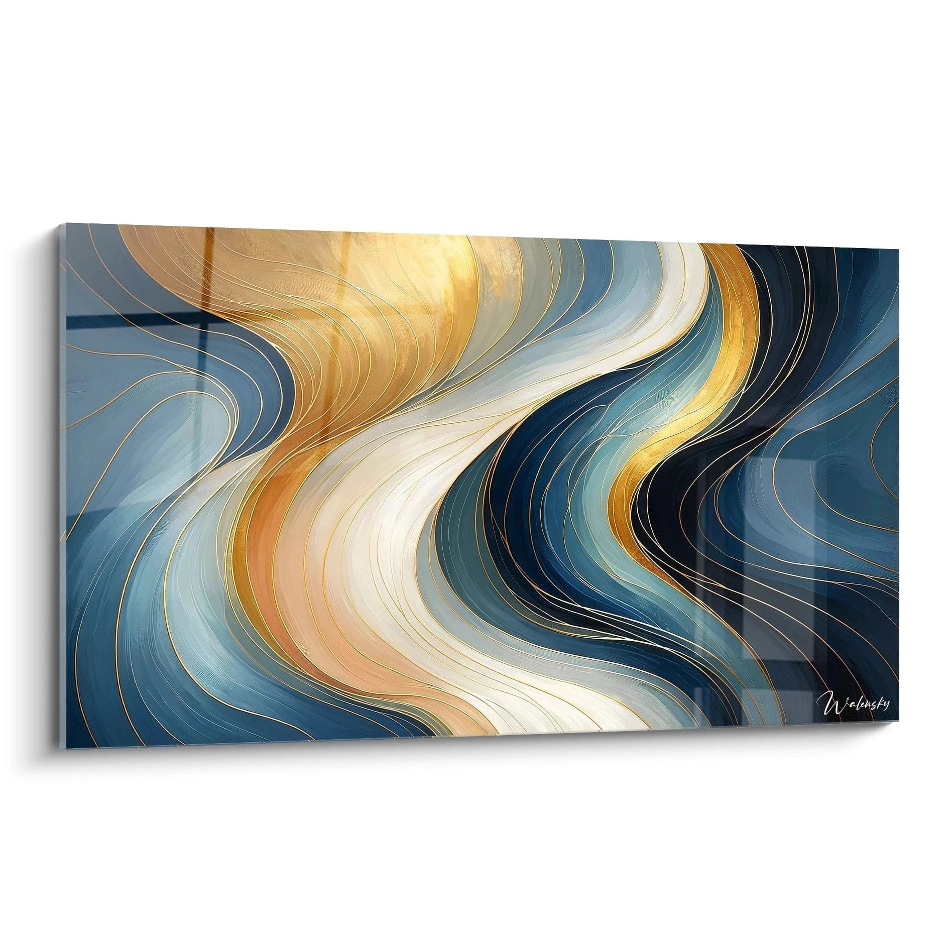
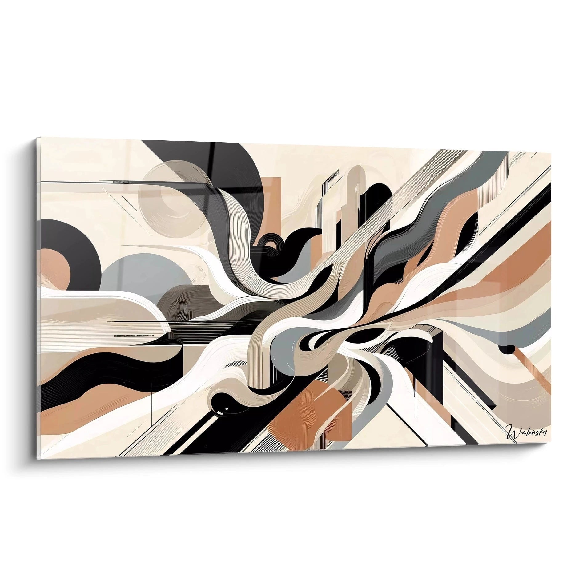
The market segment you target directly dictates your wall decoration style. High-end agencies favor refined abstract works or black-and-white architectural photographs evoking discreet luxury. Conversely, generalist establishments opt for more accessible visuals representing dynamic urban scenes or welcoming landscapes.
This coherence between commercial positioning and aesthetic choice is not superficial—it conditions your prospects' ability to envision themselves as future clients. A mismatch between displayed standing and properties offered creates cognitive dissonance detrimental to conversion.
Durability against intensive client traffic
Real estate agencies experience considerable daily foot traffic, particularly in window displays and reception areas. Professional-quality wall art for a real estate agency resists the specific constraints of this environment: temperature variations from frequent door openings, prolonged natural light exposure in window displays, and handling during regular cleaning operations.
Rigid formats and protective finishes ensure impeccable presentation over several years—a financially relevant consideration since frequent replacement would impact your facilities budget. Savvy professionals calculate cost per year of display rather than initial investment.
Which technical criteria to prioritize for intensive commercial use?
Beyond aesthetics, three technical characteristics distinguish wall art suited to a real estate agency. First, UV resistance preserves color intensity despite window display exposure, preventing premature yellowing. Second, cleaning ease—a non-porous surface cleans with a simple damp cloth, crucial in a commercial environment where impeccable cleanliness is non-negotiable. Third, relative lightness despite large dimensions facilitates periodic rearrangement without requiring specialized intervention.
These technical specifications, rarely mentioned in standard product descriptions, make all the difference between satisfactory purchase and costly early replacement.
Visual signage and traffic flow
In agencies with multiple spaces, wall art for a real estate agency participates in intuitive signage. A dynamic, colorful visual in the reception area invites interaction, while a more contemplative work in the negotiation room fosters concentration. This visual differentiation unconsciously guides clients through their journey stages, from initial discovery to final signature.
Managers of multi-room establishments find that this visual zoning strategy improves overall client experience, with each space fulfilling its function optimally through appropriate ambiance.
Strategic optimization of each commercial space through wall art
Every square meter of a real estate agency serves a precise commercial function, and wall art for a real estate agency must adapt to these differentiated uses. The frequent mistake is applying uniform decoration without considering each zone's specific needs. Understanding your establishment's spatial dynamics transforms your wall decoration into a genuine commercial tool.
Why does window display decoration differ from interior spaces?
A real estate agency's window display functions as permanent advertising media, visible 24 hours a day to passersby. Wall art for a real estate agency placed behind announcements must be impactful enough to attract attention, yet neutral enough not to visually compete with displayed properties. Panoramic horizontal formats integrate harmoniously behind digital display screens, creating attractive visual depth.
Urban landscape representations in bird's-eye view or geometric abstractions in muted tones work particularly well because they add prestige without diverting attention from real estate offers. This strategy measurably increases the time pedestrians pause before your window—the first step toward conversion.
Designing the waiting area: reducing perceived wait time
Clients regularly wait several minutes before appointments or while you process their files. Wall art for a real estate agency placed facing waiting seats transforms this dead time into positive experience. Works featuring discoverable details—complex architectures, teeming urban scenes—capture attention and reduce perceived impatience.
This psychological consideration directly impacts client satisfaction: occupied waiting feels 30% shorter than passive waiting before a bare wall. Professionals report fewer complaints and better client disposition during subsequent exchanges following this wait.
Negotiation rooms: creating a concentration sanctuary
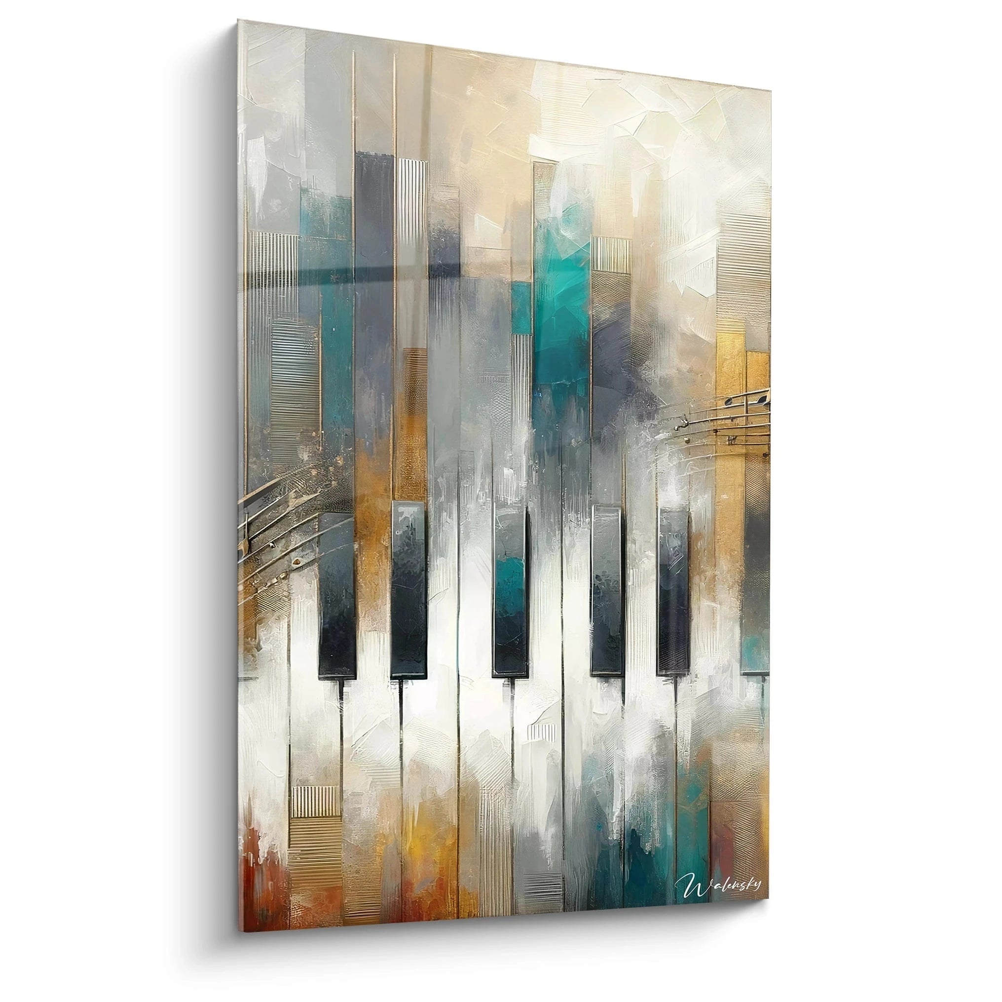
Contractual discussions require an environment fostering thoughtful reflection. In these spaces, wall art for a real estate agency adopts a more contemplative register: soothing landscapes, minimalist compositions, or black-and-white architectural photographs. The objective is eliminating any source of visual distraction or tension, allowing parties to concentrate on transaction terms.
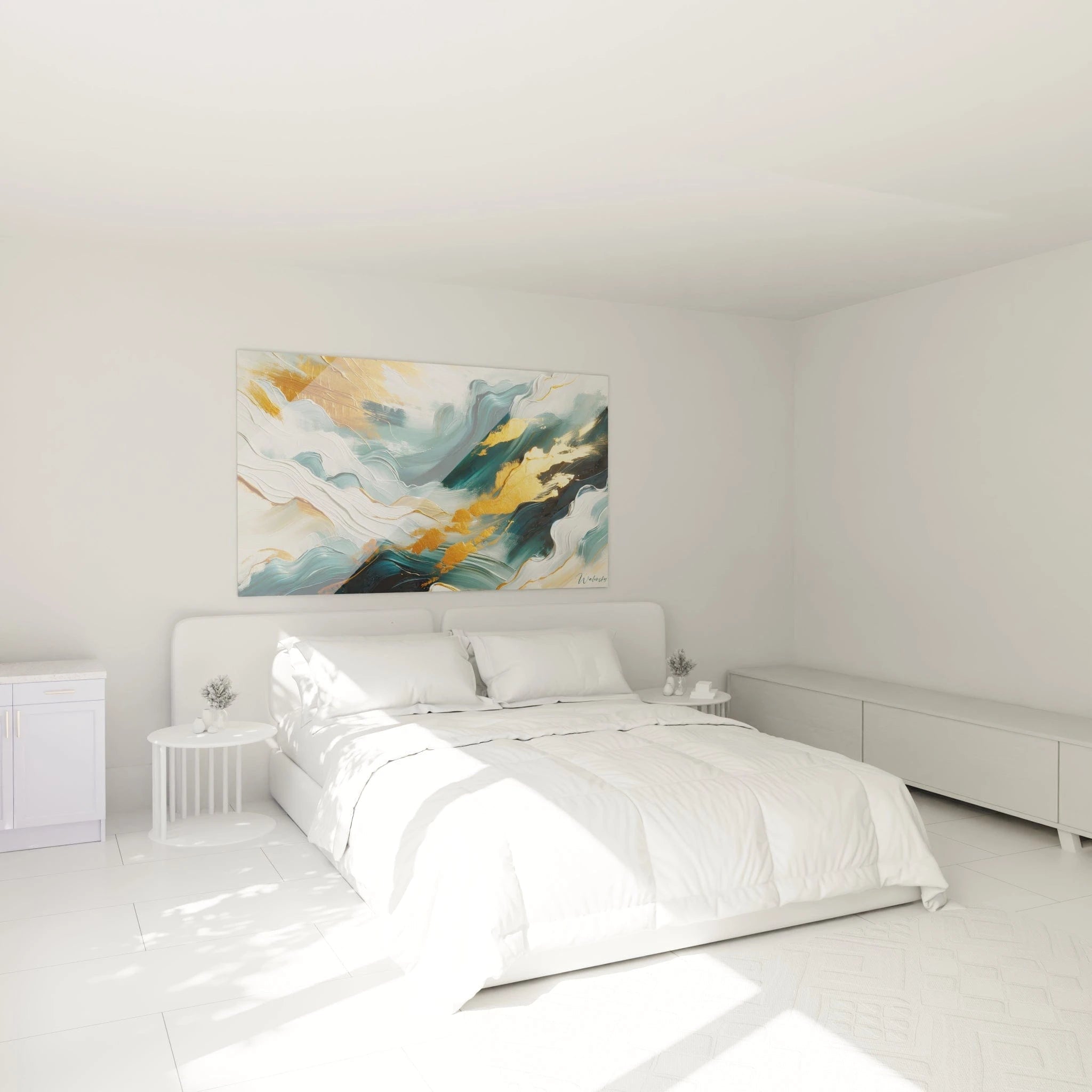
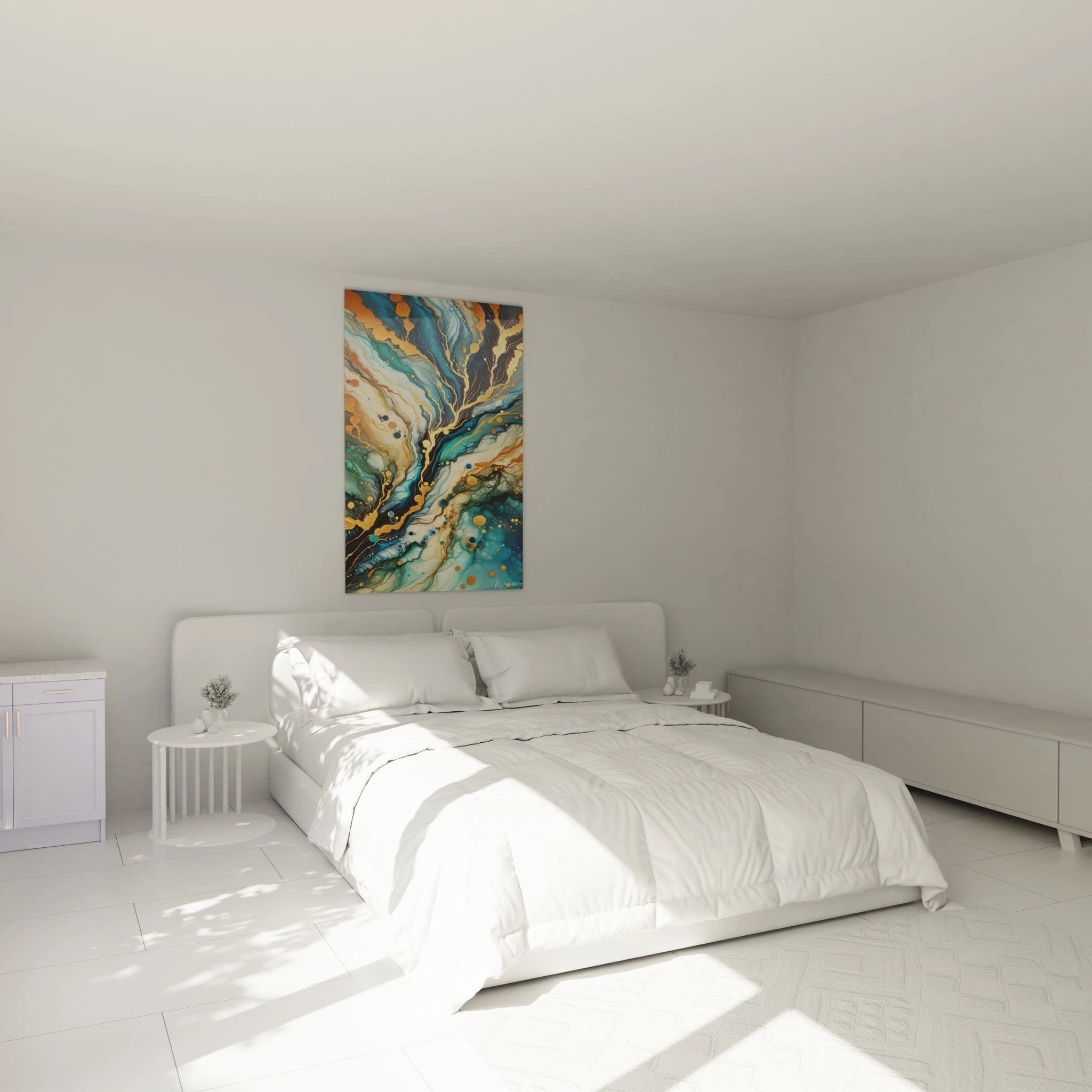
Vertical formats work well in these often-rectangular rooms, structuring space without cluttering it. Placement slightly above seated eye level prevents visual fixation during discussions while maintaining a valued aesthetic presence.
How to adapt format to architectural constraints of commercial premises?
Real estate agencies frequently occupy ground-floor commercial spaces with standardized proportions: ceiling heights of 2.80 to 3.20 meters, significant length but limited depth. Large-format horizontal wall art for a real estate agency (150x100 cm or larger) intelligently exploits these proportions, creating a width impression that counterbalances the corridor effect of narrow spaces.
For background walls visible from the street, generous dimensions compensate for viewing distance, ensuring impact even for pedestrians on the opposite sidewalk. This maximized visibility transforms your interior decoration into external communication element.
Managing commercial lighting and color rendering
Agencies typically benefit from powerful professional lighting, necessary for document consultation and creating a welcoming ambiance. Wall art for a real estate agency must be selected considering this intense luminosity that can alter color rendering or create distracting glare.
Matte or semi-matte finishes are essential to prevent glare, particularly on walls perpendicular to windows where natural light combines with artificial lighting. Tones that maintain intensity under LED lighting—gray, deep blues, olive greens—preserve visual impact throughout the day, unlike certain colors that flatten under cool light.
Visual distribution in open-plan real estate offices
Modern agencies favor open layouts where multiple advisors work simultaneously. In this configuration, wall art for a real estate agency serves as a structuring visual reference point for the space. Positioned on perimeter walls rather than dividing partitions, it creates visual breathing zones between workstations.
This organization prevents visual saturation while maintaining overall decorative coherence. Agency managers note that this approach improves employee comfort, who appreciate aesthetic elements without feeling in overcrowded space.
Which representations to avoid in professional real estate environment?
Certain visual themes, though popular in other contexts, prove counterproductive in a real estate agency. Overly personal or polarizing representations—specific cultural references, religious symbols, political messages—risk alienating part of your clientele. Similarly, scenes featuring identifiable characters create associations that may unconsciously negatively influence certain prospects.
Experienced professionals systematically favor universal and timeless subjects: geometries, landscapes, architectures, or abstractions. This neutrality ensures 100% of your clientele feels welcome, without risk of involuntary exclusion.
Integration with brand visual charter
For franchisees or agencies belonging to a network, wall art for a real estate agency must dialogue with imposed visual identity. Without literally reproducing brand colors—creating fatiguing visual redundancy—the goal is choosing complementary tones that enrich rather than contradict established color codes.
An institution using corporate blue benefits, for example, from visuals incorporating silvery grays or warm beiges, creating harmony without monotony. This decorative subtlety distinguishes thoughtful establishments from standardized installations.
Renewal strategy and long-term visual coherence
Acquiring wall art for a real estate agency doesn't constitute an isolated decision but rather part of an evolving decorative strategy. The most successful establishments plan their aesthetic investments over several years, creating recognizable visual identity that progressively strengthens their brand positioning. This methodical approach avoids improvised spending and guarantees coherence that contributes to memorizing your agency.
Plan renewal according to real estate market cycles
The real estate sector experiences marked seasonal fluctuations, with periods of intense activity in spring and fall, and slowdowns in summer and winter. Wall art for a real estate agency can be strategically renewed to mark these transitions, visually signaling to your regular clientele that your establishment remains dynamic and attentive to developments.
This rotation doesn't require massive investment: acquiring two or three works you alternate creates the impression of constantly evolving space at controlled cost. Regular clients, particularly sellers monitoring their mandate evolution over several months, appreciate these changes that punctuate their visits.
What annual budget to allocate to professional wall decoration?
Successful agencies typically dedicate 2 to 3% of their facilities budget to wall decoration—a percentage justified by direct impact on client experience. For a standard establishment, this represents acquiring one to two major pieces annually, allowing progressive renewal of overall decoration over a three-year cycle.
This budgetary approach offers two advantages: it prevents visual obsolescence harming modernity image, and it allows adapting decoration to your commercial positioning evolution. An agency developing prestige activity can gradually elevate its wall decoration standing, visually communicating this upmarket movement.
Building proprietary visual identity
Rather than following generic decorative trends, the most memorable agencies develop recognizable visual language. This might consist of systematically favoring aerial views of your city, creating visual signature that clients associate with your geographic expertise. Or exclusively selecting works within a specific chromatic range that becomes your distinctive color code.
This planned visual coherence transforms wall art for a real estate agency into branding element, equally as important as your logo or visual charter. Prospects more easily remember an agency with affirmed visual identity—a determining commercial advantage in competitive sector.
Adapting decoration to events and commercial campaigns
Key periods in the real estate calendar—professional shows, new program launches, promotional campaigns—provide opportunities to strengthen communication through wall decoration. Without falling into event excess, a temporary wall art piece can accompany major commercial operation, creating coherence among all communication supports.
This approach works particularly well for agencies specializing in specific niches: a period dedicated to rental investments can feature dynamic urban visuals, while a campaign focused on vacation properties benefits from soothing landscape representations.
How to prevent visual fatigue in staff?
Your employees encounter your wall decoration daily, and visual fatigue impacts their work well-being. Periodically renewed wall art for a real estate agency maintains a stimulating environment for your teams—a factor often neglected but crucial for talent retention in a sector where consultant turnover impacts performance.
Wise managers consult their teams when selecting new works, creating sense of space ownership that improves professional satisfaction. This collaborative involvement costs little but generates substantial benefits in terms of workplace climate.
Archiving and valorizing your decorative evolution
Photographing your agency with each decorative modification constitutes precious visual heritage. These archives demonstrate your longevity and adaptation capacity—reassuring elements for clients entrusting important transactions. Some agencies use these evolutions in their communication, showcasing their history and territorial anchoring.
This documentation also serves during property assessments or business sales, investment in quality professional setting constituting a valorizable asset demonstrating serious management.
Selection criteria for lasting investment
Facing abundant offerings, five criteria guide savvy professionals in choosing enduring wall art for a real estate agency. First, thematic versatility: sufficiently neutral work adapts to editorial line evolution. Next, manufacturing quality guaranteeing minimum five-year durability without visible alteration. Then, generous dimensions maintaining impact even in large volumes. Also, cleaning and maintenance ease compatible with commercial constraints. Finally, stylistic timelessness avoiding ephemeral fashions that would quickly date your establishment.
These parameters, systematically evaluated before acquisition, guarantee optimal return on investment and prevent impulse purchases later regretted.
FAQ - Frequently asked questions about wall art for real estate agencies
What is the ideal dimension for wall art in a medium-sized real estate agency?
For standard reception space of 30 to 50 m², favor formats of 120x80 cm to 150x100 cm creating sufficient visual impact without saturating space. Main walls can accommodate larger dimensions up to 180x120 cm for valued architectural effect.
How often should real estate agency wall decoration be renewed?
A rotation cycle of 18 to 36 months for main pieces maintains dynamic environment without generating excessive costs. Secondary spaces can retain their works longer—the essential goal being preserving impression of renewal in high-traffic client areas.
Should wall art for real estate agencies represent actual properties?
Contrary to intuition, direct property representations rarely work as they create comparisons with portfolio properties. Favor indirect evocations—iconic architectures, urban panoramas, geometric abstractions—suggesting real estate universe without competing with your announcements.
How to coordinate multiple wall art pieces in an open-plan real estate office?
Maintain chromatic coherence among different spaces by selecting works sharing a palette of two to three dominant colors. Vary formats and orientations (horizontal/vertical) to create dynamic visual rhythm while preserving overall harmony.