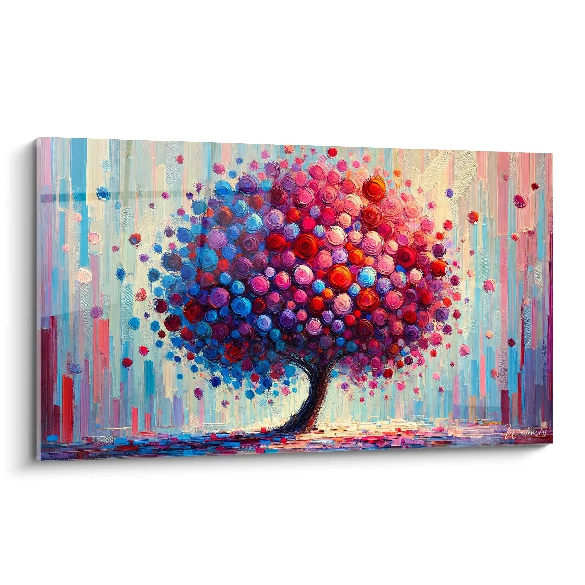
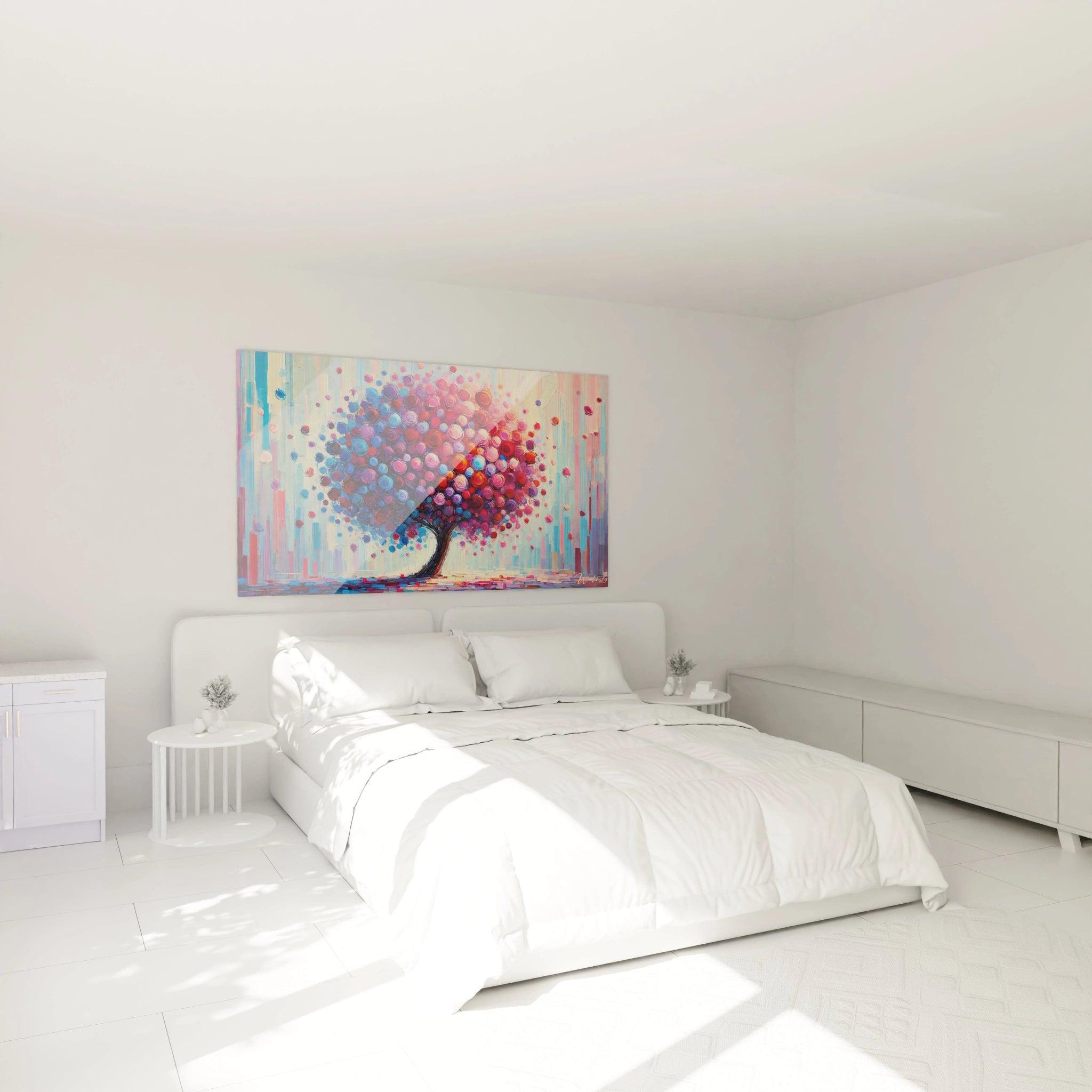
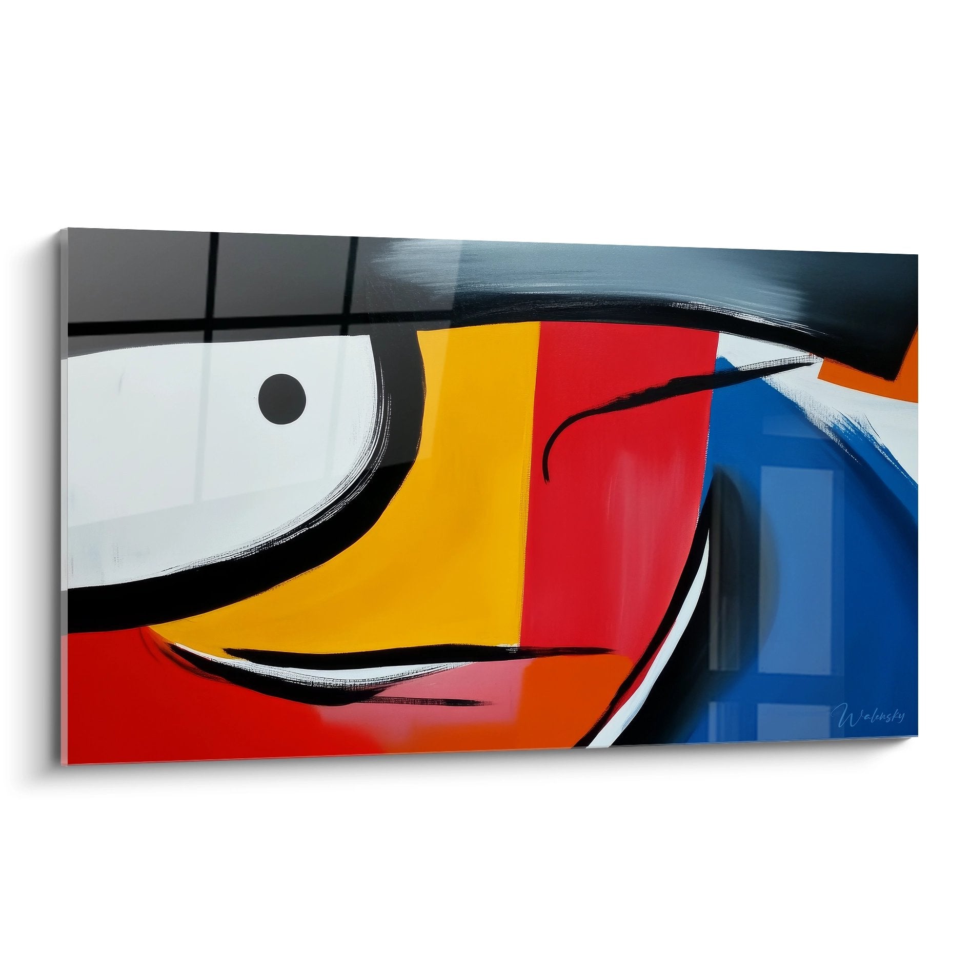
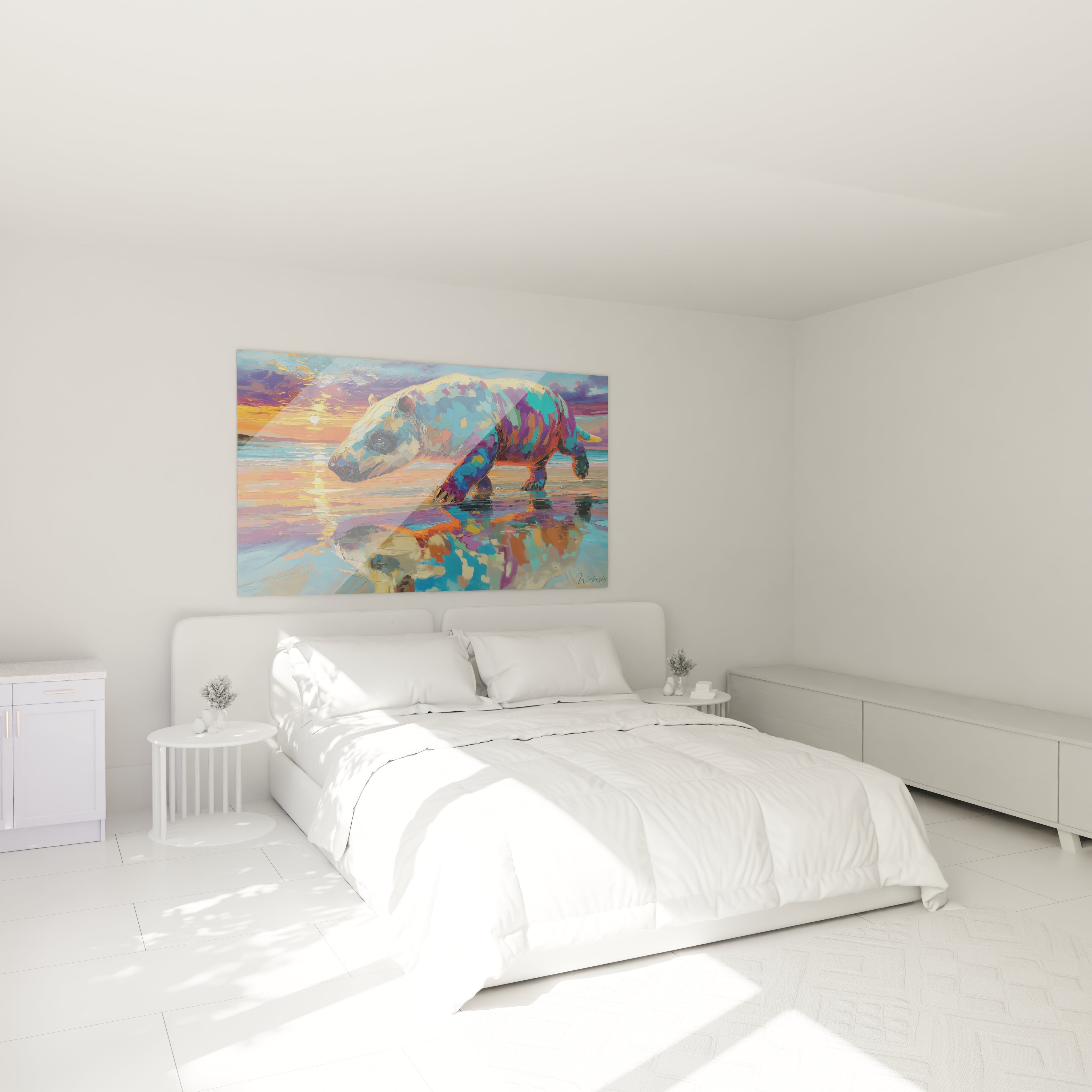
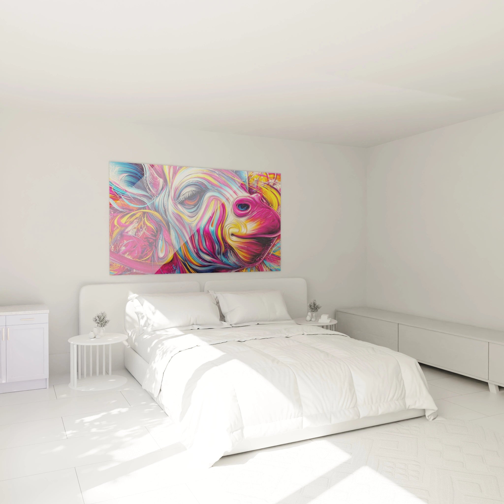
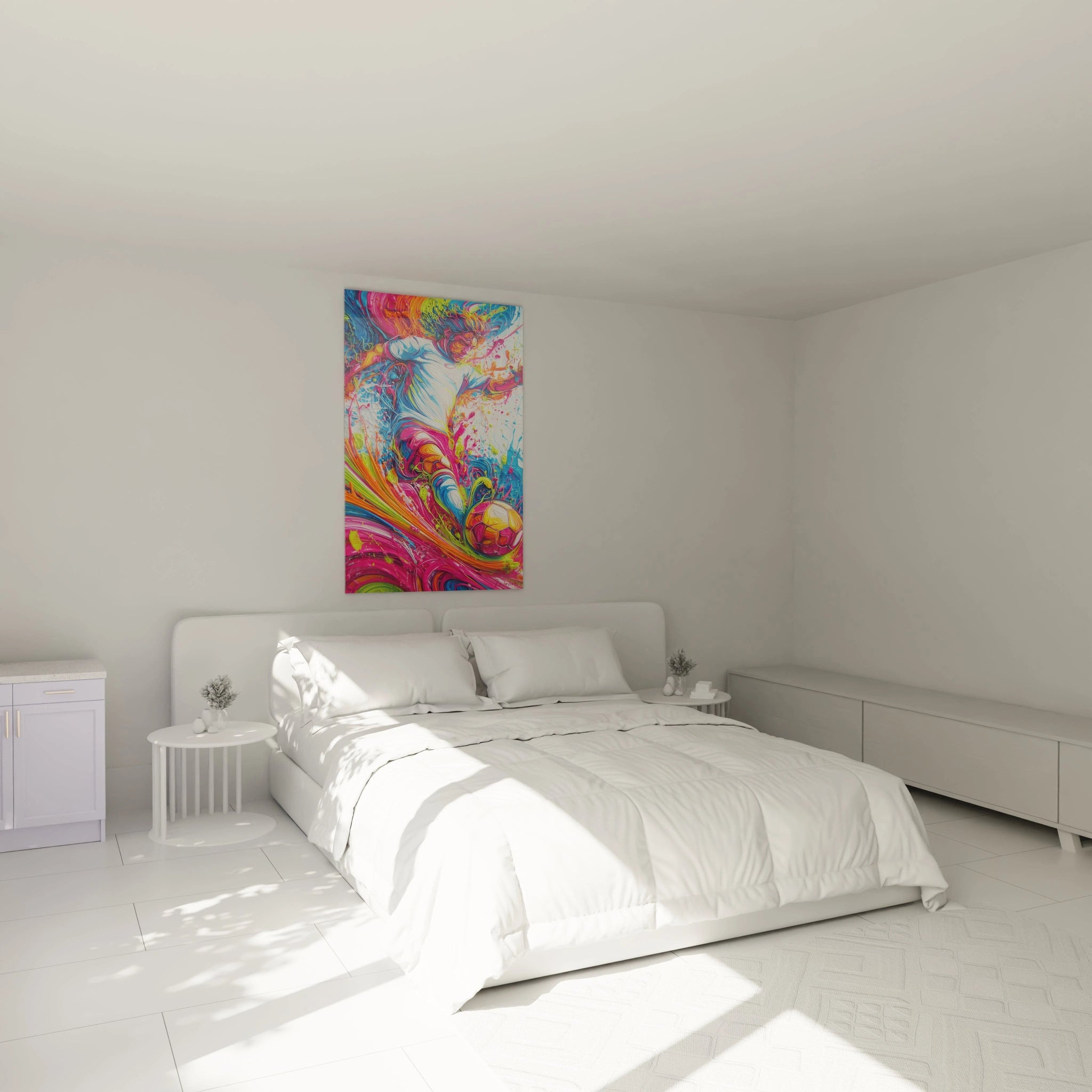
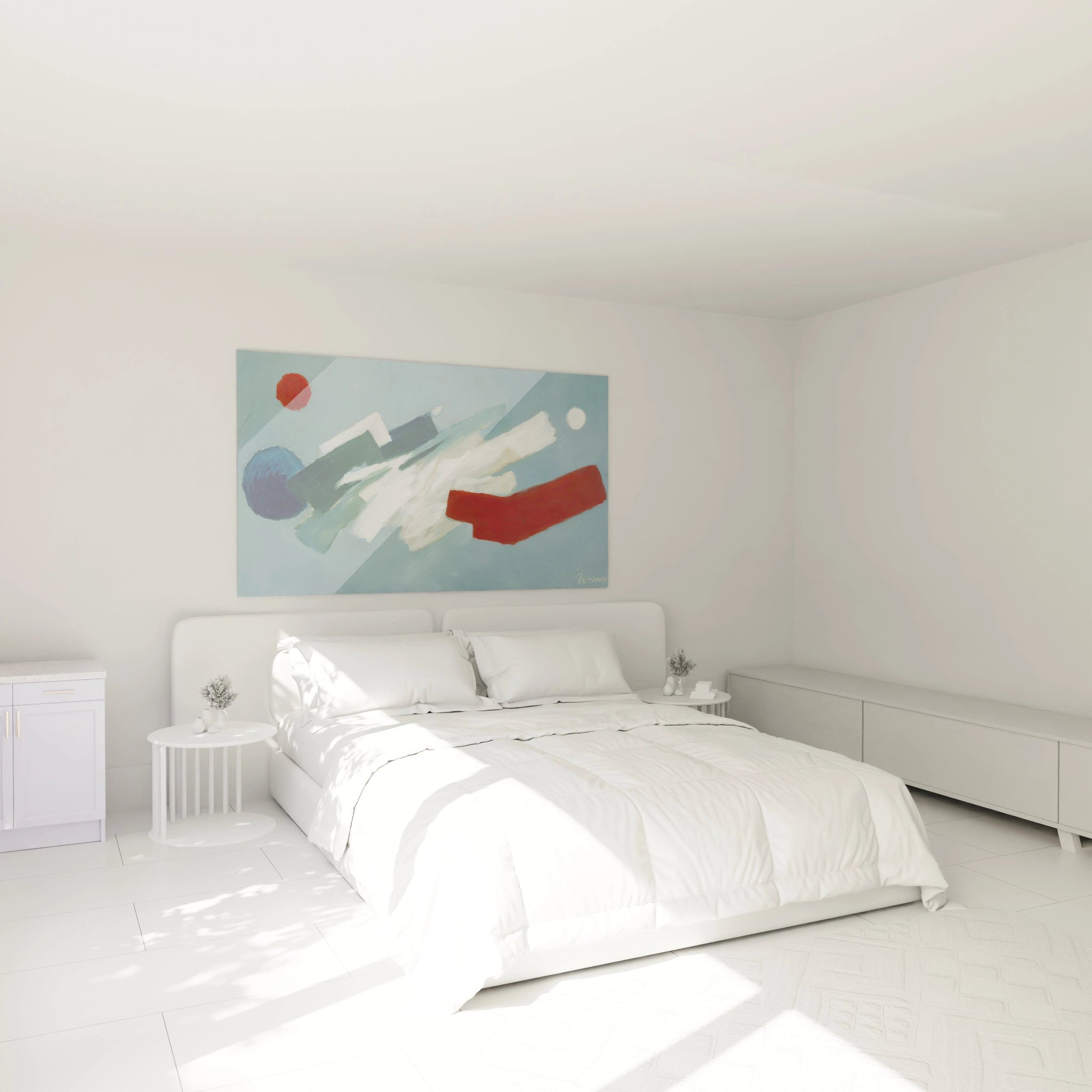
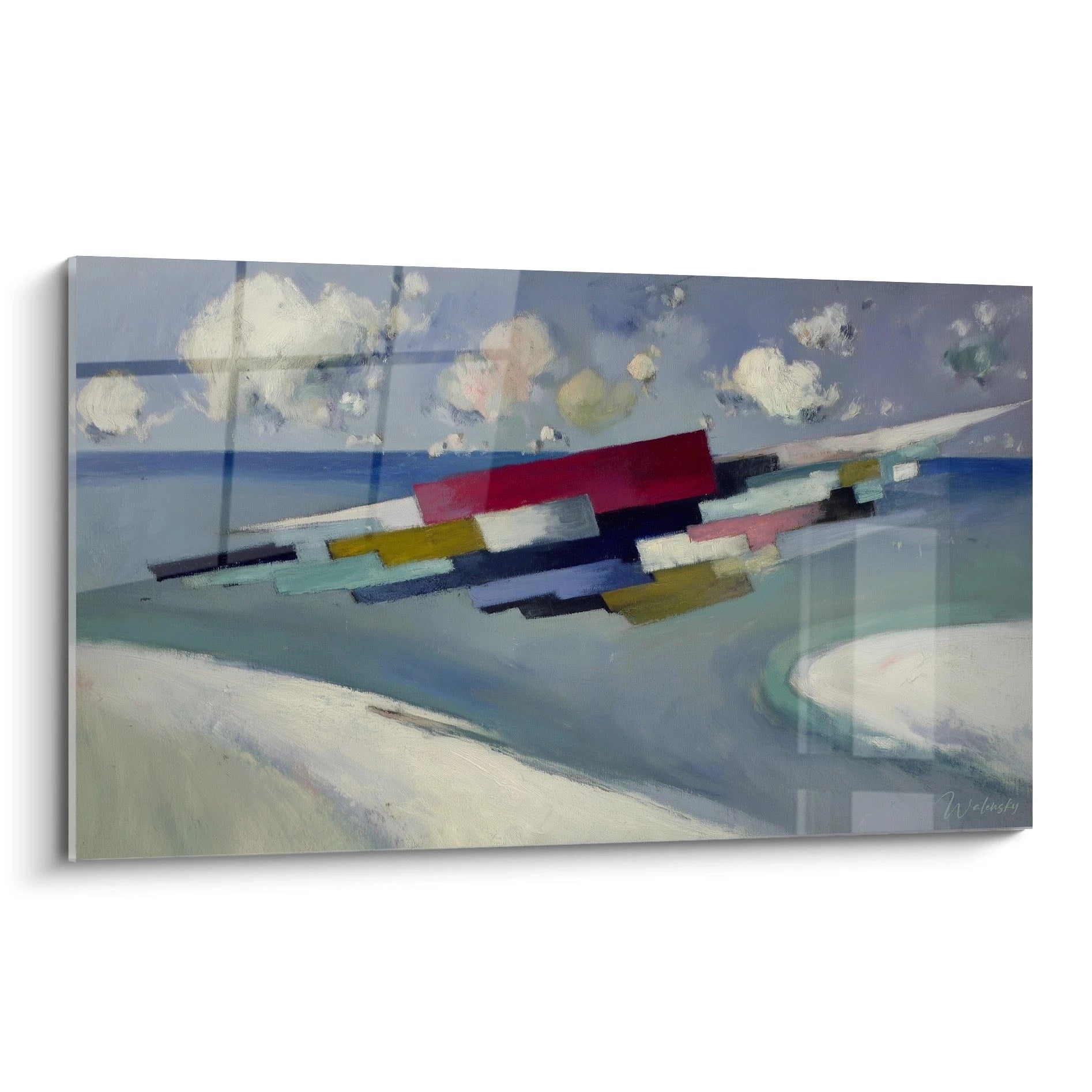
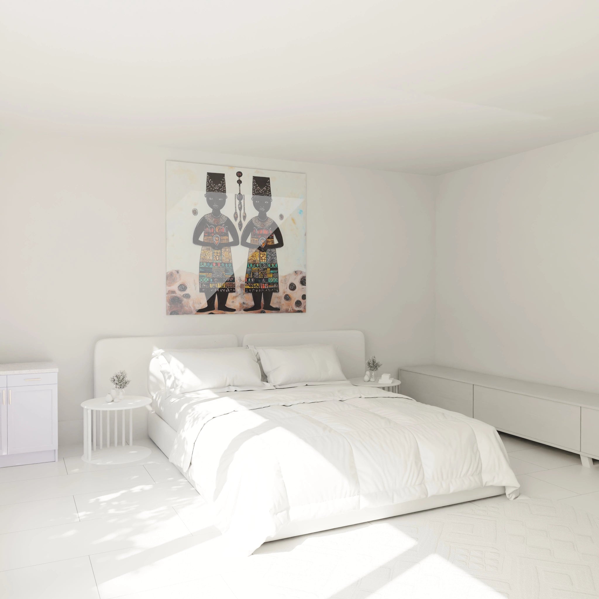
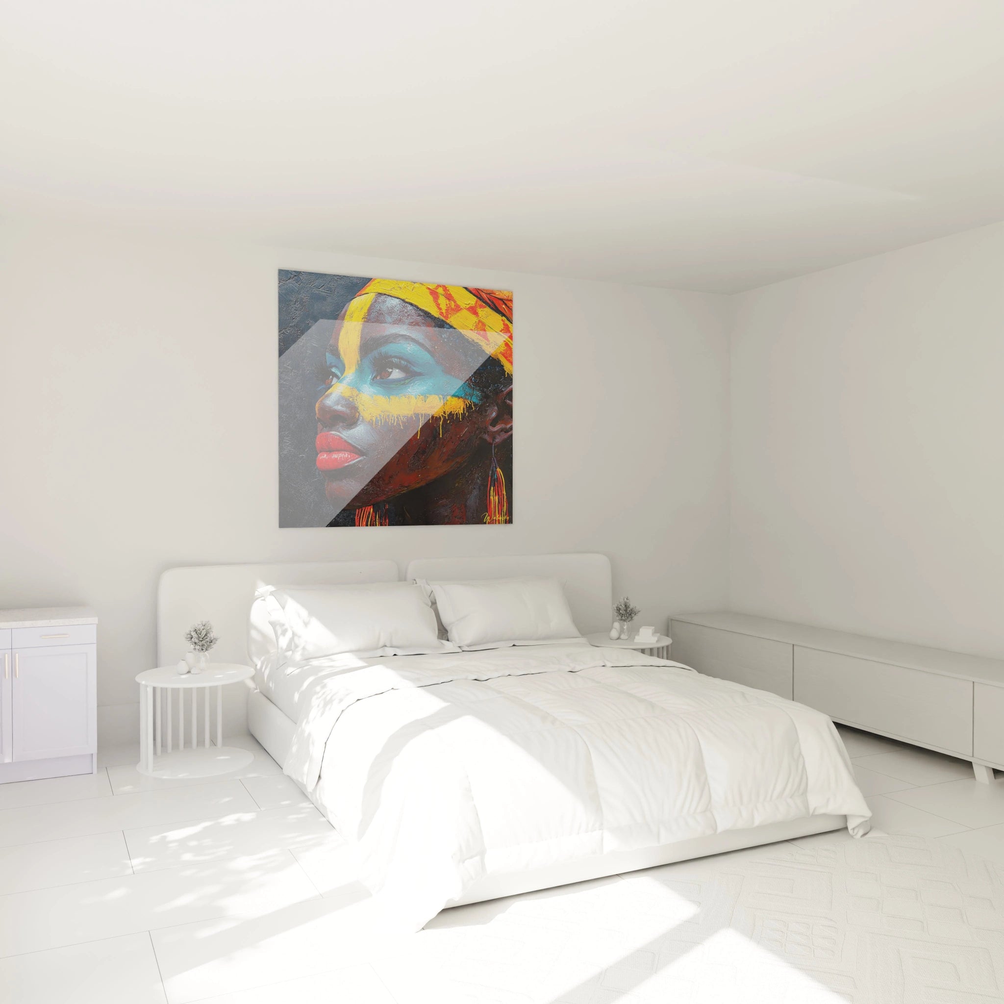
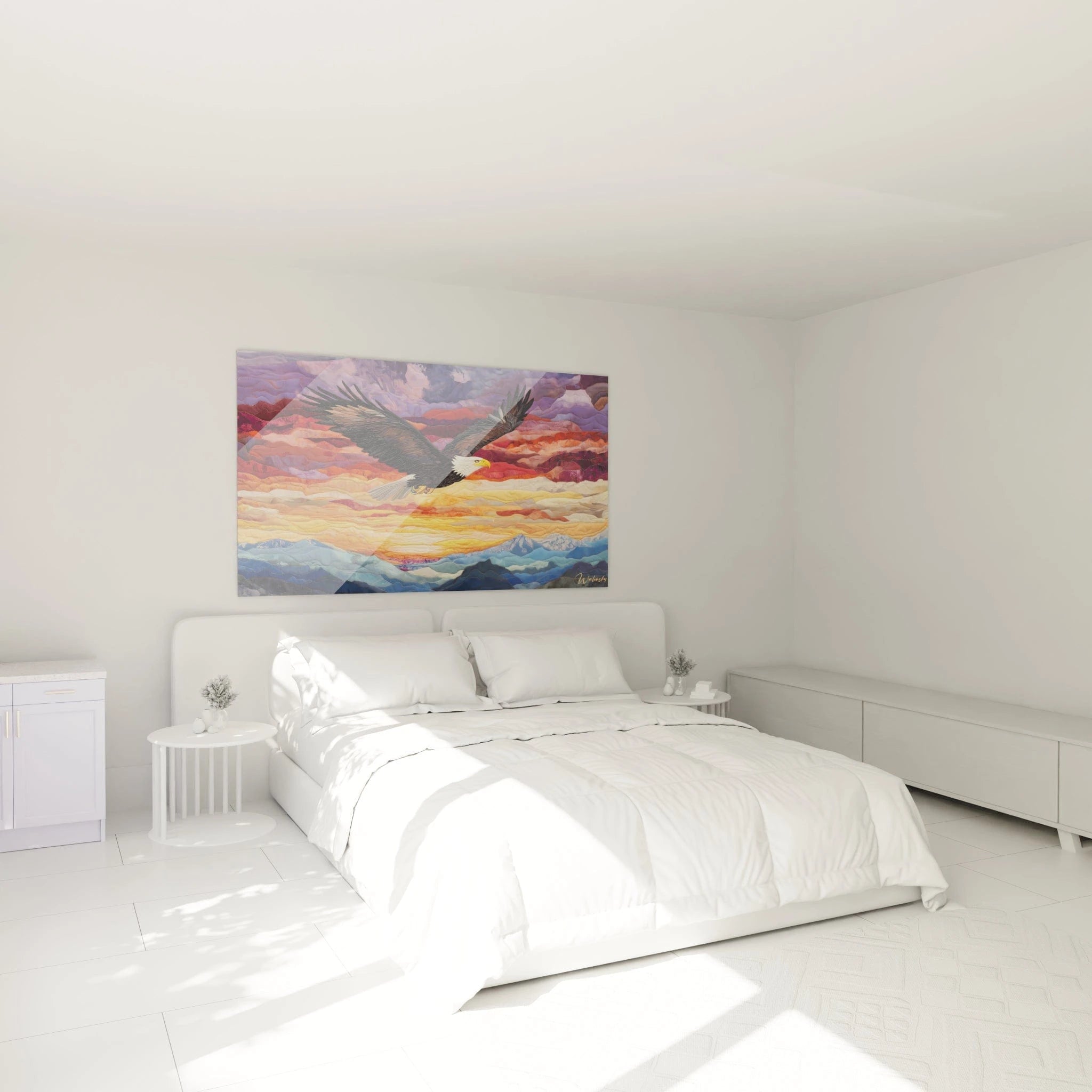
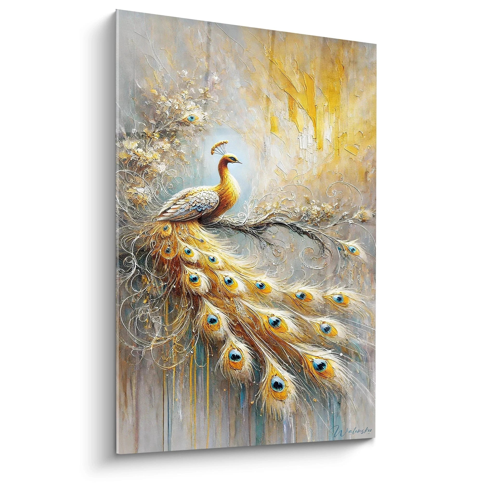
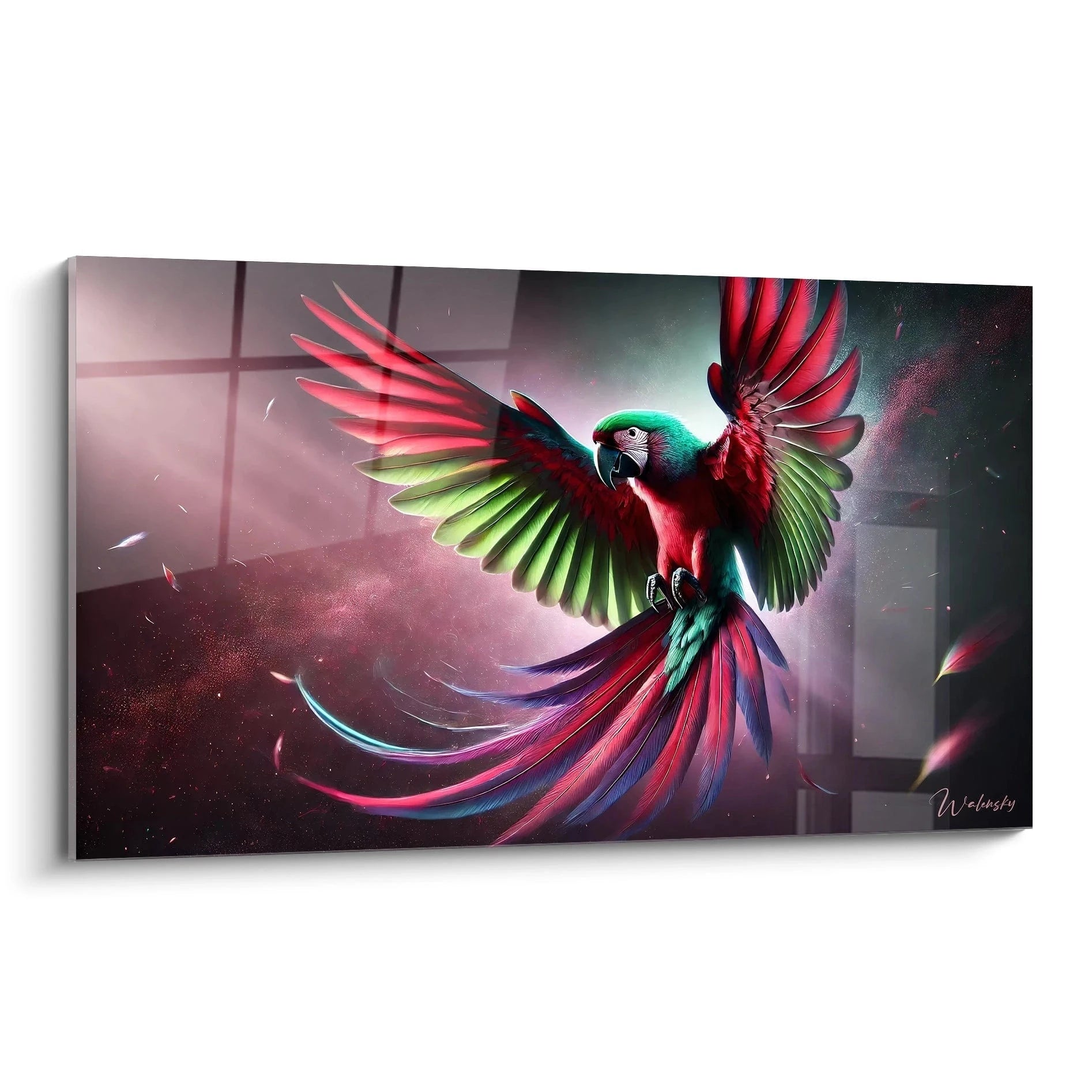
A colorful wall art for real estate agency radically transforms the client experience during agency visits and prospecting appointments. In a sector where first impressions determine 78% of engagement decisions, the strategic use of vibrant chromatic compositions creates an environment that inspires confidence while standing out from competitors adopting overly conservative visual codes. These large-scale artworks capitalize on neuropsychology of color to positively influence prospects' emotions from the moment they enter. XXL formats optimize visibility from the street, functioning as a visual magnet to attract potential passersby searching for real estate services. Investment in bold chromatic decor signals a modern, dynamic agency aligned with an exacting urban clientele's expectations.
Chromatic Psychology Serving Real Estate Transactions
The colorful wall art for real estate agency scientifically exploits neurological associations between vibrant tones and positive emotional reactions. Neuromarketing research in real estate demonstrates that reception spaces integrating multicolor compositions generate 34% additional conversational engagement compared to traditional monochrome environments. Palettes comprising energizing oranges, reassuring blues and balancing greens simultaneously activate brain regions linked to optimism, financial security and future projection.
How do colors influence real estate purchase decisions?
Strategic use of vibrant compositions in negotiation spaces creates powerful memory anchoring. When a client unconsciously associates a stimulating chromatic palette with their positive agency experience, they transfer this favorable emotion to the acquisition process itself. Monumental formats amplify this effect by occupying the peripheral visual field during file consultations, maintaining optimal emotional activation without diverting attention from contractual documents. This approach particularly suits agencies targeting young first-time buyers sensitive to contemporary and energizing environments.
Warm versus cool tones for different client segments
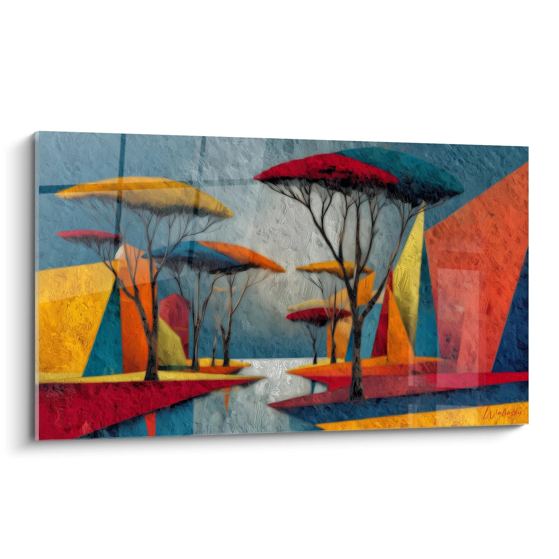
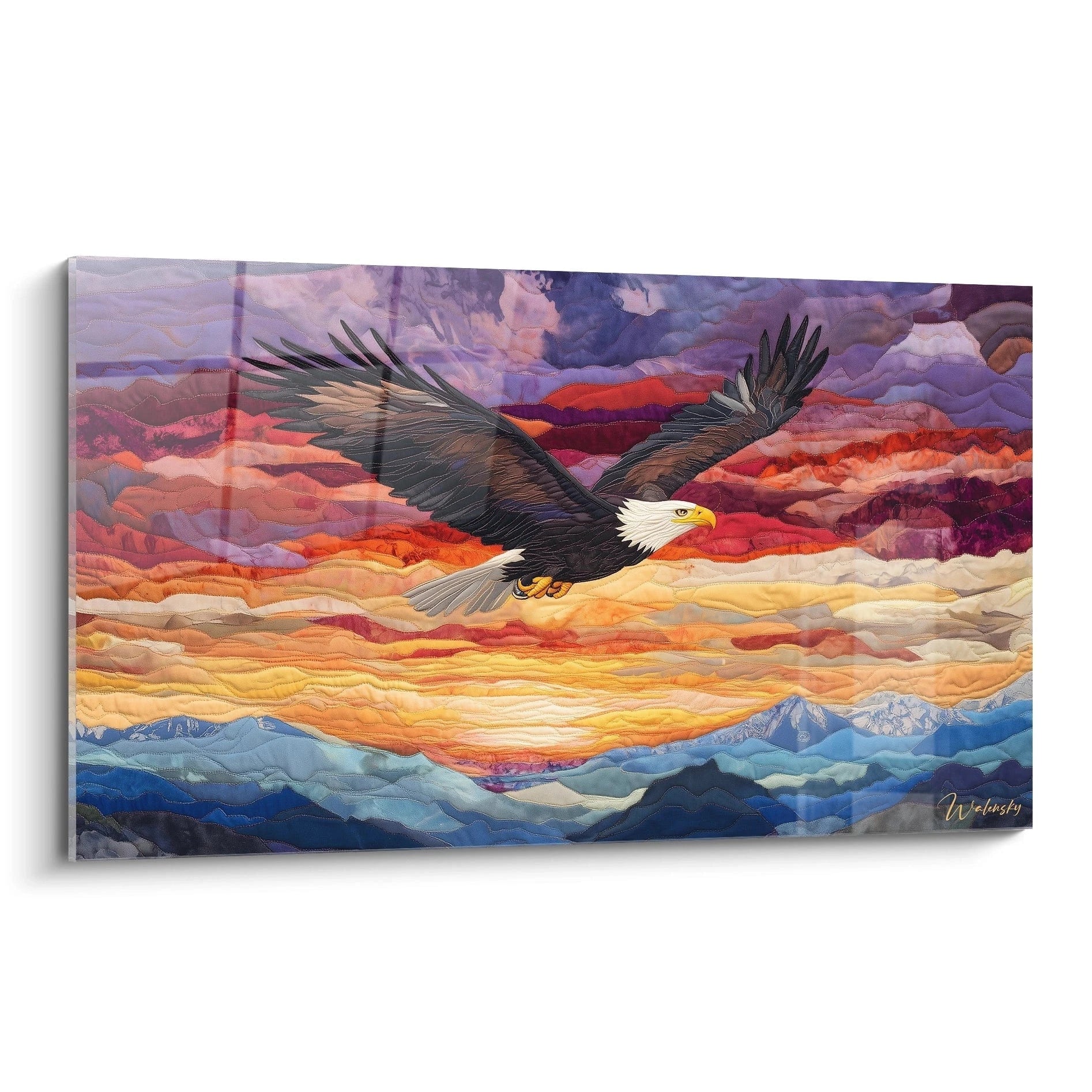
Artworks dominated by reds, yellows and oranges suit agencies specializing in exceptional properties and investor clientele, these hues symbolizing ambition and profitability. Conversely, compositions favoring deep blues, turquoises and violets calm anxious sellers during complex property appraisals. Versatile agencies opt for artworks harmoniously combining warm and cool zones, allowing psychological adaptation based on prospect profile. This chromatic flexibility transforms reception space into a modular persuasion tool.
Color-to-perceived-service-value associations
A colorful wall art for real estate agency featuring golds, coppers or metallic touches unconsciously elevates perceived fee rates. These premium nuances signal expertise and high-end network without requiring explicit commercial discourse. Compositions including contemporary pinks and corals specifically attract female decision-making clientele, particularly influential in primary residence acquisitions. Investment in formats exceeding 120x80 cm maximizes impact of sophisticated chromatic gradients, creating visual depth impossible to reproduce at smaller dimensions.
Optimizing Commercial Visibility Through Chromatic Contrast
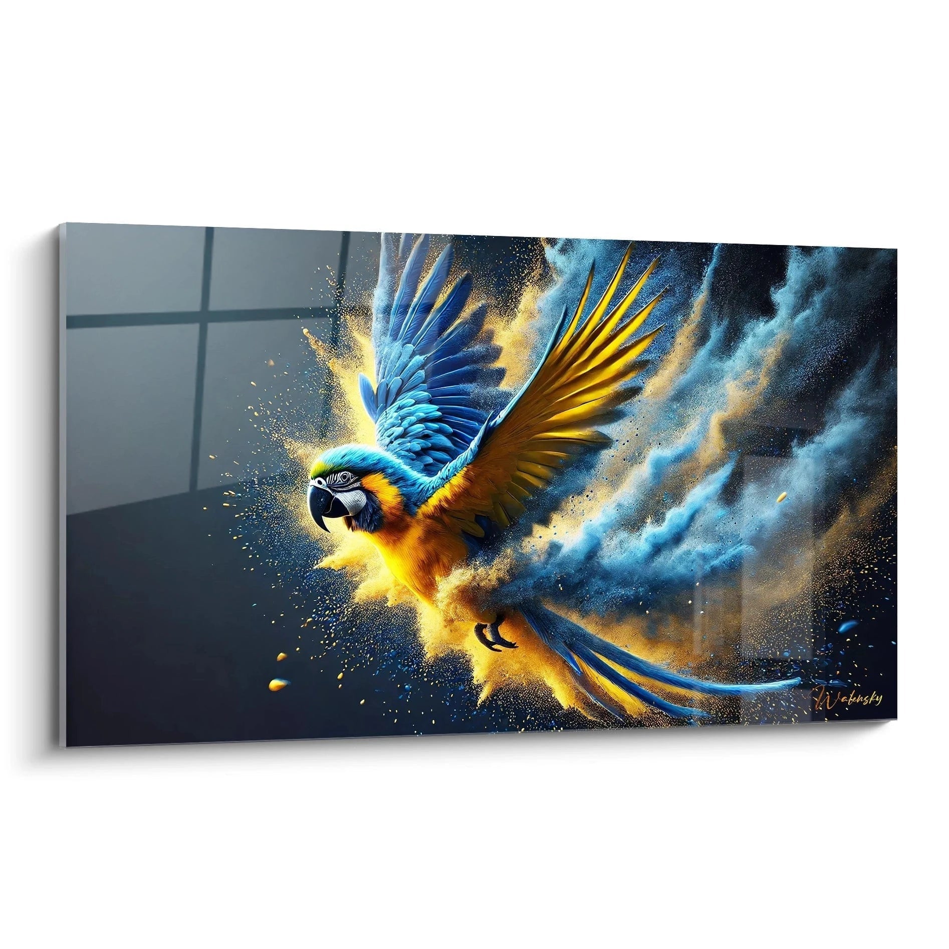
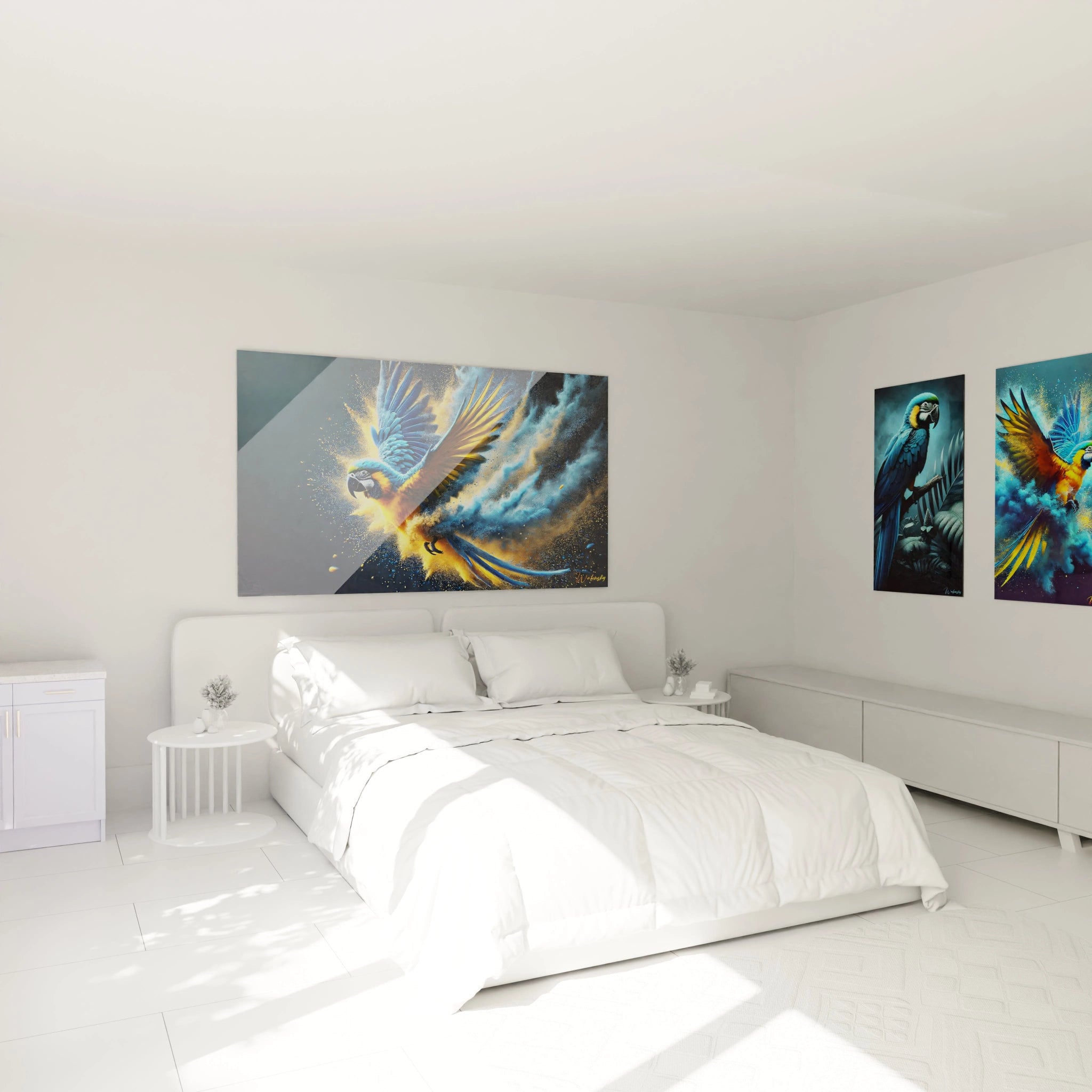
Installing a colorful wall art for real estate agency in storefront or showroom backdrop solves the critical challenge of differentiation in areas with high density of competing agencies. Commercial corridors saturated with standardized real estate signage require disruptive visual strategies to capture attention of mobile prospects. An intense chromatic composition visible from 50 meters functions as cognitive beacon, interrupting automatic visual scrolling of passersby and triggering measurable observation pause by eye-tracking.
Which chromatic palette attracts most foot traffic to agencies?
Combinations associating contrasted complementaries – cobalt blue with saffron orange, aubergine violet with lemon yellow – generate strongest retinal attraction according to commercial design studies. These accords create productive visual tension that intrigues without aggressing, encouraging threshold crossing to better grasp the artwork. XXL vertical formats exploit modern agency ceiling heights to create vertical appeal from opposite sidewalks. This strategy particularly suits locations with significant visual setback or bidirectional pedestrian circulation.
Synergy between lighting and chromatic saturation
Effectiveness of a colorful painting depends critically on its natural and artificial light exposure. Artworks positioned facing storefronts capture daylight that naturally amplifies pigment vibration, creating evolving chromatic spectacle throughout the day. In evening, neutral white LED lighting reveals full spectrum without distortion, essential for agencies practicing extended hours. Some agencies install adjustable spotlights allowing luminosity modulation based on time of day and desired traffic, transforming the painting into dynamic commercial device.
Chromatic differentiation by commercial territory
Agencies located in family residential zones favor reassuring colorful compositions integrating nature greens and Mediterranean blues, evoking quality of life and healthy environment. Business district implantations adopt energetic palettes dominated by dynamic reds and stimulating yellows, reflecting urgency and efficiency expected by investor clientele. This chromatic adaptation to territorial context reinforces perceived relevance of agency as local expert intimately understanding their market. To discover other complementary visual approaches, explore our collection of abstract wall art for real estate agency offering sophisticated alternative to colorful compositions.
Brand Strategy and Market Positioning Through Chromatic Signature
Adopting a colorful wall art for real estate agency constitutes a strategic positioning decision transcending simple decoration. Franchise networks imposing strict graphic charters often limit visual expression of points of sale, creating counterproductive uniformity. Integration of personalized chromatic artworks allows franchisees to maintain distinctive local identity while respecting corporate guidelines, responding to growing consumer demand for personalization.
Building memorable visual identity
Repetition of specific chromatic palette across all supports – monumental painting, commercial documentation, digital presence – builds professional brand consistency. Clients exposed to this visual signature during agency visits instantly recognize subsequent marketing materials, increasing email open rates by 27% according to sector data. Compositions combining three to five dominant colors offer sufficient visual richness without diluting memorization. This chromatic approach transforms the painting into cornerstone of complete identity system.
Which color codes avoid confusion with direct competitors?
Chromatic analysis of local competition frequently reveals overrepresentation of corporate blues and neutral grays, heritage of traditional banking codes. Investment in artworks favoring emerald greens, millennial pinks or contemporary oranges creates immediate perceptual distinction. Agencies specializing in prestige real estate adopt palettes including deep burgundies and sophisticated navy blues, evoking discreet luxury and estate expertise. This intentional chromatic differentiation facilitates spontaneous brand recall during prospects' later searches.
Chromatic evolution and refresh cycle
Chromatic trends in commercial design evolve cyclically every 36 to 48 months, requiring refresh planning of artworks. Proactive agencies anticipate these rotations by acquiring modular formats allowing hanging modifications or constituting complementary collections alternated seasonally. This strategy maintains perceptual freshness of space without requiring heavy renovations. Multicolor compositions present advantage of better resisting trend fluctuations than monochrome artworks quickly dated.
Chromatic investment and image return
Acquisition of a colorful wall art for real estate agency in large dimension represents marketing investment whose return measures in improved local awareness and elevated client experience value. Satisfaction surveys reveal that 41% of clients specifically memorize agency visual environment in overall service evaluation. This memory element directly influences spontaneous recommendations and online reviews, critical leverage in sector where 73% of prospects consult ratings before first contact. Monumental format guarantees optimal photographic presence on social media, transforming each client visit into viral communication opportunity.
Does colorful wall art suit all types of real estate agencies?
Vibrant chromatic compositions particularly adapt to agencies targeting young urban clientele, networks modernizing their image and structures specializing in atypical properties. Traditional estate agencies will prefer more sober palettes with subtle color touches to avoid dissonance with their sought classic high-end positioning.
What is chromatic durability of colorful wall art for real estate agency?
Contemporary artworks use UV-resistant pigments guaranteeing chromatic stability over 15 to 25 years in indirect exposure. Installation set back from full south-facing storefronts and use of protective varnish extend this durability, preserving initial investment and avoiding progressive color fading that would tarnish sought-after modernity image.
How to coordinate colorful wall art with existing graphic charter?
Optimal approach consists in selecting artwork integrating at least one of main corporate colors while introducing complementary tones enriching palette without contradicting it. This extended harmony creates sophisticated consistency avoiding monotonous repetition while maintaining brand recognition, strategy particularly effective for franchise networks seeking local differentiation.