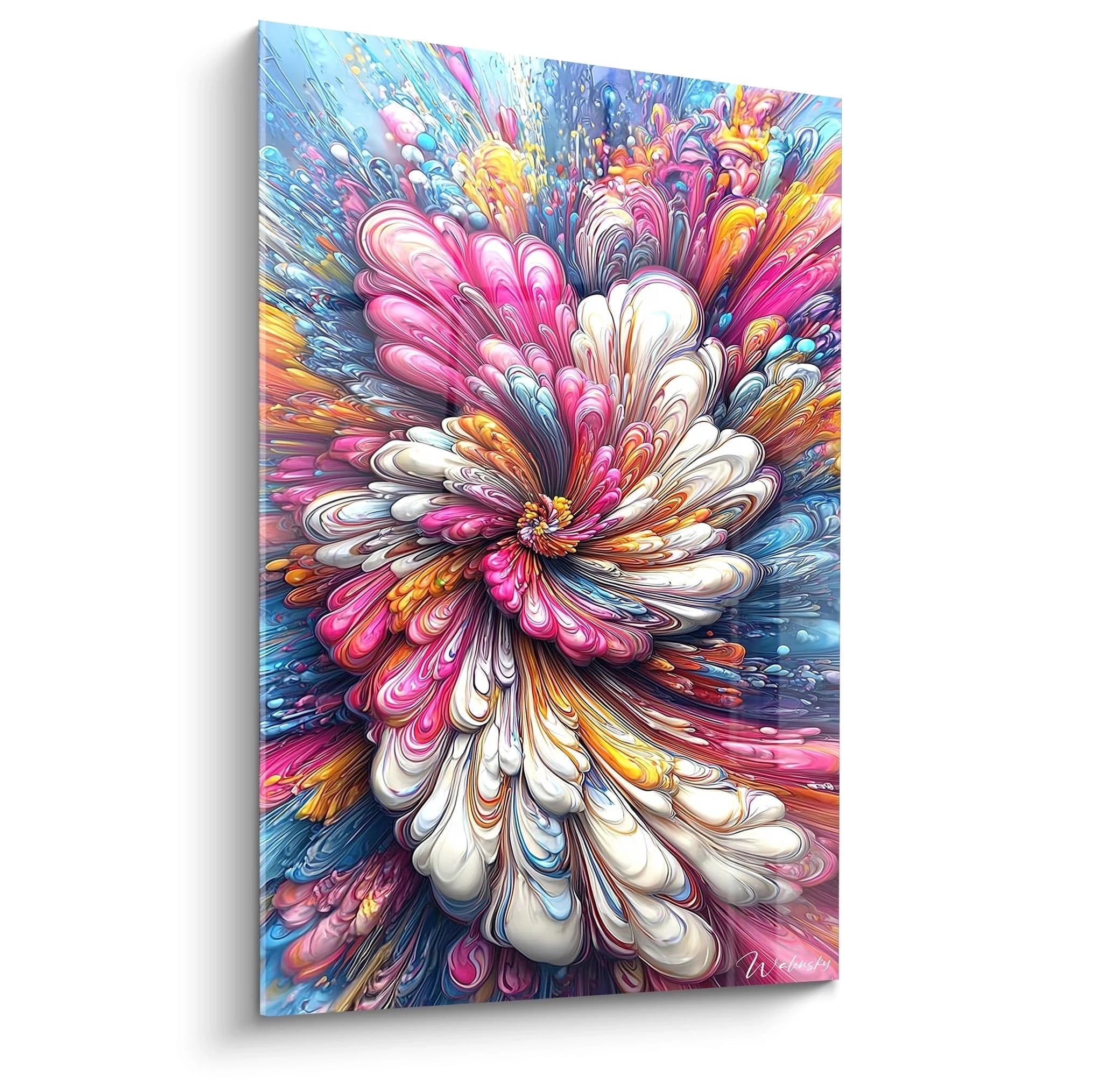
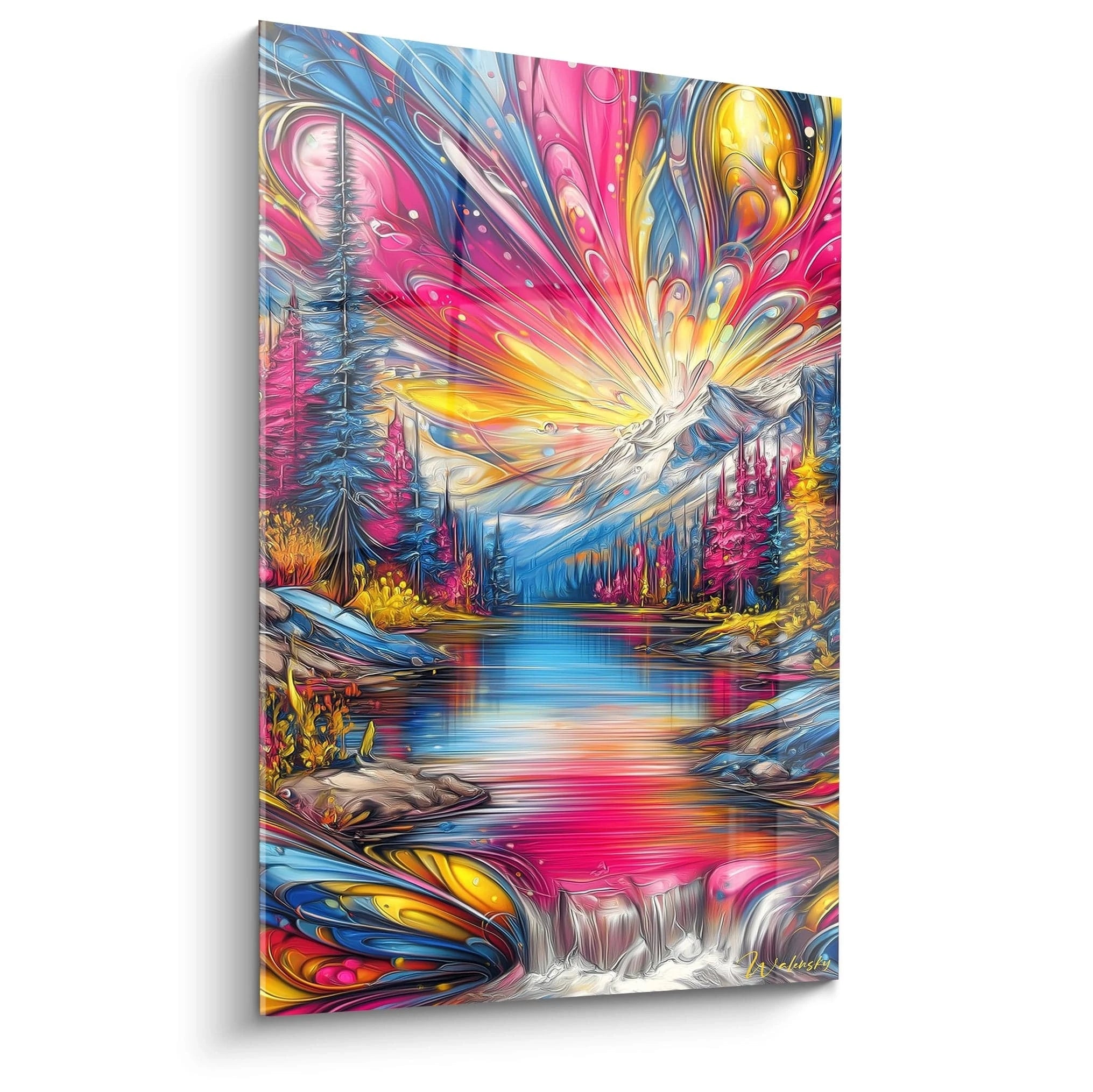
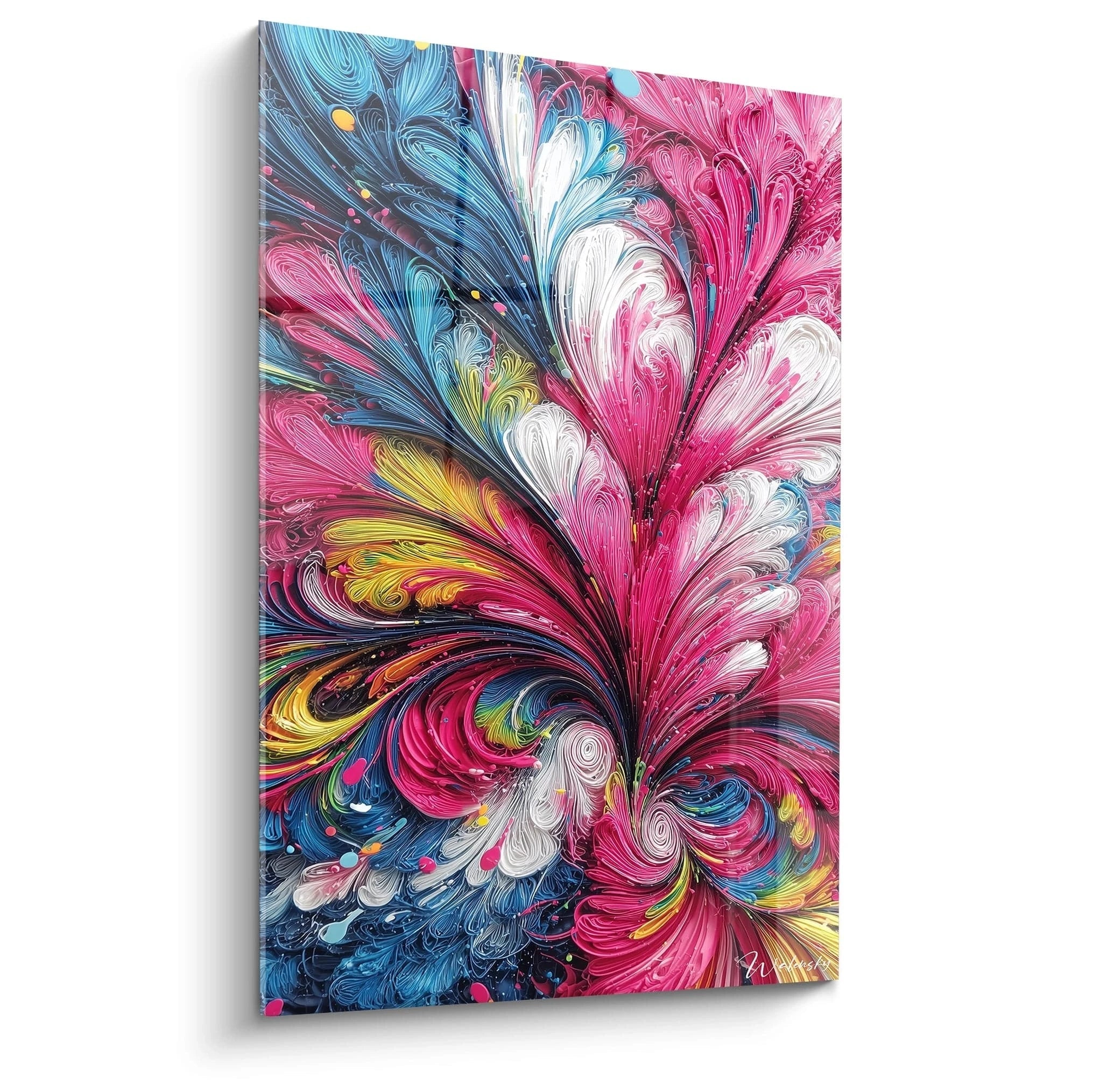
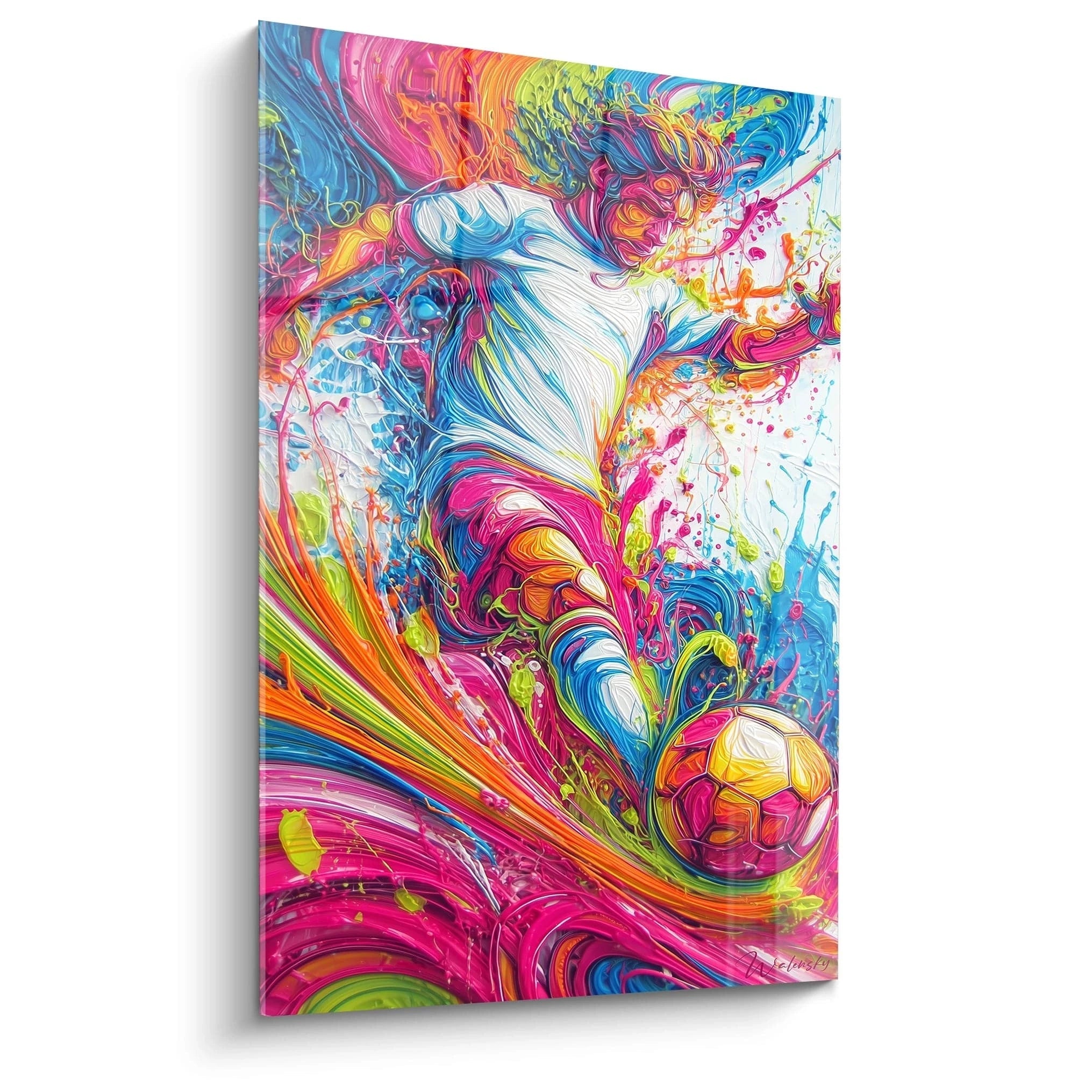
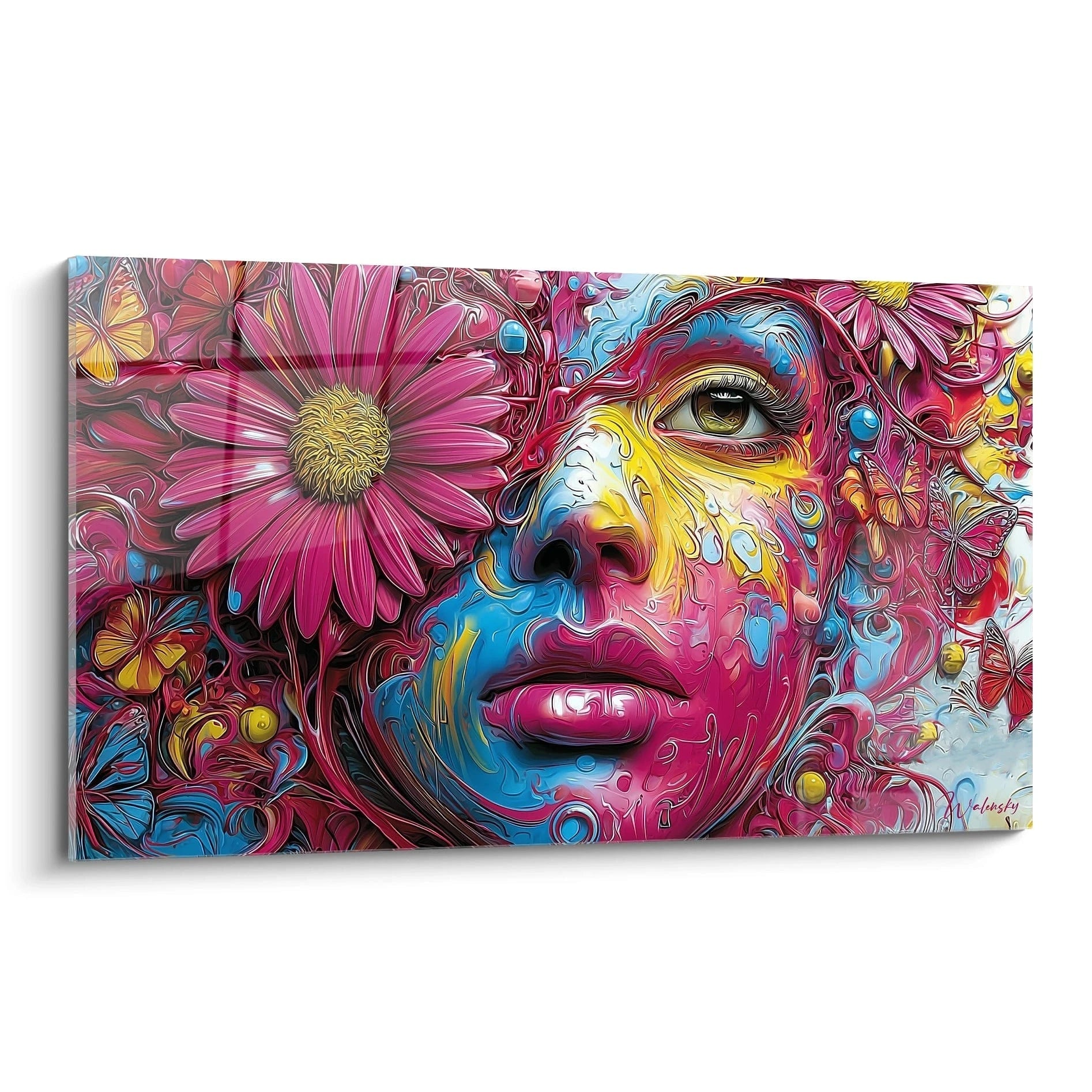
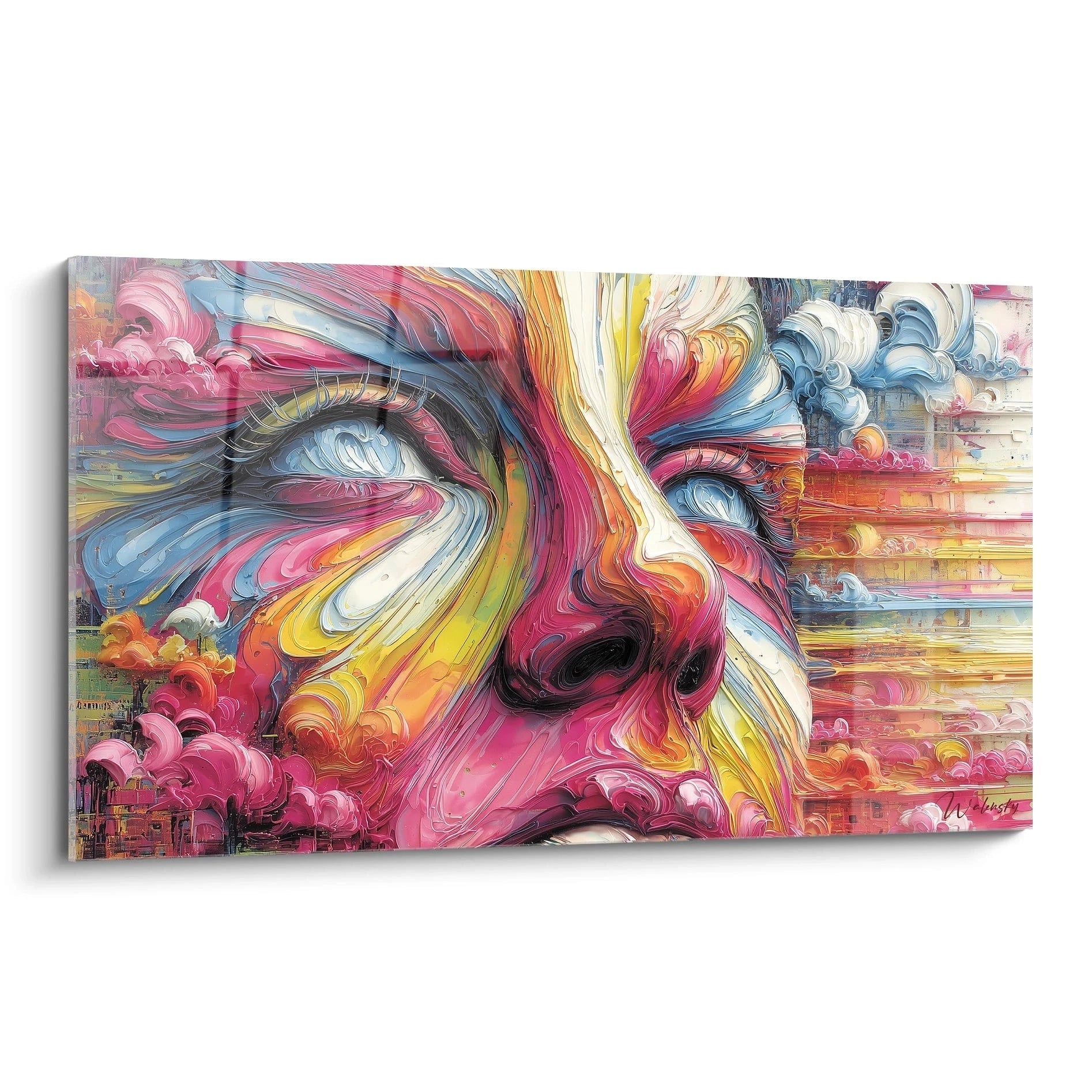
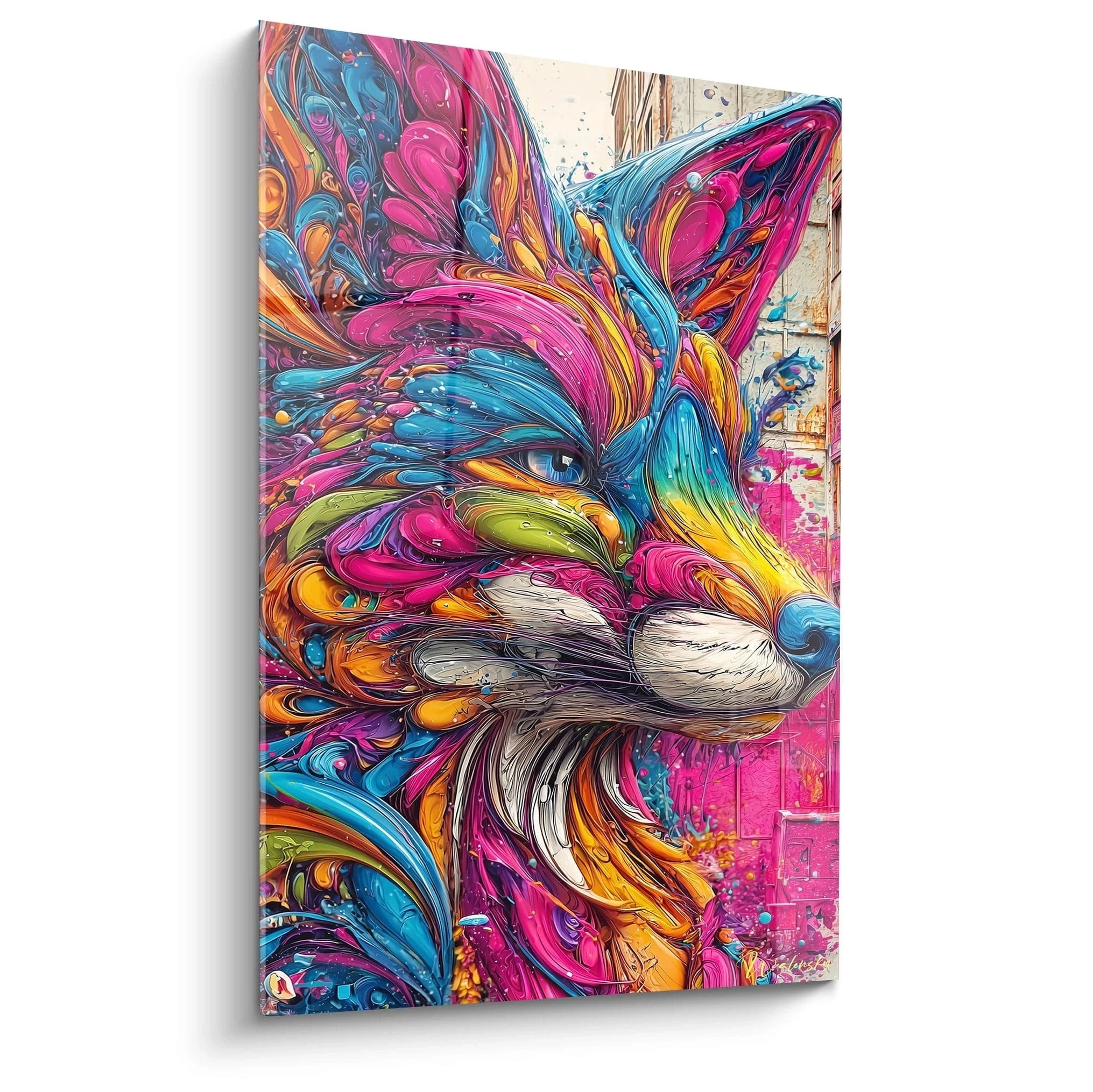
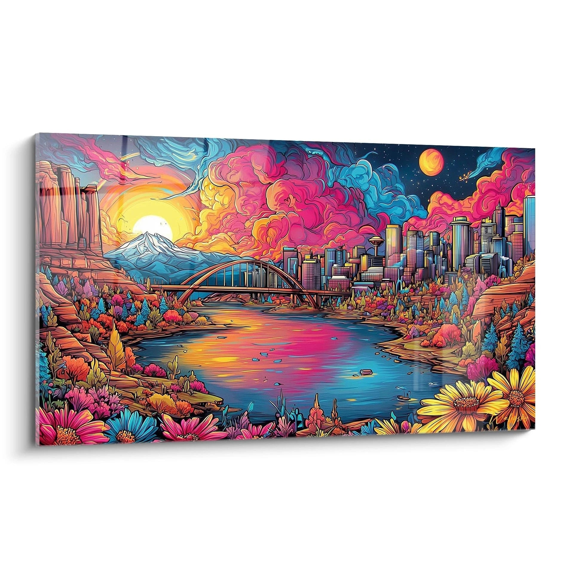
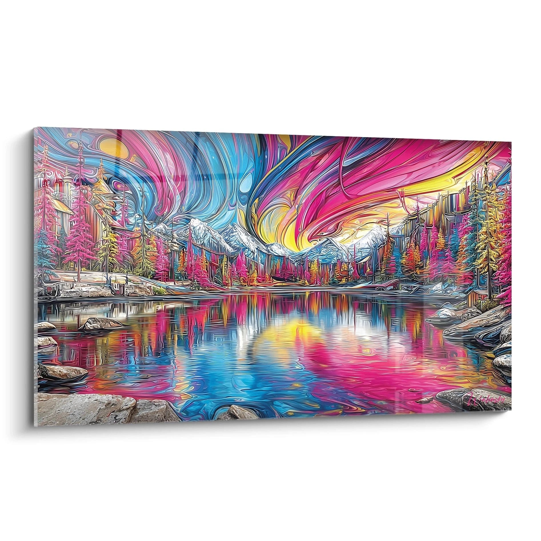
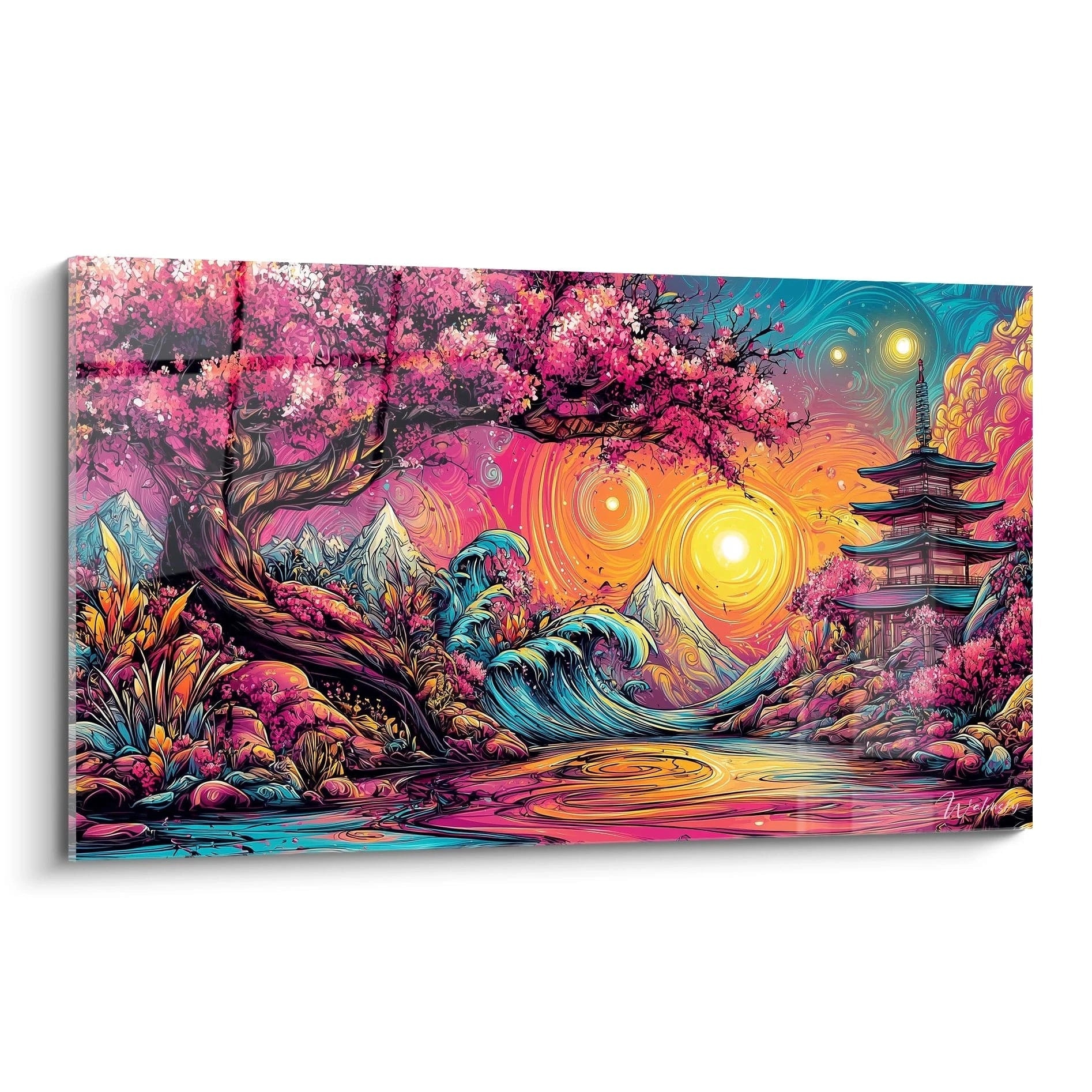
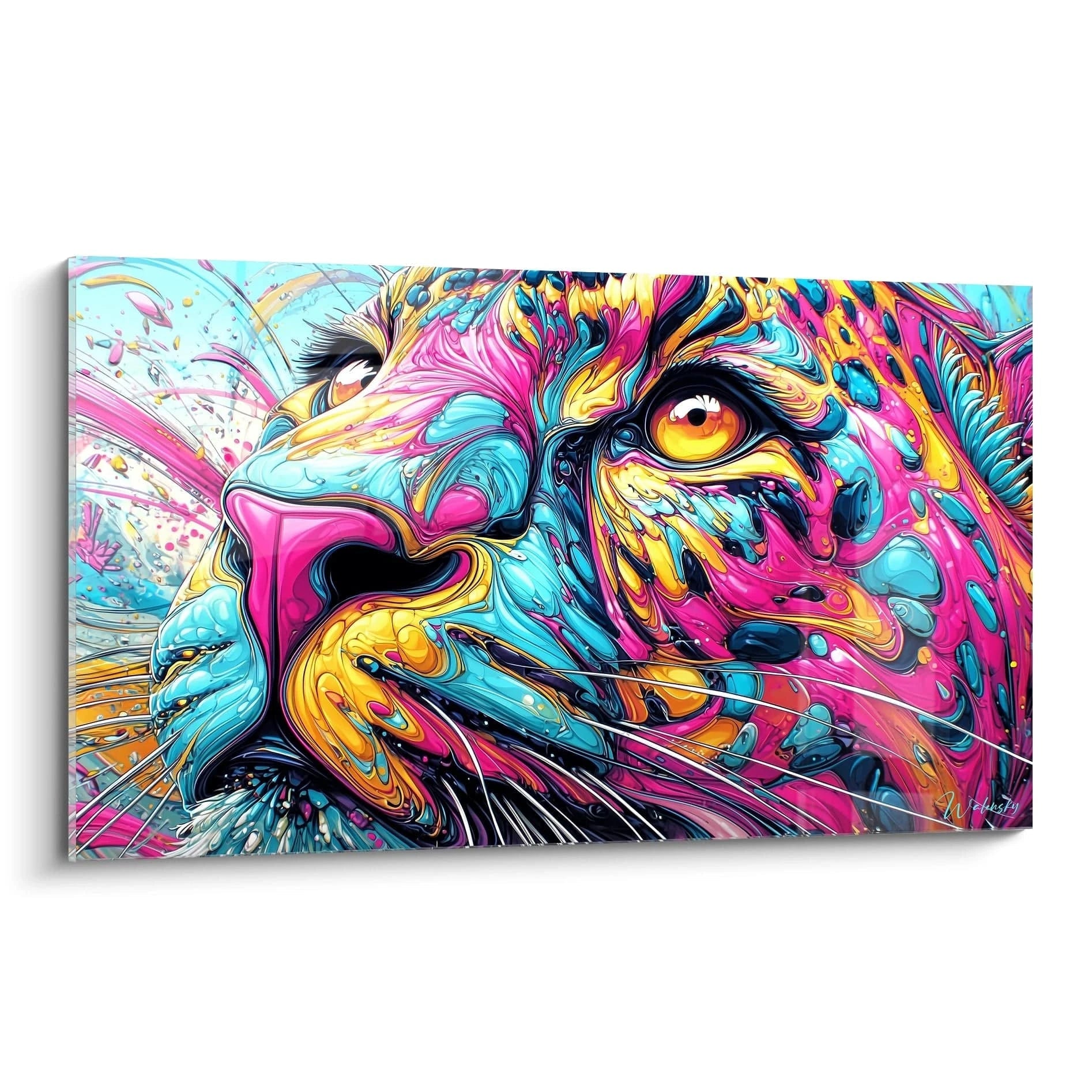
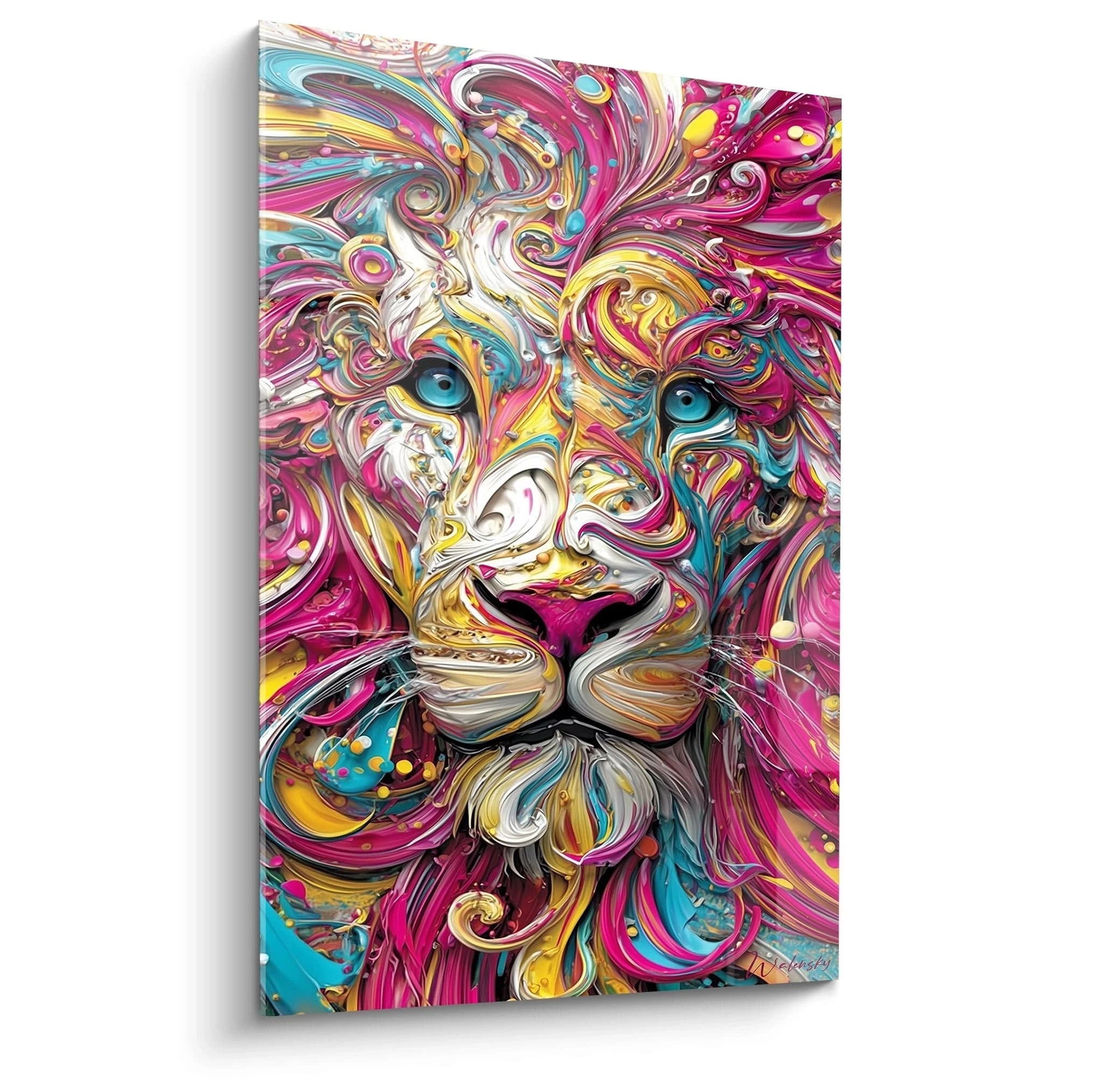
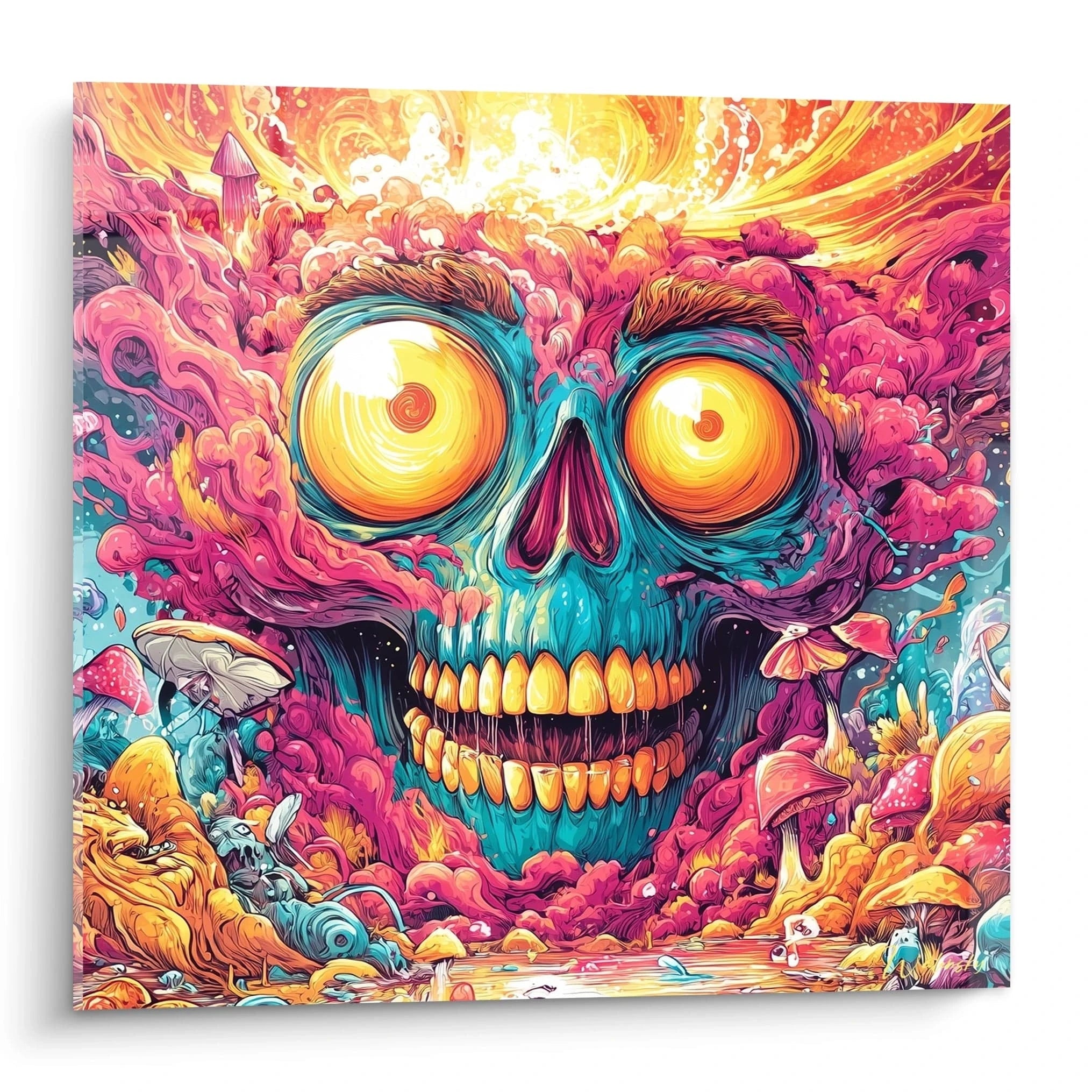
The Pink Colors Gone Wild Painting represents a chromatic explosion where the pink hue establishes itself as the guiding thread of a vibrant and spontaneous composition. This large-scale wall creation radically transforms modern spaces through its visual intensity and ability to instantly inject creative energy. Unlike traditional monochromatic artworks, this painting articulates different pink nuances in a bold chromatic choreography, creating unexpected contrasts between powder pink, electric fuchsia, and deep purple. This decorative piece addresses individuals seeking impactful wall art that breaks conventional codes while maintaining contemporary sophistication. Investment in this type of wall creation responds to a precise purchasing intention: installing a masterpiece capable of redefining an entire room's atmosphere through its chromatic presence alone.
The Chromatic Impact of Pink in Large Residential Spaces
The Pink Colors Gone Wild Painting exploits the psychological properties of the pink hue to create energizing and creative residential environments. In contemporary living rooms with generous volumes, this large-scale wall artwork acts as an atmosphere catalyst, instantly transforming a neutral space into a vibrant artistic expression zone. The multiple pink nuances generate visual dynamics that stimulate occupants' creativity while preserving a welcoming atmosphere.
How does energetic pink transform the atmosphere of a modern living room?
Installing a large pink painting radically modifies the spatial perception of a contemporary living room. Fuchsia and coral tonalities create a visual expansion sensation particularly effective in spaces with high ceilings, where the chromatic composition dialogues with architectural verticality. This interaction between abstract colors gone wild painting and architecture redefines the perceived proportions of the room.
Decorative Associations to Enhance Vibrant Pink
Arranging around an explosive pink painting requires a specific decorative strategy. Furniture with clean lines in natural materials like light oak or walnut creates a soothing contrast to the chromatic intensity. Textiles in pearl gray, taupe, or off-white tones establish visual balance allowing the artwork to retain its status as the absolute focal point.
Optimal Residential Zones for a Dynamic Pink Painting
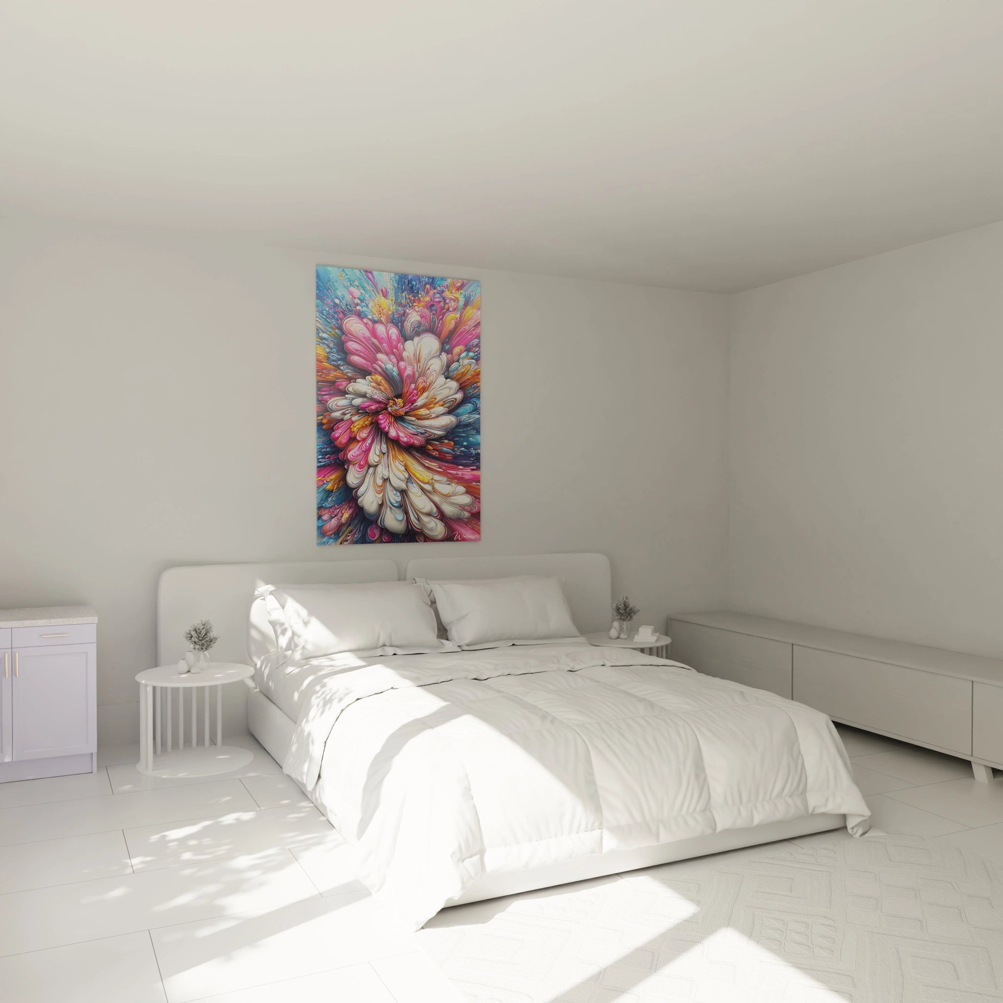
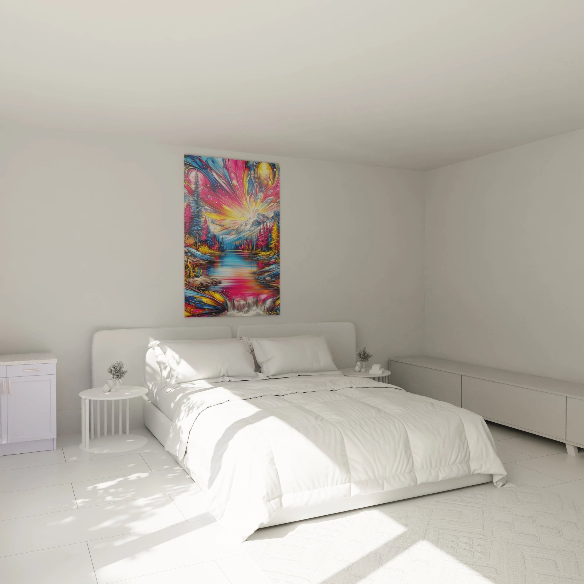
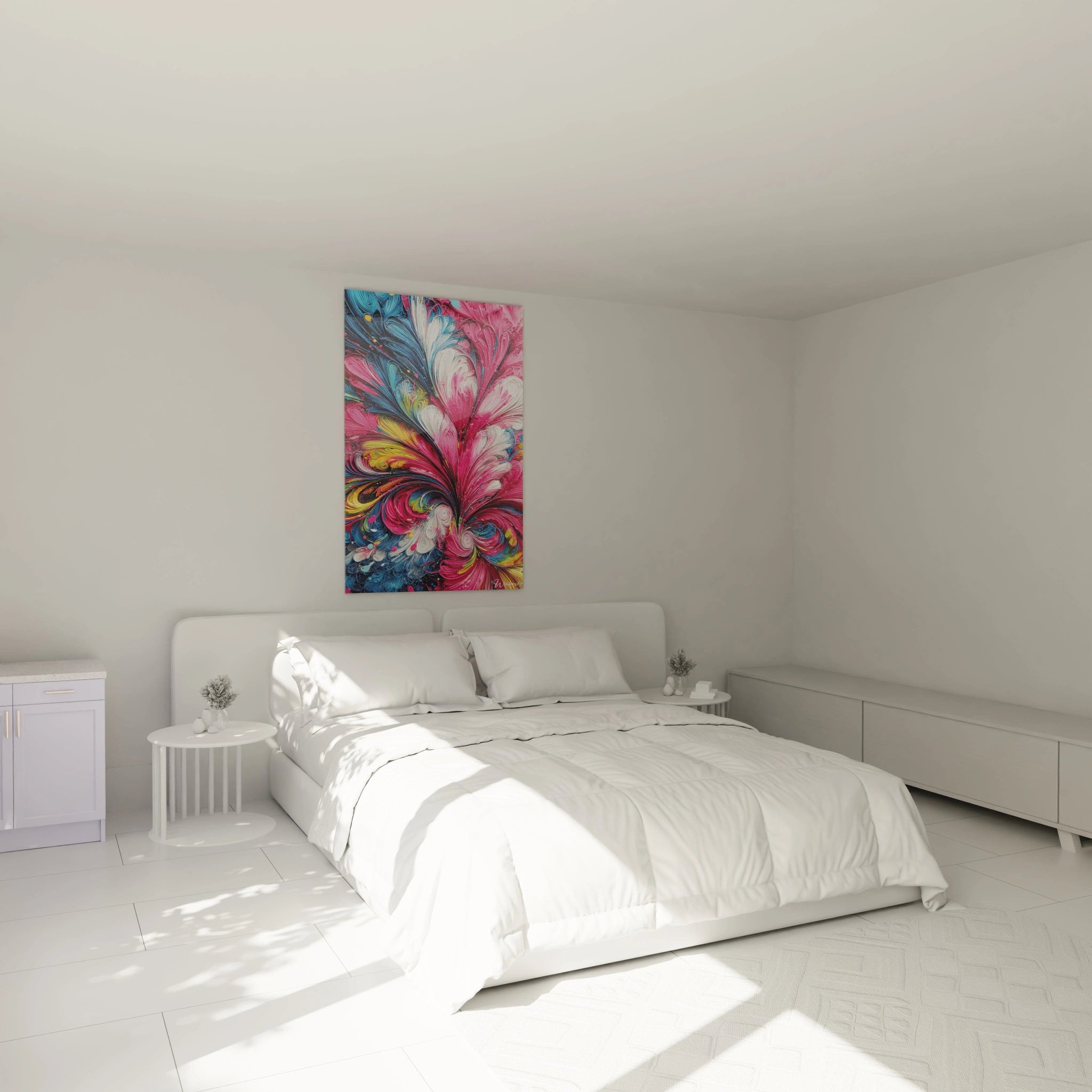
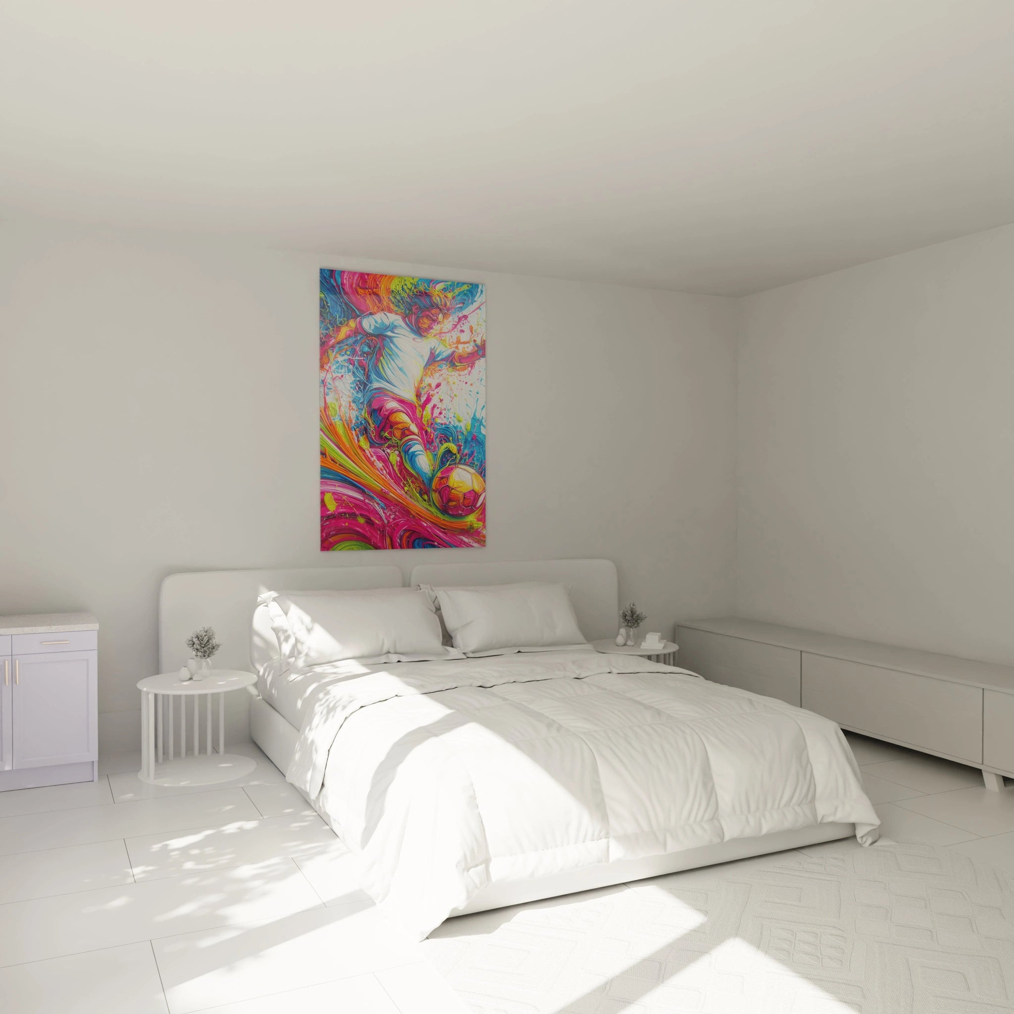
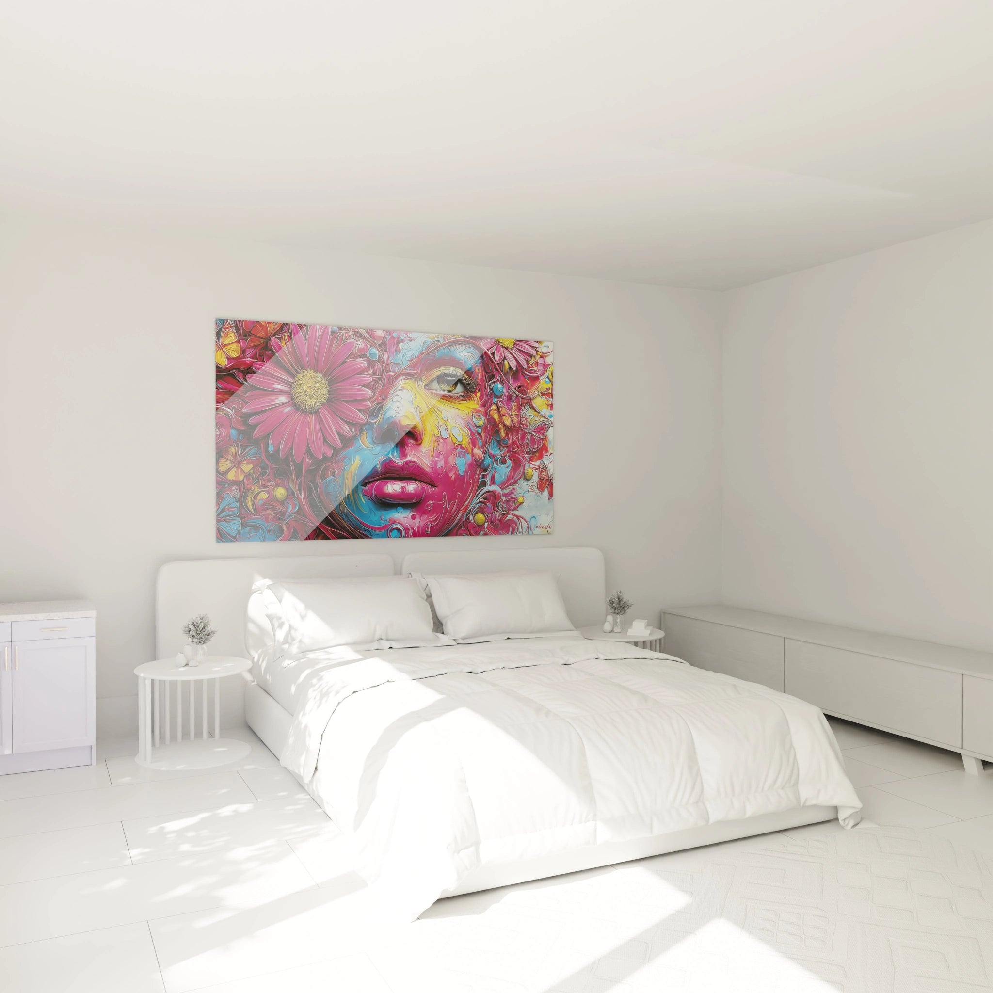
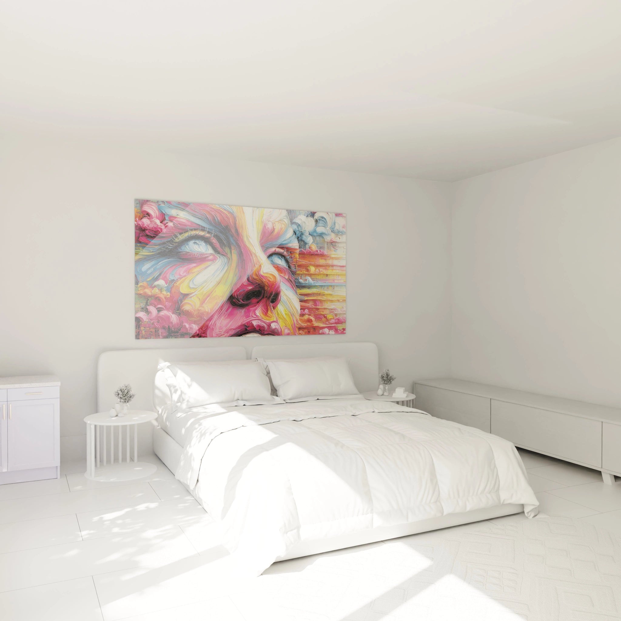
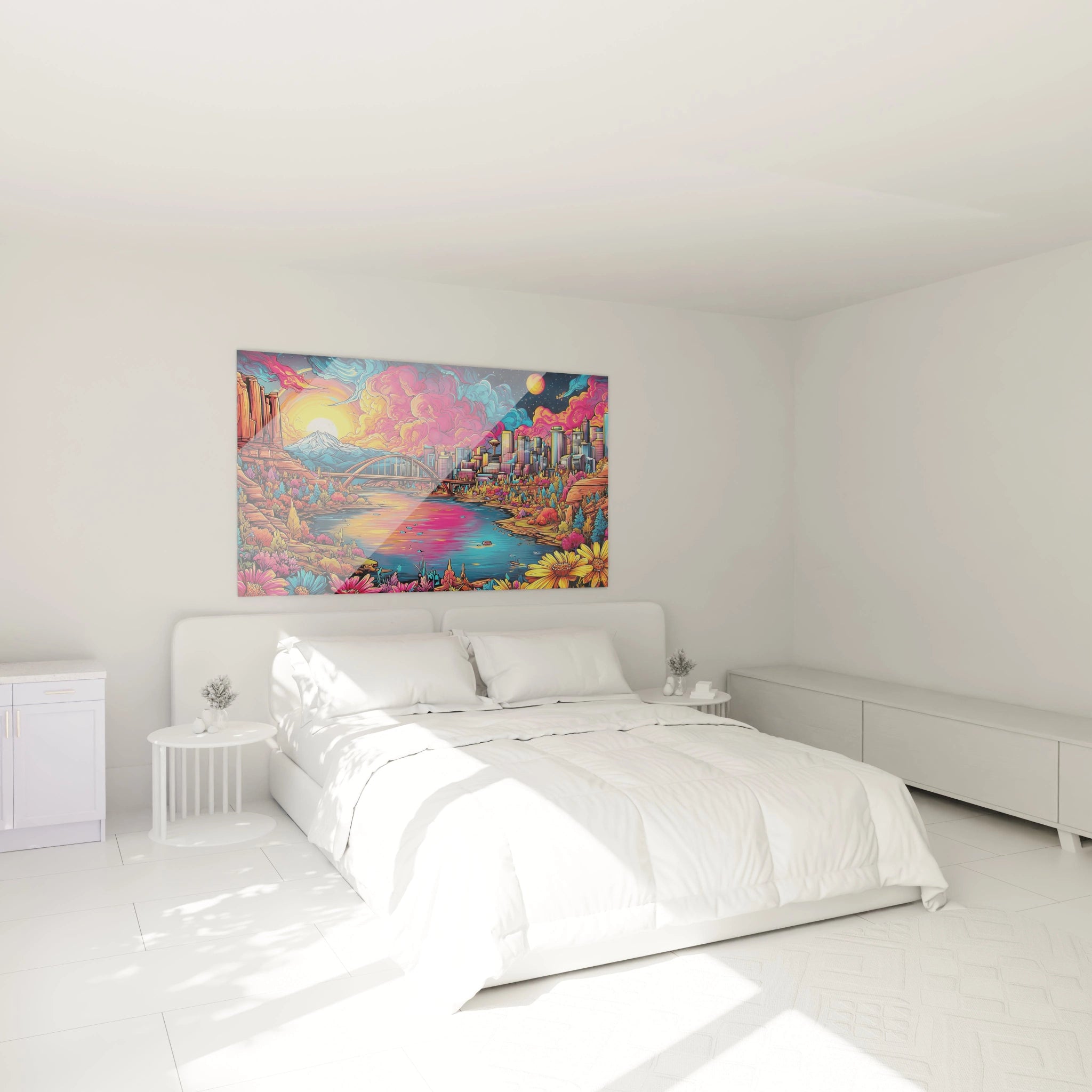
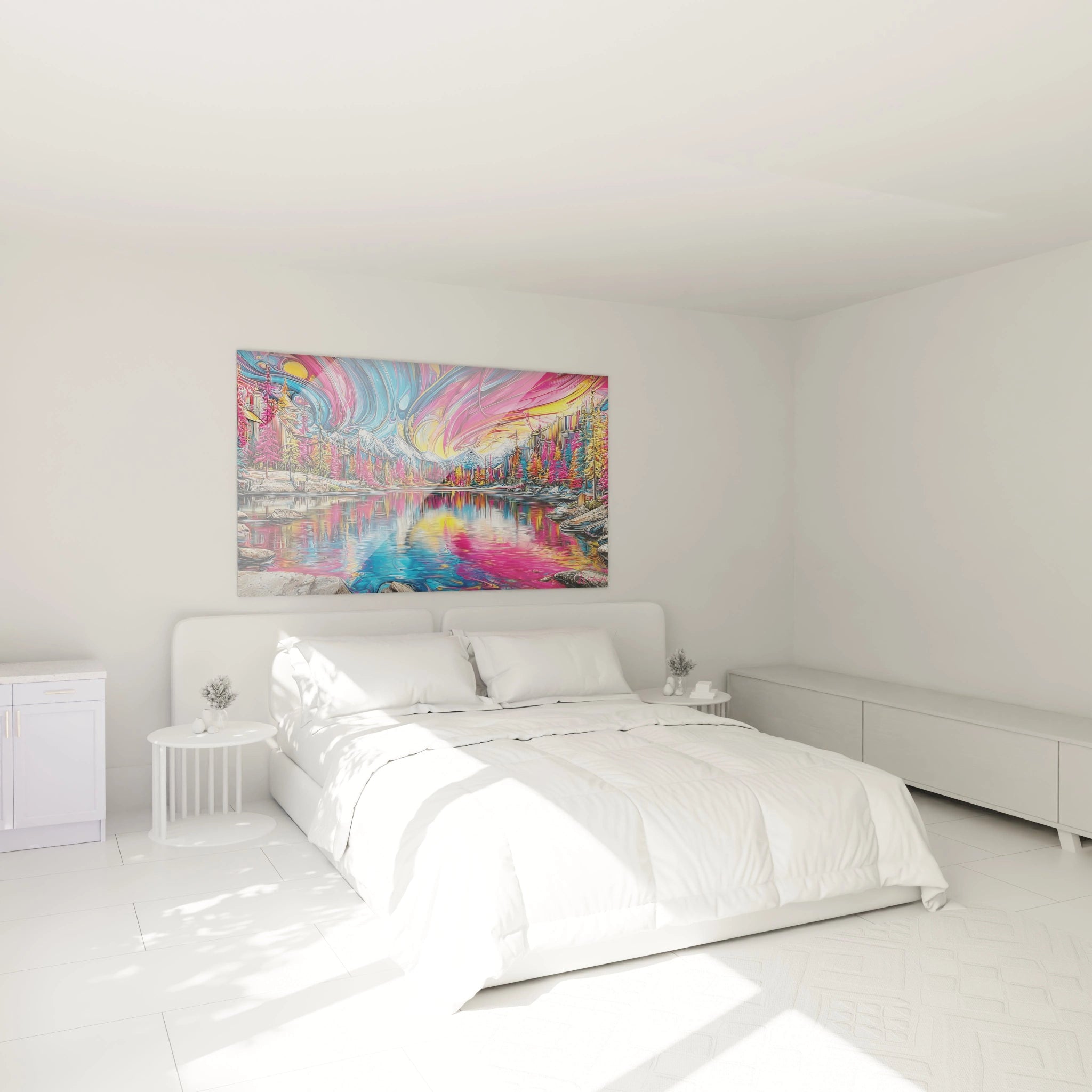
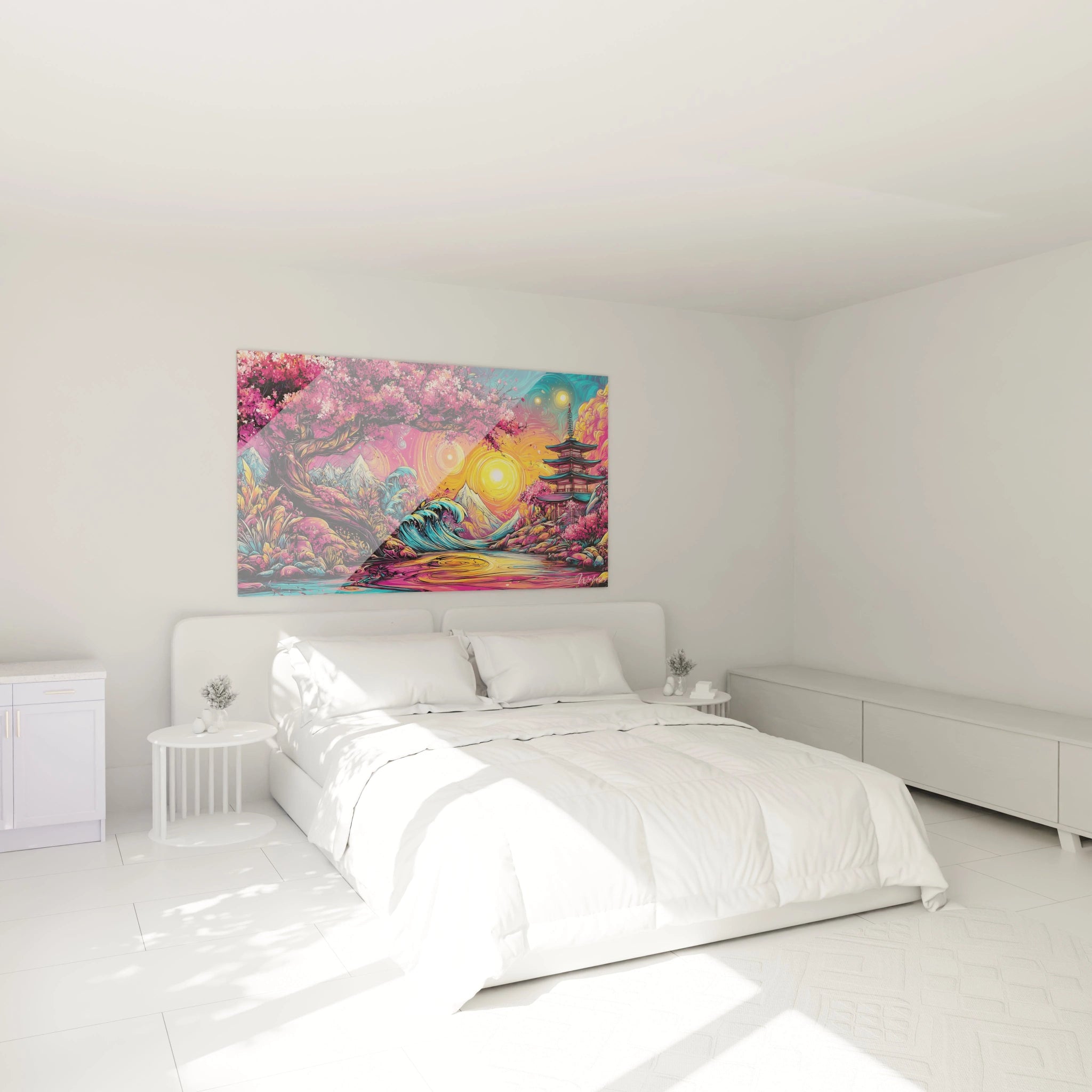
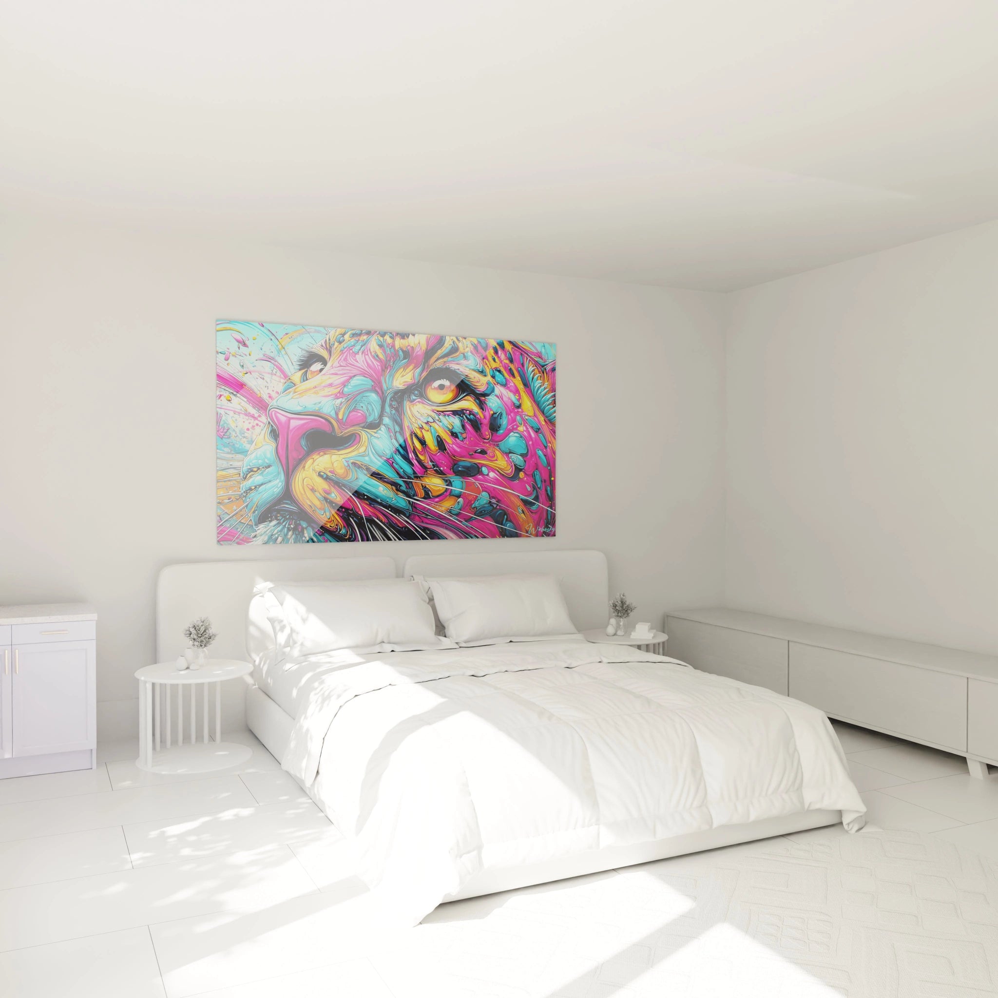
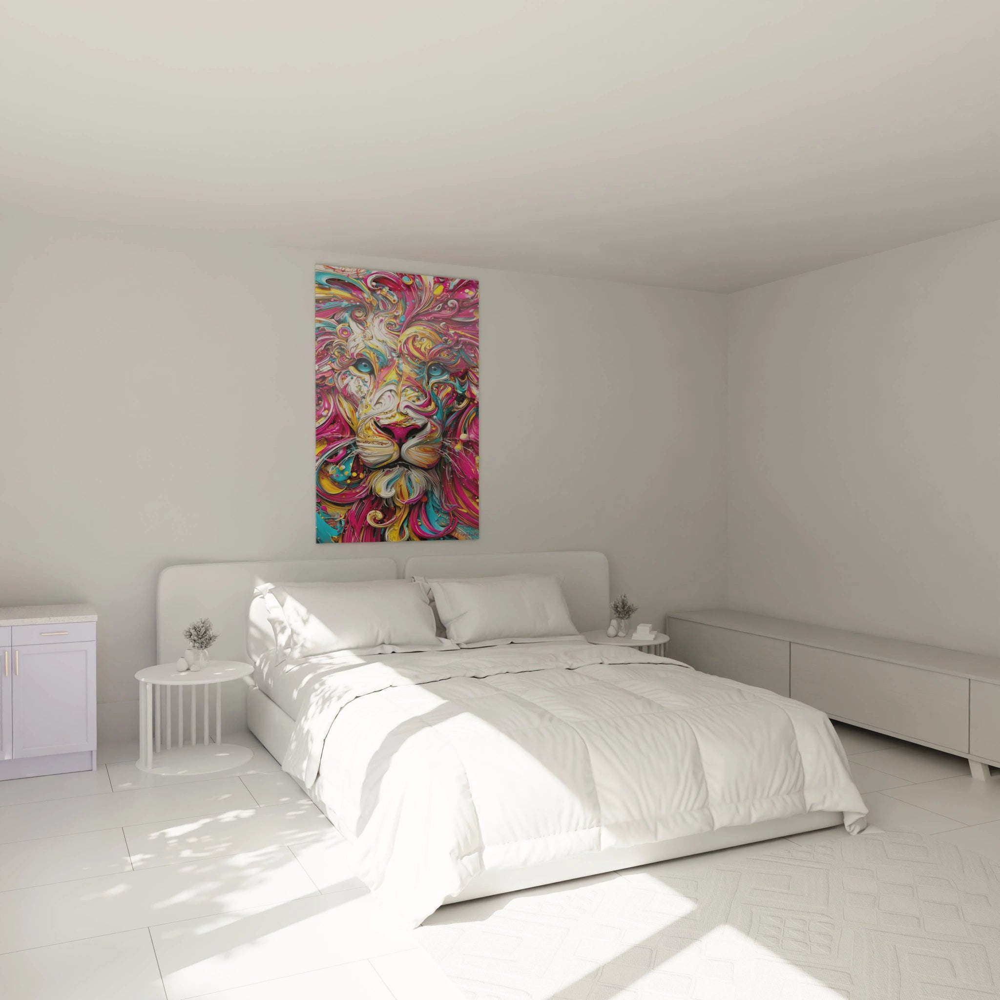
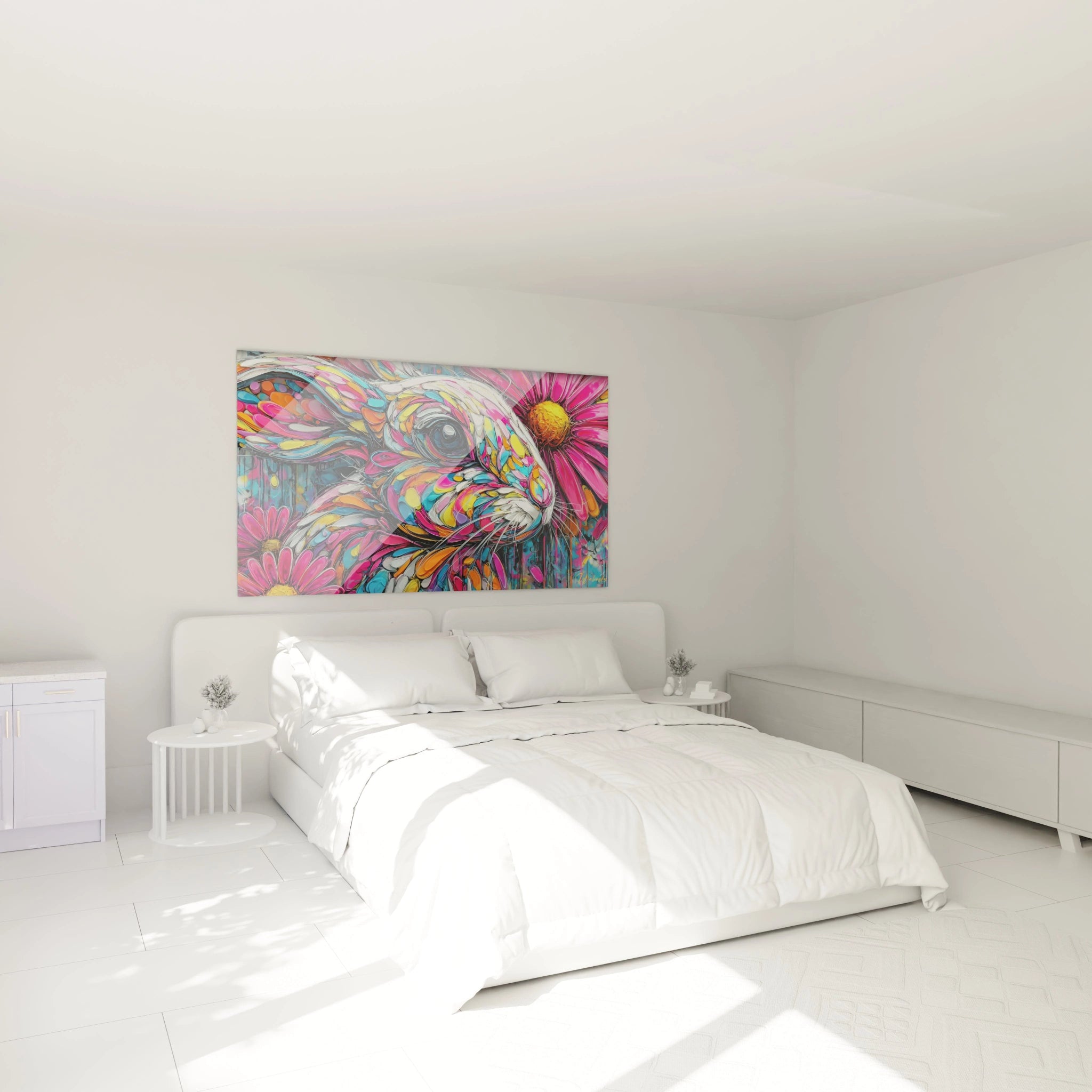
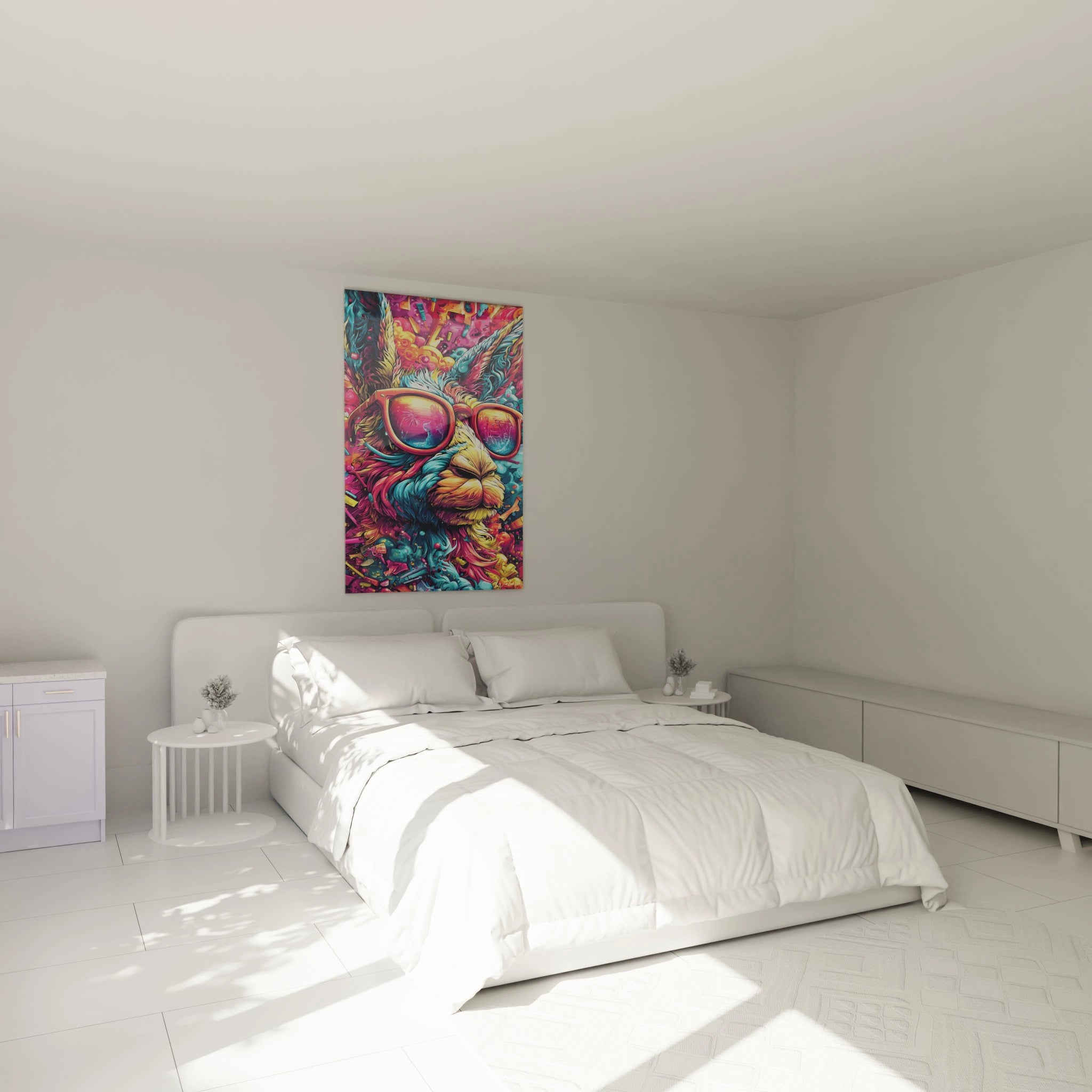
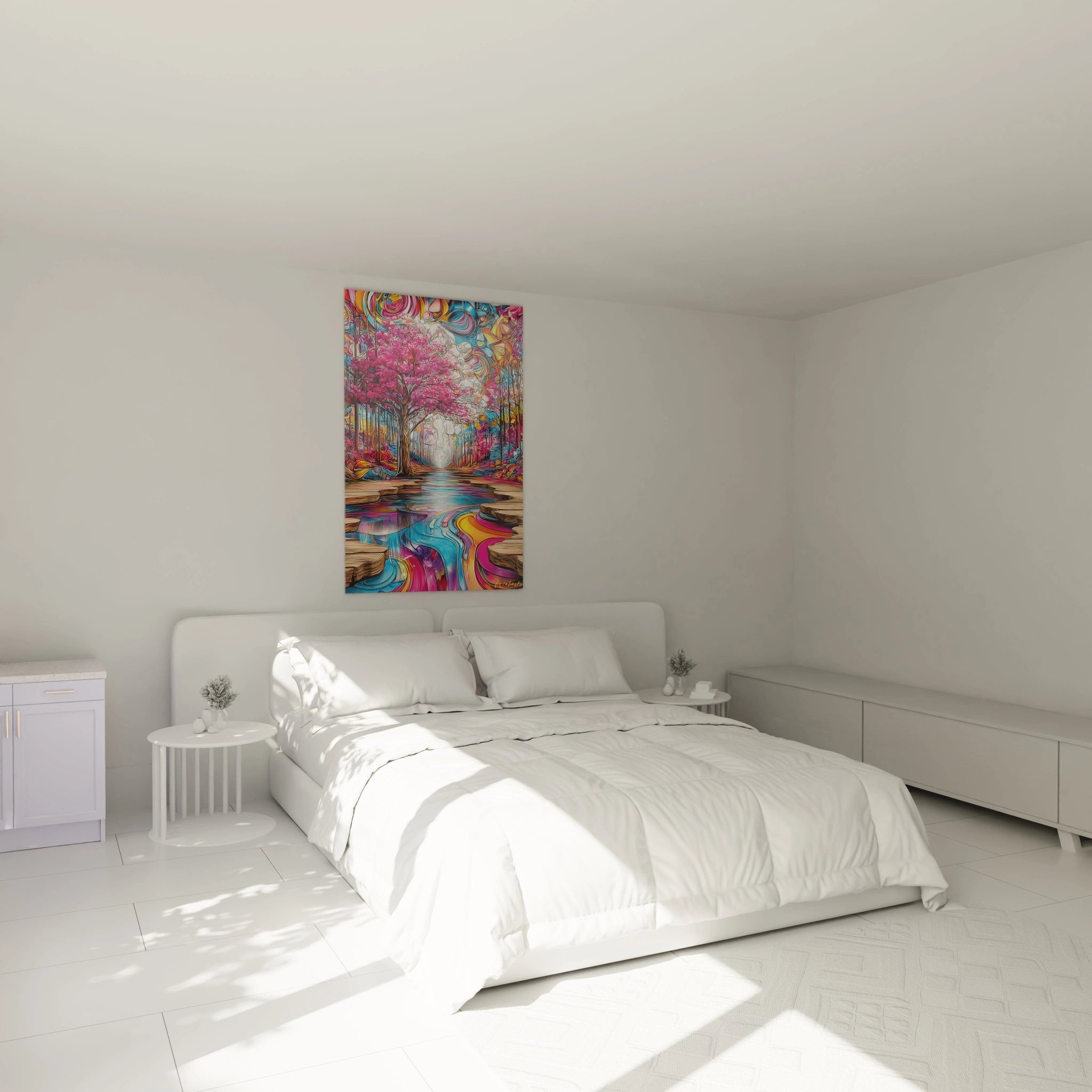
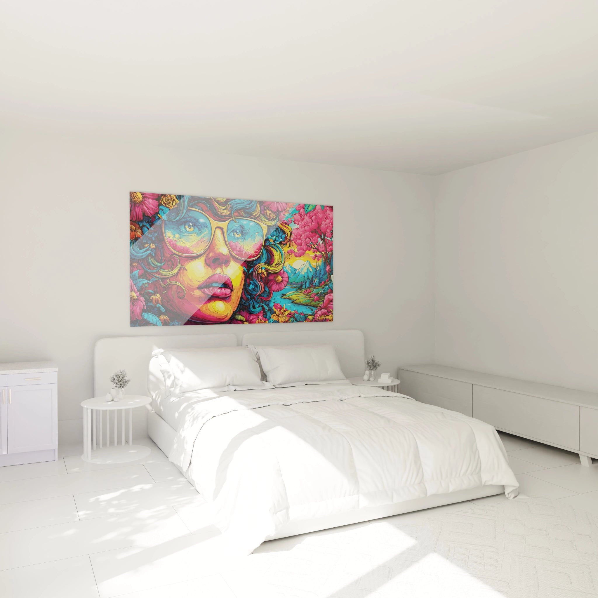
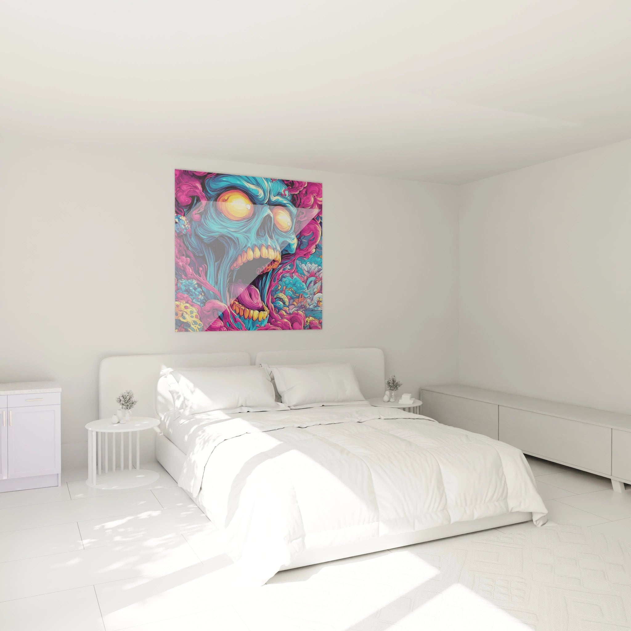
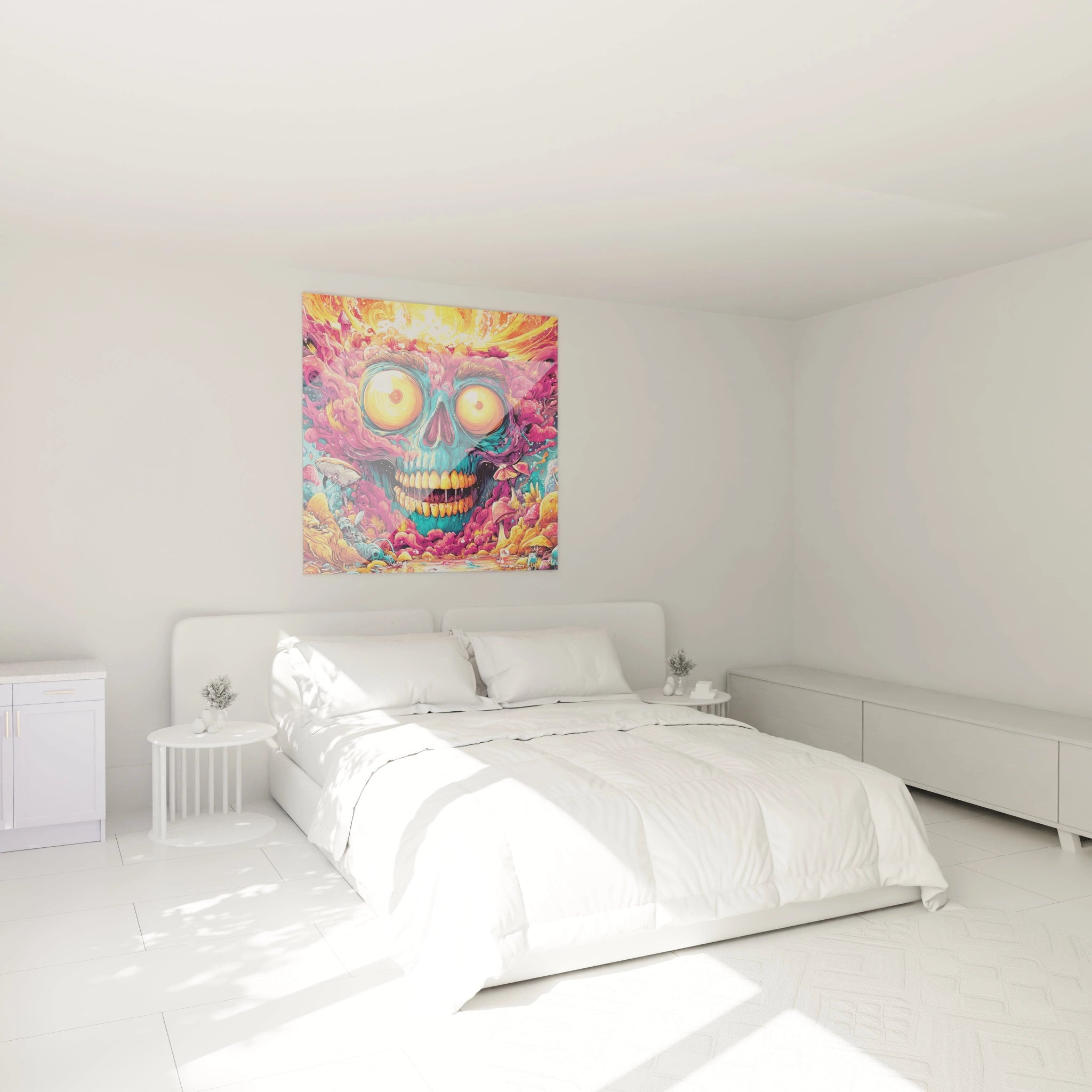
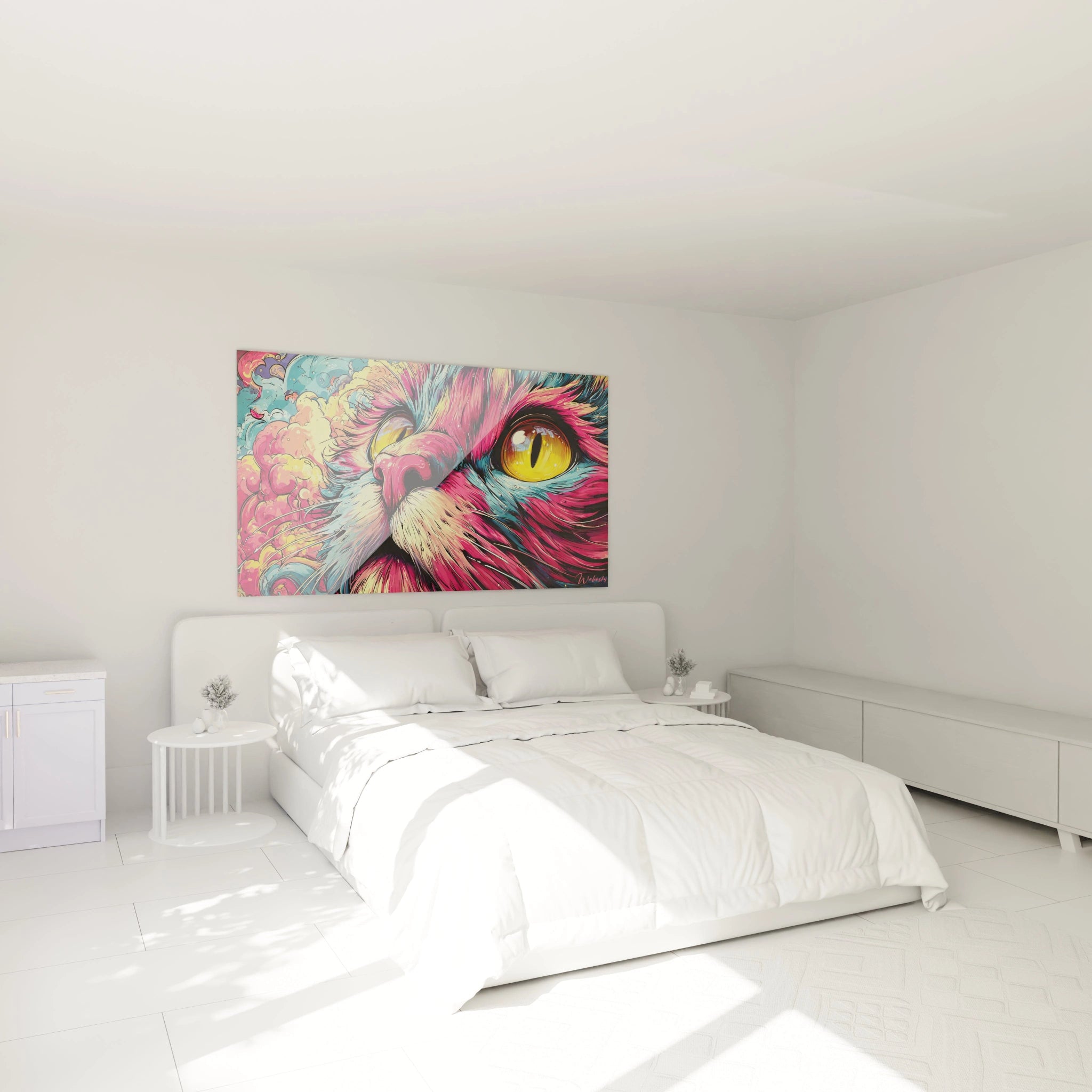
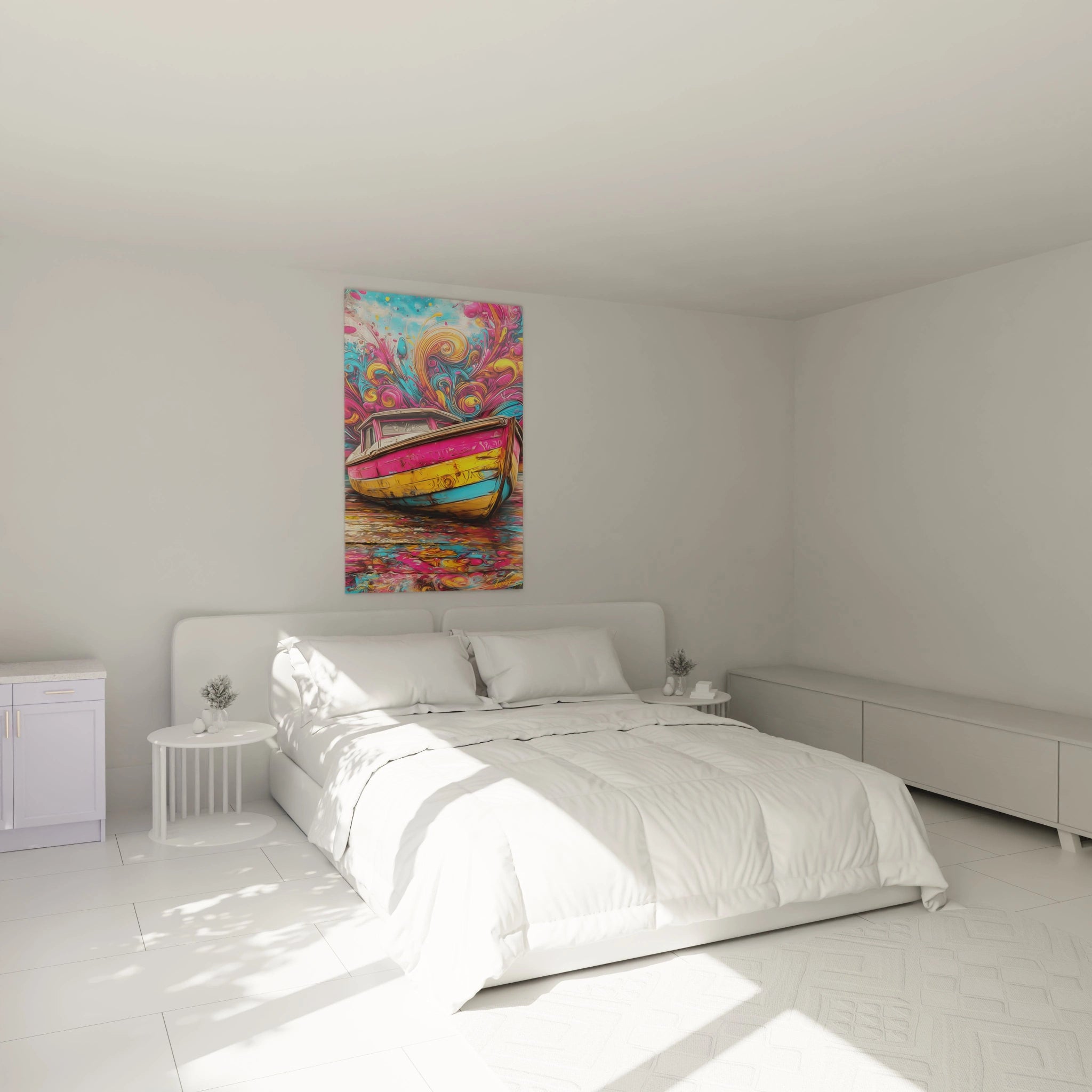
Social living spaces such as open-plan living rooms, spacious entryways, or mezzanines particularly benefit from this marked chromatic presence. In a residential office, energetic pink promotes cognitive stimulation and creative thinking. Master bedrooms with generous dimensions also welcome this artwork to create an atmosphere simultaneously dynamic and sophisticated, particularly when positioned facing the bed for immediate visual impact upon waking.
Which wall finishes enhance a large pink painting?
Anthracite gray polished concrete walls, white Venetian plaster finishes, or surfaces painted in mouse gray constitute ideal backgrounds. These neutral backdrops allow pink variations to express themselves fully without chromatic competition, while creating visual depth that accentuates the perceived three-dimensional dimension of the wall artwork.
Contemporary Aesthetics and Pink Artistic Expression
The Pink Colors Gone Wild Painting embodies a contemporary approach to wall art where chromatic spontaneity meets strategic decorative intention. This piece aligns with a current trend valuing bold colored compositions as structuring elements of spatial identity. Buyers now seek artworks capable of defining a space's atmosphere rather than simply accompanying it, positioning this type of creation as a priority decorative investment.
The Evolution of Pink in High-End Wall Decoration
Long confined to traditionally feminine universes, pink today establishes itself in mixed contemporary interiors through its sophisticated variations. Electric fuchsia nuances, deep magenta pink, and wine purple confer unprecedented chromatic masculinity to these artworks. This reappropriation of pink in audacious decorative contexts reflects a cultural evolution toward aesthetic choices liberated from gender conventions.
Why invest in a large-scale pink painting?
Acquiring an imposing pink wall piece responds to several converging purchase motivations. First, the immediate decorative impact that radically transforms a space without major renovations. Next, the property value enhancement through integrating distinctive contemporary decorative elements. Finally, the creation of a unique visual signature that differentiates an interior from standardized decorative codes, particularly sought by professionals arranging their practice or consultation space.
Complementary Chromatic Combinations with Vibrant Pink
To amplify the visual effect of a dynamic pink painting, certain color associations work particularly well. Touches of emerald green or forest green create a complementary contrast that mutually exalts both hues. Golden or copper accents in lighting fixtures and decorative accessories add a luxurious dimension without competing with the pink dominance. Matte black elements provide graphic structure that visually anchors the composition in space.
Which furniture to choose to accompany a contemporary pink painting?
Furniture pieces with sculptural forms in anthracite gray or midnight blue velvet create a sophisticated dialogue with pink tonalities. Coffee tables in white veined marble or multicolored terrazzo subtly echo the artwork's colorful spirit. Design armchairs with organic lines in textured neutral fabrics allow creating a conversational zone where the painting constitutes the natural focal point of the gaze.
Installation and Enhancement of a XXL Format Pink Painting
The monumental presence of a large-scale Pink Colors Gone Wild Painting requires a specific approach to installation and spatial valorization. These imposing wall creations, often exceeding 120 centimeters in width, require meticulous planning to optimize their visual impact while respecting architectural constraints. Strategic placement becomes determining: a clear wall benefiting from visual traffic from multiple angles allows appreciating chromatic nuances under different natural lighting perspectives.
Hanging Strategies for Large-Scale Pink Artworks
Monumental pink paintings demand robust mounting systems adapted to their substantial weight. Professional suspension rails offer positioning flexibility and optimal load distribution across multiple anchor points. This technical solution also allows adjusting height according to seasons and layout evolution without creating new wall holes. For drywall, metal toggle anchors constitute the minimum requirement to guarantee installation safety.
The influence of natural light on vibrant pinks
A large-scale pink painting reveals variable chromatic facets depending on lighting exposure. Southwest-oriented spaces benefit from warm light in late afternoon that intensifies fuchsia and coral tones, creating energizing evening ambiance. North-facing orientations offer constant and diffuse light that preserves chromatic saturation throughout the day, ideal for offices requiring stable visual stimulation.
Which rooms best enhance a monumental pink painting?
Reception spaces such as spacious entrance halls or double-height rooms constitute privileged locations where the artwork can deploy maximum impact from threshold crossing. Contemporary open kitchens with generous volumes also welcome these creations to inject an artistic dimension into traditionally functional space. Luxury dressing rooms and master suites use energetic pink to create an atmosphere simultaneously stimulating and enveloping.
How to protect a pink painting from environmental variations?
Large-scale colored wall artworks require vigilance regarding prolonged direct sun exposure that could gradually alter certain delicate nuances. Installing UV films on adjacent bay windows or using filtering shades during maximum sun hours preserves original chromatic intensity. Maintaining stable humidity between 40% and 60% prevents potential deformations linked to seasonal humidity variations.
FAQ - Pink Colors Gone Wild Painting
What viewing distance should be planned to fully appreciate a Pink Colors Gone Wild Painting?
For a large-scale artwork, a minimum viewing distance equivalent to 1.5 times its diagonal allows apprehending the composition as a whole. However, abstract pink paintings also reveal fascinating chromatic details at close distance, justifying positioning allowing multi-scale appreciation.
Is the Pink Colors Gone Wild Painting suitable for contemporary professional spaces?
Absolutely. Specialized medical practices, creative studios, fashion showrooms, and premium coworking spaces adopt these dynamic pink artworks to create memorable and differentiating visual identity. Contemporary pink conveys creativity, innovation, and human approach, perfectly aligned with values of many modern professional activities.
How to clean a large-scale Pink Colors Gone Wild Painting?
Monthly gentle dusting with a dry microfiber cloth generally suffices. For localized stains, a slightly damp cloth applied gently without rubbing preserves surface integrity. Absolutely avoid aggressive chemical products that could alter pink pigments particularly sensitive to solvents.