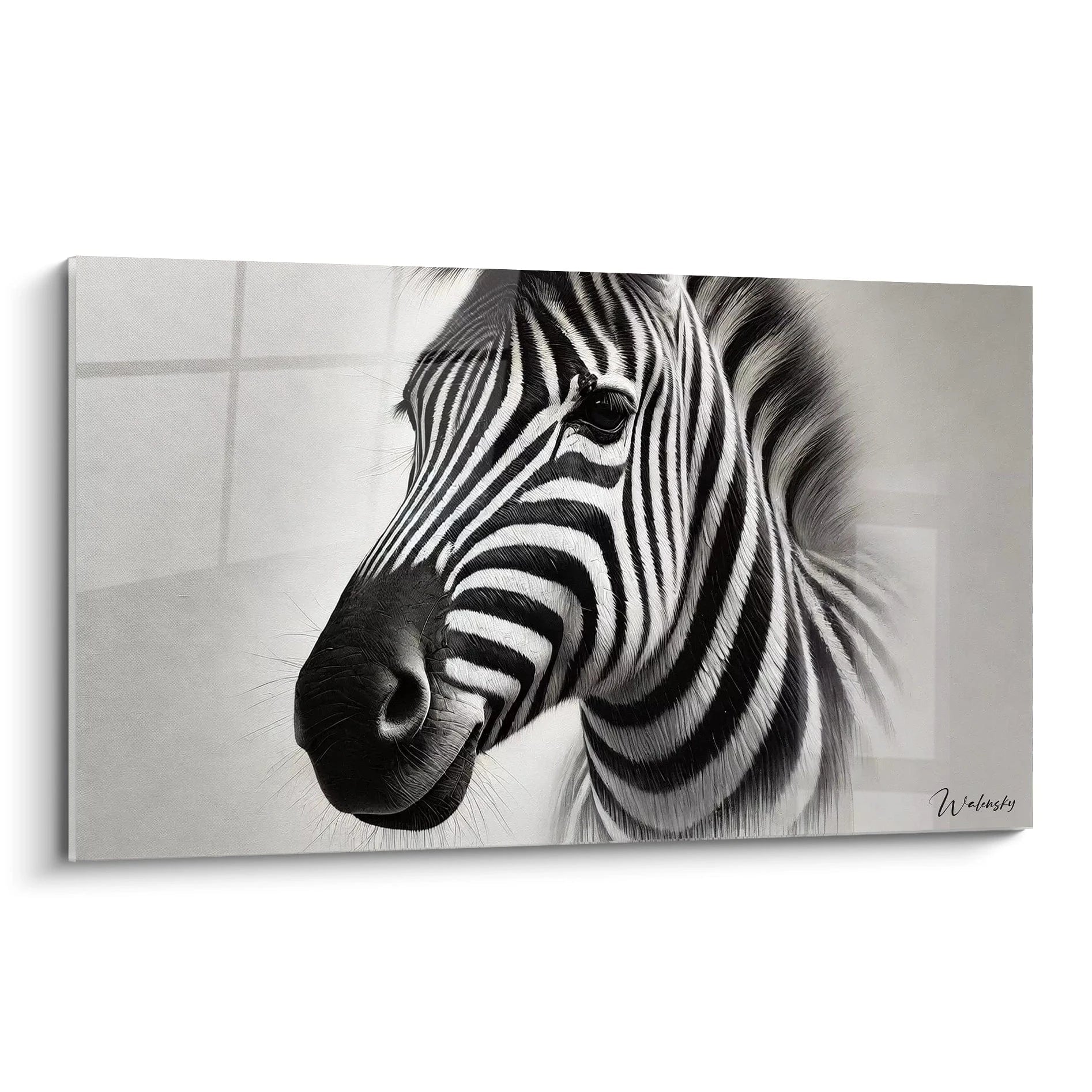
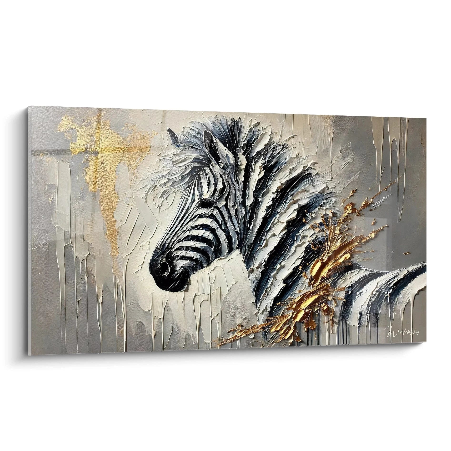
- Minimalist Colorful Zebra Artwork Presentation
- Refined Aesthetics and Chromatic Impacts
- Visual Balance and Graphic Variations
- Decorative Integration and Characteristics
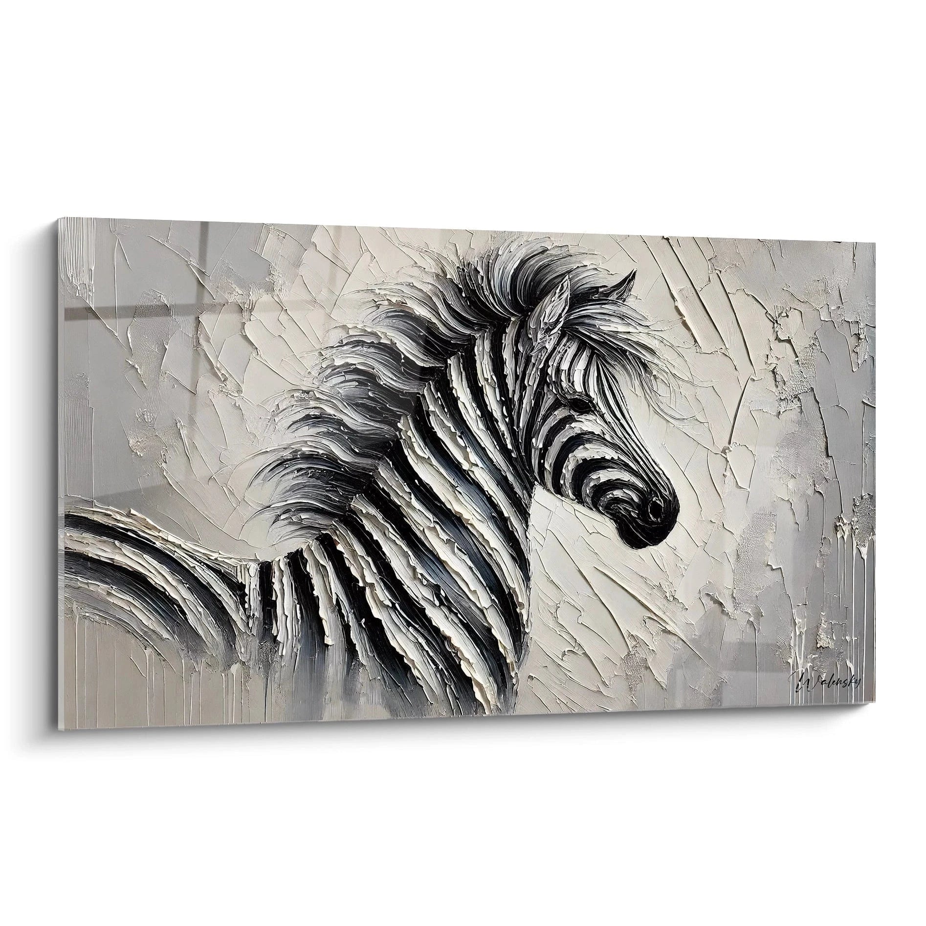
A minimalist colorful zebra artwork represents the perfect alliance between the symbolic force of the wild animal and the contemporary sobriety of refined design. This graphic interpretation prioritizes essential lines, open surfaces, and a reduced yet impactful color palette, creating a wall art piece with maximum visual impact through remarkable economy of means. Unlike saturated or complex representations, this minimalist approach to the colorful zebra relies on precision of line, balance of masses, and accurate color touches to capture attention without overwhelming the space. Each visual element is conceived for its essential contribution to the whole, eliminating all superfluous decoration in favor of a rigorous and breathing composition. The emblematic animal is thus stylized, reduced to its fundamental characteristics while maintaining its evocative force and natural dynamism.
The Minimalist Expression of the Zebra in Contemporary Decoration
What is the graphic philosophy of the minimalist colorful zebra artwork?
The
minimalist colorful zebra artwork rests on a fundamental principle: saying more with less. This graphic approach eliminates complex textures, multiple gradients, and ornamental details to retain only the structural essence of the animal. The characteristic stripes of the zebra are simplified into neat geometric bands, creating a hypnotic visual rhythm without ever slipping into decorative confusion. The silhouette can be reduced to a refined profile, a stylized frontal portrait, or even partial abstraction where only a few lines evoke the animal.
This formal economy allows chromatic accents to deploy their full expressive power. A single electric blue traversing the composition, a golden touch on the eye or muzzle, a monochromatic background contrasting sharply with natural black and white: each color intervention becomes a calculated visual event. Negative space occupies a preponderant place, allowing the eye to breathe and reinforcing the impact of graphically dense zones. To discover other creative approaches, our
colorful zebra artwork collection presents various visual interpretations ranging from absolute minimalism to richer compositions.
Specific visual codes of chromatic minimalist animal art
The minimalist approach to the colorful zebra fits into a distinct visual vocabulary where each formal choice carries precise significance. The original black-and-white contrast of the animal is deliberately unbalanced by the measured introduction of vibrant hues: a coppery orange, a fuchsia pink, an emerald green applied sparingly. These chromatic touches seek not to reproduce reality but to create emotional anchor points, guiding the eye through the composition along a controlled visual path.
The geometrization of forms constitutes another essential marker: the organic curves of the animal body are rationalized, volumes simplified into successive planes, stripes transformed into repetitive modules. This graphic systematization brings the work closer to contemporary graphic design and geometric abstraction, while maintaining immediate recognition of the subject. The large format amplifies this tension between
formal simplification and monumental presence, transforming the wall into support for an assumed aesthetic statement where less truly becomes more.
Psychological impacts of colored visual refinement
A minimalist colorful zebra artwork generates a distinct psychological effect from saturated or realistic representations. Formal refinement induces a sensation of mental clarity, spatial order, and intellectual sophistication. Graphic breathing spaces, pure color fields, and neat lines create a soothing visual environment despite the inherent dynamism of the subject. This productive contradiction between the suggested wild energy and the displayed formal calm constitutes the heart of the aesthetic experience.
Punctual chromatic interventions function as measured visual stimuli, present enough to avoid monotony but rare enough to never slip into decorative agitation. This color economy enables
harmonious integration into refined interiors where each visual element counts, where decorative accumulation is proscribed in favor of a rigorous selection of meaningful objects..
Graphic Compositions and Chromatic Balance of the Minimalist Zebra Artwork
How do visual masses organize themselves in a minimalist composition?
The spatial organization of a minimalist colorful zebra artwork obeys rigorous compositional principles where each element occupies its position for precise structural reasons. The asymmetric distribution of masses creates dynamic tension: the subject can be off-center, cut by the frame edges, or fragmented into several discontinuous zones. This deliberate break with academic centering generates visual movement, a sensation of captured instantaneity that contrasts with overall formal rigor.
The striped bands of the zebra, stylized as regular geometric modules, establish a predictable visual rhythm that chromatic accents come to punctuate unexpectedly. A bright red segment interrupting the black-and-white sequence, a turquoise zone occupying the background negatively, golden lines underlining certain curves: these color interventions function as musical counterpoints, introducing variety within repetition. The large format allows for developing these scale plays where refined zones border intense graphic concentrations, creating a stratified visual reading.
Reduced chromatic palettes and their maximum expressive power
Chromatic minimalism imposes a drastic selection of hues employed, generally limited to two or three colors beyond the fundamental black and white. This voluntary restriction amplifies the impact of each color choice: a lemon yellow becomes pure visual event, a Klein blue asserts an almost spiritual presence, a millennial pink instantly instills modernity. The purity of color fields, without modulation or texture, reinforces this raw power of color used for itself.
Monochromatic harmonies constitute a frequent approach: tonal variations of a single blue from palest to most saturated, gradient of gray enriched with a single orange accent, range of greens traversed by a golden thread. These controlled chromatic progressions create immediate visual coherence while maintaining enough variation to avoid flatness. The absence of smooth transitions, replaced by neat boundaries between color zones, accentuates the graphic and contemporary character of the whole, visual dialogue between formal rigor and chromatic vitality.
Which spaces particularly benefit from a minimalist colorful zebra artwork?
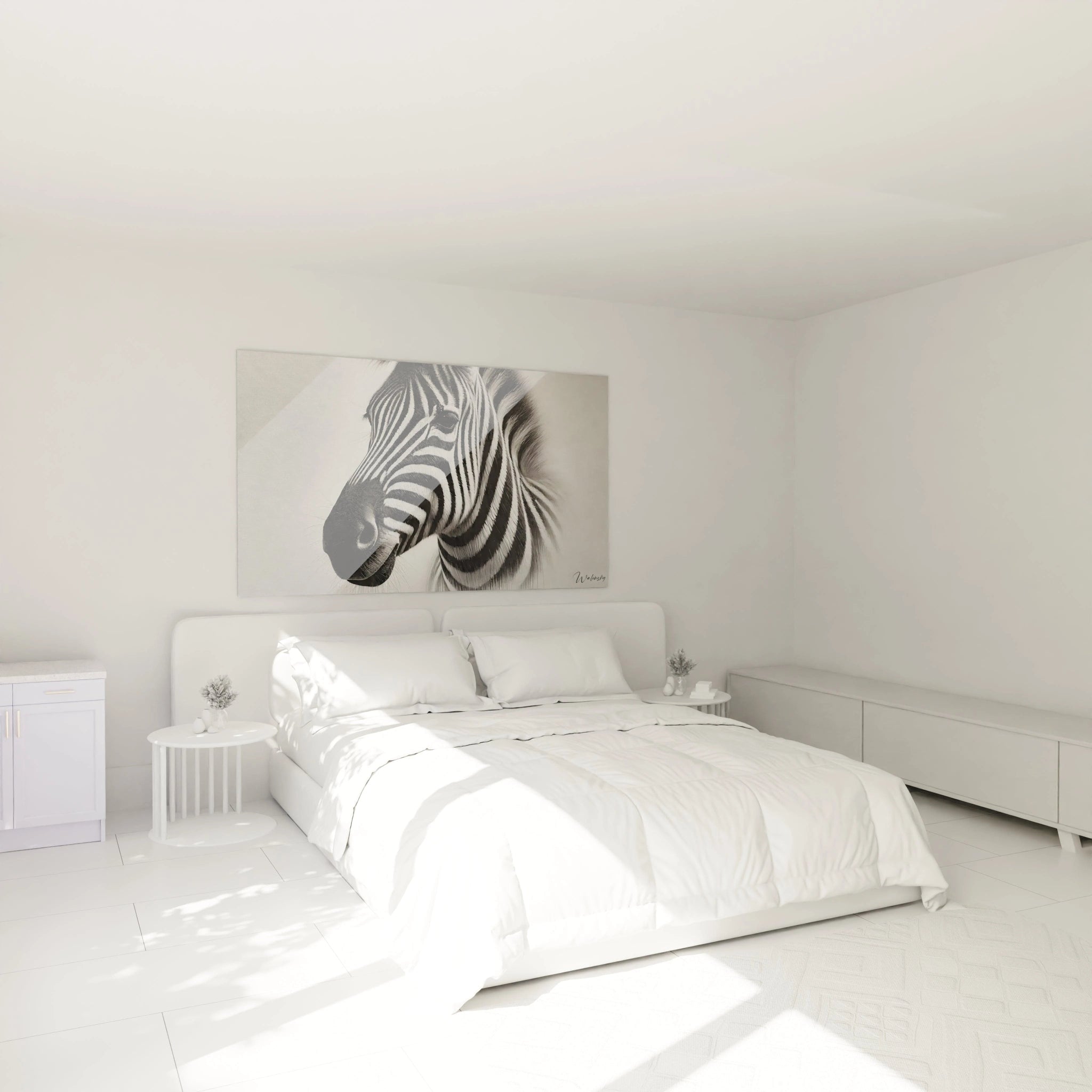
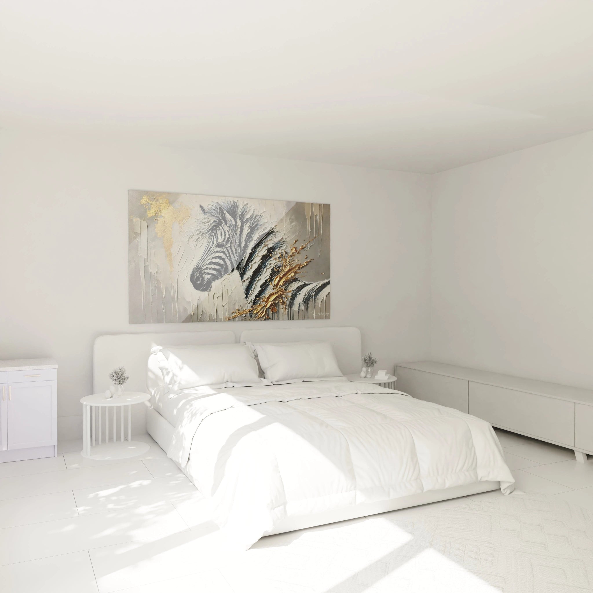
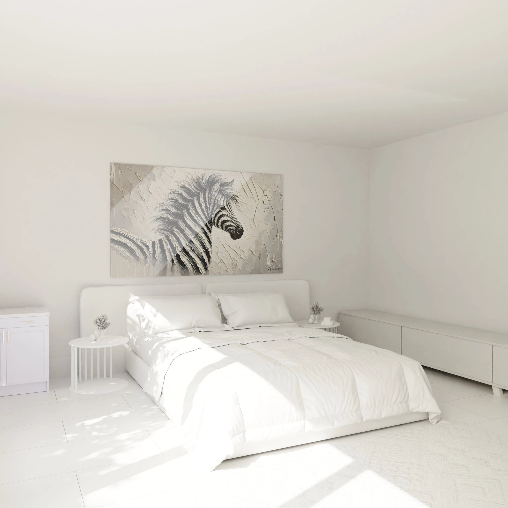
Contemporary design environments with neutral dominance find in the minimalist colorful zebra artwork the ideal visual accent. A Scandinavian interior with white walls and light wood furniture perfectly welcomes this graphic punctuation that brings personality without breaking the refined balance. Industrial lofts with generous volumes and raw surfaces gain a sophisticated dimension thanks to this measured artistic intervention that softens material brutality without denying it.
Contemporary professional spaces seek precisely this balance between affirmed presence and formal discretion: waiting areas of architecture firms, halls of technology companies, concept fashion boutiques. The large format transforms these passage zones into memorable visual experiences while maintaining required professional sobriety. Private offices of executives favoring an inspiring work environment without excessive distraction find in this minimalist colored approach the perfect aesthetic solution, controlled personality affirmation and assumed contemporary elegance.Distinctive Characteristics and Integration of the Minimalist Colored Zebra
What are the graphic techniques specific to minimalist animal art?
Geometric stylization constitutes the fundamental technique: the organic curves of the zebra are rationalized into linear segments, volumes translated into successive planes, creating an almost architectural reading of animal anatomy. The naturally irregular stripes are standardized into parallel bands of uniform thickness, establishing a hypnotic repetitive pattern. This graphic systematization can extend to partial pixelization, fragmentation into geometric facets, or reduction to a quasi-symbolic pictogram.
The strategic use of positive-negative contrast amplifies visual impact: inversion of light and dark zones, use of unpainted space as an active compositional element, figure-ground ambiguity games where the zebra emerges and dissolves simultaneously into its environment. Chromatic accents intervene according to varied logics: transparent overprinting modifying the perception of stripes, controlled color run traversing the composition, area of pure saturated color geometrically contrasting with adjacent black-and-white, creating a productive visual tension between abstraction and figuration.
Optimal decorative associations for aesthetic coherence
The ideal furniture environment for a minimalist colorful zebra artwork privileges refined lines, noble materials, and discreet textures. A sofa with simple geometric forms in solid velvet, a white marble coffee table veined with black extending the graphic play, sculptural metal lighting fixtures in matte black: each element reinforces minimalist aesthetics without visual competition. Limited reflective surfaces prevent optical multiplication that would compromise the artwork's legibility.
Vegetation elements bring a welcome organic counterpoint: a large-leaved fiddle leaf fig, birch branches in a transparent cylindrical vase, a solitary columnar cactus. This controlled natural presence dialogues with the stylized animal representation without introducing decorative confusion. Accompanying textiles ideally reprises the restricted color palette: cushions in the exact hues present in the artwork, monochromatic throw creating a visual rest zone, minimal geometric pattern rug extending the formal language of the wall composition, coherent decorative orchestration where each element reinforces overall impact.
Monumental dimensions and controlled architectural presence
The large format of the minimalist colorful zebra artwork transforms the piece into an architectural element in its own right, structuring the space visually rather than simply decorating it. With generous dimensions, the composition acquires an imposing physical presence that redefines perceived room proportions. A vertical format accentuates ceiling height, creating a sensation of elevation and spatial nobility. A panoramic horizontal format visually stretches wall width, particularly effective behind a sofa or in a corridor to amplify perceived depth.
This monumentality controlled by formal refinement avoids visual overwhelm: despite its imposing size, the artwork remains breathable through compositional void zones, pure color fields, and structural clarity. The eye can embrace the whole immediately while progressively discovering graphic subtleties through close observation. This dual reading, macroscopic and microscopic, enriches daily experience and prevents visual fatigue, monumental artwork that remains stimulating without ever becoming intrusive.
Is a minimalist colorful zebra artwork suitable for small spaces?
Paradoxically, a large minimalist colorful zebra artwork can function perfectly in reduced space by creating a visual depth effect. Formal refinement and breathing zones prevent saturation, while monumental presence diverts attention from actual physical space limitations, transforming a spatial defect into an audacious decorative asset.
How to choose the chromatic palette of a minimalist zebra artwork according to your interior?
Chromatic selection should either create harmony by reprising tones already present in the space, or generate deliberate contrast that energizes an overly neutral environment. For an interior with warm beige tones and wood, a minimalist zebra with turquoise or blue accents brings freshness. For a gray and white space, coral or mustard yellow touches inject vitality without breaking balance.
What is the visual durability of a minimalist colorful zebra artwork against trends?
The minimalist approach transcends ephemeral fashions through its timeless formal rigor. Unlike overcrowded styles quickly dated, graphic refinement and reduced palette retain their aesthetic relevance through decorative evolutions. The classic animal subject combined with contemporary treatment ensures remarkable decorative longevity, an aesthetic investment with lasting value rather than a trend purchase.