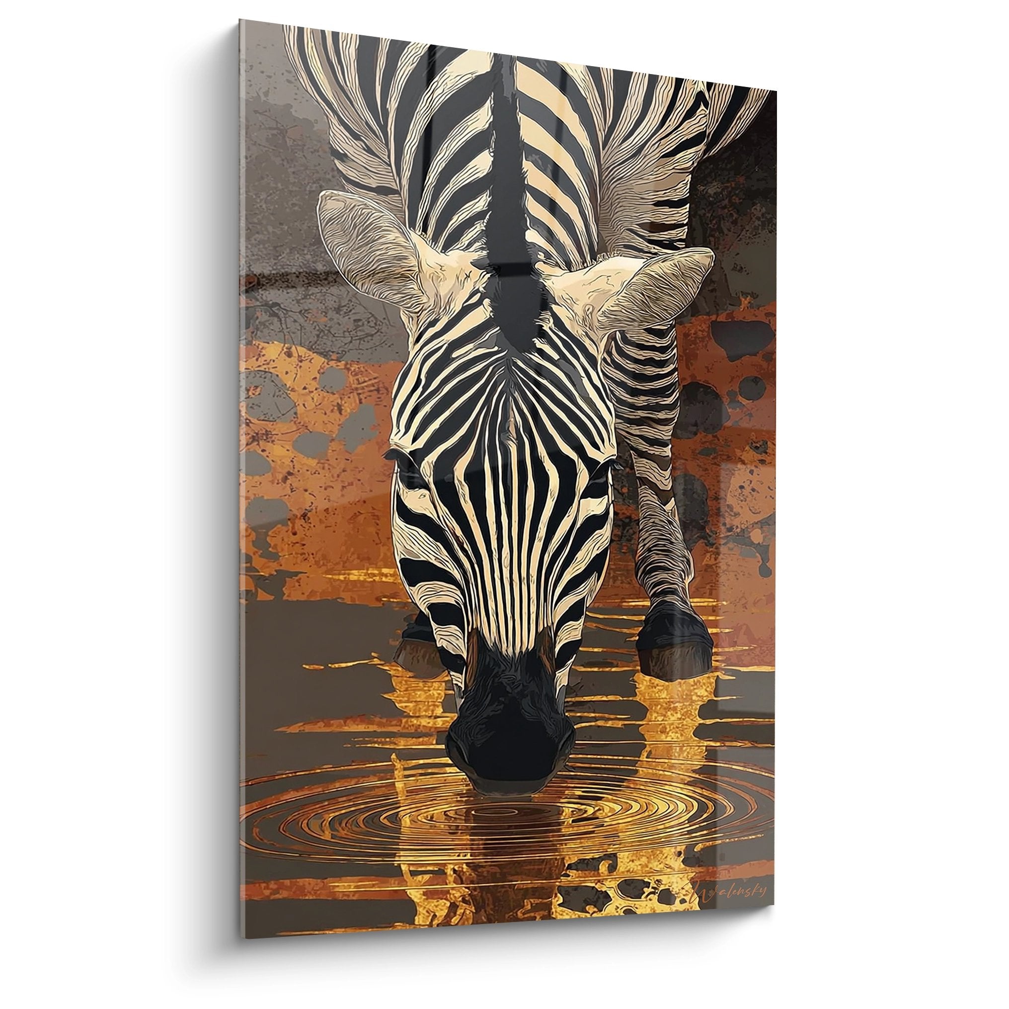
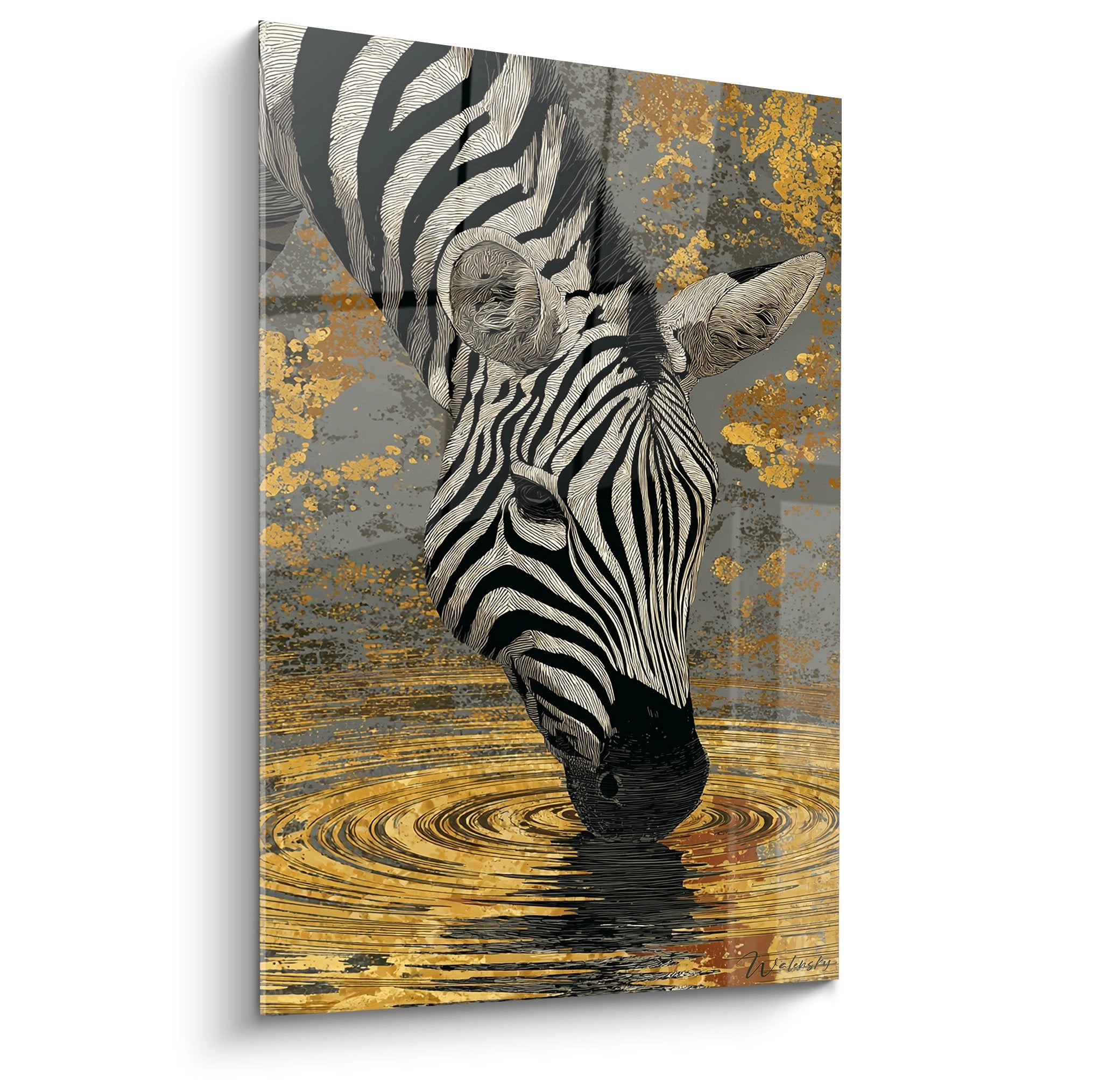
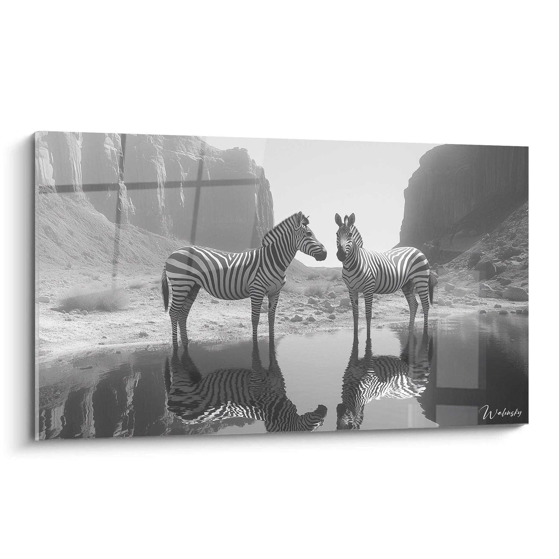
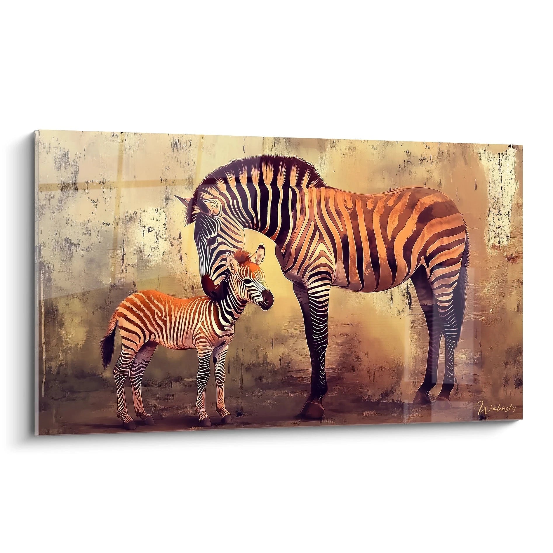
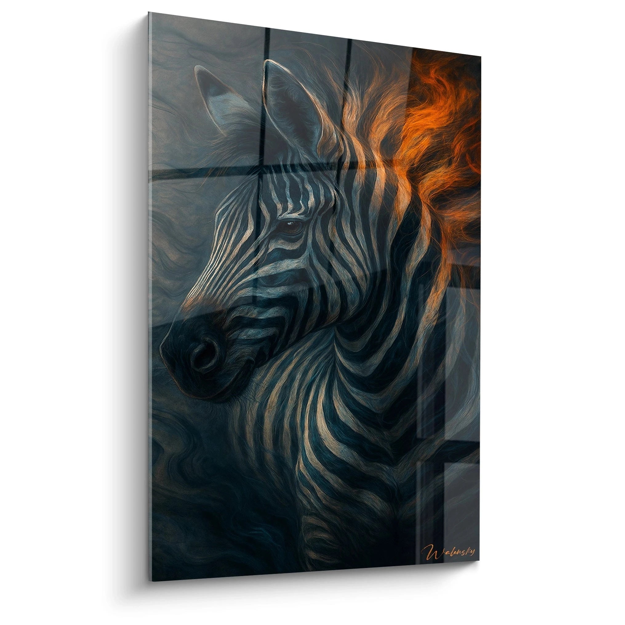
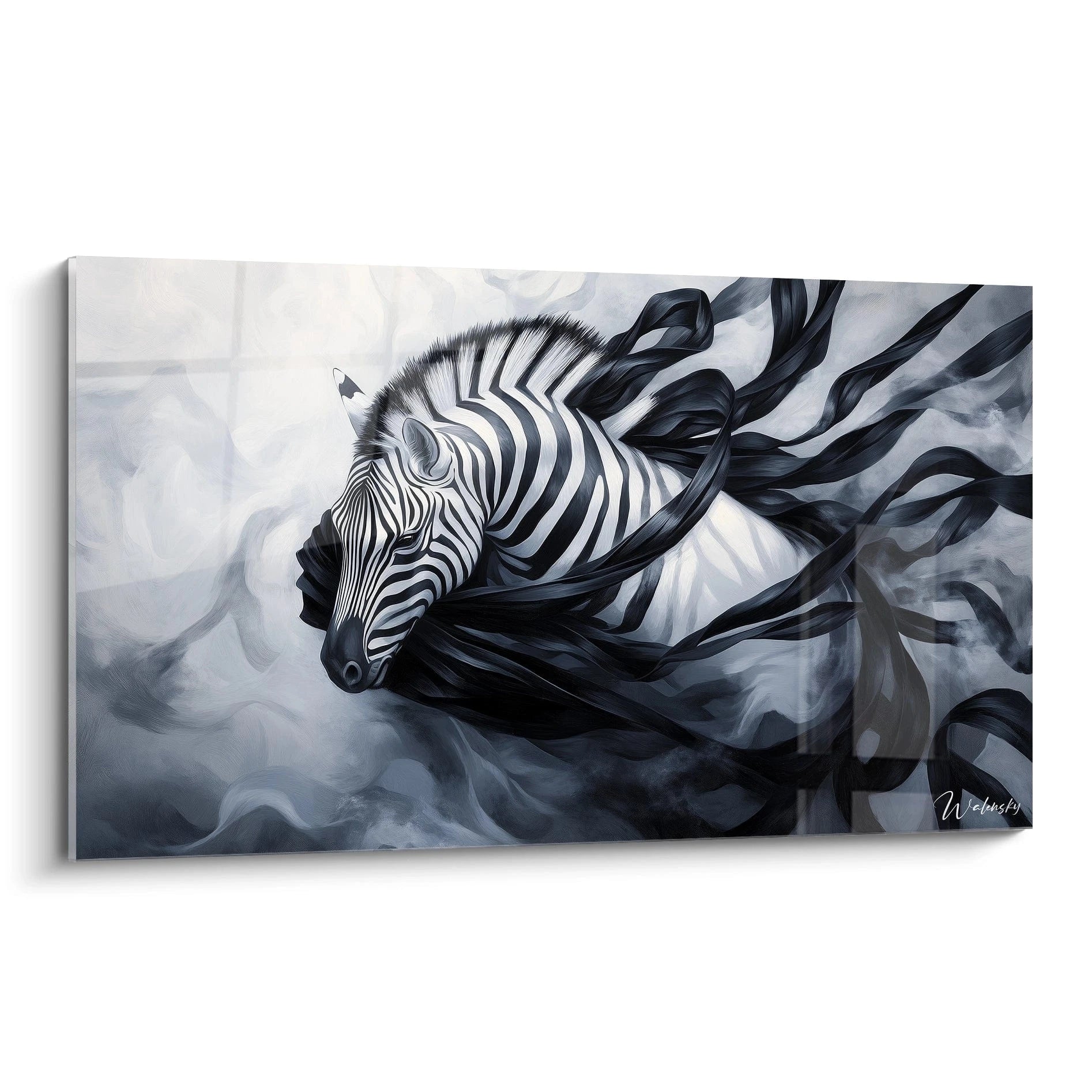
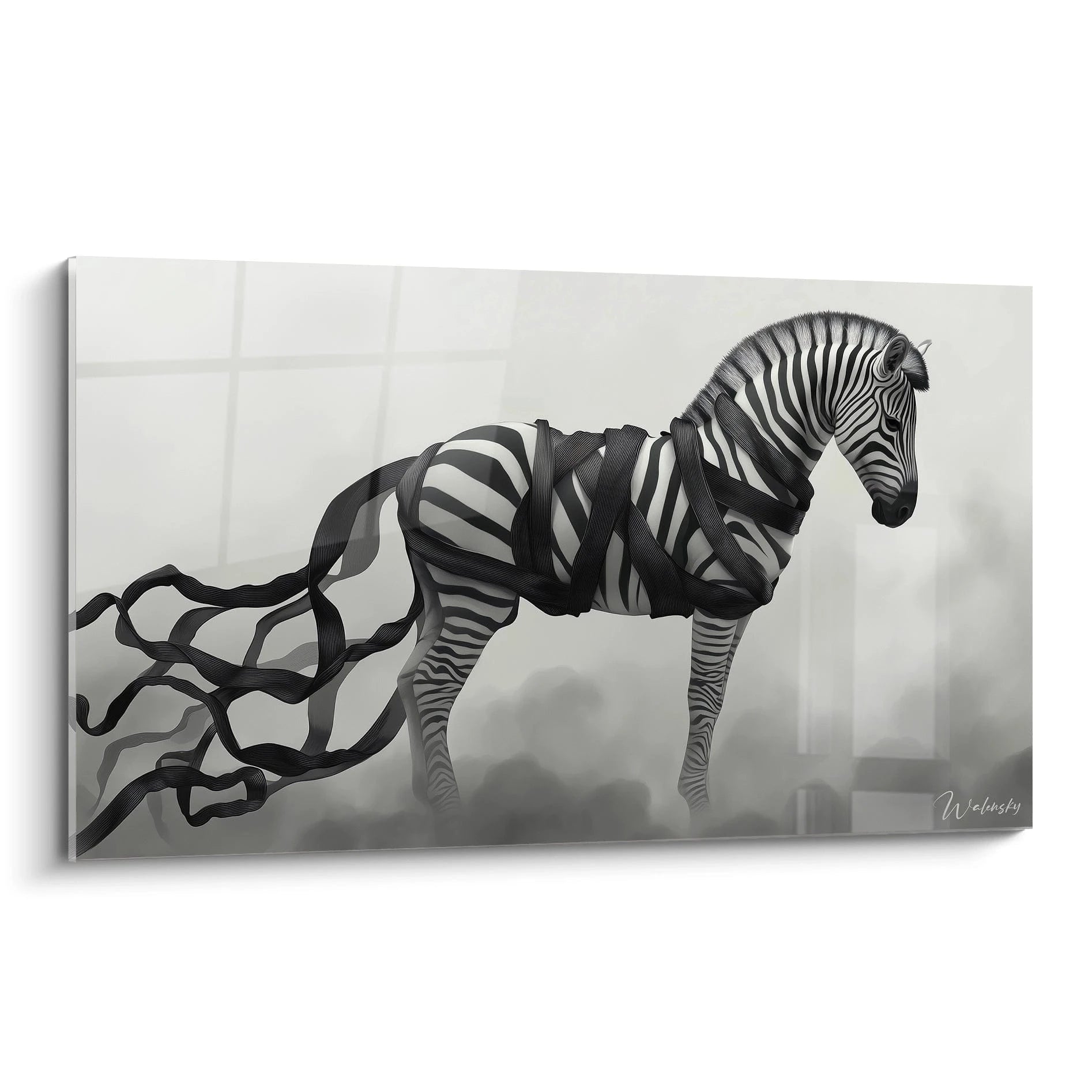
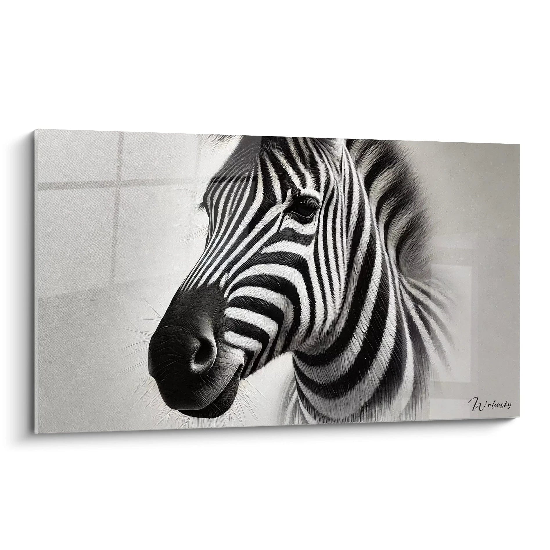
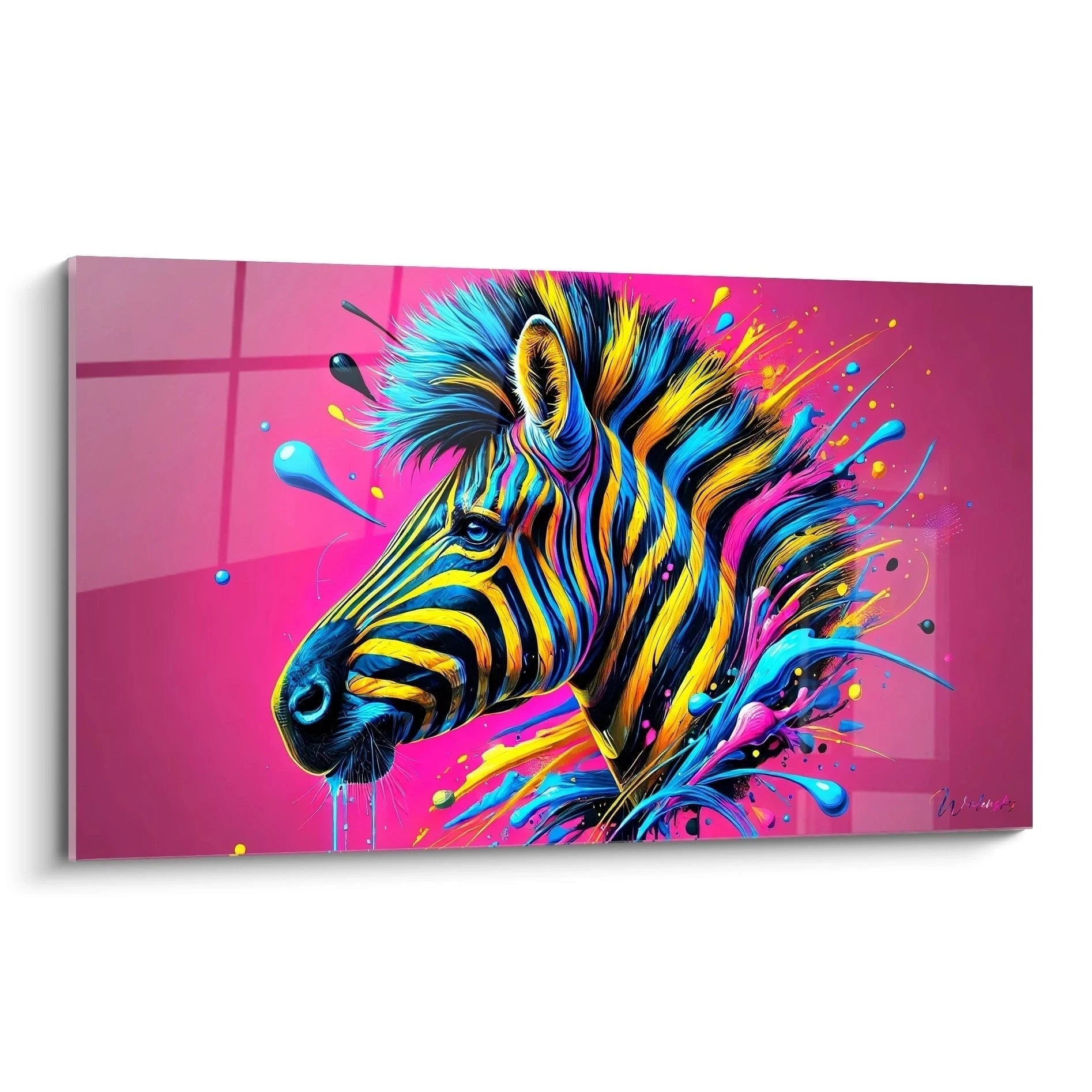
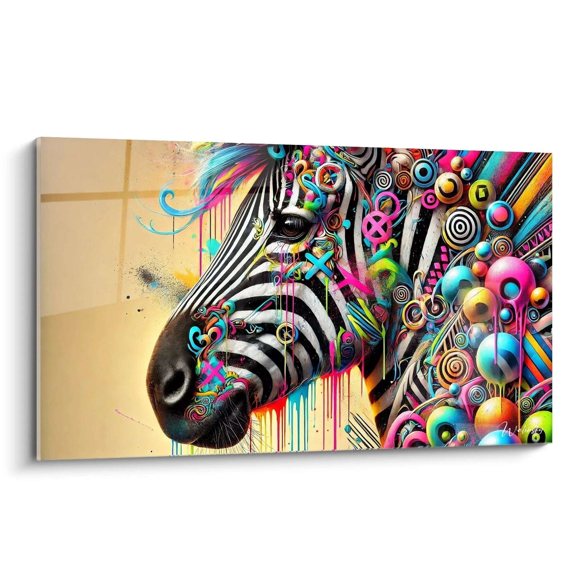
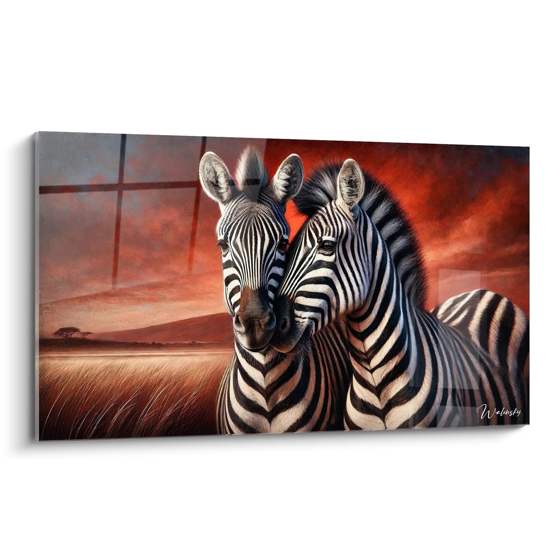
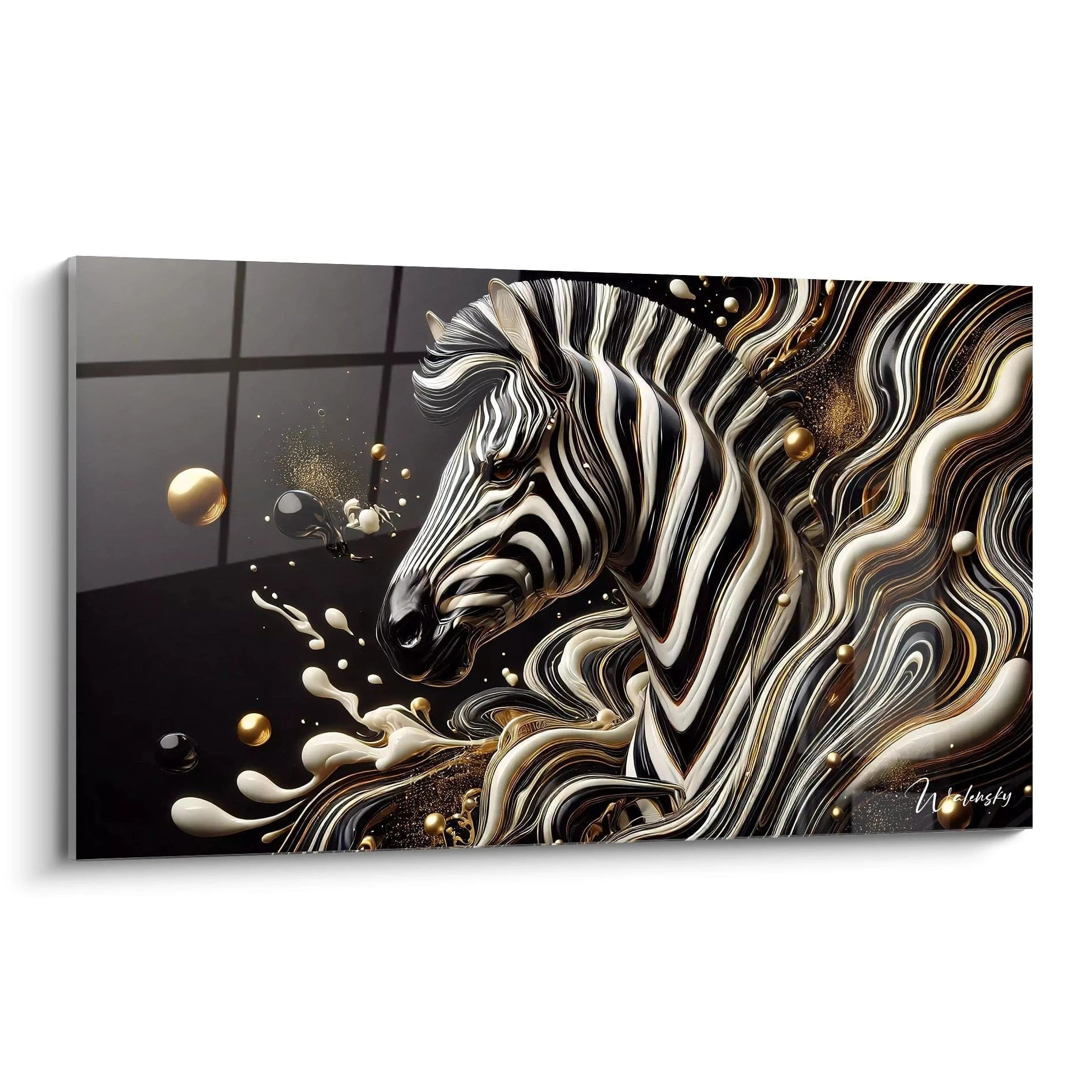
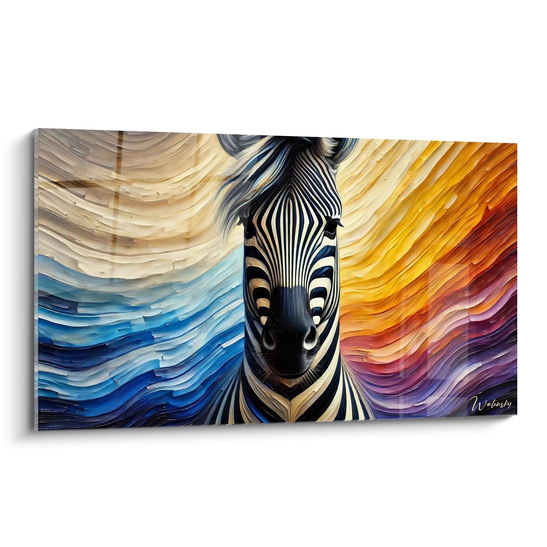
A colorful zebra painting brings spectacular dimension to your wall decor by transforming the iconic striped animal into a genuine chromatic explosion. These large-format creations transcend naturalistic representation to offer a bold vision where traditional black and white stripes transform into multicolored light spectrums. This contemporary artistic interpretation particularly appeals to modern art enthusiasts seeking to infuse vibrant energy into their living spaces. Saturated hues – from electric blue to hot pink, sunny yellow to emerald green – create striking contrast with conventional chromatic codes, positioning these works as masterpieces capable of redefining an entire room's atmosphere. For those who also appreciate more traditional approaches, our Zebra Paintings collection offers remarkable stylistic diversity.
Chromatic Audacity in Service of Decorative Expression
Why Choose a Zebra with Multicolored Stripes for Your Décor?
A colorful zebra painting represents far more than simple animal representation: it embodies a decorative philosophy founded on visual boldness and personal expression. Unlike classical representations, these creations exploit the graphic potential of zebra stripes as a structure to deploy audacious chromatic palettes. This approach transforms the wild animal into support for artistic experimentation, where each stripe becomes a distinct color field. Monumental formats amplify this chromatic intensity, creating magnetic focal points that immediately captivate visitors' attention.
Polychromatic compositions exploit unexpected combinations: rainbow gradients, orange-blue complementary contrasts, violet-pink-red analogous harmonies, or bold tricolor juxtapositions. This chromatic diversity allows precise adaptation of the work to the desired ambiance, whether dynamizing a creative professional space, bringing vitality to a contemporary living room, or creating a visual exclamation point in a home gallery. The energy emanated by these multicolored stripes stimulates creativity and fosters a positive atmosphere, particularly appreciated in environments requiring inspiration and dynamism.
Psychological Effects of Intensified Chromatic Stripes
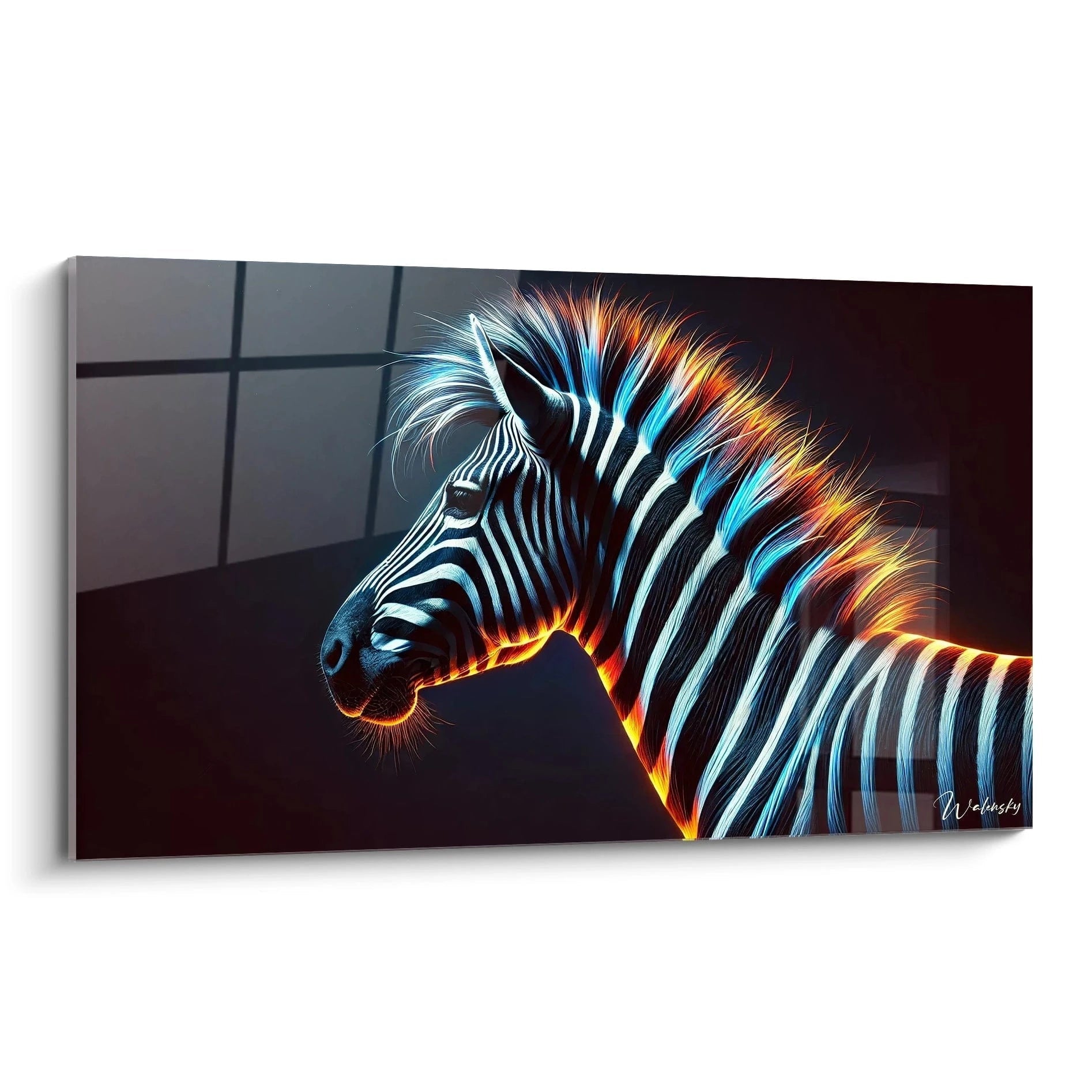
Color psychology takes exceptional dimension when applied to multicolored zebra stripes. Each hue generates specific emotional resonance: warm tones (red, orange, yellow) infuse energy and enthusiasm, while cool nuances (blue, violet, turquoise) evoke serenity and contemplation. The rhythmic alternation of these shades creates hypnotic visual movement that engages the gaze and stimulates imagination. This chromatic vibration transforms the wall into a kinetic surface, generating quasi-living presence in the space.
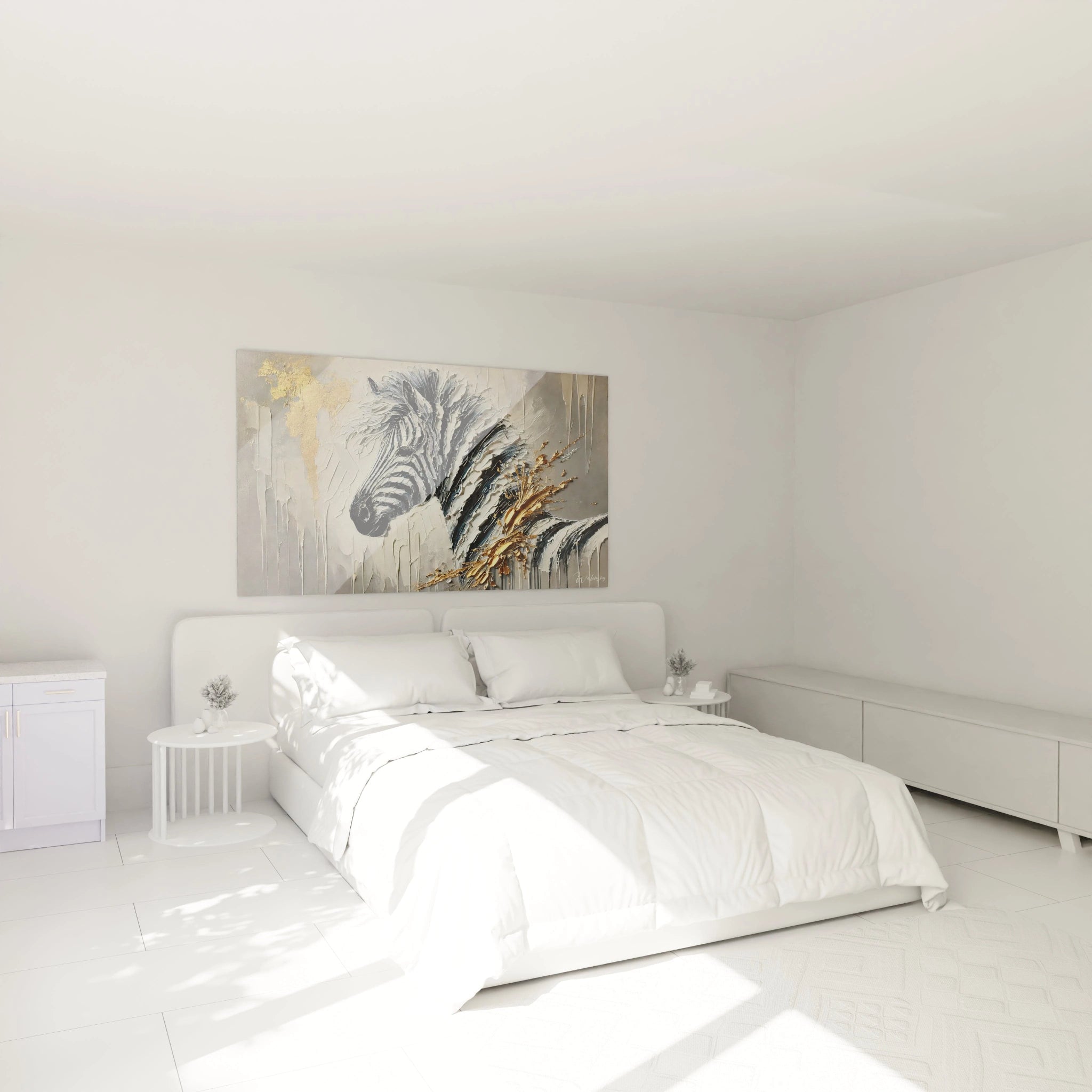
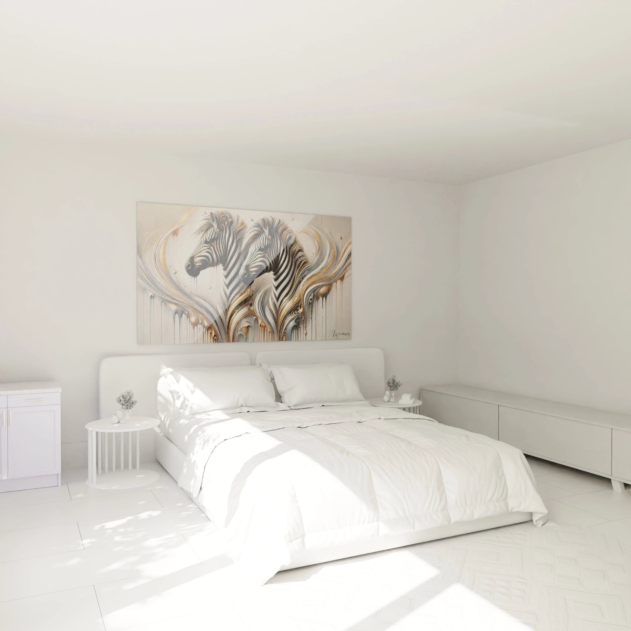
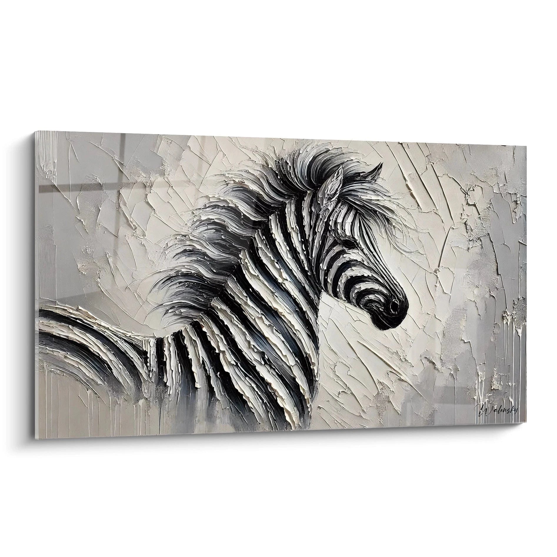
Impressive formats multiply these perceptual effects. A colorful zebra painting of large dimensions does more than occupy space: it reconfigures it visually, creating illusory depth and modifying the volumetric perception of the room. Vertical stripes generate architectural elongation, while chromatic intensity projects apparent luminosity even in poorly lit areas. This capacity to modify luminous ambiance without physical light source constitutes a major advantage for interiors seeking character and personality without decorative compromise.
Harmonization with Bold Contemporary Environments
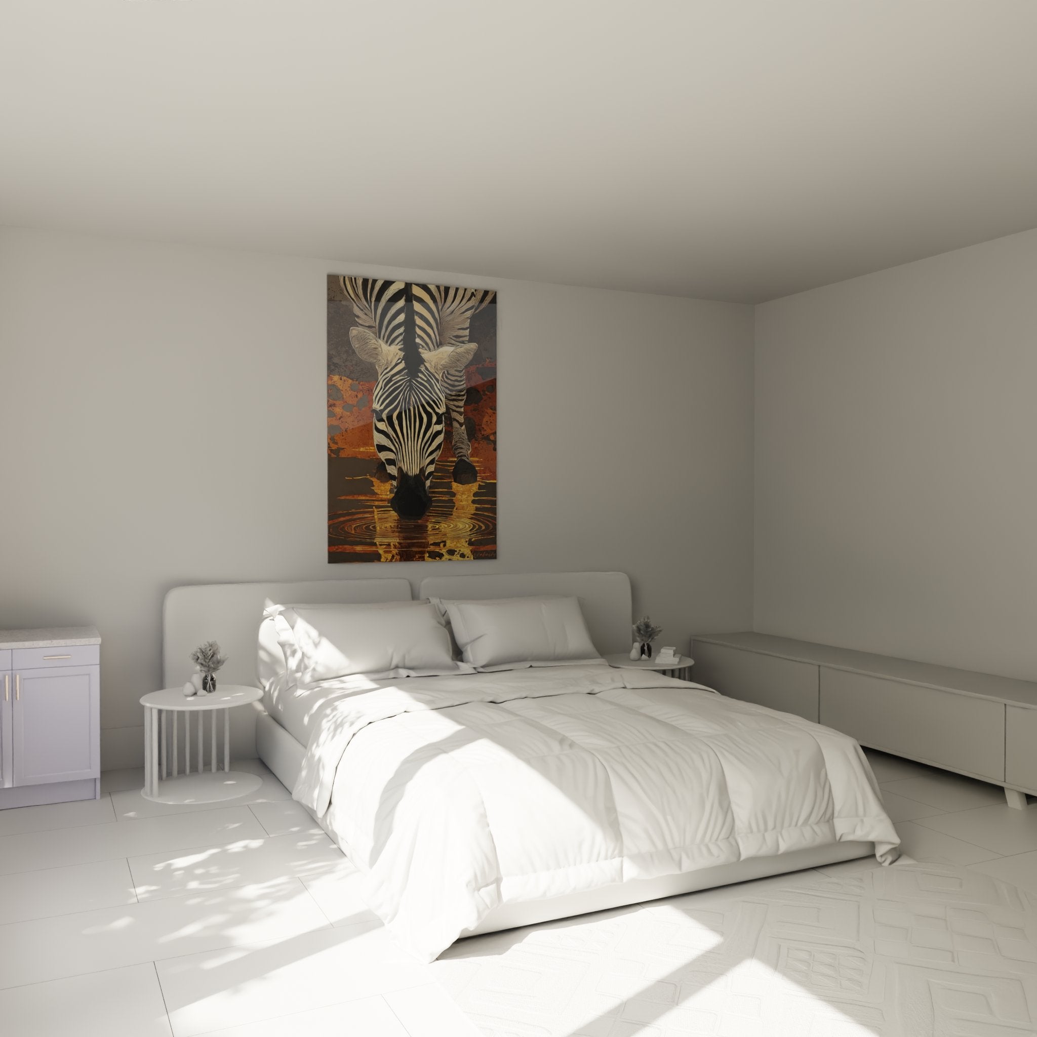
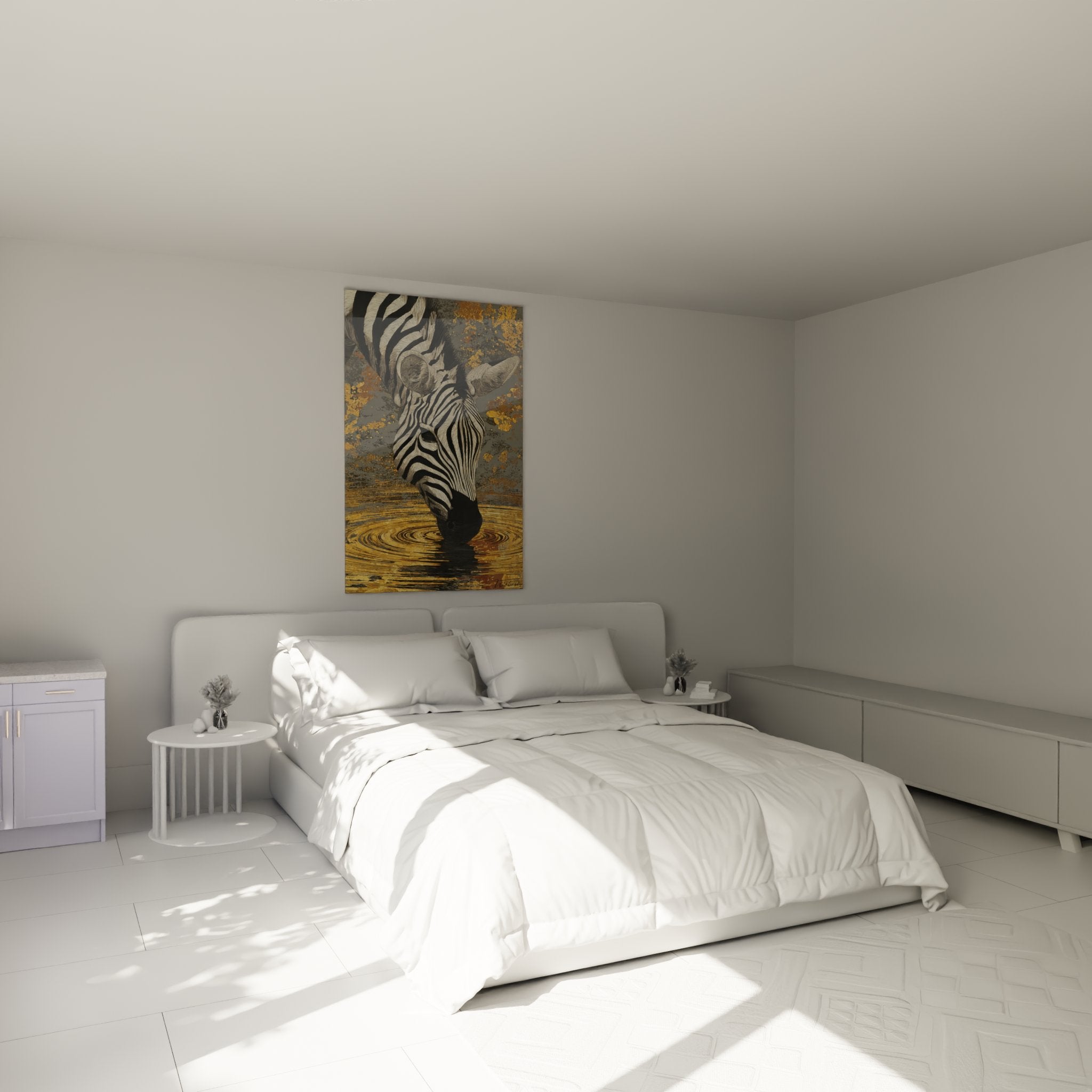
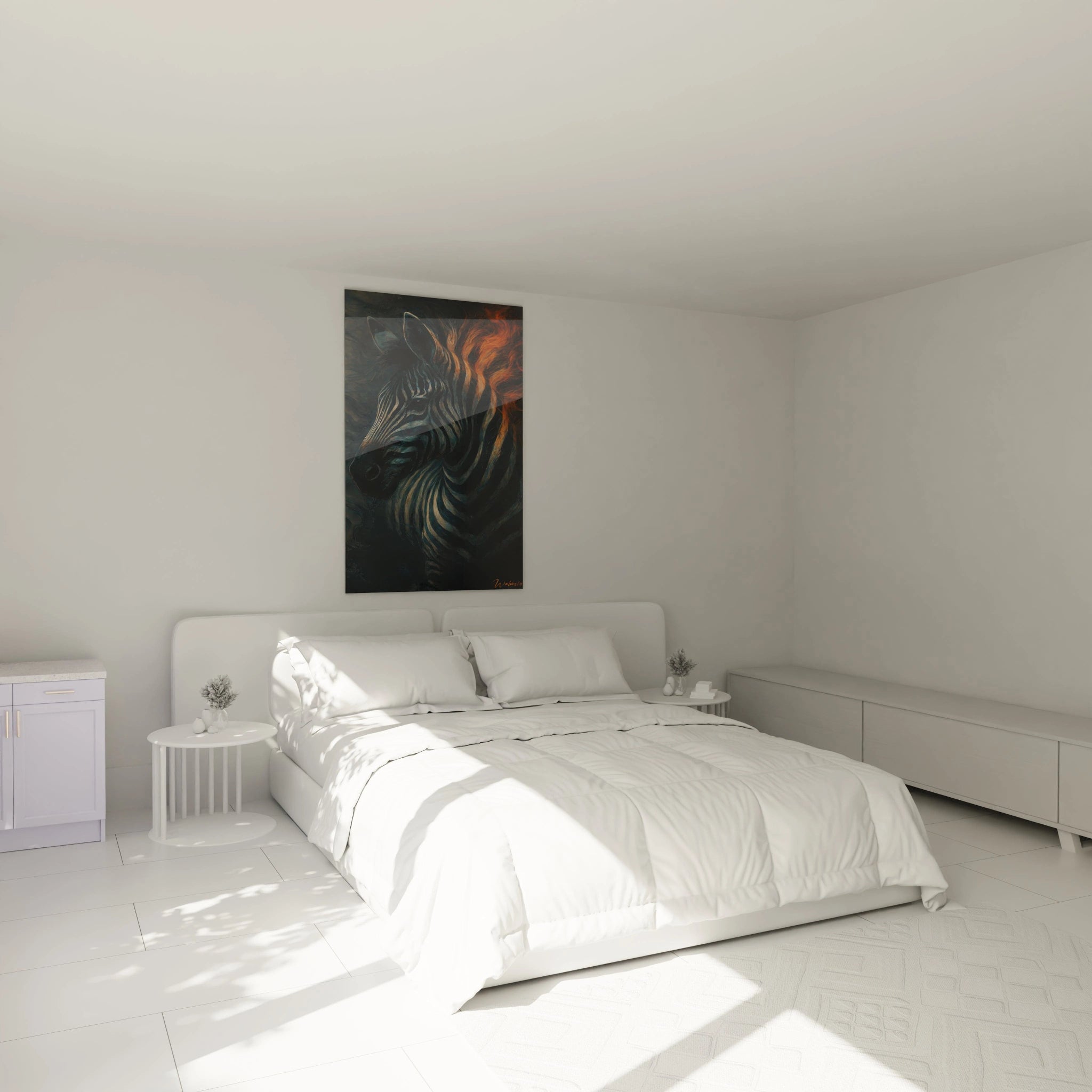
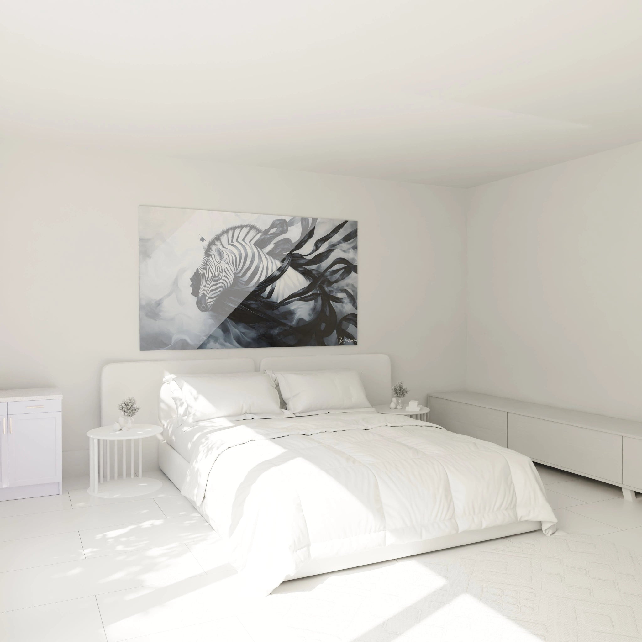
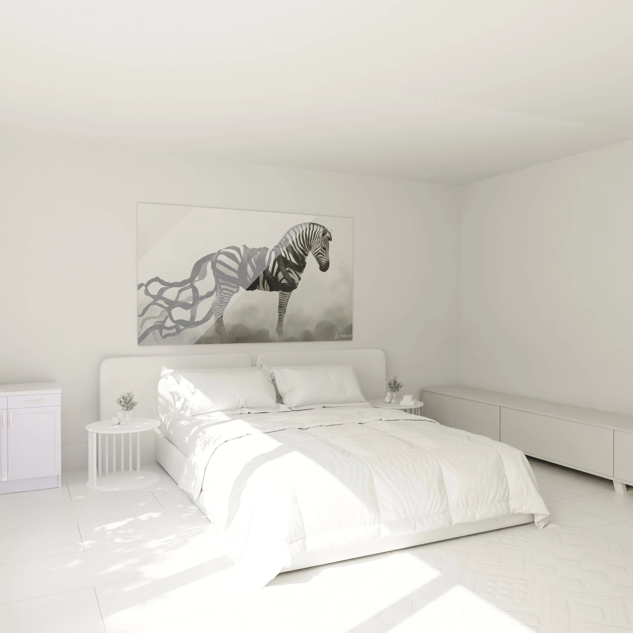
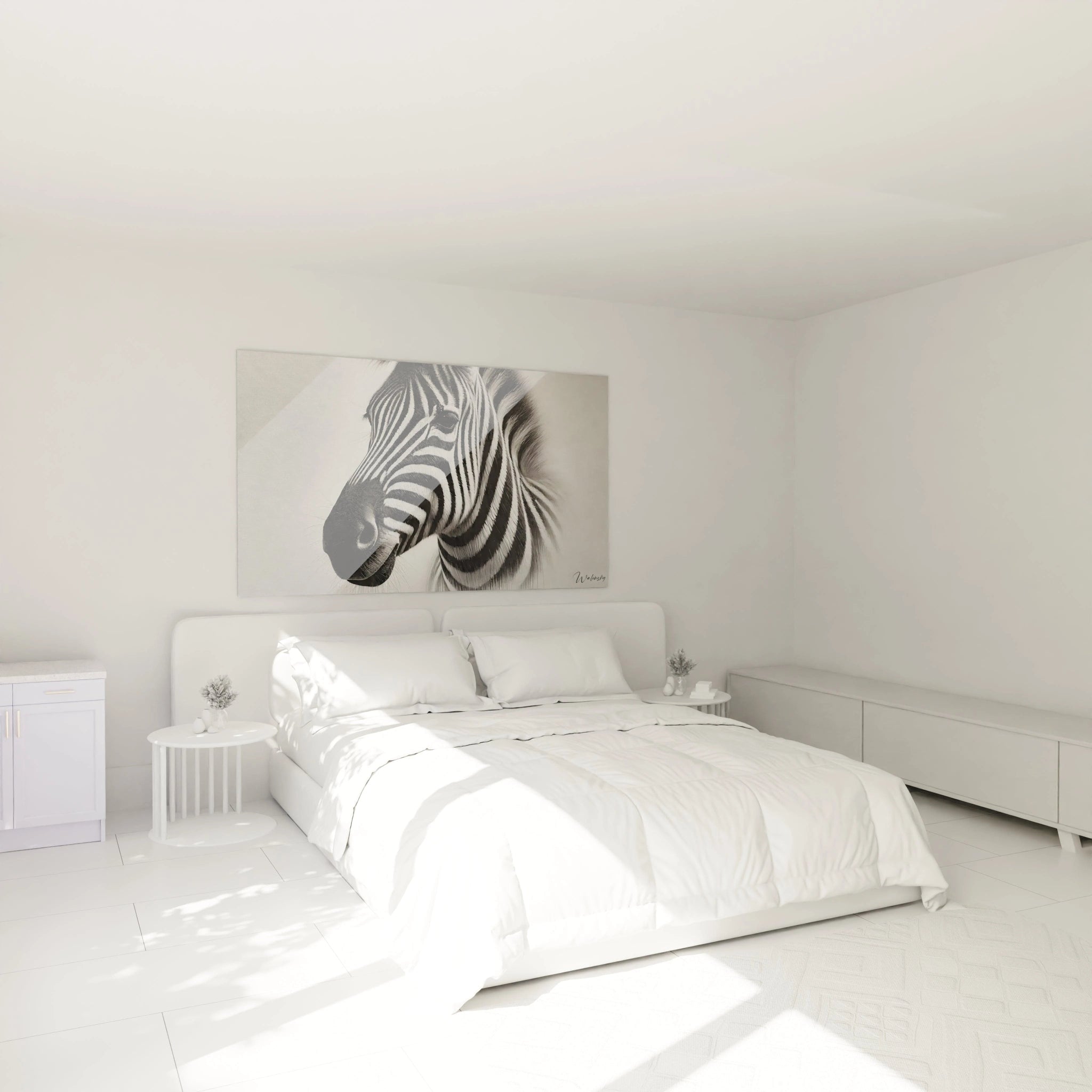
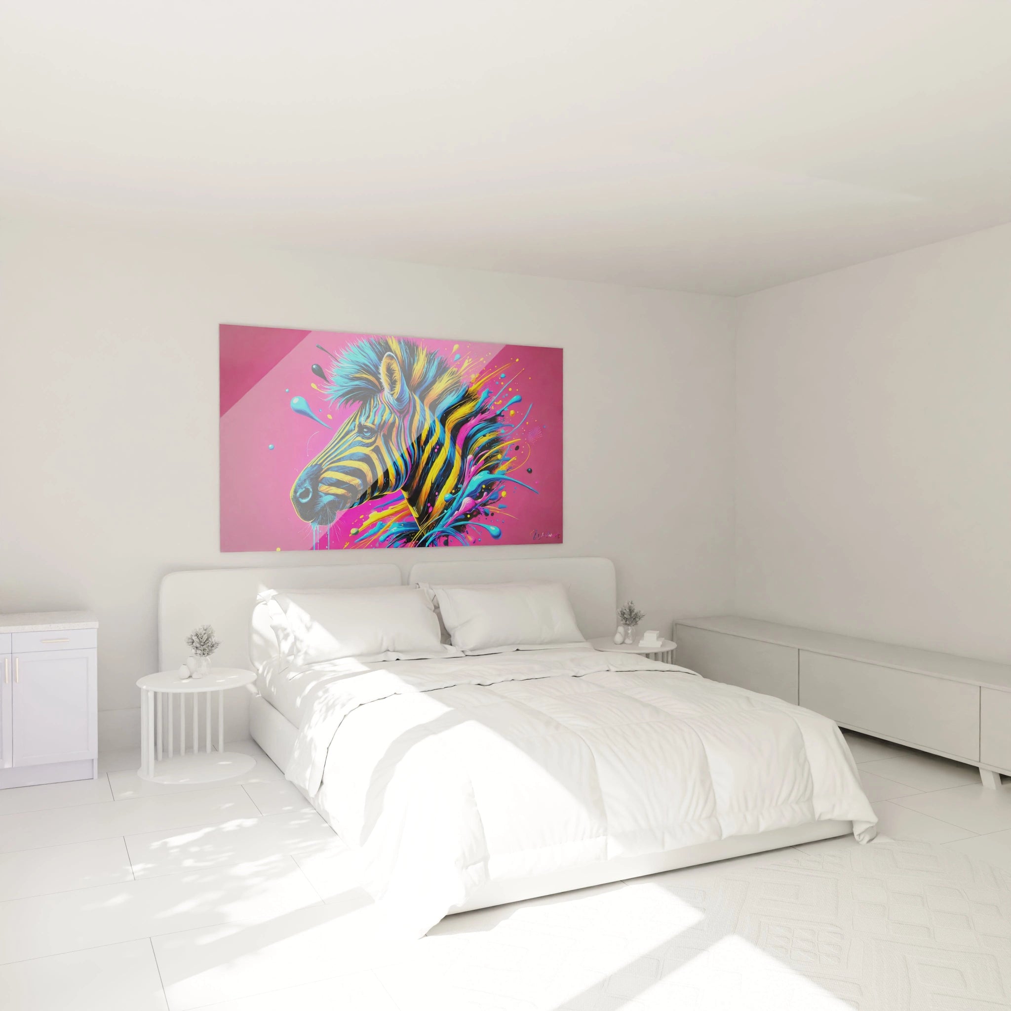
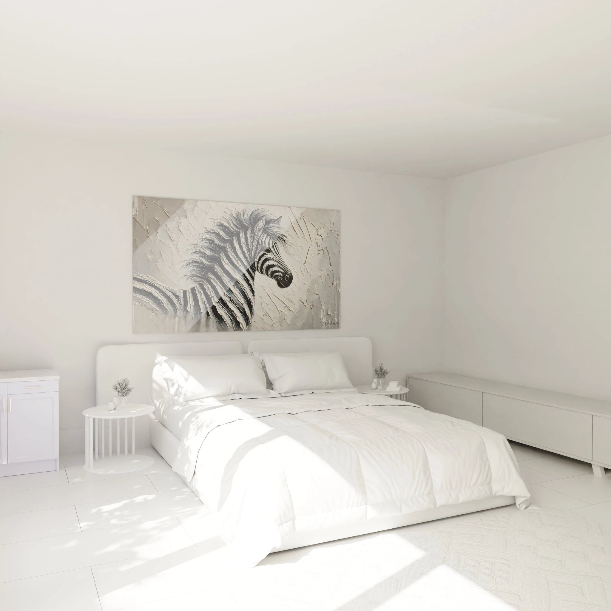
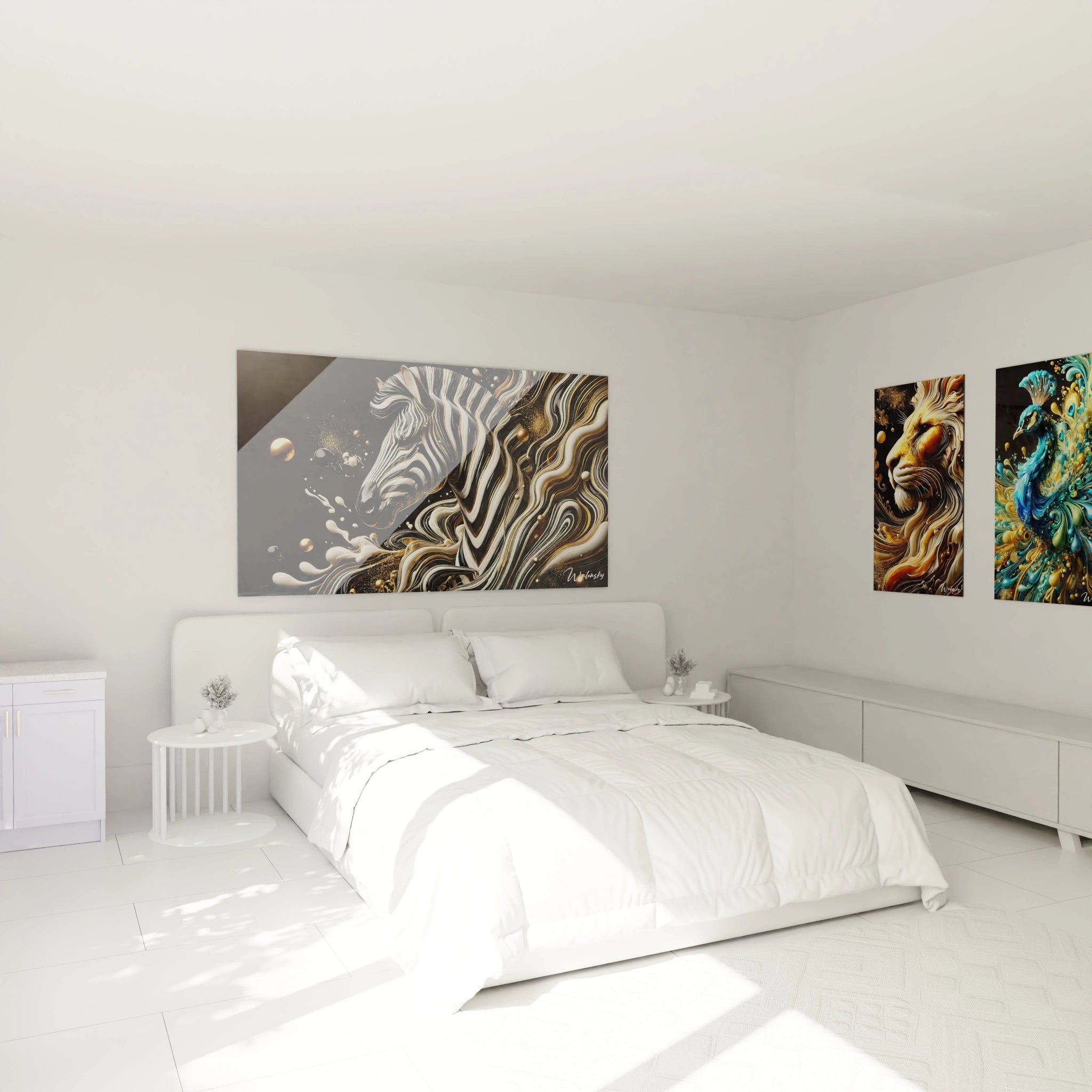
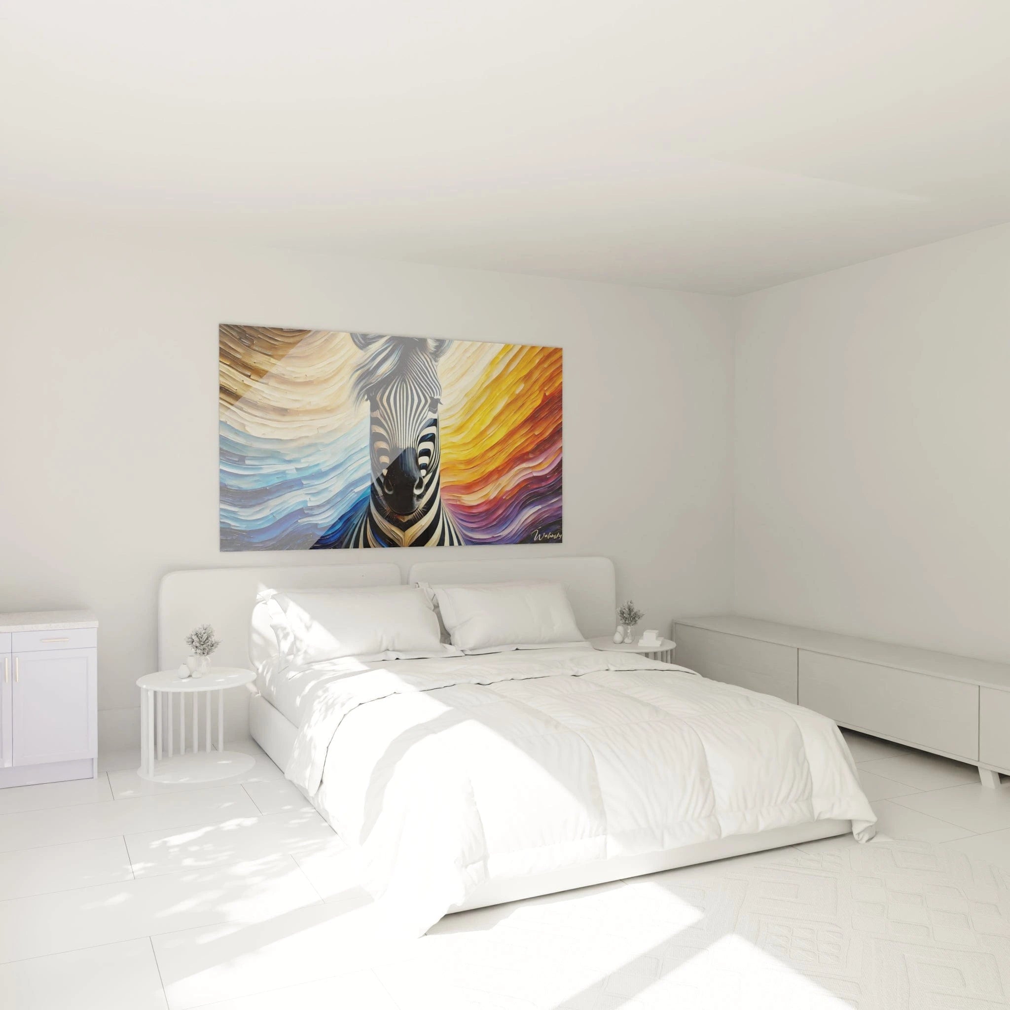
Successful integration of a colorful zebra painting requires coherent decorative approach. These works flourish particularly in streamlined design environments where their chromatic exuberance can express itself fully without visual competition. Furniture with minimalist lines, plain surfaces in white, anthracite gray, or deep black create the ideal setting for these color explosions. The contrast between architectural sobriety and pictorial exuberance generates sophisticated visual tension, characteristic of controlled contemporary interiors.
For those who also appreciate more graphic approaches, the
Artistic Zebra Painting collection offers complementary stylistic variations. Association with natural materials – raw wood, stone, lush vegetation – also creates fascinating dialogues where stylized nature encounters organic nature. Innovative professional spaces (creative agencies, technology startups, design showrooms) willingly adopt these pieces to assert their avant-garde identity and their refusal of traditional aesthetic conventions.
Revisited Symbolism of the Rainbow Zebra
How Do Colors Transform the Symbolic Message?
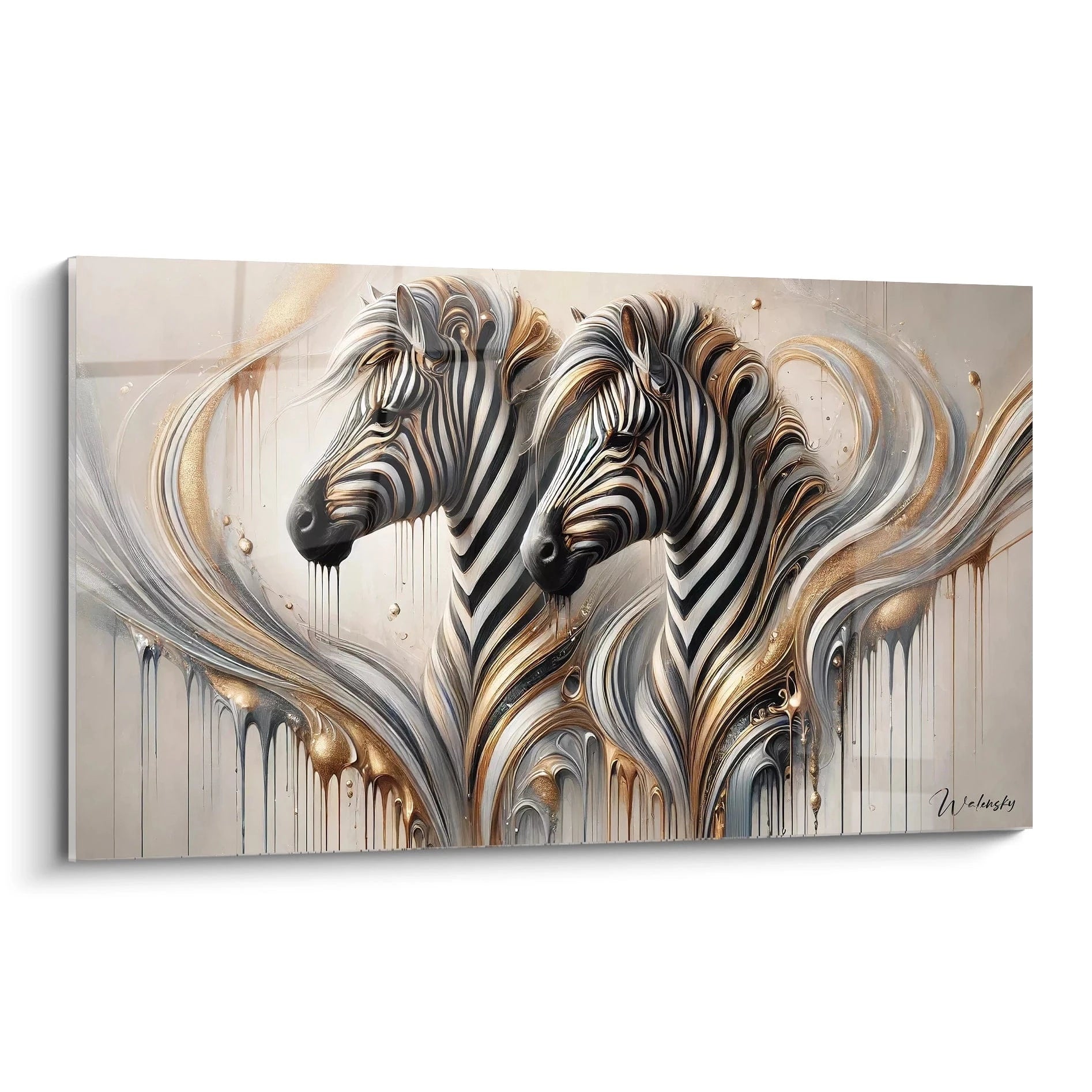
The zebra traditionally embodies individuality, uniqueness, and distinction – each animal possessing a striped pattern unique like a fingerprint. When these emblematic stripes are adorned with vibrant colors, this symbolism amplifies considerably. A colorful zebra painting becomes a manifesto of personal affirmation, visual declaration of a personality that refuses neutrality and embraces authentic expression. Saturated tones transform the wild animal into a pop-art icon, reference to artistic movements that used color as a tool for creative liberation.
This chromatic metamorphosis also carries a message of optimism and celebration of diversity. Multicolored stripes evoke the rainbow, a universal symbol of hope, reconciliation, and harmony in diversity. For contemporary art collectors, these pieces represent a progressive vision where nature is no longer simply reproduced but interpreted, commented upon, magnified through the lens of modern artistic sensitivity. This conceptual dimension considerably enriches the perceived value of the work beyond its purely decorative qualities.
Balance Between Exuberance and Sophistication
Contrary to common assumptions, a colorful zebra painting does not necessarily induce chaotic or childish atmosphere. Sophistication resides in artistic treatment: subtle gradients, controlled saturation, balanced composition. Premium creations exploit harmonious chromatic palettes where colors dialogue rather than compete. A zebra with blue-turquoise-emerald nuances creates refined marine atmosphere, while a pink-coral-gold variation evokes elegant sunset.
Monumental formats also allow chromatic complexity impossible at small scale. Tonal variations within a single stripe, progressive transitions between adjacent hues, depth effects generated by superposition of translucent layers – these techniques create visual richness that gradually reveals itself, rewarding attentive observation. This artistic depth radically distinguishes these works from simplistic commercial reproductions, positioning the colorful zebra painting as durable decorative investment rather than ephemeral trend. For a refined alternative, the
Elegant Zebra Painting collection offers more sober interpretations.
Chromatic Adaptability to Decorative Seasons
An overlooked advantage of colorful zebra paintings resides in their capacity to evolve visually according to surrounding chromatic environment. By modifying decorative accessories – cushions, rugs, decorative elements – you can highlight different tones of the work, creating the impression of decorative renewal without major change. A multicolor composition containing violet, orange, green, and blue can thus adapt to seasons: accentuation of warm tones in autumn, highlighting fresh nuances in summer.
This chromatic versatility represents substantial economic advantage. Rather than acquiring multiple works to follow decorative evolutions, a quality multicolor zebra painting accompanies your ambiance transformations durably. This adaptability suits particularly commercial spaces requiring periodic refreshes without constant investments, as well as primary residences where owners appreciate decorative flexibility without multiplication of artistic acquisitions.
Transformative Impact of Large Chromatic Formats
Why Prioritize an Imposing Format for a Multicolored Zebra?
Generous dimensions constitute a determining factor in the decorative effectiveness of a colorful zebra painting. An imposing format allows spectacular deployment of chromatic stripes, creating visual rhythm sufficiently ample to be perceived in totality even from distance. Small formats fragment this graphic continuity, whereas large dimensions fully reveal the choreography of colored bands. This amplitude transforms the wall into immersive artistic installation rather than simple hanging support.
The psychological impact of large dimensions also amplifies the emotional presence of the work. A monumental multicolored zebra never goes unnoticed: it imposes itself as an architectural element in its own right, redefining the visual hierarchy of the space. This monumentality suits particularly generous volumes – industrial lofts, double-height spaces, executive offices, reception halls – where standard proportions would disappear visually. The dimensional correspondence between the work and its environment creates essential architectural harmony for overall cohesion.
Creation of Magnetic Focal Points in Interior Architecture
A large-format colorful zebra painting functions as visual magnet, naturally orchestrating the circulation of gazes and structuring spatial perception. Positioned strategically facing the main entrance, it immediately captures attention and establishes the space's bold character. Placed above a monumental sofa or console, it crowns the furniture and creates a hierarchized decorative ensemble. This capacity to visually organize space constitutes a major advantage for vast interiors requiring structuration without physical partitioning.
Colored vertical stripes also generate upward movement that visually elevates ceilings, particularly appreciated in spaces with limited height. Inversely, in cathedral volumes, they create visual connection between floor and ceiling, humanizing intimidating proportions. This functional versatility makes the colorful zebra painting a strategic decorative tool beyond its purely aesthetic qualities. For a contrasting approach, discover the
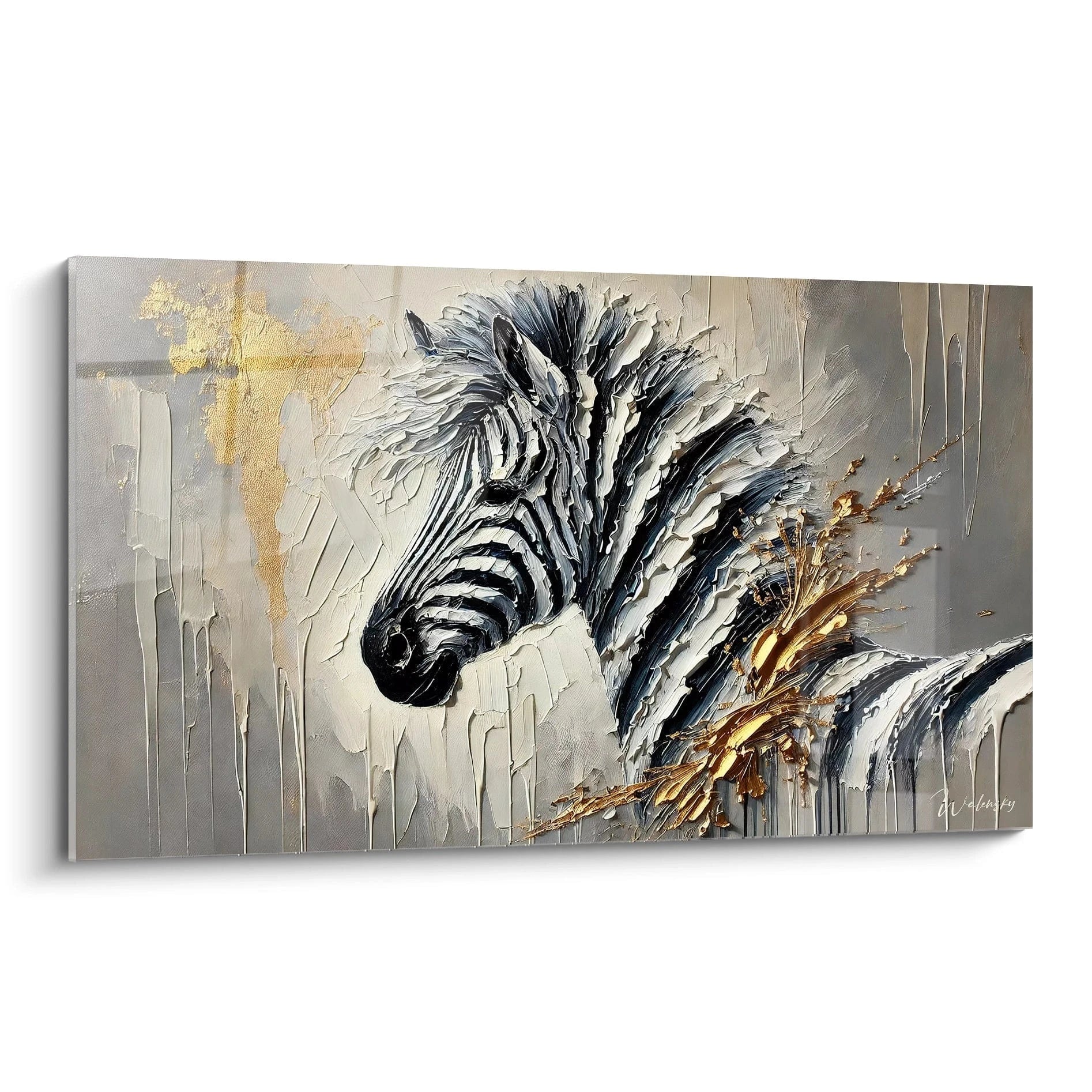
Monochrome Zebra Painting collection that explores gray nuances.
Compatibility with Contemporary Lighting
Interaction between light and color radically transforms the appearance of a colorful zebra painting throughout the day. Natural light reveals complete chromatic richness, with intensity variations according to orientation and seasons. Artificial lighting creates distinct ambiances: directional spots dramatize contrasts between stripes, diffuse lighting softens transitions, variable-temperature LED modifies hue perception. This luminous reactivity generates an evolving work that constantly renews itself.
Architectural lighting installations – adjustable spot rails, grazing side appliques, LED backlighting – allow the work to be scenarized according to moments and uses. Dynamic lighting for evening receptions, soft illumination for concentrated work, targeted chromatic accentuation to highlight specific tones. This luminous flexibility multiplies possible expressions of a single work, justifying investment in quality formats capable of supporting various lighting configurations without alteration.
Does a colorful zebra painting suit minimalist interiors?
Absolutely. The apparent contradiction between chromatic exuberance and architectural minimalism creates precisely a sophisticated visual tension. In a pared-down environment with neutral surfaces, the colorful zebra painting becomes the exclusive artistic punctuation, concentrating all decorative expression on a single masterpiece rather than dispersing accents. This "less but better" approach characterizes premium contemporary design.
Which rooms benefit most from a zebra with multicolored stripes?
Social and creative spaces derive optimal benefit from these energizing works: conversational living rooms, coworking spaces, creative meeting rooms, welcoming entrance halls. Their chromatic vitality stimulates social interaction and innovative thinking. Conversely, bedrooms generally favor calmer compositions, except for personalities deliberately seeking morning visual stimulation.
How should you coordinate the painting's colors with the rest of the décor?
Two approaches work effectively: either extract 2-3 dominant hues from the painting to repeat them subtly in accessories (cushions, decorative objects), creating harmonious chromatic echoes; or maintain the rest of the environment rigorously neutral (white, gray, black) to maximize contrast and let the work monopolize color expression. The first approach integrates, the second magnifies – the choice depends on the desired effect.