

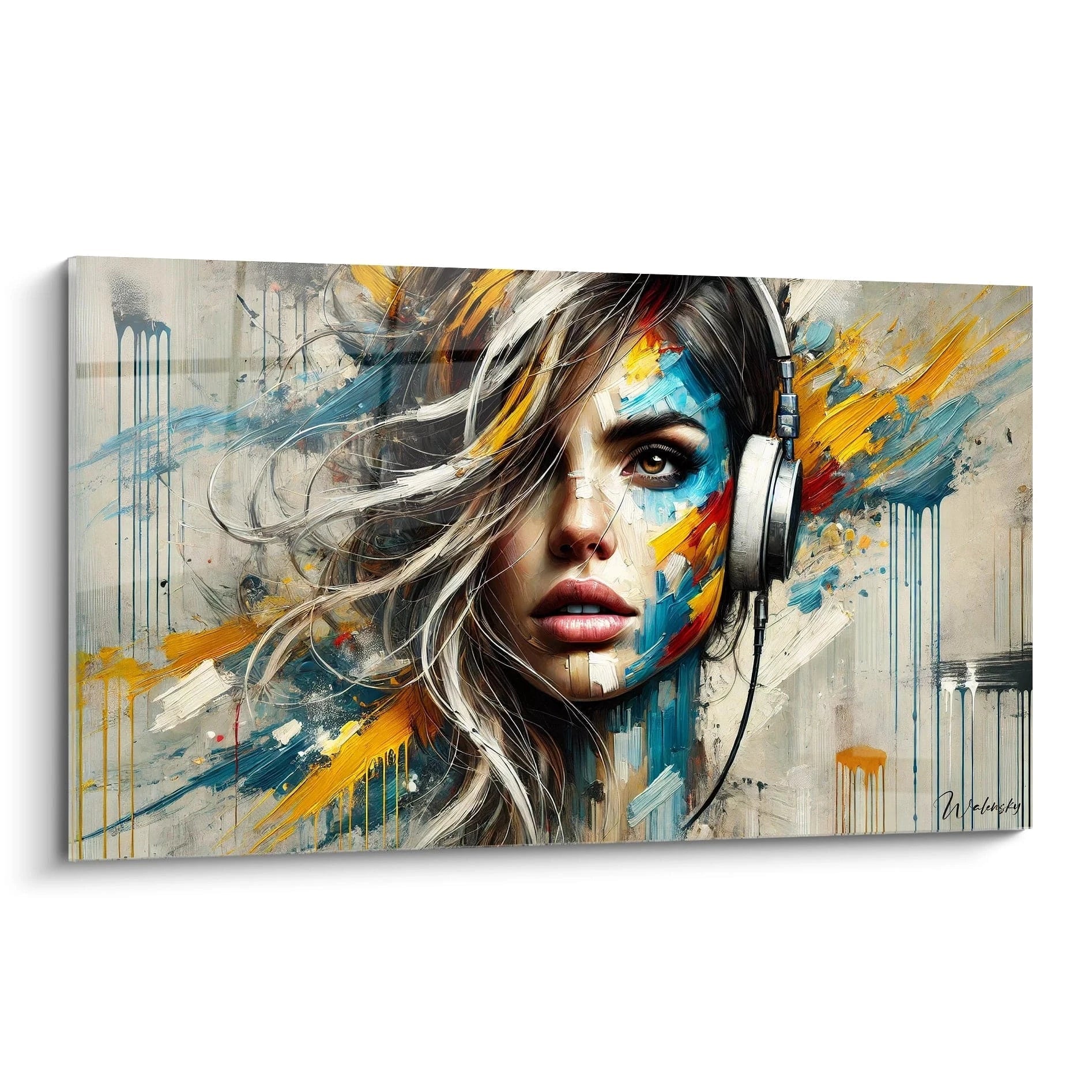






Choosing the Right Artwork Size Based on Hallway or Passage Width
October 11, 2025 · 17 min read · by Walensky
You've just hung this beautiful artwork in your hallway, but something feels off... It seems either ridiculously small or overwhelming compared to the space. You step back, observe, and that unpleasant feeling persists: your hallway isn’t doing justice to your work of art.
In the morning, as you pass by this disproportionate artwork, you feel a slight frustration. The hoped-for "wow" effect has turned into a silent disappointment. Your guests notice the inconsistency without daring to say it, and yourself avoid looking at that area of your home.
You may have already tried to reposition the artwork, changed the lighting, or even bought a different frame. But the problem persists because these solutions don't address the root cause: the chosen format simply doesn’t match the dimensions of your passage.
This frustration is perfectly normal and affects 8 out of 10 homeowners. The real cause isn't your lack of taste, but the absence of a simple method to harmonize format and space. Generic advice ignores the specificity of your hallway.
By the end of this article, you will master the rule of proportions that will transform your hallway into a personal art gallery, where each artwork finds its ideal place and creates the desired visual impact.
Why does the choice of format condition the entire atmosphere of your hallway?
A poorly decorated hallway can transform your entrance into a depressing tunnel, while a well-chosen format instantly creates a feeling of space and welcome. It's like choosing the right shoe size: a few centimeters difference is enough to ruin all comfort. Waiting any longer means accepting that your guests walk through a space that doesn’t reflect you every day, when a transformation is possible in just a few hours.
🏠 Customer testimonial: Marie recently told us: "I had hung a 40x60cm artwork in my 90cm wide hallway. My friends asked me why I chose such a small format! Switching to 70x100cm was striking: my hallway looks more spacious and elegant."
Conversation with a decor expert
The golden rule for harmonious hallways: The artwork should occupy between 60% and 75% of the width of the main wall to create optimal visual impact. This proportion creates a natural balance that visually expands the space in less than 24 hours.

Our highlight
Blue Geometric Nostalgia Painting - Abstract Music Edition
233,90€
Discover this artwork →Why isn't your hallway showcasing your artwork?
Do you recognize these situations: your painting seems to float in emptiness, the space appears unbalanced despite beautiful lighting, or your guests don’t even notice your works? These symptoms reveal a mismatch between the dimensions of your work and the architecture of your passage.
The problem isn't your artistic sensitivity, but the lack of a method for calculating proportions. Most decor advice ignores the technical specifics of hallways: ceiling height, passage width, natural light.
It’s like trying to cook without scales: you can have the best ingredients, but without the right proportions, the result will never live up to your expectations.
The silent mistake: ignoring the width of circulation
Contrary to popular belief, it's not the total width of the hallway that counts, but the actual space for circulation. A 120cm hallway with radiators, outlets or furniture doesn’t offer the same perception as a clear 100cm hallway.
Imagine watching a movie on an unsuitable screen: too small, you squint; too large, you lose sight of the whole. In a hallway, the viewing distance is fixed, so the format must be adapted to this constraint.
This lack of awareness explains why so many owners feel this persistent frustration: they chose their artwork with their heart, but without considering the geometry of the space. Result: a decoration that doesn’t reveal its potential.
🔍 Quick test: Stand in the center of your hallway and stretch out your arms. If your hands touch the walls, your circulation space is less than 90cm. This directly influences the optimal size of your artwork.
The trap of standard proportions
Artwork formats sold in stores follow industrial standards designed for classic living rooms, not the architectural specifics of modern hallways. That's why a 50x70cm piece can seem perfect in store and disappointing at home.
Think of a suit: size S, M, L may roughly fit, but only a custom adjustment reveals elegance. Your hallway has its own "morphology" that requires a tailor-made approach.
Understanding this reality finally frees you from the guilt of the “bad choice” and opens the way to a decoration that truly reflects you.
The Overlooked Impact of Hanging Height
A detail that 90% of owners neglect: hanging height alters the perception of format. A picture hung too high appears smaller, too low it visually overwhelms.
In a hallway, you primarily observe while walking, not in a static position. Your preferred viewing angle is therefore 10 to 15cm lower than in a living room where you are seated.
This subtle technicality explains why some pictures seem "out of place" in their space, creating this diffuse feeling of incoherence without being able to identify the cause.
🎯 3 signs that your format is unsuitable:
- The "postage stamp" effect: Your picture seems lost on the wall, like a small sticker on a large surface
- The feeling of crowding: The space appears narrower than it is
- Selective invisibility: Your guests never spontaneously comment on your works of art
The Trigger Factor: The Rule of Architectural Thirds
The secret of professional decorators lies in applying the rule of thirds adapted to hallways. Unlike square rooms, a hallway creates a perspective effect that amplifies or diminishes visual proportions. Imagine the tunnel effect: the more linear the space, the more each decorative element influences the overall perception. A well-calculated format acts as a lever that transforms a simple passage into a personal gallery.
To determine if this rule applies to your situation, observe your hallway from the entrance: if your gaze is naturally drawn towards the end, you are in a space where every centimeter of format counts.
Universal practical rule: In a hallway, multiply the usable width by 0.65 to obtain the ideal width of your picture. This formula works in 95% of configurations and is verified by measuring the immediate visual balance.
| ❌ Common belief | ✅ Reality | 💡 Explanation | 🎯 Practical benefit |
|---|---|---|---|
| A small picture enlarges the space | A proportionate format visually energizes | The eye naturally seeks balance | Feeling of a more generous space |
| Large formats should be avoided in passageways | Proportion is more important than absolute size | Architecture guides perception | Immediate decorative impact |
| All hallways are the same | Each space has its unique morphology | Height, width and brightness interact | Successful personalized decoration |
| Living room rules apply everywhere | Hallways require a specific approach | Different viewing angle and observation distance | Guaranteed decorative harmony |

Our favourite
The Invisible Bonds Wall Art - Contemporary Abstract Painting Edition
233,90€
Discover this artworkThe 3-Step Method for Choosing the Perfect Format
Rest assured, this method is simpler than it seems. Just like planting a garden, it's about following the right sequence: first analyze the terrain, then choose the right varieties, and finally optimize the layout. In 3 logical steps, you will go from hesitation to certainty, then from purchase to successful hanging. The final result? A hallway that reveals your personality and impresses at first glance.
🎯 Overview of the transformation: Step 1 - Measure and analyze your space (immediate satisfaction of understanding), Step 2 - Calculate the ideal size (confidence in your choice), Step 3 - Optimize the hanging (guaranteed wow effect). This logical progression guarantees a professional result in an afternoon.
Step 1: Analyze the foundations of your space
Starting with this step avoids 80% of common mistakes because it reveals the invisible constraints of your hallway. Just as an architect studies the terrain before drawing up plans, this analysis lays the foundation for a successful decoration. Once this step is complete, you will feel that satisfaction of "finally understanding why it didn't work before" and the confidence to make the right choices.
Tools needed for analysis
- Measuring tape of at least 3m: Choose a model with automatic locking to measure easily alone. Avoid sewing tapes that warp. Check the readability of the graduations as you will take several measurements. A good rigid measuring tape saves you 10 minutes and avoids reading errors.
- Smartphone with camera: The device is used to document constraints (radiators, sockets, doors) and visualize proportions. Activate the grid in the photo settings to facilitate visual analysis. This documentation becomes your space's "decorative identity card".
- Notebook and pencil: Paper is preferred over digital for quickly sketching ideas and noting measurements as you go. A simple notebook allows you to draw proportions and keep a physical record of your creative thinking.
Now, let's move on to concrete practice:
Specific actions to take
Measure the actual circulation space: Stand in the center of the hallway and measure the distance between obstacles (furniture, radiators, open doors). This measurement determines your "usable width" because it is the reference for calculating proportions. Note this value in centimeters; it will serve as the basis for all your calculations.
⏱️ Time: 5 minutes | ✅ Successful when: You have 3 consistent measurements at different locations in the hallway | ⚠️ Attention: Do not measure wall to wall but from obstacle to obstacle, otherwise you will oversize the artwork
Identify the optimal mounting area: Locate the longest wall without interruption (door, switch, radiator) of at least 80cm. This is your "wall of honor" that will receive your main artwork. Photograph this area from different angles to visualize the future impact.
⏱️ Time: 3 minutes | ✅ Success when: You have identified a continuous wall of at least 60cm | ⚠️ Attention: Avoid walls facing windows that create distracting reflections
Measure natural viewing height: Walk normally down the hallway and note at what height your gaze naturally falls. This area, generally between 1m40 and 1m60 from the floor, determines the optimal center of your artwork. A good mounting height makes the difference between a noticed and ignored artwork.
⏱️ Time: 2 minutes | ✅ Success when: You have identified the natural "eye level" | ⚠️ Attention: This height often differs from the standard rule of 1m60 depending on your height and architecture
✅ Check of step 1: You should have noted the usable width, identified the main wall and determined the mounting height. If a measurement seems doubtful, take it again because this data guides all your future choices. Congratulations, you now have the "identity card" of your hallway!
— Our selection


OUR RECOMMENDED PRODUCTS
Step 2: Calculate your custom format
This step transforms your measurements into purchase certainties. Like a tailor who translates your measurements into a pattern, you will convert the analysis of your space into precise dimensions. No more hesitation in front of the shelves: you will know exactly what suits your hallway. The snowball effect begins here: once the right format is identified, all your other decor choices (lighting, colors, accessories) harmonize naturally.
Calculation tools
- Calculator or smartphone: To apply the proportion rule without error. A simple calculator is sufficient, the important thing is the accuracy of the calculations. Smartphone "calculator" apps are perfect and always available. Format correspondence table: List the standard formats available (30x40, 40x60, 50x70, 70x100, etc.) to quickly identify the one that is closest to your ideal calculation. This list saves you time in store or online. Millimeter paper or drawing application: To visualize proportions before purchase. Drawing to scale, even roughly, reveals details invisible during pure calculations. This visualization avoids unpleasant surprises.
Proportion calculations
Apply the 65% rule: Multiply your usable width by 0.65 to get the ideal width of your artwork. For example, a 100cm usable hallway = a 65cm wide artwork. This proportion creates perfect visual balance without cluttering the space.
⏱️ Time: 1 minute | ✅ Success when: You get a clear dimension in centimeters | ⚠️ Attention: Round to the nearest standard size, don't look for the exact centimeter
Choose the height/width ratio: For hallways, prioritize landscape formats (wider than tall) that naturally follow the perspective. A 3:2 ratio (e.g., 90x60cm) or 4:3 (e.g., 80x60cm) harmonizes perfectly with the linear architecture of hallways.
⏱️ Time: 3 minutes | ✅ Success when: You have identified 2-3 compatible formats | ⚠️ Attention: Avoid square or too narrow formats that disrupt visual balance
Check availability and budget: Look for your calculated formats in your favorite collections and see if they fit your budget. Identify 2-3 alternatives to keep flexibility in your artistic choices without compromising proportions.
⏱️ Time: 10 minutes | ✅ Success when: You have selected 3 formats within your price range | ⚠️ Attention: Never sacrifice good proportions to save a few euros
📏 Validation of step 2: You now have 2-3 precise formats suitable for your hallway and budget. If you hesitate between two sizes, choose slightly larger: the visual impact will be more successful. Your purchasing decision is now informed and confident!
Step 3: Perfecting the hanging for maximum impactThis final step reveals the difference between amateur and connoisseur. Even the most beautiful artwork can be disappointing with a bad hanging, while a simple work becomes remarkable with the perfect technique. The final result you can visualize: a hallway where every visitor naturally stops to admire your artwork, transforming a simple passage into a true personal gallery that you will be proud of.
Professional hanging hardware
- 30cm minimum spirit level: Essential for perfectly horizontal hanging. Smartphone apps are practical but less precise. A quality level guarantees an immediately visible professional result. Wall-appropriate anchors: Plasterboard, concrete or brick require specific fixings. Check the load capacity: minimum 15kg for a 70cm artwork. Proper fixing ensures safety and longevity. Measuring tape and pencil: To mark the attachment points precisely. Use a gray erasable pencil to avoid permanently marking the wall. The precision of the markings determines the final quality of the hanging.
Optimal hanging technique
Determine the exact height: Place the center of the artwork at your natural eye level, measured in step 1. In a hallway, this is generally 5 to 10cm lower than in a living room because you are observing while moving. This personalized adaptation makes all the difference.
⏱️ Time: 5 minutes | ✅ Successful when: The center of the artwork is at your natural eye level | ⚠️ Attention: Do not blindly follow the 160cm rule, adapt to your morphology and space
Center horizontally with precision: Measure the width of your hanging wall and position the artwork exactly in the center. Use the formula: (wall width - artwork width) ÷ 2 = distance from the edge. This perfect symmetry creates visual harmony.
⏱️ Time: 3 minutes | ✅ Successful when: The left/right distances are equal to the nearest centimeter | ⚠️ Attention: Check the centering from different angles, not just straight on
Check the final visual impact: Step back from the entrance of the hallway and observe the whole. The artwork should naturally attract the eye without overwhelming the space. If something bothers you, adjust it by a few centimeters: these details make the difference between correct and exceptional.
⏱️ Time: 2 minutes | ✅ Successful when: You feel satisfaction and pride in seeing the result | ⚠️ Attention: Trust your first impression, it reveals the real harmony
🌟 Final validation: Your artwork is perfectly centered, at the right height, and creates the desired visual impact. If your loved ones spontaneously comment on the transformation, you've succeeded! You now master the art of enhancing a hallway with the right format.
Intelligent progression rule: If you need to change several artworks in the same hallway, start with the largest one in the center, then arrange the others in decreasing size. Wait 48 hours between each hanging to validate the harmony before adding the next.
Congratulations, you have acquired the eye of a professional decorator! This mastery of proportions gives you a head start on 90% of homeowners who decorate intuitively. Here are now the subtleties that will make you a true expert in hallway decoration.
🎓 Tip from an experienced decorator: Vary the hanging height by 2-3cm between several artworks in the same hallway to create a dynamic visual rhythm, like a melody in decor. This technique avoids the "military alignment" effect while maintaining overall harmony.
Frequent question from our customers
"I'm afraid that a large artwork will be too overwhelming in my small hallway..."
This hesitation is perfectly understandable as we often associate "small space" with "small decoration". In reality, it's the opposite that works: a proportionate format visually enlarges the space by creating a focal point that guides the eye. Imagine wearing a thin scarf with a winter coat: it gets completely lost. A well-proportioned accessory, on the contrary, structures the silhouette. Your hallway deserves the same attention to proportions to reveal its decorative potential. To reassure you, start by applying our 65% rule: if the calculation gives 60cm wide, that's exactly what your space needs to thrive. Trust in the mathematics of harmony!
🏠 Reassuring test: Cut a rectangle with the calculated dimensions from newspaper and temporarily attach it to the wall. You will immediately see that, instead of overwhelming, this proportion dynamizes and visually structures your hallway.
— You may also like


The 5 mistakes that ruin the decorative effect
Knowing these pitfalls avoids you months of frustration and regretted purchases. These errors affect 8 out of 10 homeowners, even with good decorating intentions. Avoiding them directly places you in decorative excellence.
- 🚫 Copying dimensions from another room: Each hallway has its own architectural constraints. What works at your neighbor's can create a imbalance at yours. Always respect your personalized analysis even if it differs from the standards. This "copy-paste" decor error explains 40% of layout failures. 🚫 Neglecting lighting when choosing the format: A dark hallway requires different colors and contrasts that influence the perception of size. A perfect format can seem dull without proper lighting. Test your choice at different times of the day before finalizing. 🚫 Choosing multiple small paintings instead of an adapted format: The accumulation of small formats creates a "wall exhibition" effect that visually clutters. A single well-proportioned painting structures the space better than three small ones lost. Elegant simplicity always triumphs over decorative overload. 🚫 Ignoring your hallway's perspective: A long hallway visually amplifies formats, a short hallway reduces them. This perspective changes the perception of proportions and should influence your final choice. Always observe from the main entrance to validate the actual effect. 🚫 Sacrificing quality to respect a tight budget: A small high-quality painting impresses more than a cheap large format. Texture, colors, and finish are as important as dimensions. Prefer an excellent 50x70cm to a mediocre 70x100cm: the decorative impact will be greater.
🔍 Pre-purchase verification system: Does your calculated format respect the 65% rule? Does the lighting enhance the colors? Have you tested the visualization from the entrance? Does the budget allow for satisfactory quality? These 4 control points guarantee a successful purchase.
— In the same vein


Practical questions about hallway decoration
Allow between €150 and €400 for a quality painting depending on the format: 50x70cm (€150-€250), 70x100cm (€250-€400). Investing in quality guarantees durable colors and careful finishes. Optimization tip: prioritize "favorites" collections which offer excellent value for money without compromising decorative impact.
Analysis and selection take 2-3 hours, hanging takes a maximum of 30 minutes. The transformation effect is immediate: as soon as the hanging is finished, you feel the change in atmosphere. Concrete example: Marie transformed her entrance hallway in an afternoon and has been receiving systematic compliments from her guests.
For formats up to 60cm, high-performance adhesive systems support 8-12kg without drilling. Beyond that, wall mounting is recommended for safety. Intermediate solution: discreet hanging rails allow easy changes without new holes, ideal for tenants or the undecided.
In a very narrow hallway, apply the 70% rule instead of 65% to compensate for the close visual effect. Also prefer light colors and airy subjects that visually enlarge the space. Special technique: a triptych (3 related paintings) creates a continuous perspective particularly successful in restricted spaces.
Absolutely, but respect a hierarchy: 1 main painting with calculated format, then secondary works maximum 30% smaller. Harmony rule: keep the same frame style and space at least 15-20cm between each work. This composition creates a personal, coherent and sophisticated gallery.
Your hallway transformed: from anonymous passage to personal gallery
In a few weeks, when you return home, your gaze will naturally be drawn to this hallway that has become your decorative pride. Your guests will spontaneously stop to admire this perfectly proportioned painting, and you will feel the deep satisfaction of having created a space that truly resembles you.
Beyond simple decoration, you have acquired the eye of a professional decorator: this ability to analyze a space, understand its constraints and bring the perfect solution. This skill will naturally apply to all your future decor projects, giving you confidence in your aesthetic choices.
Understanding proportions was indeed the missing element. Now that you master this science, your first concrete step is to measure your hallway according to our method. Within 48 hours maximum, you will be able to visualize the possible transformation and take action with peace of mind.
🚀 Your transformation starts now: You have all the tools to succeed in this decorative metamorphosis. Every day of delay is another day of enduring a hallway that doesn't look like you. Your future self will thank you for taking the step today!
Also read: 📖 Read more articles on hallway decoration
</div
More selected pieces
Golden Tear Eye Wall Art - Abstract Face Edition
233,90€
Discover this artwork →Explore our collections


