

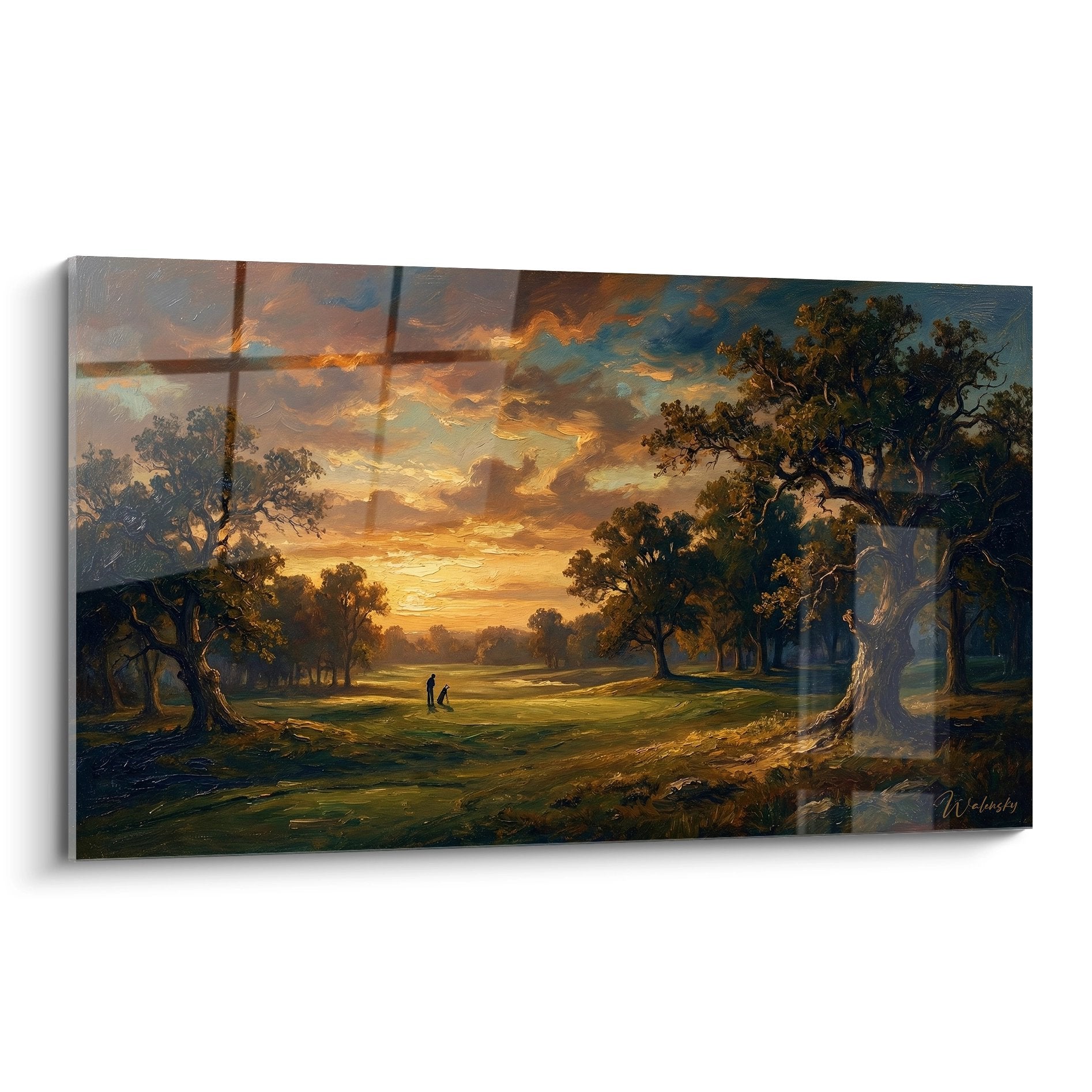






Wall art on black wall: which artworks work best?
October 11, 2025 · 17 min read · by Walensky
Golden rule for black wall art: The secret lies in the balance between contrast and harmony – like a chef perfectly dosing his spices. You will get a space that breathes modern elegance in 2-3 weeks, the time it takes for your eye to adapt to this new refined aesthetic.
Understanding what’s really happening with your black wall
Perhaps you recognize these three frustrating situations: you hang a picture and it seems to float in the void, or it creates a stain that attracts the eye unpleasantly, or it makes the room darker than expected.
What’s really happening is that your eye is looking for visual anchor points on this uniform surface. The problem isn't your choice or taste, but a lack of understanding of the optical properties of black in space.
It’s like trying to take a photo without understanding light: the rules exist, but no one has explained them clearly to you.
The first hidden cause: Light absorption
Contrary to what many think, a black wall doesn't extinguish light – it concentrates and redistributes it differently. This property can transform an ordinary picture into a centerpiece.
Imagine a theater spotlight: the black background makes the main actor stand out by creating dramatic depth impossible to achieve on a white wall.
This revelation changes everything in your approach: instead of “compensating” for the darkness, you will exploit its power to create stunning visual effects that will impress all your visitors.
💡 Immediate test: Place your hand 20 cm from your black wall and observe: the shadow created is softer and deeper than on a light wall. It's this same softness that will envelop and magnify your future work of art.
The contrast error that 90% of people make
Most people believe you need to create maximum contrast with pure white or very bright colors. In reality, subtle contrasts and tonal variations create a much more refined sophistication.
It’s like the difference between shouting and whispering confidently: the whisper captures attention much better than the shout.
Result: instead of a “catalog store” effect, you get that cozy atmosphere found in luxury hotels and private galleries.
The texture factor no one notices
On a black wall, texture becomes the protagonist. A smooth surface disappears, as a pronounced texture creates fascinating light and shadow games.
You can verify this by observing how a crumpled fabric catches the light differently from a smooth fabric on your black sofa.
This discovery transforms your search: you are no longer looking for a beautiful image, but a visual tactile experience inviting you to approach and explore.
3 signals that your choice will work:
- The artwork "dialogues" with the ambient light: It doesn't reflect it brutally but sculpts it, like a candle creating dancing shadows rather than a neon sign that blinds
- It creates a "visual breathing space": Your eye can rest on it without fatigue and discover new details with each glance, like contemplating a fireplace
- It generates an emotion before an analysis: You feel something before even "understanding" the artwork, a sign that it touches your aesthetic subconscious
The secret trigger: the rule of dramatic proportions
On a black wall, standard proportions no longer work. You must dare bold formats: either larger to create an imposing presence, or smaller for a "precious jewel" effect. It's a domino effect: the right proportion releases the entire aesthetic potential of the space, as a conductor finds the right tempo and suddenly makes the whole symphony resonate.
Universal practical rule:
If your artwork seems "just correct" on the black wall, you either need to enlarge it by 30% or reduce it by half. Visual excellence on black does not tolerate mediocrity in medium sizes.| ❌ Classic approach | ✅ Black wall approach | 💡 Why it works | 🎯 Visual benefit |
|---|---|---|---|
| Search for maximum black/white contrast | Play with nuances and textures | Black amplifies subtleties rather than oppositions | Art gallery sophistication rather than "poster" effect |
| Standard "safe" proportions | Assumed dramatic formats | Black requires character to exist | Strong and memorable presence |
| Privilege clear and defined images | Exploit textures and materials | Light reveals reliefs against a dark background | Sculptural and tactile effect |
| Avoid dark colors "out of fear" | Dare sophisticated color schemes | Deep tones dialogue with black | Luxurious and soothing harmony |

More selected pieces
Minotaur Wall Art No. 1 - Myths and Legends Edition
233,90€
Discover this artwork →The foolproof method for choosing your artwork on a black wall
Rassurez-vous, choisir la pièce d'art parfaite pour votre mur noir n'est pas un pari risqué. C'est une methodical approach in three steps, as building a house : first the aesthetic foundations, then the visual structure, and finally the refined finishes. At each step, you will feel your confidence grow and your vision become clearer.
🎯 Method overview : Step 1 - Define the desired atmosphere and emotion (foundations), Step 2 - Select the style and proportions that suit you (structure), Step 3 - Choose the finishes and textures that enhance it (refinement). This logical progression leads you from general intention to precise choice, with the certainty of a harmonious result.
Step 1 : Define your target atmosphere (the foundations)
Starting with the atmosphere rather than the object, is like choosing the melody before the instruments. This approach avoids impulsive purchases and guarantees a coherent result in line with your personality and lifestyle.
The 3 pillars of your target atmosphere
- The main emotion you want to feel : Serenity, dynamism, sophistication, creativity... This is your aesthetic compass that guides all other choices. Close your eyes and imagine yourself in this room: what do you want to feel? This emotion determines everything else, because a black wall can amplify any atmosphere, but you must first define it clearly.
- The desired level of intensity : Intimate and subdued atmosphere or strong and noticeable presence? This is the "volume" of your decor. A black wall can whisper elegance or proclaim boldness - both are beautiful, but require different approaches for the works of art that accompany them.
- The function of the room in your daily life : Relaxation area, reception area, work area, contemplation area? This function directly influences the type of artwork that will support your well-being. A black wall reveals and intensifies the use of a space more than a neutral wall.
Now, let's move on to the visual translation of your atmosphere
How to make your vision concrete
Create your "mental moodboard" : Gather 3 to 5 images (magazines, Pinterest, photos) that embody your ideal atmosphere, even if they don't necessarily show paintings. The idea is to capture the general atmosphere: a photo of a chic restaurant, a corner of an elegant shop, a hotel lounge... These references will serve as a beacon for all your future choices.
⏱️ Time : 15-20 minutes | ✅ Success when : Your 5 images tell the same emotional story, even if they are very different visually | ⚠️ Attention : Don't let yourself be influenced by what is "fashionable" - your personal taste will be your best guide in the long term
Test the lighting at different times: Observe your black wall in the morning, afternoon and evening with your usual lighting. Take photos to capture these variations. The artwork you choose should be beautiful under all these conditions, as lighting completely transforms the appearance of a work on a black background.
⏱️ Time: 1 day of passive observation | ✅ Successful when: You can accurately describe how the light "travels" across your wall depending on the time of day | ⚠️ Attention: Don't forget evening artificial lighting, which is often different from natural light
Define your "aesthetic comfort zone": Identify what naturally attracts you: organic or geometric shapes? Warm or cool colors? Figurative or abstract styles? This self-analysis prevents you from falling for a painting that doesn't reflect your personality, even if it is objectively beautiful.
⏱️ Time: 10 minutes of reflection | ✅ Successful when: You can explain in 2-3 sentences what you like and why | ⚠️ Attention: Distinguish what you truly like from what you think you should like
✓ Validation of step 1: You have a clear vision of the desired atmosphere, you know how your wall's light behaves, and you have identified your aesthetic preferences. If you are still hesitating, take an extra day of observation - this foundation determines the success of your project.

Our favourite
Golden Fluid Movement Wall Art on Dark Background - Dynamic Energy - Black and Gold Abstract Edition
233,90€
Discover this artworkOUR RECOMMENDED PRODUCTS
Step 2: Selecting the style and proportions (the structure)
Now that your foundations are solid, you will build the visual structure of your project. This step is more technical but also more rewarding, as you will see your vision take shape concretely. The snowball effect begins: each correct choice makes the next easier.
Selecting the perfect style for your black wall
Identify styles that work with black: Abstract art with textures (perfect for creating depth), contrasting black and white photographs (modern gallery effect), paintings in warm gold/copper tones (creating a precious setting), or sophisticated monochromatic works (camaïeu harmony). Each style exploits the power of the black background differently.
⏱️ Time: 30 minutes of research | ✅ Successful when: You feel a clear attraction to a maximum of 1-2 styles | ⚠️ Attention: Styles with too much fine detail can get lost on black - prioritize shapes and strong contrasts
Calculate dramatic proportions: Measure your wall and apply the "large or small, never medium" rule. For a grand format: 60-80% of the width of the wall. For a "jewel" effect: maximum 25% of the width. Intermediate formats create a visually unappealing hesitation on black backgrounds.
⏱️ Time: 10 minutes with a measuring tape | ✅ Successful when: You have two clear size options (large OR small) | ⚠️ Attention: Take into account the ceiling height - a low ceiling requires more horizontal formats
Virtually test your options: Use paper sheets of the correct dimensions, temporarily taped to the wall, to visualize the impact of different formats. This simulation immediately reveals whether your theoretical choice works in the reality of your space.
⏱️ Time: 15 minutes of testing | ✅ Successful when: One of the options makes you say "that's exactly it!" | ⚠️ Attention: Observe from different points in the room, not just facing the wall
🎨 Validation of step 2: You have identified the style that inspires you and defined the exact proportions that will enhance your black wall. Your paper tests confirm that your choice creates the desired visual impact. On to the final stage for the finishing touches that will make all the difference!
Step 3: Choose finishes and textures that enhance (the refinement)This last step transforms your good choice into an exceptional choice. This is where the difference between a well-decorated interior and a space that makes an impression lies. You now master the codes of the black wall and can play with subtleties like an expert.
The magic of finishes on a black background
Select the optimal texture: Matte finish for a velvety and sophisticated effect, glossy finish to create dynamic reflections, relief texture to sculpt light, or metallic finish for a precious effect. On black, texture becomes protagonist and completely transforms the perception of the work.
⏱️ Time: 20 minutes of analysis | ✅ Successful when: You can visualize exactly the effect that the chosen texture will create | ⚠️ Attention: A texture that is too marked can dominate the subject of the work - balance according to your target atmosphere
Optimize the frame or support: Black frame for a "window on art" effect, gold/copper frame to awaken warm tones, white frame to create breathing space, or no frame (stretched canvas) for a clean contemporary effect. The frame dialogues with the black wall and can transform everything.
⏱️ Time: 15 minutes of visualization | ✅ Successful when: Your choice of framing amplifies the desired effect without competing with it | ⚠️ Attention: A frame that is too conspicuous can divert attention from the artwork itself
Finalize the placement and lighting: Optimal height (center of the artwork at 5'3" from the floor), lighting angle to reveal textures without creating reflections, and viewing distance to appreciate the whole. These technical details make the difference between an amateur and a professional hanging.
⏱️ Time: 25 minutes of adjustments | ✅ Successful when: The artwork is perfectly highlighted from all viewing angles in the room | ⚠️ Attention: Check the lighting in the evening - that's often when you'll enjoy your painting the most
Rule of progression to master black walls: You can move on to a more ambitious project (multiple artworks, entire wall) when your first artwork fully satisfies you for 2-3 weeks. Patience in observation is better than haste in accumulation.
Congratulations! You have just mastered the secret codes of black walls. This expertise places you in the restricted circle of people to truly understand the art of wall staging. Your next visitors will immediately notice this sophistication that distinguishes your interior.
🎓 Expert level tip: Create a "night lighting" specific to your artwork with an indirect light source (wall sconce or adjustable spotlight). On a black wall, this dedicated lighting transforms your painting into a true artistic installation that impresses during evenings with friends.
Frequent question from our readers
"What if my painting ultimately doesn't look as good as expected? I'm afraid of making a mistake on an important purchase..."
This concern is perfectly understandable and even healthy - it shows that you are taking this decision seriously. The beauty of the method you have just learned is that it eliminates 90% of the risk of error by having you think BEFORE buying. In addition, most serious galleries offer trial periods or satisfaction guarantees. You also have the option to start with a quality reproduction to test, before investing in an original artwork.
💡 Reassuring action: Start by photographing some artworks that you like and simulate them on your wall with an augmented reality application or a simple photo montage. You will immediately see if the harmony works before any financial commitment.
— Our selection


The 5 fatal mistakes to absolutely avoid with a black wall
Now that you have mastered the method, let's protect your investment by avoiding common pitfalls. These errors are so common that even experienced decorators sometimes fall into them, but you will easily avoid them.
- ⚠️ Choosing a piece too small out of fear: It's the instinctive "safety" reaction, but on a black wall, a format that is too timid disappears completely and wastes the dramatic potential of your surface. Result: your wall looks like a page with a small sticker lost on it. The solution: dare generous proportions or assume the jewel-like effect with a very small format, but absolutely avoid medium sizes which create no impact.
- ⚠️ Favoring garish colors to "compensate" for black: We think we're doing well by choosing bright red or neon yellow, thinking that it will "wake up" the wall. In reality, this creates an unpleasant neon effect that fatigues the eye. Prefer rich and deep colors (burgundy, navy blue, forest green) or metallic tones that harmonize with black.
- ⚠️ Neglecting specific lighting: A painting on a black wall without adequate lighting is like a diamond in a closed drawer. The classic mistake is to rely on the general lighting of the room. Invest in dedicated lighting (spot rails, adjustable sconces) that reveals textures and creates that nocturnal magic that only black walls can offer.
- ⚠️ Hanging too high or too low: On a black wall, height errors are visually amplified. Too high: the work seems to float in space. Too low: it appears crushed by the dark mass. The rule: center of the artwork at eye level (approximately 1m60), adjustable according to the function of the room (lower in a living room where you sit, standard in a hallway).
- ⚠️ Multiplying works without coherence: The black wall is so powerful that it can make you want to do too much. Resist the temptation to hang several different paintings "to fill". A single well-chosen work will have a thousand times more impact than a heterogeneous patchwork, even if each piece is beautiful individually.
🛡️ Safety checklist before hanging: Does your artwork dialogue with the ambient light? Does the proportion create a "wow" effect or a "that's nice" effect? Does the emotion felt correspond to your target atmosphere? Can you admire the work from all points of passage in the room? If one answer is no, take the time to readjust - your patience will be rewarded with years of aesthetic satisfaction.
— You may also like


Frequently asked questions about paintings and black walls
Your transformation into a wall art expert begins now
In a few weeks, when your friends cross the threshold of your living room and stop, impressed, in front of your black wall masterfully enhanced, you will remember this moment when you were still hesitating. You will savor this discreet pride of those who master the aesthetic codes and who have created something unique and personal.
Beyond the simple visual pleasure, You will have developed an expert eye that will serve you in all your future decor projects. This understanding of volumes, contrasts and proportions will become your aesthetic signature, that little difference that makes everything seem naturally harmonious at home.
The most difficult part - understanding the mechanisms - is behind you. All that remains is to take action: start this weekend with step 1, observe your wall under different lighting conditions, and let your intuition be nourished by this new expertise.
🚀 Your first step towards excellence: Aesthetic perfection is not an innate talent but a series of informed choices. You now have all the keys in hand - your black wall awaits only your boldness to reveal its spectacular potential!
Also read: 📖 Discover all our decor guides
</div— In the same vein


Our highlight
Black Knight Wall Art No. 1 - Myths and Legends Edition
233,90€
Discover this artwork →Explore our collections


