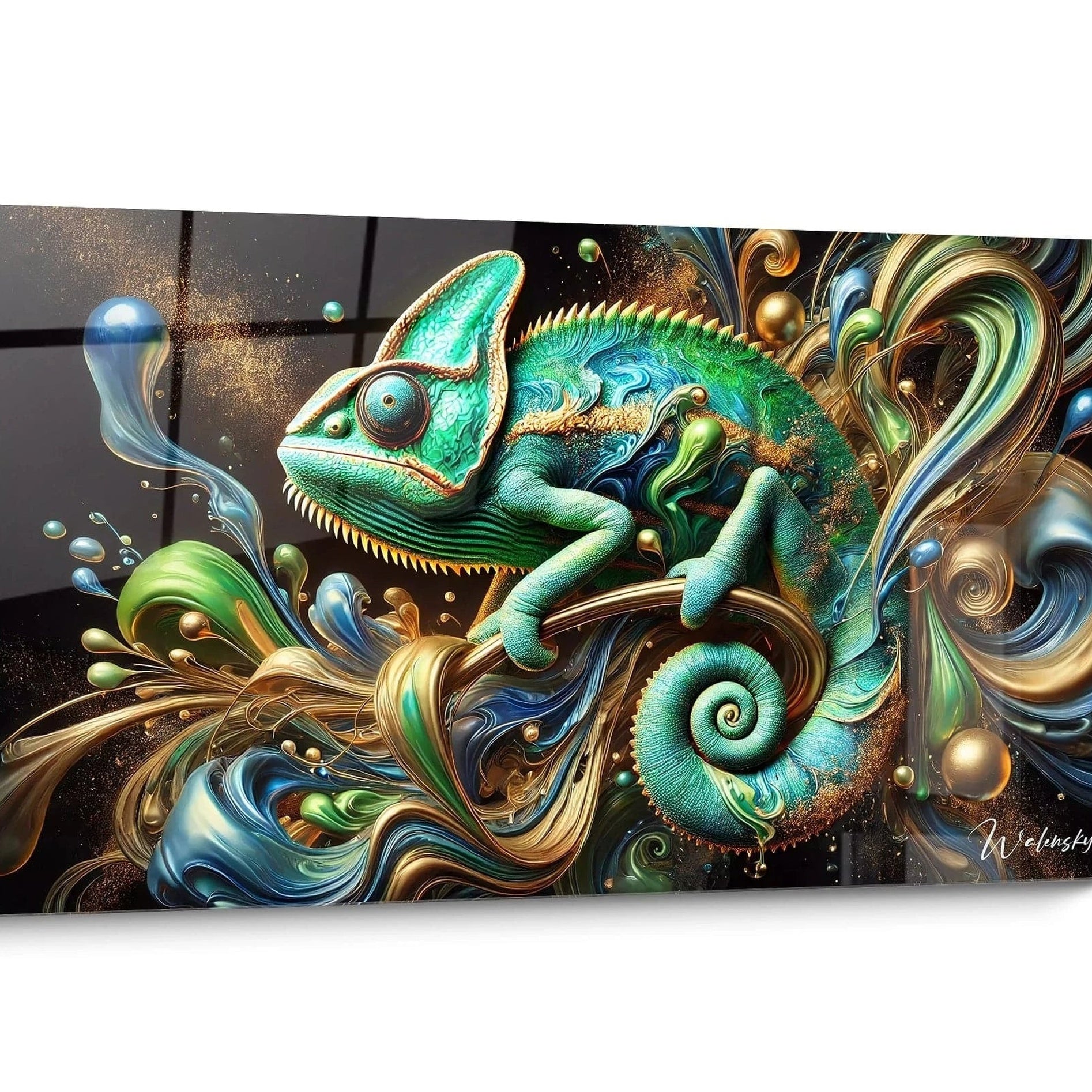
Composez votre galerie d'art

Patterned artwork and wallpaper: how to avoid cluttering?
To combine patterned artwork and wallpaper, respect the rule of opposites: busy patterns + simple artwork, or understated wallpaper + complex work. Choose complementary colors, allow space between ...

Should the artwork dictate the wall color, or vice versa?
Two possible approaches: start with an existing artwork to choose the wall color (safe), or select the wall first then the artwork (more daring). The former guarantees harmony, the latter stimulate...
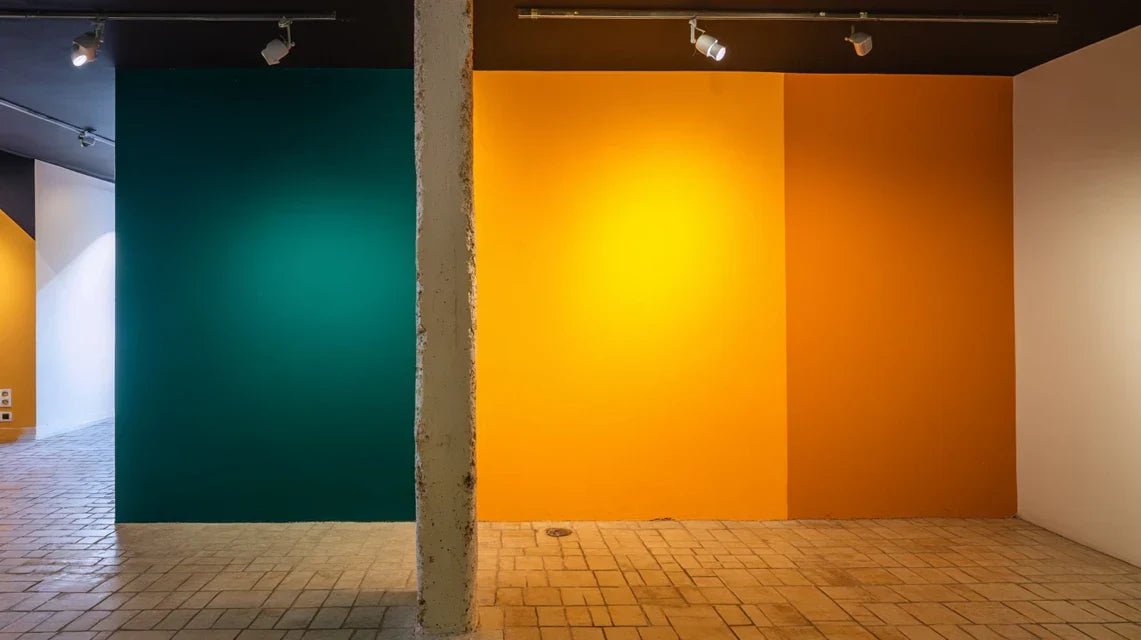
Wall Art “part painted wall – part gallery” : how to balance ?
To succeed with this bold composition: clearly define the zones (1/3 - 2/3), harmonize the colors, create a smooth transition (frieze, molding), respect a visual rhythm. This theatrical approach tr...

Monochromatic Painting: Minimalism or Invisibility?
Monochromatic painting succeeds when it plays on nuances and textures rather than contrasts. Vary the materials, finishes (matte/glossy), add gold or black details. This minimalist approach require...

Wood wall + glass artwork: natural and modern combinations
The wood-glass combination creates a rich dialogue between raw materials and smooth finishes. Wood brings warmth and authenticity, while acrylic glass adds modernity and shine. Choose artworks with...
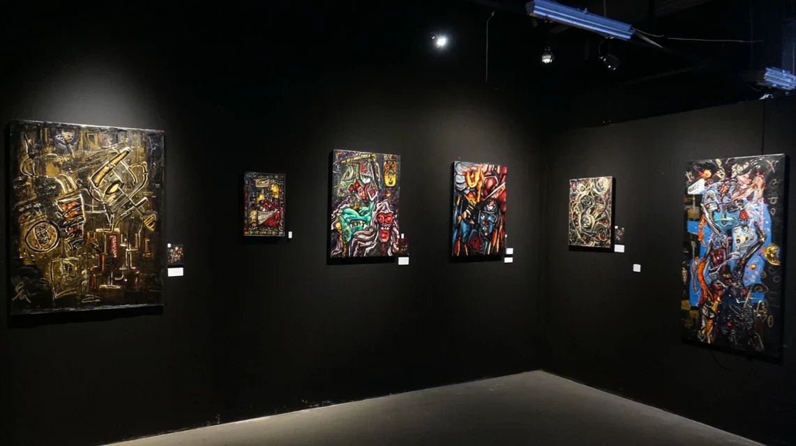
Wall art on black wall: which artworks work best?
On a black wall, golden, silver or brightly colored paintings literally explode. Favor works with white, metallics or neon tones. Black and white photographs create a gallery effect. Avoid dark ton...

Neutral on neutral: beige painting on a cream wall, good idea?
The beige-cream harmony works if you play with textures and nuances. Vary the materials: matte canvas on satin walls, textured frame, or add a touch of discreet color. The subtlety lies in the deta...