

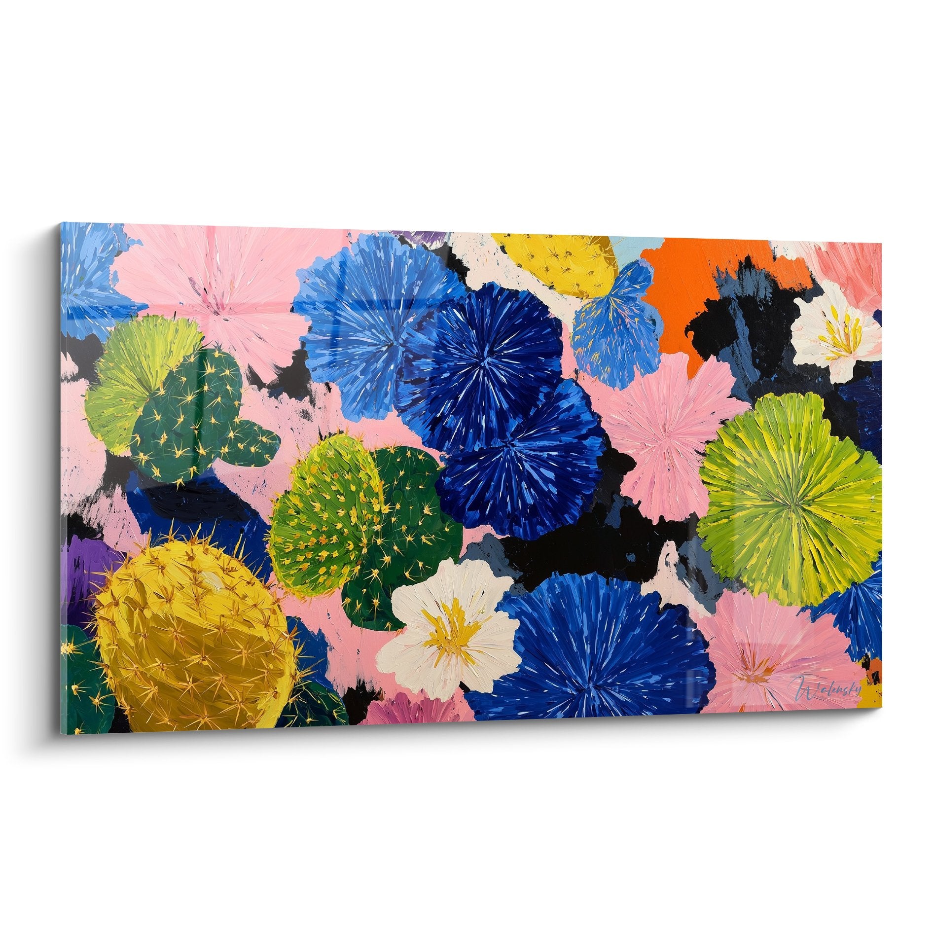






Customizing Wall Art to Match Your Company's Visual Identity
October 11, 2025 · 18 min read · by Walensky
This unpleasant feeling follows you throughout the day. Your clients notice this inconsistency, your colleagues ask questions, and you feel that dull frustration of not having succeeded in creating the perfect visual harmony that your space deserves.
You've probably tried to move the artwork, play with lighting, or even modify some decorative elements. But nothing works: this visual dissonance persists and spoils the overall impression you wanted to create.
Rest assured, it’s neither a matter of taste nor a bad artistic choice on your part. The real difficulty lies in the subtle harmonization between the artwork and your company's visual identity - a challenge that few decorators truly master.
By the end of this article, you will know exactly how to customize your wall art to perfectly reflect your corporate identity, creating that visual consistency that will impress your clients and strengthen your brand image.
Why visual harmony between wall art and corporate identity is crucial today?
In a world where brand image is decided in seconds, every detail of your professional space tells a story. A poorly integrated artwork can sabotage years of work on your visual identity, like a false note in a perfectly orchestrated symphony. The opportunity you risk missing? That of positively marking the minds of your visitors from their first impression.
Expert testimony: Sarah, director of an architecture firm, recently confided to us: "I invested €15,000 in a magnificent abstract painting for our reception hall. But the colors absolutely did not match our red and white graphic chart. As a result, our clients thought we lacked consistency in our aesthetic choices. How could they trust us with their projects?"
Conversation with a decor expert
The golden rule of visual harmony: A perfectly integrated artwork must engage with your identity without copying it, creating an emotional resonance that reinforces your brand message in less than 3 seconds of observation.

Understanding what's really happening behind this visual dissonance
You may feel that your space lacks soul despite beautiful elements, that your artworks seem "stuck" on the walls, or even that the overall look lacks sophistication despite a significant budget invested in wall art.
This frustration doesn't come from a lack of taste on your part, but from a lack of understanding of the subtle codes of visual harmonization. Most traditional decor advice completely ignores the "corporate identity" dimension when choosing artwork.
Imagine an orchestra conductor leading talented musicians without a common score: each instrument plays correctly, but the overall sound is wrong. That's exactly what’s happening with your current decor.
The first hidden cause: confusion between "assortment" and "harmony"
Contrary to popular belief, harmonizing doesn't mean perfectly matching colors. True harmony is born from the dialogue between elements, not their resemblance. A company with corporate blue colors can perfectly accommodate an artwork with orange tones.
It’s like tuning a piano with a violin: they don't produce the same frequencies, but together they create a melody. This complementarity generates more impact than a monotonous repetition of the same tones.
This revelation will completely transform your approach: you’ll stop looking for the “right color” artwork and focus on the one that will sublimate your identity through intelligent contrast. Your decor eye will gain sophistication and originality.
🔍 Immediate test: Look at your company logo and identify its complementary color on the color wheel (red/green, blue/orange, yellow/purple). See how this combination instantly creates more visual dynamism than monochrome harmony!
The second hidden cause: ignorance of your brand's "emotional language"
Many think that it’s enough to respect the colors of the logo to create consistency. In reality, each company exudes a specific emotional personality: dynamism, serenity, innovation, tradition... This emotion must be reflected in the artistic choice.
It’s like choosing the soundtrack for a film: a thriller and a romantic comedy use different instruments to create the right atmosphere. Your artwork should carry the same emotion as your brand.
Once this dimension is understood, you will never choose an artwork solely for its beauty, but for its ability to tell your company's story. Your visitors will immediately feel this narrative consistency.
The third hidden cause: the trap of uniformizing spaces
One detail almost no one notices: wanting the same style everywhere creates a monotony that detracts from your image. The reception area, meeting room and offices have different functions and should therefore breathe differently.
You can identify this trap in your company by observing if all your paintings seem to come from the same catalog, if they generate the same emotion in each room, or if no space really stands out from the others.
This uniformity creates visual fatigue for your visitors and employees, reducing the memorability of your identity and the effectiveness of your workspaces according to their specific function.
🎯 The 3 warning signs to watch out for:
- The "catalog decor" syndrome: All your paintings seem to come from the same store - a sign of a lack of unique personality
- The "sleepy museum" effect: Your works are beautiful but do not evoke any particular emotion - revealing a disconnection with your company's DNA
- Visitor confusion: You are often asked "what is your industry?" - proof that your decor does not tell your story
The trigger element: the "invisible visual signature"
The factor that really makes the difference is this "invisible visual signature" that only truly successful spaces possess. Like a domino effect, once this signature is in place, all decorative elements naturally find their place. You can identify it when your visitors spontaneously say "it looks like you" without being able to explain why.
The rule of the "emotional red thread": Each work in your company should carry a piece of your story, creating a coherent narrative journey that your visitors follow unconsciously. Test it by asking someone close to you to guess your industry after visiting your premises.
| ❌ Classic decorative approach | ✅ Identity personalization | 💡 Mechanism | 🎯 Concrete benefit |
|---|---|---|---|
| I choose what I like visually | I choose what tells my story | Emotional narrative coherence | Spontaneous memorization of your brand |
| I match the colors of my logo | I dialogue with my corporate colors | Dynamic complementarity | Multiplied and sophisticated visual impact |
| I standardize all my spaces | I adapt art to each function | Functional differentiation | Optimization of efficiency by zone |
| I focus on universal beauty | I cultivate my unique signature | Identity personalization | Immediate competitive differentiation |

Our favourite
Trace Artwork in Gold and Jade - Abstract Painting Edition
233,90€
Discover this artworkThe progressive method to personalize your paintings to your identity
Now that you understand the underlying mechanisms, personalization will become a piece of cake. We'll proceed like an architect: first the foundations (your visual DNA), then the structure (the emotional mapping of your spaces), and finally the decoration (personalized artistic choices). In 3 weeks, you’ll have created a unique visual signature that will make your premises a true ambassador for your brand.
🎨 Transformation overview: Week 1: deciphering your deep visual identity, Week 2: emotional mapping of your spaces, Week 3: artistic selection and personalization. Each step generates visible results that accumulate to create the final "wow" effect.
Step 1: Decrypting Your Company's Visual DNA (Week 1)
Starting with this foundation is essential because all subsequent artistic choices will naturally stem from it. It’s like planting strong roots before growing a tree: once your visual DNA is clarified, every decorative decision becomes obvious. You'll feel the deep satisfaction of "knowing exactly what you're looking for".
Necessary Decryption Tools
- Your complete graphic chart: Logo, color palette, typography - it reveals your conscious personality. Retrieve it from your graphic designer or agency. Make sure it contains the precise color codes (Pantone, RGB). Avoid incomplete "light" versions that mask your visual richness.
- Your company mission formulated in 3 keywords: It captures the emotion you want to convey. Ask 5 clients to describe your business in 3 adjectives, then find the common denominator. Look for words that come up spontaneously - they reveal your real emotional impact.
- Photos of your current spaces: They show the invisible inconsistencies in everyday life. Take them from the angle of a visitor discovering it. The photographic gaze reveals details that the accustomed eye no longer notices.
Now, let's move on to concrete action:
Practical Application of Decryption
Create your "emotional identity card": List 10 adjectives that perfectly describe your company, then rank them by order of importance. This prioritization reveals your dominant brand personality. Keep the top 3 - they will guide all your future artistic choices.
⏱️ Time: 45 minutes | ✅ Success when: Your 3 final keywords make you smile and say "that's exactly us!" | ⚠️ Attention: Avoid generic words like "professional" or "quality" - they don't differentiate you enough
Analyze your hidden color palette: Identify your dominant color, your secondary color, and find their complement on the color wheel. This trilogy constitutes your basic artistic palette. Test the visual effect by juxtaposing these colors - you should feel a sense of dynamic balance.
⏱️ Time: 30 minutes | ✅ Successful when: Your trilogy of colors creates a pleasant contrast without aggression | ⚠️ Attention: Do not confuse "complementary color" and "opposite color" - the first harmonizes, the second clashes
Define your "emotional temperature": Does your company exude warmth (friendliness, dynamism) or coolness (serenity, professionalism)? Close your eyes and imagine the ideal atmosphere of your reception area. This feeling guides the choice between warm and cool tones for your artworks.
⏱️ Time: 20 minutes | ✅ Successful when: You can say "we are rather..." with conviction | ⚠️ Attention: Many hesitate for fear of limiting themselves - choosing a temperature does not exclude nuances
🎪 Validation of step 1: You must have a clear identity card: 3 emotional keywords + 1 trilogy of colors + 1 dominant temperature. Test it by presenting it to a colleague - they should say "yes, that's us!". If you still doubt, that's normal: this new clarity will revolutionize your decor approach.
— Our selection


OUR RECOMMENDED PRODUCTS
Step 2: Map the emotion of each space (Week 2)
You are now moving to the next level: making your global identity dialogue with the specific needs of each area. This step is particularly rewarding because you will discover the hidden emotional potential of your premises. The snowball effect begins: each optimized space positively influences the others.
Emotional mapping tools
- Plan of your premises with annotated areas: Hall, offices, meeting rooms, relaxation areas - each area has its emotional mission. Ask for the plan from your real estate manager or draw it yourself. Make sure all passageways are identified - they are crucial for consistency in the journey. Functional analysis grid: For each space, define the priority emotion to generate: trust, creativity, serenity, dynamism... This grid transforms your decoration into a performance tool. Base yourself on the actual use, not the theoretical use of each area. Behavioral observation log: Note how people behave in each space for a week. These observations reveal the emotional dysfunctions to be corrected by wall art.
Assign an "emotional mission" to each space: Reception hall = first impression (confidence), meeting rooms = concentration (active serenity), offices = efficiency (gentle energy). Adapt according to your activity. Each mission guides the appropriate artistic style: geometric abstraction for concentration, soothing landscapes for relaxation.
⏱️ Time: 60 minutes | ✅ Successful when: Each space has its clear and different mission | ⚠️ Attention: Avoid emotional overload - a space can only carry one dominant emotion
Create your "emotional journey" of visit: Trace the typical route of a customer from entrance to exit. Identify key moments where wall art can reinforce your message: welcome (confidence), waiting (relaxation), negotiation (serenity). This emotional sequence optimizes overall customer experience.
⏱️ Time: 45 minutes | ✅ Successful when: You clearly visualize the "emotional journey" of your visitors | ⚠️ Attention: Do not neglect transition areas - they are often decisive
Step 3: Select and personalize your artworks (Week 3)
You now reach the level of a professional decorator: each artistic choice becomes strategic and consistent. What's the difference between an amateur and a connoisseur? You no longer choose what you like, but what serves your identity. The final result will be a space where each visitor instantly feels your company's personality and remembers it memorably.
Custom selection tools
- Adapted stylistic reference: Create an inspiration board mixing your graphic chart + photos of atmospheres + artistic examples corresponding to your emotional keywords. This board prevents you from making unsuitable impulsive purchases. Limit yourself to a maximum of 10 references to maintain consistency.
- Selection criteria grid: Note from 1 to 5 for: color coherence, emotional suitability, technical quality, visual impact. A painting must total at least 16/20 to be considered. This objective method avoids counter-productive crushes.
- Virtual integration test: Digitally overlay the candidate artwork on a photo of your space real. This visualization immediately reveals scale or harmony problems invisible in the catalog.
Apply your personalized "60-30-10" rule: 60% of the artwork reflects your dominant emotional temperature, 30% dialogues with your secondary colors, and 10% brings creative surprise. This proportion guarantees harmony while avoiding monotony. Visually check these proportions before purchase.
⏱️ Time: 30 minutes per artwork | ✅ Successful when: The artwork "feels right" with your identity at first glance | ⚠️ Attention: Do not force an artwork that does not naturally respect these proportions
Test the "signature" effect: Temporarily place the artwork in the intended space and observe spontaneous reactions for 48h. Positive comments like "it suits you well" confirm the success of personalization. This test phase avoids post-purchase regrets.
⏱️ Time: 48h observation | ✅ Successful when: At least 3 people make spontaneous positive comments | ⚠️ Attention: Polite compliments do not count - only authentic reactions validate
The intelligent progression rule: Start by personalizing the most visible space (welcome hall), then gradually expand. Each success gives you confidence and refines your eye. Wait to be 100% satisfied with one space before moving on to the next - quality takes precedence over speed.
Congratulations! You now master the subtleties of an expert that transform a simple wall hanging into a true identity signature. These advanced techniques give you a decisive advantage over 95% of companies that decorate "by feel" without a coherent strategy.
🏆 Master decorator technique: Create subtle visual "echoes" between your spaces: same family of shapes (rounded/angular), same color intensity, or even the same artistic technique. This invisible coherence unites your premises like chapters in the same book. Concrete example: if your hall features organic curves, repeat this fluidity in the shape of the frames in your other spaces.
Frequent question from our readers
"What if my employees don't like the new paintings I chose?"
This concern is perfectly normal and reveals your concern for the well-being of your teams. The good news? When personalization is done right, it generates collective pride rather than rejection. Your employees become ambassadors of this visual identity that they recognize as "their" company. To dispel this doubt, involve them in the process by presenting your approach and collecting their feedback on the desired atmosphere. Their adhesion will come naturally when they understand the logic.
💡 Immediate reassuring action: Conduct an anonymous mini-survey on "the ideal office atmosphere" with your teams. You will discover that their expectations naturally align with your company's vision - this convergence will reassure you in your artistic choices.
— You may also like


The 5 mistakes to absolutely avoid when personalizing
Warning, these traps are insidious and can sabotage months of reflection! I share them to protect you from the disappointments that unfortunately too many entrepreneurs experience. These errors are normal but totally avoidable with the right reflexes.
- 🚫 The "mismatched collection" trap: Buying piece by piece without an overall vision. It's tempting because each work taken in isolation is beautiful, but the global result lacks narrative coherence. Consequence: your spaces look like a patchwork with no personality. Solution: Always buy thinking about your entire decorative journey. Rest assured: 80% of corporate art buyers fall into this trap at first! 🚫 The "over-personalization" error: Wanting to incorporate your logo or colors everywhere. This visual insistence fatigues the eye and gives an aggressive commercial impression rather than a refined one. Consequence: Your visitors feel "attacked" by your identity instead of being seduced. Alternative: Focus on subtlety - an emotional resonance is better than graphic repetition. It's normal: the line between personalization and intrusion is fine! 🚫 The "functional uniformity" syndrome: Choosing the same artistic style for all your spaces under the pretext of consistency. Result: your offices and relaxation room generate the same emotion, reducing the effectiveness of each zone. Consequence: Visual fatigue and decreased productivity depending on the space. Corrective action: vary styles while maintaining subtle links (same extended palette, same finish quality). Many make this mistake thinking they are doing well! 🚫 The "rush purchase" defect: Crashing for a work without testing it in the real space. Lighting, proportions, acoustics completely change the perception of a painting. Consequence: Post-installation disappointment and wasted budget. Prevention: Always negotiate a trial period or use digital visualization. This haste happens to the most cautious when they find "the" perfect piece! 🚫 Neglecting the "wear and tear" effect: Choosing a very impactful work without anticipating long-term fatigue. What impresses at first glance can become overwhelming on a daily basis. Consequence : you end up avoiding certain areas of your own premises! Solution : favor works with a "progressive revelation" that reveal their details over time. Even professional decorators sometimes get it wrong!
🛡️ Anti-error verification system: Before any purchase, check 4 points : Does the work tell your story? (narrative test), does it integrate harmoniously? (visual test), does it respect the function of the space? (functional test), will you be able to stand it every day? (durability test). Warning signs : hesitation for more than 24 hours, need to "convince" your loved ones, or a sentence like "it will work fine".
— In the same vein


Your most frequently asked questions about customization
Allow 3 to 6 weeks for a complete transformation, depending on the size of your premises. The reflection phase (identification of your DNA) takes 1 week, selection 2-3 weeks, final installation 1 week. Optimization : start with your reception area for an immediate impact, then gradually extend. Concrete example : a 200m² cabinet with 5 distinct areas was completely personalized in 4 weeks using this progressive method.
Between €150 and €800 per square meter of wall surface to decorate, depending on the desired level of finish. For a 30m² hall: average budget of €6,000. Budget tip : invest 60% in the reception area (maximum impact), 30% in customer areas, 10% in internal zones. Return on investment : a consistent visual identity increases brand memorability by 23% according to marketing studies.
Forget traditional "industry codes"! An accounting firm can perfectly adopt colorful contemporary art if it wants to project innovation and modernity. The real question: does this style express your company's unique personality? Practical test: show 3 different styles to your best clients and ask which one "resembles" you the most. Their intuition often reveals your identity better than conventions.
Excellent news: 70% of your current artworks can be optimized! Changing the frame, a new location, adapted lighting, or thematic grouping is often enough. Advanced technique: create "visual bridges" with accessories (planters, cushions) in the colors of your chart. Only exchange criterion: if an artwork generates an emotion totally opposite to your identity (e.g., melancholy for a dynamic company).
Turn them into actors rather than spectators! Organize a "our identity in 3 words" workshop with your collaborators - their conclusions will naturally join your vision. Practical phase: ask them to vote for 3 atmospheres out of 10 proposed for each space. Surprising benefit: this involvement strengthens their sense of belonging and makes them your best ambassadors with clients. Attention: keep the final decision-making power - too much democracy harms coherence.
Your transformation into a visual identity expert
In 3 weeks, when you cross the threshold of your premises, you will feel that deep satisfaction of work accomplished. Visitors will immediately notice this "signature" unique to you that distinguishes you from your competitors. Your employees will express their pride in working in an environment that resembles them, and you will discover that particular pleasure of receiving compliments on the "exceptional atmosphere" of your company.
This mastery of visual harmony goes far beyond simple decoration: you have developed a strategic eye that will serve you in all your future visual choices. Communication, packaging, events... your new aesthetic sensitivity will become a lasting competitive advantage that strengthens your professional credibility in all areas.
Understanding was indeed the most difficult step - now that you know "why", the "how" flows naturally. Your first concrete action? Identify today your 3 emotional keywords by asking yourself this question: "How would I like the atmosphere of my company to be described?". These 3 words are your compass - the rest will follow naturally!
🎯 Your signature awaits you: You now have all the keys to create a unique visual identity that truly reflects you. This personalization is no longer a luxury but a strategic investment in your brand image. Your space of tomorrow starts with your first decision today !
Also read: 📖 Read more articles on corporate wall art
</div


