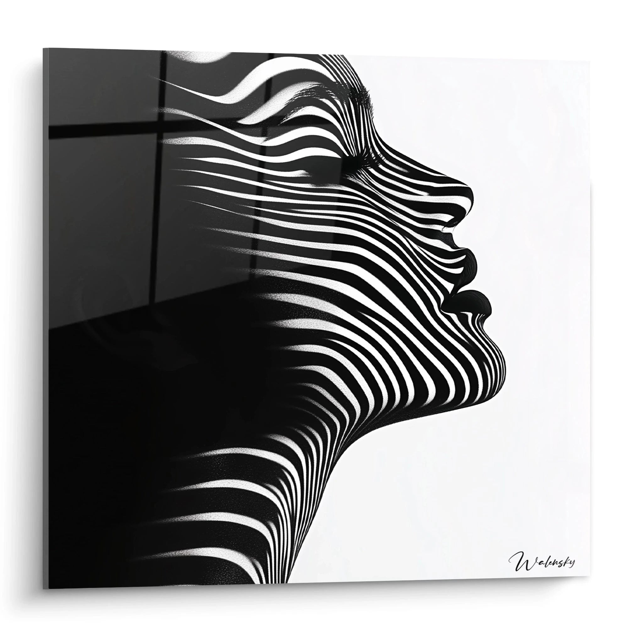
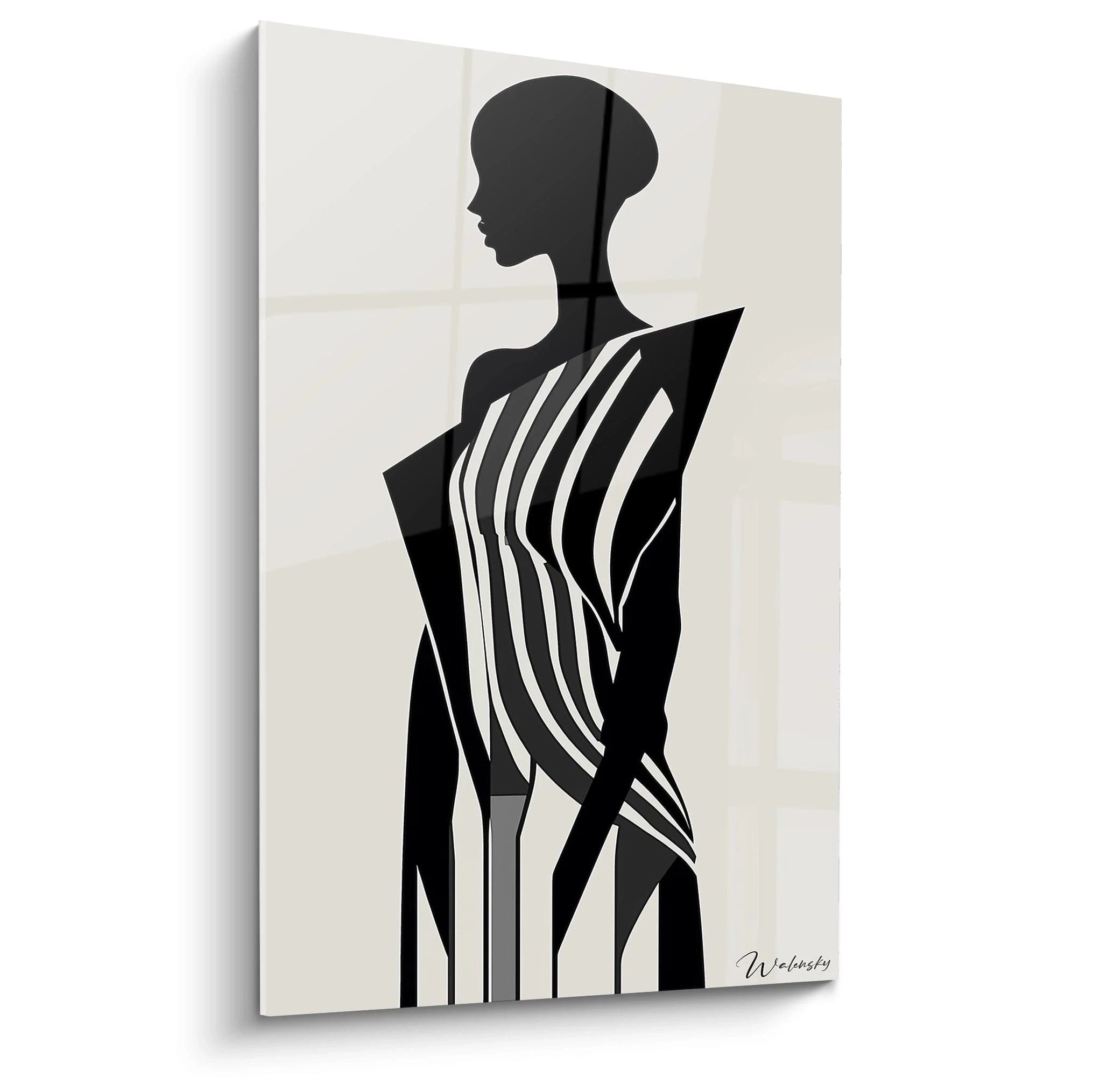
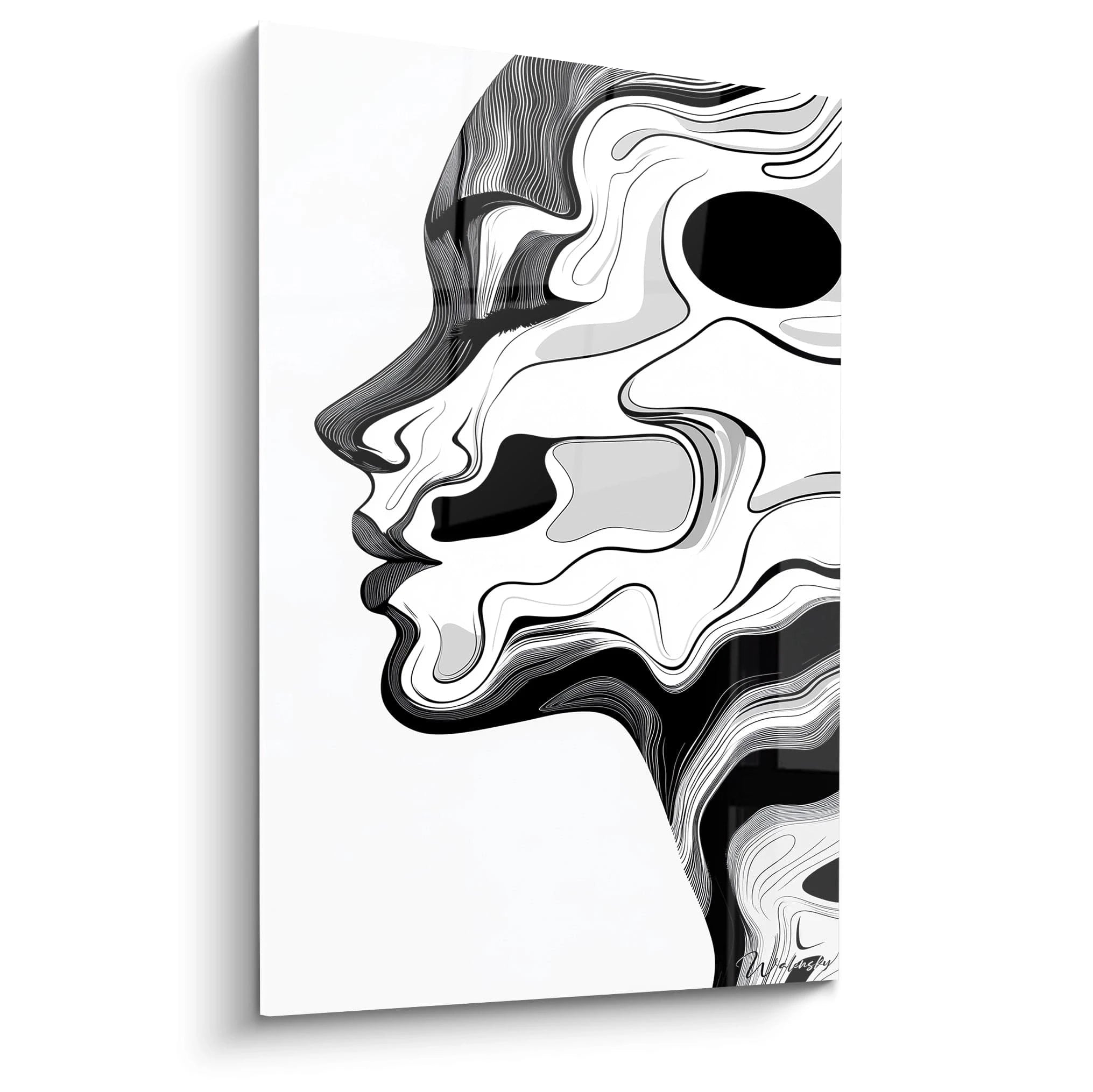
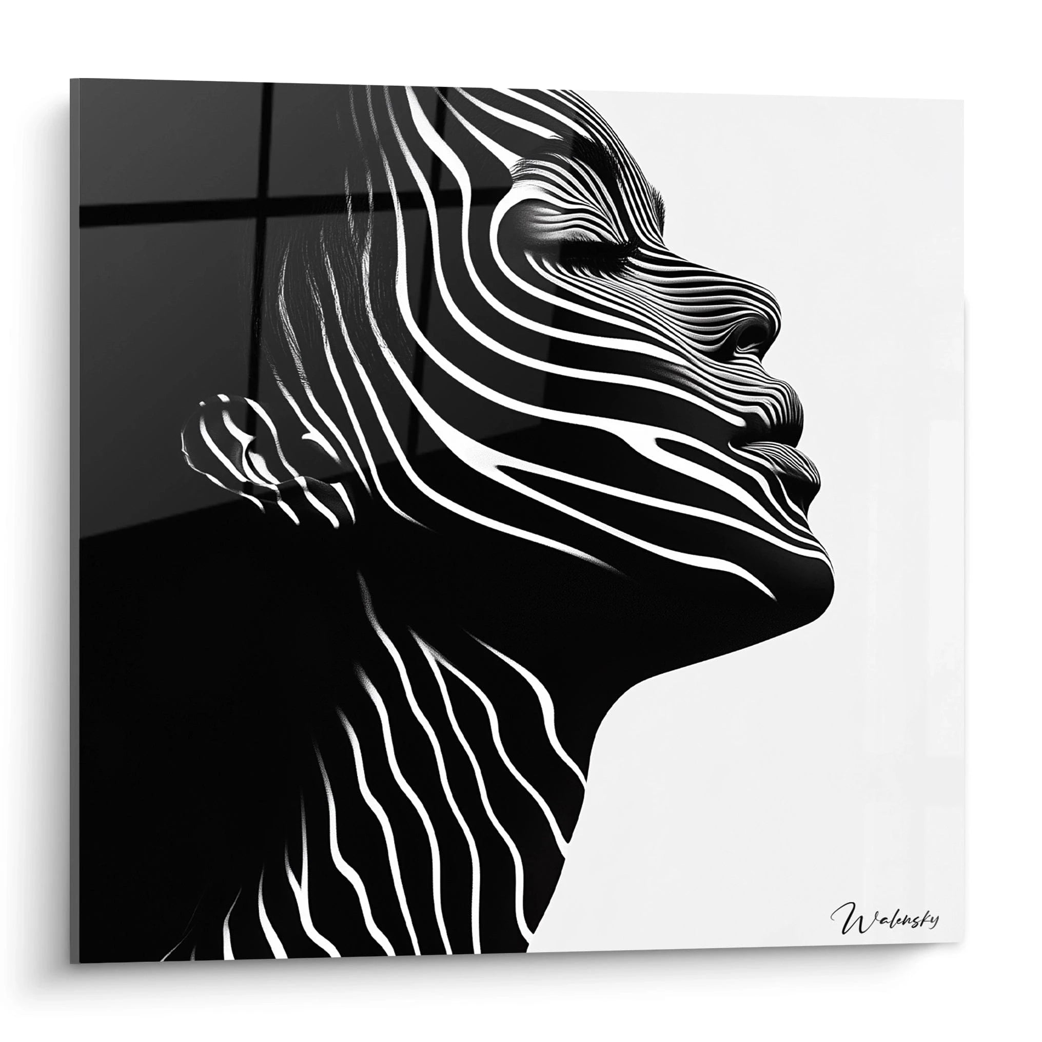
A black and white striped portrait wall art emerges as a strategic decorative solution for spaces characterized by pronounced verticality. This specific orientation addresses the architectural constraints of narrow walls, slender corridors and circulation areas where horizontal format would be disproportionate. Monochrome stripes in portrait orientation create a visual elongation effect particularly sought after in contemporary environments where every vertical centimeter counts. The alliance of linear graphic design and vertical format radically transforms the spatial perception of rooms with high ceilings or walls restricted in width.
Portrait Orientation at the Service of Vertical Architecture
The black and white striped portrait wall art masterfully exploits the vertical dimension to address specific architectural challenges. In narrow entrances, staircases or transitional spaces, this elongated format integrates naturally without encroaching on circulation. Monochrome stripes accentuate this intrinsic verticality, creating an upward dynamic that guides the eye upward.
Why prioritize portrait format for graphic stripes?
The vertical orientation of black and white stripes in portrait format generates an incomparable directional visual rhythm. Unlike horizontal compositions that visually widen space, this configuration sculpts wall height. Vertical monochrome bands create a repetitive cadence that structures space without weighing it down, particularly effective in passage areas where the eye lingers only briefly.
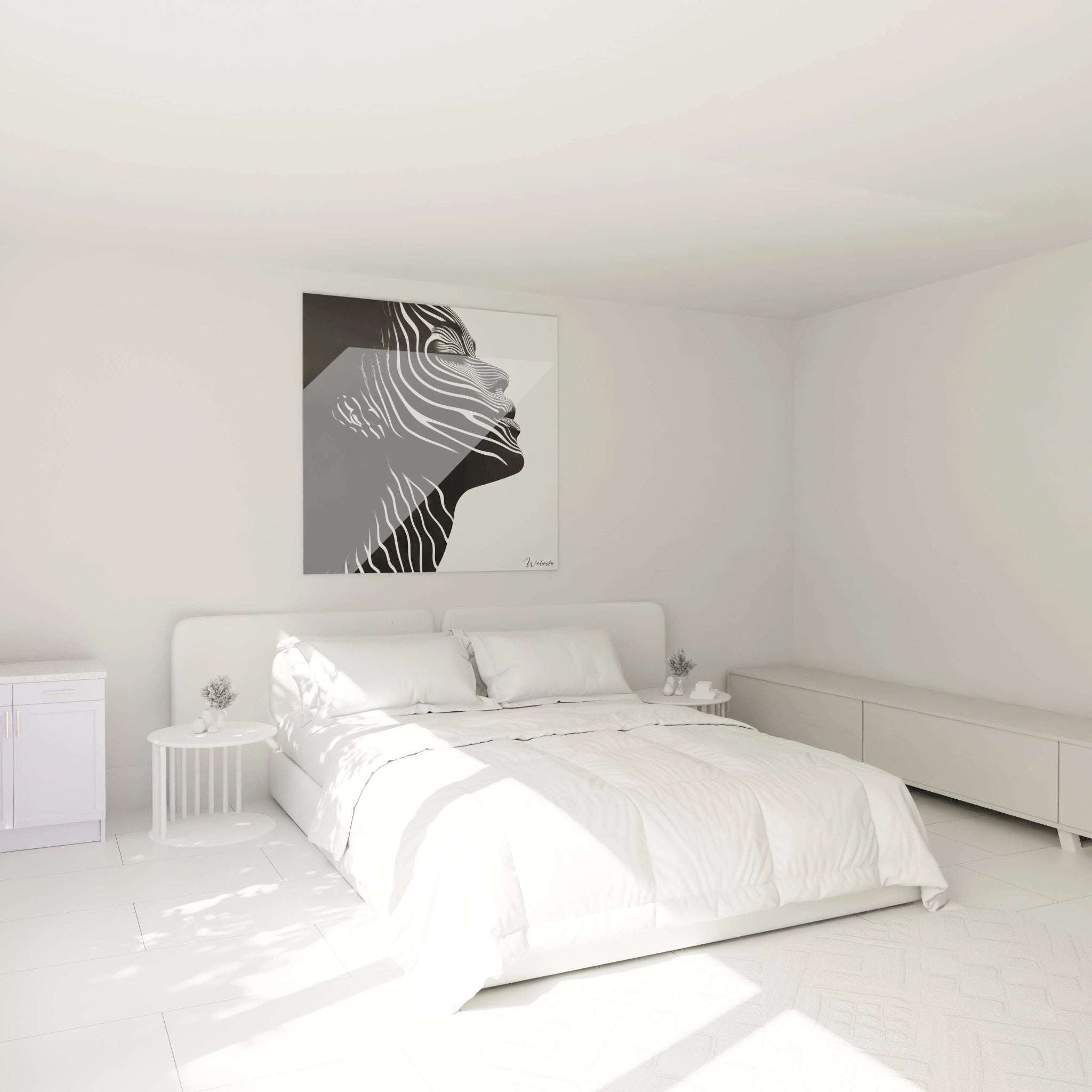
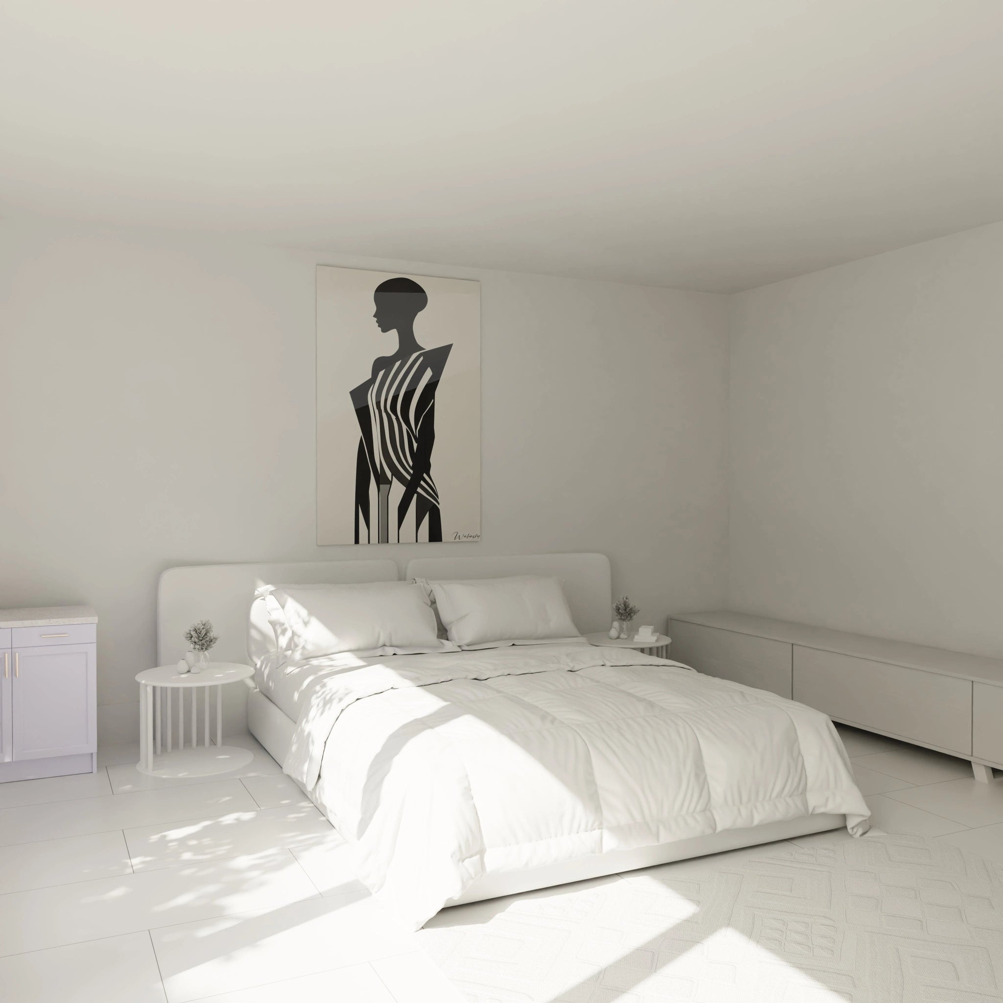
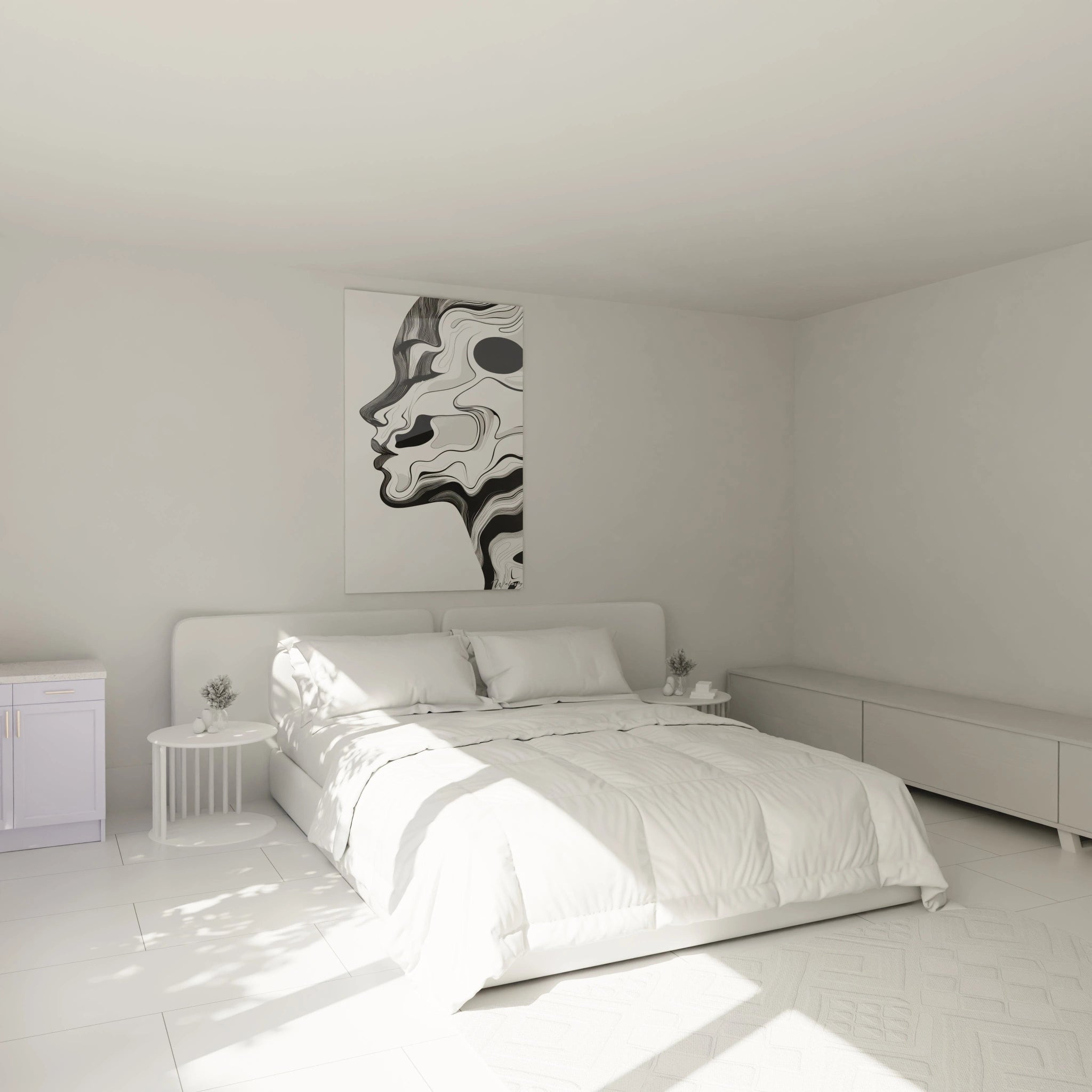
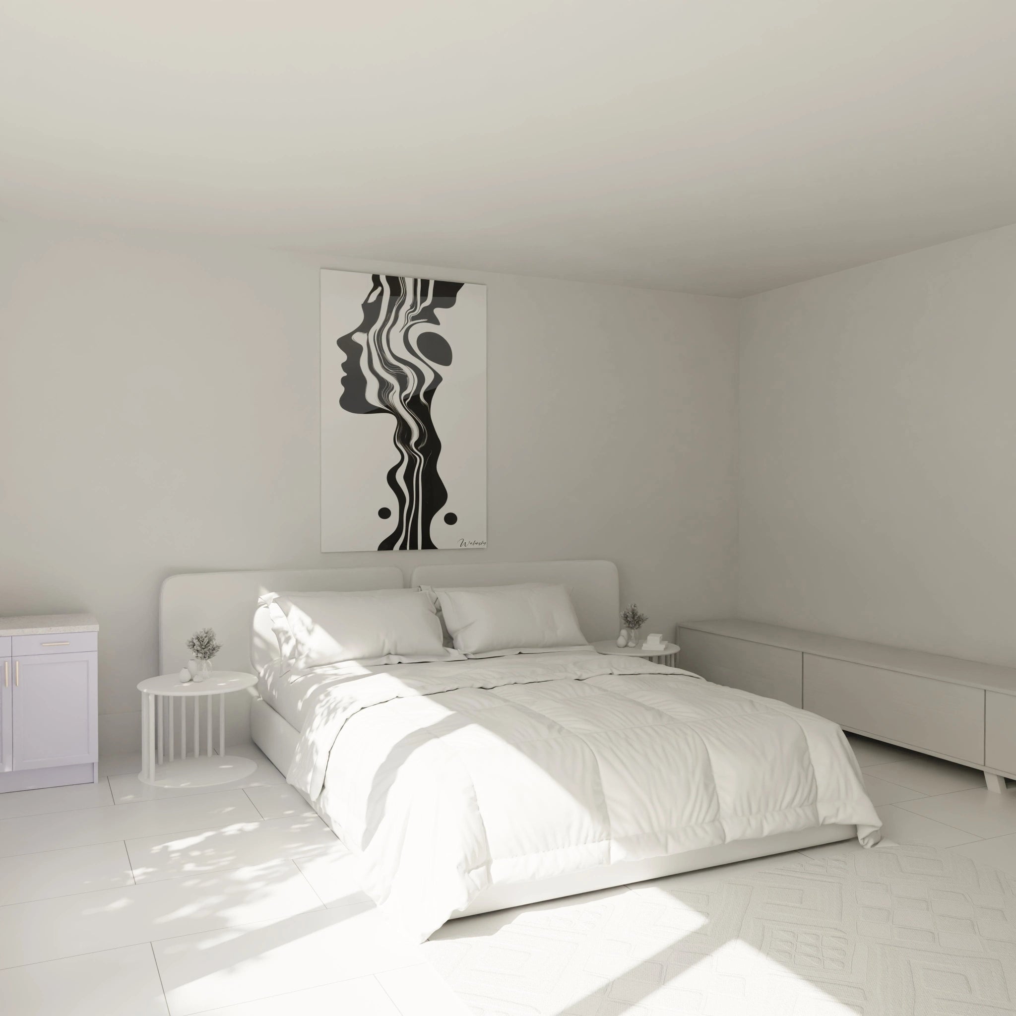
The large dimensions of these wall creations amplify their architectural impact. An imposing portrait format transforms a simple corridor into a private art gallery, fully exploiting the often-neglected ceiling height. This decorative approach perfectly suits lofts, duplexes and dwellings with generous volumes where narrow but high walls require specific visual solutions.
The vertical elongation effect in confined spaces
In environments with restricted wall surfaces, the black and white striped portrait wall art produces an optical extension phenomenon. Parallel vertical lines create an illusion of additional height, making ceilings visually higher. This decorative technique proves invaluable in urban apartments where every square meter demands visual optimization.
To maximize this architectural effect, position your wall composition on narrow walls flanking openings or in vertical corners. Monochrome stripes in portrait orientation harmoniously dialogue with door and window frames, creating a geometric continuity that structures the entire spatial ensemble. If you seek a complementary approach with less directional compositions, explore our collection of abstract black and white striped wall art to vary visual effects.
Monochrome Contrast as Psychological Amplifier
The black and white striped portrait wall art exploits the neurological power of maximum contrast to create an immediate focal point. This radical chromatic opposition instantly captures visual attention, a phenomenon particularly strategic in transitional spaces where observation time remains limited. Vertical monochrome stripes generate graphic tension that sustains interest without saturating perception.
How does black and white contrast influence spatial perception?
Black-white alternations in vertical format create an optical rhythm that psychologically structures space. This regular visual pulsation paradoxically soothes the eye while maintaining an energizing dynamic. In minimalist or Scandinavian interiors, this chromatic duality integrates as a visual punctuation element that avoids the monotony of refined palettes.
The absence of color in these graphic compositions frees mental space from any specific emotional association. Black and white in portrait orientation functions as a chromatic neutralizer that allows other decorative elements to express their colored identity. This strategic neutrality suits collectors of art wishing to preserve the decorative flexibility of their spaces.
What stripe density should you choose for optimal impact?
The frequency of vertical bands radically determines the perceptual effect of your wall composition. Wide spaced stripes create soothing visual breathing, ideal for bedrooms or offices requiring a concentration atmosphere. Conversely, closely spaced thin bands generate dynamic optical vibration, perfect for social spaces and reception areas where visual energy stimulates interactions.
In the large dimensions characteristic of our creations, prioritize proportions coherent with observation distance. For narrow corridors where proximity is inevitable, opt for medium stripes avoiding visual moiré effect. In double heights or staircases allowing substantial distance, contrasted wide bands assert their architectural presence without optical aggressiveness.
- Wide stripes (15-25 cm): structuring architectural effect for long distances
- Medium stripes (8-15 cm): versatile balance for standard residential spaces
- Fine stripes (3-8 cm): graphic dynamism for rapid-passage zones
- Irregular alternations: rhythmic sophistication for contemporary art enthusiasts
Integration Strategies for Large-Scale Vertical Formats
Installing a black and white striped portrait wall art in large dimensions requires prior architectural reflection. These imposing formats radically transform the volumetric perception of spaces, functioning more as structuring elements than simple ornaments. The pronounced verticality of these graphic compositions necessitates precise analysis of visual flows and multiple viewpoints in the room.
Where should you strategically position a large vertical format?
Privileged locations for these monumental compositions include stairwell gable walls, where available height fully values portrait format. Entry halls with generous ceilings also offer ideal vertical surfaces, creating a memorable architectural first impression. In industrial lofts, position these monochrome stripes on walls separating living spaces to visually mark functional transitions.
Contemporary professional spaces also exploit these imposing vertical formats. Corporate receptions, law offices and creative agencies use these graphic compositions to assert strong visual identity upon threshold entry. Chromatic neutrality guarantees aesthetic durability independent of corporate graphic charter evolutions.
Which chromatic environments complement these compositions?
The black and white striped portrait wall art excels in monochrome interiors where it creates sophisticated tonal continuity. Pair it with anthracite gray, off-white or sand beige walls to generate subtle monochromatic harmony that values graphic contrasts without chromatic competition. Raw materials like polished concrete, natural stone or whitewashed wood dialogue harmoniously with these linear compositions.
In colorful environments, these vertical stripes function as soothing visual pauses. Facing an accent color wall, monochrome graphics offer a restful counterpoint that balances chromatic intensity. This decorative strategy proves particularly effective in urban lofts where different functional zones showcase distinct colored identities requiring neutral transition elements.
- Complementary materials: brushed metal, textured glass, natural linen textiles
- Associated furniture: refined lines, black metal structure, wire-frame legs
- Architectural lighting: directional spotlights creating shadows accentuating stripes
- Decorative accessories: geometric sculptures, monochromatic ceramic objects
How do you manage the visual impact of very large dimensions?
A monumental portrait format requires sufficient visual distance to be apprehended globally. Calculate minimum observation distance equivalent to 1.5 times the composition height for optimal perception. In constrained spaces, accept fragmented reading where stripes become architectural texture rather than complete image, creating an enveloping graphic immersion.
Maintaining these extended vertical surfaces requires thoughtful accessibility. Prioritize locations allowing periodic cleaning without obstructing furniture. Large dimensions expose more to natural light variations: anticipate reflections based on window orientation and diurnal light evolution to maintain monochrome contrast readability throughout the day.
Is a black and white striped portrait wall art suitable for low ceilings?
Paradoxically, yes. Vertical stripes create an elevation illusion that visually compensates for limited ceiling heights. Prioritize formats whose height reaches 80-90% of floor-to-ceiling distance to maximize this optical elongation effect without creating crushing disproportion.
How do you choose the width of a black and white striped portrait wall art for a corridor?
In a corridor, width should represent 50-70% of available wall width, leaving balanced lateral breathing space. This proportion avoids visual obstruction effect while sufficiently asserting graphic presence to structure circulation space.
Do vertical monochromatic stripes cause visual fatigue long-term?
No, if density is adapted to observation distance. Clear black-white contrasts in regular alternation create a soothing rhythm once perception adjusts. Unlike complex or saturating colored patterns, monochrome geometric simplicity guarantees aesthetic durability without weariness, particularly in vertical formats that structure without invading.