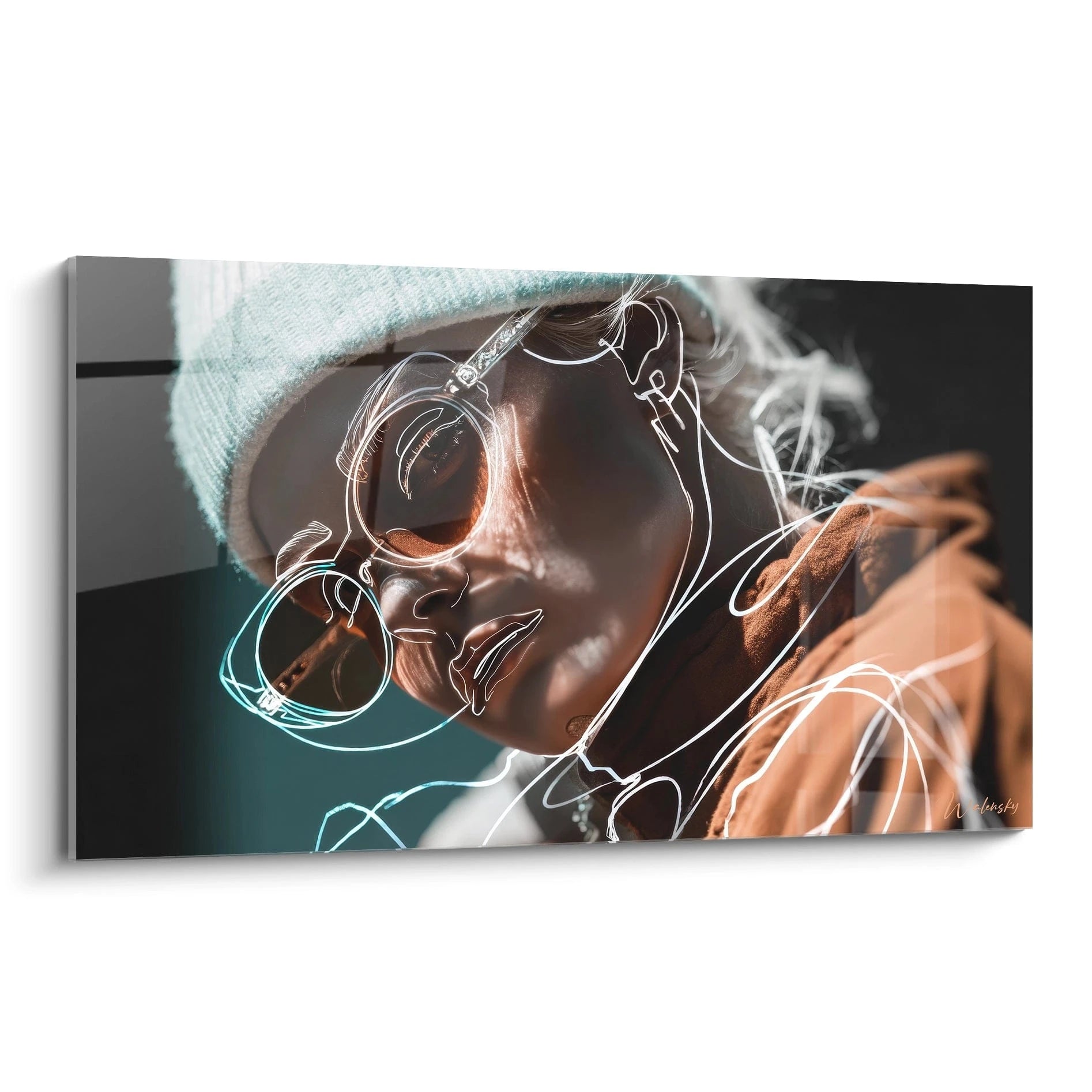
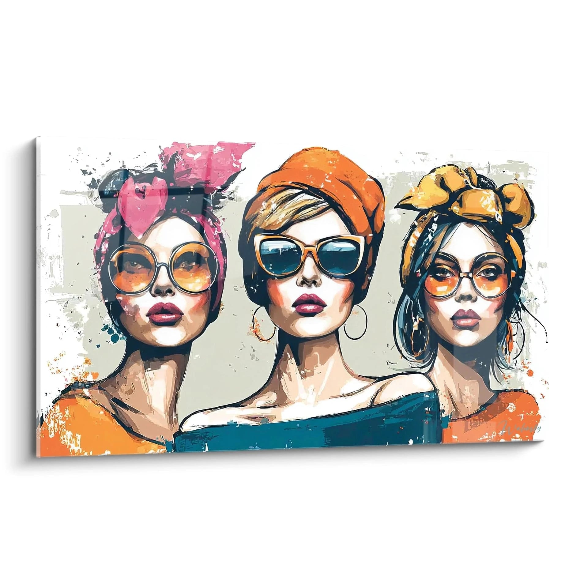
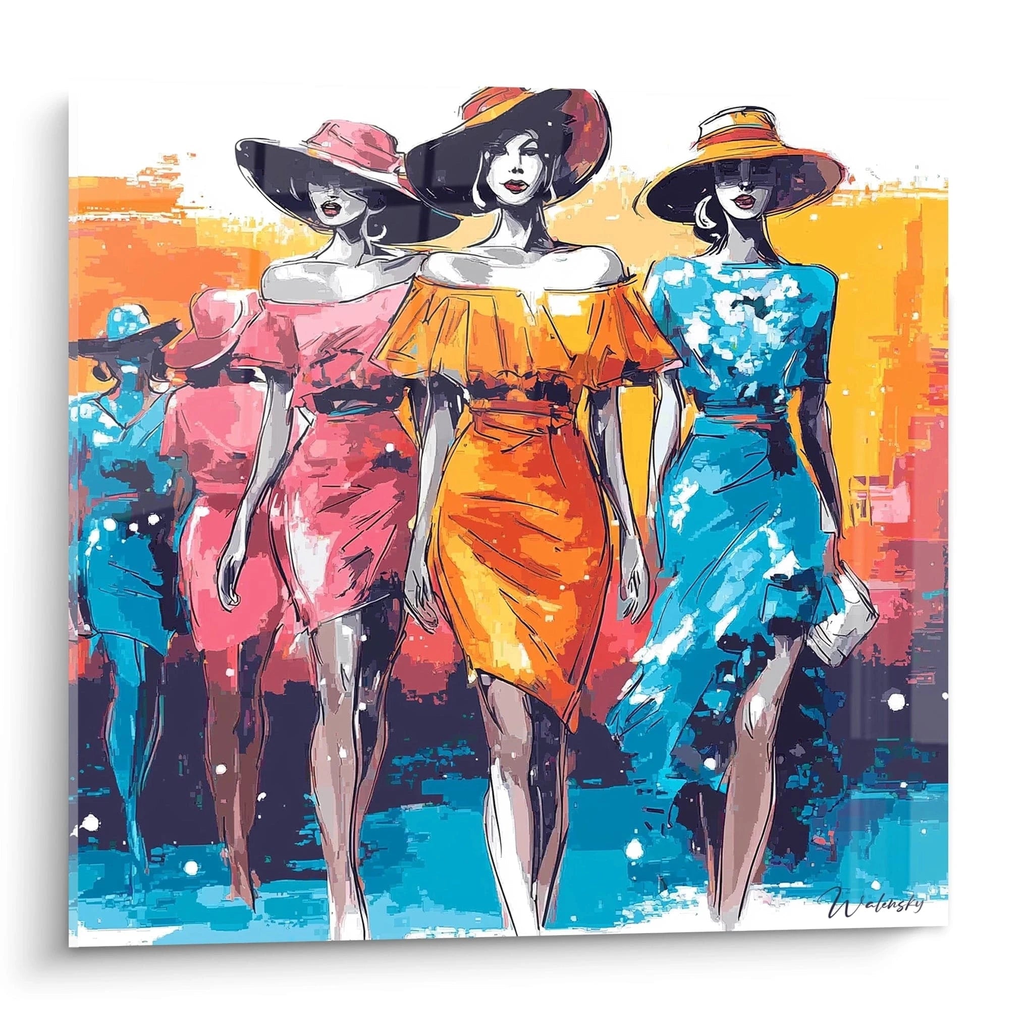
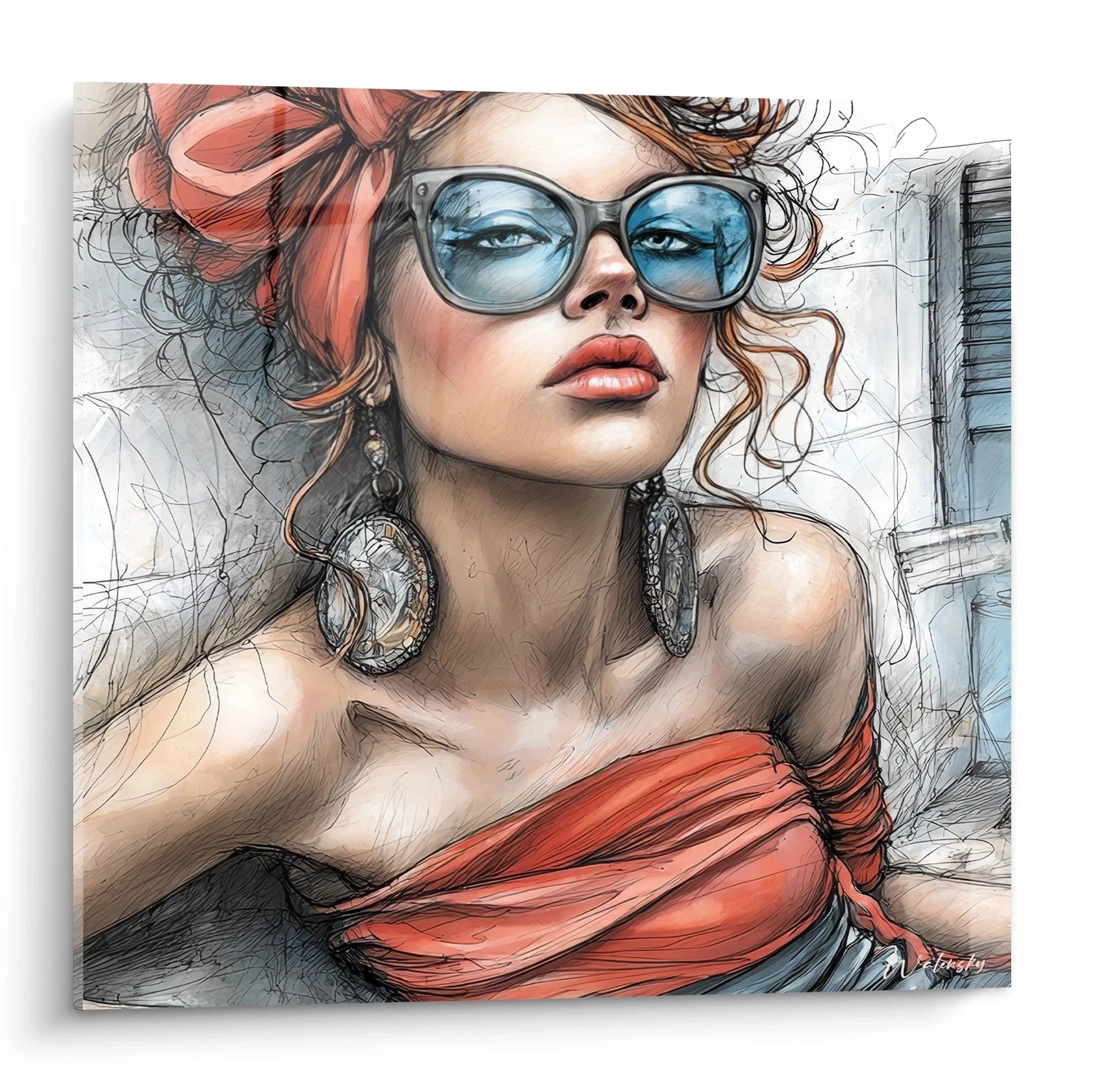
A colorful fashion illustration wall art instantly transforms the atmosphere of a commercial or residential space through its exceptional chromatic power. These large-format creations capture the bold essence of haute couture fashion shows and contemporary ready-to-wear through explosions of saturated hues that immediately energize modern interiors. Unlike monochromatic approaches, these fashion representations prioritize intense chromatic layering, striking contrasts, and vibrant gradients that evoke the creative energy of fashion capitals. Each composition celebrates stylized female silhouettes through brilliant pigments that dialogue with interior architecture, creating striking focal points in showrooms, cutting-edge boutiques, or urban lofts. The range of available formats allows for imposing wall presence that rivals the visual impact of artistic installations, while the richness of nuances offers infinite possibilities for harmonizing with sophisticated decorative environments.
The Art of Chromatic Saturation in Fashion Illustration
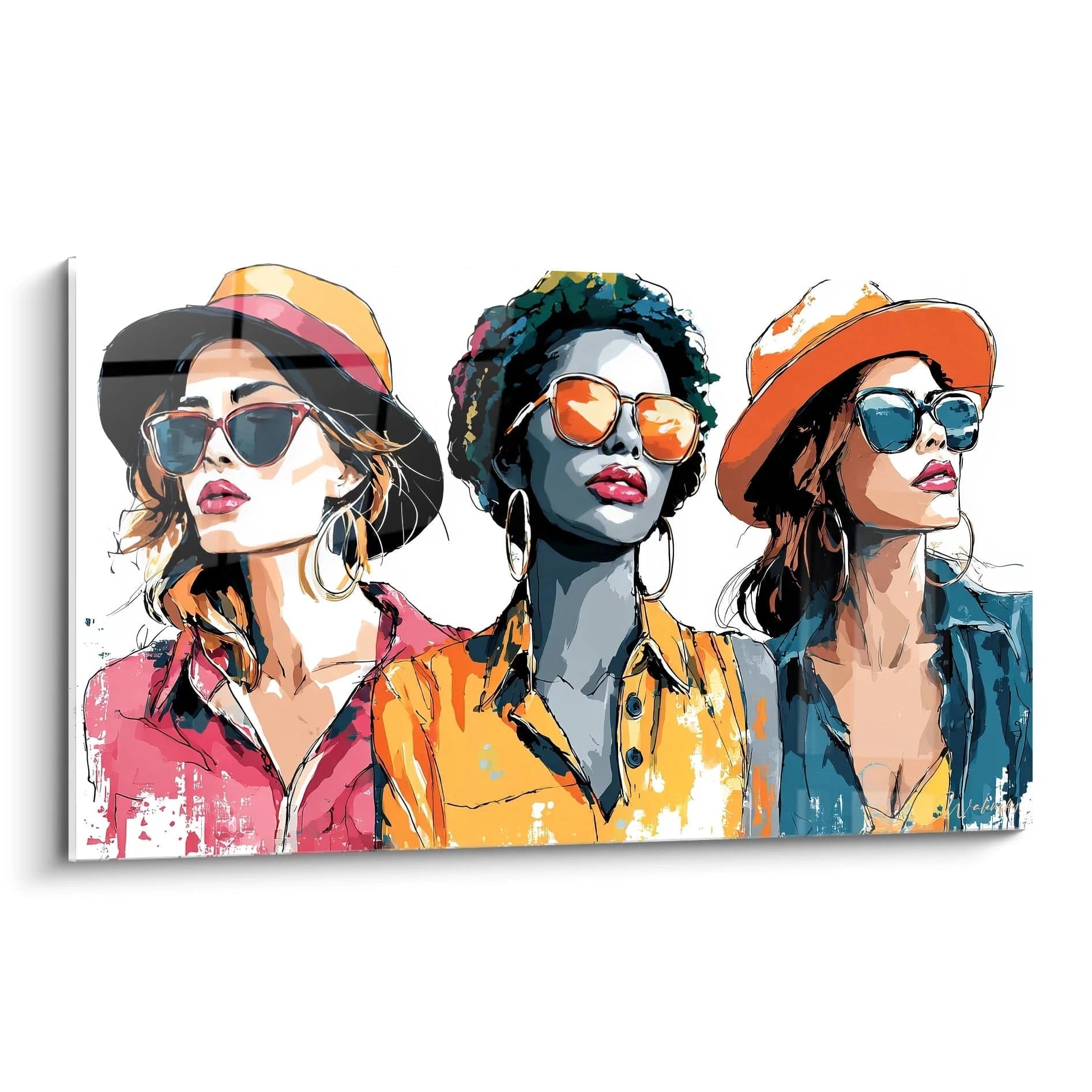
A colorful fashion illustration wall art stands out through its pigmentary audacity that transcends traditional decorative conventions. These creations exploit maximum saturations to capture visitors' immediate attention, particularly effective in commercial spaces where visual impact determines brand identity. Electrifying hues – intense fuchsias, deep cobalts, incandescent oranges – layer in complex strata that reproduce the textile richness of avant-garde collections.
Why Do Saturated Palettes Intensify Wall Presence?
The psychology of visual perception reveals that polychromatic compositions generate retinal stimulation three times superior to neutral approaches. In a retail space, this sensory activation extends client attention time by 40% according to behavioral studies. Large formats amplify this effect by creating immersive chromatic fields that literally envelope the gaze, transforming a simple wall into a stylistic manifesto. Vibrant gradients – from turquoise to magenta, lemon yellow to crimson red – create hypnotic transitions that naturally guide visual exploration.
The Balance Between Intensity and Decorative Sophistication
Contrary to common misconceptions, using vivid colors does not imply visual vulgarity. High-end fashion illustrations master the subtle balance between maximum saturation and aesthetic refinement through several compositional techniques. Chromatic rest zones – neutral or lightly tinted spaces – allow colorful explosions to breathe, preventing perceptual overload. Golden proportions often govern the distribution of color masses, creating instinctive mathematical harmony.
Which Environments Benefit Most from Vibrant Compositions?
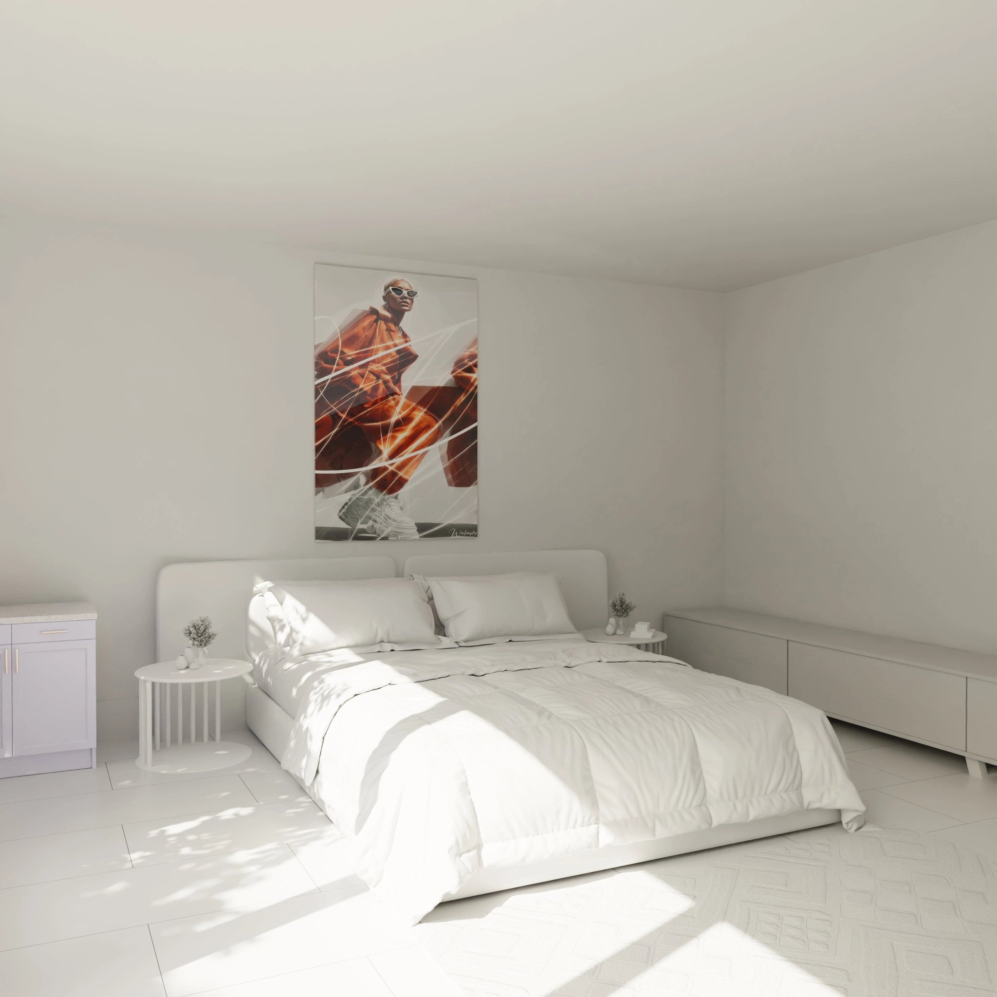
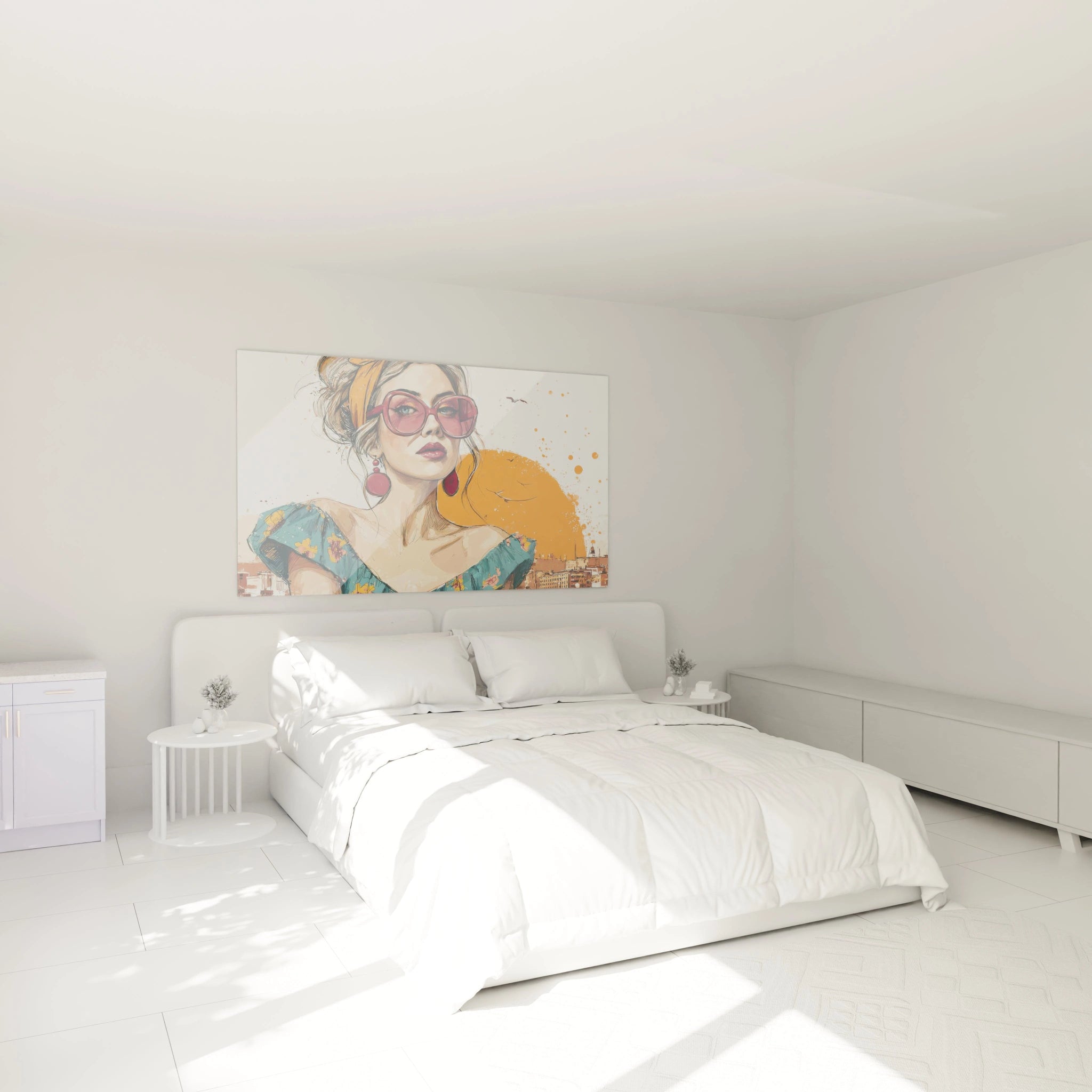
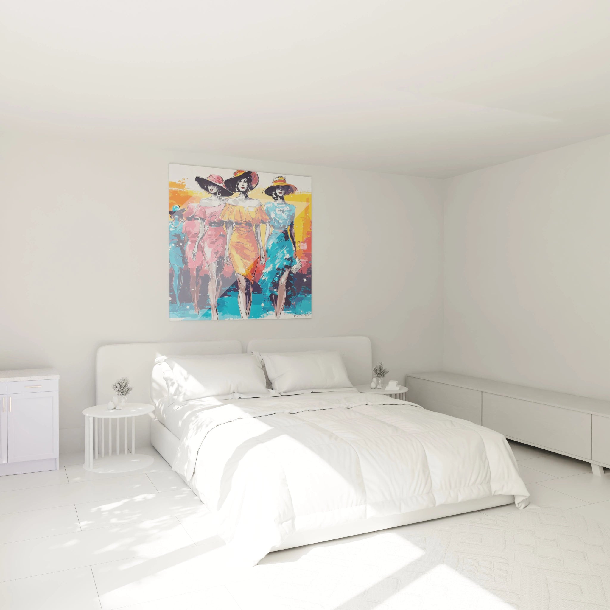
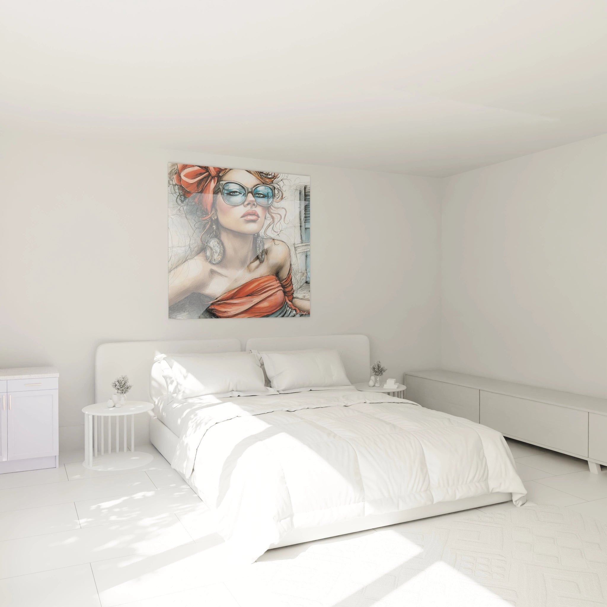
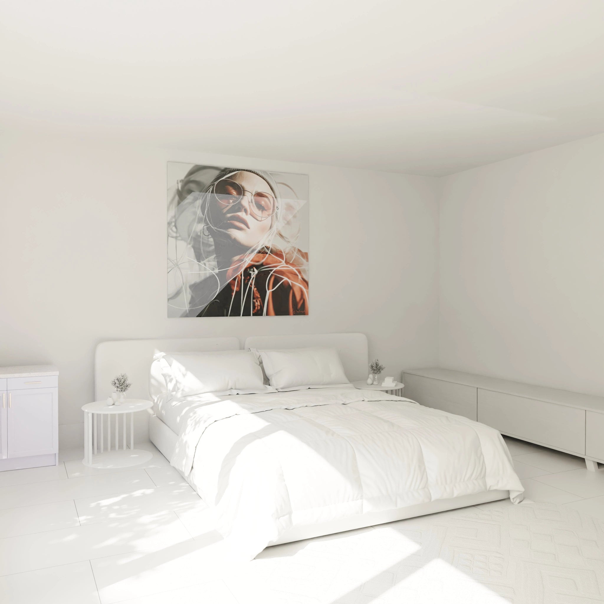
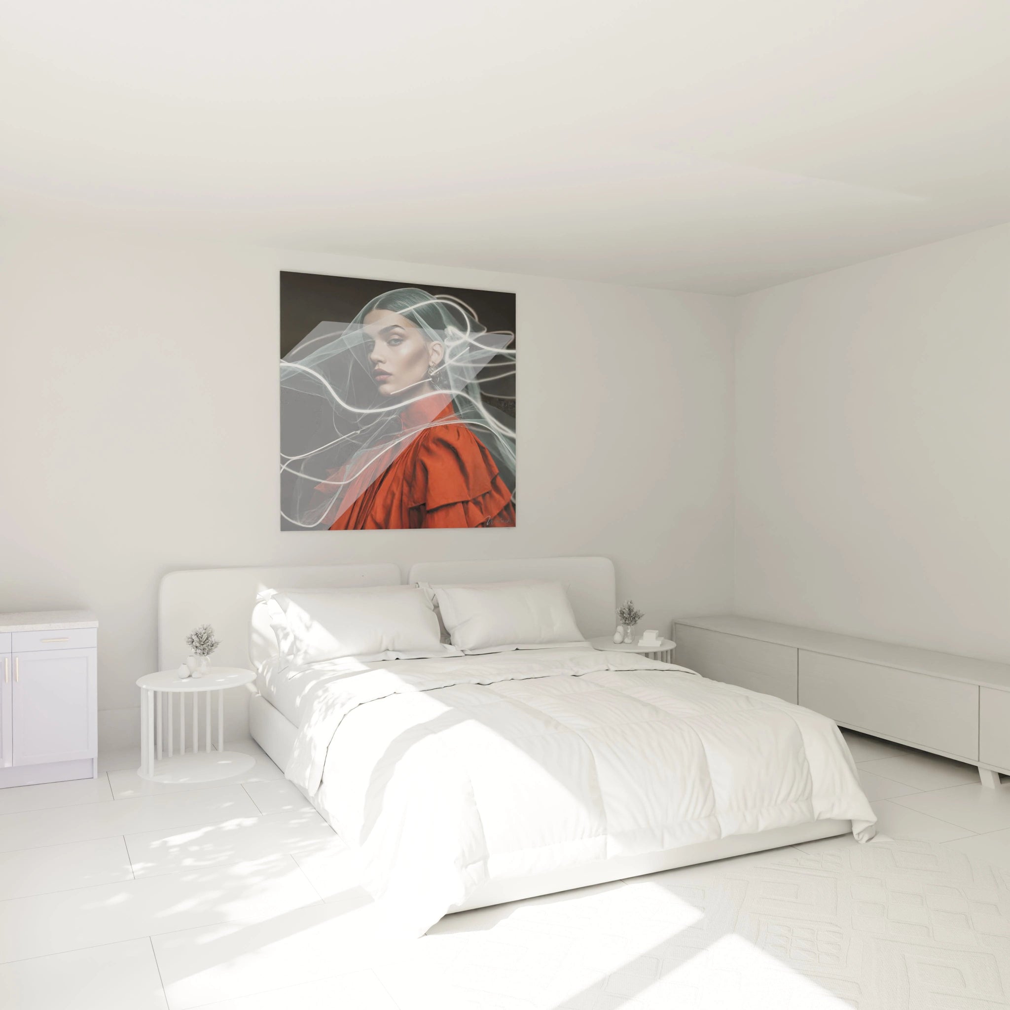
Contemporary spaces with minimalist architectures constitute the ideal setting for these chromatic explosions. An industrial loft with white walls and exposed metal structures sees its coldness neutralized by the injection of warm pigments. Women's ready-to-wear boutiques use these compositions to reinforce their creative positioning, while design agencies and creative studios find them daily inspiration catalysts. For those seeking a more understated alternative, the world of minimalist fashion illustration wall art offers an understated approach that privileges chromatic restraint. Contemporary residential living rooms transform these pieces into decorative investments that resist passing trends thanks to their paradoxical timeless character.
Integration Techniques in Existing Decorative Palettes
Inserting a colorful fashion illustration wall art requires thoughtful chromatic strategy to avoid dissonance. The extraction method involves identifying a secondary hue of the illustration – present at only 15-20% of the composition – and repeating it in three surrounding decorative elements: cushions, vases, rugs. This technique creates visual bridges that naturally integrate the centerpiece. Professionals also recommend the 60-30-10 rule: 60% of neutral tones in the space, 30% of secondary colors, 10% of vibrant accents embodied by the illustration itself.
Psychological Impact of Saturated Hues on Spatial Experience
Environmental neurosciences demonstrate that intense chromatic compositions profoundly modify our spatial perception and emotional state. A colorful fashion illustration wall art acts as a sensory stimulant that increases dopamine levels in observers, generating sensations of vitality and optimism. This neurological activation explains why commercial spaces integrating these pieces experience measurable improvements in customer mood, resulting in longer shopping journeys.
The Science of Chromatic Associations in the Fashion Universe
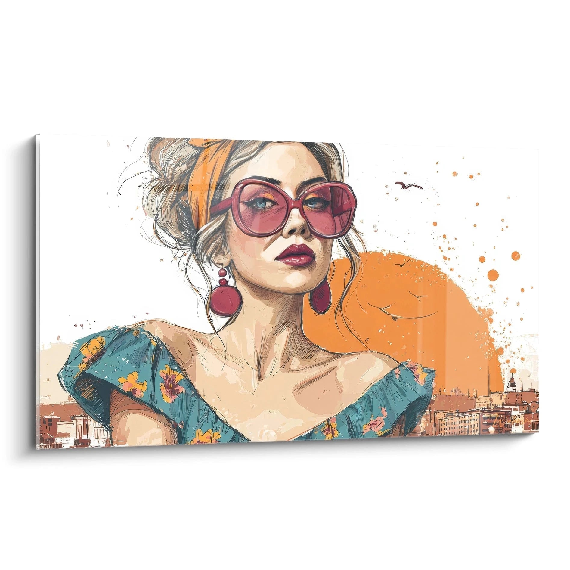
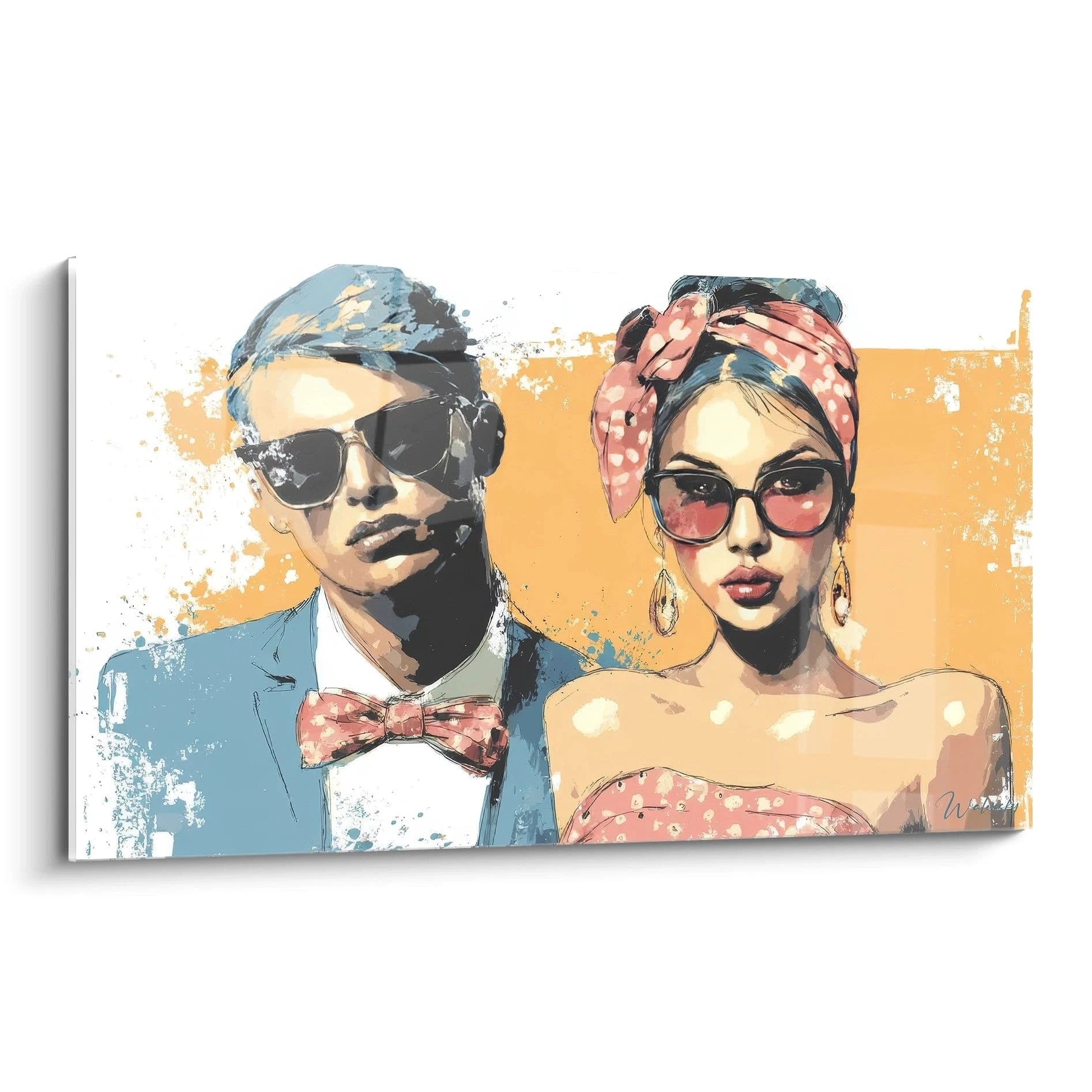
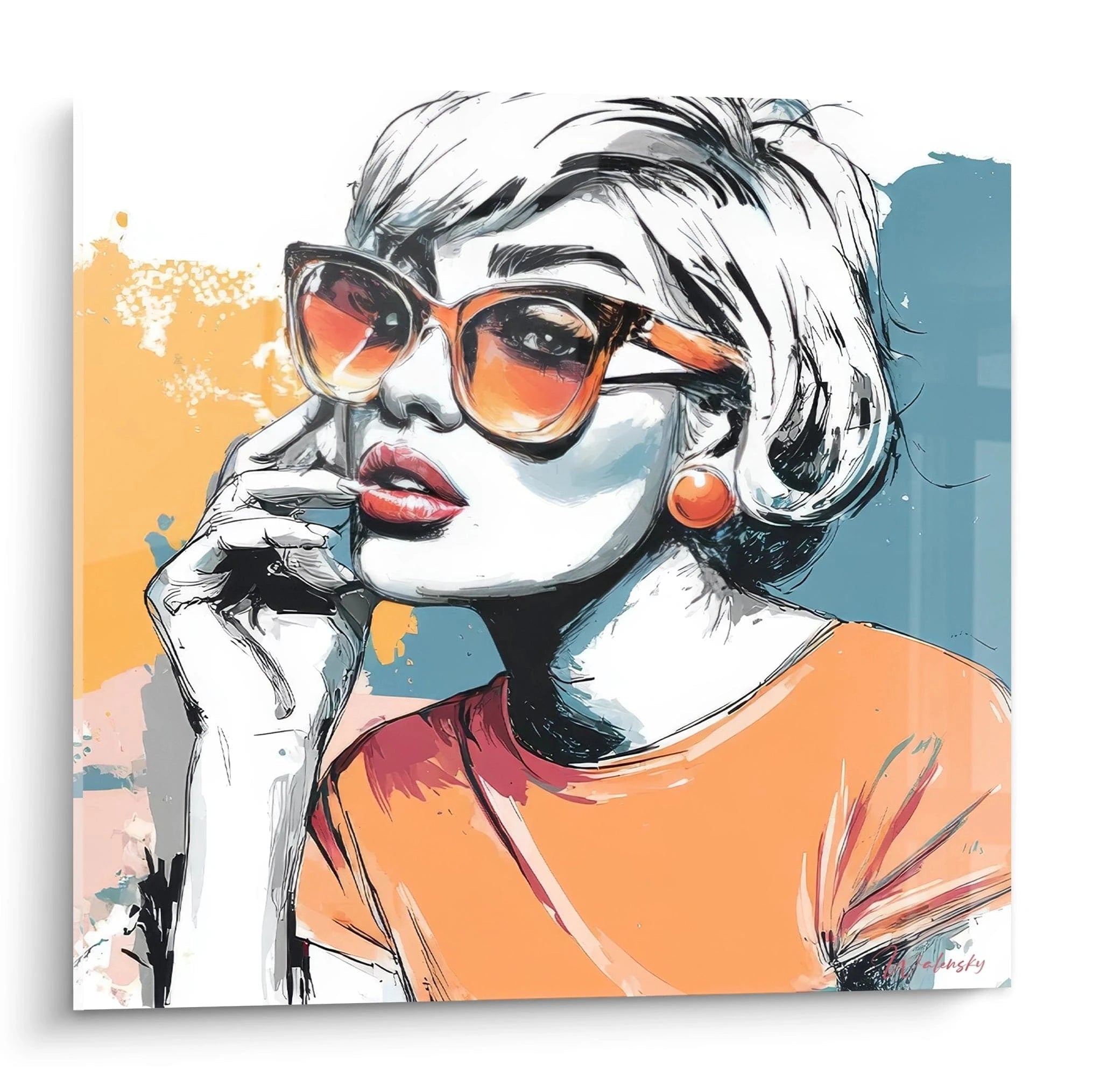
Each color combination carries specific cultural codes that fashion illustrators exploit consciously. Pink-orange pairings evoke Mediterranean sunsets and carefree summer vibes, perfect for resort collections. Blue-green associations recall ocean depths and project sophisticated aquatic elegance. Complementary triads – violet-yellow-green – create dynamic visual tensions that reflect avant-garde designers' audacity. These chromatic choices are never random but correspond to precise narrative strategies.
How Do Large Dimensions Amplify Chromatic Effect?
Monumental scale radically transforms the experience of saturated pigments. On a format of 120x180cm or larger, hues overflow habitual perceptual frames to create a peripheral chromatic environment. This visual immersion phenomenon generates measurable physiological responses: increased pupil dilation, paradoxical heart rate slowing despite stimulation, increased creativity measured by post-exposure cognitive tests. Generous surfaces also allow subtle tonal variations – 40 shades of blue for example – impossible to perceive on small formats.
Contrast Strategies to Maximize Wall Presence
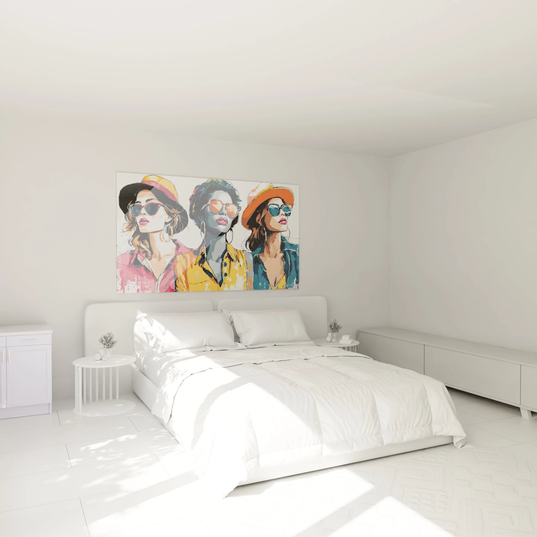
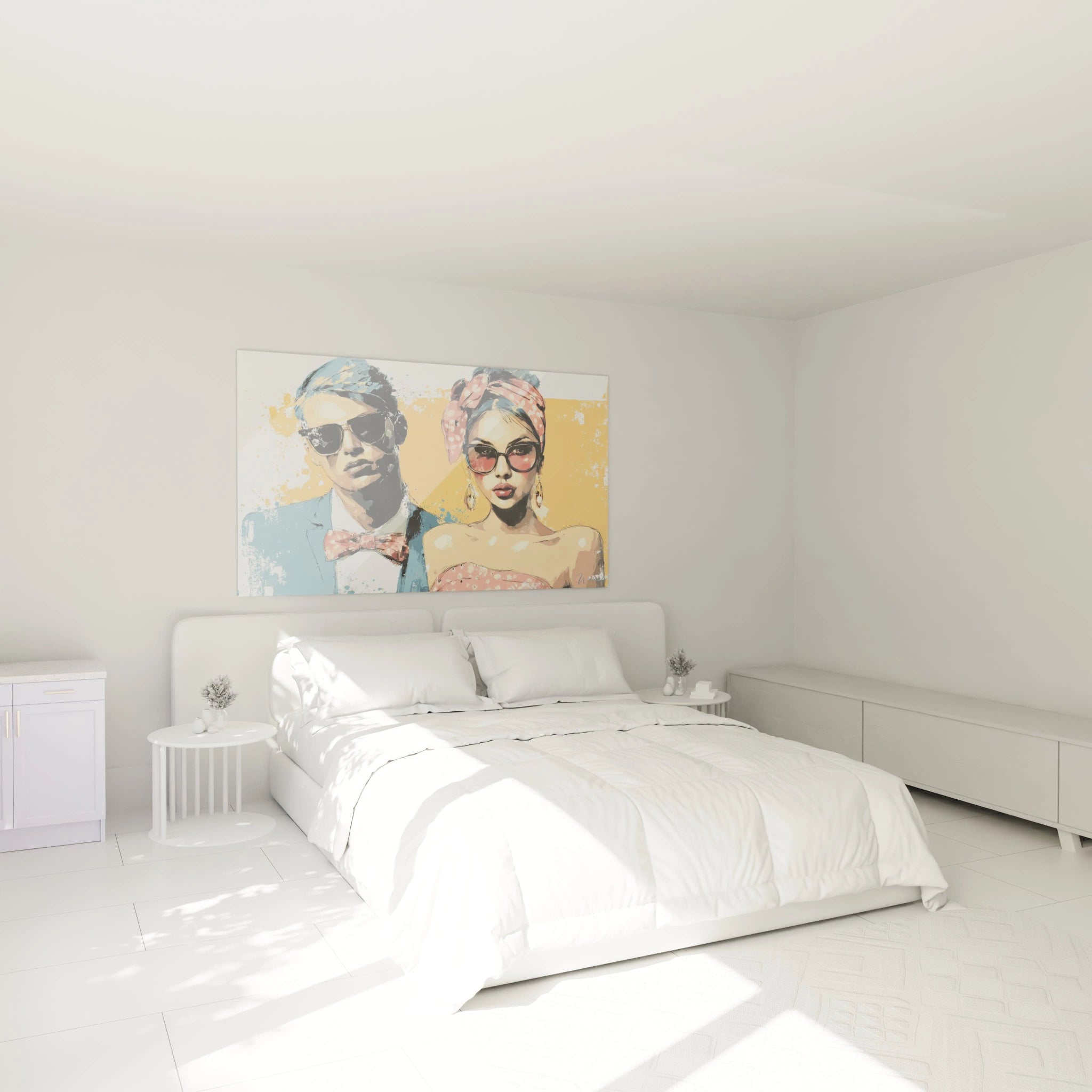
The impact of a colorful fashion illustration wall art largely depends on its immediate chromatic environment. Against an anthracite or matte black wall, vibrant hues reach maximum intensity through simultaneous contrast effect – an optical phenomenon where colors appear 30% more saturated against dark backgrounds. Conversely, on pristine white surfaces, the illustration generates a light projection effect that seems to radiate beyond its physical limits. Interior architects exploit these principles by creating dedicated chromatic niches that transform the artwork into spatial installation.
Which Fashion Styles Are Valued by Vivid Palettes?
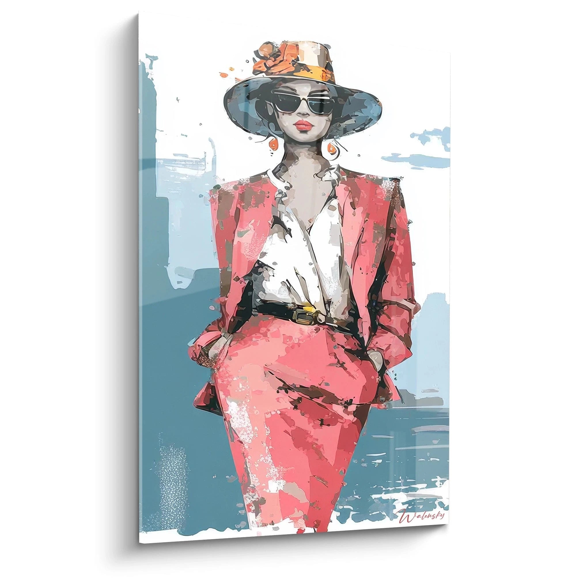
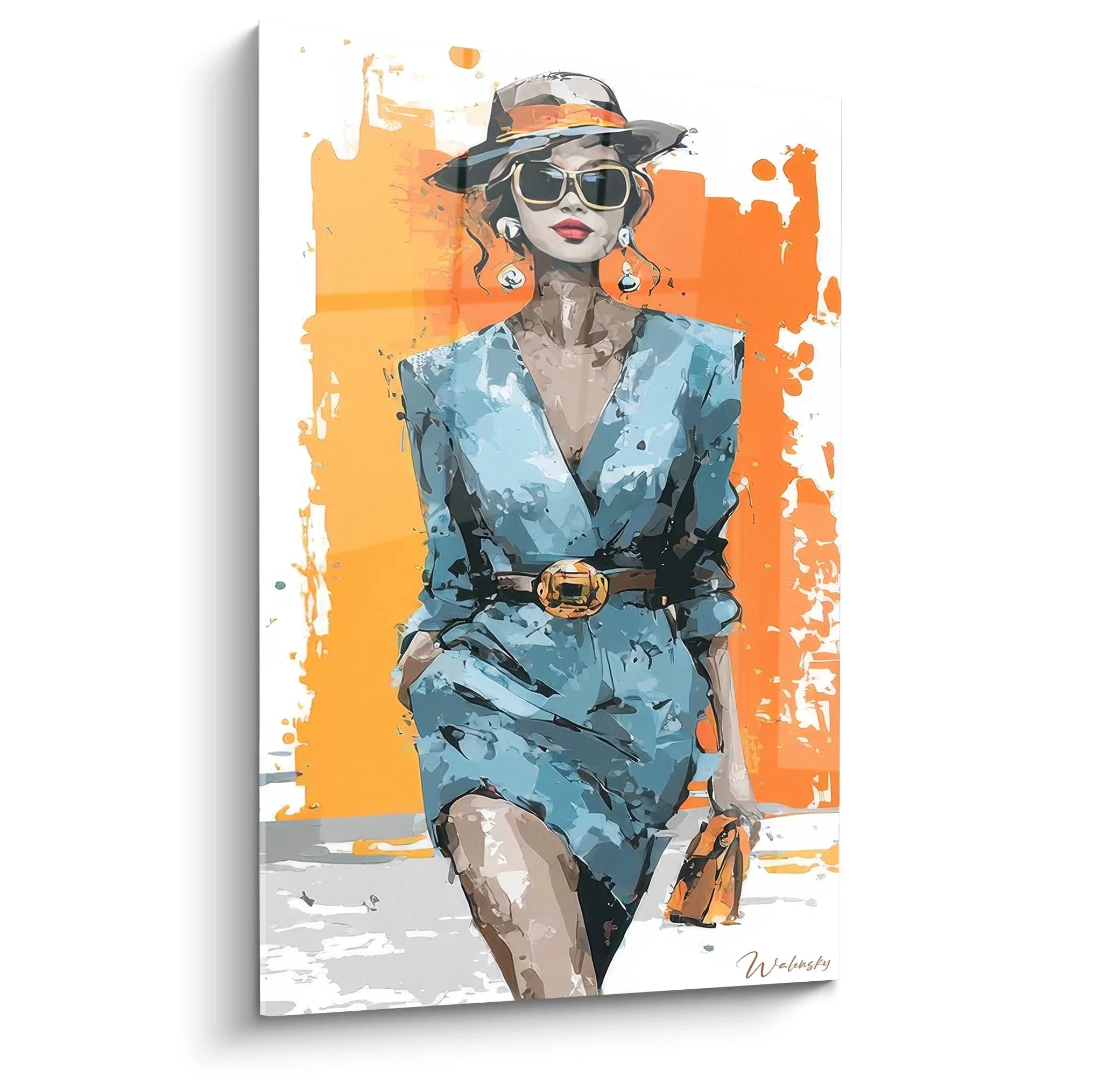
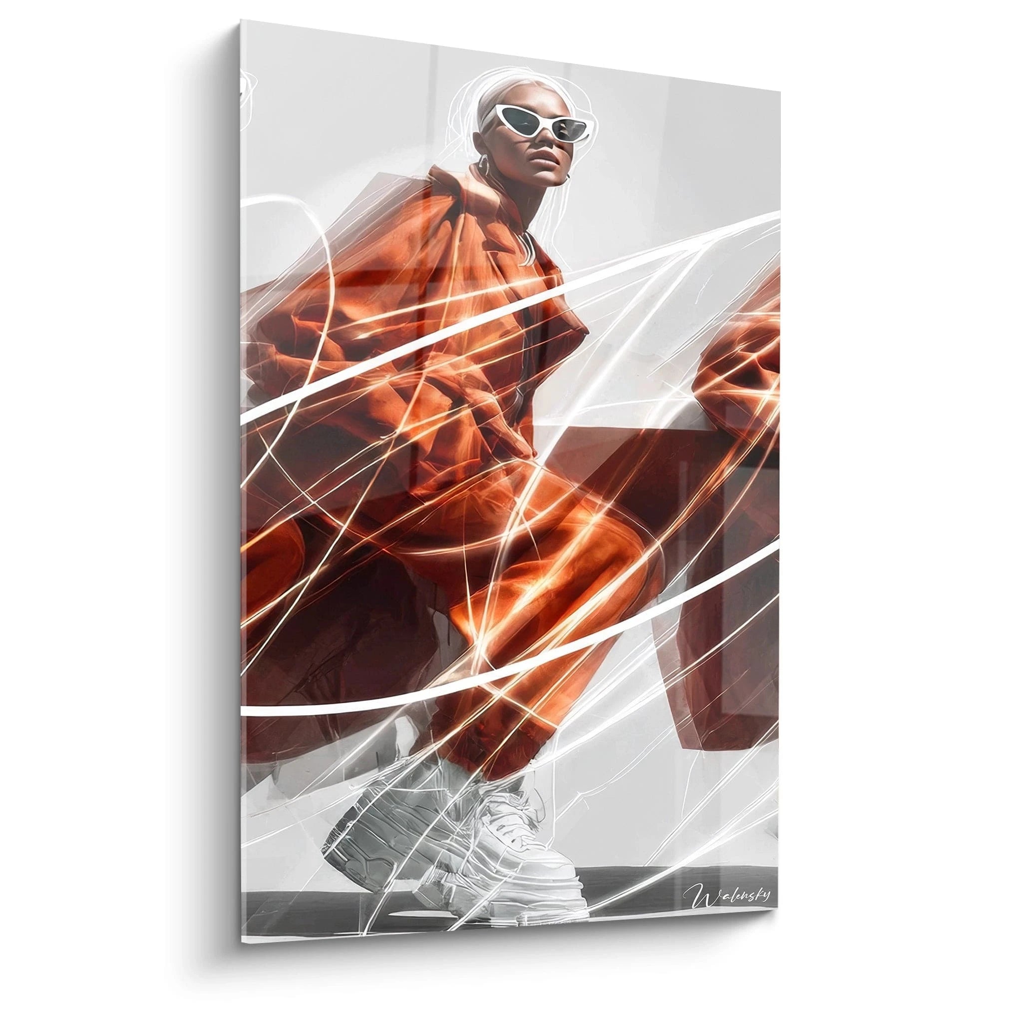
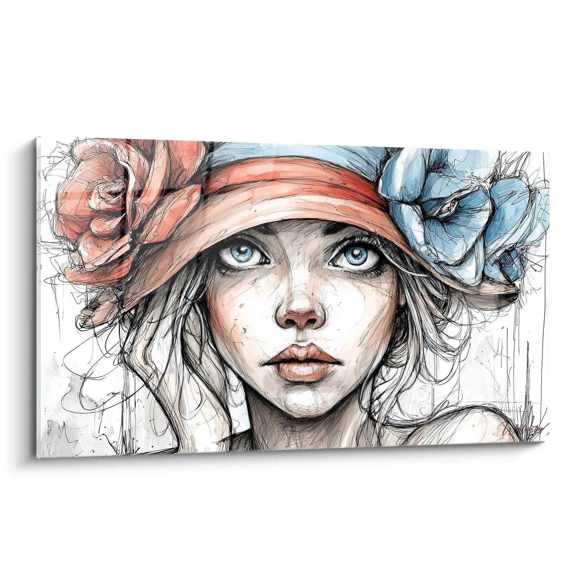
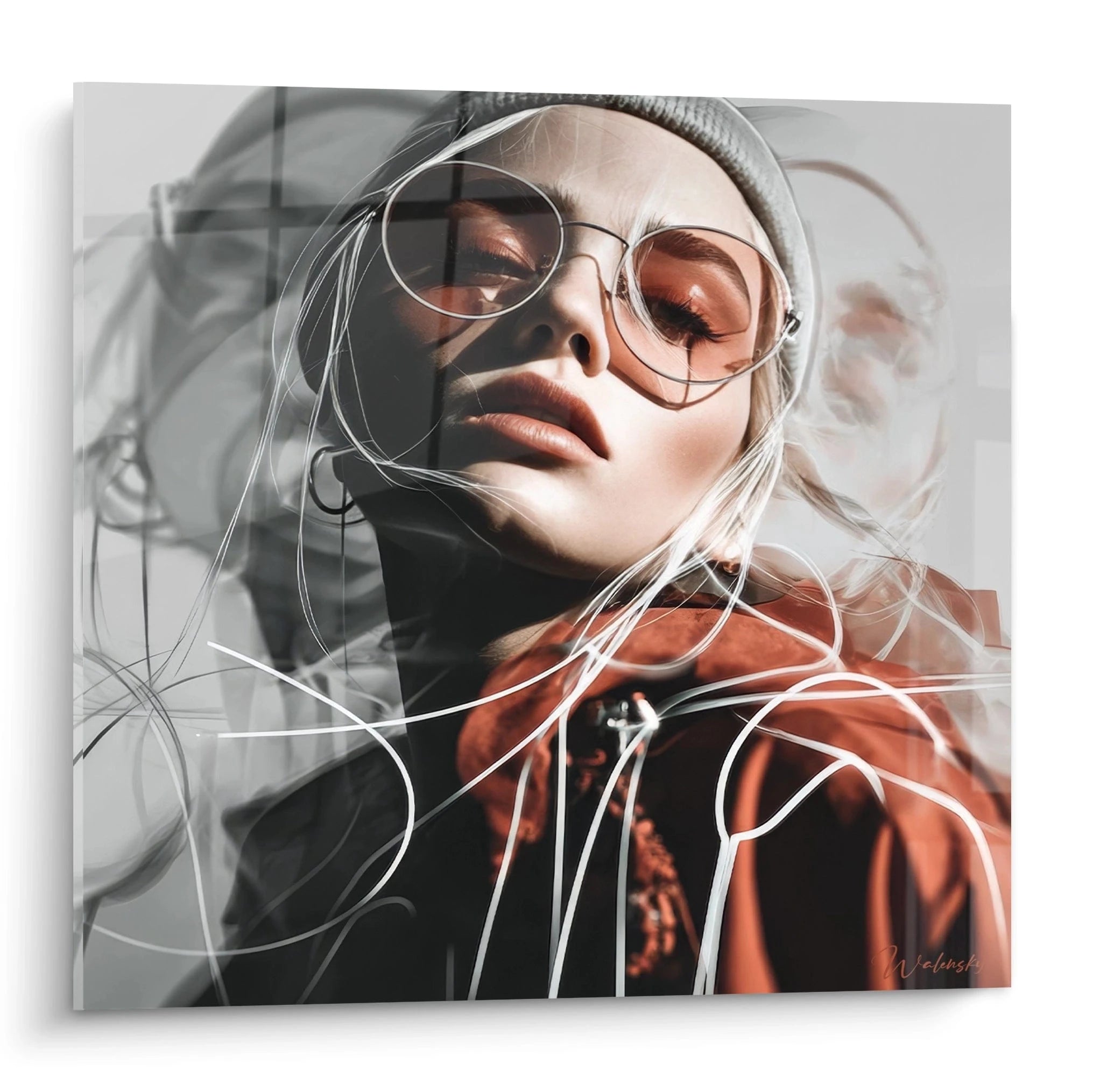
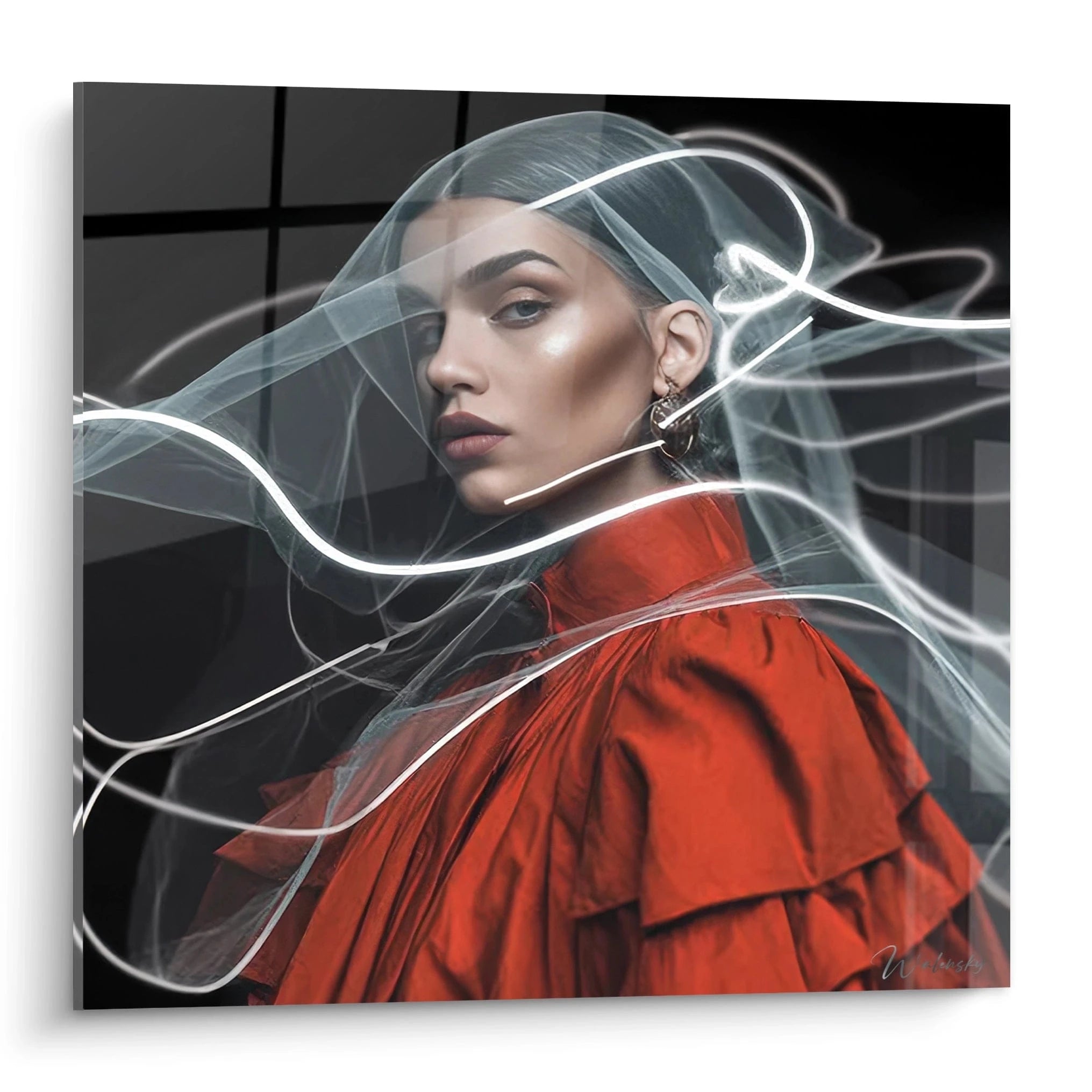
Colorful illustrations excel in representing exuberant fashion aesthetics: evening gowns with complex draping, gala outfits with precious ornamentations, haute couture silhouettes with sculptural volumes. Saturated hues faithfully restore the brilliance of luxury textiles – shimmering satins, iridescent organzas, metallized brocades – that monochromatic approaches cannot suggest. Oversized accessories – spectacular hats, statement jewelry, iconic bags – particularly benefit from these chromatic treatments that celebrate creative extravagance rather than minimalist discretion.
Visual Composition and Chromatic Hierarchy in Fashion Illustration
The construction of a colorful fashion illustration wall art follows rigorous compositional principles that orchestrate the apparent chaos of multiple hues. Professional illustrators first establish clear chromatic hierarchy: a dominant color occupies 50-60% of the surface, a secondary one 25-30%, and several accents share the remainder. This stratification prevents visual cacophony while maintaining sought-after perceptual richness. Directional lines – dynamic diagonals, elegant verticals – guide the gaze through different chromatic zones according to deliberate narrative progression.
The Art of Gradient as Stylistic Signature
Progressive transitions between hues constitute a distinctive characteristic of these creations. Unlike uniform flat colors, ombré gradients – from dark to light – or rainbow transitions create illusory depths that add sculptural dimension to two-dimensional silhouettes. These chromatic blends imitate light effects on moving fabrics, capturing the fleeting instant when a dress swirls under runway spotlights. Contemporary illustrators master transitions over 15-20cm height, creating hypnotic color metamorphoses that retain attention for extended minutes.
Which Techniques Strengthen Clarity Despite Complexity?
Facing chromatic abundance, maintaining narrative clarity requires specific strategies. Sharp graphic outlines – black or white lines of 2-3mm – delineate colored zones and prevent their optical fusion. Visual silence zones – spaces intentionally left neutral – provide essential perceptual pauses. Stylized anatomical simplification eliminates superfluous details to concentrate attention on essential chromatic interactions. These techniques allow the eye to deconstruct then reconstruct the composition according to a particularly gratifying active exploration process.
Synergy with Architectural Lighting for Dramatic Effects
Strategic illumination literally metamorphoses the experience of a colorful fashion illustration wall art. Variable temperature LED spotlights (2700-5000K) allow modulation of hue perception: warm light to intensify reds-oranges-yellows, cool to exalt blues-greens-violets. Grazing lighting systems at 30° create micro-shadows that reveal surface textures, adding tactile dimension to visual experience. High-end commercial installations integrate dynamic lighting programming that gradually transforms the artwork's appearance throughout the day, creating renewed chromatic spectacle.
Decorative Investment and Patrimony Valorization
Beyond their immediate aesthetic impact, these creations represent judicious patrimony acquisitions. The fashion illustration market has experienced 18% annual growth over the past five years, driven by growing institutional recognition of this artistic medium. Works signed by established illustrators regularly appreciate in value, transforming initial decorative purchase into tangible investment. Limited-edition large formats enjoy particular liquidity on the secondary market, sought by private collectors and corporations for their prestigious reception spaces.
Is a colorful fashion illustration wall art suitable for conservative professional spaces?
Absolutely, provided chromatic intensity is adapted to cultural context. Law firms and financial institutions opt for compositions where vivid hues occupy less than 30% of the surface, balanced by dominant neutral zones. This approach preserves professionalism while signaling openness to contemporary creativity.
What Durability Do Saturated Pigments Offer Against Light Exposure?
Professional prints use pigmentary inks with lightfastness rated 100+ years under standard museum lighting. Current technologies guarantee exceptional chromatic stability even for hues reputed as fugitive such as magentas and cyans, provided direct sun exposure exceeding 4 hours daily is avoided.
How Does Colorful Fashion Illustration Wall Art Influence Space Perception?
Polychromatic compositions generate perceptual expansion that makes rooms appear 15-20% larger according to psychometric studies. Warm hues simultaneously create paradoxical intimacy, while cool tones increase ceiling height sensation. This duality enables purely visual architectural corrections without structural work.