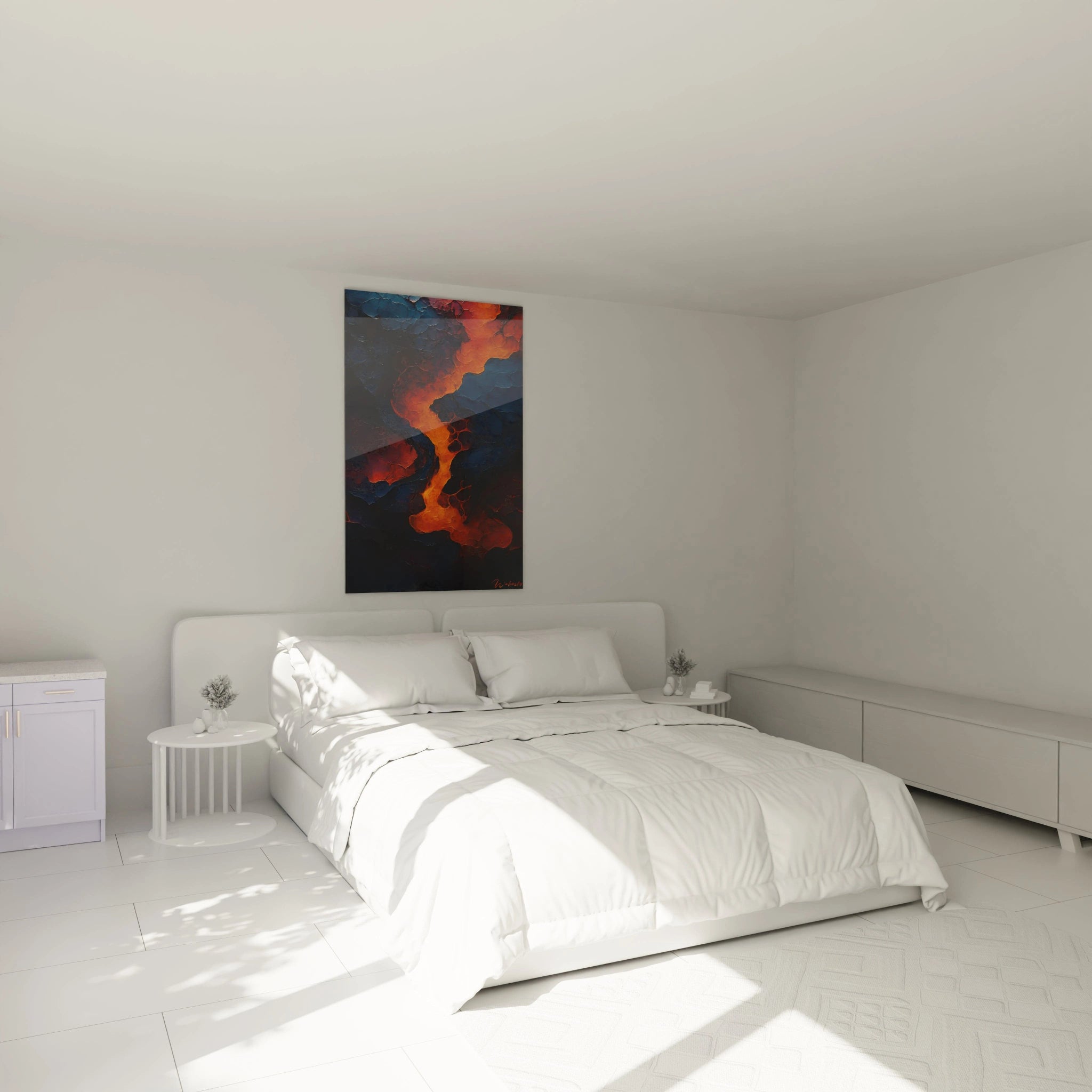
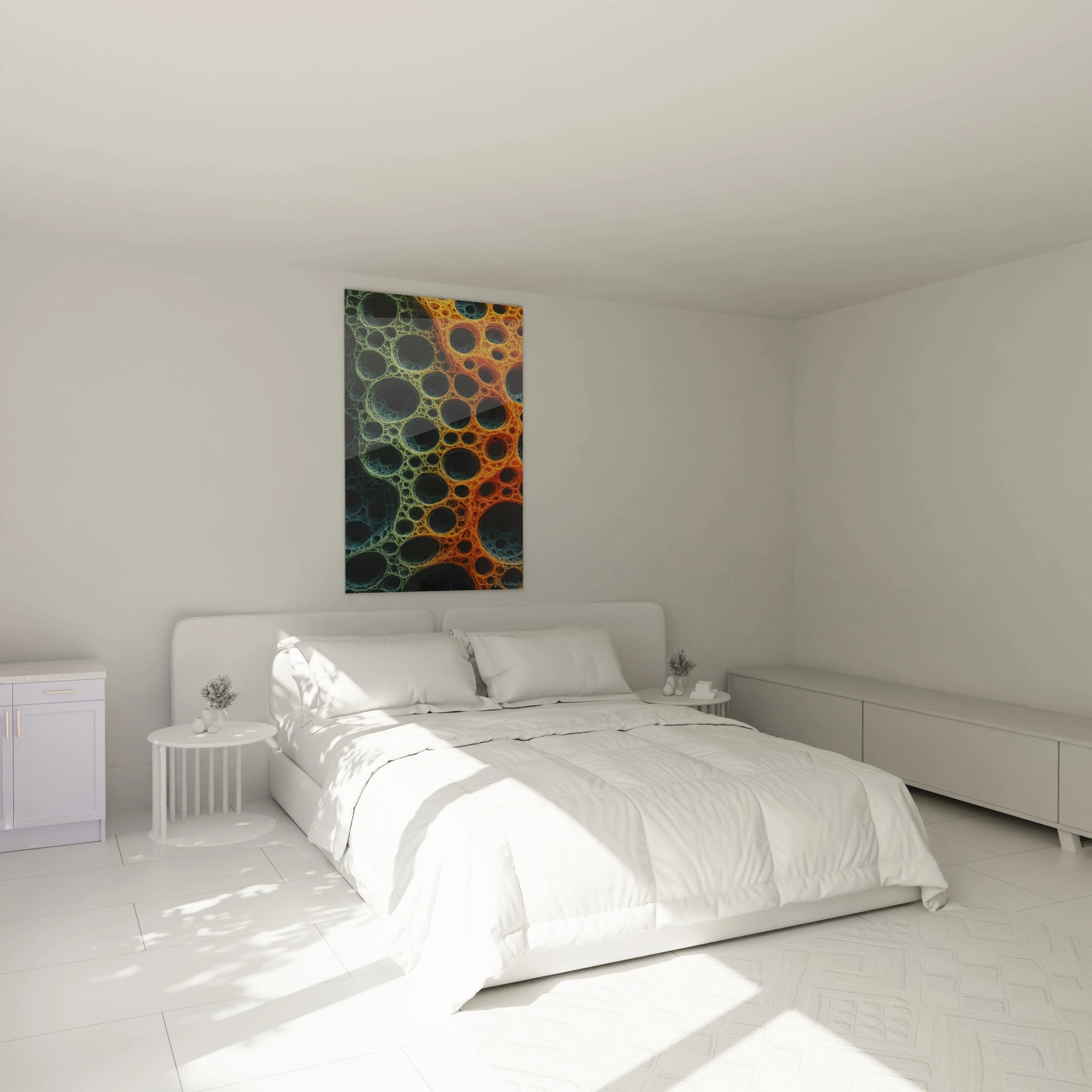
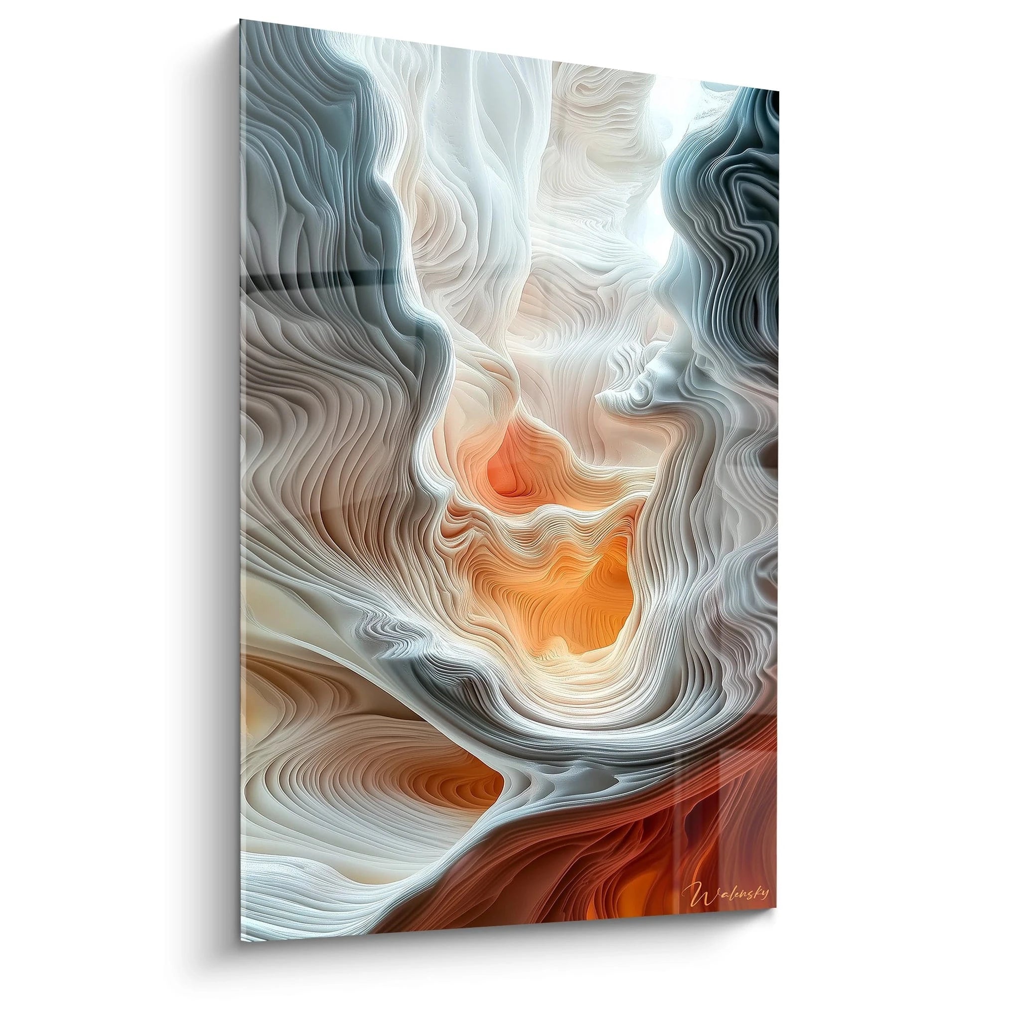
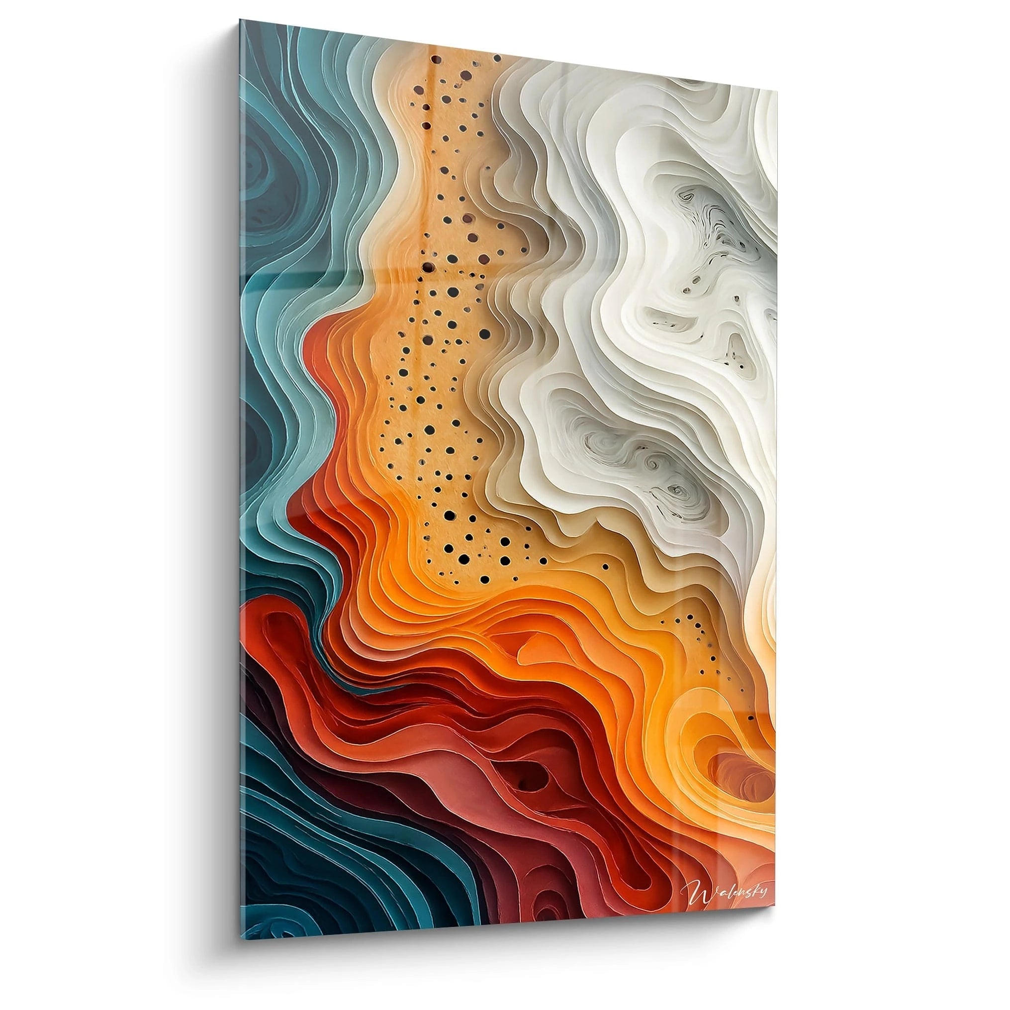
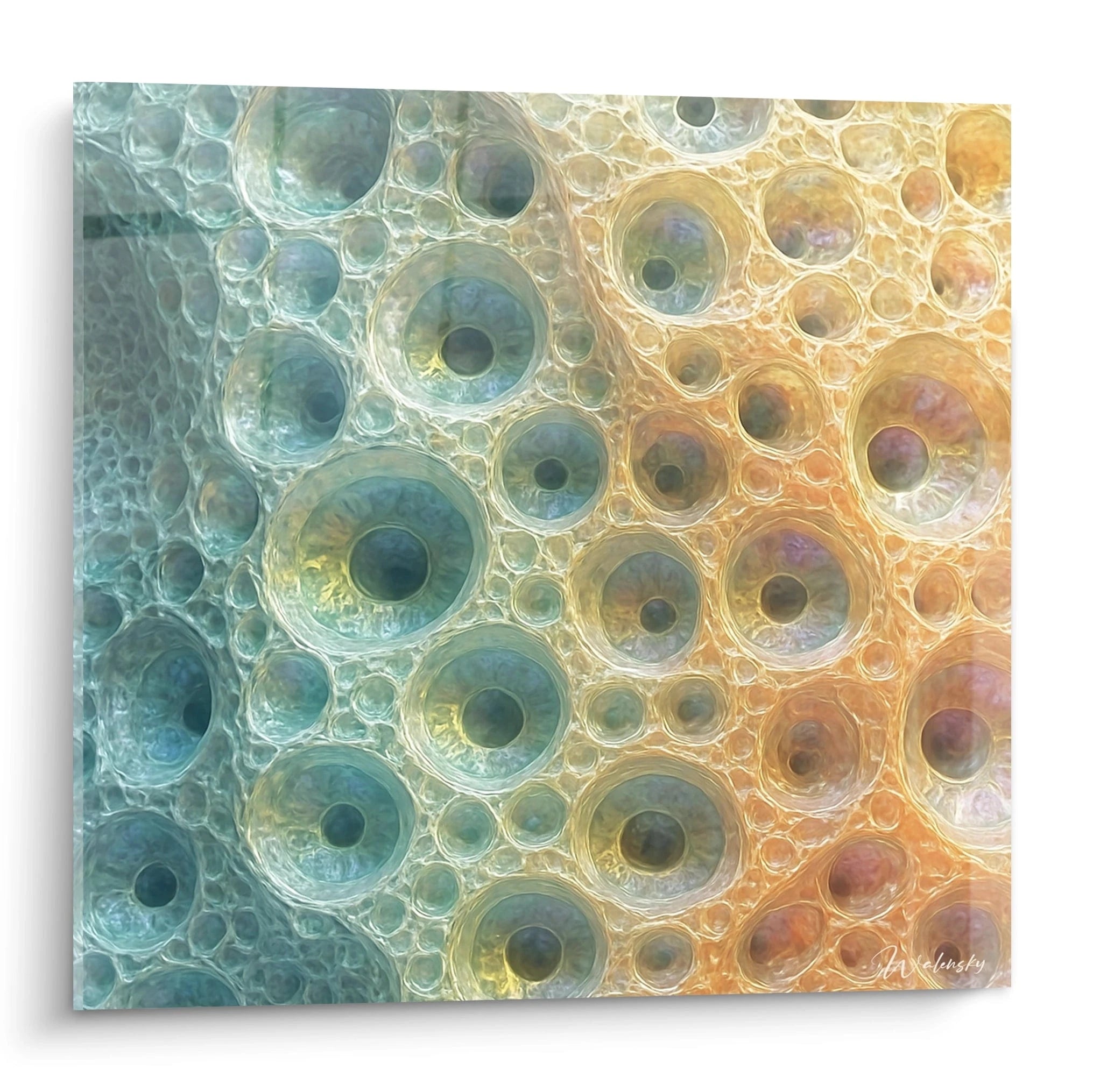
A colorful abstract relief wall art radically transforms spatial perception within an interior through its play of textured volumes and saturated hues. Unlike monochrome or two-tone compositions, these wall creations exploit the interaction between pronounced reliefs and expanded chromatic palettes to generate visually captivating focal points. The layering of structured materials across multiple depths creates variable cast shadows according to viewing angle and ambient light intensity, offering an evolving decorative experience throughout the day. Large-scale formats amplify this immersive effect by deploying extended textured surfaces where each colored zone dialogues with adjacent reliefs. This sculptural approach to wall art addresses contemporary spaces seeking simultaneous aesthetic sophistication and assertive architectural presence, particularly in open volumes requiring powerful visual anchor elements without burdening overall composition.
Chromatic energy amplified by relief
A colorful abstract relief wall art exploits the synergy between three-dimensional materiality and pigment saturation to create wall compositions of remarkable visual intensity. The tactile dimension of projecting surfaces multiplies the perceptual impact of vibrant tones by generating natural chromatic transitions through interplay of shadows and light.
How do reliefs intensify the perception of vivid colors?
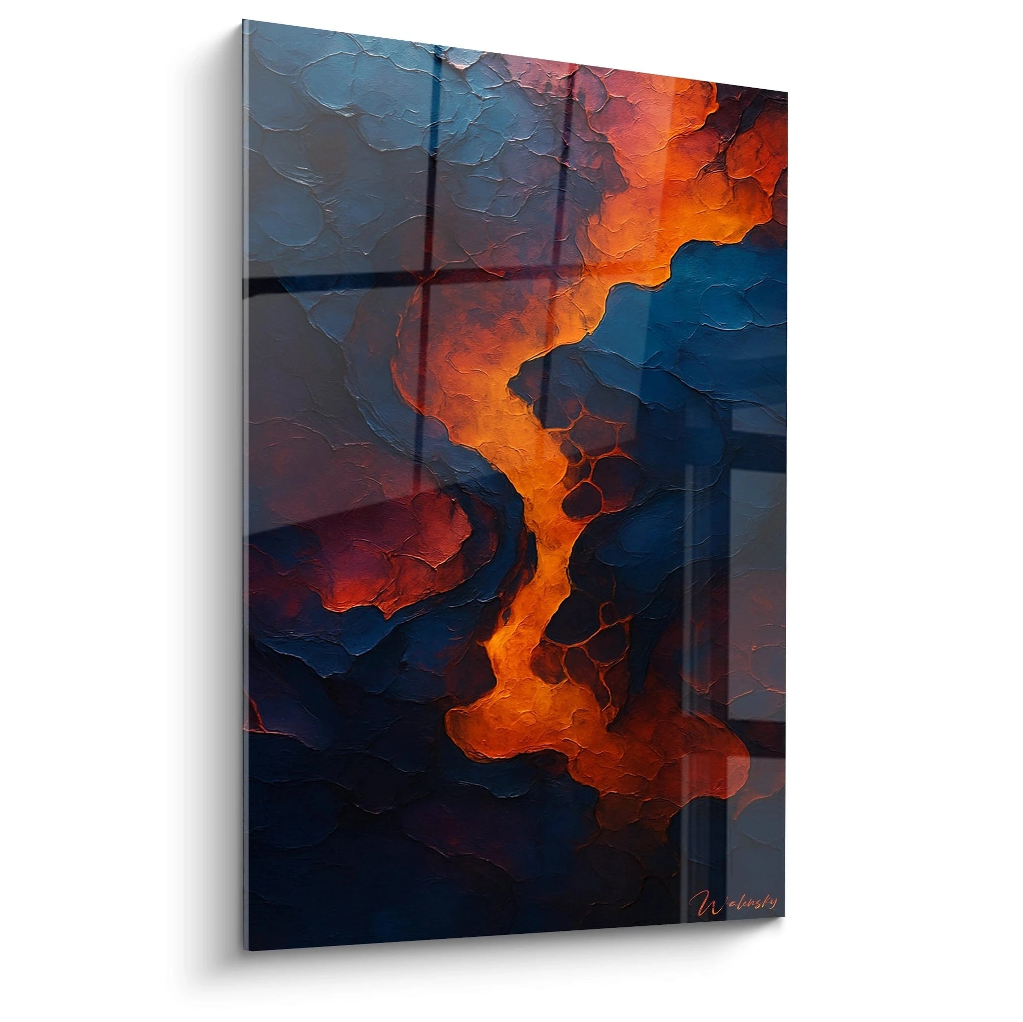
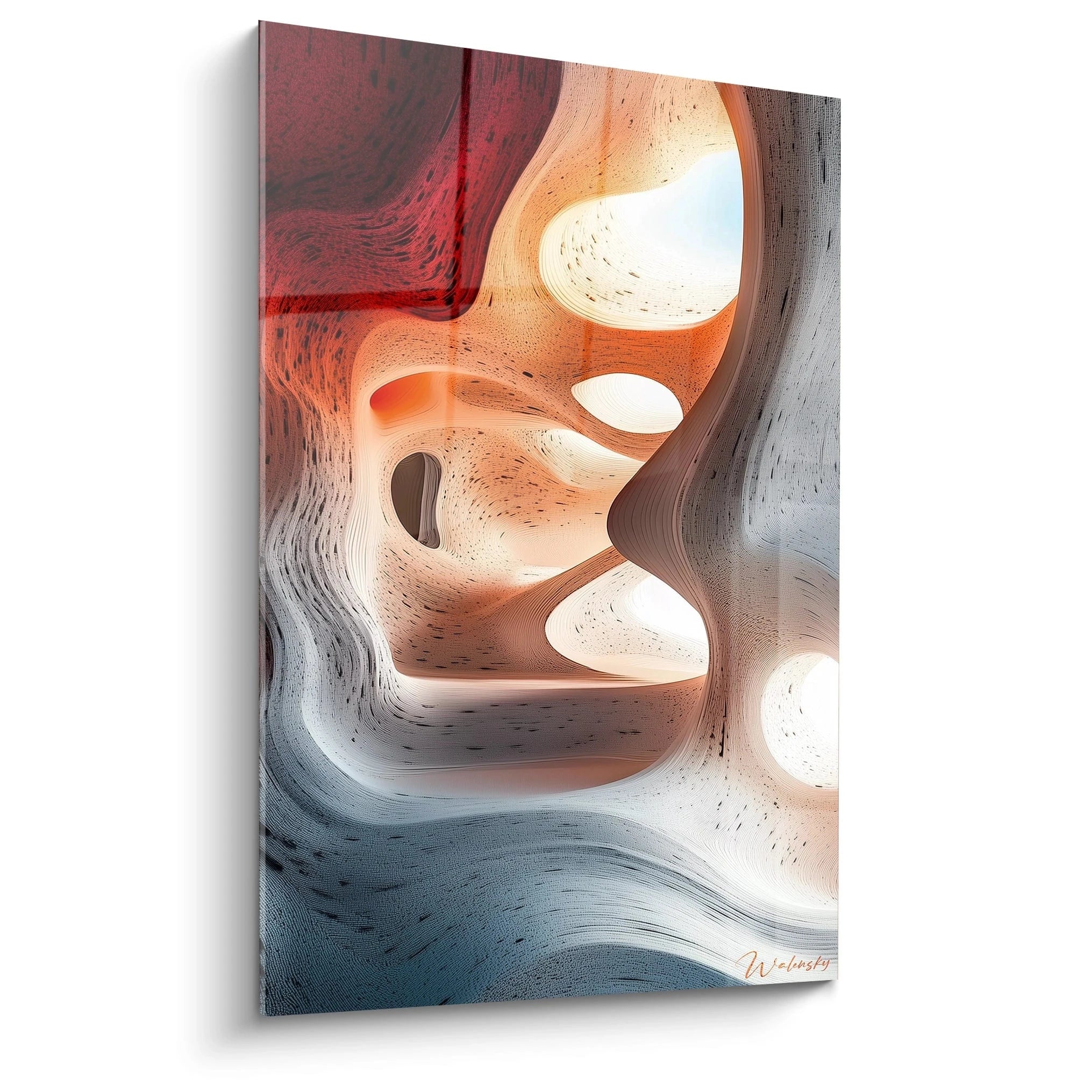
Structural irregularities capture and diffract light selectively according to spatial orientation. A vermillion-red protuberance receiving lateral illumination simultaneously reveals carmine nuances in recesses and orange tones on edges, creating chromatic depth impossible to achieve on flat surfaces. This perceptual variability transforms each viewing of the work into a renewed experience, particularly in spaces benefiting from evolving natural light sources. Polychromatic compositions in relief thus generate dynamic ambiances ideal for shared living areas where visual stimulation encourages social interaction.
Balancing strategies for multi-color textured palettes
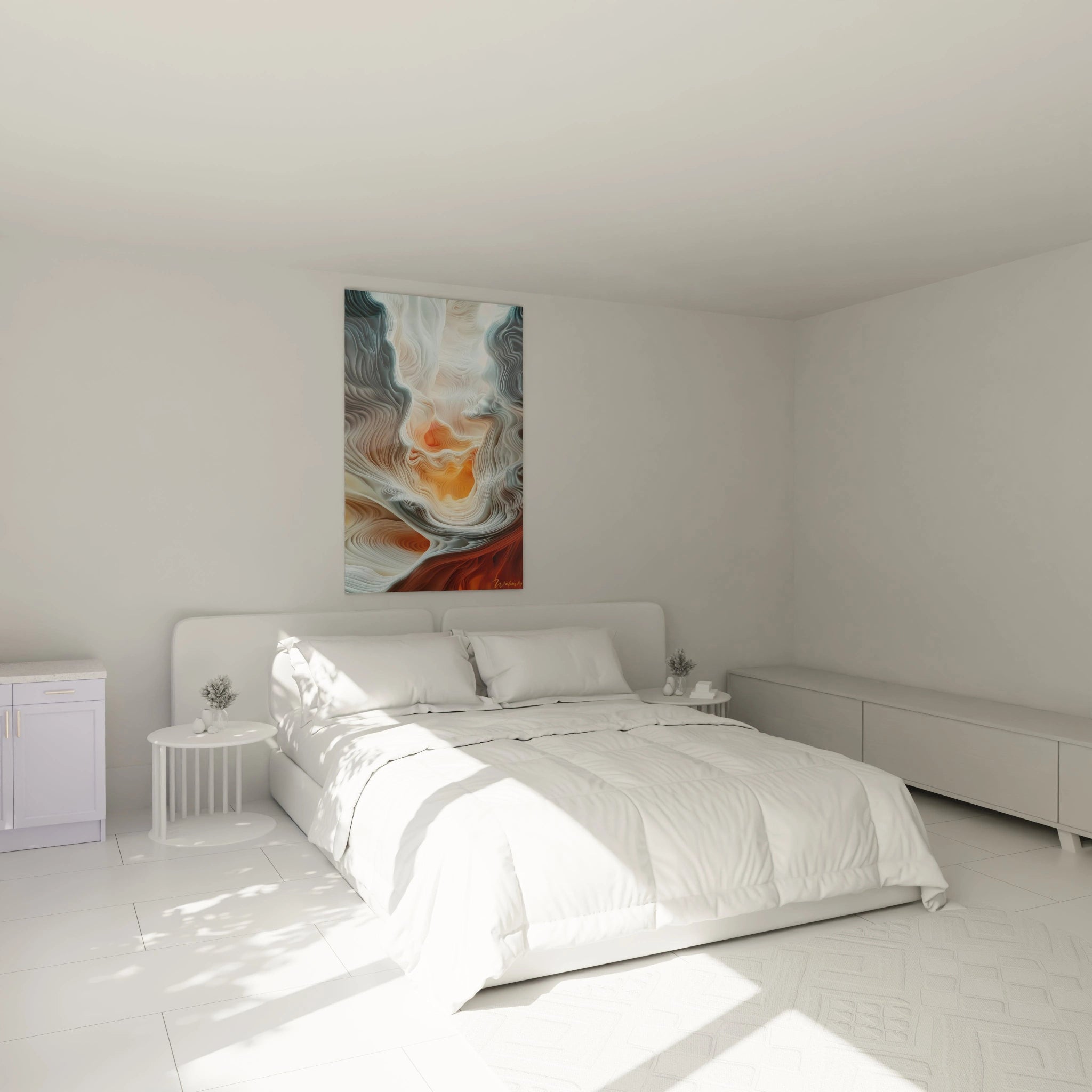
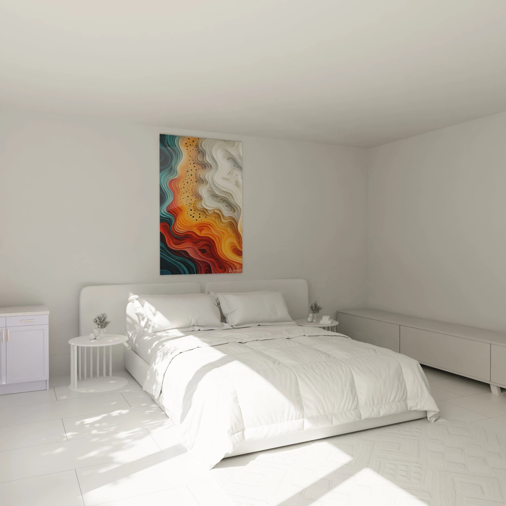
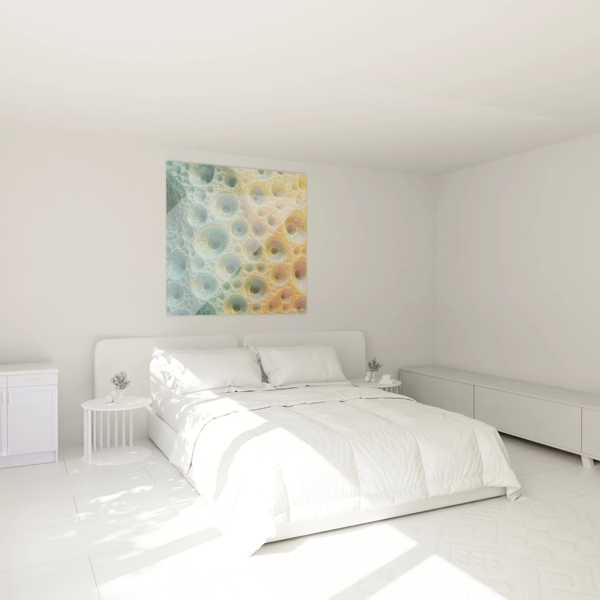
Integrating a colorful abstract relief wall art into an interior requires a calibrated approach accounting for the visual weight generated by the relief-color combination. Minimalist spaces with neutral walls constitute the optimal context, allowing the piece to fully deploy its presence without decorative competition. For already colorful environments, privileging compositions where one dominant work tone subtly echoes an existing element creates harmonious continuity while maintaining necessary contrast. Monumental formats function particularly well in double-height volumes or open spaces where their architectural scale dialogues with built structures.
Which spaces benefit most from colored relief compositions?
Reception areas such as entry halls and social spaces maximize the striking effect of these creations. A large-format colorful abstract relief wall art installed facing the main entrance immediately establishes a memorable aesthetic signature, transforming simple passage into a qualified spatial experience. Industrial lofts with raw surfaces find in these compositions a refined counterpoint, where chromatic vibrancy warms cold materials while reliefs dialogue with visible concrete or brick textures. In collaborative offices, these works stimulate creativity through visual energy while acoustically structuring space through their dense materiality. Upscale dining spaces exploit their capacity to create immersive decors without bulky furnishings.
Decorative associations that amplify impact
To fully showcase a colorful abstract relief modern wall art with brilliant tonalities, the environment must adopt calculated sobriety. Minimalist luminaires with directional beams highlight relief variations without creating visual clutter. Furnishings with clean lines in natural materials such as blonde wood or brushed metal establish textural dialogue without chromatic competition. Accompanying textiles can echo a secondary color from the composition to create subtle echoes distributing the work visually throughout space without diluting its focal impact.
Sculpted materiality in service of polychromatic expression
The physical dimension of a colorful abstract relief wall art transcends simple two-dimensional representation to invest architectural space as a chromatic sculptural element. This hybridization between painting and sculpture generates works whose material presence rivals furniture while preserving wall decoration function.
Which techniques create the most expressive reliefs?
Contemporary artists superimpose various thicknesses of structured materials to obtain elevation differences reaching several centimeters, creating true colored abstract landscapes. Stratifications of acrylic compounds mixed with mineral charges allow construction of resistant protuberances capable of supporting intense pigmentation without cracking. Controlled casting techniques generate organic formations with fluid contours, while knife applications produce sharp edges and geometric facets. This technical diversity translates into richness of visual vocabularies adaptable to different decorative universes, from contemporary industrial ambiances to revisited neo-classical interiors.
Perceptual evolution according to lighting conditions
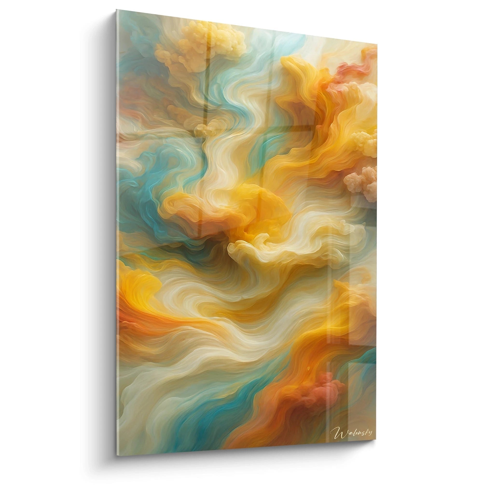
A colorful abstract relief wall art unveils unprecedented aspects through variations in natural and artificial lighting. At dawn, grazing light dramatically amplifies reliefs, transforming an apparently moderate composition into a turbulent landscape where each projection casts disproportionate shadows. At midday, zenith illumination partially uniformizes volumes while saturating colors achieving maximum chromatic intensity. Twilight softens contrasts while warm sunset tones dialogue with pigments, creating ephemeral harmonies impossible to anticipate during creation. This visual temporality justifies investment in consequential formats that occupy sufficient visual field for these subtle transformations to become perceptible and daily enrich spatial experience.
Why prioritize large formats for these compositions?
Generous dimensions allow deployment of complex chromatic progressions where multiple tones interact across varied reliefs. On reduced formats, multiple color-texture juxtaposition risks producing a confused effect, while extended surface provides necessary space to organize distinct chromatic zones linked by relief transitions. Large-scale wall compositions also create an immersion effect where the viewer perceives the work not as decorative object but as architectural modification of space itself. This monumental scale particularly suits upscale commercial spaces, hotel lobbies or exceptional residences where art becomes identity signature element rather than mere ornament.
Interactions with architectural materials
The affirmed materiality of a colorful abstract relief wall art resonates with surrounding built surfaces. Facing raw concrete, colored reliefs create sophistication contrast without negating the industrial roughness of the support. On glossy lacquered panels, matte textures of pigmented reliefs absorb light differently, generating depth effects amplified by reflection. In interiors with exposed woodwork, colored protuberances establish dialogue between natural wood organicity and geometric or gestural abstraction of composition. This capacity to dialogue with different material vocabularies explains the decorative versatility of these creations, adaptable to both minimalist lofts and renovated Haussmann apartments seeking assertive contemporary touches.
Spatial composition and chromatic orchestration
The arrangement of colored masses in relief within a colorful abstract relief wall art obeys sophisticated spatial composition principles where visual balance and dynamism coexist. These works require thorough reading of their internal structure to optimize architectural integration and maximize decorative impact.
Principles for distributing colored volumes
Experienced artists orchestrate reliefs according to compositional logics borrowing equally from sculpture and painting. Some creations adopt central concentration where most pronounced reliefs and most saturated tones converge toward an energetic epicenter, while peripheral zones progressively calm. Other compositions privilege rhythmic distribution where alternate zones of strong texture-chromatic activity and visual rest areas, creating dynamics comparable to musical notation. Elongated horizontal formats frequently exploit lateral narrative progression where the gaze circulates from one colored sequence to another, ideal for linear spaces such as exhibition corridors or circulation walls. Vertical compositions develop ascensional gravity, particularly effective in spaces with significant ceiling height where they naturally accompany architectural elevation.
How to analyze the structure of a textured polychromatic composition?
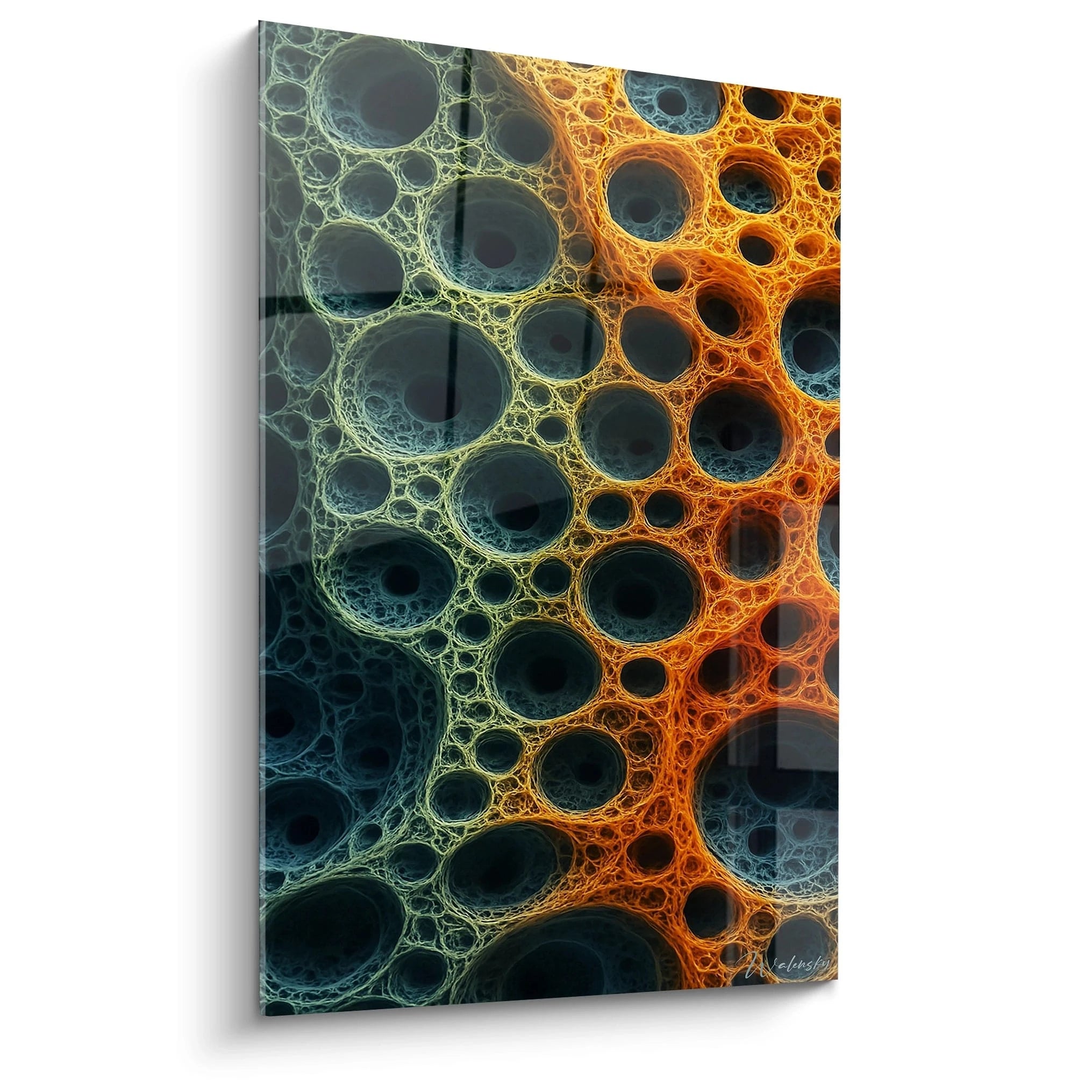
Evaluating a colorful abstract relief wall art requires simultaneous observation of several organizational strata. The chromatic structure reveals relationships of dominance, complementarity or contrast between different colored zones. Identifying the hue occupying the largest surface and those functioning as accents allows anticipation of color balance the work will establish in its environment. Topographic structure maps elevation variations of the surface, distinguishing maximum projection zones, deep recesses and modulated transitions. Interaction between these two systems determines the work's personality: a composition where warm colors coincide with salient reliefs generates expansive energy, while inverted configuration produces more introspective effect.
Installation strategies to maximize sculptural presence
Installing a colored relief composition requires particular attention to the work-wall-light relationship. Minimum clearance of 15 centimeters between the work's base and any lower furniture element preserves visual integrity and avoids perceptual interference. For formats exceeding 150 centimeters, a viewing distance of at least three meters allows apprehension of the composition in its entirety while perceiving textural details. Lateral directional lighting dramatically accentuates reliefs, recommended for contemporary ambiances seeking maximum sculptural effect. Diffuse frontal lighting better suits spaces privileging chromatic harmony over volumetric theatricality. Mounting systems must account for the substantial weight of these creations, often exceeding flat compositions due to accumulated material thickness.
Decorative evolution and aesthetic permanence
A colorful abstract relief wall art retains decorative relevance over time through its inherent complexity that progressively reveals subtleties. Unlike graphic patterns whose reading quickly exhausts, the textural and chromatic richness of these compositions offers renewed exploration depth with each observation. This perceptual longevity justifies investment in museum-quality pieces whose careful execution guarantees material and pigment stability over time. Climate-controlled environments optimally preserve these works, though contemporary techniques offer satisfactory resistance to moderate hygrometric variations. Cleaning is limited to gentle dusting with natural feather duster, avoiding any contact that might alter textured surfaces.
Frequently asked questions about colorful abstract relief wall art
Is colorful abstract relief wall art suited for domestic spaces or only professional environments?
These creations adapt perfectly to contemporary private residences with sufficient volume to accommodate their assertive presence. Open living rooms, mezzanines and staircases constitute privileged locations where their visual impact structures space without cluttering it. In professional environments, they reinforce brand identity while humanizing work spaces through tangible artistic dimension.
What minimum viewing distance should be planned to fully appreciate these compositions?
For formats between 100 and 150 centimeters, an observation distance of 2.5 to 3 meters allows embracing the global composition while perceiving textural details. Creations exceeding 180 centimeters ideally require 4 to 5 meters of viewing distance for optimal apprehension, though close consultation reveals interesting complementary aspects. This spatial requirement naturally orients these works toward large architectural volumes.
How to coordinate the colors of colorful abstract relief wall art with an existing interior?
Rather than seeking exact correspondence, privilege an approach through chromatic resonance where a secondary work tone subtly recalls an existing decorative element creates sophisticated harmony. Polychromatic compositions generally offer multiple possible color anchoring points, enabling fluid integration into varied environments. The inverse approach of neutralizing the environment to maximize the work's impact also constitutes coherent decorative strategy, particularly prized in contemporary minimalist interiors.