

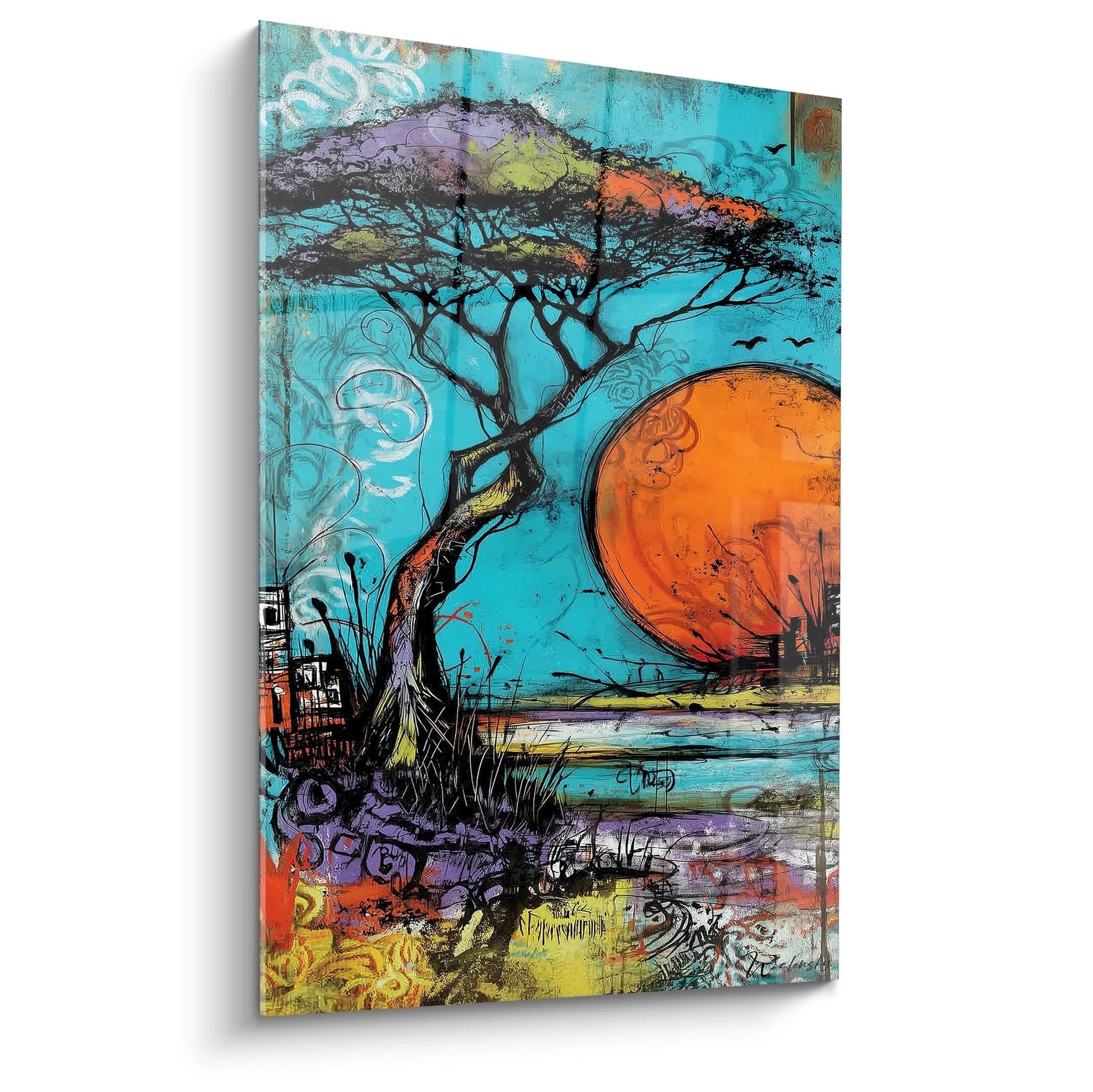






Creating contrasts between colorful paintings and minimalist architecture
11 October 2025 · 19 min read · by Walensky
You’ve spent months choosing every detail of your minimalist interior, from the clean lines to the perfectly balanced neutral tones. But today, facing your pristine walls, you feel that frustrating impression of something missing, that little voice that whispers that your space, while elegant, remains cold and impersonal.
You observe these smooth surfaces, these perfect angles, this monochrome harmony that you so desired. Yet, emotion is absent. Your guests admire politely, but you feel they leave without being truly touched by your world.
You may have tried adding a few touches of color in small doses - a cushion here, a plant there. But the result disappoints you: either it's too timid and gets lost in the neutrality, or it clashes completely with your carefully constructed aesthetic.
It's normal to feel this frustration! The problem isn't your taste or your interior. It's simply that no one has explained to you how to create harmonious contrasts between colorful art and sleek architecture. These two universes seem opposed, but they can actually sublimate each other.
By the end of this article, you will master the art of transforming your minimalist space into a vibrant and personal showcase, where each colorful artwork reveals the beauty of your architecture while expressing your unique personality.
Why does your minimalist interior need colorful art now?
The era of totally neutral interiors is coming to an end. Magazines and social media are now full of spaces that dare to combine sleek architecture and vibrant artistic expressions. If you wait any longer, you risk your interior becoming dated in a few years. It's like wearing a perfectly tailored suit but without a tie or accessory : technically impeccable, but it lacks that personal signature that makes all the difference.
🏠 Customer testimonial: "Sarah, an interior architect, had created a loft with perfect lines and white walls and polished concrete. Beautiful on paper, but she couldn't feel at home in it. By adding three abstract paintings with warm colors on the main wall, she transformed her space into a true cocoon. Her clients now systematically ask her how to reproduce this magic in their own homes."
Conversation with a decor expert
The secret lies in the balance of proportions: the more streamlined your architecture, the more expressive your art can be. It's the principle of the neutral frame that reveals the beauty of the painting. You will achieve a striking contrast that enhances both elements in less than 24 hours after hanging.
Why haven't your previous attempts worked?
Do you recognize these situations? You find a magnificent painting in a gallery, but once you get it home, it seems dull. Or perhaps: you accumulate small touches of color that, instead of harmonizing, create a confused patchwork effect. Maybe you also opted for reproductions without relief that literally disappear on your walls.
What's really happening is that you're applying the rules of traditional decoration to a minimalist context. It's like using a classic cooking recipe with high-end ingredients: the result cannot be optimal. Art in a minimalist space obeys different codes.
Imagine your interior as a stripped-down theater scene. Every element you place in it automatically becomes the hero of that scene. If you multiply the small heroes, no one really shines. If you choose a timid hero, it gets lost.
First hidden cause: you underestimate the power of emptiness
Contrary to what many think, emptiness is not a void to be filled, but an amplifier. In a cluttered space, a work of art has to struggle to attract attention. In a clean space, it reigns supreme. The difference? It's like comparing a soloist in a symphony orchestra to a soloist on an empty stage.
Think of the principle of luxury storefronts : Hermès never displays ten bags in its storefront, but one, beautifully showcased by the space around it. Your white wall plays exactly that role of a prestigious showcase.
This revelation changes everything in your approach to wall art. Instead of trying to "furnish" your walls, you will learn to orchestrate them. Your gaze no longer flits, it pauses and savors.
🔍 Immediate test: Look at your main room and count the number of decorative elements visible at a glance. If you exceed 5 elements, your brain has difficulty prioritizing visual information. Temporarily remove half and observe how the space breathes better.
The error of timid proportions
In a minimalist space, the rules of proportion are reversed. Where a traditional interior accepts multiple medium formats, a clean aesthetic requires either very large or very small, but never "medium". It's the difference between a whisper and a statement.
It's like choosing between a subtle perfume and a signature perfume : in a neutral environment, everything that doesn't assert its presence simply disappears. Your eye, accustomed to the strong lines of your architecture, needs an equivalent visual impact.
Result: your standard-size paintings seem to shrink on your large walls, creating that feeling of "something that's not quite right" without you being able to put your finger on it. The perfect artwork in another context becomes insignificant in your home.
The trap of over-coordination of color
Here's the paradox that almost no one notices: the more you try to perfectly harmonize colors, the more artificial the result seems. It's like wearing a completely matching outfit from head to toe: technically coordinated, but without surprise or personality.
In your daily life, notice this phenomenon at home: the elements you like the most are often those that create a slight mismatch from the rest, that little dissonant note that awakens interest. A colored shoe with a sober suit, a textured cushion on a smooth sofa.
This over-coordination prevents you from experiencing emotion, that subtle vibration that makes a space lively and endearing. Your interior remains in the register of a beautiful showcase rather than a real home.
3 signals that betray over-coordination:
- Your guests compliment but don't settle in spontaneously: The perfect harmony impresses but doesn't invite relaxation, like a luxury hotel lounge
- You hesitate to use certain pieces "so as not to damage them": When everything is too coordinated, you're afraid of breaking the fragile balance
- You feel the need to tidy everything up before visitors arrive: An over-coordinated interior can't handle any spontaneity, any trace of real life
The trigger: the absence of an emotional anchor point
What really makes the difference is the presence of an element that tells your personal story. It's the positive domino effect: when a piece really looks like you, it makes you want to live there, to entertain, to create memories. Identify this element in your home : it's often the object towards which your gaze naturally directs when you return, the one that makes you smile for no reason.
Universal rule of successful contrast: A strong element + a clean environment = striking harmony. Test it immediately: isolate your most beautiful decorative piece on a clear wall and observe how it takes on a new dimension.
| ❌ Traditional approach | ✅ Minimalist approach | 💡 Key principle | 🎯 Result obtained |
|---|---|---|---|
| Multiply small touches of color | Concentrate the impact on a strong work | Law of unique visual focus | Captivated gaze and structured space |
| Perfectly match all tones | Create a controlled contrast | Creative tension between opposites | Dynamism and affirmed character |
| Choose secure formats | Dare remarkable proportions | Size/visual impact match | Strong and memorable presence |
| Favor neutral decor | Invest in expressive art | Emotion over coordination | Personal and endearing space |

Our selection
Ochre and White Marble Staircase Painting - Southern Sweetness - Architecture Edition
233,90€
Discover this artworkThe 3-step method to succeed with contrasts
Rassure yourself, creating harmonious contrasts is nothing mysterious once you understand the logic. It's like learning to cook: it just takes following the recipe step by step. We will build your visual balance like a chef builds a dish : first the solid base, then the main flavors, finally the finishing touches. At each step, you will see your space gain character and emotion.
🎯 Overview of the transformation: Step 1 : Analyze your architecture to identify its strengths (15 min). Step 2 : Select your flagship artwork according to specific criteria (1 week of reflection). Step 3 : Orchestrate the hanging and lighting (2 hours of installation). Result: a space that resembles you and impresses durably.
Step 1: Decode your architecture to reveal its potential
Before choosing anything, you must understand what you are working with. It's like a gardener who studies his soil before planting: the nature of the soil determines which flowers will flourish. This step will avoid you 90% of costly mistakes and will give you the satisfaction of seeing that everything articulates logically.
The key elements to identify in your space
- Dominant guidelines: Observe whether your architecture favors horizontal lines (beams, shelves, low furniture) or vertical lines (high windows, bookcases). Identify them by holding an imaginary string : this framework will guide the orientation of your artworks. A horizontal architecture will call for vertical formats to create contrast, and vice versa.
- Natural light quality: Note how the light evolves throughout the day and which areas are favored. Soft light favors subtle colors, direct light enhances strong contrasts. Test by placing a sheet of white paper in different locations: where it best reveals its texture, your artworks will reveal their nuances.
- The main viewpoints: From which places do you most often look at the room? From the sofa, the entrance, the open kitchen? These viewing angles will determine the optimal location of your flagship artwork. It should be visible and attractive from your everyday living position.
Now, let's move on to the practical analysis of these elements
The methodical observation of your space
Mapping natural attention zones: Stand in your space and note where your eye spontaneously goes. It is generally where an architecture reveals its intentions: a corner of a wall highlighted by light, a wall that seems to be waiting for something. These zones are your premium locations, do not waste them with small scattered decorative elements.
⏱️ Time: 10 minutes | ✅ Success when: You have identified 2-3 maximum zones that naturally attract the eye | ⚠️ Attention: Do not confuse "visible zone" and "attractive zone" - an entire wall can be visible without having a particular presence
Measure dominant proportions: Record the dimensions of your main architectural elements (ceiling height, width of main walls, size of openings). These measurements will give you the harmonious ratios for your future artworks. A painting should never be exactly the same width as a piece of furniture or a window : it should be at least 20% larger or at least 30% smaller.
⏱️ Time: 5 minutes | ✅ Successful when: You know the 3-4 key measurements of your room | ⚠️ Beware: Many neglect the mounting height - also note the height of your furniture to anticipate vertical harmony
✅ Step 1 validation: You must be able to explain in a sentence the "character" of your architecture : rather cozy or theatrical? Rather intimate or impressive? This personality will guide the type of art that will thrive there. If you are still unsure, take a photo under different lighting - the objective often reveals what the accustomed eye no longer sees.
Step 2: Select the artwork that will transform your space
You are now entering the most exciting phase : the one where you will give a soul to your architecture. This step requires more reflection than action, because the right choice will permanently transform your daily life. This is when your home truly becomes yours, when it tells who you are beyond trends.
Selection criteria for a flagship artwork
- Immediate emotional impact: Choose a work that makes you react within the first 3 seconds. Perhaps an involuntary smile, a deeper inspiration, or that feeling of "this is exactly it." Avoid lukewarm or rational crushes - in a minimalist space, only strong emotion justifies the privileged place given to art.
- Technique and material: Favor works with relief, texture, a perceptible thickness. In your environment with smooth surfaces, these asperities create a tactile contrast even at a distance. A thick canvas, a visible material treatment, colors in relief: all details that enrich the daily visual experience.
- Contrasting color palette: Identify the dominant color of your artwork and check that it does not exist anywhere else in the room. This color will become your signature, your emotional red thread. If your space is gray and white, a deep red or intense blue will create that striking contrast you are looking for.
The optimal selection process
Test the presence effect: Before making any purchase, visualize the artwork in your space using a simulation. Take a photo of your wall and mentally or digitally overlay the artwork you are considering. If it does not immediately transform the atmosphere of the photo, it will not transform your daily life. A successful artwork changes the perception of the entire space, not just the area where it is located.
⏱️ Time: 30 minutes per artwork | ✅ Successful when: The artwork visually dominates the space without overwhelming it | ⚠️ Beware: Online photos often distort colors - if possible, see the artwork in person or request photos in natural light
Validate consistency with your lifestyle: A strong artwork must be able to withstand your daily life without constraining you. If you often entertain, choose something that launches conversations. If you prioritize relaxation, opt for tones that soothe even after a difficult day. The perfect art for you is in tune with who you are, not who you would like to appear.
⏱️ Time: A few days of reflection | ✅ Successful when: You are looking forward to living daily with this artwork | ⚠️ Beware: Be wary of pure aesthetic crushes - wall art will accompany you for years
Step 3: Orchestrate the installation to reveal all the magic
Installation is the art of revealing the potential of your choice. A perfectly chosen artwork, poorly hung, loses 50% of its impact, while a decent artwork perfectly staged can become memorable. This final step transforms your acquisition into a true decorative masterpiece that your guests will not forget.
Hanging techniques that make the difference
Determining the optimal hanging height: The center of the artwork should be 1m65 from the floor in a circulation area, 1m50 in a seated living area. This height corresponds to the natural eye level and creates a feeling of instinctive balance. Mark this level with a pencil before drilling - a 10 cm error is enough to unbalance the entire composition.
⏱️ Time: 15 minutes of measurement + 30 minutes of installation | ✅ Success when: The artwork seems to "float" naturally on the wall | ⚠️ Attention: If you have low furniture (console, sofa), respect a minimum distance of 20 cm between the furniture and the bottom of the frame
Adjust lighting to enhance colors: Install dedicated lighting at a 30° angle to the surface of the artwork. This angle avoids reflections while revealing reliefs and chromatic nuances. Warm white LED lighting (2700K) best respects the actual colors while creating a warm atmosphere that pleasantly contrasts with the potential coldness of minimalist architecture.
⏱️ Time: 1 hour for simple lighting | ✅ Success when: The artwork remains attractive even in the evening, without overwhelming the rest of the ambient lighting | ⚠️ Attention: Lighting that is too direct or too cold turns your artwork into a public advertisement - dose the intensity
Rule of progression towards mastery: Start with a single strong artwork, master its impact, and then only consider other additions. You are ready for the next step when your guests spontaneously comment on your artwork and when you yourself do not tire of it after 3 months of daily cohabitation.
You now master the fundamentals, but a few expert subtleties can transform your success into a true decorative signature. These details make the difference between a beautiful achievement and a space that permanently marks everyone who discovers it.
🎨 Collector's tip: Create a "dialogue" between your main artwork and a small element of the same color family elsewhere in the room (a book, an object, a textile). This discreet resonance unifies the space without overwhelming, like a perfume that reveals itself in successive touches. The eye subconsciously establishes a connection that reinforces the overall harmony.
"What if it doesn't go with my future decor changes?"
"I'm afraid of getting tired of it or wanting to change something else in a few years..."
This is a very legitimate concern shared by many of our perfectionist clients! In reality, a true work of art enriches over time and adapts to the evolution of your interior. Think of the paintings in beautiful homes: they cross decades, revealing new facets according to the transformations of the decor. If you choose a piece that truly moves you rather than a "coordinated" piece, it will naturally accompany your evolutions. And then, what satisfaction to see in a few years that your crush of today remains your pride!
💡 Longevity test: Before finalizing your choice, imagine this artwork in your living room with walls of a different color. If it remains attractive, that's a good sign! A true work of art transcends fleeting decor trends.
— Also to discover


— Other curated pieces


The 5 mistakes that sabotage your efforts (and how to avoid them)
Even with the best intentions, some traps remain tempting and can undo all your efforts with a few unfortunate decisions. I prefer to warn you now rather than see you repeat the common mistakes I regularly encounter. These mistakes are normal, predictable, and above all avoidable!
- ⚠️ Wanting to replicate magazine looks: Magazine setups are designed for photography, not everyday life. As a result: you create a beautiful but unlivable decor on a daily basis. Adapt the inspiration to your reality : keep the spirit, modify the proportions. Don't hesitate to test for a few days before finalizing.
- 🎯 Choosing by elimination rather than by infatuation: Faced with the embarrassment of choice, the temptation is to settle for "not bad". A serious mistake in a minimalist space! This lukewarm approach produces a lukewarm result. It's better to wait to find THE piece that makes you vibrate than to give in to urgency with a compromise. Your patience will be rewarded with years of satisfaction.
- 📏 Underestimating the importance of proportions: A painting that is too small on a large wall seems lost, a painting that is too large overwhelms the space. This mistake is very common because it is difficult to visualize before installation. Use kraft paper with the intended dimensions and tape it to the wall for 48 hours to test the effect before ordering. Your eyes will get used to it and reveal to you whether the proportion works.
- 💡 Neglecting the lighting of the artwork: Lighting can transform an ordinary work into a crush, or ruin an exceptional piece. Many install the artwork and discover too late that it "doesn't render" in their existing lighting. Anticipate this question from the selection stage and budget for dedicated lighting if necessary.
- 🔄 Multiplying changes out of impatience: It takes 2 to 3 weeks for the eye to get used to a significant decorative change. The temptation is to modify, add, adjust before this adaptation period. Give yourself this digestion time before any further changes. Often, what seems "not enough" at the beginning becomes "perfect" after a few weeks of cohabitation.
🔍 Security checklist before finalization: Does the artwork attract the eye first? Does it create a positive emotion after 10 minutes of observation? Do the proportions seem natural from different angles of view? Does the lighting reveal its colors without creating a glare? If you answer "yes" to these 4 questions, you have found your success.
— In the same spirit


Frequently Asked Questions about Art in Minimalist Interiors
Allow 3 to 4 weeks between starting your research and final installation. 1 week to analyze your space and define your criteria, 2 weeks to find the perfect artwork (authentic favorites don't force themselves), and a few days for optimal installation. To speed up the process, prepare a photo folder of your space under different lighting conditions : you will be able to evaluate the works more quickly.
For a significant visual impact, allow between €300 and €800 for the main artwork, plus €100 to €200 for dedicated quality lighting. This investment may seem important, but compared to years of daily pleasure, it costs less than a gym subscription! Prioritize a quality piece rather than several average works : the visual and emotional impact is different.
Installing a wall artwork remains accessible to any amateur handyman with the right tools : drill, level, suitable wall plugs. The real difficulty lies in choosing the location and height. If you are unsure, mark the position with pencil and live with it for a few days before drilling. For lighting, an electrician may be necessary depending on the desired complexity.
A good indicator: if you continue to discover details in the artwork after several weeks of observation, that's a good sign! Pieces that reveal themselves gradually resist the wear of the gaze better than those that deliver their full impact immediately. Also test your attachment: if you start imagining this artwork in your next move, it has earned its definitive place.
The principle works everywhere, but the intensity must adapt to the use of each space. Living room and entrance can handle strong contrasts that affirm your personality. Bedroom and office benefit from softer contrasts that accompany without stimulating. Bathroom and kitchen require moisture-resistant and easy-to-clean artworks. The important thing is to maintain a chromatic or stylistic common thread between the rooms.
Your transformation into an emotion architect
In a few weeks, you will no longer recognize your interior. Where you felt that nagging frustration of a too-safe space, you will discover a perfect balance between architectural sophistication and personal expression. Your guests will stop short when discovering your artwork, searching for the words to express this feeling of "that's exactly you". And you will feel that discreet pride of knowing that your home really tells your story.
This transformation far exceeds the decorative scope. By learning to create harmonious contrasts, you develop your artistic eye, your confidence in your aesthetic choices, your ability to transform a space according to your vision. These skills will serve you in all your future decor projects, and even beyond: in your clothing choices, your floral compositions, your outdoor arrangements.
The hardest part was understanding the hidden mechanisms, and that's done! Now, all you need to do is start by analyzing your space using the method you just learned. This weekend, explore your interior with this new perspective, identify that area that's waiting for a strong work to reveal its potential. Your transformation adventure begins now !
🚀 Your first step to success: You now have all the keys to create an interior that truly reflects you. Trust your instincts, follow the method, and dare to contrast that transforms your everyday life. In 6 months, you won't be able to imagine your space without the artwork that gives it soul.
Also to read: 📖 Read more articles on art and architecture
Explore our collections


