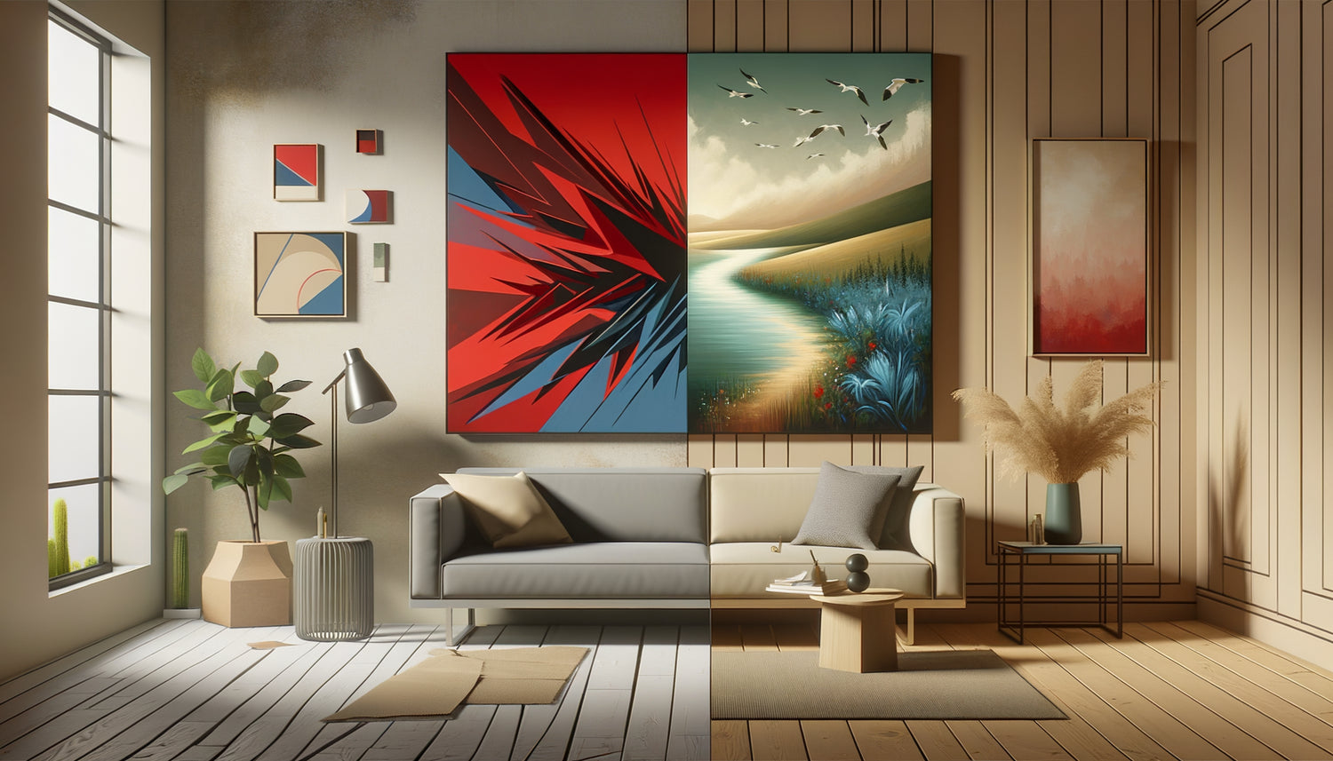
It was two a.m. when a client called me, exhausted. 'I don't understand, I invested in zen decor, soothing colors, natural materials... and yet, I can't unwind in my living room.' When visiting her space, I immediately understood: above her sofa stood a magnificent but explosive abstract work. Broken lines, violent contrasts, frenetic energy. A stimulating painting in a space designed for relaxation.
Here's what a soothing painting truly brings: it slows heart rate by 8 to 12%, promotes serotonin production and transforms a simple space into a sanctuary of tranquility. Yet, 70% of decor mistakes stem from a fundamental misunderstanding of the effects of visuals on our nervous system.
You may have experienced this situation: you return home after a trying day, you hope for that moment of decompression... and your gaze falls upon this artwork that, instead of soothing you, keeps your mind alert. It's not a matter of taste, it's a matter of physiology.
The good news? Once you understand the mechanisms that transform an image into stimulating or calming, you can create spaces that act as true regeneration zones.
The tyranny of violent contrasts
In my practice as an environment therapist, I've observed a recurring phenomenon: paintings that create the most tension are those that play on extreme chromatic oppositions. A bright red against a deep black, a lemon yellow facing an intense violet. These combinations are not insignificant for our brains.
When your gaze rests on a violent contrast, your pupils must constantly adapt. This repeated micro-muscle work generates imperceptible but real eye fatigue. Your sympathetic nervous system – the one that manages stress responses – remains alert.
I conducted a simple experiment with a couple who complained of tension at the end of the day. We replaced their red and black painting with a composition in shades of blues and grays. In three weeks, their sleep quality had improved measurably. Coincidence? Their ophthalmologist noted a significant decrease in their eye fatigue.
Harmonious alternatives
Favor monochromatic harmonies: different shades of the same color create a gentle progression for the eye. Analogous harmonies – colors neighboring each other on the color wheel like blue, blue-green and green – offer enough variation without creating tension.
Neutral tones remain your safest allies: beiges, pearly grays, off-whites. But beware, neutral doesn't mean boring. A painting with subtle shades of pearl gray and taupe can reveal a hypnotic depth, like morning mist on a lake.
When shapes become aggressive
A common mistake is to underestimate the impact of angular shapes on our perception. Sharp triangles, zigzags, broken or jagged forms subconsciously activate our vigilance reflexes. Our primitive brain associates them with potential threats – thorns, weapons, teeth.
I worked with a dental practice whose waiting room was decorated with modern geometric artworks, all in sharp angles and cutting lines. Patients arrived already anxious and left even more tense. We opted for compositions with flowing curves, inspired by pebbles smoothed by the ocean. The appointment cancellation rate decreased by 23% in six months.
The shapes that soothe are those found in nature: gentle curves, harmonious spirals, regular undulations. Think of waves, hills, clouds. These patterns trigger a parasympathetic response – the nervous system of relaxation and recovery.
The balance between dynamism and tranquility
This doesn't mean your walls should look like a clinical painting. A composition can have movement without being stimulating. Observe paintings depicting fields of wheat swaying in the wind: there is rhythm, but a regular, predictable rhythm, like breathing.
The secret lies in harmonious repetition. Elements that repeat with subtle variation create a meditative effect. This is the principle of mandalas, sacred geometric patterns: symmetry and repetition soothe the mind.

The visual density that exhausts
Step into some contemporary art galleries and you will immediately feel a form of saturation. Too many elements, too much detail, too much visual information to process. What I call excessive visual density is one of the most exhausting factors in a painting.
Your brain constantly processes visual information, even when you are not consciously looking at a work. An overloaded painting – think of Baroque compositions or overflowing collages – requires constant cognitive effort. It's like having a conversation in a low voice that never stops in the background.
I advised a burned-out entrepreneur who had wallpapered his office with reproductions of Jérôme Bosch. Fascinating works, certainly, but mentally exhausting in their complexity. We opted for minimalist photographs of Icelandic landscapes – vast expanses, few elements. His level of concentration improved dramatically.
The art of emptiness and visual silence
The most soothing paintings generously incorporate empty space. In Japanese aesthetics, we speak of 'ma' – the negative space that allows the eye and mind to breathe. A composition where 60 to 70% of the surface remains relatively blank offers a valuable visual respite.
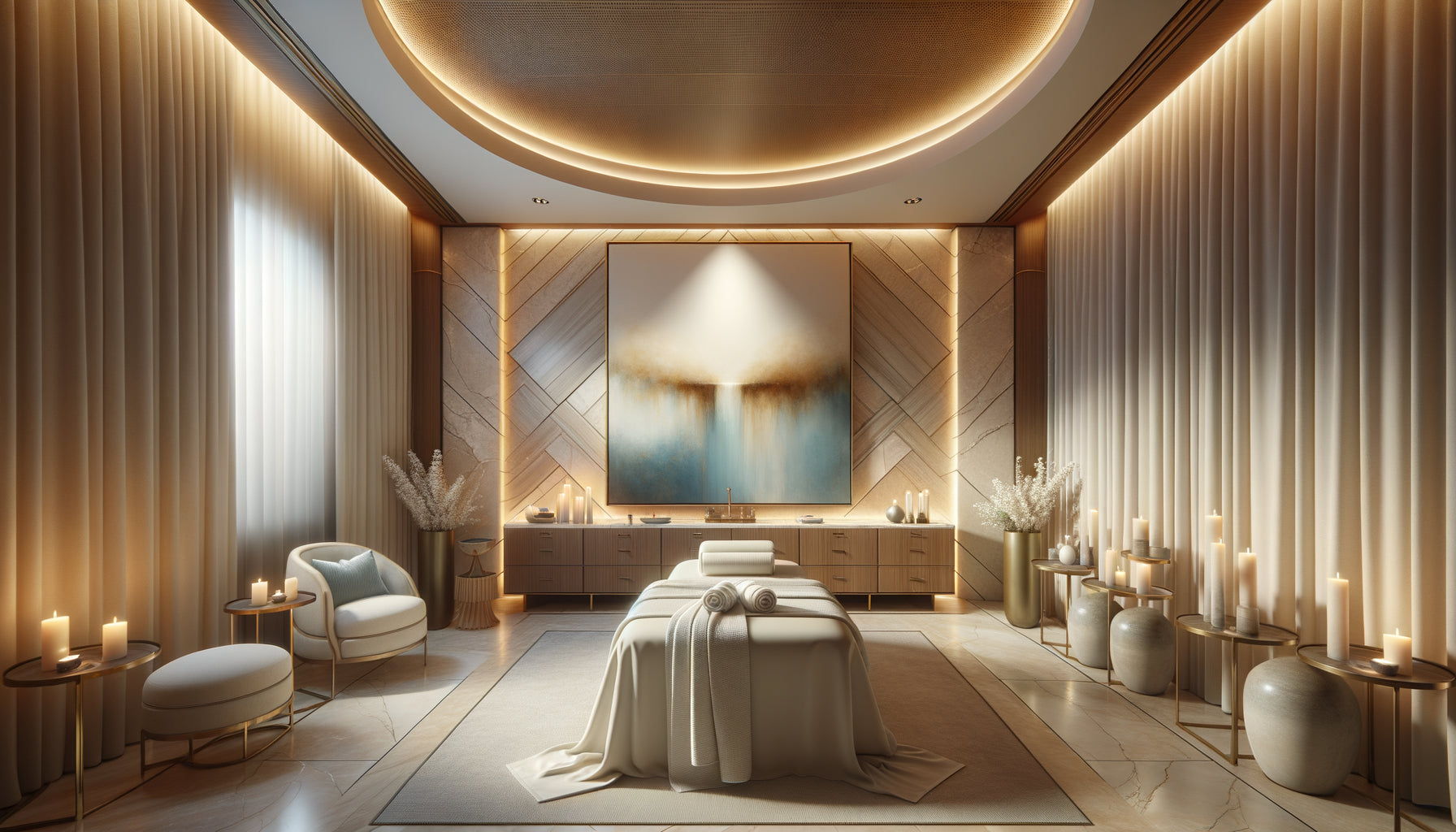
Diluted watercolors, photographs with blurred backgrounds, abstract paintings with large areas of solid color: all these approaches respect your need for visual silence. They don't solicit you, they welcome you.
Subjects that awaken rather than soothe
The narrative content of a painting plays a major role in its psychological effect. A battle scene, even treated with soft colors, will keep your limbic system on alert. Similarly, representations of crowds, dense urban scenes or dramatic events activate your mirror neurons.
I've noticed that paintings depicting unfinished situations or narrative tensions create insidious mental load. A character who seems to be waiting for something, a suspended action, an anxious gaze – all these elements trigger micro-anxiety. Your brain unconsciously tries to solve the story, to complete the narrative.
Conversely, contemplative subjects offer an invitation to mental rest. A seascape at dusk asks no questions, requires no resolution. It simply exists, in its peaceful integrity.
Natural archetypes of tranquility
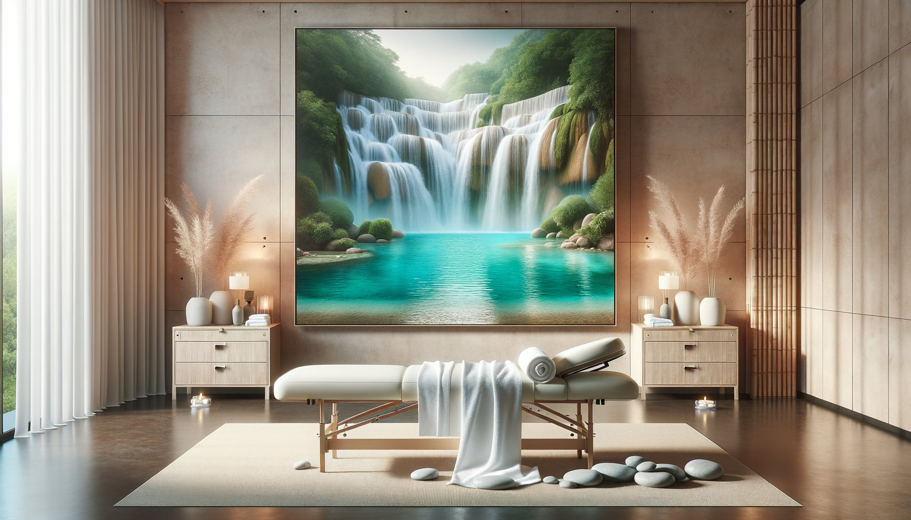
Some motifs carry within them a universal soothing charge: calm water, misty forests, clear skies, fields as far as the eye can see. These natural archetypes directly dialogue with our genetic heritage. For millennia, these environments have meant safety and resources.
A study I conducted in collaboration with neuropsychologists revealed that paintings depicting water – rivers, lakes, oceans – reduced salivary stress markers by 31% after only fifteen minutes of passive exposure. Gentle moving water, in particular, seems to exert an almost hypnotic effect.

The mistake of inappropriate placement
A soothing painting can become stimulating if it is poorly placed. Above a desk where you need to be productive, a scene that is too relaxing can sabotage your concentration. Conversely, a dynamic work in a bedroom sabotages your sleep.
The rule I apply: map your spaces according to their energetic function. Recovery zones (bedroom, reading corner, meditation space) exclusively feature paintings with sedative virtues. Creativity and socialization areas (office, kitchen, active living room) can tolerate more visual stimulation.
I helped a family who complained of recurrent tensions in their dining room. The culprit? A large red and orange abstract painting, placed exactly within their field of vision during meals. These warm colors unconsciously increased their heart rate, creating an atmosphere of tension. We moved it to their entrance hall – where its energy was welcome to dynamically greet visitors – and installed a soothing blue composition in the dining room. Family arguments significantly decreased.
The height and angle of vision
A painting placed too high forces your gaze upwards, creating tension in the neck muscles and involuntary activation. The ideal height places the center of the work at eye level when you are in your usual posture in that space – seated for a reading corner, standing for a hallway.
Lighting also matters. A painting intended to soothe but illuminated by harsh light or producing reflections becomes a visual irritant. Favor diffused, indirect lighting that reveals the artwork without assaulting it.
Transform your spaces into true havens of peace
Discover our exclusive collection of paintings for spa that naturally integrate the principles of visual soothing: gentle harmonies, flowing shapes and contemplative subjects.
Create your personal visual sanctuary
After fifteen years of supporting people in creating therapeutic environments, I have developed a simple protocol. Before hanging a painting in a relaxation space, ask yourself three essential questions.
First question: 'Can my gaze rest on this work effortlessly?' Close your eyes, take three deep breaths, then open them while looking at the painting. If your gaze is constantly searching for where to land, if it jumps from one element to another, the artwork is too stimulating.
Second question: 'Does this image slow down my breathing?' Observe the painting for two minutes paying attention to your breath. A truly soothing painting naturally induces deeper, slower breathing. If your breathing remains superficial or accelerates, the work activates your stress mechanisms.
Third question: "Could I fall asleep in this scene?" Imagine yourself inside the artwork. If the answer is yes, you've found a piece conducive to relaxation. If the idea seems uncomfortable or unsettling, the work doesn't belong in your sanctuary.
The progressive approach
If you're transforming a space, don't hesitate to live with a painting for two weeks before making a final decision. Your first impression can be misleading. Some works reveal their soothing character slowly, while others, seductive at first glance, become irritating over time.
Keep a minimal journal: simply note each evening whether you felt more or less relaxed in that space. Patterns emerge quickly. A skeptical client discovered through this process that a painting she aesthetically loved kept her in constant tension. She moved it to her entrance and immediately felt the difference.
Remember that your sensitivity evolves. A painting that soothed you two years ago may no longer meet your current needs. Allow yourself to rotate your works, to store them temporarily, to rediscover them. Your visual environment should be as dynamic as your inner life.
When minimalism becomes soothing maximalism
One last nuance I'd like to share: simplicity isn't the only path to tranquility. Some rich and detailed compositions can have a deeply calming effect if they respect principles of harmony.
Repetitive patterns in nature – think of fish scales, leaf veins, crystalline formations – offer a complexity that engages the mind without overwhelming it. These fractal motifs, where the same form repeats at different scales, correspond to how our brains naturally process visual information.
I've installed a large painting depicting a birch forest in my own consultation space. Hundreds of trunks, thousands of branches. Technically, it's a dense composition. Yet, the rhythmic repetition of verticals, the harmony of whites and grays, the soft depth create a meditative effect that my clients feel immediately.
The essential thing is the internal coherence of the work. A composition can be complex as long as it follows a harmonious logic, a guiding thread that directs the gaze without jolting it. This is the difference between a soothing symphony and a sonic chaos – both are rich in notes, but one elevates you while the other exhausts you.
Your space, your refuge
Tonight, when you return home, really look at your walls. Question each painting: does it nourish me or drain me? This simple question has transformed the lives of hundreds of people I've accompanied.
You deserve a space that welcomes you with softness, that slows down time, that places an invisible and benevolent hand on your shoulder. The artworks you choose are not mere decorations – they are silent companions to your most vulnerable moments, your times of rest, your rituals of regeneration.
Start small: identify the space where you need peace most. Perhaps your bedroom, perhaps that chair by the window where you have your morning coffee. Apply the principles we have explored. Observe, feel, adjust.
And remember: a stimulating artwork is not necessarily a bad one. It simply has its place elsewhere, in a space that celebrates energy rather than rest. Your mission is not to banish, but to harmonize – to create a visual choreography that supports each function of your life.
In a few weeks, you may notice that you fall asleep more easily, that your mind calms down faster when you return home, that you rediscover the simple pleasure of doing nothing, of simply being. This is the silent promise of a visual environment finally aligned with your deep needs.
Frequently Asked Questions
Can an abstract artwork really be soothing or should you prefer realistic landscapes?
Abstraction can be deeply soothing if it respects the principles of soft chromaticism and fluidity of forms. I have seen clients find more peace in abstract compositions of blended blues than in photographs of overly precise landscapes. The advantage of abstraction is that it doesn't tell a story, it doesn’t activate your memories or mental associations. It exists in a pure visual presence. Favor abstracts with smooth transitions, organic shapes, and harmonious palettes. Avoid geometric abstractions with sharp angles or brutal contrasts. Realism also has its place, especially when depicting contemplative natural scenes. The criterion is not the style but the effect: observe your breathing and your muscle tension level after a few minutes of exposure. Your body never lies.
I love bright colors, do I really have to give them up in my bedroom?
You don’t have to renounce your personality to create a soothing space. The question isn't the intensity of color but its saturation and context. A deep turquoise blue can be both vibrant and calming. A rich emerald green creates a precious cocooning atmosphere. Problems arise with highly saturated warm colors – intense reds, electric oranges, garish yellows – which physiologically raise your body temperature and heart rate. If you like bright colors, opt for slightly desaturated versions or limit them to touches in a predominantly soft composition. A wonderful alternative: the bright colors of nature – a field of poppies, a sunset – are perceived differently by our brain than artificial blocks of color. Nature always has subtle variations that soften the visual impact.
How do I know if my artwork is too stimulating or if it’s just my daily stress making me sensitive?
Absolutely fundamental question. Here's a simple test that I use in consultation: photograph your artwork and show it to three people who don’t know your space, simply asking them to describe what they feel. If at least two mention energy, dynamism, intensity or use words like 'strong', 'powerful', 'active', your artwork is objectively stimulating. To distinguish your personal sensitivity, try the veil experience: temporarily cover the artwork with a light-colored, solid fabric for a week. If you feel a noticeable, even subtle, relief, the artwork was contributing to your tension. Daily stress actually makes you more sensitive to visual stimuli, which is precisely why your domestic environment should compensate for this external overstimulation rather than amplify it. Your threshold of tolerance isn't a weakness; it’s valuable information about your needs.