I spent twelve years designing the visual identity of restaurants, from neighborhood bistros to Michelin-starred establishments. And each time a client asks me where to hang their artwork, I think back to that Lyon restaurateur who had installed a magnificent collection of lithographs... in his empty back room. The result? No one saw them. The walls near the tables remained desperately bare, and the atmosphere sorely lacked character.
Here's what strategic wall art placement brings to your restaurant: an immersive customer experience that transforms each meal into a memorable moment, optimization of every square meter to create a consistent atmosphere, and instant enhancement of your identity that fosters customer loyalty.
Many restaurateurs hesitate to install artwork near high-traffic areas or tables, for fear of cluttering the space or creating a sense of disorder. They relegate their finest paintings to free walls, thinking they are preserving a certain elegance. But this approach paradoxically creates cold, segmented spaces where customers never truly feel enveloped by the atmosphere of the place.
Rest assured: there are proven principles for creating the perfect balance between ambitious decoration and spatial comfort. By understanding how your customers perceive space according to their position, you will transform your restaurant into a place where each table becomes a unique experience.
I'm going to reveal how to orchestrate your wall art so that every customer, whether seated in the main dining room or near the entrance, fully enjoys your visual universe.
The psychology of sight: why blank walls are never enough
When a customer sits at a table, their field of vision naturally narrows. They no longer see the entire room as they did upon arrival. Their gaze focuses on what is immediately around them: the person facing them, the neighboring table, and especially the wall located in their direct line of sight.
I conducted a fascinating observation in a Parisian restaurant in Le Marais. The owner had concentrated all his photography collection on the back wall, near the bar. Magnificent staging... that only 20% of customers noticed. The remaining 80%, seated at the side tables, spent their evening facing impersonal white walls.
Wall art near tables creates what I call “visual intimacy bubbles”. They psychologically delineate the customer's personal space, transforming a simple place in a crowded room into a small personal cocoon. This feeling of ownership significantly increases perceived comfort.
Neuroscience teaches us that our brains process spaces differently according to their visual density. A blank wall activates brain areas related to expectation and impatience. A wall inhabited by an artwork stimulates circuits of pleasure and curiosity. Your customers don't just stay in your restaurant: they inhabit a universe you create for them.
The three strategic zones to orchestrate your artworks
Zone 1: Impact Walls (Entrance and Overall Impression)
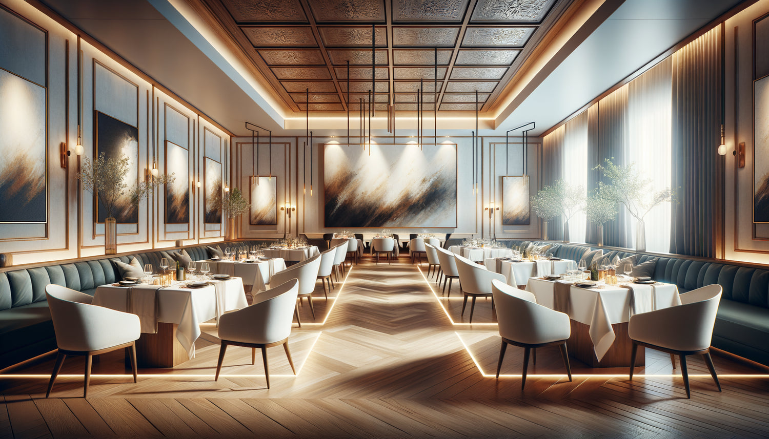
These are your traditional free walls, visible upon entry. They deserve your masterpiece pieces: large formats that tell your identity at a glance. I recommend minimum sizes of 100x150 cm for these locations, with strong visuals that set the tone.
A Breton seafood restaurant I accompanied installed an immense abstract canvas in ocean tones on its main wall. The effect? Customers systematically photograph this wall and mention the artwork in their online reviews. Your digital visibility starts with your physical visual impact.
Zone 2: Proximity Walls (Along Benches and Fixed Tables)
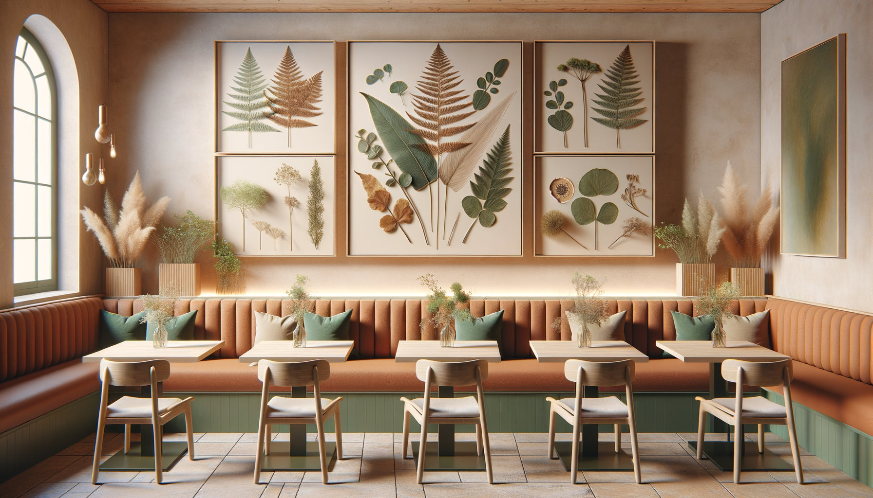
This is where the magic happens. Wall art installed 30-50 cm from chair backs creates an unparalleled intimacy. Opt for medium formats (60x80 cm or 70x100 cm) that enrich the experience without dominating the conversational space.
The golden rule? The center of the artwork should be at eye level when seated, approximately 120-130 cm from the floor. Too high, it disappears from natural vision. Too low, it creates a feeling of oppression.
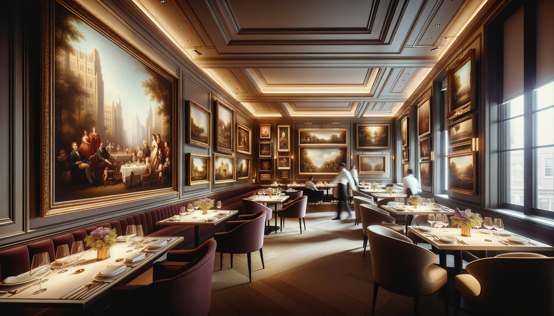
I've seen restaurants transform their attendance simply by dressing these proximity walls. Customers now book requesting “the table near the peony artwork” or “the bench under the lithographs.” Your artworks become emotional landmarks, reasons to return.
Zone 3: Circulation Walls (Corridors, Passages to Restrooms)
Never neglect these transitional spaces. Well-chosen wall art transforms the route to the restrooms into a mini-art gallery. Vertical format preferred (40x120 cm), hanging in series to create a visual rhythm that naturally guides the step.
A restaurateur from Toulouse created a “gallery of flavors” in his corridor: eight paintings representing aromatic herbs in macro photography. Customers slow down, observe, comment. A simple utilitarian passage becomes an extension of the gastronomic experience.

Fatal mistakes that ruin even the most beautiful artworks
Error #1: Installing oversized wall art near small tables. A 48x72 inch (120x180 cm) piece next to a two-seater table? Disaster. The customer feels overwhelmed, watched. Respect the one-third rule: your artwork should never exceed one-third of the width of the table it accompanies.
Error #2: Creating visually unequal zones. If your artworks are concentrated only on one side of the room, you create an implicit hierarchy between “good” and “bad” tables. Distribute your works harmoniously so that every customer feels valued, regardless of their seat.
Error #3: Ignoring specific lighting. A painting near a table requires indirect lighting that highlights it without dazzling the customer. I've seen too many restaurateurs install magnificent artworks in shadowy areas where they completely disappear at night.
Artwork lighting should represent 15% of your total light budget. Adjustable spotlights, warm color temperature (2700-3000K), adjustable intensity: these details make the difference between an amateur decoration and a professional staging.
The crossed gazes method for perfect placement
Here's my foolproof technique, tested in more than fifty establishments. Install yourself successively at each table in your restaurant for ten minutes. Note what your gaze encounters naturally, effortlessly.
First observation: identify the “visual dead zones” – those walls you fix without realizing because they are in your direct line of sight. These are your priority locations for captivating wall art.
Second observation: spot multiple viewing angles. Some strategic locations allow several tables to enjoy the same work, maximizing its impact. A painting placed at the corner of two perpendicular walls can enrich the experience of six to eight place settings simultaneously.
Third observation: test the “three-second rule.” If your gaze naturally settles on a location within the first three seconds after you sit down, that spot deserves quality artwork. Beyond that, the location remains secondary.
A Michelin-starred chef from Lille applied this method and was astonished to discover that his “star” wall (the one he saw from his kitchen) was only visible from four out of thirty-two tables. He redistributed his wall art based on actual customer gazes rather than his own perception. The result? A 23% increase in mentions of “exceptional atmosphere” in online reviews.

Compose a cohesive collection between proximity and distance
True sophistication comes from balance. Your free walls welcome declarative works that affirm your overall identity. Your close-up walls receive more intimate, detailed pieces that reward prolonged observation.
Create a visual conversation between these two levels. If your large canvas on a free wall represents an urban landscape, the wall art near the tables can decline architectural details, facade textures, shadow games. This thematic continuity creates an immersive experience without repetition.
I recommend the 60-30-10 rule adapted to catering: 60% of your “visual budget” on impact and free walls, 30% on close-up table walls, 10% on circulation areas. This proportion guarantees a strong first impression while preserving the richness of the seated experience.
Styles can also vary intelligently. Your free walls support bold, abstract contemporary works that capture attention. Near the tables, prioritize more figurative, narrative wall art that accompanies conversation without dominating it. Abstract art stimulates, figurative art soothes: play on this complementarity.
Ready to transform each table into a unique visual experience?
Discover our exclusive collection of wall art for Restaurant that enhances every location in your establishment, from impact walls to the most intimate corners.
Adapt your strategy to your restaurant type
A convivial bistro and a gourmet table do not call for the same approach. A table-to-table bistro massively benefits from wall art near the seats: they create a sense of personal space even in a tight configuration. Prioritize medium formats (50x70 cm), numerous, which generate a warm gallery atmosphere.
The gourmet table, with its generous spacing, can afford to concentrate art on free walls to create an elegant sobriety. But be careful: even in this context, a few selected works near certain tables (particularly romantic duo tables) bring a touch of appreciated exclusivity.
Theme restaurants (Japanese, Mediterranean, industrial) gain by distributing their wall art in a balanced way to reinforce immersion. Each customer, wherever they are seated, should be immersed in the universe you offer. Art then becomes a narrative tool that goes beyond simple decoration.
I accompanied an Asian fusion restaurant that installed calligraphy triptychs near each bench, while two lacquered panels adorned the main walls. Result: even the tables at the back, formerly shunned, are now sought after for their “artistic intimacy”.
Visualize the transformation of your space
Imagine your restaurant tomorrow evening, during Friday's service. A couple enters, discovers your large canvas on the welcome wall – immediate impact. We seat them at their table, and there, just within their natural field of vision, a more intimate work captures their attention while they consult the menu. They are no longer simply sitting in your restaurant: they inhabit a space designed for them.
The solo customer having lunch, the one who would have instinctively taken out his phone, is now observing the details of the lithograph to his left. He slows down, savors, stays fifteen minutes longer. Your art becomes your best salesperson, the one that transforms a functional meal into a welcome break.
The answer to your initial question? The two approaches are complementary, not opposed. Your free walls create identity, your proximity walls create experience. Installing wall art only on free walls is like serving only the appetizer of a menu: insufficient to fully satisfy.
Start this week: identify your three visual zones, test the cross-gaze method, and first invest in locations that will reach the most customers. Your restaurant will never be perceived the same way again.
Frequently Asked Questions about Wall Art Placement in Restaurants
What is the minimum distance to respect between a painting and the back of a chair?
I recommend an absolute minimum of 25 centimeters between the frame and the backrest at rest. This distance avoids any risk of snagging or bumping during sitting and rising movements. The ideal is between 30 and 50 centimeters: close enough to create the desired visual intimacy, far enough not to hinder natural movements. If your configuration requires a shorter distance than 25 cm, opt for a slightly higher hanging (140 cm from the floor to the center) or choose a vertical format rather than a horizontal one. In my projects, I often use discreet transparent felt protectors on the lower corners of frames for really constrained locations. This precaution protects both the artwork and the furniture without altering the aesthetics. Remember to physically test these distances by sitting down and simulating typical meal gestures before final installation.
How to choose the subjects of paintings according to their location in the restaurant?
The fundamental rule: free walls welcome declarative and energetic works that set the overall tone, while wall art near tables favors more contemplative and soothing subjects. Near dining areas, absolutely avoid overly figurative representations of food (paradoxically counterproductive) or anxiety-inducing themes. Prioritize landscapes, harmonious abstract compositions, elegant still lifes, or themes related to your culinary concept in a poetic rather than literal way. A Mediterranean restaurant will gain more from paintings evoking the light and textures of the South than from photos of dishes. For circulation walls, dare to use more dynamic, graphic subjects that create rhythm. I particularly like thematic series in these spaces: they tell a progressive story that makes movement interesting. Always adapt the emotional intensity of the work to the duration of exposure: strong and synthetic for quick passages, subtle and detailed for prolonged stay locations.
Should you change wall art regularly or keep a permanent collection?
This question reveals two equally valid philosophies depending on your positioning. A permanent collection creates a strong and reassuring identity: your regulars develop an emotional attachment to the works, which become an integral part of their experience. This is the approach I recommend for establishments seeking to build a lasting and recognizable image. On the other hand, seasonal rotation (every 3-4 months) stimulates curiosity and gives additional reasons to return and discover new items. This strategy works particularly well for young or trendy restaurants that cultivate a dynamic image. My favorite solution? The 80-20 compromise: keep 80% of permanent artworks that define your visual DNA, and renew 20% of your display according to the seasons or in collaboration with local artists. This formula creates novelty without losing consistency. Some of my clients even organize quarterly vernissages which become marketing events in their own right, transforming their restaurant into a temporary gallery and generating good coverage on social networks.