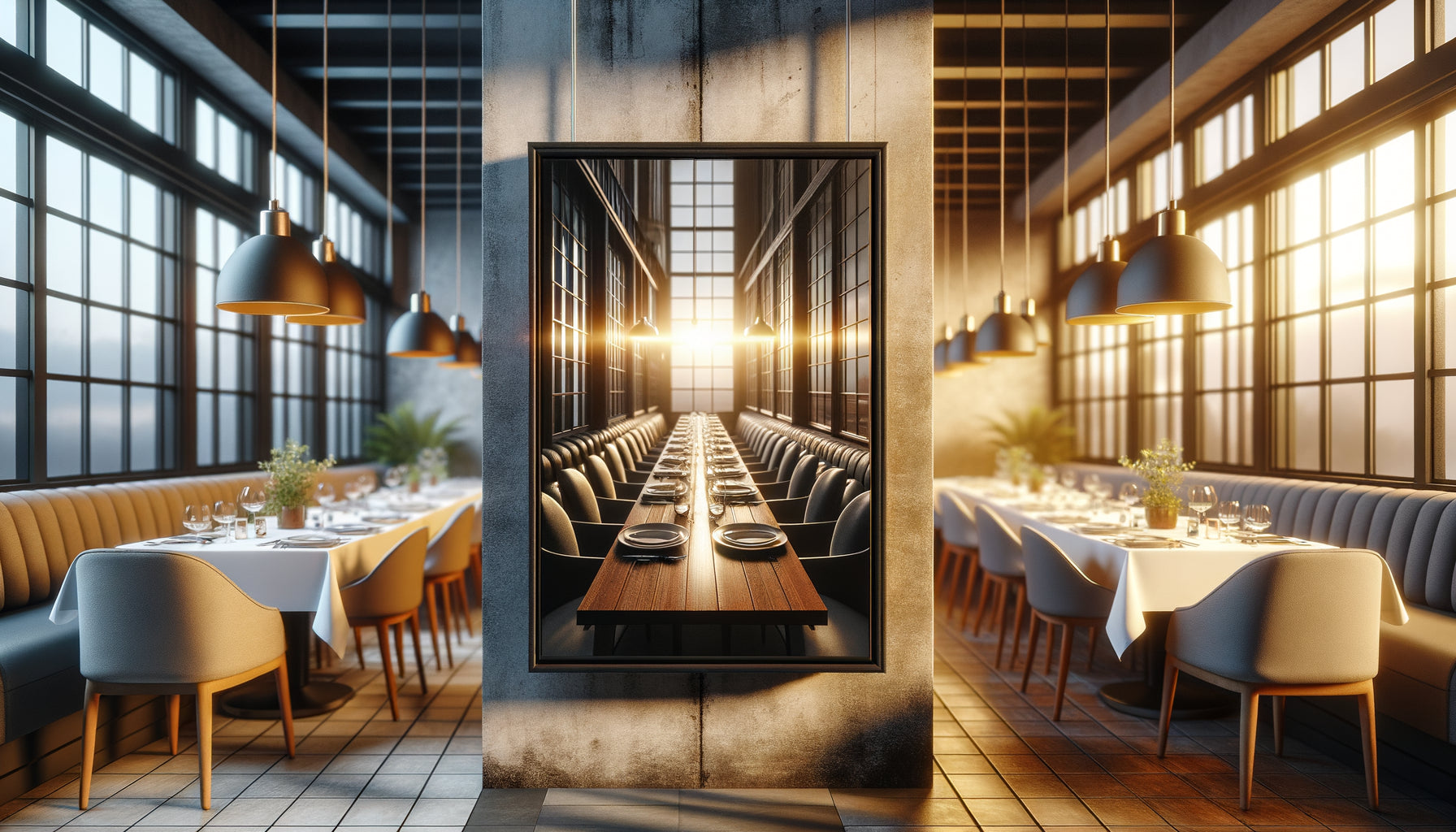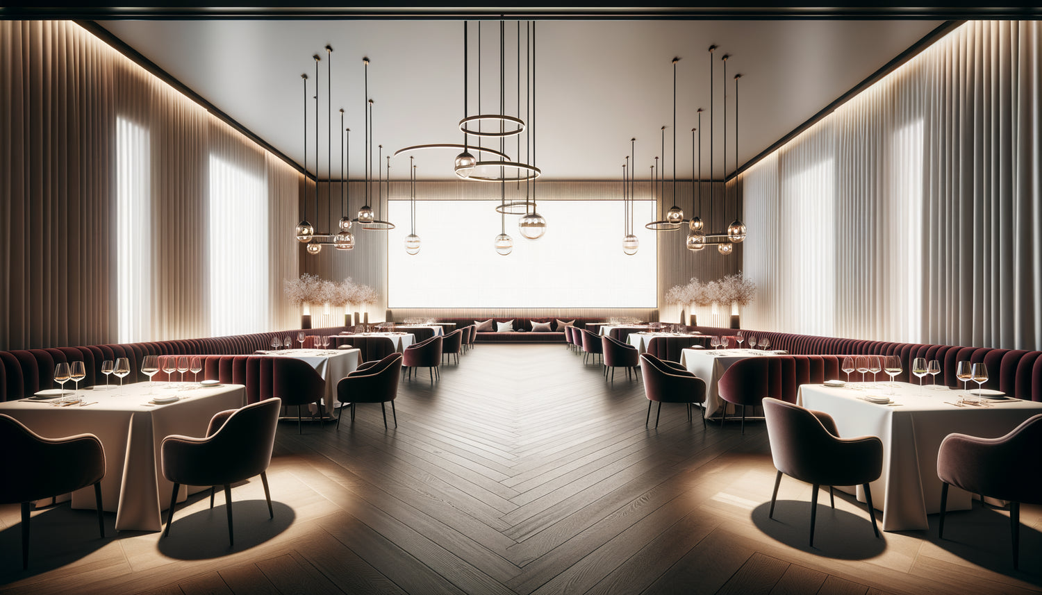
I've spent fifteen years transforming anonymous restaurant walls into spaces where every meal becomes a memorable experience. And if I were to count the number of times a restaurateur has asked me: “What do I put on this 6-meter long wall?”, I’d lose count. This endless wall, which runs along the banquettes or faces the entrance, often represents the greatest decorative challenge for an establishment. Too empty, it gives an unfinished impression. Overloaded, it stifles the atmosphere.
Here's what triptychs bring to restaurant long walls: a visual dynamic that guides the eye without tiring it, installation flexibility that adapts to architectural constraints, and a decorative presence that structures space without weighing it down. Where a single format risks getting lost or appearing disproportionate, the triptych creates rhythm and breathing.
You've probably already felt this frustration: you install a beautiful artwork on your long wall, yet something feels off. Either it seems tiny, lost in this expanse, or it overwhelms the room with its imposing mass. You wonder if you should have opted for several small formats, but you fear the “overloaded gallery” effect.
Rest assured: this question crosses the minds of all restaurant professionals. The solution doesn't lie in the absolute size of the artwork, but in its ability to dialogue with the architecture. And that’s precisely where the triptych reveals its relevance.
I will show you why triptych paintings are often the most elegant answer for dressing restaurant long walls, how they transform spatial challenges into decorative assets, and in what situations a single format might nevertheless be better suited to your establishment.
The spatial equation that every restaurateur knows
A restaurant is not a museum. This obvious fact changes everything. In a museum, the visitor comes for the artwork: they stop, step back, contemplate. In a restaurant, art accompanies the experience without dominating it. Your customers circulate, sit down, converse. Their gaze scans the space intermittently, capturing impressions rather than details.
On a wall of 5 to 8 meters – a classic dimension in urban restaurants –, a single artwork 2 meters wide will inevitably create dead zones. Empty spaces that attract the eye negatively. To fill these voids, you would be tempted to install a gigantic work of art 3 or 4 meters long. But then the question of necessary distance arises: in a restaurant where tables are close together, no one can step back far enough to embrace the artwork as a whole.
The triptych solves this equation with mathematical elegance. Three panels of 80 cm spaced 15 to 20 cm cover approximately 2.70 linear meters. But visually, they command nearly 3.50 meters of attention thanks to the intervals that create rhythm. The eye moves around, goes back and forth, perceives unity without saturation.
When composition becomes architectureFor a project for a Parisian bistro on rue du Faubourg Saint-Antoine, the owner absolutely wanted a large, unique seascape. His dream: to evoke his Breton origins. We installed a magnificent canvas 2.50 meters long. The result? Customers at nearby tables only saw a portion of sky or ocean, never the whole thing. Those in the back perceived it as an indistinct blue patch.
We eventually opted for a marine triptych: rocky coast on the left panel, oceanic expanse in the center, lighthouse on the right panel. Each guest, depending on their position, captured a different part of the scene. And miraculously, everyone felt like they were "seeing the complete work" because the brain reconstructed the narrative.
It is here that the triptych reveals its narrative strength. It doesn't present an image; it tells a sequence. For a restaurant, this effect is valuable: it shows without imposing, it suggests an atmosphere without hammering it. The three panels function like the three acts of a play or the three movements of a symphony.
Visual breathing
Between each panel of a triptych slips a space of silence. These few centimeters of bare wall are not empty: they create breathing. In the bustle of a restaurant – conversations, service movements, passages –, this visual breathing calms. It allows the eye to rest before bouncing to the next panel.
A unique format, even perfectly sized, imposes a compact presence. It can become oppressive on a long wall, especially if the work features saturated colors or a dense composition. The triptych fragments this presence while maintaining coherence. It's like comparing a monologue to a dialogue: the information can be identical, but the perception changes radically.

Situations where the unique format prevails
Let's be honest: the triptych is not a universal solution. I have worked on projects where a large, single format was clearly imposed.
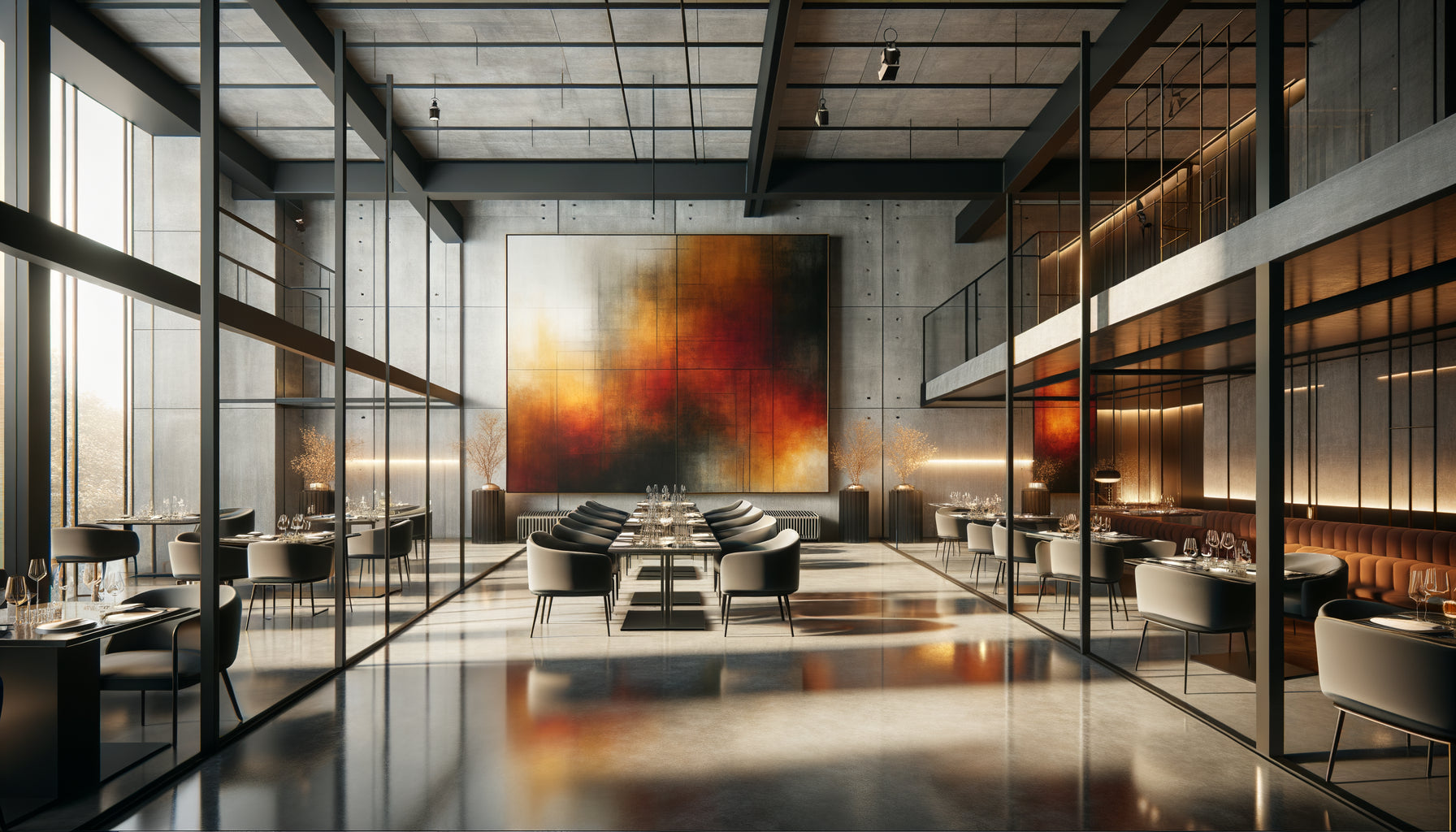
In an understated gourmet restaurant with minimalist decor, a single large format can become the absolute focal point. If all your decoration plays on restraint – restrained furniture, monochrome palette, subtle lighting –, a triptych risks introducing too much rhythm, too much movement. A unique, monumental and contemplative work will instead amplify this meditative atmosphere.
Visual breathing
Between each panel of a triptych slips a space of silence. These few centimeters of bare wall are not empty: they create breathing. In the bustle of a restaurant – conversations, service movements, passages –, this visual breathing calms. It allows the eye to rest before bouncing to the next panel. A unique format, even perfectly sized, imposes a compact presence. It can become oppressive on a long wall, especially if the work features saturated colors or a dense composition. The triptych fragments this presence while maintaining coherence. It's like comparing a monologue to a dialogue: the information can be identical, but the perception changes radically.Situations where the unique format prevails
Let's be honest: the triptych is not a universal solution. I have worked on projects where a large, single format was clearly imposed. In an understated gourmet restaurant with minimalist decor, a single large format can become the absolute focal point. If all your decoration plays on restraint – restrained furniture, monochrome palette, subtle lighting –, a triptych risks introducing too much rhythm, too much movement. A unique, monumental and contemplative work will instead amplify this meditative atmosphere.Similarly, some artworks lose their essence if fragmented. A full-length portrait, a centered composition, a scene whose strength lies in the concentration of the gaze: these subjects require the unity of format. Imagine cutting Girl with a Pearl Earring into three panels – the very idea seems sacrilegious. Some images demand this absolute integrity.
Finally, in small restaurants where the long wall does not exceed 3 to 4 meters, a triptych can create an impression of clutter. Three frames, three hanging points, three reflections of light: it is sometimes too much information for an intimate space with 30 seats. A single format of modest dimensions (120 x 80 cm) carefully centered will suffice to inhabit the space.
The psychological effect on your customers
Here's something few restaurateurs consider: how your customers photograph your establishment for Instagram or Google Maps. And yes, these photos are now your main storefront. A triptych offers exceptional photogenic qualities.
Its tripartite composition naturally creates depth in photos. The diagonals between the panels guide the eye to the rest of the room. In a selfie or table photo, the triptych in the background structures the image without dominating it. Result: publications where your restaurant appears « designed », thoughtful, harmonious.
A single imposing format, on the other hand, often appears cropped in smartphone photos. Too large to fit into the frame, it becomes an indistinct block of color. Unless you are lucky enough to have customers who do architectural photography, which remains marginal.
The visual memory of the experience
Several studies in environmental psychology show that we remember spaces better when they contain visual rhythms. A triptych creates just this memorable rhythm. Your customers will more easily remember « the restaurant with the three forest paintings » than « the restaurant with the large painting ».
This memorization is not insignificant. It directly influences word-of-mouth recommendations. When someone seeks to describe your establishment to a friend, they will rely on these distinctive visual markers. The triptych then becomes an identity element, just like your culinary specialty or your lighting atmosphere.

Practical installation: what the triptych changes
Let's talk about logistics, because that’s often where decisions are really made. Installing a triptych requires more preparation than a single format, certainly. Three levels to align, three attachment points to fix, the spacing to calculate. But this apparent complexity hides unexpected advantages.
First benefit: the modularity. Your wall presents a structural column that divides it into unequal zones? With a triptych, you can position two panels on one side, one on the other, playing with the spacing. Impossible with a rigid single format that would hit against the architectural obstacle.
Second advantage: transport and handling. Three 80 cm panels fit through any door, staircase or corridor. A single 3-meter format often requires contortions, even the removal of doors. In an active restaurant, where deliveries are made during off-peak hours through congested passages, this difference becomes decisive.
Finally, maintenance. One panel of the triptych is damaged? You replace it individually without dismantling everything. A glass breaks on a large single format? It's the entire work that needs to be taken down, transported and repaired. With the activity rate of a restaurant, these practical considerations weigh heavily.
Create a consistent visual signature
Beyond the functional question, the choice between triptych and single format defines your visual identity. A restaurant that multiplies single formats on different walls projects an image of an art gallery, an eclectic collection. A restaurant that favors triptychs affirms consistency, a desire for rhythm and harmony.
I accompanied a chain of contemporary breweries that made abstract triptychs their visual signature. Each establishment has its own triptych, in the same color range but with different compositions. Result: immediate brand recognition. Regular customers instantly identify “their” brewery, while perceiving belonging to a coherent whole.
Your long wall deserves better than a compromise
Discover our exclusive collection of wall art for Restaurant that transforms architectural challenges into unforgettable decorative assets.
Conclusion: the art of structuring space
So, do triptych paintings work better on the long walls of restaurants than single formats? The answer is not binary. It depends on your architecture, your identity, and the experience you want to create. But in most cases, a triptych offers a more suitable solution to the specific constraints of catering: constant traffic, multiple viewpoints, need for consistency without monotony.
The single format remains relevant in minimalist spaces, small surfaces, or when the artwork itself requires this integrity. But the triptych brings what restaurants fundamentally seek: a presence that accompanies without dominating, a structure that guides without constraining, a rhythm that enlivens without tiring.
Your next step? Measure your wall, photograph it from different angles, note the circulation areas and main viewpoints from the tables. Then imagine how a triptych could create a dialogue with these lines of force. You will probably see that long wall not as a problem, but as an opportunity to create a memorable visual experience for each of your customers.
FAQ: Your questions about triptych paintings in restaurants
How much spacing should be allowed between the panels of a triptych?
The ideal spacing is between 5 and 20 centimeters depending on the size of the panels and the desired effect. For panels 60 to 80 cm wide, I recommend 10 to 15 cm: enough space to create visual breathing room without excessively fragmenting the composition. In a restaurant where the gaze is often lateral (customers seated along the wall), a spacing of 15 cm works particularly well because it remains perceptible even in peripheral vision. Avoid spacings less than 5 cm, which give an impression of hesitation, as if you hadn't dared to choose between the single format and the triptych. Conversely, beyond 25 cm, you lose narrative coherence and get three separate paintings rather than a tripartite work. Also consider the proportions: the spacing should represent about 10 to 15% of the width of a panel to create a harmonious balance.
Does a triptych necessarily cost more than a single format of equivalent size?
Not necessarily, and that's great news for your budget. In terms of the artistic support itself, a triptych can even be slightly less expensive than a very large single piece, because monumental-sized canvases require reinforced frames and specific tensioning techniques. Three 80 x 100 cm panels are technically simpler to produce than a single 2.50 x 1.50 m canvas. On the other hand, framing effectively multiplies costs by three if you opt for quality frames. But here's the trick I often use: triptychs on stretched canvases without frames, with painted edges, offer a very elegant contemporary look while saving substantially on framing. For installation, yes, you will pay a little more in labor (three fixing points instead of one), but the difference remains marginal – count 30 to 50 euros extra. Ultimately, the value for money often favors the triptych for long walls, as it better solves the spatial problem.
Can a triptych be created with three distinct works or is visual continuity required?
Both approaches work, but they produce radically different atmospheres. A narrative triptych – where the three panels form a single continuous scene – creates a strong and unified presence, ideal for becoming the focal point of a restaurant. This is what I generally recommend for main walls. On the other hand, a thematic triptych – three distinct works but harmonized by the color palette, style or subject – offers more flexibility and prolonged visual interest. Your regular customers will discover different details on each visit. This approach works wonderfully well with photographs, geometric abstractions or botanical compositions. The key is to maintain consistency: same frame format, same dominant chromatic tone, same artistic style. Absolutely avoid mixing genres (abstract + landscape + portrait), which will create a visual cacophony. Think of your triptych as a musical chord: the notes can be different, but they must belong to the same key to create harmony.