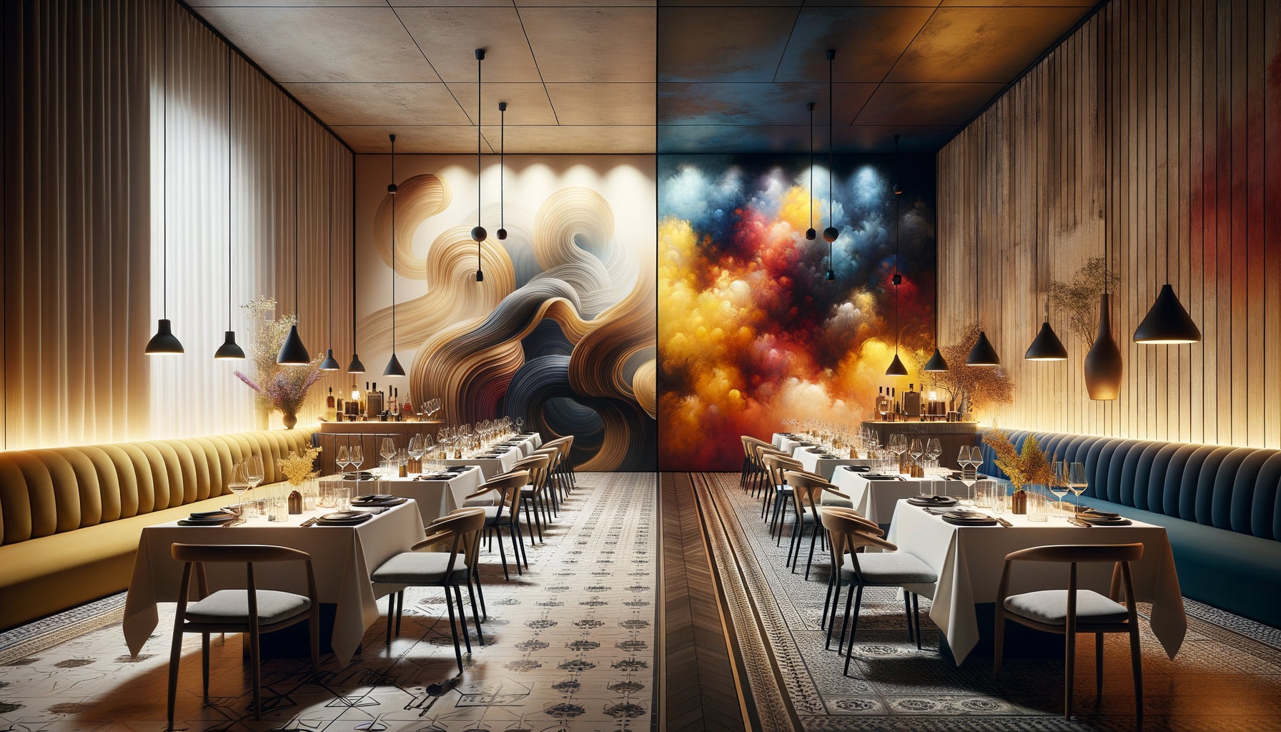
A few months ago, I walked into a Savoyard inn where everything seemed perfect: century-old beams, solid oak tables, caned chairs... Yet, something felt off. On the main wall hung an abstract canvas with fluorescent colors, completely disconnected from the soul of the place. The owner confessed to having spent weeks choosing his furniture but barely an hour on this wall art. A fatal mistake.
Here's what a well-chosen wall art brings to your rustic restaurant: it extends the story told by your wooden furniture, creates an enveloping atmosphere that brings back your customers, and transforms your walls into true extensions of your identity. It’s the difference between a nondescript decor and a memorable experience.
The problem? Faced with thousands of artworks available, we find ourselves paralyzed. How to ensure that this wall art will dialogue with these walnut tables, these pine chairs, this oak console? How to avoid bad taste while asserting your personality?
Rest assured: harmonizing a painting with wooden furniture in a rustic restaurant does not require a degree in art history. It just takes understanding a few fundamental principles that I will share with you, drawn from my fifteen years of accompanying restaurateurs in their quest for the perfect atmosphere.
In the lines below, you'll discover how to decode the language of your wood, choose colors that enhance rather than compete, and select a style that tells your story. Because a rustic restaurant deserves better than approximate decor.
Listen to what your wood is telling you before choosing your painting
Your wooden furniture already has an established personality. Pine exudes a rustic lightness with its visible knots and honey tones. Oak asserts its presence with its marked veins and amber hues. Walnut brings a dark, almost aristocratic sophistication. Starting by precisely identifying the wood species that make up your space is the first step to choosing a harmonious wall art.
I often observe this mistake: falling in love with a painting without considering the chromatic temperature of the surrounding wood. Pine furniture in light, warm yellow-orange tones will call for works with warm nuances: ochres, terracotta, olive green, golden beige. Conversely, dark walnut furniture with cool undertones will beautifully complement anthracite grays, deep blues, and forest greens.
Texture counts as much as color. If your tables bear the marks of time, with imperfections and a raw appearance, prioritize a painting with a textured surface: thick knife painting, visible linen canvas, matte finishes. This textural consistency creates a visual conversation between the elements of your rustic restaurant.
The three-meter test that never fails
Stand three meters away from your main wall. What is the dominant impression? Cozy warmth? Understated elegance? Mountainous robustness? Your wall art should amplify this impression, not contradict it. If your wood furniture evokes a forest cabin, a still life with mushrooms will work wonderfully where a tropical beach would seem incongruous.
Color palettes that enhance wood without competing
The harmony between wall art and wood furniture rests on a delicate balance: enough contrast for the artwork to stand out, enough consistency for it to seem like it has always belonged there. In a rustic restaurant, three color strategies work wonderfully.
The enriched tonal range strategy involves choosing an artwork that picks up on the tones of the wood and deepens them. With medium oak furniture, opt for chocolate browns, deep sepia, burnt ochres. This approach creates a cocooning, enveloping atmosphere, particularly suitable for intimate spaces. I've seen it transform a cold restaurant room into a cozy refuge.
The natural complement strategy introduces the colors that naturally accompany wood in its original environment. For light woods, think summer sky (pale blue), meadow (tender green), ecru linen. For dark woods, prefer deep forest green, stone gray, navy blue. These combinations speak to our subconscious, which recognizes these associations as natural and soothing.
The accent strategy brings a touch of more assertive color, but in a controlled proportion. A painting predominantly neutral (beige, taupe, gray) with accents of rust, olive green or duck blue. This note of color is then echoed in your cushions, tablecloths or tableware, creating a harmonious visual circulation throughout your restaurant.
Colors to absolutely avoid
In a space dominated by rustic wood furniture, certain colors create visual dissonances. Bubblegum pink, electric violet, neon orange clash with the authenticity sought. Similarly, pure black can create too aggressive of a visual hole – prefer nuanced anthracites. Immaculate white often appears clinical: opt for off-whites, ivoires, ecru that better dialogue with the natural tones of the wood.

Styles and subjects: telling the same story on walls and furniture
The most frequent mistake I observe? A rustic restaurant with farmhouse furniture adorned with urban abstract paintings or photographs of skyscrapers. This narrative disruption destabilizes customers who cannot identify the place's identity.
For an establishment with wooden rustic furniture, several visual universes work beautifully. Natural landscapes – autumnal forests, misty mountains, lavender fields – extend the invitation to nature already suggested by the wood. Still lifes representing game, fruits, vegetables, cheeses evoke local gastronomy in line with your culinary concept.
Rural scenes of life – village markets, grape harvests, field work – tell a story of authenticity and traditions. Antique botanical representations, with their slightly aged appearance and understated frames, bring a touch of learned elegance without breaking the rustic atmosphere.
Even abstract art can find its place, provided certain codes are respected. Favor organic abstractions, with shapes evoking driftwood, polished stones, or geological strata. Avoid overly strict geometries and very urban compositions that would contradict the countryside soul of the place.
The narrative power of series
A particularly effective technique is to install not one large wall art, but a series of three or four medium-sized works on the same theme. Herbs, antique tools, landscapes from different seasons... This repetition creates a visual rhythm that guides the eye and reinforces the identity of your rustic restaurant.
Format and placement: the art of just proportion
I have seen magnificent wall artworks completely lost because they were poorly sized or placed. In a restaurant with massive wooden furniture, proportions must respect the visual weight of the furnishings. An imposing 180 cm oak console requires a painting at least 120 cm wide – otherwise, the work will appear anecdotal.
The rule of thirds works remarkably: your artwork should measure about two-thirds the width of the furniture it surmounts. Above a large rectangular table, a horizontal format that follows the line of the furniture is preferable. Facing a series of high chairs, an elongated vertical format will create a nice counterpoint.
The ideal location is at eye level when seated, or about 140-150 cm from the floor for the center of the artwork. Your customers will spend most of their time sitting: it is from this position that they should fully enjoy the work. A painting that is too high gives the impression of being inaccessible, almost ignored by the space.
In corners, near beams, or framing a window, a wall art piece can play an architectural role by structuring the space. However, be careful not to overload: in a rustic restaurant where wood already occupies a lot of visual space, it is better to have a few strong works than multiple small paintings that would create confusion.

Frame and finishes: these details that make all the difference
The frame constitutes the transition zone between your wall art piece and your wooden furniture. This interface deserves your full attention. A raw wood frame, with its imperfections and visible grain, naturally dialogues with rustic tables and chairs. Driftwood brings a bohemian touch that works beautifully in mountain or seaside establishments.
The thickness of the frame should correspond to the robustness of your furniture. Massive, thick-lined furniture calls for substantial frames of 5 to 8 cm. More delicate furniture can accommodate thin frames of 2 to 4 cm. This consistency of proportion creates an unconscious harmony that the eye immediately captures.
The finish of the frame can echo that of your furniture: waxed wood for waxed furniture, aged wood for patinated furniture, untreated light wood for Scandinavian furniture. Some of my most daring clients have even had frames made from the offcuts of wood from their custom tables - a striking result of visual unity.
An elegant alternative: the frameless painting, particularly for contemporary works. The painted edges then extend the composition, creating a modern effect of continuity that pleasantly contrasts with the tradition of rustic furniture without contradicting it. This option works particularly well in restaurants that blend rusticity and contemporary touches.
Lighting, the accomplice too often forgotten
A beautifully chosen painting can lose all its impact with inadequate lighting. In your rustic restaurant, prioritize warm lighting (2700-3000K) that respects the cozy atmosphere while revealing the nuances of your work. A small directional wall lamp or a discreet track can transform the perception of a painting, especially in the evening when natural light declines.
Your rustic restaurant deserves a decoration to match
Discover our exclusive collection of wall art for Restaurants that naturally complements wooden furniture and creates the warm atmosphere your customers will never forget.
Wall art as a signature of your identity
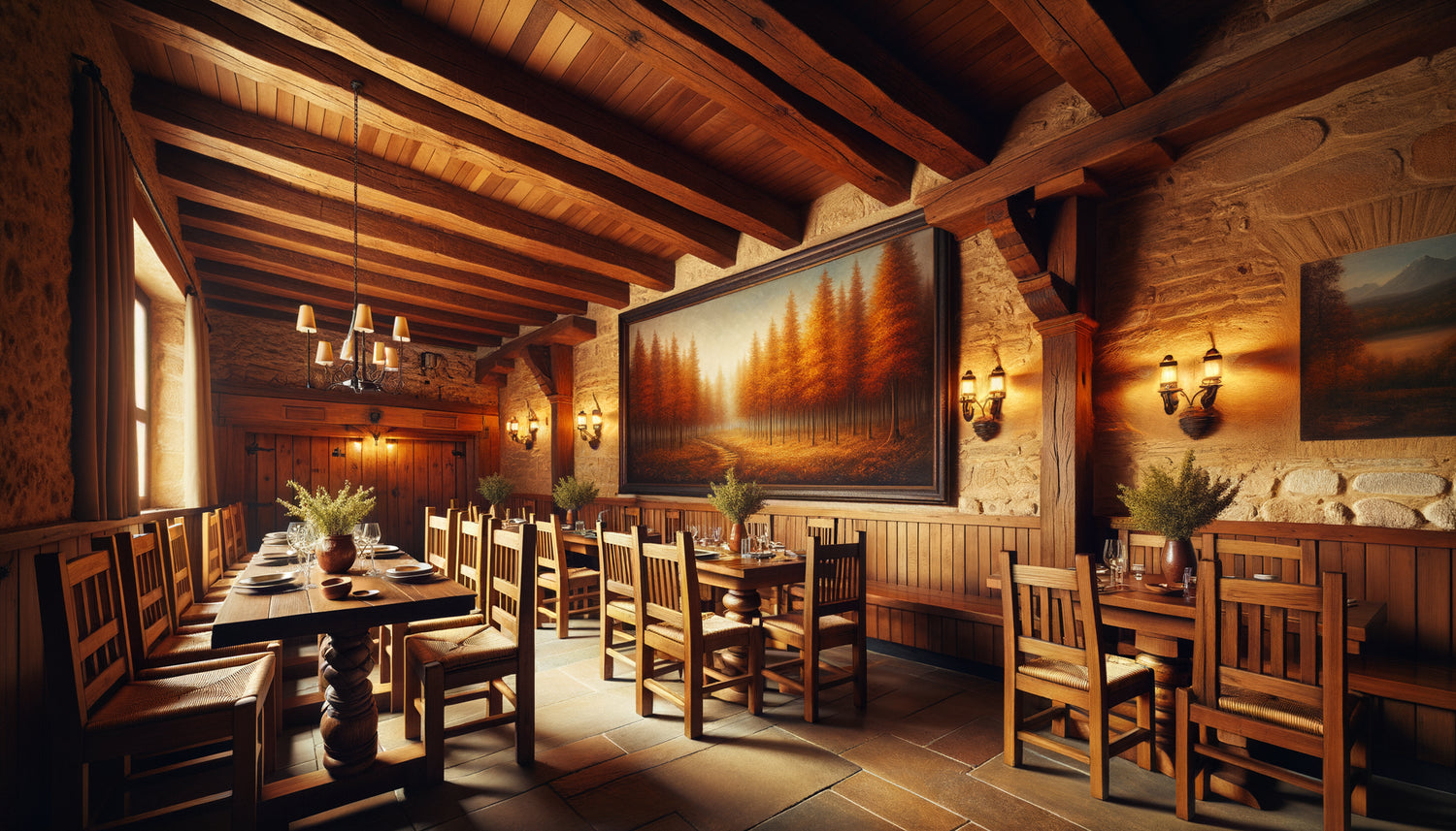
Imagine your guests, seated at their table enjoying their signature dish, their gaze naturally falling on this wall art that seems to have always been part of the place. This autumn forest with warm tones responding to the shades of your oak tables. This still life evoking the local produce you serve. This mountain landscape extending the architecture of exposed beams in your dining room.
Choosing a artwork that harmonizes with your wooden furniture is not a question of rigid rules, but of narrative consistency. Listen to what your space tells you, respect the personality of your wood essences, and let yourself be guided by the story you want to tell. The wall art of your rustic restaurant is not an accessory decoration: it's a silent ambassador of your vision and values.
Start today. Photograph your bare walls and furniture under different lighting conditions. Precisely identify your wood species and their dominant tones. Define three adjectives that summarize the desired atmosphere. This information will become your compass for selecting the wall art that will transform your space into a truly memorable experience.
Frequently asked questions about choosing wall art for a rustic restaurant
Can I mix different styles of wall art in my restaurant with wooden furniture?
Absolutely, provided you maintain chromatic and thematic consistency. If your wooden furniture already creates a strong visual unity, you can afford to vary the styles of wall art – a landscape here, a still life there, an abstraction elsewhere. The trick is to respect a common color palette and avoid brutal narrative breaks. For example, you can mix black and white photography of rural landscapes, oil painting of still life, and botanical watercolor, as long as the whole evokes the natural and authentic universe of your rustic restaurant. However, limit yourself to two or three styles maximum to avoid the cluttered effect that would dilute your identity.
What is the minimum size for a wall art to have an impact in a restaurant?
In a commercial space like a restaurant, wall art must have sufficient presence to be perceived despite the ambient animation. I recommend a minimum of 60x80 cm for an isolated painting, or 40x50 cm if you compose a series of three works. Above a large buffet or imposing console, do not hesitate to go up to 120x150 cm. Massive wooden furniture has a strong physical presence: a painting that is too small would seem intimidated, almost ridiculous. Also consider the viewing distance - in a large room, your customers may be 5 or 6 meters from the wall: the work must remain legible and impactful even from this distance. A simple test: photograph your wall with the painting and check that it remains visible and attractive even in an overall view of the entire room.
How to maintain a wall painting in a restaurant environment?
The environment of a restaurant poses specific challenges: humidity from the kitchen, temperature variations, possible splashes. To protect your wall art, choose imperatively a varnished work or protected by an anti-reflective glass if it is located near areas of passage or service. Avoid installing a painting directly above a radiator or facing a south-facing window, as these conditions accelerate the degradation of colors. Monthly dusting with a dry microfiber cloth is sufficient for routine maintenance. Once a year, have the hook and frame checked, especially if your establishment experiences vibrations (intensive traffic, music). In more exposed areas such as near the kitchen, prioritize quality reproductions rather than fragile original works - you can renew them every 3-4 years to refresh your decor without guilt or considerable investment.