In my framing workshop in Bruges, I handle canvases of all sizes on a daily basis. Yet, certain formats keep recurring: 50x65 cm for a classic landscape, 81x100 cm for a panoramic scene. These proportions are no coincidence. They directly inherit from an economic and artistic system developed five centuries ago by the Flemish guilds, those corporations of painters who revolutionized European art production.
Here's what the influence of the Flemish guilds brings to your understanding of art: the discovery of a rational system behind every painting you admire, the key to choosing formats that enhance your interior, and an intimate connection with a centuries-old tradition that still shapes our walls today.
Have you ever wondered why landscape paintings all seem to respect the same harmonious proportions? Why does a maritime panorama naturally breathe in a stretched format, while a mountain view flourishes in a more vertical frame? This apparent uniformity hides a fascinating history of commercial standardization and artisanal excellence.
Rest assured: understanding this influence requires no training in art history. By exploring the workshops of 16th-century Flanders, you will discover how pragmatic artisans laid the aesthetic foundations that still guide our contemporary decorative choices. This knowledge will transform your gaze on every work you contemplate.
When commerce meets art: the birth of a system
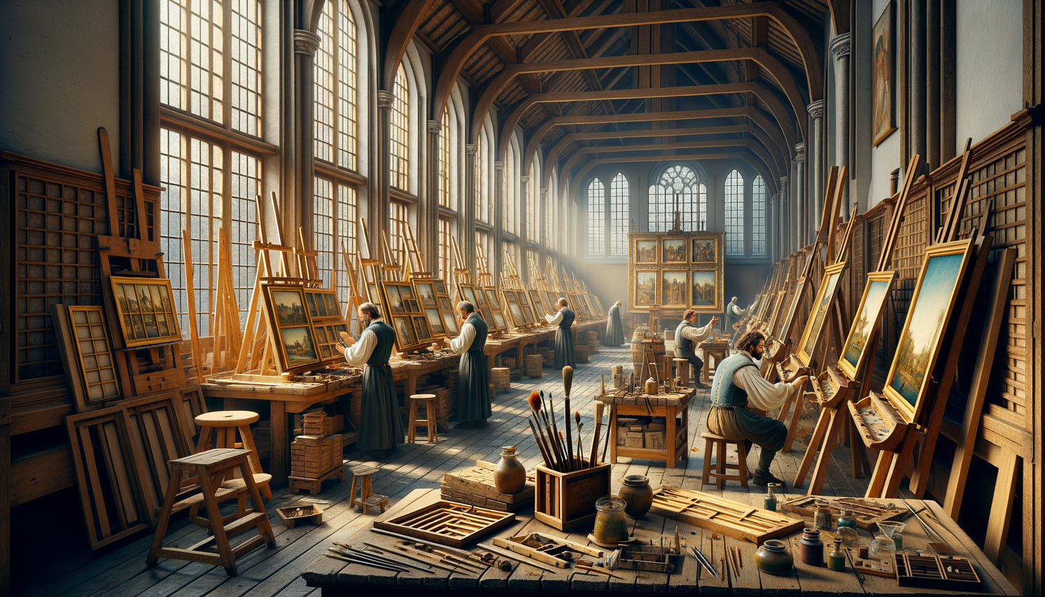
In the prosperous cities of Flanders – Antwerp, Bruges, Ghent – the guilds of Saint Luke brought together painters, sculptors and goldsmiths under the same corporate banner. These professional organizations did not only regulate artistic quality: they standardized production to facilitate international trade. Landscape formats were born from this dual requirement of excellence and efficiency.
The Flemish guilds established standardized measurements based on the dimensions of locally available wood panels. Baltic oak, imported in fixed-size planks, imposed material constraints. Rather than suffering them, master painters transformed this limitation into a creative opportunity, defining ideal proportions for each pictorial genre.
For landscapes, three main formats gradually emerge: the classic landscape format with a width/height ratio of approximately 1.3:1, the panoramic format reaching 2:1, and the vertical format for architectural views. These proportions are not arbitrary: they correspond to the natural perception of our field of vision and how our eye scans a natural scene.
The geometry of harmony: why these proportions work
In my daily work, I notice that the formats inherited from the Flemish guilds possess a timeless quality. A forest landscape in a 65x50 cm frame immediately captures the eye, creating a perfect balance between the horizontality of the subject and the verticality of the support. This harmony is not the result of coincidence.
Flemish painters, keen observers of nature, intuitively understood what science confirms today: our peripheral vision extends more in width than in height. The standardized landscape format reflects this physiological reality, offering a natural frame for rural, marine or urban scenes. When you hang a painting respecting these proportions, you create a window that organically extends your space.
The guilds also codified secondary formats for specific uses. The so-called 'marine' format – particularly elongated – accompanied coastal views and distant horizons. The 'landscape figure' format, slightly more vertical, was suitable for pastoral scenes with characters. This specialization allowed collectors to harmonize their galleries according to consistent aesthetic rules.
The export of a European standard
The commercial power of the Flemish guilds propagated these formats far beyond the Netherlands. Art merchants who bought landscapes in Antwerp to resell them in Venice, Madrid or London demanded standardized dimensions facilitating transport and framing. Gradually, all of Europe adopted Flemish proportions as implicit references.
This standardization profoundly influenced subsequent artistic production. Even French painters of the 17th century, working for an aristocratic clientele, respected the formats inherited from the Flemish guilds. The Royal Academy of Painting in Paris would eventually codify these dimensions officially, conferring institutional legitimacy that still persists today.

From the Flemish easel to your living room: a remarkable continuity
When you choose a landscape painting for your interior, you unknowingly perpetuate a five-century tradition. The formats offered by contemporary framers – 40x50 cm, 60x80 cm, 70x100 cm – derive directly from the standards established by the Flemish guilds. This continuity is a testament to the intuitive accuracy of these original proportions.
In my practice, I observe that customers instinctively turn to these classic formats, even when offered modern alternatives. A maritime landscape in an 80x60 cm frame generates immediate satisfaction, as if the subject had found its natural setting. This aesthetic resonance can be explained by centuries of collective visual conditioning.
Flemish guilds also influenced how we compose our walls. Their practice of creating harmonious sets – series of landscapes with coordinated formats – directly inspires current 'gallery wall' trends. Arranging three artworks of related sizes creates a visual coherence inherited from this corporate harmonization logic.
Subtle variations : how formats tell stories
Beyond standardization, Flemish guilds passed down a subtle knowledge: each format variation modifies the narrative experience of the landscape. A slightly more square format (1.2:1 ratio) concentrates attention on a central element – a majestic tree, an isolated farm. The panoramic format invites visual travel, guiding the eye from one edge to another of the composition.
This sensitivity to landscape proportions is particularly valuable when choosing a work for a specific space. A narrow hallway naturally welcomes a vertical format or a triptych of elongated views, while a living room wall calls for a large horizontal format. Flemish masters had anticipated these architectural considerations in their system of formats.
I often recommend to my clients to experiment with traditional proportions before exploring bolder contemporary formats. Understanding why a 3:2 format works for a countryside landscape gives you the keys to appreciate – or intelligently transgress – these conventions established by the Flemish guilds.
Persistence in contemporary art
Even today's landscape photographers and digital creators gravitate around formats inherited from the guilds. The 3:2 ratio of reflex cameras is not so far from the Flemish 1.3:1. This permanence suggests that these proportions respond to something fundamental in our aesthetic perception, beyond trends and eras.
Want to welcome this tradition into your home?
Discover our exclusive collection of nature artworks that honor the timeless proportions established by Flemish masters, to transform your interior into a harmonious gallery.

Choosing Wisely: Applying the Flemish Heritage Today
Understanding the influence of Flemish guilds on the standardization of formats significantly enriches your decorative decisions. Rather than choosing a painting at random, you can now assess whether the proportions serve or detract from the subject depicted. A vast alpine panorama deserves an elongated format that amplifies its majesty; a dense forest thrives in a more vertical frame that accentuates the elevation of the trunks.
In my workshop, I always encourage clients to hold the works at different distances, to visualize them on their walls. Classic Flemish formats possess this remarkable quality of working equally well from near and far. Their intrinsic balance never fatigues the eye, creating a soothing presence that traverses decades without tiring.
The essential lesson of the guilds remains their ability to combine commercial rationality with aesthetic excellence. By standardizing landscape formats, they did not stifle creativity – on the contrary, they established a universal visual language allowing artists to focus their inventiveness on composition, light, and atmosphere. This liberating discipline remains relevant for any contemporary creator.
The Silent Echo: When History Dialogues with Your Wall
Each time you hang a landscape in a traditional format, you weave an invisible link with the Bruges workshops of the 16th century. This silent dialogue across the centuries confers an unsuspected depth to your decorative gesture. You are not simply choosing a pleasant image: you are perpetuating a conversation aesthetic begun by artisans who believed in the civilizing power of visual harmony.
The Flemish guilds bequeathed us far more than a system of measurements. They demonstrated that technical constraints, far from stifling creativity, can structure excellence. Their influence on the standardization of landscape formats illustrates how a pragmatic organization of artistic work paradoxically engenders lasting and universal freedom of expression.
Imagine your living room transformed by this new understanding. Each landscape painting becomes a window not only onto the nature depicted but also onto the fascinating history of the art trades. Your guests will no longer simply see a pretty woodland view – they will contemplate the culmination of a technical and aesthetic tradition that has shaped five centuries of European visual culture. Simply start by observing the proportions of the works that spontaneously attract you. You will probably discover that they respect the ratios established by Flemish masters, living proof that certain harmonies cross the ages without ever growing old.
Frequently Asked Questions
Why are landscape formats so uniform in commerce?
This uniformity can be directly traced back to the influence of Flemish guilds, which as early as the 16th century standardized dimensions to facilitate the production and international trade of artworks. These painters' corporations established proportions based on available materials (particularly Baltic oak panels) and on our natural visual perception. The classic landscape format with a width-to-height ratio of approximately 1.3:1 became dominant because it corresponds to our natural horizontal field of vision. This standardization gradually spread throughout Europe thanks to the commercial network of Flemish art dealers, and was later formalized by painting academies. Even today, the formats offered by frame manufacturers and printers derive from these original proportions, testifying to their intuitive accuracy and ability to enhance natural scenes.
How to choose the right landscape format for my interior?
The choice of format depends both on your space and the subject depicted. For a living room wall or above a sofa, prioritize a classic horizontal format (ratio 1.3:1 or 1.5:1) that creates a balanced presence without dominating the space. The Flemish guilds taught us that each proportion tells a different story: a very elongated panoramic format (2:1 ratio) invites visual travel and is perfect for seascapes or vast horizons. For a narrow hallway or between two windows, a more vertical or square format concentrates attention on a central element. Always consider the ceiling height and viewing distance: traditional Flemish formats have this remarkable quality of working just as well up close as they do from afar. Feel free to cut out a piece of cardboard with the intended dimensions and temporarily position it on your wall to assess the effect before making a final purchase.
Do standardized formats limit artistic creativity?
Contrary to this common belief, the Flemish guilds demonstrated that standardization of formats paradoxically frees creativity. By establishing proven harmonious proportions, they allowed artists to focus their inventiveness on composition, light treatment, atmosphere and subject rather than technical dimension questions. These formats constitute a universal visual language that facilitates aesthetic communication between creator and viewer. The greatest landscape painters – from Bruegel to Turner, from Corot to the Impressionists – worked in these classic formats without ever feeling limited. The discipline of an established proportion structures excellence rather than constrains it. That said, knowing these traditional conventions also allows you to intelligently transgress them for specific effects: an unusual square format for a landscape can create interesting creative tension, but this transgression only makes sense in relation to the established norm.