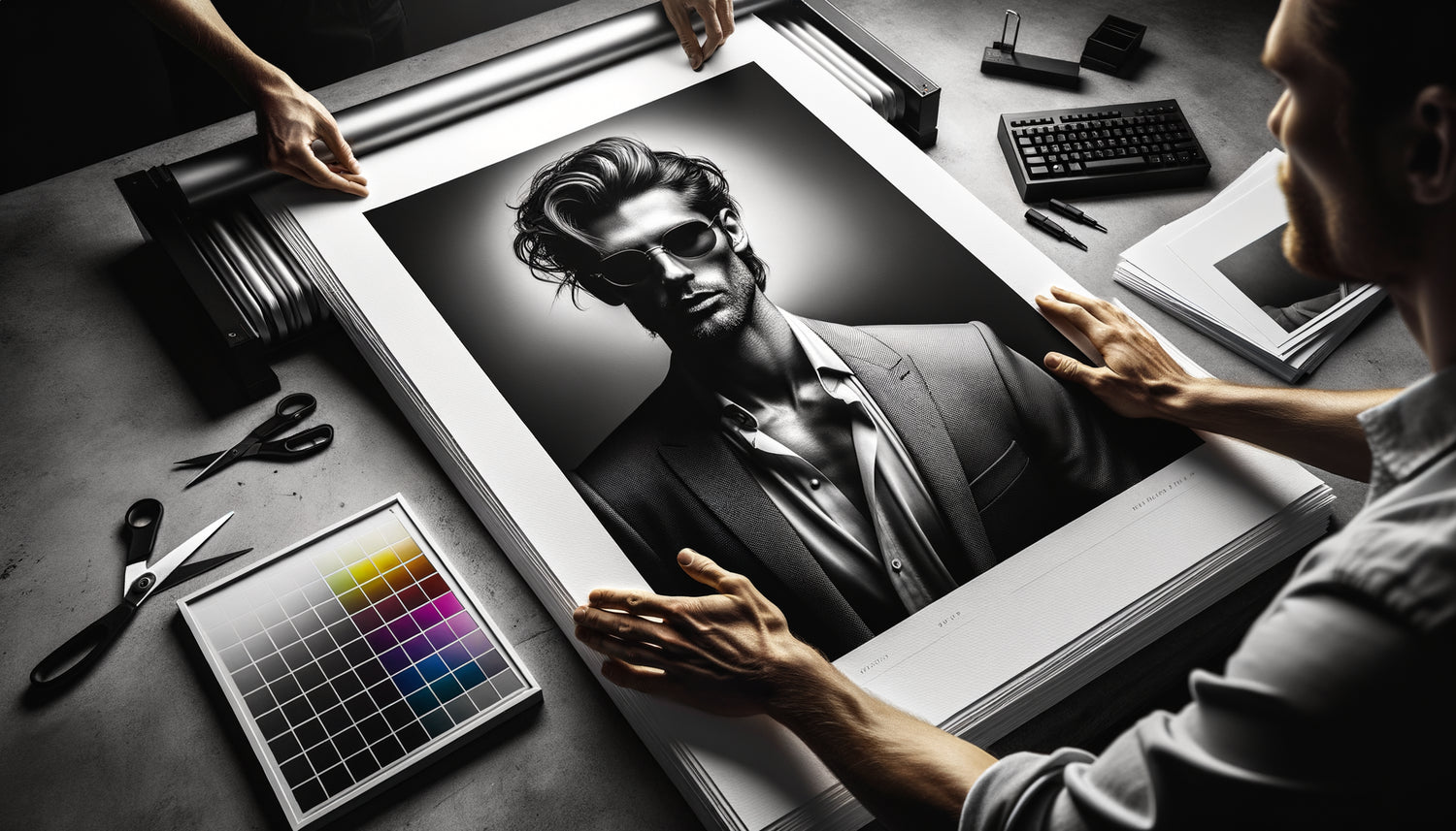
I will never forget the day a client contacted me urgently. She had just received a limited edition photograph signed by a renowned artist. The deep black of the clothing, the striking contrast with the model's skin... everything was perfect. Until she hung it facing the window in her Parisian living room. Daylight revealed the printed reverse side through transparency, turning this €800 piece into a simple poster. A nightmare.
Here's what an appropriate Fine Art paper weight guarantees: total opacity that enhances your contrasts without compromise, a physical presence that confers value and authenticity, and peace of mind to display your works in front of any light source.
You love these fashion prints with deep blacks, these haute couture portraits where every detail counts. But how many times have you hesitated in front of the screen, wondering if the print would live up to your expectations? This question of paper weight seems technical, almost secondary compared to the beauty of the image. Yet, it determines whether your investment will transform into a wall masterpiece or a visible disappointment when viewed against the light.
Rest assured: after fifteen years managing a gallery specializing in fashion photography and having supervised more than 2000 Fine Art prints, I can assure you that there are precise benchmarks. Standards that transform a simple print into a true collector's item.
In this article, I will reveal exactly which paper weight to choose according to your fashion style of work, why strong contrasts require particular attention, and how to avoid costly mistakes that even experienced collectors still make.
The critical threshold: why 270 g/m² represents the absolute minimum
When we talk about contrasted fashion works, we generally evoke these spectacular compositions: a black dress sculpted by light, an immaculate white background that highlights a carmine lipstick, these games of shadows and lights that define exceptional fashion photography.
Fine Art paper below 270 g/m² has a structure too thin to completely block the transmitted light. On a print with moderate contrasts, this transparency remains discreet. But on a work of fashion where deep blacks meet pure whites, the phenomenon becomes flagrant: heavily inked areas create visible dark spots on the reverse side, while the lighter parts reveal the texture of the wall or support.
I personally tested prints on 200 g/m² paper for an exhibition of runway portraits. Result: under the halogen lighting of the gallery, some prints seemed almost translucent in their lightest areas. A catastrophe narrowly avoided by reprinting everything on a denser medium.
The 270 g/m² weight therefore marks this point of equilibrium where the opacity begins to be sufficient for moderately contrasted works. But for truly dramatic fashion compositions, those that precisely play on these stark contrasts, this threshold remains low.
310 to 340 g/m²: the comfort zone for pronounced contrasts
This range represents the ideal territory for most contemporary fashion works. A 310 g/m² Fine Art paper offers substantial thickness, reassuring rigidity to the touch, and above all opacity that effectively blocks light transmission.
Take the example of a typical high-fashion photograph: a model dressed in black against a pure white background, with deep shadows sculpting the face. On a 310 g/m² paper, even when placed in front of a window in full daylight, the print retains its visual integrity. Blacks remain impenetrable, whites betray no parasitic information from the back.
This grammage also corresponds to the standard used by most professional fashion photographers for their limited editions. It offers several concrete advantages:
→ A physical presence that justifies the price of a work of art
→ Easy handling during framing without risk of creasing
→ Optimal long-term preservation thanks to structural stability
→ Compatibility with all professional mounting systems
For a fashion print of 60x90 cm with pronounced contrasts, I systematically recommend 310 g/m² minimum. This density guarantees that your investment will last through the years without the perceived quality degrading, even if exposure conditions evolve.

Beyond 400 g/m²: when excellence meets prestige
Some Fine Art papers reach 400 or even 450 g/m². At this level, we enter the realm of premium gallery prints, those intended for demanding collectors and high-value pieces.
The opacity becomes total, absolute. Even a powerful lamp placed directly behind the print reveals no transparency. But beyond this technical aspect, these grammages bring a unique sensory dimension: the weight in hand, the texture under your fingers, the slightly different sound when you handle the work.
I exhibited a series of Haute Couture runway portraits printed on 430 g/m² paper. Visitors invariably stopped longer in front of these pieces. Several spontaneously told me that the artwork seemed more 'real', more 'precious'. The grammage becomes an element of the aesthetic experience, not just a technical specification.
For large-format fashion works (over 100 cm), for very limited editions (less than 10 copies), or for pieces intended for prestigious environments, these higher grammages represent a consistent choice. The additional cost remains moderate (about 30% compared to a 310 g/m²) for a considerable perceived benefit.
The Pitfalls of Transparency According to Paper Types
Not all Fine Art papers behave the same way in terms of transparency, even at equal grammage. Chemical composition, surface treatment, and fiber structure dramatically influence the final result.
Fine Art papers made from 100% cotton, such as Hahnemühle Photo Rag or Canson Infinity Rag Photographic, naturally offer better opacity than alpha-cellulose based papers. Their denser fibrous structure blocks light better. A 308 g/m² cotton paper can rival in opacity with a 350 g/m² cellulose paper.
Satin or semi-gloss papers often have a coating layer that slightly improves opacity compared to ultra-matte surfaces. For fashion works with extreme contrasts, this difference can be decisive.
Pay particular attention to 'natural white' or 'warm tone' papers: their slightly creamy tint better masks any possible transparencies than bright pure whites, which tend to amplify the phenomenon.
I compared side by side the same very contrasting fashion image printed on five different 300-310 g/m² papers. Opacity differences reached 20 to 25% depending on the references. Grammage alone does not tell the whole story: the nature of the paper counts as much as its thickness.

How to Test Opacity Before Validating Your Order
Here is a simple method that I systematically use in galleries before validating a series of prints for an artist. It avoids unpleasant surprises on important orders.
Always request physical samples of the papers being considered. Manufacturers like Hahnemühle, Canson or Epson generally offer free or low-cost sample packs. Receive these samples at your home, in your actual exhibition environment.
Place the sample in front of a window in full daylight. Observe it from backlighting. Can you clearly see your fingers through it? Can you distinguish the pattern of a printed paper placed behind it? If so, the grammage or type of paper is not suitable for strong contrasts.
Then simulate the intended lighting conditions. If your fashion work will be placed between two windows, facing a bay window, or lit by powerful spotlights creating indirect backlighting, test these configurations with the sample.
Finally, compare the visual rendering with and without backlighting. On an insufficiently opaque paper, you will notice a loss of depth in blacks, a 'veil' that attenuates contrasts. This is exactly the phenomenon you are trying to avoid.
Transform your space with the intensity of captured fashion
Discover our exclusive collection of fashion wall art that enhances contrasts without compromising on print quality.
The golden rule I've applied in galleries for fifteen years
After thousands of prints and countless customer feedback, I’ve established a simple recommendation that has never failed: for any fashion artwork featuring areas of pure black covering more than 30% of the surface, do not go below 310 g/m².
This rule applies particularly to the following compositions: fashion portraits on a uniform background, photographs of black clothing, silhouettes backlit, studies of dark drapes, or graphic creations combining black typography and white space.
For less contrasting works (dominant mid-tones, soft atmospheres, pastel colors), 270-280 g/m² paper may be sufficient. But as soon as the composition deliberately plays on extremes, investing in a higher grammage is not a luxury, it's a technical necessity.
I always add this precision to my clients: the extra cost of 310 g/m² paper versus 250 g/m² generally represents 15 to 20% of the total price of a Fine Art print. But it eliminates 100% of the risk of disappointment. The calculation is quick.
Imagine your interior in six months. This runway photograph that you admire every morning while drinking your coffee. The deep blacks that give structure and character to your living room. The bright whites that dialogue with natural light without ever betraying their manufacturing secret.
The right Fine Art paper grammage is not just another technical variable. It’s the guarantee that your aesthetic and financial investment will maintain its integrity, whatever the exposure conditions. It's the difference between a print that makes you doubt and a work that makes you proud.
Start by identifying the contrast level of the artwork that attracts you. Observe the proportion of deep blacks. Consider the intended location. Then choose 310 g/m² as a basis for reflection for affirmed contrasts, adjusting upwards (400 g/m²) for exceptional pieces, or downwards (270 g/m²) only for soft atmospheres.
Your wall awaits this presence, this intensity that never fades. Even backlit.
FAQ: Your questions about grammage and transparency
Can framing compensate for insufficient grammage?
This is a question I hear regularly, and the answer is nuanced. A frame with a mat does indeed create a distance between the glass and the print, which slightly reduces the risk of visible transparency. Similarly, a rigid opaque backing (foam board, dibond) placed directly against the back blocks any light transmission. However, these solutions have significant limitations. First, not all decorative styles lend themselves to traditional framing: prints mounted on dibond or prints under plexiglass, very popular for contemporary fashion artworks, leave the paper more exposed. Second, framing adds a significant cost (often €100 to €300 depending on size), whereas choosing the right grammage directly only represents an additional twenty euros. Finally, and perhaps most importantly: paper that exhibits transparency often reveals other weaknesses (insufficient rigidity, fragility during handling). My advice: consider framing as an aesthetic element, not as a technical solution to a paper weight problem. First invest in the right support, then choose the presentation that enhances your fashion artwork.
Do canvas prints avoid the transparency problem?
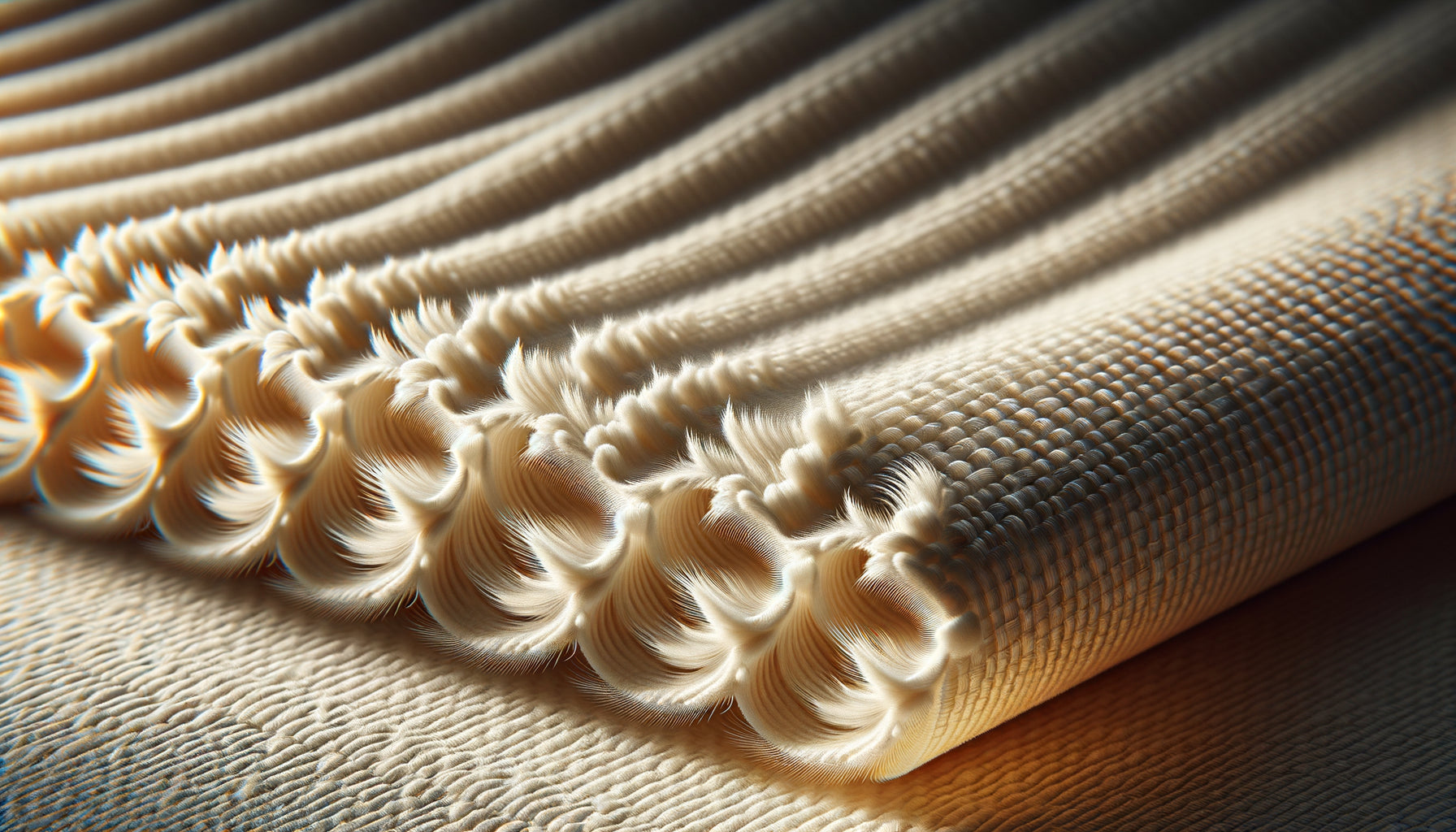
Canvas represents an interesting alternative to Fine Art papers, particularly appreciated for large format fashion artworks. Its textile structure naturally offers excellent opacity, even with relatively modest grammages (320-400 g/m² for canvases). The interlaced fibers create a very effective physical barrier against light transmission. However, canvas has very different aesthetic characteristics from Fine Art paper: a visible texture that can interfere with fine details, slightly less precise color rendering, and above all this 'painterly' dimension which is more suitable for some styles than others. For a very graphic fashion photograph, with sharp contrasts and meticulous details, Fine Art paper in the appropriate weight remains generally superior. Canvas excels rather on compositions with pronounced artistic effects, large format works (beyond 120 cm) where the texture becomes an asset, or environments requiring high humidity resistance. I have several collector clients who intelligently mix both supports: canvas for large-format decorative pieces in their living room, high-density Fine Art paper for more intimate and detailed artworks in their office or bedroom.
How do I know if my current artwork suffers from transparency?
Many artwork owners live with this problem without even realizing it, until a change in lighting or layout suddenly makes it obvious. Here is a simple test you can perform immediately. Wait for a sunny day and observe your fashion print at different times: morning, noon, late afternoon. If you notice that some black areas appear less deep at certain hours, or a 'halo' appears around strong contrasts when the light comes from behind, your paper lacks opacity. Another test: position yourself exactly between a light source (window, lamp) and your artwork. Do you see a difference in intensity depending on your position? Sufficiently opaque paper should offer a consistent visual rendering regardless of the orientation of the light. Finally, if your work is framed, temporarily remove it and place a white sheet against its back, then a black sheet. If the contrast rendering changes noticeably between these two configurations, the grammage is insufficient. The good news: this problem is simply solved by ordering a new print on Fine Art paper of at least 310 g/m². Several of my clients were amazed to rediscover their favorite works after this simple technical change. Blacks regain their depth, whites their pure luminosity, and the whole gains a presence that finally fully justifies the initial investment.