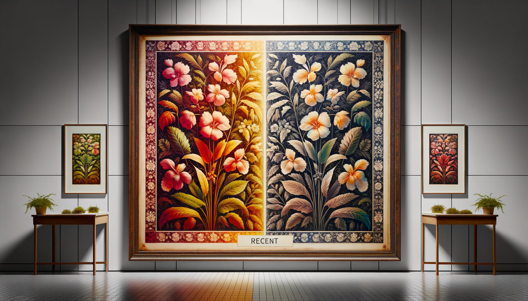
Last week, a customer walked into my studio with a Matisse reproduction she had paid 300 euros for. She was disappointed: the colors seemed dull, the cheap paper betrayed her expectations. “I thought I was buying a beautiful print,” she confided in me. It was at that moment that I showed her a museum grade giclée print next to her purchase. Her face lit up: the difference was striking.
Here's what a true museum grade giclée print brings you: exceptional color fidelity that respects the original artwork, guaranteed longevity of up to 100 years without alteration, and quality worthy of museum collections that transforms your interior into an art gallery.
The market is full of mediocre prints sold as works of quality. Technical terms are confusing, salespeople juggle vocabulary, and you end up with a reproduction that loses its luster in a few months. This frustration is legitimate: how to distinguish the authentic from marketing?
Rest assured, recognizing a museum grade print does not require a degree in fine arts. After fifteen years spent supervising the printing of art editions for galleries and collectors, I have developed an infallible method for identifying genuine high-end giclée prints. I am going to share with you the secrets that will transform your gaze and protect your artistic investments.
The paper immediately reveals the level of quality
Close your eyes and touch a museum grade giclée print. The texture speaks to you instantly. The paper has a generous weight, between 300 and 400 g/m², which gives it an incomparable tactile presence. It's not just paper: it's 100% pure cotton, sometimes mixed with acid-free alpha-cellulose that won’t yellow over time.
Commercial standard prints generally use paper between 150 and 250 g/m², often made from wood pulp. Run your hand across the surface: it feels flat, almost plasticized. The museum grade print, on the other hand, breathes. True art paper like Hahnemühle Photo Rag, Canson Infinity Baryta or Somerset Velvet has a soul, a depth that your fingers immediately identify.
A simple test: observe the edge of the paper. A museum grade print reveals a uniform and dense thickness, sometimes with visible fibers. Standard commercial paper shows a compact, smooth, industrial edge. This difference is not insignificant: it guarantees the print's longevity and its resistance to ambient humidity.
Pigment inks: an investment in time
This is where the real difference lies between a fleeting print and a work that transcends generations. Museum grade giclée prints exclusively use archival pigment inks, generally with 8 to 12 different color cartridges. These inks contain particles of solid pigments suspended in a medium, creating colors that resist light, moisture and time.
Classic commercial prints use dye inks, which are much less expensive but dramatically less durable. These inks dissolve in the liquid medium and penetrate superficially into the paper. Exposed to natural light, they begin to degrade within a few months. I have seen commercial prints lose 40% of their color intensity in less than a year near a window.
How to check? Ask for the longevity certificate. An authentic museum grade print includes a written guarantee mentioning durability: generally 100 to 200 years under museum conditions (indirect light, stable temperature), and 60 to 80 years under standard indoor conditions. If the seller hesitates or avoids the subject, consider this a major red flag.

Color fidelity that makes all the difference
Place a museum grade giclée print under different light sources: natural light, warm LED, indirect lighting. The colors remain consistent, vibrant, accurate. This color stability comes from the printing technology used: large-format professional printers such as Epson SureColor P9000 or Canon imagePROGRAF PRO, regularly calibrated with spectrophotometers.
The museum grade printing process includes ICC (International Color Consortium) color management. Each print is profiled according to the paper used, guaranteeing that the reproduced colors faithfully correspond to the values of the original artwork. This precision is measurable: the Delta E (perceptible difference between two colors) must be less than 2 for a museum grade print, whereas it often exceeds 10 for a commercial print.
Standard commercial prints go through uncalibrated consumer machines with generic color profiles. Result? Greens tending towards blue, orange reds, grayish blacks. Compare several copies of the same commercial print: you will notice variations in color between the prints, something unthinkable with a true professional giclée print.
These technical details that never lie
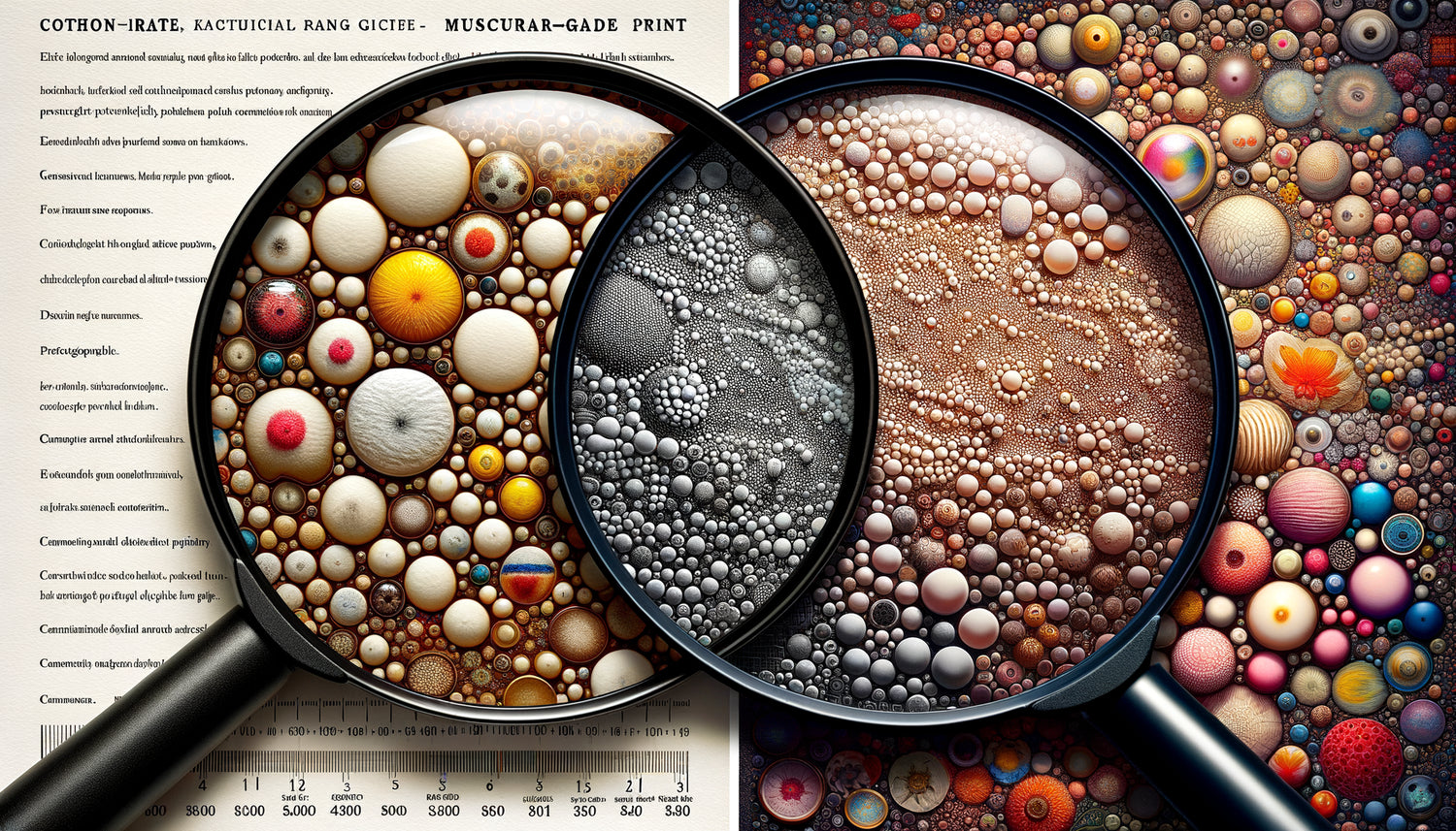
Examine the print with a magnifying glass. A museum grade giclée print reveals exceptional resolution, generally 1440 dpi or higher. Transitions between colors are imperceptible, creating perfectly smooth gradients. No grain, no visible dot: just a color continuity that imitates the original painting.
On a standard commercial print, you’ll often notice a dot structure, particularly in gradient areas. The resolution, often limited to 300-720 dpi, is sufficient for a distant eye but betrays the quality as you get closer. Pure whites may show a slight color veil, and deep blacks lack the density characteristic of true art prints.
Another revealing indicator: the margin. Authentic museum grade prints generally include a white margin of at least 2-3 cm around the image, allowing for framing without cropping the artwork. This margin often carries printing information: title, edition number, artist’s or master printer’s signature, date. Commercial prints are frequently printed edge to edge, without this traditional border that authenticates the seriousness of the print.

The story behind the print is as important as the technique
A true museum grade giclée print comes with complete documentation. The certificate of authenticity mentions: the exact type of paper (commercial name and weight), the ink technology used, the name of the printer or workshop, the edition number if the edition is limited, and often the date of printing.
This certificate isn't just marketing: it’s traceability that guarantees your rights as a collector. Serious museums and galleries require this documentation for any acquisition. Without it, it is impossible to prove archival quality, insure the artwork at its true value, or resell it under optimal conditions.
Commercial prints generally arrive without documentation, sometimes with just a simple shipping tracking number. This lack of traceability reveals the seller’s industrial approach: you are not buying a reproducible work of art in respect of the original, but a disposable decorative product. The difference in philosophy is directly reflected in the difference in price and durability.
The price: an investment that justifies itself
Let's be frank: a museum grade giclée print costs significantly more than a commercial print. For a 60x80 cm format, expect between 150 and 400 euros depending on the paper, edition and complexity of the image. This price reflects real costs: premium art papers (10-15€ per large sheet), professional pigment inks (cartridges cost 100-200€ each), regular equipment calibration, and printer expertise.
In contrast, commercial prints sell for between 30 and 100 euros for similar formats. This price difference may seem attractive, but calculate the real cost: a print that degrades in 2-3 years will cost you more to replace regularly than a museum grade print which will retain its brilliance for decades.
I encourage my clients to consider museum grade giclée prints as an artistic investment rather than a decorative expense. You are not just buying an image: you are acquiring a reproduction that respects the artist's intention, enhances your interior sustainably, and may even increase in value if the edition is limited and the artist recognized. This perspective completely transforms the financial equation.
Transform your walls into an authentic art gallery
Discover our exclusive collection of fashion paintings that celebrate timeless elegance with certified museum grade giclée prints.
Your gaze transformed, your choices informed
Now you have the keys to identify a true museum grade giclée print. The next time you consider acquiring an artwork reproduction, you will know how to touch the paper to assess its weight, request the ink longevity certificate, check the resolution and color fidelity, demand complete documentation.
This knowledge protects you from disappointments and transforms your walls into spaces where true art breathes. An authentic work of art does not simply decorate: it enriches your daily life, inspires your conversations, and testifies to your appreciation for lasting quality. Start by examining the prints you already own. Compare them to the criteria mentioned. You will immediately see which ones deserve their place, and which would benefit from being replaced by reproductions worthy of your interior.
Frequently asked questions about museum grade giclée prints
How long does a museum grade giclée print actually last?
The lifespan of a museum grade giclée print primarily depends on its exposure conditions. In a controlled museum environment (indirect light, stable temperature between 18-22°C, humidity 40-50%), manufacturers guarantee 100 to 200 years without visible color alteration. In a standard residential interior with indirect natural light, expect 60 to 80 years of optimal preservation. Even when directly exposed to sunlight behind UV glass, a museum grade print will retain its quality for 25 to 40 years, compared to 6 months to 2 years for a standard commercial print. This extraordinary longevity fully justifies the initial investment: you will literally pass on your collection to future generations. To maximize lifespan, simply avoid direct sunlight and opt for framing with UV-protective glass.
Can you really see the difference with the naked eye between the two types of print?
Absolutely, and the difference is immediately apparent once you know what to look for. Place a museum grade giclée print next to a commercial print: the colors of the former literally seem to vibrate, with a depth and natural saturation that the commercial print cannot match. Blacks are truly black, not grayish. Whites remain pure, without the slight yellowish haze characteristic of cheap prints. Approach within 30 cm: on the museum grade print, color transitions remain smooth and imperceptible, while the commercial print often reveals a grainy texture or banding in gradients. Even without technical expertise, the feel of the paper is immediately noticeable to the touch: the museum grade print has body, a tactile presence that commercial paper cannot imitate. This visible difference explains why galleries, professional decorators, and collectors never use commercial prints for their serious projects.
Does the high price of a museum grade print systematically guarantee its quality?
Unfortunately not, and that's precisely why knowing the technical criteria is essential. Some unscrupulous sellers capitalize on the trend and apply high prices to prints that do not deserve the museum grade designation. The price must be justified by verifiable characteristics: acid-free certified art paper (ask for the exact brand like Hahnemühle, Canson Infinity or Moab), archival pigment inks (Epson UltraChrome, Canon Lucia Pro), minimum resolution 1440 dpi, and above all a detailed certificate of authenticity. Don't hesitate to ask sellers specific questions: what exact type of paper do you use? What is the ink longevity guarantee? Can I see an example of a certificate? A serious seller will respond with transparency and pride. Conversely, evasion or vague answers generally indicate inferior quality despite an inflated price. The optimal value for money is between 150 and 400 euros for a medium format (60x80 cm) from a recognized printer or established gallery.