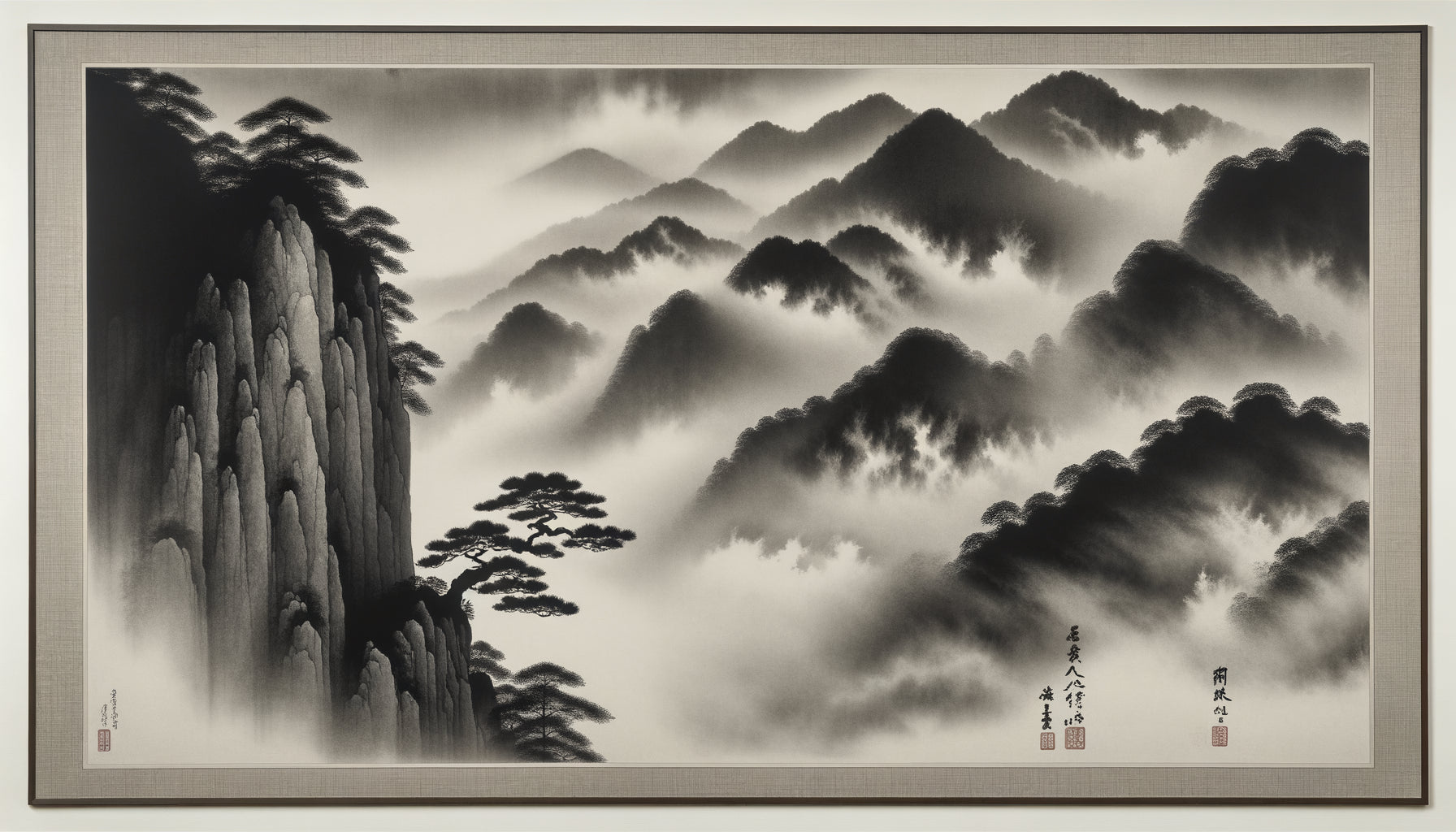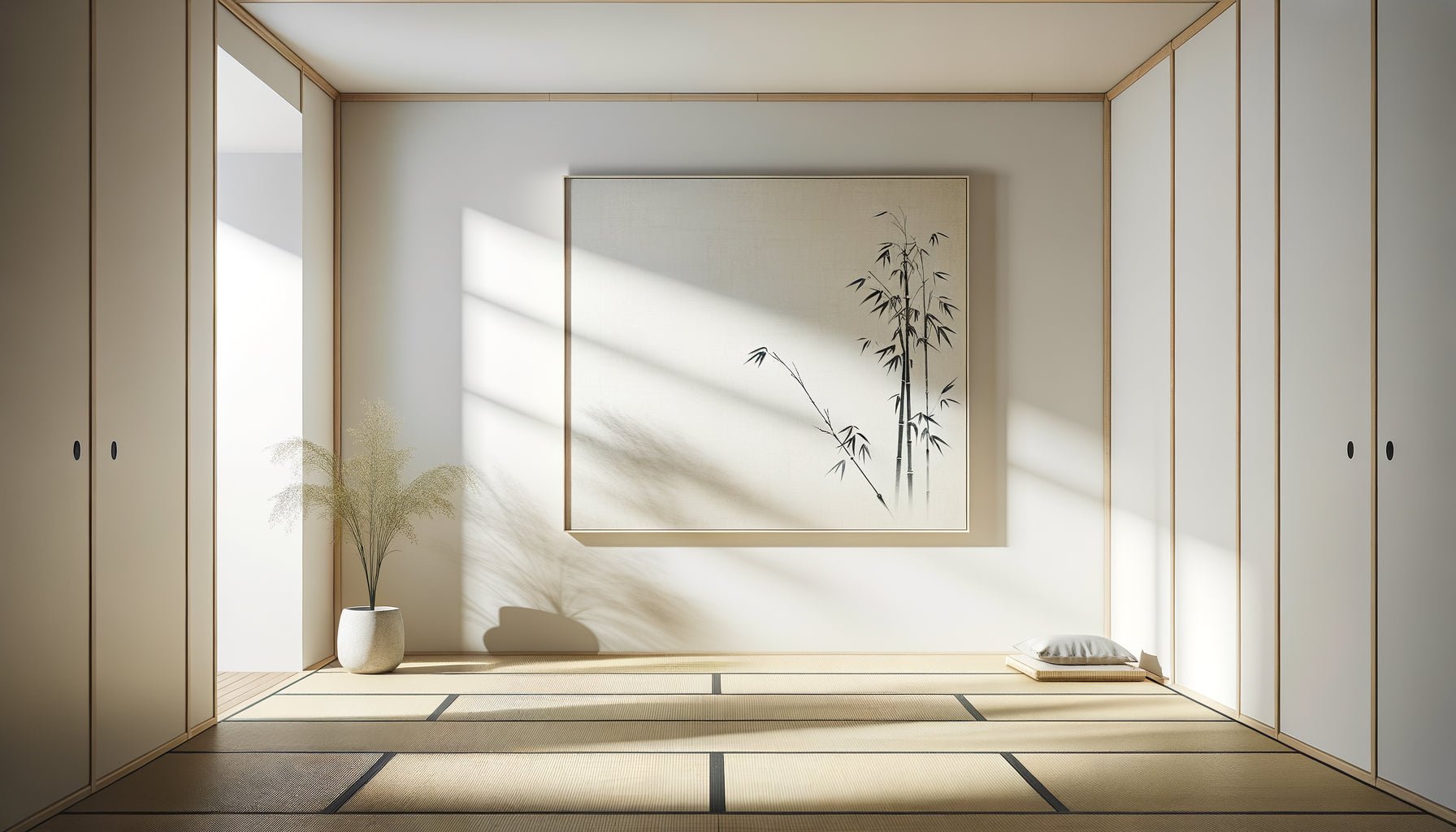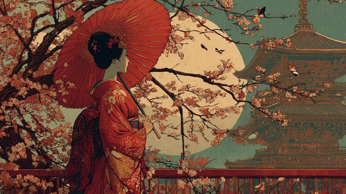
Paris, 1867. A young woman stops abruptly in front of the window of a porcelain dealer’s shop. It's not the vases that catch her eye, but the wrapping paper: a Japanese print depicting a monumental wave. She goes inside and asks to buy this simple piece of paper. The seller smiles. She is the tenth customer this week to request these “floating world” images. A silent revolution has just begun in European living rooms.
Here's what Japonism brought to Western decor: a liberation from rigid symmetrical compositions, color audacity previously unimaginable, and a celebration of nature in its most poetic intimacy. In three decades, these Ukiyo-e prints have transformed the way we live, decorate, and even perceive space.
You may have felt this frustration when contemplating your current interior: everything seems predictable, aligned, almost stifling in its academic perfection. The artworks are centered, the colors muted, the patterns conventional. Where has the surprise gone? The emotion? That breath of fresh air that a truly living space provides?
Rest assured: our great-great-grandparents felt exactly the same way in their overloaded Victorian salons. Until Japanese prints offered them an extraordinary visual escape. And this revolution remains disturbingly relevant to our contemporary interiors.
I'm going to tell you how these simple printed sheets of paper overturned Western living art, and above all, how their lessons can transform your own decorative universe.
When the West Discovers the “Floating World”
The story begins with a magnificent chance encounter. In 1854, Japan opens to Western trade after two centuries of isolation. The first shipments arrive in European ports, wrapped in recycled paper: Ukiyo-e prints considered worthless in Japan. These “floating world” images depicted courtesans, Kabuki actors, poetic landscapes – the quintessential popular art.
Parisian artists were the first to understand. As they unrolled these wrapping papers, they discovered a radically different aesthetic: dizzying asymmetrical compositions, pure color planes without gradations, bold framing that cuts off figures. Everything that Western academicism had forbidden for centuries.
Madame Desoye’s shop on rue de Rivoli becomes the Parisian sanctuary of Japonism. Manet, Monet, Degas flock there. They buy these prints by the dozens. Not only to study them in their workshops, but to hang them in their homes, in their living spaces. Japonism begins as an intimate decorative revolution before conquering galleries.
Asymmetrical Composition: Breaking the Codes of Balance
Imagine a bourgeois living room in 1870. Everything is symmetrical: the mirror centered above the fireplace, the armchairs facing each other, the paintings aligned at eye level. This symmetry was synonymous with good taste, refinement, social stability.
Ukiyo-e prints offer the absolute opposite. Hokusai places his famous wave on the left side, Mount Fuji tiny on the right. Hiroshige cuts his bridges diagonally, leaves entire areas of empty sky. This dynamic asymmetry creates a movement, a visual tension that captivates infinitely more than a predictable balance.
Avant-garde decorators immediately grasp the potential. They begin to hang Japanese prints in an offbeat way, creating wall compositions that guide the eye on a journey rather than static contemplation. A large format on the left, three small ones cascading to the right. This approach, revolutionary in 1875, remains the basis of all successful contemporary wall decor.
Japanese asymmetry teaches a fundamental lesson: balance is not symmetry. You can create harmony through tension, surprise, controlled imbalance. Your walls don't need to be perfect scales to be beautiful.

Discover this inspiring work
The chromatic boldness: from pastel to pure brilliance
The revolution of colors is perhaps the most spectacular. Victorian Europe favors muted tones: beiges, browns, olive greens, powder blues. Pigments are expensive, bright colors considered vulgar. One softens, degrades, nuances.
Japanese prints explode into living rooms like chromatic fireworks. Prussian blue – that intense ultramarine blue that Hokusai uses for his waves – fascinates and shocks simultaneously. Vermilion reds, deep purples, vibrant greens assert themselves boldly in pure planes, without shadow or modeling.
This colorful frankness immediately inspires the Decorative Arts. Wallpaper adopts Japanese-inspired patterns with bold colors. Ceramics abandon pastels for bright glazes. Textiles finally dare to use audacious contrasts: blue and orange, green and red, combinations considered impossible just a few years ago.
William Morris, a major figure in the Arts and Crafts movement, integrates this Japanese lesson into his creations. His famous wallpapers combine the natural exuberance of motifs with a palette now liberated, directly inspired by the ukiyo-e he passionately collects.
Nature as a Central Theme: From Monumental Landscapes to Intimate Details
19th-century Western art represents nature in two ways: overwhelming romantic landscapes, or very composed academic still lifes. Nothing between the two. Nothing intimate.
Japanese prints reveal a third way, infinitely more applicable to home decor. Hiroshige knows how to make a simple flight of swallows in the rain poetic. Hokusai dedicates entire series to cherry blossoms, chrysanthemums, peonies – not as formal arrangements, but as living presences captured in their natural environment.
This approach radically transforms Western floral and botanical decoration. Symmetrical compositions in vases give way to asymmetrical arrangements, single branches, simplified ikebana. Decorative motifs are inspired directly by this attentive observation: a dragonfly on a reed stem, a heron in the reeds, a flowering prunus branch against a moon.
Japonisme teaches that nature does not need to be spectacular to be decorative. A detail observed with accuracy possesses more strength than a generic panorama. This lesson still nourishes contemporary botanical decoration today, from minimalist posters to current plant wallpapers.

Discover this inspiring artwork
Empty Space as a Decorative Element
Here is perhaps the deepest, most difficult revolution to grasp for 19th-century Westerners: emptiness is part of the composition. In ukiyo-e prints, large areas remain blank – cloudless sky, pristine snow, uniform mist. This is not an oversight; it is an intention.
This concept of ma, the interval meaning in Japanese aesthetics, disrupts Western decoration saturated with clutter. Victorian living rooms accumulate: paintings crammed together, multiplied trinkets, patterns overlapping on fabrics and wallpapers. The horror of emptiness reigns supreme.
Decorators influenced by japonisme finally dare to embrace empty space. A single painting on a wall panel. A unique vase on a console. Textiles with spaced motifs allowing the background to breathe. This revolution of emptiness will not fully triumph until the 20th century with modernism, but its roots go directly back to the 1870s-1900s.
The Japanese print demonstrates that an isolated element in space gains presence, strength, and the ability to evoke emotion. Emptiness is not absence, but amplification. This lesson remains fundamental for any contemporary interior: fewer elements, better chosen, better highlighted.
How to integrate the heritage of Japonism today
This century-old revolution still deeply permeates our current decorative choices, often without us realizing it. Every time you hang a frame off-center, choose a bold color, let a wall breathe, you extend this legacy.
To authentically capture this spirit in your interior, prioritize reproductions of original prints over sweetened interpretations. The works of Hokusai, Hiroshige or Utamaro possess a visual power that transcends eras. Their bold graphic design perfectly dialogues with contemporary minimalist aesthetics.
In terms of color palette, dare to use the combinations legitimized by Japonism: deep blue and pristine white, carmine red and black, emerald green and gold. These combinations work just as well in a classic interior as they do in a contemporary one, bringing that touch of controlled boldness.
Think asymmetry in your wall compositions. Instead of aligning three identical frames, create a dialogue between different formats, placed at varying heights. Leave empty space – that famous ma – around each element. The visual breathing it provides infinitely better showcases your choices.
Transform your interior with the timeless elegance of Japonism
Discover our exclusive collection of Asian art that captures this visual boldness and the poetry of everyday life inherited from the masters of ukiyo-e.
The living heritage of a silent revolution
This young Parisian woman from 1867, fascinated by a simple wrapping paper, could not have imagined the extent of the revolution she sensed. In three decades, Japonism has methodically deconstructed Western decorative certainties: obligatory symmetry, muted colors, saturation of spaces, academic hierarchy of subjects.
Ukiyo-e prints taught that beauty often arises from the unexpected: a decentered composition, a bold contrast, an intimate detail magnified, an assumed void. These lessons have nourished all the decorative movements of the 20th century, from Art Nouveau to contemporary minimalism.
Your own interior can still benefit from this aesthetic wisdom. Start simply: choose a print that moves you, place it where no one would expect it, leave it space to breathe. Observe how it transforms your view of the surrounding space. That's exactly what those first collectors felt 150 years ago.
The revolution continues, one wall at a time.
Frequently Asked Questions About Japonism in Decoration
How to Recognize a Genuine ukiyo-e print from a reproduction?
Original ukiyo-e prints have distinctive characteristics that you can identify even without extensive expertise. First, the paper: thin, slightly textured, often somewhat yellowed with age. The colors show a natural patina, sometimes variations in intensity due to manual block printing. You will often see unprinted margins with possible traces of handling. Modern reproductions have too uniform colors, too white or too smooth paper. Also look for the artist's and publisher's seals, present on all authentic prints. To get started with decoration, museum-quality reproductions offer an excellent compromise: they capture the visual power of the originals at an accessible price, while respecting the original colors and proportions. The essential thing is that the artwork speaks to you and transforms your space.
Are Japanese prints suitable for a modern minimalist interior?
Absolutely, and it's even a particularly coherent association! Contemporary minimalism shares many principles with Japanese aesthetics: economy of means, importance of emptiness, purification of forms, restricted but frank color palette. Ukiyo-e prints, with their graphic compositions and blocks of pure colors, naturally dialogue with current uncluttered interiors. A large Hokusai print on an immaculate white wall creates exactly that powerful focal point sought by minimalist design. The asymmetry of Japanese compositions also breaks the sometimes rigid coldness of overly geometric interiors. For optimal results, limit yourself to one or two prints per room, choose simple frames (matte black, light natural wood, or even frameless under glass), and leave plenty of space around. This breathing amplifies the presence of the artwork rather than drowning it.
What wall colors should you choose to enhance Japanese prints?
The choice depends on the chromatic intensity of your prints, but some principles work universally. White or off-white remains the safe bet: it allows the vivid colors of ukiyo-e to express themselves fully without competition. This was also the choice of the first Parisian Japanophiles. For more character, light to medium grays create a subtle depth that particularly enhances prints with blue or green hues. Warm beiges and soft earth tones wonderfully enhance autumnal scenes in orange tones. If you are daring, a dark blue or matte black wall can create a spectacular gallery effect, provided you have suitable lighting. Avoid colors that are too saturated or too warm (red, bright orange) which would enter into visual competition. The goal is always for the wall to serve as a setting, not a competitor. Also consider the lighting: Japanese prints, often printed on delicate paper, benefit from indirect lighting which avoids discoloration while revealing their subtle nuances.