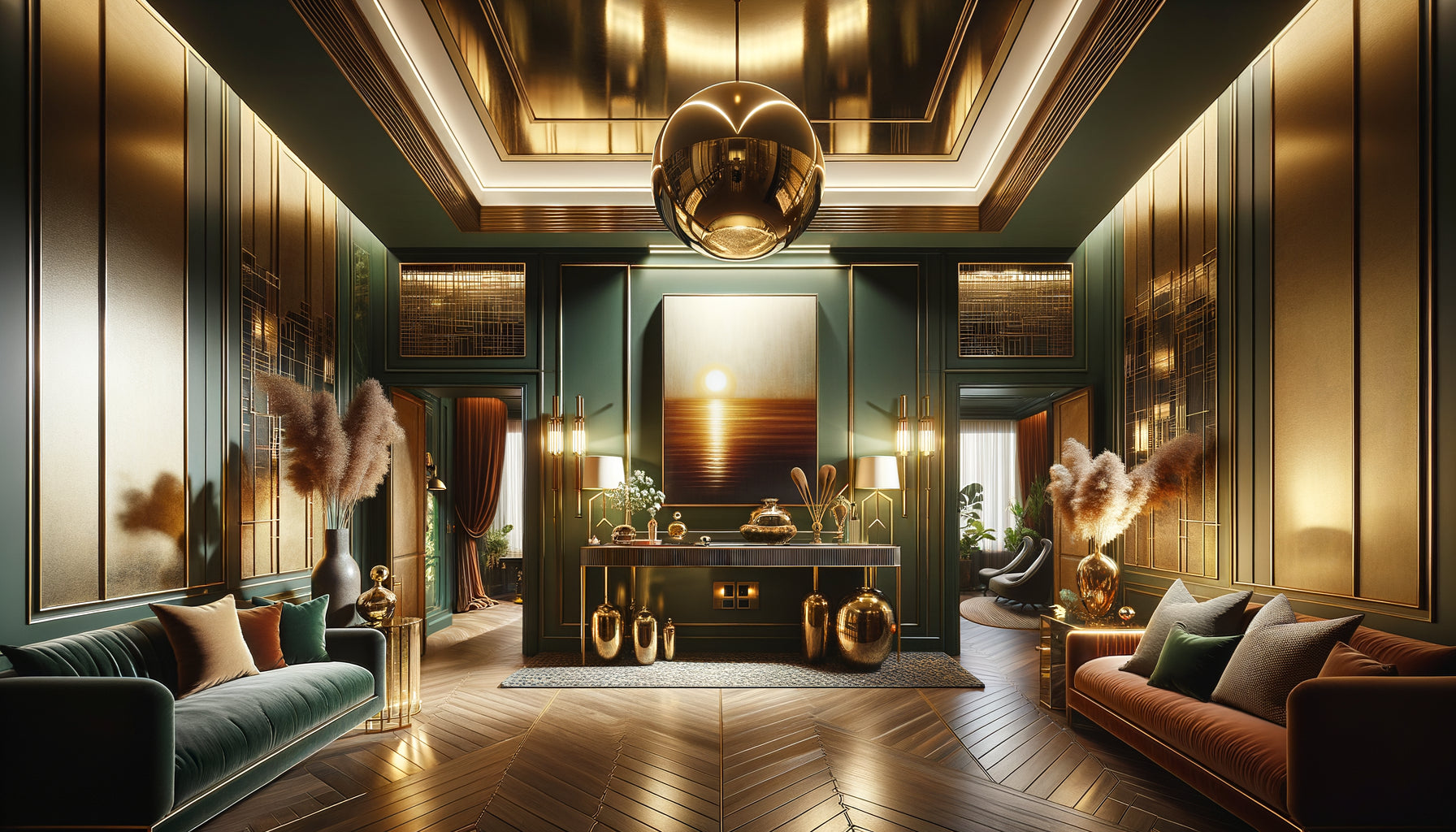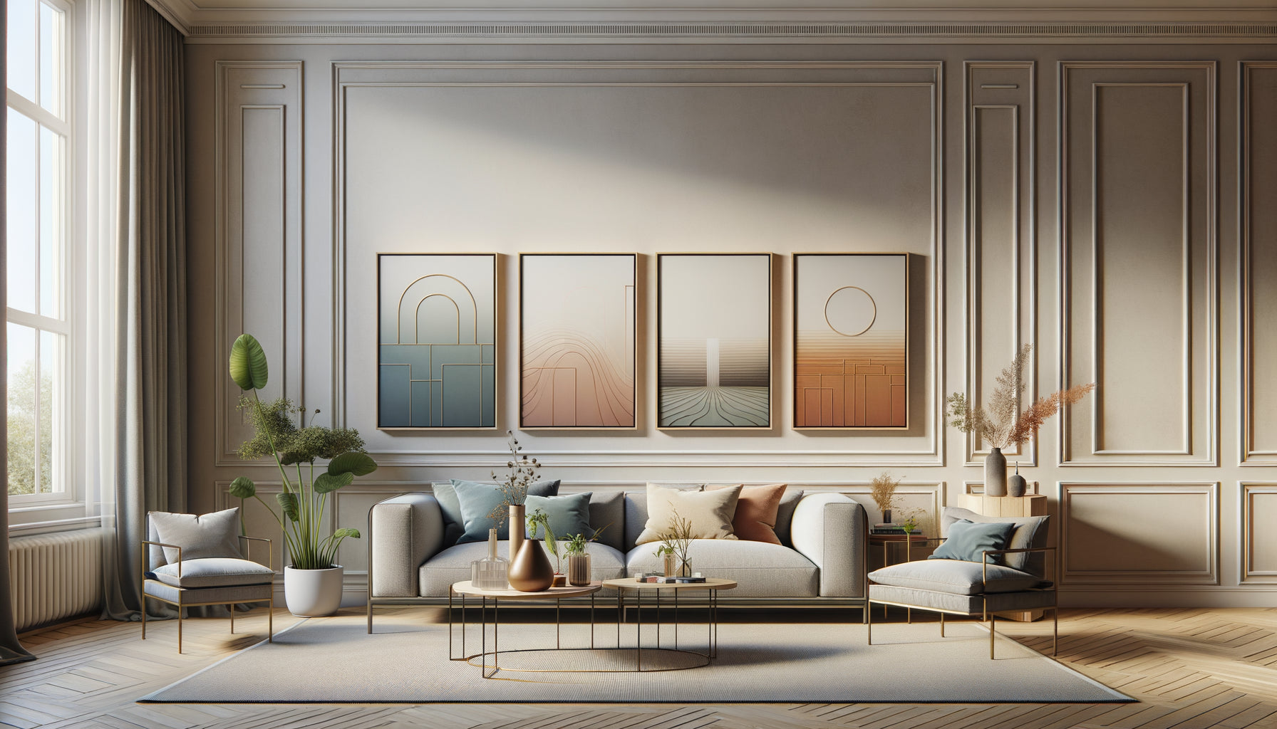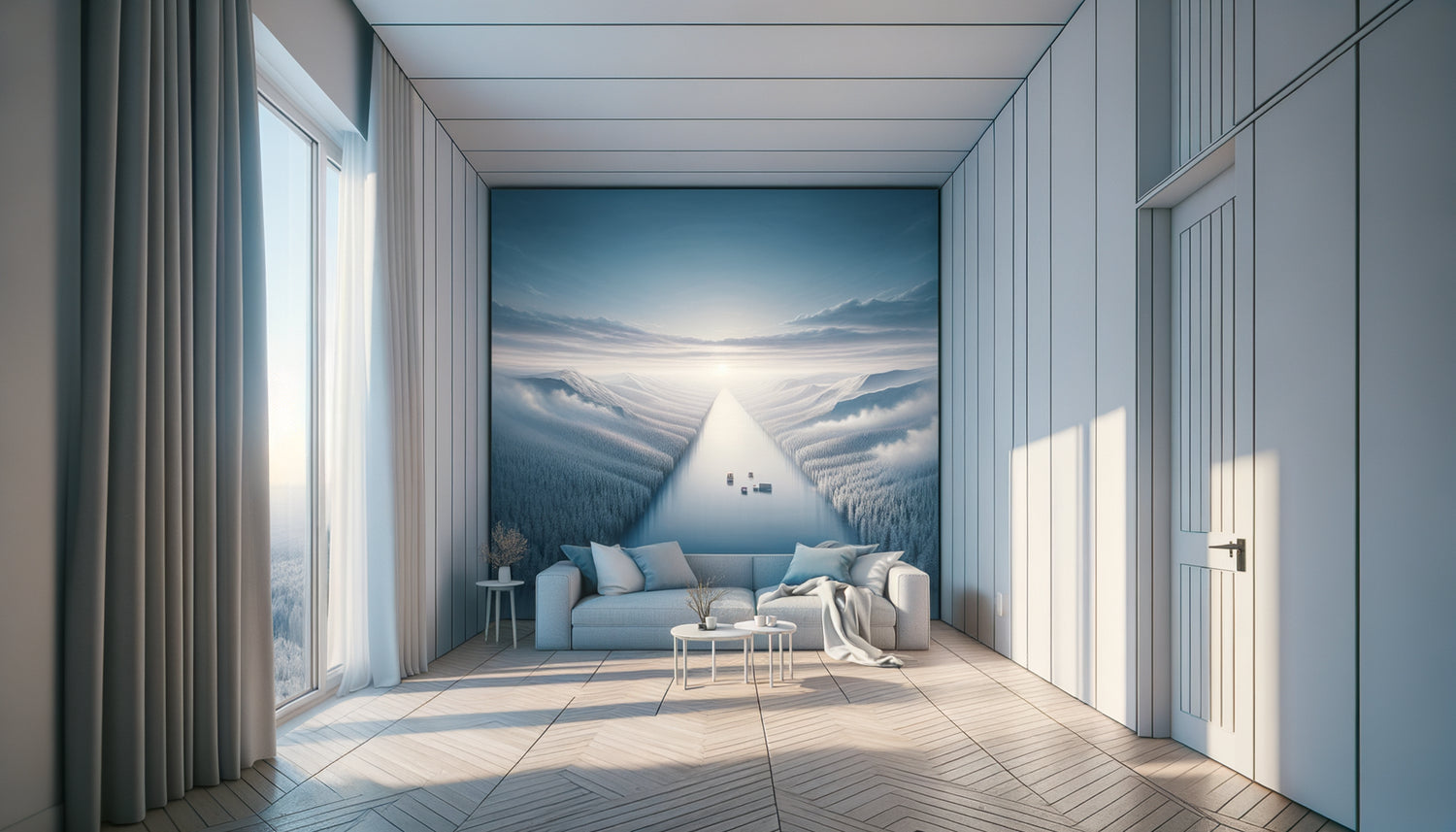
I learned this lesson during a photoshoot for a studio apartment of 22m² in the Marais district. The owner had just received three consecutive reviews mentioning “the confined space.” In one day of strategic restaging, including the addition of three carefully selected artworks, the same studio was described the following month as “surprisingly spacious.” Magic? No. Visual psychology.
Here's what strategic artworks bring to your small-space Airbnb: a sense of depth that visually pushes walls back, an eye movement that creates the impression of volume, and visual storytelling that diverts attention from actual dimensions. Three elements that transform “small but functional” into “cozy and perfectly optimized.”
The challenge with small Airbnb spaces isn't their actual size. It’s the first impression – those ten seconds when your traveler opens the door and subconsciously gauges whether they will be comfortable. A bare wall visually brings the wall closer. A poorly chosen artwork crushes the space. But the right piece? It opens a window where there wasn't one.
Rest assured: you don’t need a gallery budget or a degree in art history. What matters is understanding how the human eye evaluates space, and using that knowledge to your advantage. I will show you exactly what types of artworks create this illusion of enlargement, and most importantly how to position them to maximize their effect.
The golden rule no one tells you about artwork in small spaces
Forget everything you've been told about “small formats for small spaces.” It’s the classic mistake I see in 80% of compact Airbnbs. A 30x40cm artwork on a 3-meter wall? It actually emphasizes the smallness of the room, creating a “stamp” effect.
The secret: a generously sized artwork (minimum 90x60cm) creates a powerful focal point that visually restructures the entire space. The eye anchors itself on this expressive surface, and the brain subconsciously recalculates the proportions of the room based on this strong visual reference point.
I tested this approach in an 18m² studio in Lyon. Instead of three small frames scattered around, a single horizontal artwork of 120x80cm above the sofa bed. The result? Travelers consistently overestimated the actual area by 4 to 6m² in their reviews. Large format gives breadth, where small format infantilizes the space.
The perspectives that open imaginary windows
Artworks with perspective are your best allies for creating depth. A road leading to the horizon, a forest path disappearing into the woods, an alley lined with trees, a seascape with a low horizon line: these compositions literally invite the eye to travel beyond the wall.
Linear perspective works on a simple principle: our brain automatically interprets the convergence of lines as distance. By hanging a perspective artwork on the wall facing the entrance, you create a visual escape that gives the impression that the room extends further.
Test with a seascape. A low horizon in the composition allows the top of the painting to breathe, creating a feeling of openness towards the sky. In a space with low ceilings, this effect is particularly valuable: it counterbalances vertical compression with a visual escape upwards.
The placement trick to maximize depth effect
Position your perspective paintings on walls perpendicular to the entrance. When a traveler enters your Airbnb, their gaze naturally scans from left to right, then focuses on the back wall. It is here that your perspective painting should work its visual enlargement magic.
Avoid placing these works on the entrance wall: no one will turn around to see them once inside. Their illusionary power would be wasted.

Cool colors that push walls away
Chromatic temperature directly influences our perception of distances. It's pure visual physics: cool colors (blues, turquoise, pale purples) seem to recede, while warm colors (reds, oranges, intense yellows) advance towards us.
A painting dominated by blues or turquoise creates an impression of the wall receding. The brain interprets these shades as distant planes, just like the sky or mountains in a natural landscape.
I transformed a stifling 20m² Parisian studio with a large abstract painting in ocean blue gradients. The owner was skeptical: "It will be cold!" After three months, the result was a 15% increase in booking rate and recurring comments about “the pleasant and airy space.” Cool tones didn't cool the welcome; they refreshed the spatial perception.
However, pay attention to balance. In a north-facing room, already bathed in cold natural light, a painting entirely in icy blues could actually create a too clinical atmosphere. Prefer then blues nuanced with touches of gold or warmer emerald greens that retain their receding effect while maintaining conviviality.
Abstract art that blurs dimensional landmarks
Abstract compositions have a superpower: they prevent the brain from establishing a scale reference. Faced with a realistic landscape with trees and people, your eye immediately calculates proportions. Facing an abstract work? This dimensional evaluation function is short-circuited.
Abstract paintings with overlapping layers of color create a delightfully effective spatial ambiguity. The eye explores the different layers without ever settling on a definitive 'before' or 'after'. This constant movement of the gaze generates an impression of movement and space.
Prioritize compositions with upward or lateral movement: shapes that rise or extend horizontally. This directional dynamism visually amplifies ceiling height or room width. A vertical abstract painting in a low-ceilinged space raises the eye. An horizontal abstract painting in a narrow room widens the perception.
The diptych or triptych technique to stretch the space
Instead of a single painting, consider a composition in two or three panels aligned horizontally. This visual continuity literally stretches the width of the wall. The eye follows the rhythm of the frames and perceives a lateral expansion, particularly effective in long hallways or studio apartments.
Space the panels 5 to 8cm maximum to maintain visual unity while creating breathing room that lightens the whole.

Vertical patterns that add centimeters to the ceiling
In a space with a low ceiling (less than 2.40m), the feeling of compression can be oppressive. Paintings with dominant vertical lines are your elegant solution: birch forest, architecture with columns, abstract composition with vertical bands, cascading height.
Vertical repetitions guide the eye upwards and create an illusion of elevation. It's the same principle as vertical stripes: they visually lengthen the silhouette. Applied to your Airbnb, this principle symbolically adds precious centimeters to the perceived height.
One of my favorite projects: an attic apartment with a severe roof slope. I installed a stylized birch triptych on the lowest wall. Counterintuitive result: instead of emphasizing the architectural constraint, these upward lines created a harmonious dialogue with the slope, transforming the peculiarity into a design asset.
Strategic placement that multiplies the enlargement effect
Even the perfect painting will fail if its location is missed. The standard hanging height (center of the painting 1.60m from the floor) works in generous spaces. In a small Airbnb, adapt this rule according to the desired effect.
To accentuate the height: hang slightly higher than normal, with the bottom edge of the frame at 5'7" from the floor. This position raises the gaze and visually clears low spaces, particularly appreciated above a bed or sofa.
To widen: prioritize horizontal (landscape) formats on narrow walls. The brain establishes a parallel between the orientation of the painting and the dimensions of the room. A horizontal painting suggests lateral expansion.
Also exploit dead corners: this corner between window and wall angle, this space above the door, this side wall in the entrance. A well-placed painting transforms a dead corner into an interesting point that enriches the overall perception of volume.
Ready to transform the perception of space in your Airbnb?
Discover our exclusive collection of Airbnb art specially selected to create enlargement illusions in small spaces.
Visualize the transformation
Imagine your traveler crossing the threshold after a tiring flight, dragging their suitcase. Their gaze scans the space in seconds. They see that large painting with marine perspective facing the entrance. Their eye travels to that blue horizon. A slight smile. "It's more spacious than in the photos," they say to their travel companion.
This first positive impression colors their entire experience. The 22m² studio will not be perceived as “cramped” but as “perfectly optimized”. Your rating for cleanliness goes up (a space that breathes seems cleaner). Your rating for accuracy of photos also (the space seems consistent with expectations). And that five-star comment mentioning “pleasant space”? That's your next marketing superpower.
Start with a single strategic wall: the one facing your entrance. A large format painting, perspective or dominant cool tones, hung at the right height. Observe the difference in the comments of your next three travelers. Then optimize other walls according to the same principles.
Small Airbnb spaces are not a fatality to be endured. They are visual puzzles to solve. And paintings? Your master pieces to win this chess game against square meters.
Frequently Asked Questions
How many paintings are needed in a 20m² Airbnb studio to create an enlargement effect?
Less is definitely more in small spaces. I recommend a maximum of 2 to 3 artworks for a 20m² studio, with a simple rule: one large statement artwork (minimum 90x60cm) as the centerpiece, and possibly one or two medium formats (50x40cm) in specific areas like the kitchenette or bathroom. Beyond that, you risk visual overload which produces exactly the opposite effect sought: the eye doesn't know where to rest, the space seems cluttered and therefore even smaller. Focus on quality and strategic placement rather than quantity. A single perfectly chosen artwork, ideally positioned, will do more to visually enlarge your space than three poorly selected artworks.
Do mirrored or reflective artworks work better to enlarge a small Airbnb?
It's a popular belief, but the reality is nuanced. Pure mirrors are indeed champions of spatial enlargement, but they pose practical challenges in Airbnbs: risk of breakage, sometimes disturbing reflections (no one likes seeing themselves from their bed), and constant cleaning of fingerprints. Artworks with metallic touches or glossy varnish offer an interesting compromise: they subtly capture and reflect light without the drawbacks of a pure mirror. An abstract composition with gold leaf or silver accents brings bright spots that energize the space. My advice: reserve real mirrors for functional areas (entrance, bathroom) where their practical utility justifies their presence, and use artworks to create the illusion of enlargement in living spaces, where their artistic dimension enriches the overall aesthetic experience.
Should thick frames be avoided in small Airbnb spaces?
Counterintuitively, no! A thin “discreet” frame can give a cheap appearance that devalues the whole. A frame with presence (3 to 5cm thickness) in a finish consistent with your overall decor visually structures the artwork and gives it the importance necessary to create its enlargement effect. The key lies in the color and finish of the frame: prioritize light tones (white, light natural wood, pale gray, champagne gold) that blend harmoniously with light walls and maintain brightness. Absolutely avoid thick black frames in very small spaces: they create heavy visual blocks that fragment the space instead of unifying it. A thick white frame around a marine perspective artwork? It acts like an architectural window that reinforces the illusion of depth. It's this overall intention of the frame-artwork-wall ensemble that counts.